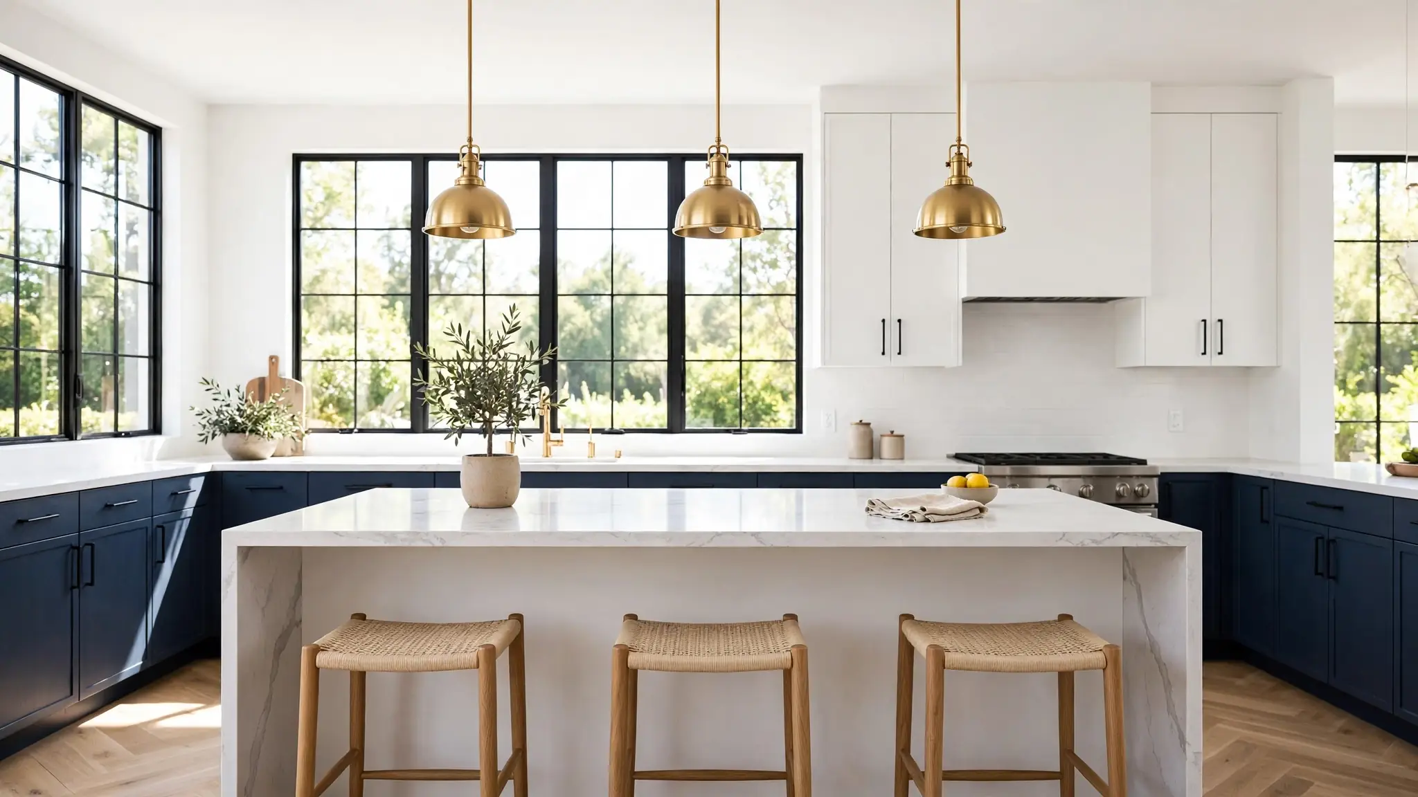
20 Two Tone Kitchen Cabinet Ideas for Bold, Modern Style
Thinking about two tone kitchen cabinet ideas for your next refresh? You are not alone. Two tone cabinets have become the go-to move for kitchens that need personality without a full remodel. The concept is simple: pair two complementary cabinet colors, usually a light tone up top and a deeper shade below, to create contrast and depth. In my experience, this approach makes even builder-grade kitchens look custom. Below you will find 20 fresh pairings, from navy and white to walnut and cream, each with practical tips to get the look right. Whether you paint or replace, these combos will help your kitchen feel bold, modern, and completely you.
A quick note on planning before we explore the pairings. Good storage thinking crosses room boundaries: the same zone logic in my shared sibling bedroom storage ideas guide applies to kitchen cabinets too. Group everyday items where you reach most, and reserve high or deep spots for occasional pieces. With that mindset, every color combo below becomes easier to plan.
Navy Lower Cabinets
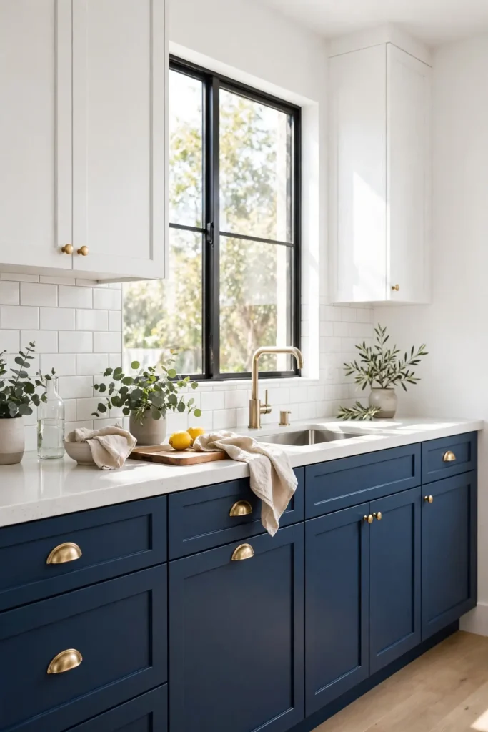
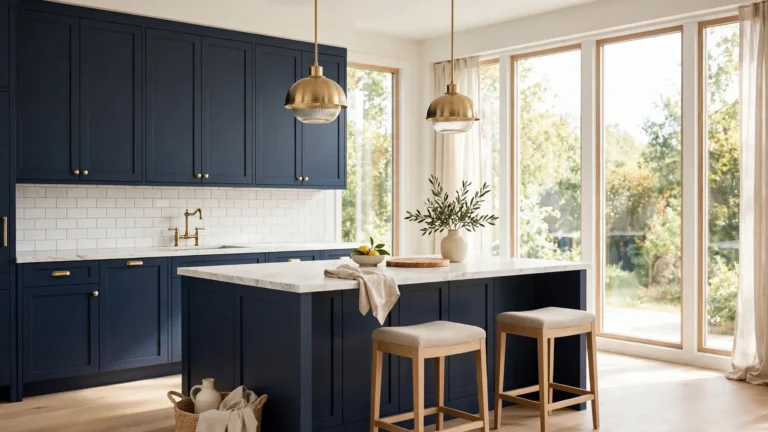
Deep navy base cabinets ground a kitchen with quiet confidence. The dark lower tone hides everyday scuffs and smudges far better than white, which matters in a busy cooking space. Pair the navy with crisp white uppers and the room instantly feels taller and brighter. I have noticed this combo photographs beautifully for resale listings too.
Hardware choice seals the look. Brushed brass pulls warm up the navy, while matte black keeps it moody and modern. Keep countertops light, like honed quartz or butcher block, so the contrast stays crisp. In my experience, navy reads as a neutral, so it pairs with almost any accent color you love.
White Upper Contrast
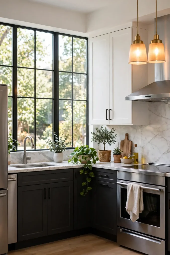
- White uppers reflect daylight deep into the room, keeping small kitchens bright.
- Choose a warm white if your floors run warm; a cool white suits gray floors.
- Open shelving on one wall breaks up the white without adding a third color.
- Matte finishes hide fingerprints better than glossy ones on upper doors.
- Carry the white onto the ceiling for a seamless, taller look.
The real win here is balance. Dark lowers add drama at eye level where you see them most, while white uppers lift the sightline. I have seen this work well in many cases, especially in galley kitchens that need every trick to feel open. Keep the palette tight and the result feels custom.
Charcoal Island Pop
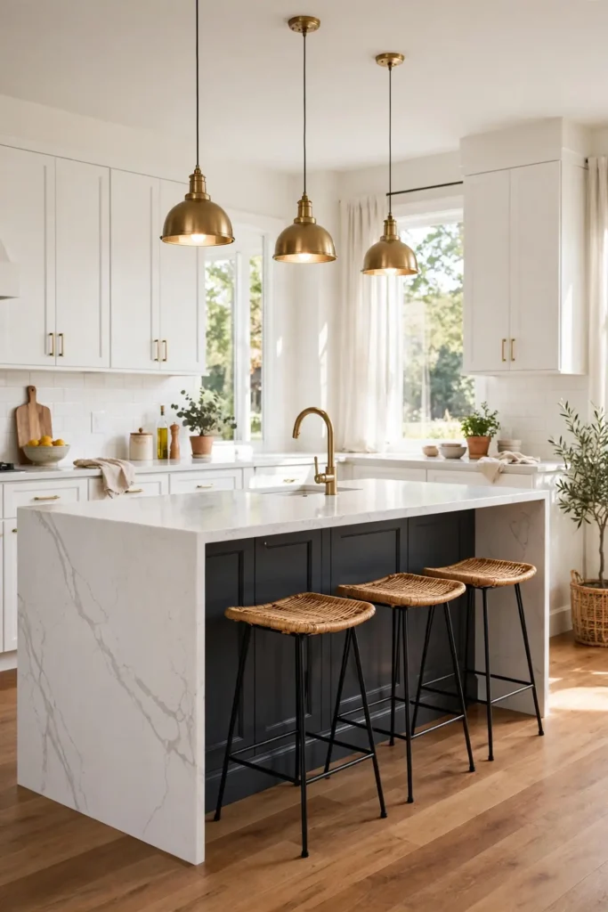
Quick Tip: Paint just the island charcoal and leave the perimeter cabinets one light color for instant contrast. This single move adds depth without overwhelming the room or your budget. Always sample the paint on a large board first, then view it in morning and evening light before committing. View samples at night too, since matte black shifts under artificial light.
A charcoal island becomes the natural gathering spot, anchoring stools and conversation. The dark tone grounds light floors and makes pendant lights pop overhead. That is why many experts recommend testing island color separately from wall cabinets, since islands catch different light. One bold island beats a whole dark kitchen for impact. It photographs well too.
Sage Green Pairing
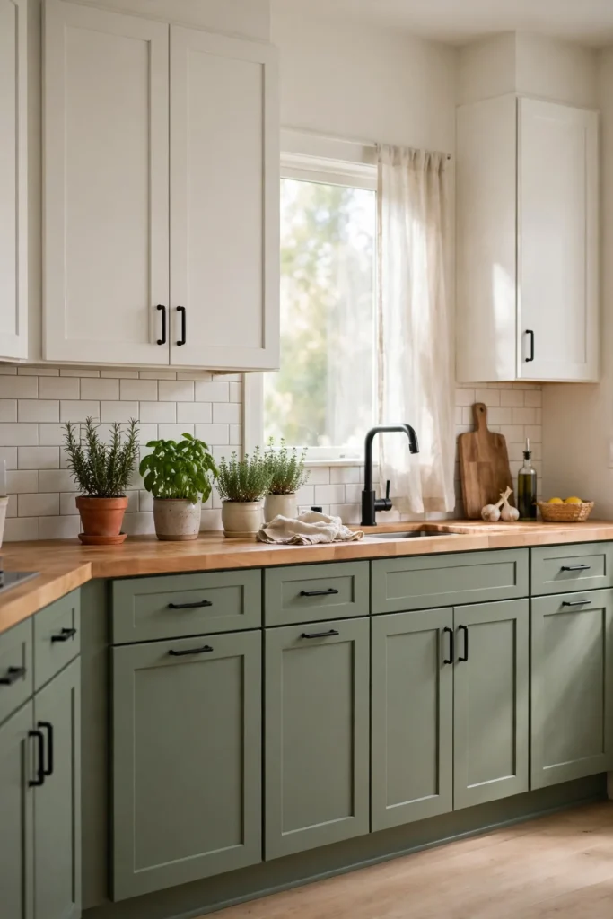
BEFORE: The kitchen felt flat with all-white cabinets that showed every mark. The space lacked personality and blended into the walls. Guests barely noticed the kitchen at all.
AFTER: Sage green lowers brought calm color while white uppers kept things airy. The kitchen now feels styled and serene. Brass knobs finished the look with a soft glow.
Sage sits beautifully between gray and green, so it works with warm wood and cool stone alike. I have tried this pairing in a north-facing kitchen where light runs cool, and the sage warmed the whole room. Keep hardware simple so the color stays the star.
Black Base Drama
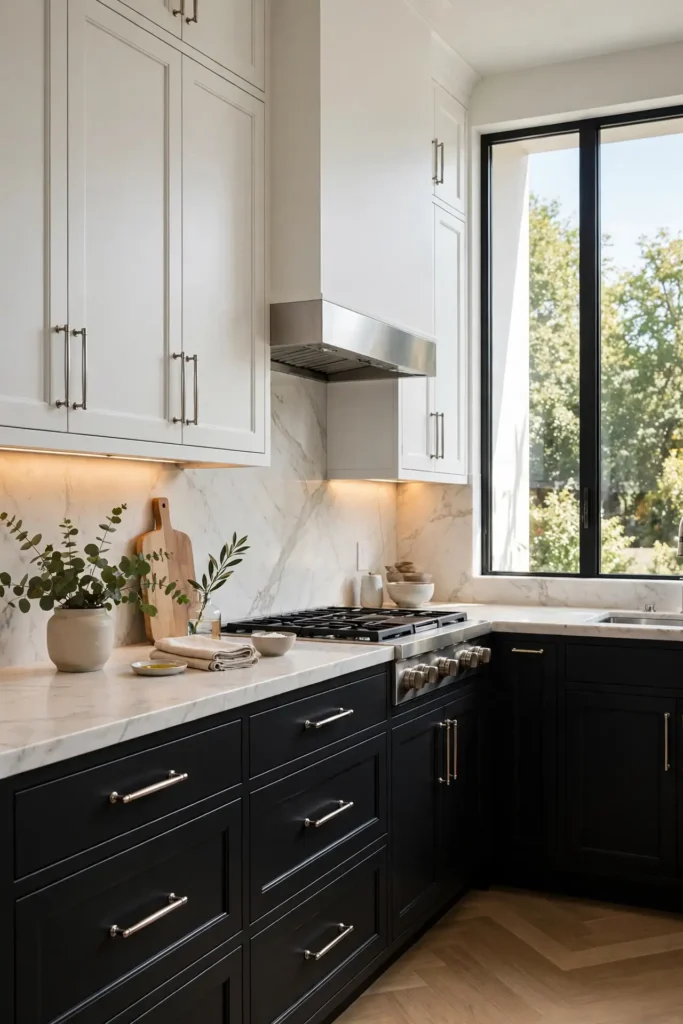
- Choose a soft black with warm undertones so it reads rich, not harsh.
- Paint base cabinets first, then step back to judge the contrast with uppers.
- Swap in light countertops to keep the dark bases from feeling heavy.
- Add under-cabinet lighting so the black does not swallow the workspace glow.
Black bases make a kitchen feel tailored and high end, like a custom suit. The drama works best when the rest stays quiet: light walls, simple backsplash, minimal clutter. I have noticed bold bases also hide wear beautifully, which busy families appreciate. One dark tone keeps the look sharp, not chaotic.
Warm Wood Mix

| Detail | White Oak | Walnut |
| Tone | Light airy grain that brightens | Deep rich brown with warmth |
| Pairs With | White, sage, soft gray | Cream, black, brushed brass |
| Best For | Calm Scandinavian style kitchens | Moody modern luxury spaces |
| Cost | Mid range, widely available | Higher end, custom feel |
| Care | Wipes clean, low maintenance | Needs oiling once yearly |
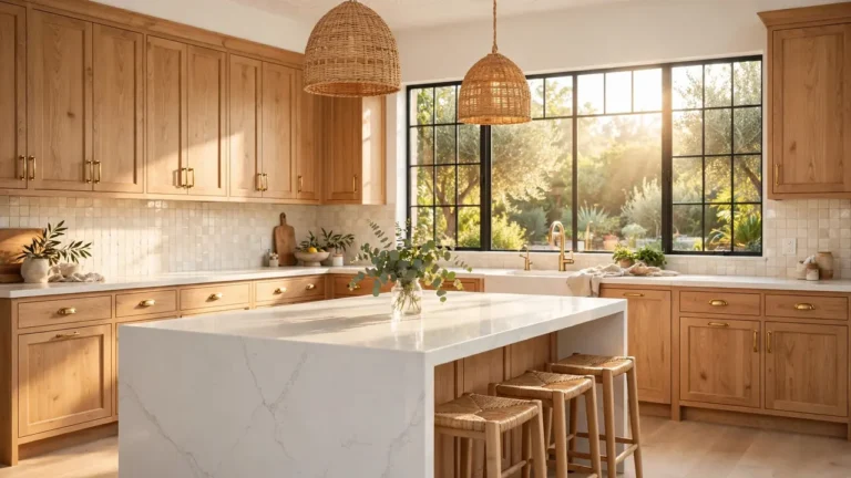
Wood plus paint is the friendliest two tone combo, since the wood reads as a neutral. White oak keeps things breezy; walnut adds instant richness. In my experience, wood lowers with painted uppers age gracefully and never feel trendy. Choose the wood tone that matches your floor’s warmth.
Gray Two Tone
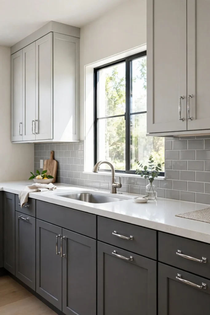
DO: Pair light gray uppers with charcoal lowers for soft contrast.
DO: Repeat the gray in the backsplash to tie the palette together.
DO: Choose warm gray if your lighting runs cool.
DON’T: Mix warm and cool grays in the same kitchen.
DON’T: Add a third cabinet color; two is the sweet spot.
DON’T: Forget to test gray swatches in your actual light.
Gray on gray is the safest two tone route, and safe can still look sharp. The key is undertone discipline: pick one temperature and stick with it everywhere. I have seen this work well in many cases, from rentals to forever homes. Small hardware updates keep it feeling fresh for years.
Blue Island Statement
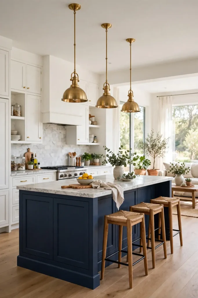
Cost: $200 to $600 for quality cabinet paint, primer, and new hardware
Time: One full weekend, including thorough prep and proper dry time between coats
Skill Level: Beginner friendly if you sand well and use a cabinet-grade primer
Best For: Open plan kitchens where a bold island anchors the whole space
A blue island delivers the two tone look with the smallest commitment and the biggest payoff. If you tire of the color, repainting one island costs little and takes a weekend. Navy, slate, and dusty blue all play beautifully with white perimeters. Echo the island color in one small accessory so the choice feels fully intentional.
Cream Dark Duo
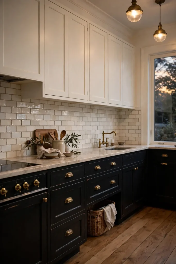
Cream uppers with near-black lowers feel softer than stark white and black. The creamy tone warms the room while the dark base adds definition. This pairing suits traditional and transitional kitchens especially well. I have noticed cream hides dust better than pure white, a quiet practical win. It also glows warmly under evening lighting.
Keep the backsplash simple so the two tones stay the heroes. A handmade-look subway tile in soft white adds texture without noise. Finish with aged brass hardware for warmth. The result feels collected and calm, never flat. In my experience, this combo appeals to buyers too, which matters if you might sell.
Green Upper Fresh
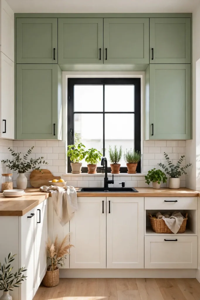
- Sage or olive uppers bring nature in without overwhelming a small kitchen.
- Pair green uppers with warm white lowers for a fresh, balanced look.
- Repeat the green in a potted herb or artwork for cohesion.
- Matte green finishes feel modern; satin adds a soft glow.
- Test the green next to your countertop; undertones must harmonize.
Green uppers flip the usual script, and the surprise works. Eyes travel up to the color, making ceilings feel higher. That is why many experts recommend green for kitchens lacking natural warmth. Keep lowers light so the room stays bright and the green stays the star.
Matte Black Pair
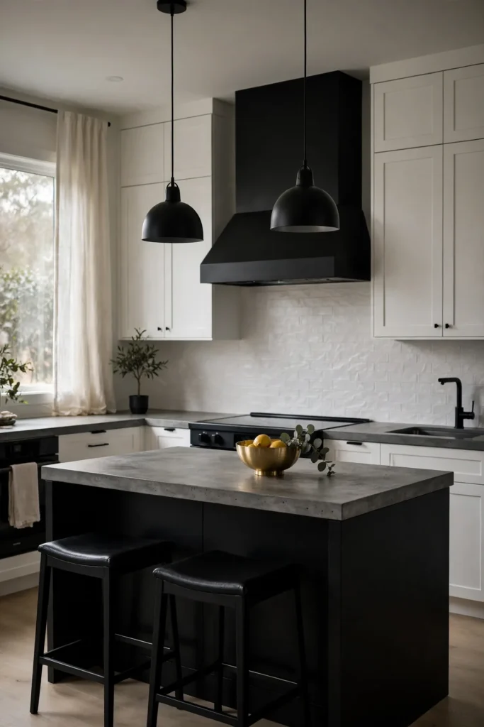
Quick Tip: Use matte black on the island and range hood only, keeping perimeter cabinets white. This limits the dark to two focal points for maximum impact. Matte finishes show fewer smudges than gloss, which keeps the look clean longer. View samples at night too, since matte black shifts under artificial light.
Matte black reads as soft and modern rather than harsh. The low sheen absorbs light, which makes surrounding whites look brighter by contrast. I have seen this work well in many cases, especially with concrete or light wood floors. Add one metallic accent to keep it from feeling flat.
Oak Island Warmth
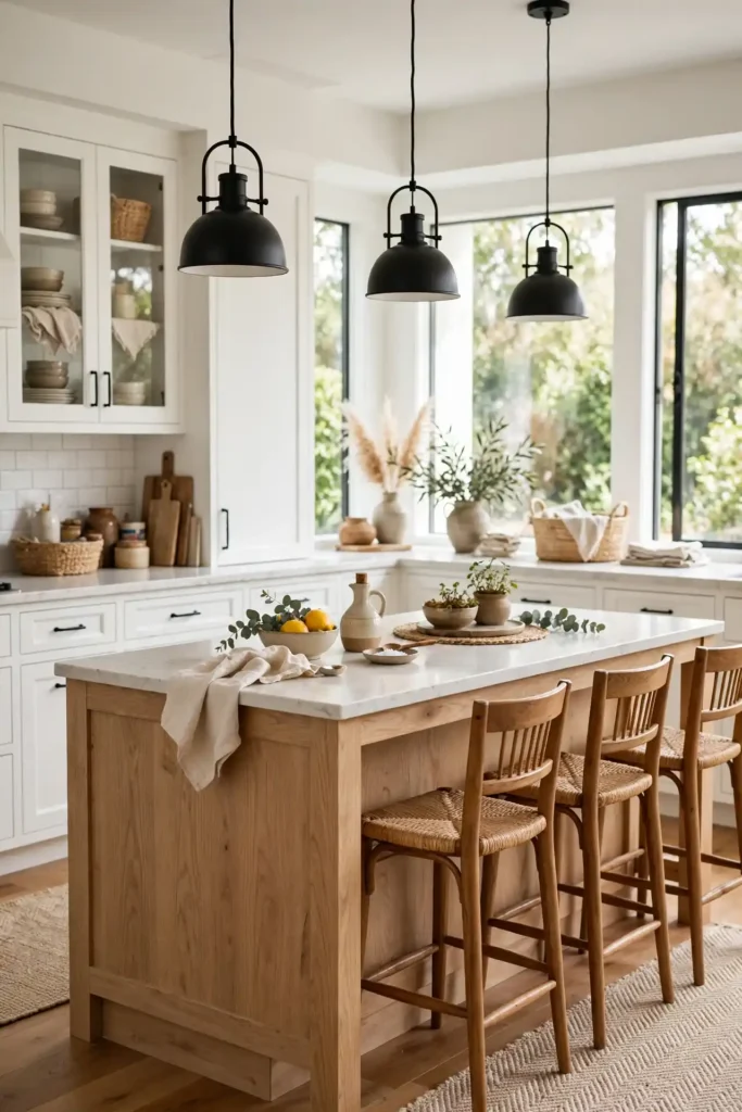
BEFORE: The all-white kitchen felt cold and a bit sterile. The large island dominated without adding any warmth. Everything blended into one bright blur.
AFTER: A white oak island brought natural warmth and texture. The kitchen now feels inviting and layered. Guests now gather around it naturally.
Wood islands are wonderfully forgiving with kids and daily cooking. The grain hides small dents that would show on paint. In my experience, oak pairs with nearly any perimeter color, from white to deep green. Seal it well and it ages beautifully. It is the hardest working two tone choice you can make.
Teal Lower Bold
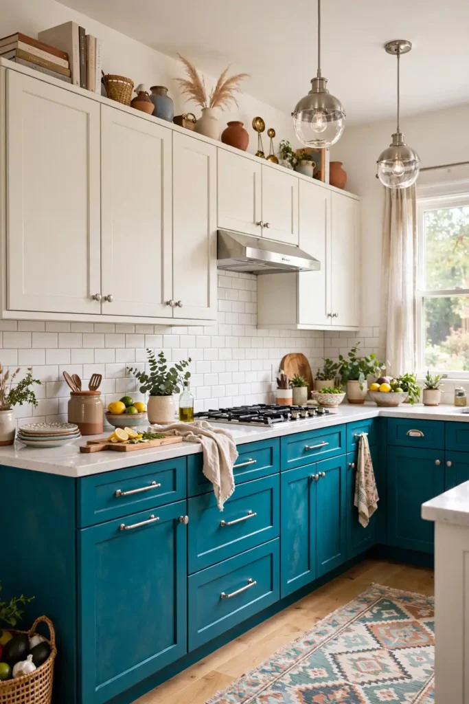
- Pick a teal with gray undertones so it feels sophisticated, not tropical.
- Paint the lowers and live with them a week before choosing hardware.
- Add brushed nickel pulls; the cool metal flatters teal beautifully.
- Keep walls and uppers warm white to balance the bold color.
- Seal with a durable topcoat; bold colors show wear faster.
Teal is the extrovert of cabinet colors, full of personality. It works surprisingly well in small kitchens because the boldness distracts from size. I have tried this in a rental kitchen refresh and the transformation stunned everyone. Commit fully; half measures dull the effect. Bold color rewards bold choices.
White Dark Split
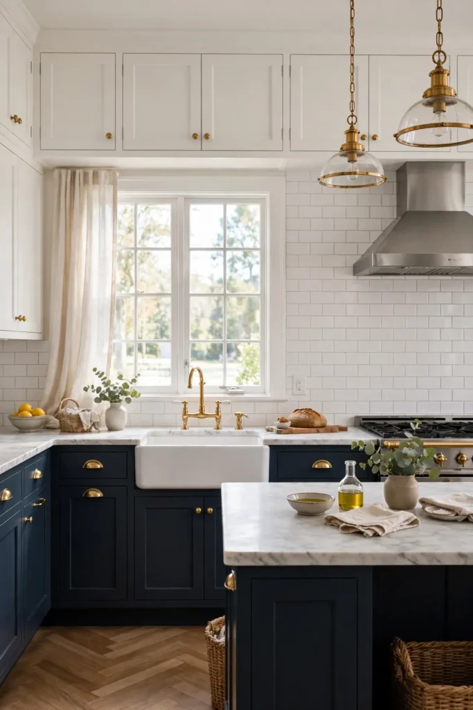
| Detail | Classic Split | Modern Split |
| Upper Color | Crisp white shaker | Warm white flat front |
| Lower Color | Navy or black | Charcoal or forest green |
| Backsplash | Subway tile | Large format stone |
| Floor Pairing | Light wood keeps it airy | Dark wood adds drama |
| Vibe | Timeless and bright | Moody and tailored |
The classic white-over-dark split remains popular because it simply works. Dark grounds the room; white lifts it. Your hardware and backsplash decide whether the look leans traditional or modern. In my experience, this is the safest bold move in kitchen design. For a closer look at one specific color, see my navy blue kitchen cabinet ideas guide. Start here if two tone feels new to you.
Walnut Cream Blend
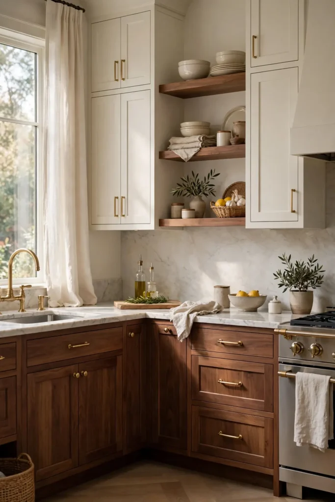
DO: Let walnut’s grain show; choose a clear or light stain.
DO: Pair walnut lowers with creamy white uppers for warmth.
DO: Echo the wood in open shelves or a range hood trim.
DON’T: Pair walnut with orange-toned floors; the clash is real.
DON’T: Use heavy grain on both cabinets and island.
DON’T: Skip sealing; walnut needs protection from steam.
Walnut plus cream is pure quiet luxury. The combination feels custom and considered without shouting. I have noticed this pairing photographs warmly, which matters for open plan homes. Keep the palette restrained and let the wood do the talking. Two materials beat two paints for lasting richness.
Slate Blue Mix
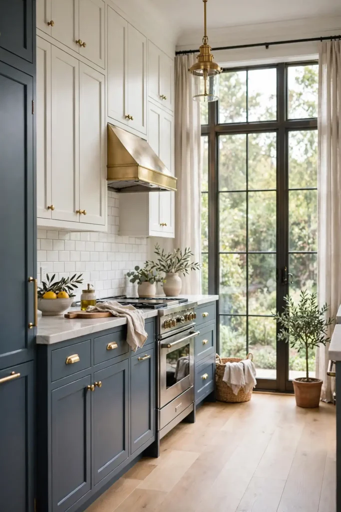
Cost: $300 to $800 for paint, primer, and hardware updates
Time: Two weekends for careful prep and full cure time
Skill Level: Intermediate; spraying gives the smoothest finish
Best For: Kitchens needing color without going fully dark
Pairs With: Warm whites, light oak floors, and brushed brass hardware
Slate blue sits between gray and navy, giving you color with restraint. It shifts beautifully through the day, looking gray in morning light and blue by evening. I have seen this work well in many cases, especially in homes with mixed warm and cool finishes. The chameleon quality keeps it interesting for years.
Beige Charcoal Calm
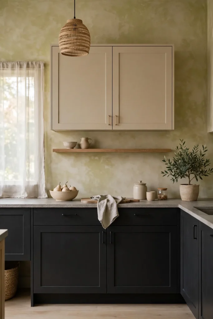
Beige uppers with charcoal lowers create a calm, grounded kitchen. The beige warms the upper walls while charcoal anchors the base. This combo suits minimal and Japandi styles beautifully. I have noticed beige reads richer than white without adding visual weight. It also hides everyday dust better than stark white.
Texture matters here more than color. Choose a limewash or matte finish on the beige for depth. Keep countertops honed and simple. The result is serene and sophisticated, a kitchen that never shouts. In my experience, this palette calms busy mornings and suits open plan living. Small and large kitchens both wear it well.
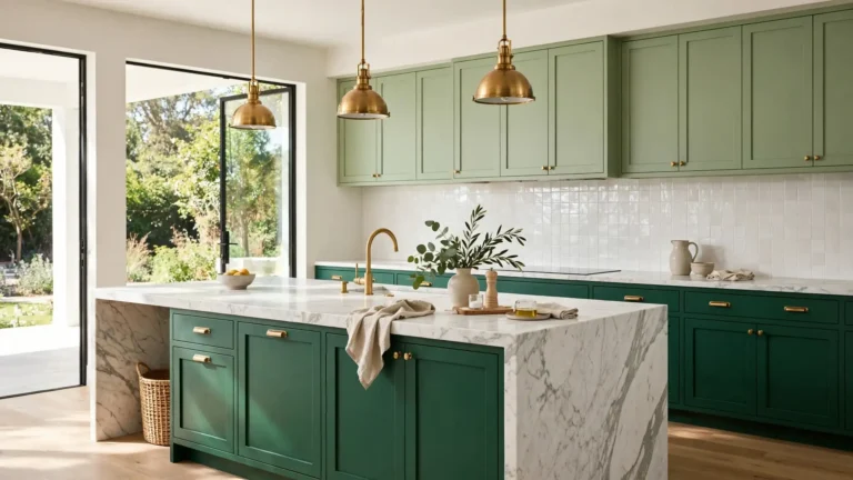
Forest Green Rich
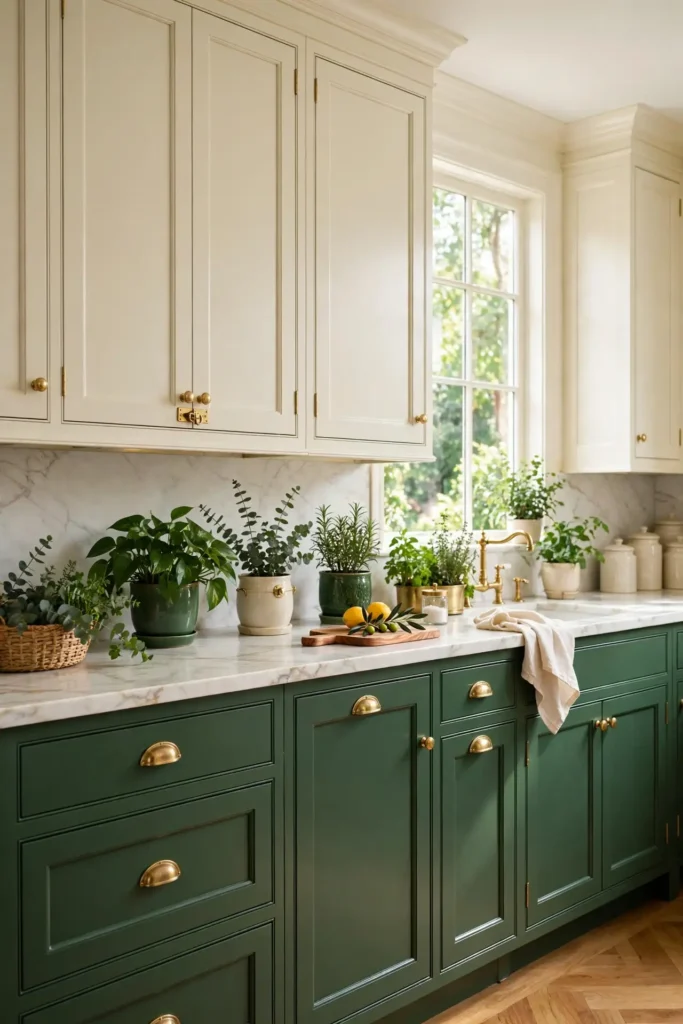
- Forest green lowers feel rich and botanical, especially with brass hardware.
- Pair with creamy uppers so the green stays lush, not dark.
- Marble or light quartz counters keep the palette fresh.
- Add a green plant or two to echo the cabinet color.
- Satin finish shows the depth of green better than flat matte.
Forest green brings the outdoors in with grown-up polish. The color feels both classic and current, a rare combination. That is why many experts recommend it for homeowners wanting color with longevity. It pairs as happily with modern lines as with traditional trim. Green kitchens simply make people happy.
Light Dark Balance
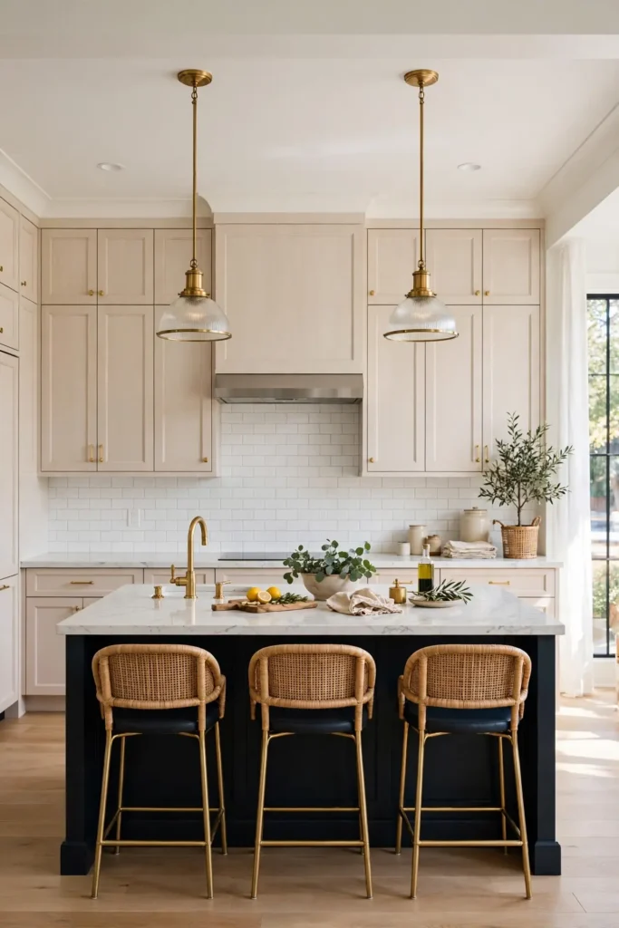
Quick Tip: Follow the 60-30-10 rule: 60 percent light cabinets, 30 percent dark, 10 percent accent. This ratio keeps two tone kitchens balanced and pleasing. Measure your cabinet fronts roughly; eyeballing works fine for this guideline. Write the ratio on a sticky note and check it as you plan each wall.
Balance is what separates stunning two tone kitchens from chaotic ones. Too much dark feels heavy; too little feels accidental. I have tried the ratio trick in several kitchens and it never fails. Step back often during the process and trust your eyes. Your gut knows when the mix is right.
Brass Accent Finish
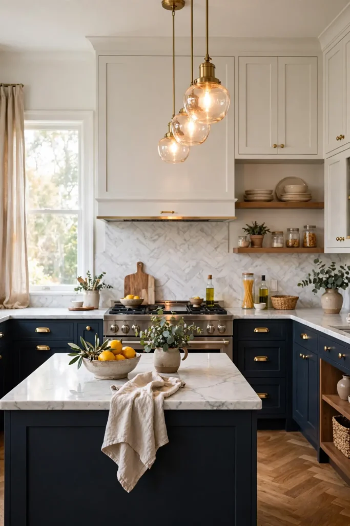
BEFORE: The two tone cabinets looked good but felt unfinished. The silver hardware disappeared against both colors. Nothing connected the upper and lower colors.
AFTER: Brushed brass pulls and knobs tied the light and dark together. The kitchen suddenly felt designed and complete. Every element now feels intentional and warm.
Hardware is the jewelry of the kitchen, and brass flatters nearly every two tone combo. The warm metal bridges light and dark tones with ease. Choose unlacquered brass if you love a living finish that patinas. It is a small change with outsized impact. Swap hardware before repainting; you might love the refresh alone.
Conclusion
Two tone cabinets prove that contrast is the secret to a kitchen with character. Whether you go bold with black and brass or calm with beige and charcoal, the right pairing makes your kitchen feel intentional and designed. I have seen how small changes like these can completely shift the way a space feels. Save your favorite combos on Pinterest, then start with one wall or just the island. Share this guide with a friend planning their own refresh, and enjoy creating a kitchen that feels bold, modern, and unmistakably yours with these two tone kitchen cabinet ideas.

One Comment