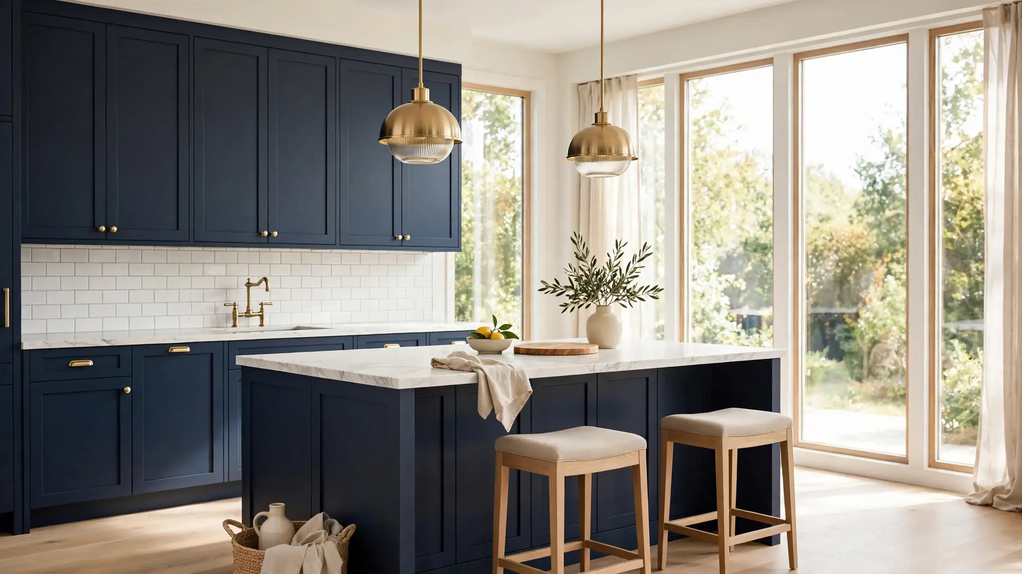
25 Navy Blue Kitchen Cabinet Ideas for Bold Elegance
There is something undeniably confident about a kitchen that leans into color, and navy blue kitchen cabinet ideas deliver that bold elegance in a way few other choices can. In my experience, deep navy reads as both classic and current, which makes it a smart long term pick. These 25 ideas show you how to pair rich blue cabinets with brass hardware, marble counters, warm wood, and crisp white for a kitchen that feels dramatic yet welcoming. You will find two tone layouts, lighting tricks, and storage upgrades that keep the space functional and beautiful. For calm inspiration beyond the kitchen, explore my japandi bedroom ideas. Let us design the striking, timeless kitchen you have been picturing.
Midnight Navy Palette
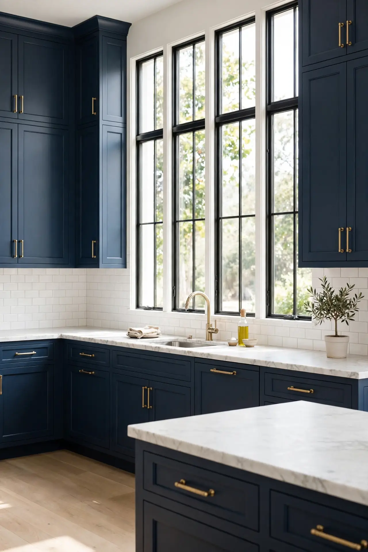
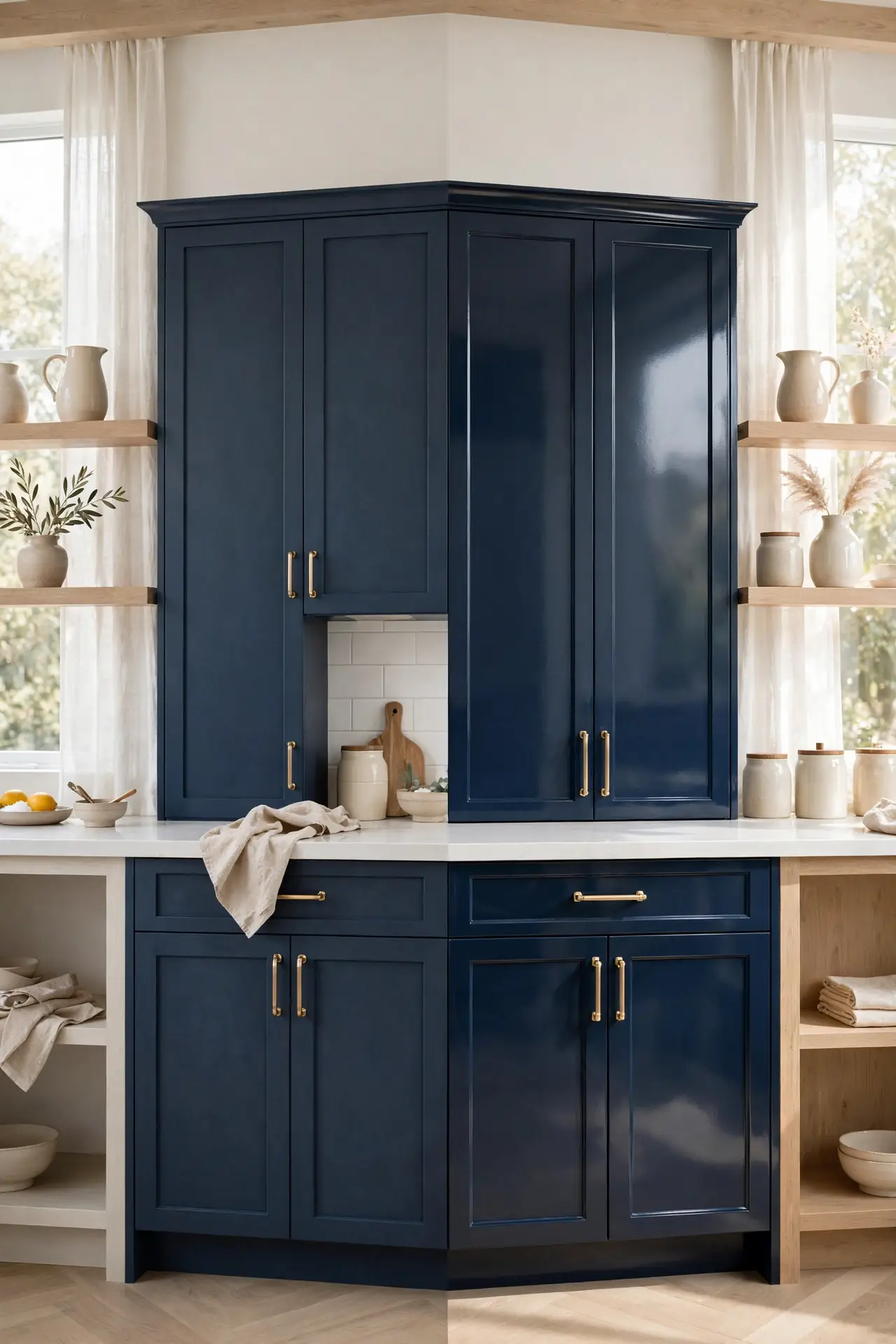
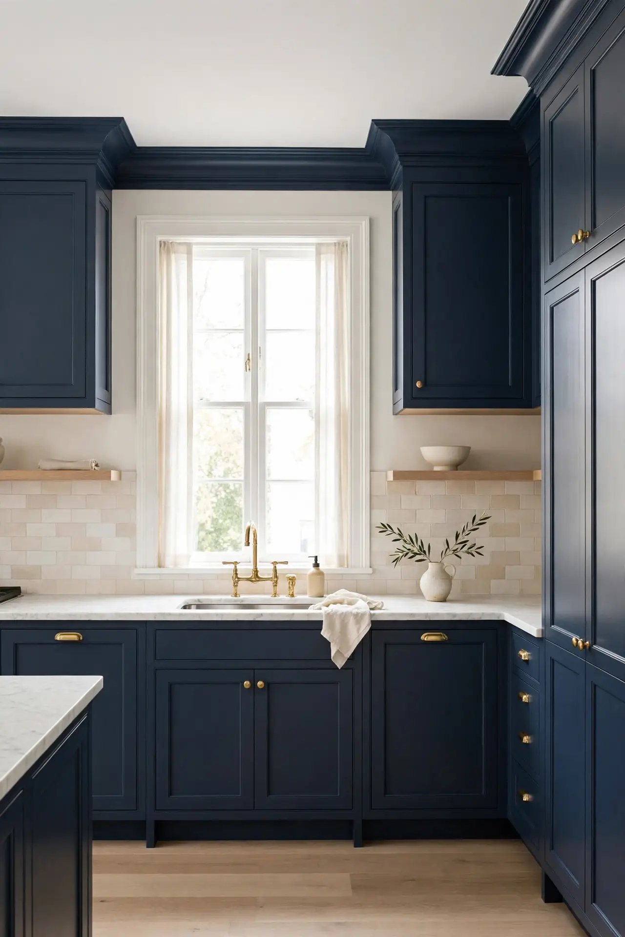
Committing to navy on every cabinet gives your kitchen instant confidence and polish. The deep color grounds the room, hides everyday wear, and pairs beautifully with warm metals and cool stone. I have noticed full navy kitchens photograph incredibly well. Keep walls light so the cabinets stay the star.
Balance the drama with pale countertops and a bright backsplash that bounces light around. Brushed brass pulls and knobs add warmth against the cool blue, and a runner rug softens hard floors. Choose matte paint for a velvety, fingerprint resistant finish that looks expensive. This all in approach suits cooks who want a kitchen with personality and staying power.
Brass Hardware Glow
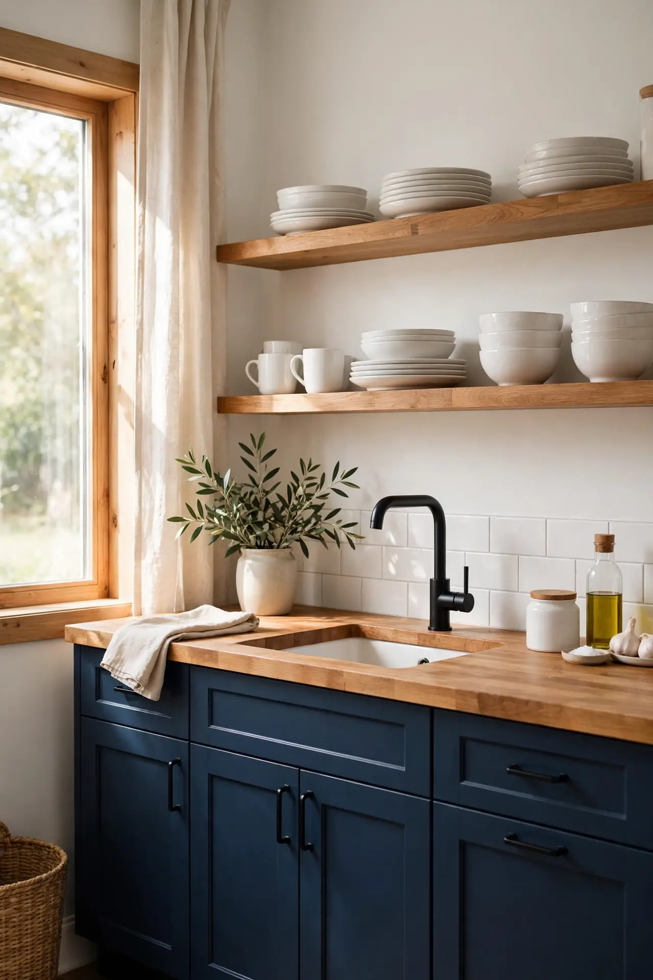
- Brushed brass bar pulls warm up cool navy instantly. The golden tone pops against deep blue like jewelry.
- Match the faucet finish to your hardware for cohesion. Consistent metals make budget cabinets feel custom.
- Use cup pulls on drawers and knobs on doors. Mixing shapes adds classic, collected charm.
- Lacquered brass resists tarnish in busy kitchens. Wipe pulls weekly to keep their warm shine.
Brass against navy is a timeless pairing that never feels trendy or tired. The warm metal softens the cool cabinetry and adds a layer of luxury without a full remodel. I have seen this simple swap lift an entire kitchen in a single afternoon. Start with the most visible doors and drawers, then finish the rest as budget allows.
White Marble Contrast
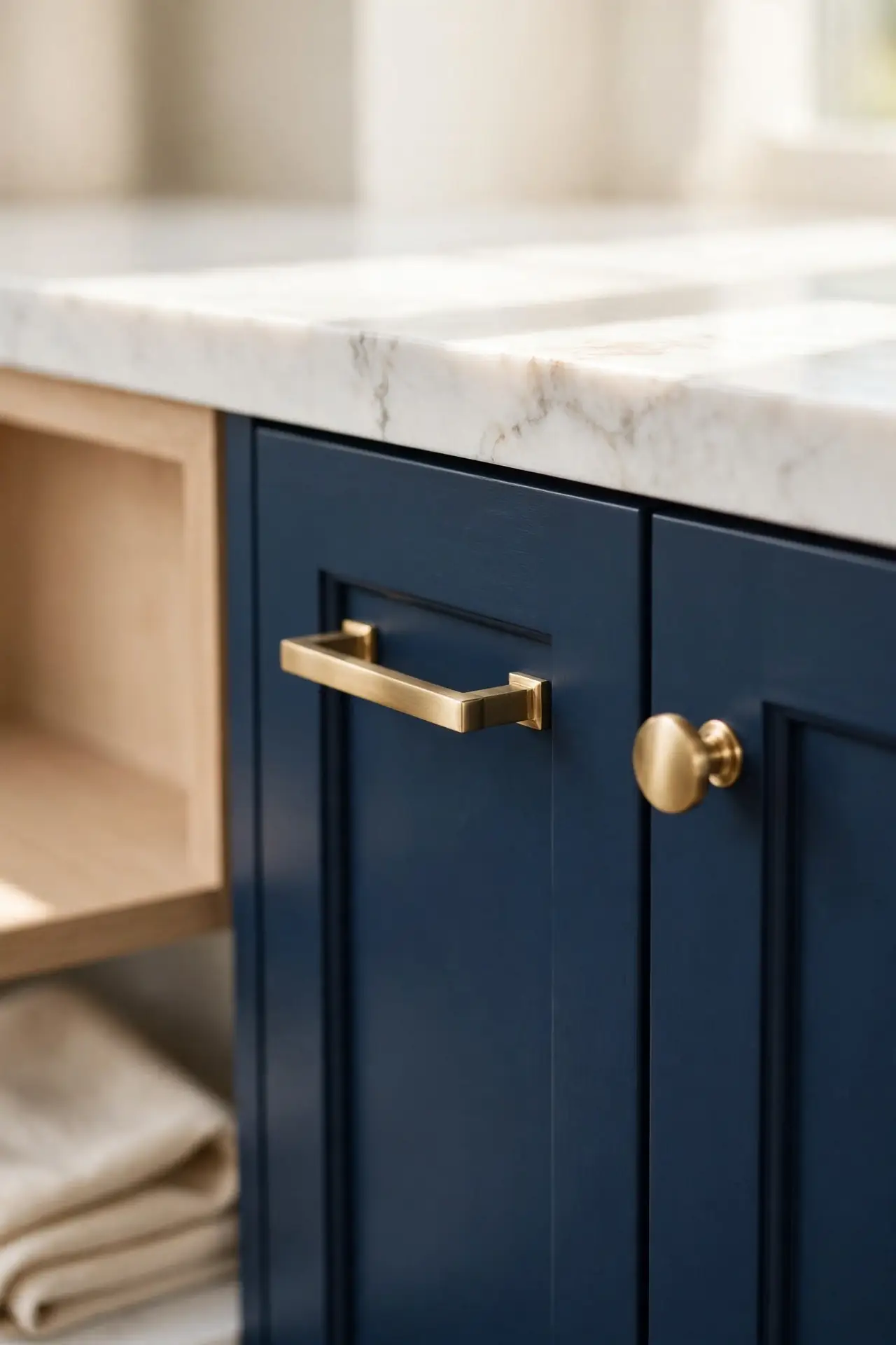
Quick Tip: Choose a marble with soft grey veining rather than bold gold streaks. The quiet pattern keeps navy cabinets as the focal point while adding natural movement. Seal the stone yearly since marble stains easily in working kitchens. Honed finishes hide etching better than polished ones. Ask your fabricator about quartz alternatives that mimic marble.
White marble against navy creates the crisp contrast that makes both materials shine. The pale stone lightens the deep cabinetry, and the blue makes the veining look even more striking. I have noticed this pairing works in both tiny galley kitchens and grand open plans. Keep the backsplash simple so the marble stays the star.
Warm Butcher Block
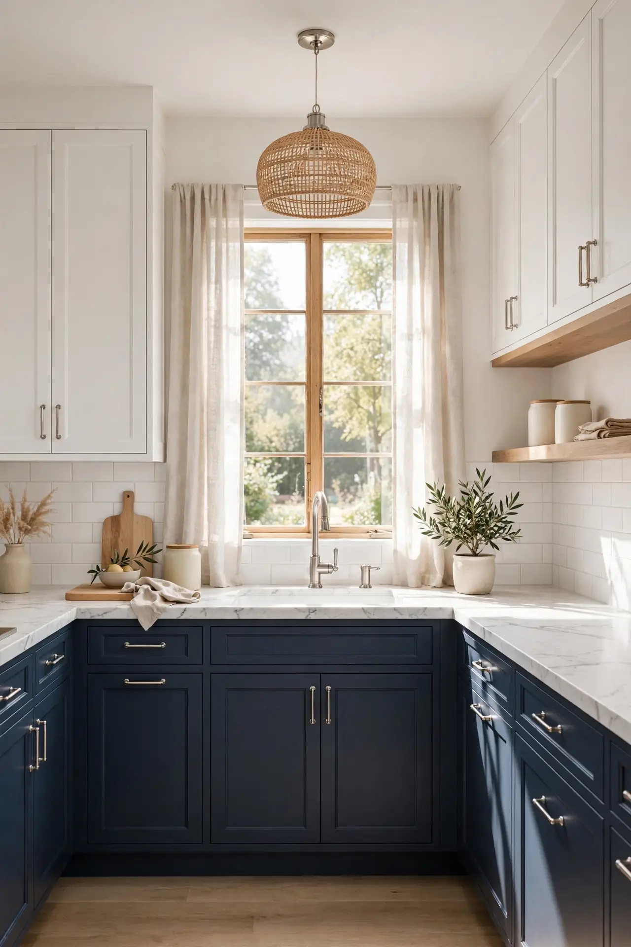
BEFORE: Cold stone counters next to navy cabinets can make a kitchen feel chilly and formal. The all cool palette sometimes reads more office than home, especially in north facing rooms. It looks pretty but works poorly.
AFTER: Swapping in warm butcher block instantly softens the look with honey toned wood. The natural grain adds organic texture that balances the bold blue beautifully.
Wood and navy are a match made for cozy, collected kitchens. The warm countertop invites touch and makes the space feel lived in rather than showroom perfect. Oil the block monthly to keep it rich and water resistant. I have seen this single change make renters and owners alike fall back in love with their kitchens.
Shaker Door Classic
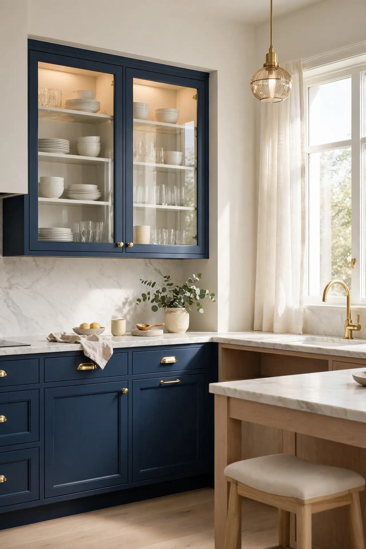
- Choose a true Shaker profile with clean square edges for timeless appeal. Avoid overly ornate profiles that fight the bold color.
- Paint frames and doors the same deep navy for a unified built in look. Mismatched tones cheapen the effect.
- Add simple cup pulls or slim bar handles in brass or matte black. Keep hardware consistent across every door.
- Finish with a satin or matte clear coat for durability. Kitchens need paint that wipes clean easily.
Shaker doors and navy paint are a classic pairing that suits almost any home style. The simple frame detail adds just enough interest without competing with the rich color. That is why many experts recommend this combination for resale value. It feels custom, timeless, and quietly luxurious.
Matte Versus Gloss
| Finish | Matte Navy | Gloss Navy |
| Look | Soft, velvety, understated | Reflective, bright, modern |
| Light | Absorbs light, cozy feel | Bounces light, airy feel |
| Upkeep | Hides fingerprints well | Shows smudges, wipe often |
| Mood | Warm, quiet luxury | Bold, high energy |
| Cost | Same paint price | Same paint price |
| Durability | Touch ups blend in | Scratches show more |
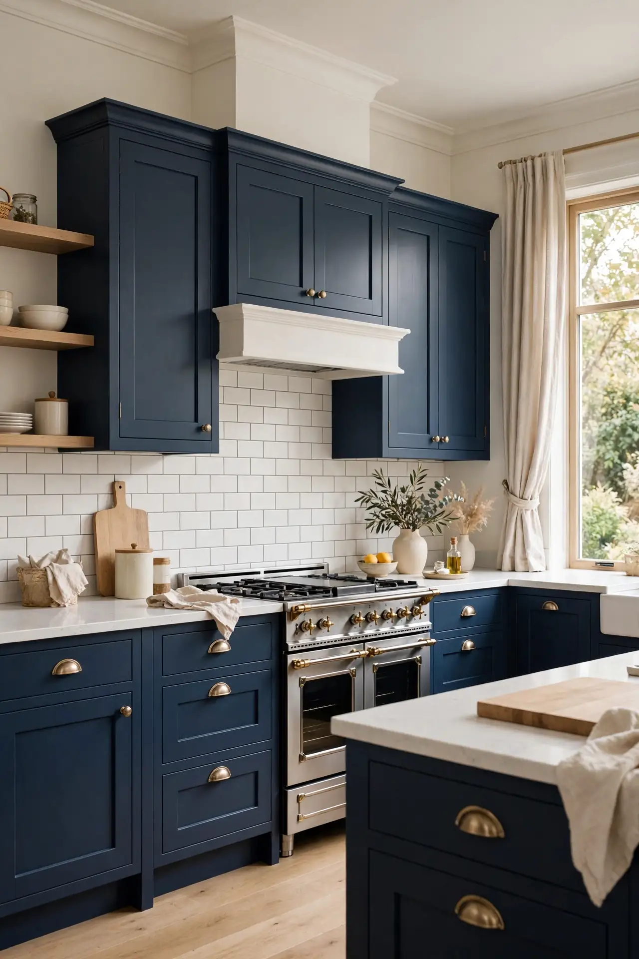
Choosing between matte and gloss comes down to your kitchen’s light and your tolerance for wiping. Matte forgives busy family life, while gloss rewards minimalists with mirror like shine. I have noticed matte navy feels more current in 2026 kitchens. Either way, invest in quality cabinet paint so the rich color stays true for years.
Glass Front Display
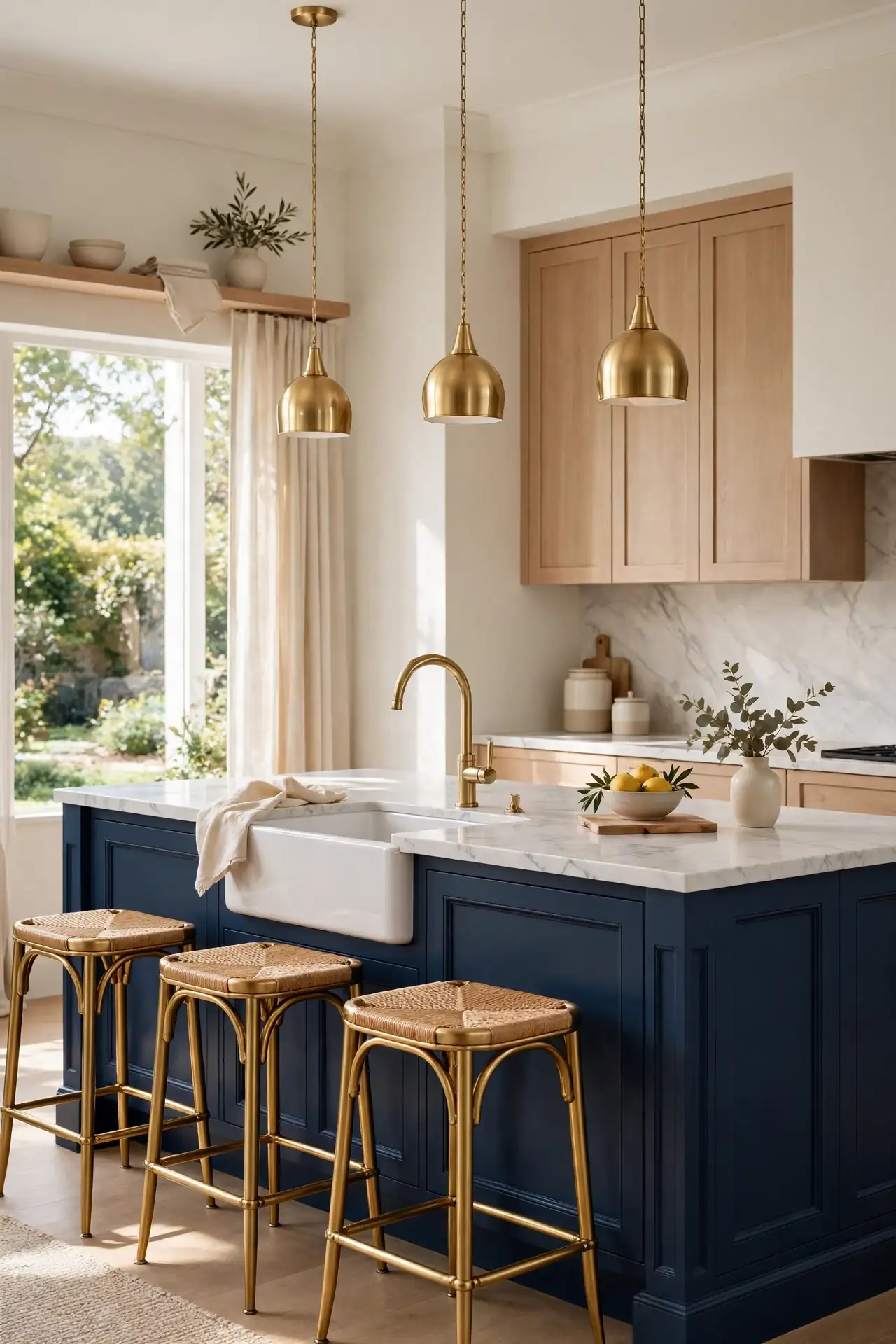
- DO: Style shelves with white dishes and glass. Keep groupings odd numbered and airy.
- DO: Add LED strips inside each cabinet. Lighting makes glass fronts glow at night.
- DO: Display only pieces you love using. Breathing room keeps shelves elegant.
- DON’T: Do not cram shelves with mismatched items. Clutter ruins the refined look.
- DON’T: Do not leave interiors unfinished. Bare insides look cheap behind glass.
- DON’T: Never skip weekly dusting. Glass shows every speck.
Glass front cabinets break up walls of navy and add a lighter, more open feeling. They turn everyday dishes into decor and invite you to keep things tidy. Paint the interiors a soft cream or pale blue for extra depth. This detail works best on uppers flanking the range or sink.
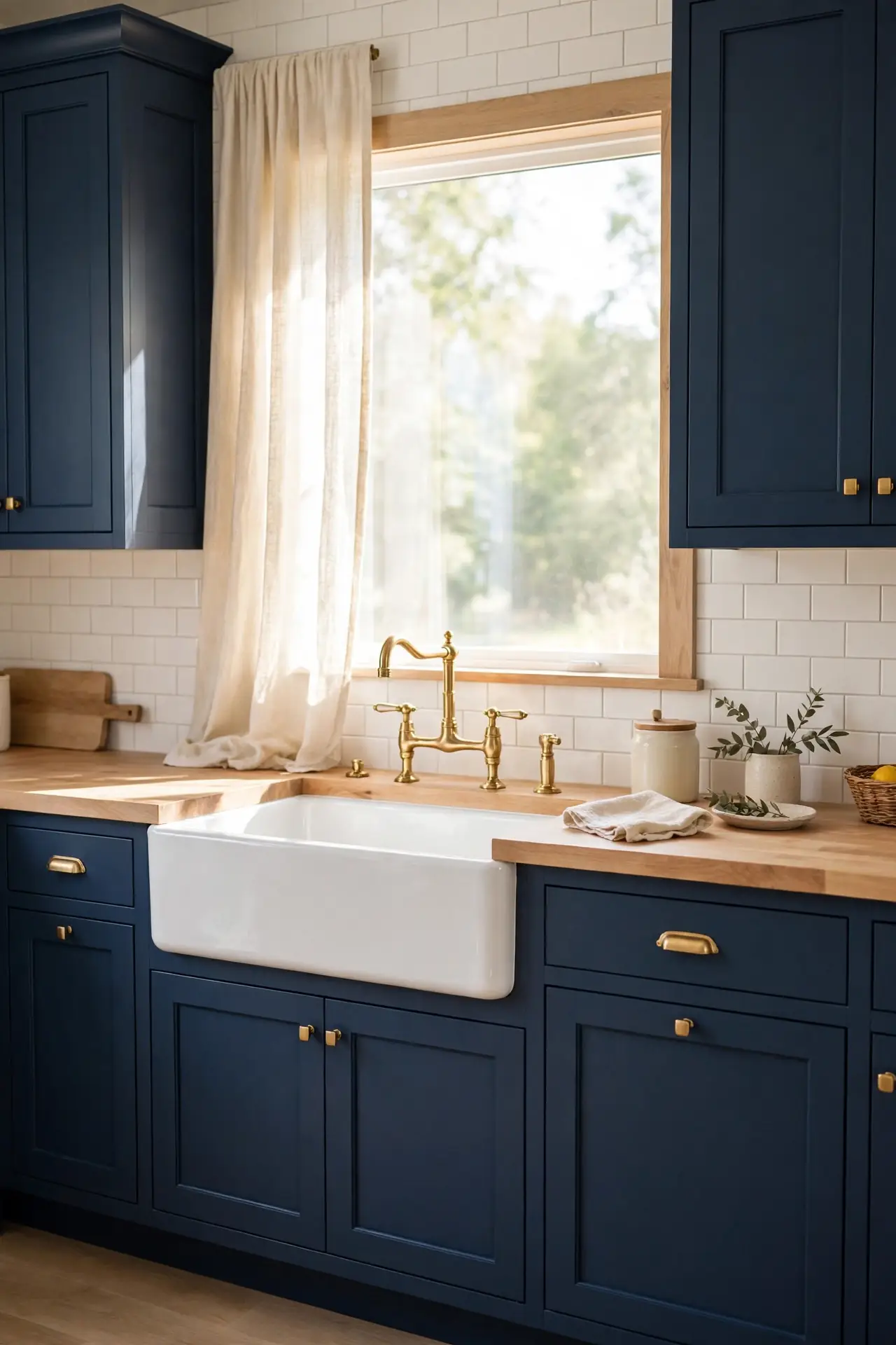
Gold Faucet Accents
Cost: Moderate | Time: One afternoon | Skill Level: Beginner | Best For: Instant luxury | Pairs With: Brass hardware
A gold faucet against navy cabinetry looks like it was designed by a professional, even in a modest kitchen. The warm metal draws the eye and ties together brass pulls, light fixtures, and curtain rods. Choose a high arc style for practical sink access and easy pot filling. In my experience, brushed gold hides water spots far better than polished chrome. Match the finish to your cabinet hardware for a cohesive look that feels intentional. This small upgrade delivers outsized style for the money.
Navy Island Centerpiece
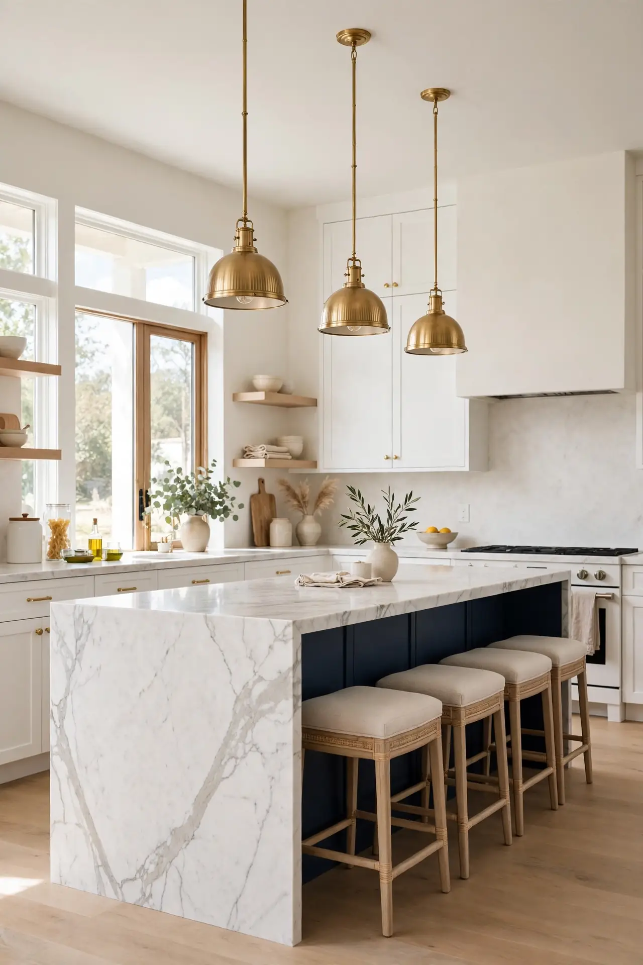
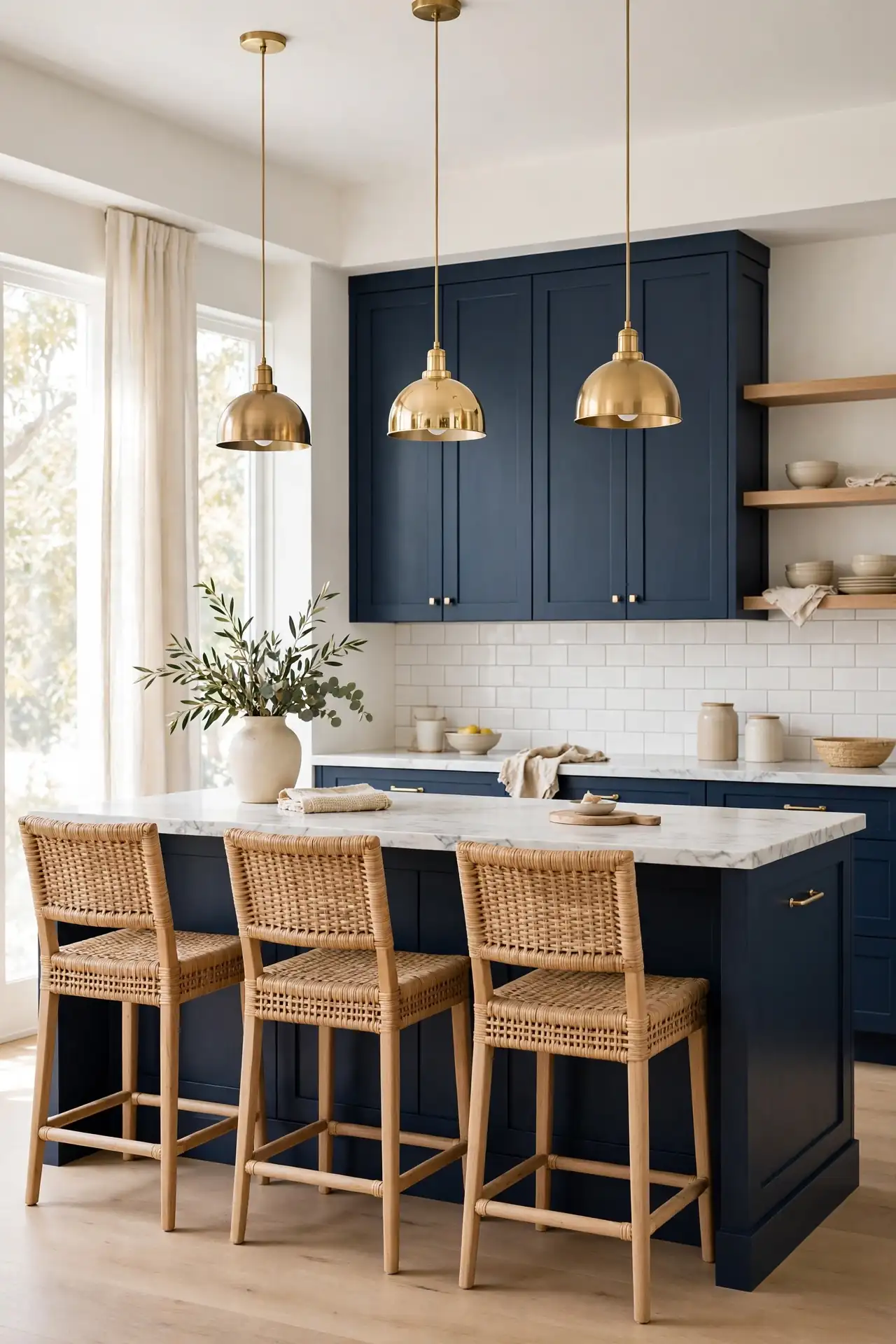
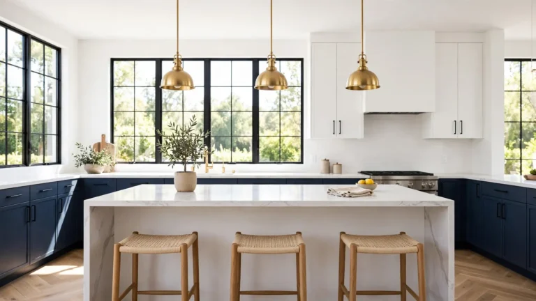
Painting just the island navy while keeping perimeter cabinets white gives you bold color without full commitment. The island becomes a natural focal point that anchors the whole room. I have noticed this two tone approach photographs beautifully and feels less risky for resale. Choose a deep, true navy rather than a grey blue for maximum impact.
Style the island with brass pendant lights and comfortable counter stools to complete the look. A waterfall marble edge or chunky wood top adds luxury that guests notice immediately. Keep the surrounding palette quiet so the navy island stays the hero. This single bold move can define your entire kitchen design.
Under Cabinet Lighting
- LED strips under uppers wash navy lowers in warm glow. The light makes deep blue look rich, not dark.
- Choose 2700K warm white for cozy ambiance. Cool white can make navy feel stark and cold.
- Add a dimmer switch for full control. Bright for cooking, soft for evening entertaining.
- Battery puck lights work where wiring is tricky. Stick them up in minutes with no electrician.
Good lighting is the secret to making dark cabinets feel inviting rather than heavy. Under cabinet strips highlight your backsplash and make food prep safer and easier. I have seen this upgrade change how a navy kitchen feels after sunset. Install them before you decide the color is too dark.
Herringbone Backsplash

Quick Tip: Run the herringbone pattern all the way to the ceiling behind open shelves. The vertical lines draw the eye up and make ceilings feel taller. Use a light grout that matches the tile so the pattern stays subtle. Dark grout can look busy next to bold navy. Carry brass hardware through both tones for unity.
Herringbone tile adds movement and craft to a navy kitchen without introducing another color. The zigzag pattern catches light beautifully and gives the eye somewhere to travel. I have noticed handmade look tiles with slight variation feel especially rich against flat cabinet paint. Keep the tile creamy white for classic contrast.
Farmhouse Sink Pairing

BEFORE: A standard stainless sink can look cold and utilitarian next to rich navy cabinets. The industrial vibe sometimes clashes with the classic elegance of deep blue. It looks pretty but works poorly.
AFTER: A white fireclay farmhouse sink brings softness and old world charm. The apron front becomes a pretty focal point against the dark cabinetry.
Farmhouse sinks and navy cabinets share a timeless, collected feeling that never goes out of style. The white apron lightens the run of dark lowers and adds a handcrafted touch. Choose a single bowl for maximum usable space. I have seen this pairing win over even the most color shy homeowners.
Coffee Station Nook
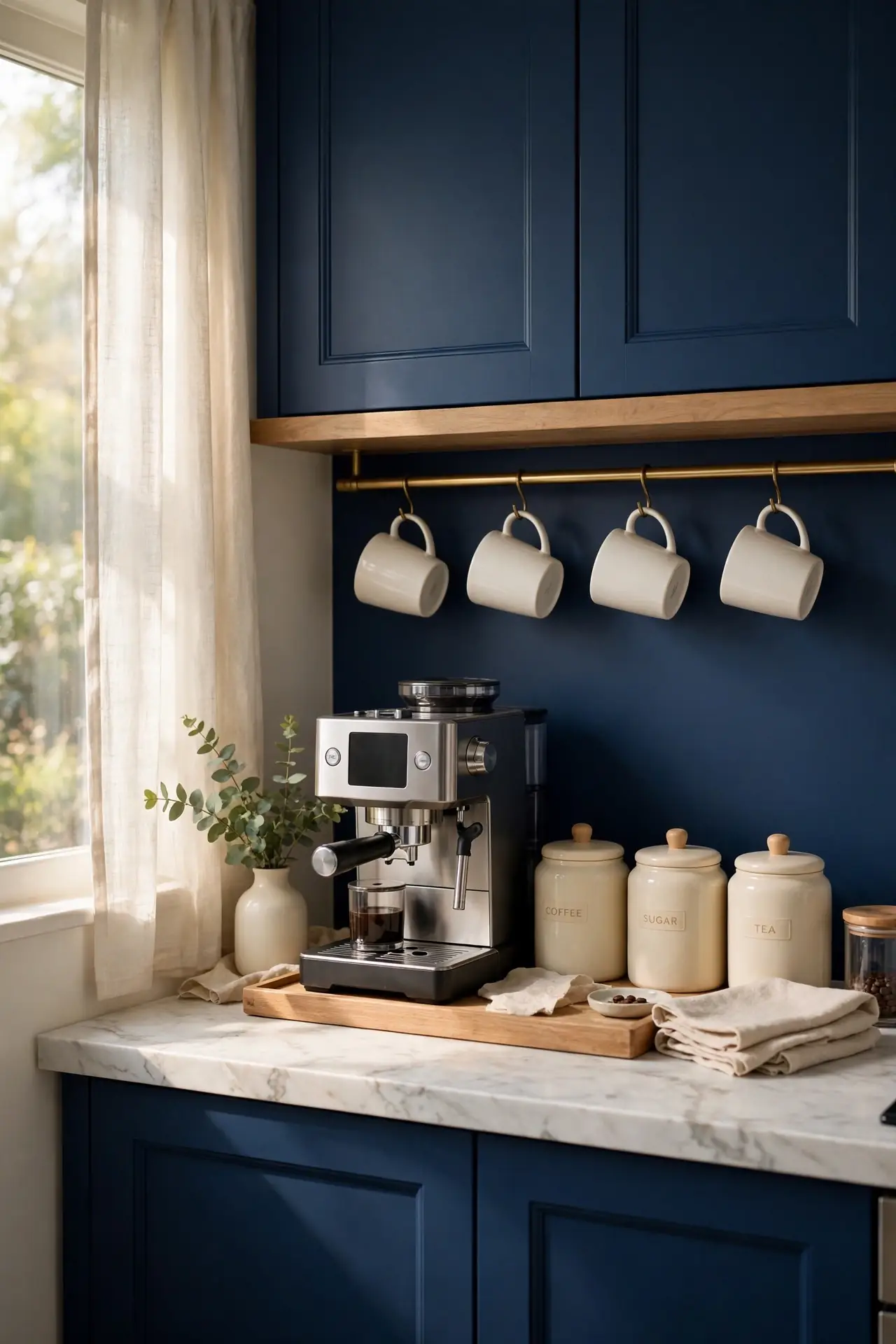
- Dedicate one stretch of counter near an outlet for your coffee setup. Keeping it in one zone prevents clutter spreading.
- Add a small tray to corral the machine, mugs, and sugar. Trays make the station look styled, not messy.
- Hang favorite mugs on hooks under the upper cabinet. Displayed mugs double as cheerful decor.
- Store beans and filters in matching canisters. Coordinated containers keep the nook tidy and pretty.
A dedicated coffee nook turns rushed mornings into a small daily ritual. The navy backdrop makes white mugs and wood accents pop beautifully. For restful color ideas in other rooms, see my moody green bedrooms. Keep the station stocked and wiped down so it always invites you in.
Light Versus Dark
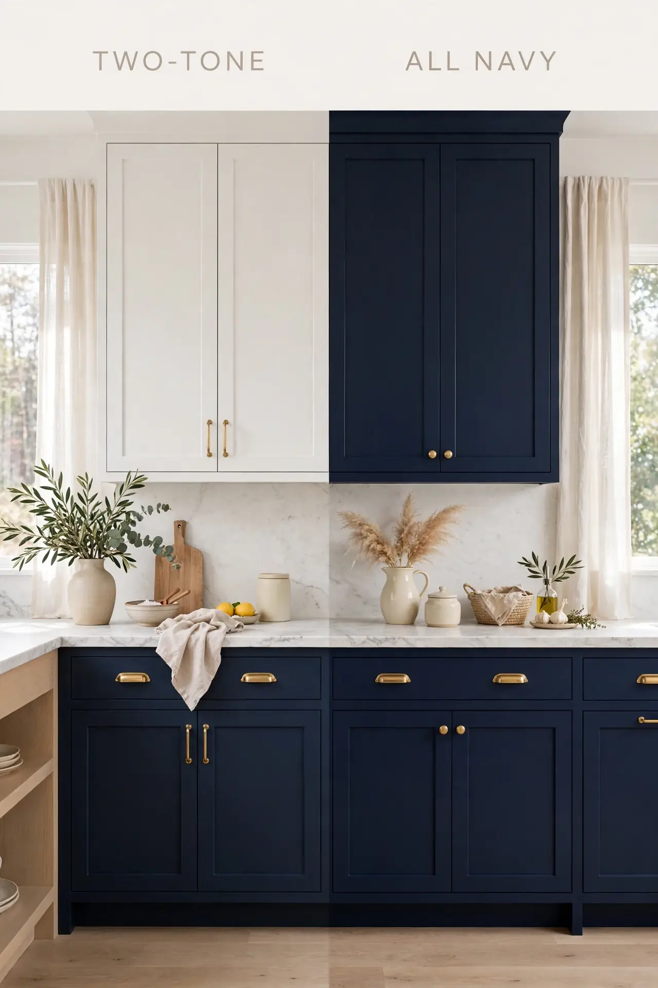
| Choice | Navy Lowers, White Uppers | All Navy Cabinets |
| Look | Classic two tone balance | Bold, dramatic, enveloping |
| Light | Brighter, airier feel | Cozier, moodier feel |
| Resale | Broadest buyer appeal | Strong but narrower appeal |
| Cost | Same paint and labor | Same paint and labor |
| Best For | Small or dark kitchens | Large, bright kitchens |
| Upkeep | White shows grime faster | Navy hides wear better |
Deciding how much navy to use is the biggest choice in this kitchen. Two tone layouts feel safe and bright, while full navy delivers maximum drama. I have noticed all navy works best with generous natural light. Either route looks stunning with brass hardware and marble counters, so follow your light and your courage.
Pantry Door Statement
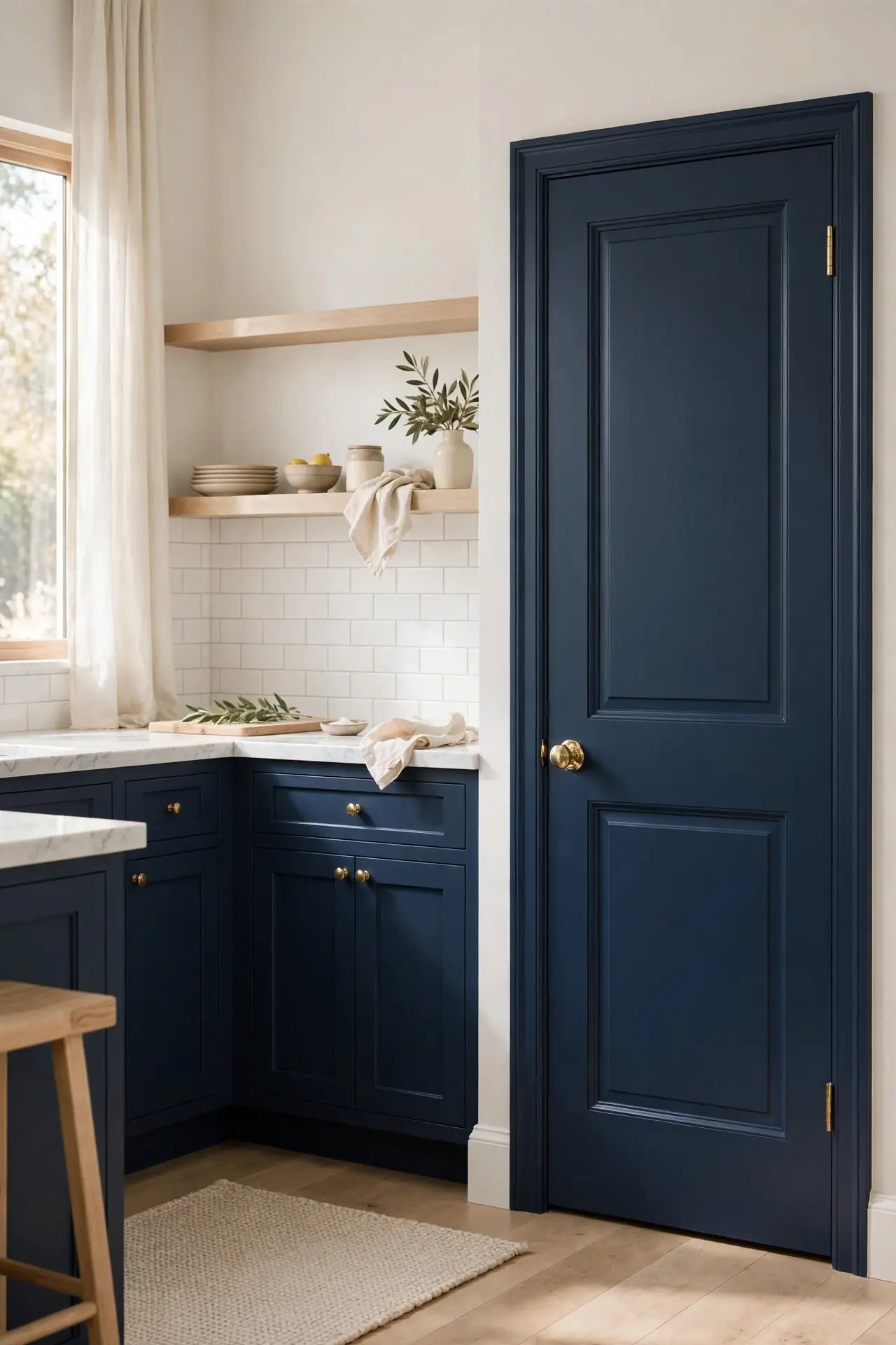
- DO: Paint the pantry door the same deep navy. Matching doors look built in.
- DO: Use the same brass knob as cabinets. Repeated hardware ties it in.
- DO: Keep surrounding decor simple. Let the bold door star.
- DON’T: Do not leave the pantry door white. It looks like an afterthought.
- DON’T: Do not add fussy signs or decals. Rich color needs no extras.
- DON’T: Do not forget the door frame. Paint trim to match for polish.
A navy pantry door turns a forgettable necessity into a design moment. It connects the kitchen visually and adds a punch of color at eye level. That is why many experts recommend painting interior doors to match cabinetry. One quart of paint and an afternoon is all it takes.
Crown Molding Finish
Cost: Low | Time: One weekend | Skill Level: Intermediate | Best For: Custom built in look | Pairs With: White ceilings | Finish: Satin or matte
Crown molding painted the same navy as your cabinets makes them look like custom millwork. The detail draws the eye up and gives the kitchen a finished, furniture like quality. Keep the ceiling bright white for crisp contrast that highlights the molding profile. In my experience, this one trim detail adds more perceived value than almost any other. Measure twice and caulk every seam for a truly professional result. Your kitchen will look like it was designed, not just assembled.
Hidden Appliance Garage
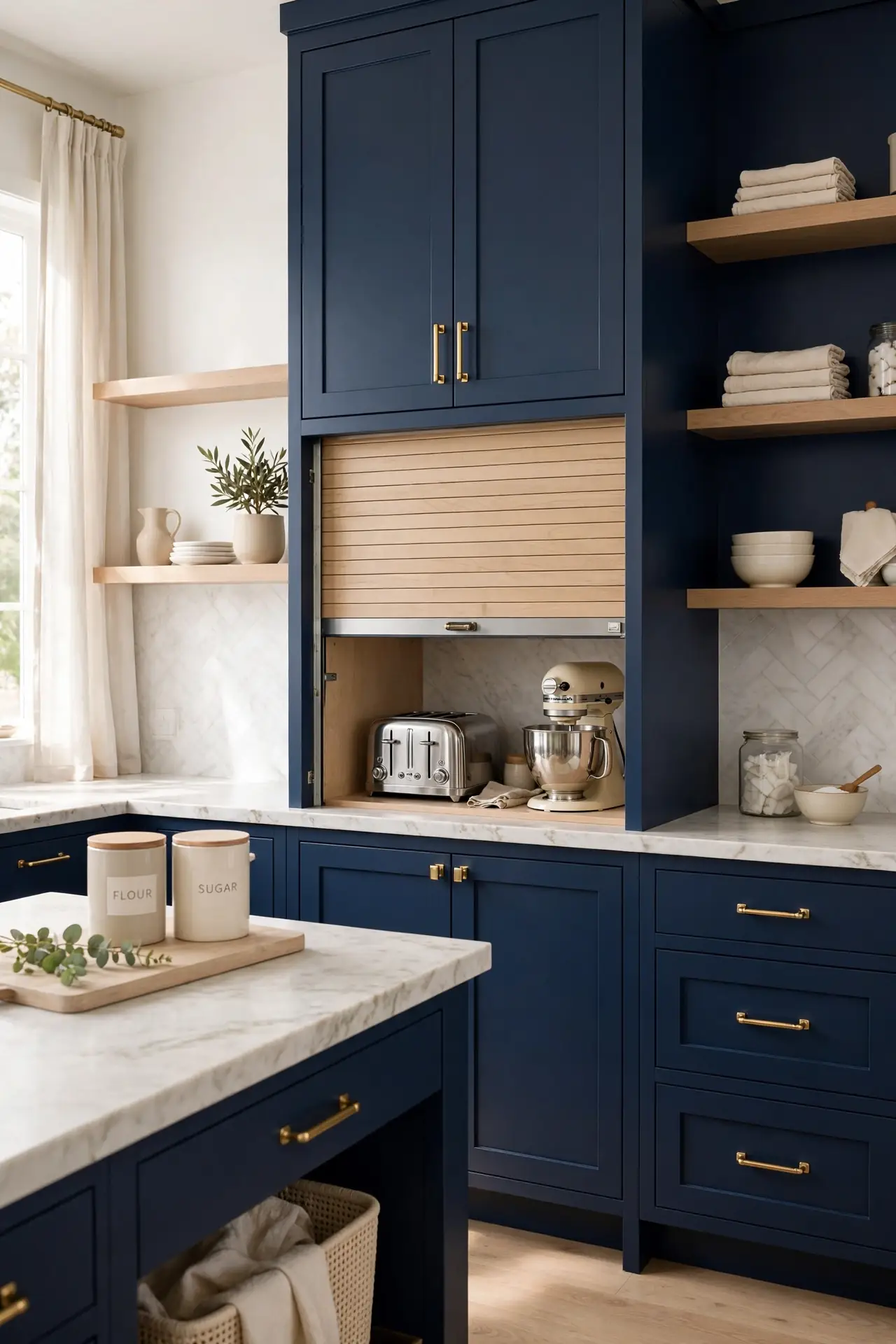
Small appliances cluttering the counter can ruin the calm of a navy kitchen. An appliance garage with a roll up or lift door keeps the toaster and mixer handy but hidden. Paint the garage interior a light color so you can see inside easily. This trick keeps counters clear for actual cooking and prep.
Match the garage door front to your navy cabinetry so it disappears when closed. Add an outlet inside for true grab and go convenience. I have noticed families with kids love this feature most. Clear counters make even a small navy kitchen feel twice as large.
Statement Range Hood
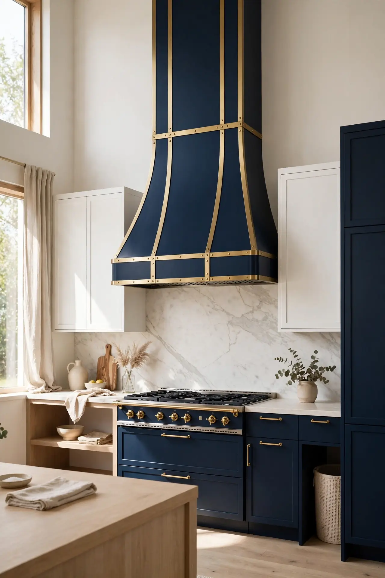
- Paint the range hood the same deep navy. A matching hood looks custom.
- Add brass strapping for a designer touch. Metal bands upgrade simple shapes.
- Choose a chimney style that reaches the ceiling. Tall hoods make kitchens feel grand.
- Vent properly to the outside always. Recirculating hoods struggle with heavy cooking.
The range hood is the natural focal point of any kitchen, so make it count. A navy hood framed by white uppers or open shelves creates instant drama. I have seen this single element define the whole room’s style. Size it correctly for your cooktop so beauty never sacrifices function.
Two Tone Balance
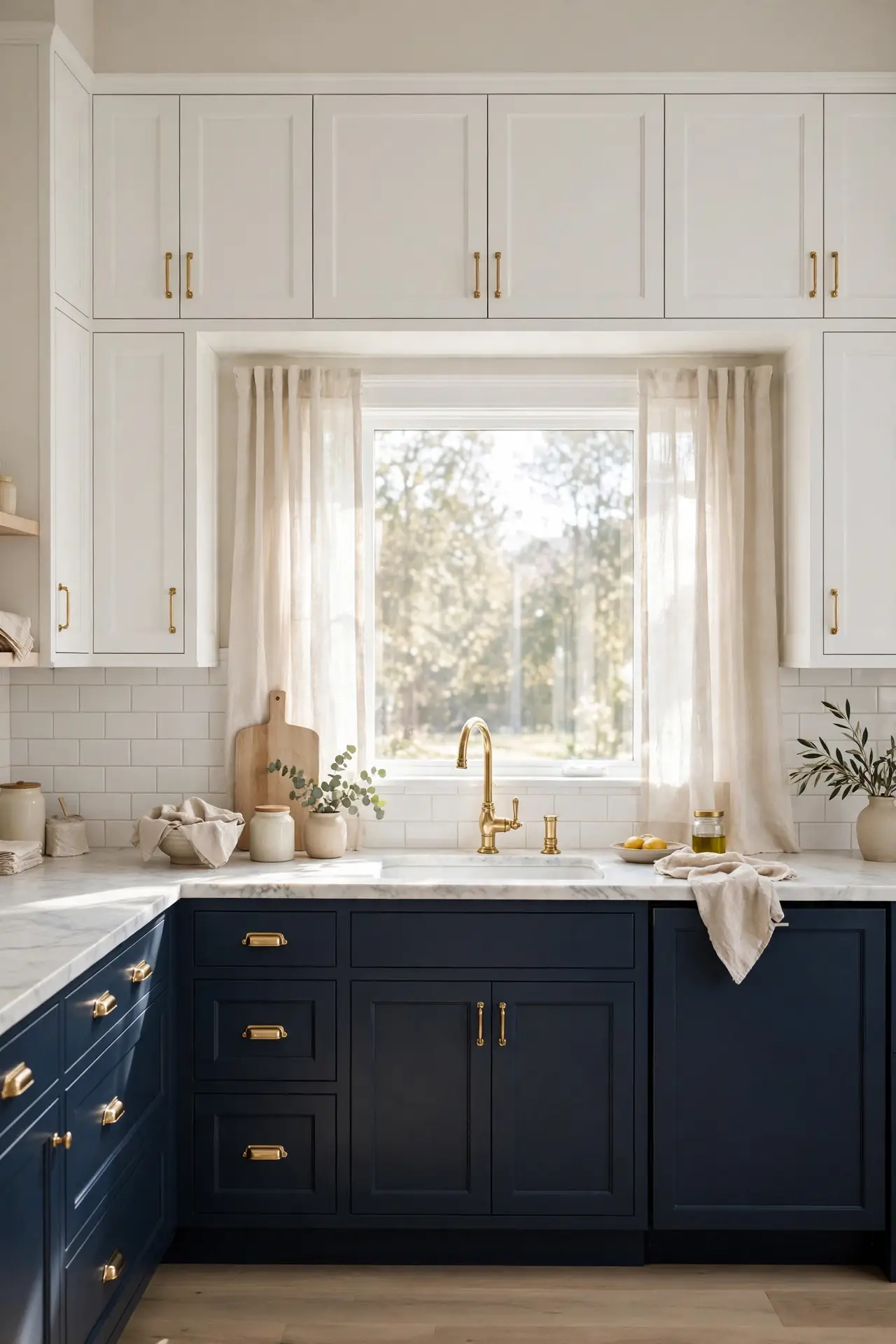
Quick Tip: Keep the darker navy on lower cabinets where it grounds the room. White or cream uppers lift the eye and keep the kitchen feeling open. This classic split works in nearly every kitchen size. For galley kitchens, try navy on one wall only. Carry brass hardware through both tones for unity.
Two tone kitchens give you the best of both worlds: drama below, brightness above. The contrast adds visual interest that all one color kitchens sometimes lack. I have noticed this layout makes small kitchens feel larger while still delivering bold style. Repeat the navy in a island or pantry for cohesion.
Breakfast Bar Seating
BEFORE: A navy island with no seating can feel like a beautiful barrier in the room. Without stools, the island separates rather than gathers the family. It looks pretty but works poorly.
AFTER: Adding three woven counter stools invites everyone to gather around. The natural texture softens the bold blue and adds relaxed warmth.
Seating turns your navy island from showpiece into the heart of the home. Kids do homework there while you cook, and guests linger longer. Choose stools with backs for comfort during long chats. Leave 24 inches of width per stool so nobody feels squeezed. Wipeable seats survive family life best.
Vertical Storage Wins
- Install a tall pull out pantry next to the fridge. Narrow pull outs use every inch of vertical space.
- Add stacked upper cabinets that reach the ceiling. The top row stores rarely used items beautifully.
- Use the insides of cabinet doors for spice racks. Door mounted storage frees shelf space fast.
- Hang pots from a ceiling rail above the island. Vertical hanging keeps heavy cookware accessible.
Navy kitchens look best when counters stay clear, and vertical storage makes that possible. Going up instead of out preserves precious counter space for cooking. I have seen small kitchens double their storage with these tricks. Start with one pull out and feel the difference immediately.
Oak Versus Walnut
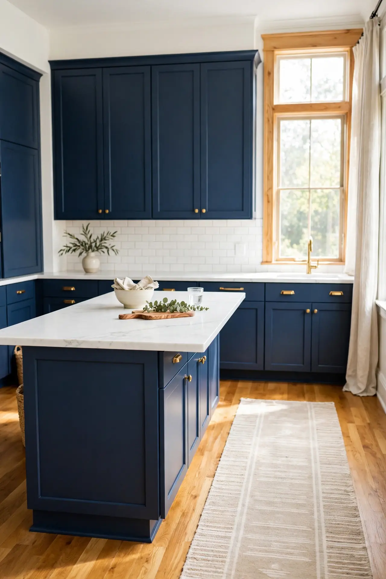
| Wood | Warm Oak Accents | Rich Walnut Accents |
| Tone | Light, honey, golden | Deep, chocolate, brown |
| Feel | Bright, airy, casual | Moody, rich, formal |
| Pairs With | Brass and cream | Brass and black |
| Best For | Small, bright kitchens | Large, dramatic kitchens |
| Upkeep | Shows wear less | Shows dust more |
| Cost | Budget friendly | Pricier hardwood |
| Grain | Bold, visible grain | Subtle, smooth grain |
Both woods warm up navy beautifully, so choose by the mood you want. Oak keeps things light and Scandinavian, while walnut leans rich and traditional. I have noticed oak floors with navy cabinets feel especially current right now. Mix in brass hardware either way for a cohesive, collected look.
Warm Wood Floors

- DO: Choose oak or hickory with warm undertones. Honey toned floors glow against navy.
- DO: Run planks toward the longest sightline for more visual space.
- DO: Add a washable runner in the work zone. Runners protect floors and add softness.
- DON’T: Do not pick grey washed floors. Cool grey fights the warmth navy needs.
- DON’T: Do not skip a proper sealant. Kitchens need water resistant finishes.
- DON’T: Do not mix too many wood tones. Two woods maximum keeps things calm.
Warm wood floors are the secret ingredient that stops navy kitchens feeling cold. The natural honey tones balance the deep blue and add organic life underfoot. That is why many experts recommend wood over tile with dark cabinetry. Choose matte finish for a modern, low glare look.
Evening Glow Lighting
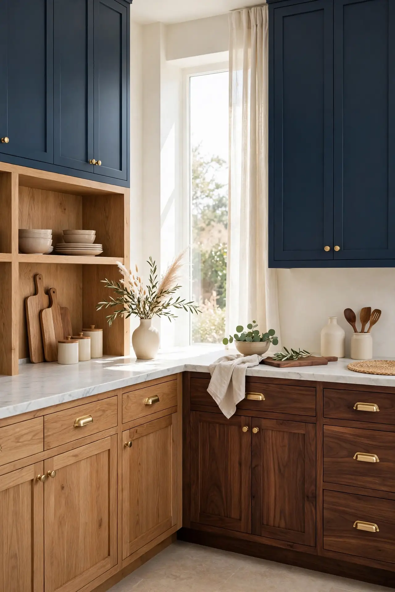
Cost: Moderate | Time: One weekend | Skill Level: Intermediate | Best For: Moody ambiance | Pairs With: Dimmer switches | Layers: Three minimum | Bulbs: 2700K warm
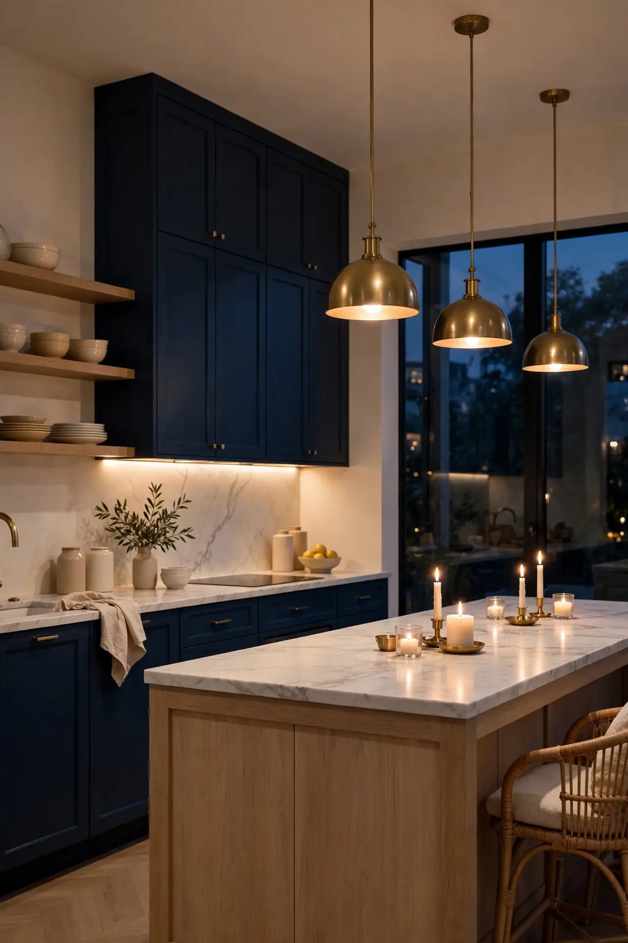
Navy kitchens truly shine after dark when layered lighting takes over. Combine pendants, under cabinet strips, and a warm picture light for depth. Dim everything low for dinner parties and let the blue glow like velvet. In my experience, 2700K bulbs flatter navy better than any other temperature. Add candles on the island for flickering warmth that no bulb can match. Your kitchen will feel like an intimate restaurant every single night. This is the detail guests always compliment first.
Open Shelf Styling
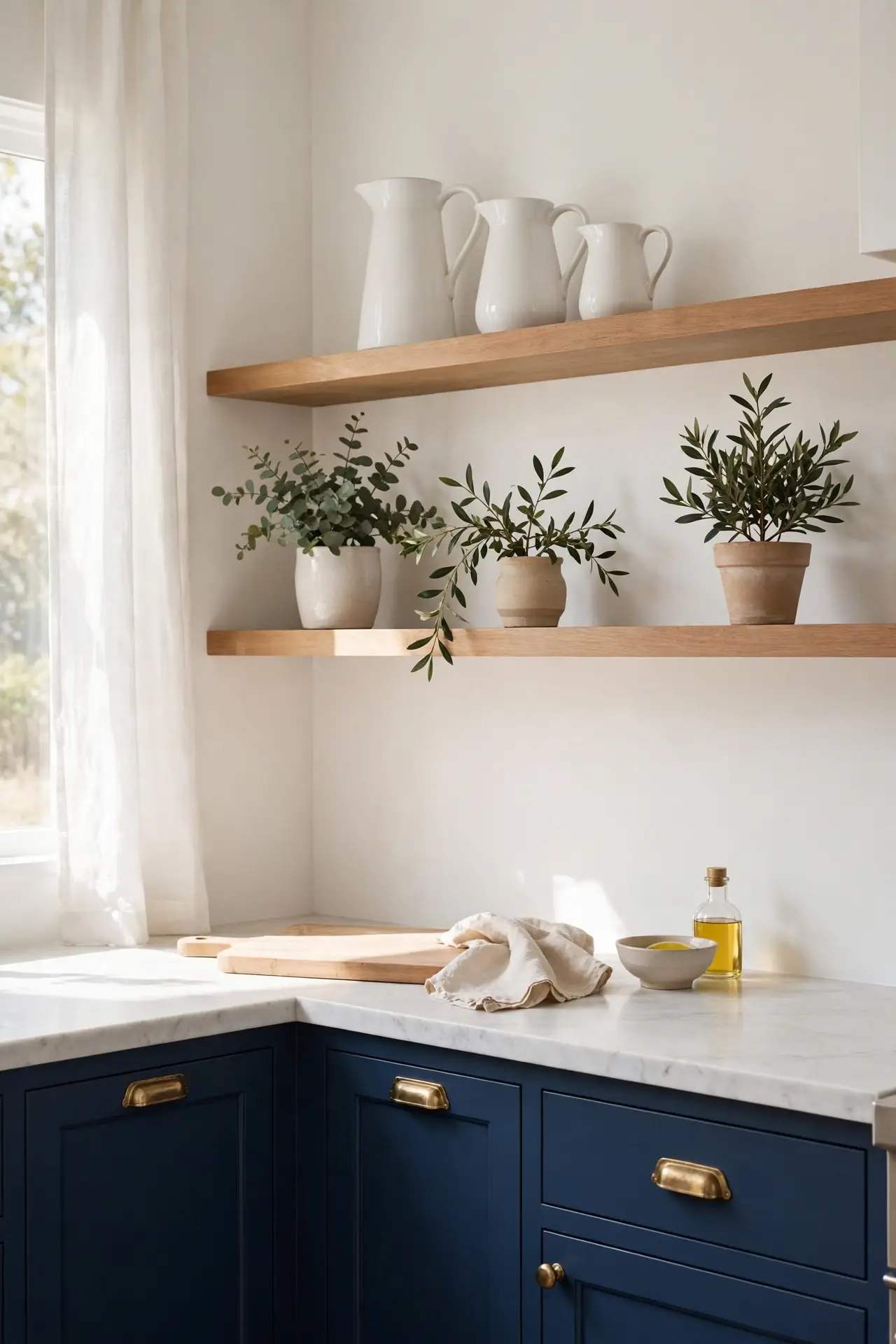
Replacing a few navy uppers with open wood shelves lightens the whole kitchen instantly. The mix of closed and open storage feels personal and collected. Style shelves with white pitchers, wood boards, and small plants for lived in charm. I have noticed open shelves encourage tidiness, which keeps the kitchen looking sharp.
Keep shelf styling simple with breathing room between objects. Group items in threes and vary heights for a natural look. Dust shelves weekly since open storage shows everything. This airy detail balances bold navy and makes the kitchen feel custom and loved. Start with one shelf before committing to more.
Conclusion
These navy blue kitchen cabinet ideas prove that bold color and classic style can live happily together. Start with the pairing that excites you most, whether that is brass hardware, marble counters, or a two tone layout, and build from there. Save this post to Pinterest so your favorite looks are easy to find later, and share it with a friend who is dreaming about a kitchen refresh. I have seen how one confident color choice can completely shift the way a kitchen feels. Your elegant, dramatic cook space is closer than you think. Pick one idea this weekend and watch your kitchen start to change.

4 Comments