25 Traditional Blue and White Kitchen Decor Ideas for Classic Charm
White cabinets, deep blue accents, and porcelain with hand painted patterns have kept kitchens feeling fresh for generations. That timeless mix is exactly why traditional blue and white kitchen decor never dates: it stays crisp in morning light, calm at dinner, and welcoming for every guest who walks in.
The twenty five ideas ahead work in layers, from cabinets and tile to towels and tiny brass details, so small kitchens and large family rooms both get a clear plan. In my experience, starting with one strong layer, then adding pattern slowly, keeps the palette calm instead of busy. Shoppers who love layered lighting at the table often borrow scale ideas from sculptural pendant lighting dining room guides when choosing pendants over an island or breakfast table nearby.
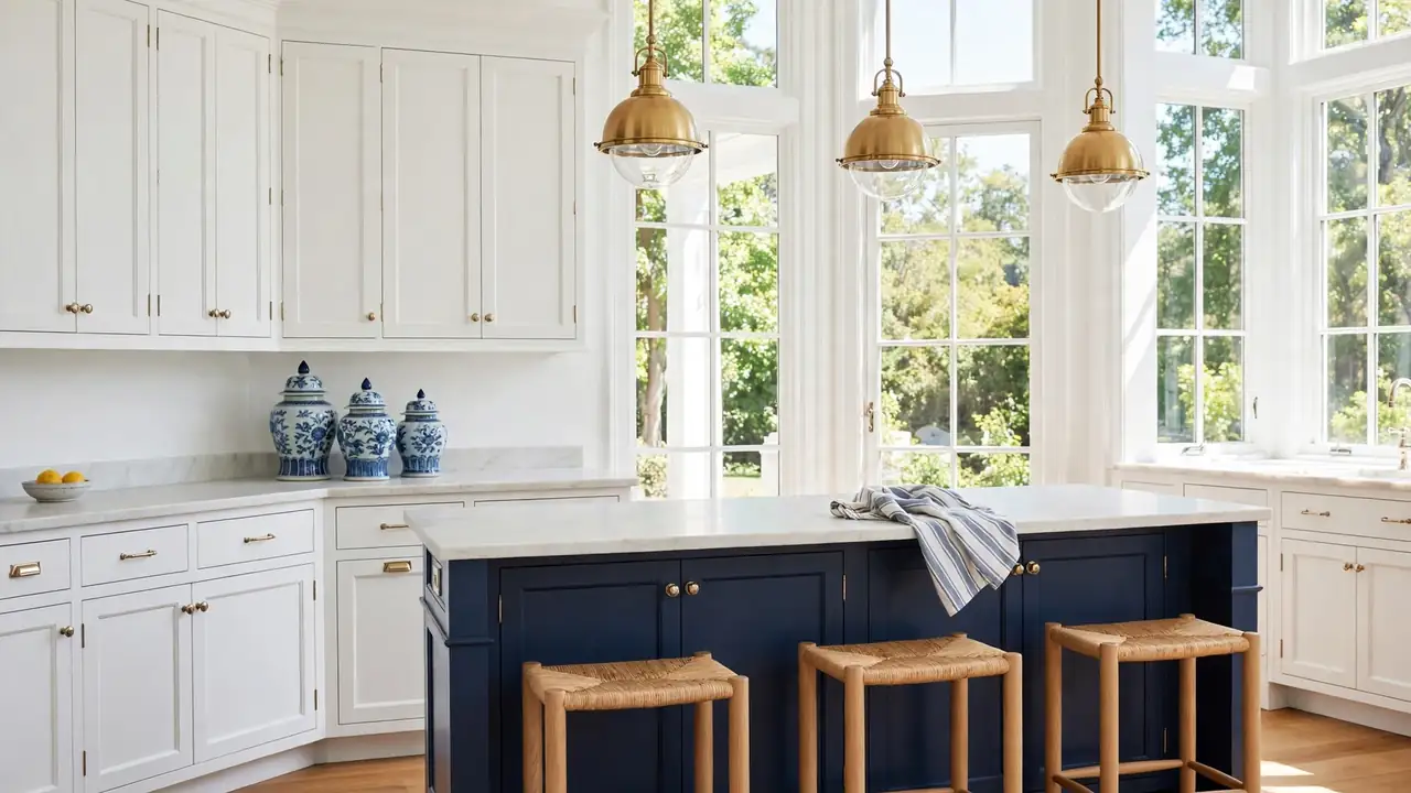
White Shaker Cabinets

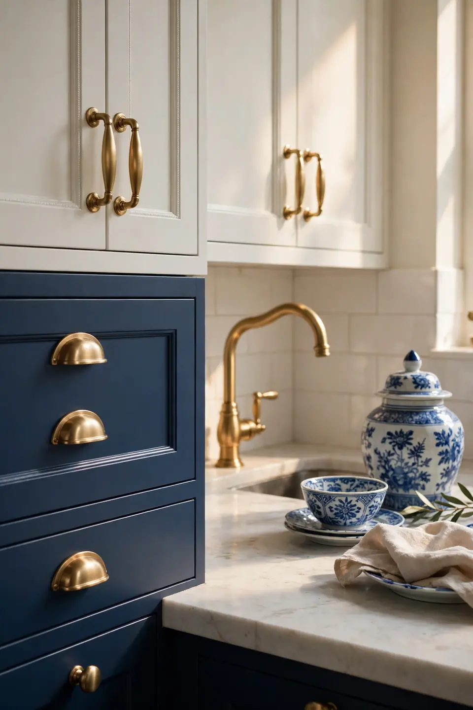
Crisp white shaker frames give the whole room its calm backbone. The recessed panels catch soft shadows through the day, so plain doors still feel crafted and detailed. Pair them with brushed brass knobs and a pale stone counter, and the white stays warm rather than stark or cold.
Balance matters more than brightness here. Keep upper cabinets white, then let lower drawers, an island, or a hutch carry the blue. I’ve noticed this split keeps small kitchens airy while still giving the palette real depth. Finish with one porcelain vase on the counter, nothing more, so the clean lines stay the story.
Blue Lower Cabinets
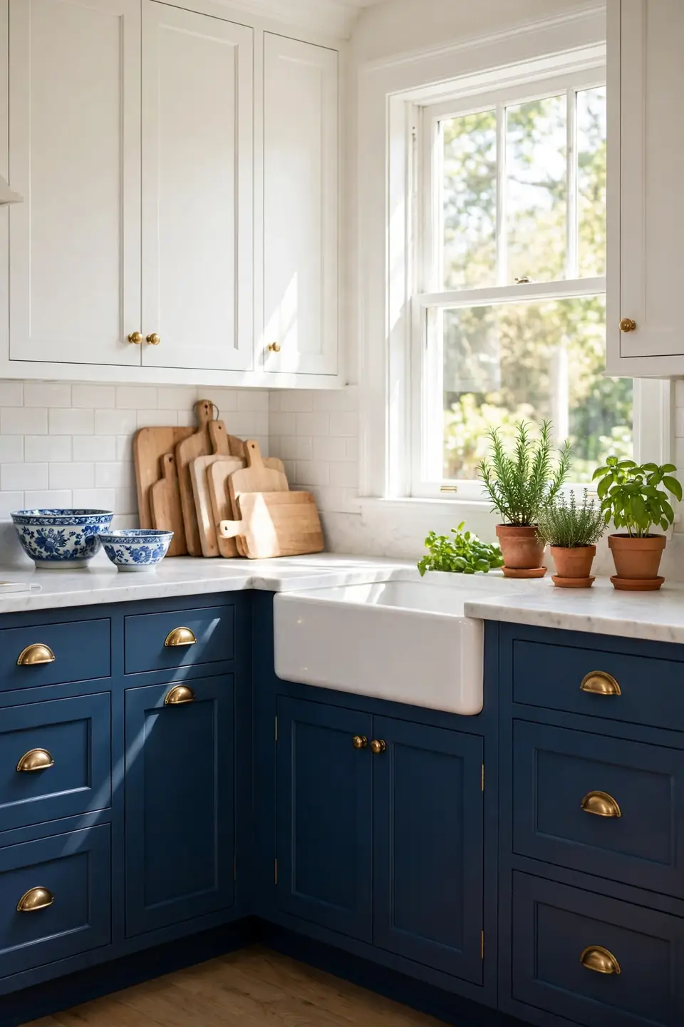
- Paint lowers in a rich navy or denim blue with a satin finish that wipes clean easily.
- Keep uppers and walls white so the darker base feels grounded, never heavy or closed in.
- Repeat the blue in two small places only, like a runner and a striped towel.
- Choose brass or aged nickel pulls to warm the cool base color.
- Test the shade on one drawer first and live with it for a full week.
Two tone cabinetry solves the biggest worry with blue: too much of it. White above eye level keeps light bouncing around the room, while blue below hides scuffs from shoes, pets, and busy weekday cooking. The contrast reads classic in photos and even calmer in real life.
Ginger Jar Counter Styling
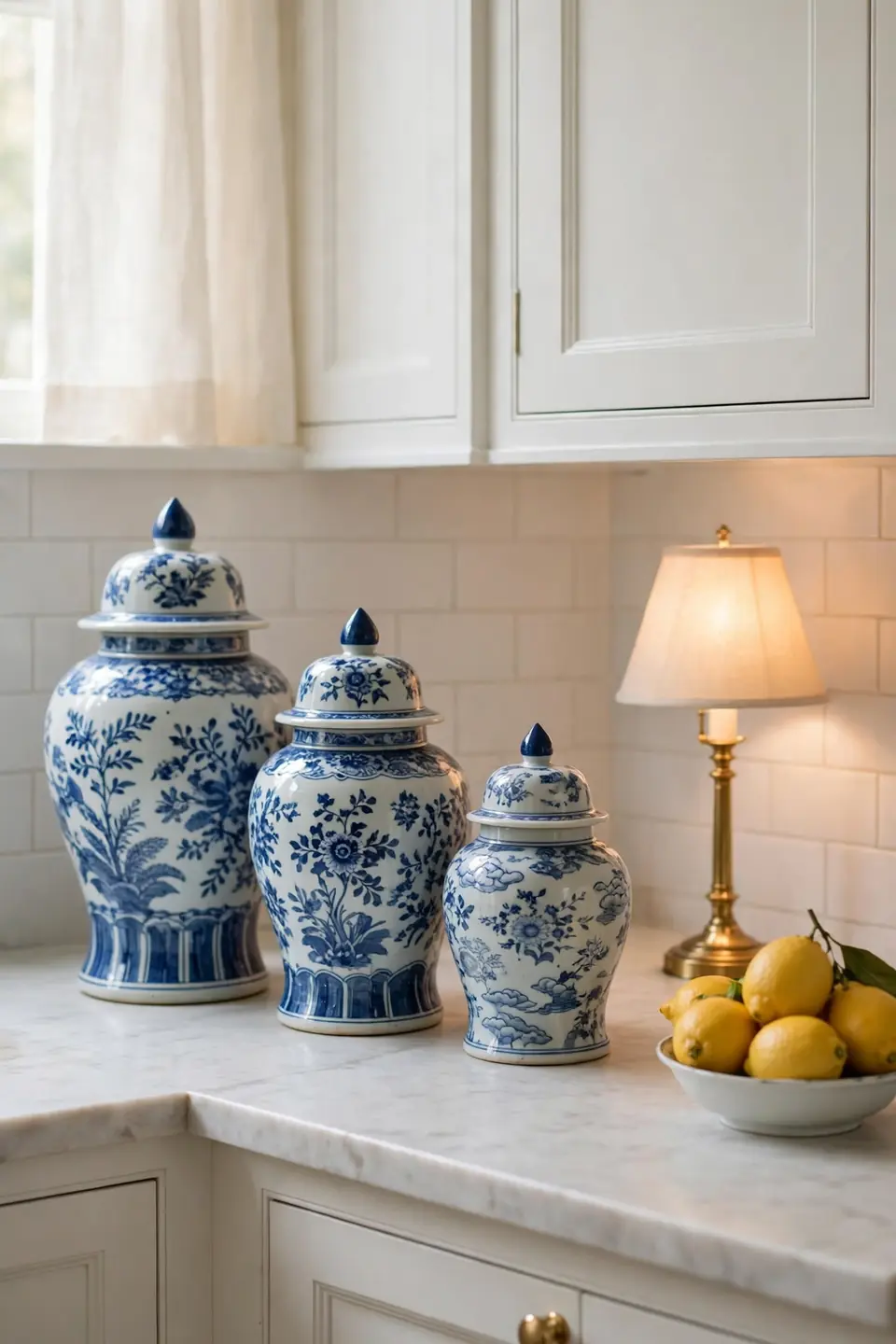
Quick Tip: Group ginger jars in odd numbers and vary the heights by at least a few inches. Place the tallest jar at the back, near the wall, and keep the front of the counter clear for daily cooking space and prep work.
Porcelain jars earn their keep far beyond looks. Store tea bags, sugar, or spare utensils inside, and the prettiest storage in the room also becomes the most useful. Blue floral patterns on white glaze link the counter to tile, towels, and dishes without matching everything exactly, which keeps the vignette relaxed, useful, and collected over time through every season of cooking and gathering.
Blue Tile Backsplash
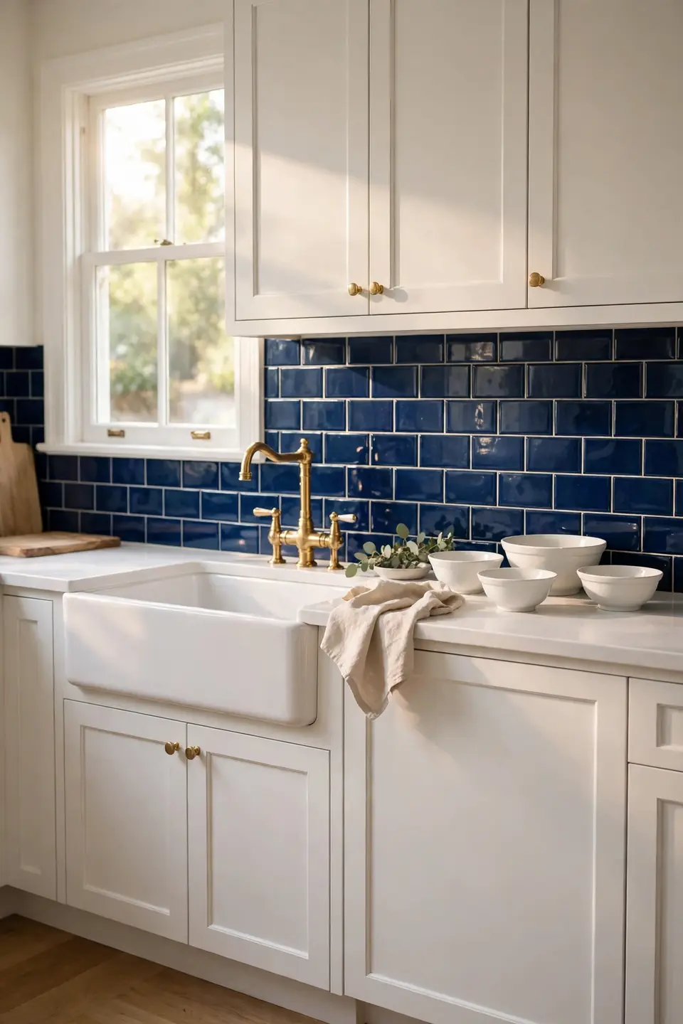
BEFORE: Plain white walls behind the stove splashed easily and offered no focal point at all. The cabinets looked fine, yet the cooking zone felt unfinished, like a frame waiting for its picture to arrive and settle in.
AFTER: Glossy blue tiles now run from counter to cabinet, catching light with every hour. The color frames the range, wipes clean after frying, and gives white cabinets a rich partner that feels planned from the very start.
Small tiles with white grout read traditional, while larger tiles feel calmer and more modern. Either way, carry the tile across the whole wall instead of stopping behind the stove. That full sweep is what makes the splashback feel built in, generous, and worth the weekend it takes to install.
Open Shelf Porcelain Display
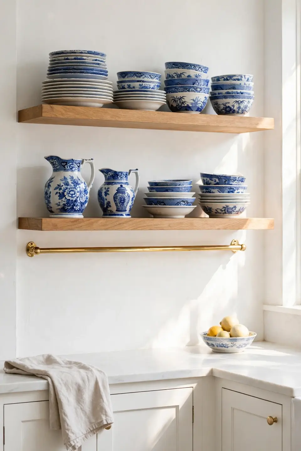
What You Need:
- Two sturdy shelves in white paint or light oak, mounted level and anchored into studs for heavy porcelain.
- A tight edit of daily plates, bowls, and one pitcher, all within the blue and white family.
- Small plate stands for two hero pieces at the back, so patterns stay visible behind stacks.
- A soft brush for weekly dusting, kept in a drawer right below the shelves.
Shelves work hardest when they hold things used every day, because daily use keeps displays fresh and dust free. Leave breathing room between stacks, roughly a hand width, so each pattern can be seen. The display then changes naturally as pieces rotate through meals, washing, and back again.
Brass Hardware Accents
| Feature | Brushed Brass | Polished Nickel |
|---|---|---|
| Warmth | Golden and warm | Cool and silvery |
| Mood | Classic and cozy | Crisp and formal |
| Care | Soft cloth only | Wipes bright fast |
| Best With | Navy and cream | White and grey blue |
Hardware is the smallest change with the loudest effect in a blue and white scheme. Brass warms every cool tone around it, so cabinets feel welcoming instead of chilly. Keep one finish across knobs, pulls, faucet, and light fittings, and the room reads considered from every doorway, in daylight and lamplight alike, all year. Mixing two metals can work, but one calm repeat is safer for a classic look.
Striped Linen Window Treatments
Do:
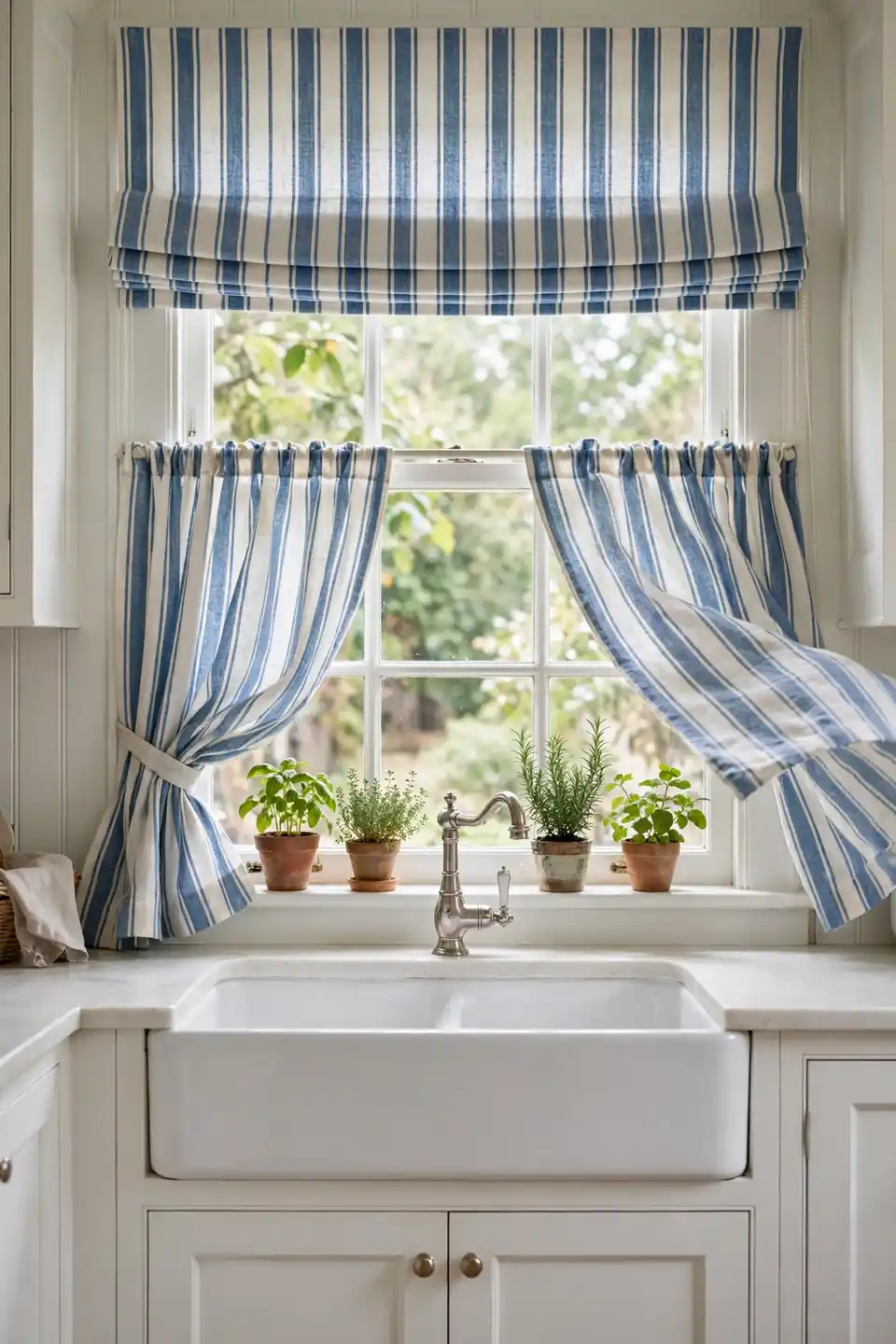
- Hang cafe curtains mid window so privacy and daylight both survive.
- Pick stripes in the same blue family as your tile or cabinets.
- Wash linen in cold water and hang it damp for soft natural folds.
- Repeat the stripe once more in a towel or seat cushion nearby.
Don’t:
- Cover the whole window with heavy drapes in a small bright kitchen.
- Mix three different stripe widths in one small room.
- Let fabric pool onto a wet sink counter behind the faucet.
- Choose dry clean only cloth for a busy cooking space.
Linen softens hard kitchen edges: stone, steel, tile, and glass. Its gentle stripe brings pattern without shouting, and the fabric moves in a breeze, making the room feel alive on warm afternoons.
Delft Inspired Tile Accents
Cost: Low for a small panel | Time: One weekend | Skill Level: Intermediate | Best For: Stove walls and small niches
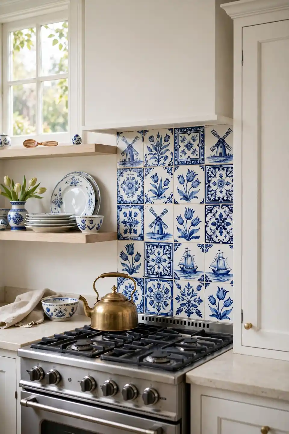
A few patterned tiles go a long way. Set them as a framed panel behind the range or inside a shallow niche, surrounded by plain white field tiles that keep the cost down and the pattern special. Each small scene, a windmill, a boat, a simple flower, rewards a closer look while guests wait for coffee. I’ve seen this work well in many cases where a full patterned wall would have overwhelmed a compact room completely, despite its charm and history.
Farmhouse Sink Focal Point
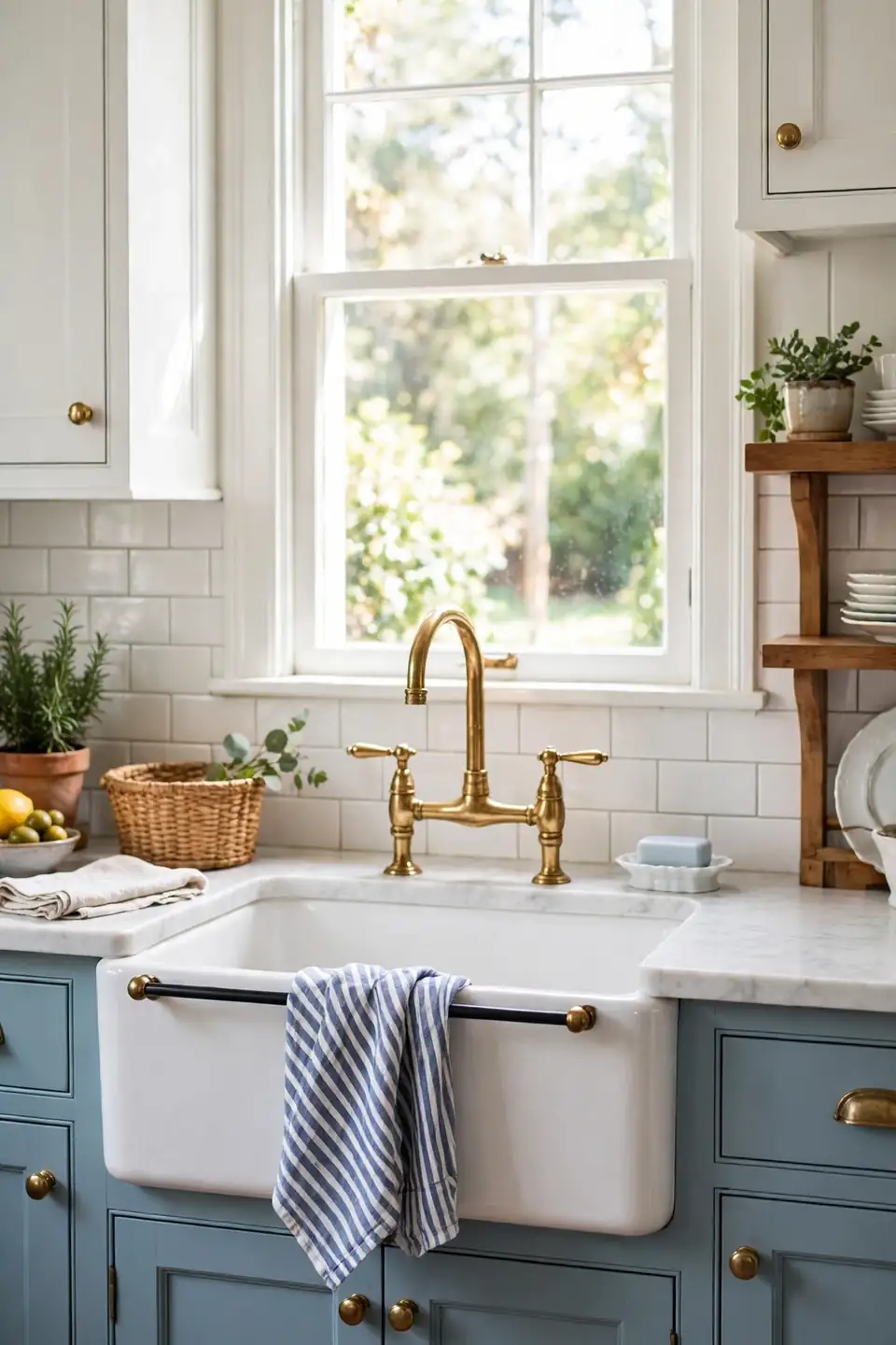
A deep white apron sink anchors the room like a piece of furniture. Its broad front face catches light, breaks up long cabinet runs, and gives big roasting pans a proper home after Sunday lunch. Paired with a brass bridge faucet, the sink corner becomes the spot every guest notices first.
Keep the styling around it disciplined and simple. A wooden board, a small porcelain dish for soap, and one striped towel are enough. Clutter hides the clean lines that make the sink special. Choose fireclay if the budget allows; it resists stains and chips, and its soft sheen suits the classic palette beautifully over many years.
Painted Blue Island

- Paint the island one shade deeper than any other blue in the room for clear hierarchy.
- Top it with pale stone or butcher block so the dark base stays balanced and bright.
- Hang two or three brass pendants in a row, spaced evenly along its full length.
- Style it with one bowl of lemons and patterned side plates.
- Repeat the island blue in a far corner hutch.
An island painted blue gives the whole scheme its center of gravity. It is also the safest place for a bold color, because it reads like furniture rather than architecture. Guests naturally gather around it, and in my experience that is where traditional blue and white kitchen decor feels warmest, with food, conversation, and pattern all meeting in one spot.
Porcelain Plate Wall
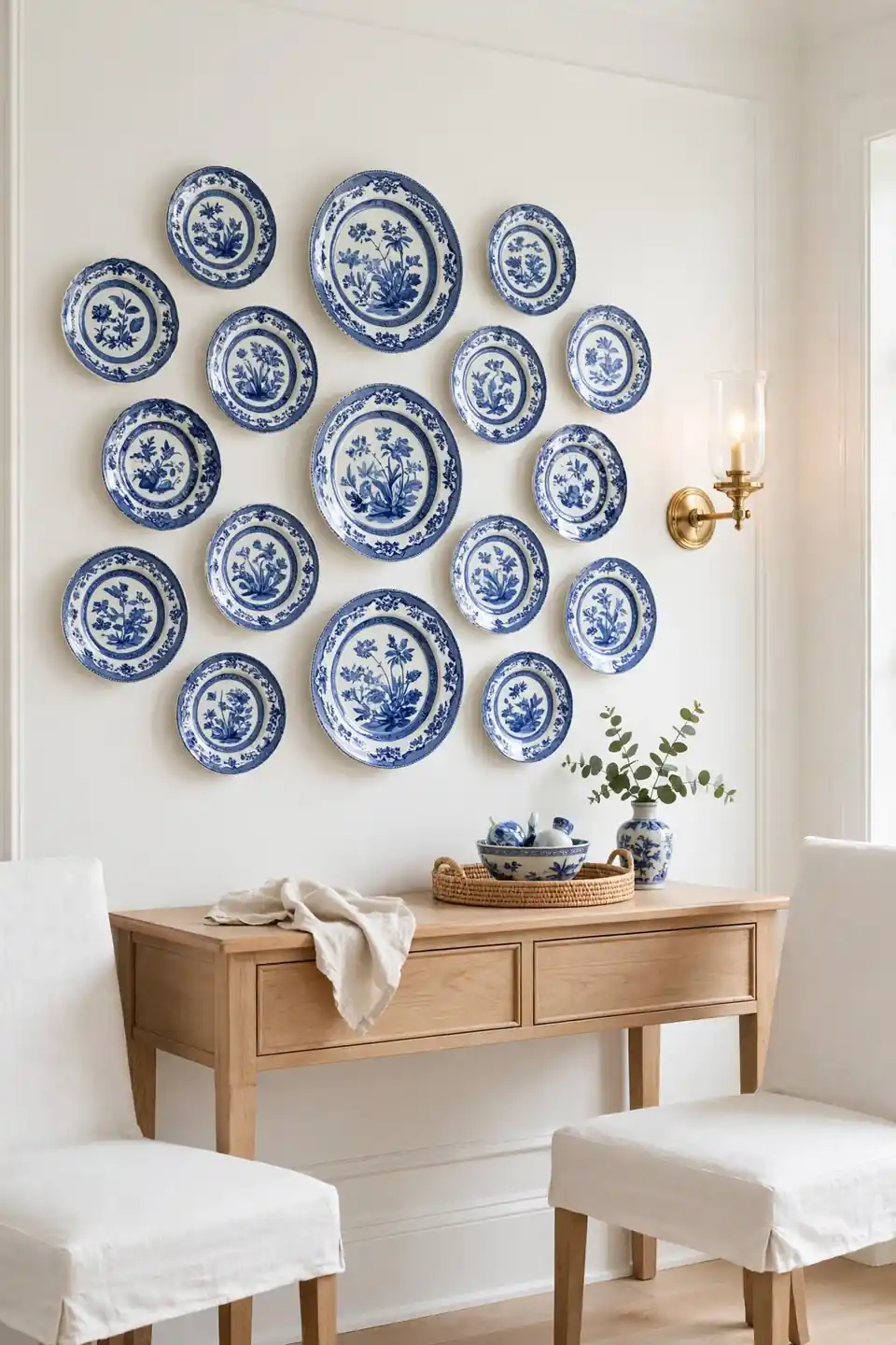
Quick Tip: Lay the whole arrangement on the floor first and photograph it from above. Move plates until the gaps feel even, then trace each plate on paper, tape the papers up, and hang into the outlines one by one.
Plate walls suit kitchens because the art is already in the cupboard. Mix floral rims, striped edges, and one or two scenic centers, keeping sizes varied but spacing tight and even. Hang the group near the eating area rather than the cooking zone, away from steam and splashes, so delicate glazes stay bright and unchipped for many years of daily family meals.
Classic Checkerboard Floor
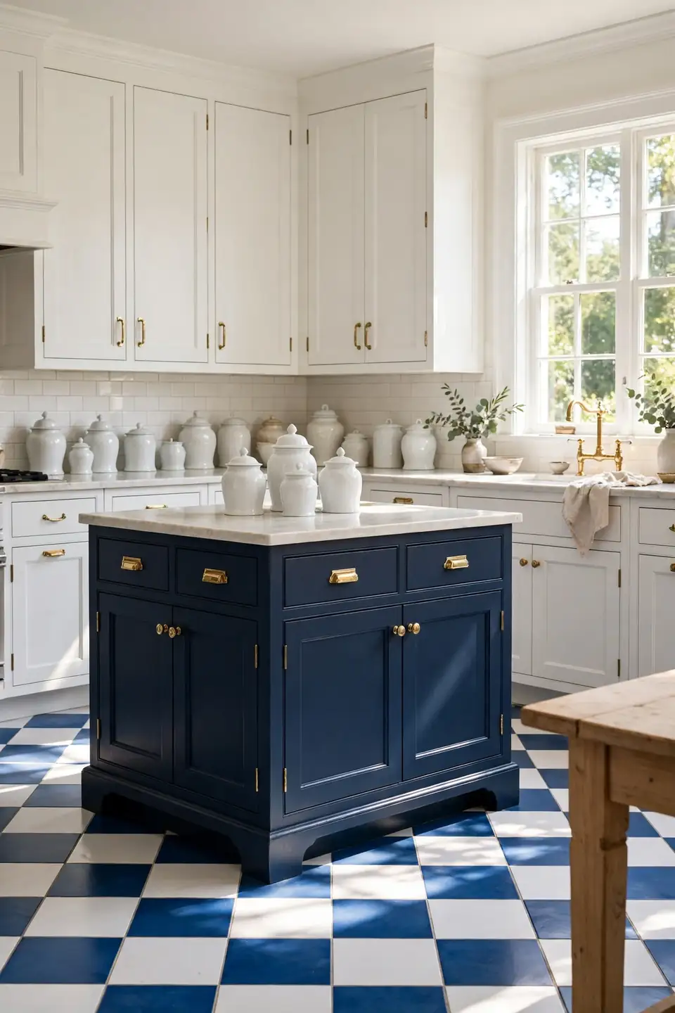
BEFORE: Worn plain flooring made the kitchen feel tired no matter how clean the counters were. White cabinets floated with nothing to ground them, and the room lacked any pattern at floor level to balance the tile above.
AFTER: Blue and white checks now anchor every cabinet and bounce light in a steady rhythm. The pattern hides crumbs between cleanings and gives the whole room a diner fresh, classic energy from the doorway.
Scale decides whether checks feel calm or busy. Large squares suit big rooms and long galley layouts, while small checks charm in compact spaces. Keep the blue soft, closer to denim than navy, and let grout lines stay pale. A flat woven runner over the busiest stretch adds comfort for the cook without hiding the pattern.
Woven Basket Storage
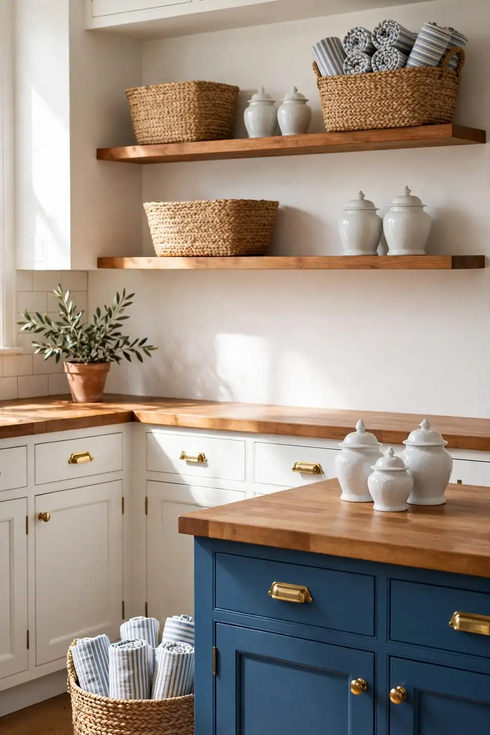
What You Need:
- Three matching baskets for dry goods, sized to the shelf depth so nothing hides behind them.
- Two smaller baskets for towels and napkins, kept near the sink and table for quick grabs.
- Plain paper labels tied with twine, so contents stay clear without printed text or fuss.
- A spare basket by the door for mail and clutter that drifts into cooking space.
Texture keeps a blue and white room from feeling flat or cold. Woven fibers add the warm, handmade note that porcelain and tile cannot give. Shoppers drawn to calm neutrals often pair this look with mushroom taupe bedroom decor ideas elsewhere at home, since both palettes love natural wood and soft woven texture.
Blue Floral Roman Shades

| Feature | Floral Shades | Striped Shades |
|---|---|---|
| Pattern | Soft and romantic | Sharp and tailored |
| Light | Gentle filtered glow | Even and bright |
| Best Room | Garden facing kitchens | Small urban kitchens |
| Pairs With | Floral porcelain | Checked floors |
Floral fabric at the window echoes the patterns on porcelain, tying hard and soft surfaces together. Choose a print with plenty of white ground so the shade still feels light at noon. Lined shades hang in neater folds and block harsh glare during summer, while unlined ones glow softly. Either choice benefits from a simple white tape border that frames the print neatly and gives the shade a tailored, finished edge.
Striped Runner Rug
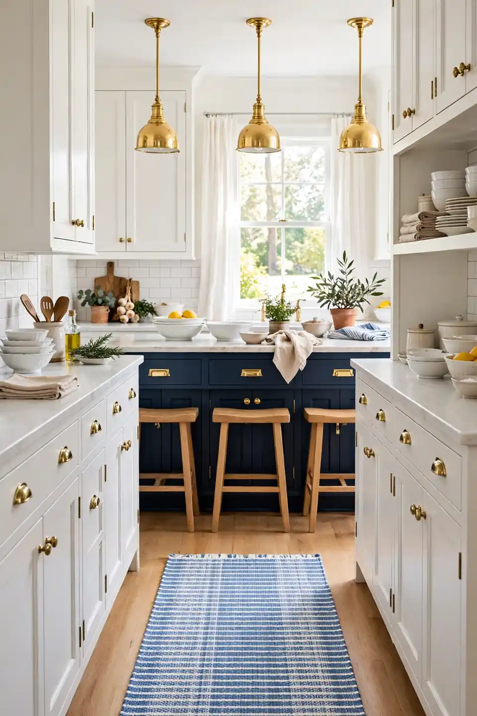
Do:
- Measure the run and leave a hand width of floor each side.
- Choose flatweave cotton or wool that slides under doors and washes well.
- Anchor the runner with a thin grip pad so corners never curl up.
- Run stripes long, guiding the eye through the room.
Don’t:
- Place a thick pile rug where spills and crumbs land every day.
- Pick stripes so thin they buzz against a checkerboard floor nearby.
- Cover a beautiful floor edge to edge just for softness.
- Skip the pad and accept a runner that travels daily.
A runner gives tired feet a softer shift and the palette a low, calm layer of pattern, while protecting the busiest floor strip. Shake it weekly, wash it monthly, and stripes stay crisp.
Glass Front Cabinets
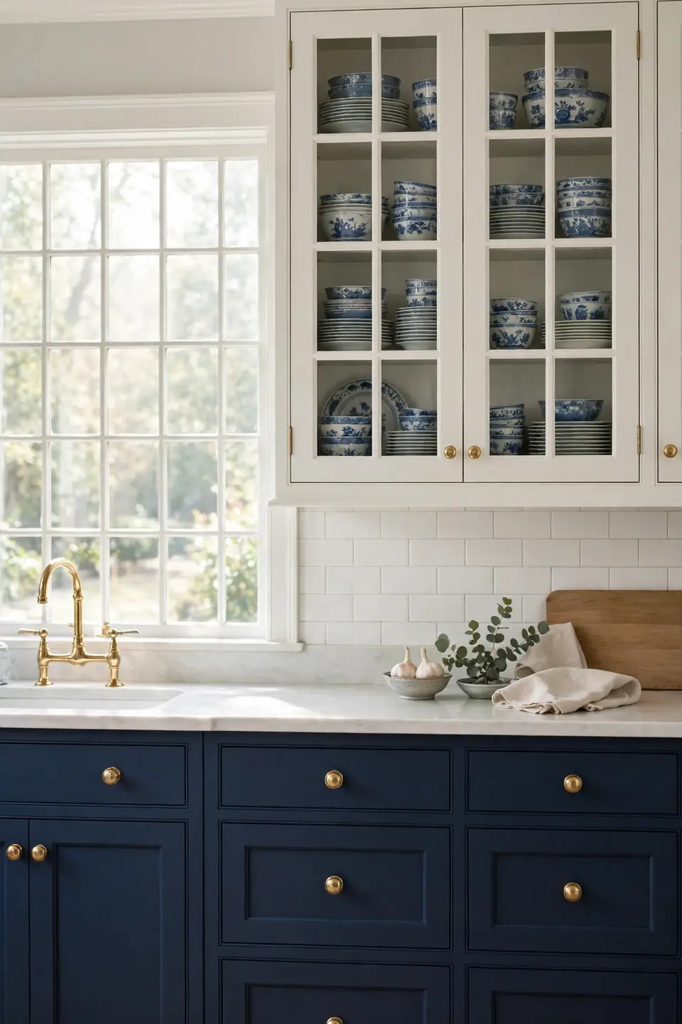
Cost: Medium for new doors | Time: One day to restyle | Skill Level: Beginner | Works In: Kitchens with tidy dish collections
Glass fronts turn storage into display without any extra shelf space. Behind the panes, keep stacks low and grouped by pattern, with the prettiest pitcher at eye level. Frosted or seeded glass forgives a less tidy cupboard, while clear glass rewards an edited one. Paint the cabinet interiors the palest blue, and even plain white dishes gain a soft backdrop that makes the whole wall feel deeper, calmer, and far more personal on busy weekday mornings and slow weekends alike.
Blue Enamel Cookware Display
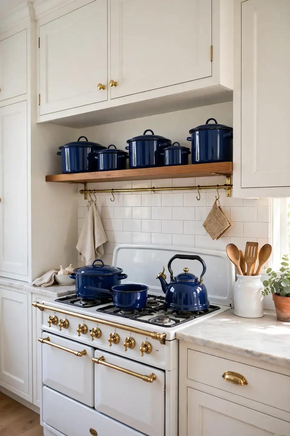
Cobalt enamel pots sitting on the hob bring color exactly where the eye lands during cooking. The glossy finish echoes glazed tile, so the stove zone feels linked to the backsplash behind it. A matching kettle completes the small group and waits ready for tea all day long.
Keep the display honest and working. Pots that cook daily earn their place out in the open; the rest belong in drawers. Limit the group to three pieces in one blue, with lids on, so the hob still reads tidy. Enamel chips if knocked hard, so store boards and heavy pans one shelf away from the display.
White Marble Countertops
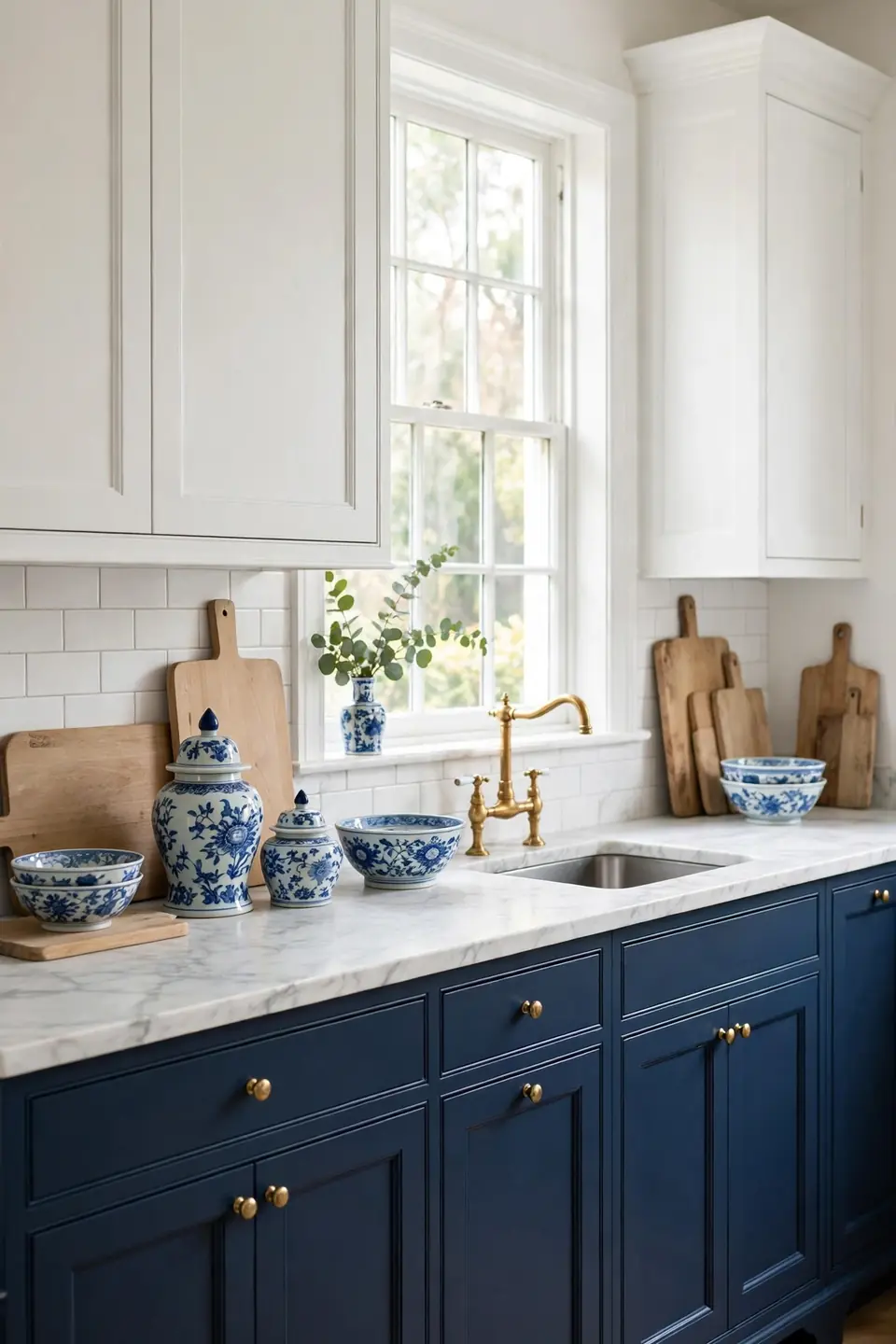
- Seal marble twice a year and wipe spills within minutes, especially lemon and tomato.
- Keep a pale wood board stationed for chopping, protecting the busiest stretch of stone.
- Let veining stay soft and grey so the surface reads calm beside strong blue.
- Style with porcelain and brass only, keeping daily clutter in drawers below.
- Choose honed over polished finishes to hide etching and suit a relaxed classic mood.
Marble gives the palette its quiet luxury. The cool white surface brightens navy cabinets and makes blue porcelain look richer by contrast. Yes, it asks for care, but the patina that builds over years suits a traditional room, where signs of real cooking feel like history rather than damage.
Beadboard Ceiling Charm

Quick Tip: Paint beadboard one shade paler than the cabinets for a gentle ceiling glow. Test the color at midday and again at dusk, because ceiling light shifts blue tones more than wall samples ever suggest at the store.
Overhead pattern is easy to forget, yet it covers the largest surface in the room. Beadboard grooves add shadow lines that make even a low ceiling feel crafted. Keep walls and cabinets white, and the pale blue above reads like open sky. That’s why many experts recommend looking up before buying anything new for a kitchen that feels almost finished but still slightly plain.
Butcher Block Warmth
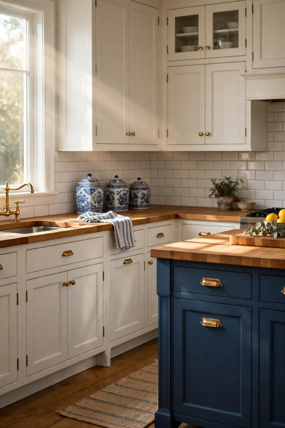
BEFORE: Cold grey counters made the blue cabinets feel chilly and the white walls feel bare. The room photographed well but felt unwelcoming at breakfast, when everyone wanted warmth with their first coffee of the day.
AFTER: Honey toned wood now wraps the worktops, softening every edge in the room. Grain and small knife marks give the classic palette a lived in honesty that stone alone could never offer.
Oil the wood monthly where water lands, and sand small stains out in minutes with fine paper. Butcher block suits the palette because it supplies the warm middle note between crisp white and deep blue. Keep one section near the stove dedicated to hot pans on trivets, and the surface will serve happily for decades.
Blue Toile Curtains

What You Need:
- Toile fabric with a white ground and one clear blue, enough for fullness twice the window width.
- A simple brass or white rod mounted close to the ceiling to stretch the window height.
- Plain white lining that protects the print from sun fade and keeps folds neat.
- Small tiebacks in twisted cord or ribbon for open, airy daytime styling.
Toile brings storytelling to the window, tiny scenes that guests study while the kettle boils. Keep the rest of the room quieter when curtains carry this much pattern: plain towels, simple porcelain, clear counters. The balance keeps the print feeling classic and collected rather than busy or themed.
Vintage Brass Faucet
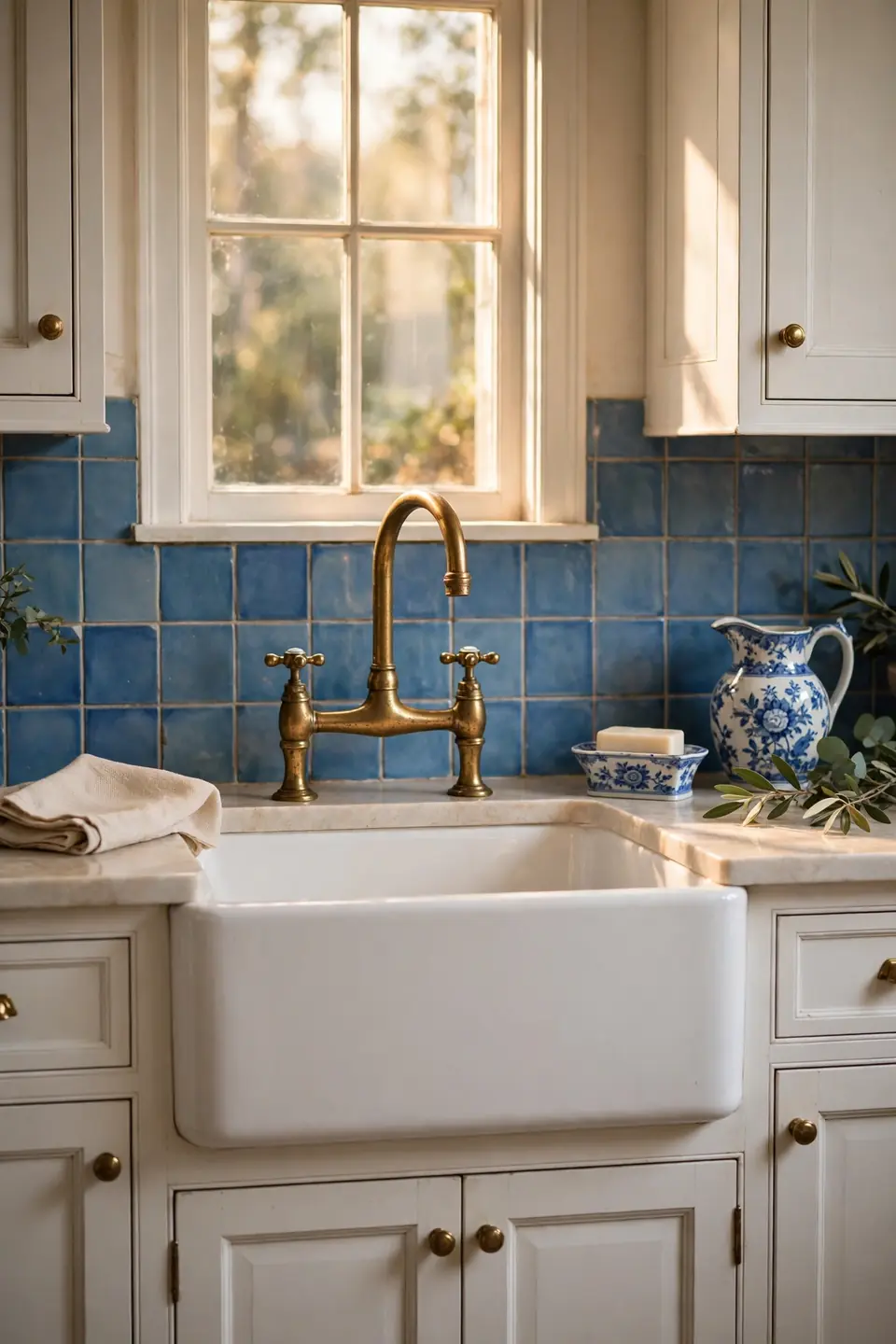
| Feature | Bridge Faucet | Single Lever |
|---|---|---|
| Look | Period and detailed | Clean and simple |
| Control | Separate hot and cold | One hand mixing |
| Cleaning | More joints to wipe | Quick single wipe |
| Best For | Farmhouse sinks | Busy family kitchens |
A bridge faucet suits the sink like jewelry suits a plain dress: small, warm, and impossible to miss. The exposed pipework and cross handles echo older kitchens, grounding new cabinets in something older and calmer. Choose unlacquered brass if you enjoy a living finish that deepens with touch, or lacquered brass for a steady shine with almost no upkeep at all through years of daily splashes and washing up.
Windowsill Herb Garden
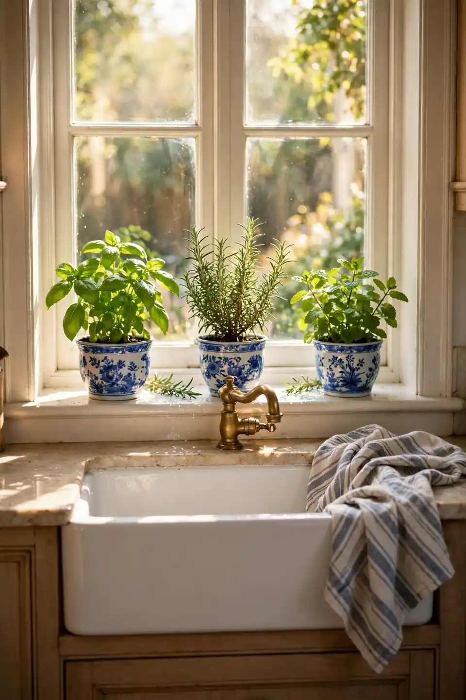
Do:
- Pick herbs you truly cook with, starting with basil, mint, and rosemary.
- Give each pot a saucer so watering never marks the sill paint.
- Turn pots a quarter each week so stems grow straight and bushy.
- Pinch tips often; regular picking is what keeps herbs producing.
Don’t:
- Overwater until soil stays soggy and roots begin to sulk.
- Crowd six pots where light only reaches the front row.
- Let mint share a pot; it takes over every neighbor fast.
- Place delicate herbs above a hot radiator in winter months.
Green is the one color this palette always welcomes. Fresh leaves soften the blue and white order, smell wonderful when brushed, and end up in dinner, which makes the prettiest sill in the room also the most practical one.
Blue Striped Dish Towels
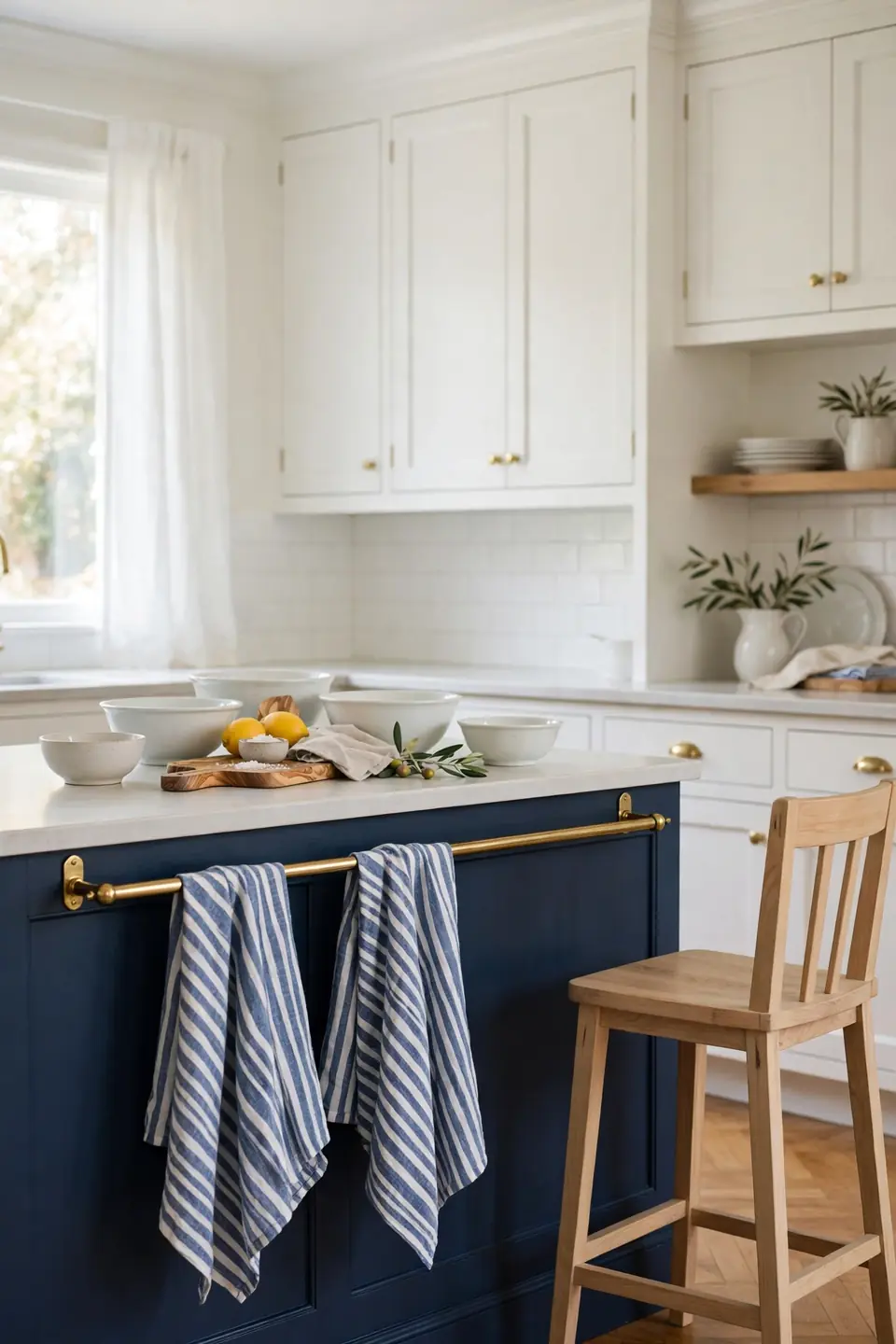
Cost: Very low | Time: Five minutes | Skill Level: Beginner | Best For: Renters and quick refreshes
Towels are the fastest pattern swap a kitchen owns. Fold one over the oven handle, hang a pair on a brass rail, and drape a third beside the sink for real work. Keep the stripe family consistent, mixing widths but never colors, and six inexpensive towels can refresh the whole palette each season. Linen dries faster than cotton and softens with every wash, so the hardest working cloth in the room also ages the most gracefully, wash after wash, season after season, year after year.
Layered Blue Table Linens

Cloth on the table is where the palette gets to relax. A white cloth sets the calm base, a striped runner adds direction, and patterned napkins bring the playful top note. Breakfast feels considered even on weekdays, and guests read the layers as care rather than formality or fuss.
Mix patterns by scale and the table never looks matched from a set. Wide stripes below, small florals above, plain porcelain in between. Keep a spare set pressed and ready, because a fresh cloth hides a tired table instantly. In my experience, this corner is where the whole scheme proves itself, turning ordinary meals into small daily rituals.
Conclusion
Small layers add up fast in a blue and white room: one jar, one stripe, one warm brass detail at a time. Start with the idea that solves your biggest daily annoyance, live with it for a week, then add the next layer slowly. That steady pace is how traditional blue and white kitchen decor stays personal instead of copied. Save your favorite ideas to Pinterest, share the list with anyone planning a refresh, and enjoy watching a classic palette settle into your home. I’ve seen how small changes like these can completely shift the way a space feels.