23 Cream and Olive Green Kitchen Decor Ideas for Earthy Warmth
Earthy color pairs rarely miss, and soft olive against warm cream is one of the calmest combinations a kitchen can wear. Gentle cream and olive green kitchen decor works because the green brings garden freshness while cream keeps every surface feeling warm and light. Add pale wood, brushed brass, and white stoneware, and the room reads collected rather than decorated, ready for slow breakfasts and busy weeknight cooking alike.
Begin with the biggest surfaces first, cabinets and walls, then repeat the pairing in small doses across shelves, textiles, and tableware. The same patience with layered neutrals that shapes dark floral bedroom design ideas applies here too, because both palettes reward restraint over noise. Keep patterns quiet, let texture do the talking, and the kitchen will feel settled instead of themed. In my experience, two colors repeated with discipline beat five colors used once every single time.
Olive Green Cabinet Doors
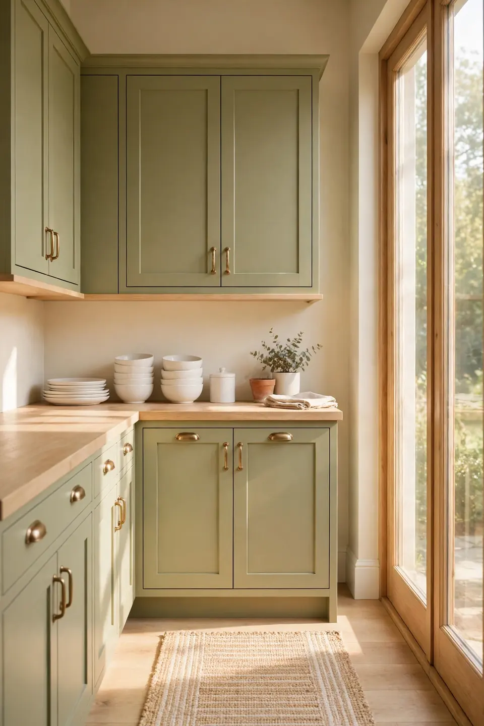
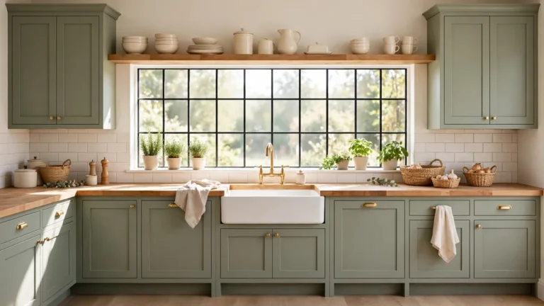
Soft olive on the cabinet doors sets the whole kitchen’s temperature in one move. The color sits between green and grey, so it reads earthy in daylight and calm under evening bulbs, never loud in either. Pair the doors with warm cream walls and pale counters, and the green deepens without darkening the room.
Finish matters as much as color here. A matte or eggshell paint keeps olive looking like painted wood rather than plastic, and simple shaker fronts suit the shade better than ornate profiles. Keep the upper run cream if the kitchen is small; olive below the counter and cream above keeps the work zone grounded and the eye level light.
Cream Plaster Wall Finish
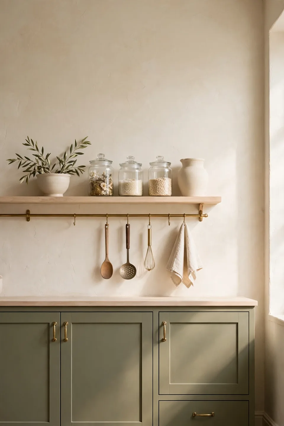
- Choose a warm cream with a yellow or beige base, never a blue one
- Roll on a plaster effect finish for gentle, cloudy texture
- Keep the ceiling one shade lighter than the walls
- Test a large board at breakfast and dusk before committing
- Carry the same cream onto trim for a seamless, calm envelope
Cream plaster is the quiet partner that lets olive cabinets glow. The slight texture catches light unevenly across the day, so plain walls never look flat or sterile. Against that warmth, olive reads richer, brass reads softer, and even plain white appliances settle in without shouting for attention.
Stoneware Countertop Vignette
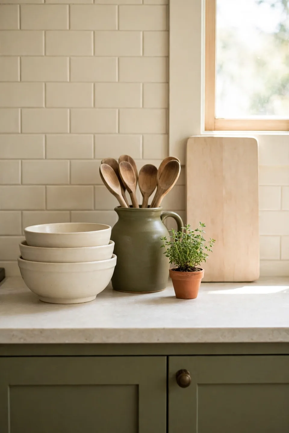
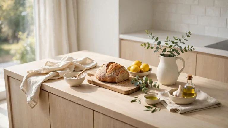
Quick Tip: Group countertop pieces in threes on one pale wood board: a cream stoneware bowl stack, an olive jug holding wooden spoons, and one small potted herb. The board corrals the group into a single calm shape, so counters look styled instead of scattered, and lifting everything to wipe down takes seconds.
Counters earn their calm by what stays off them. Keep daily tools inside the vignette’s color family, cream, olive, wood, and hide the rest in drawers. When every visible object answers to the palette, even a hardworking counter photographs like a styled shelf, and cooking mess reads as life rather than clutter.
Cold Cupboards Warm Up
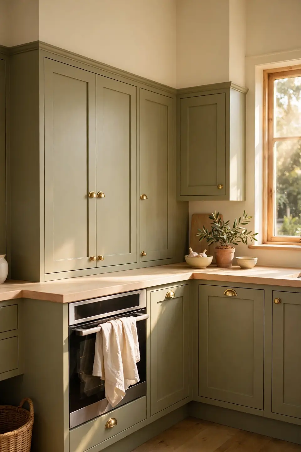
BEFORE: The cupboards were a cold blue grey, the walls a stark white, and the whole kitchen felt like a clinic at noon. Steel handles and a grey floor drained every trace of warmth, and nobody lingered at the counter longer than a kettle took to boil.
AFTER: Olive doors, cream walls, and brass cup handles changed the temperature completely. A pale wood counter and a cream linen towel softened the edges, and the same small kitchen now holds people long after the cooking ends.
Temperature, not size, was the real problem in that room. Grey and white together read cold under most bulbs, while olive and cream bend warm in any light. Swap the two biggest color fields first; small accessories can only polish a palette, never rescue one.
Open Shelf Styling Steps
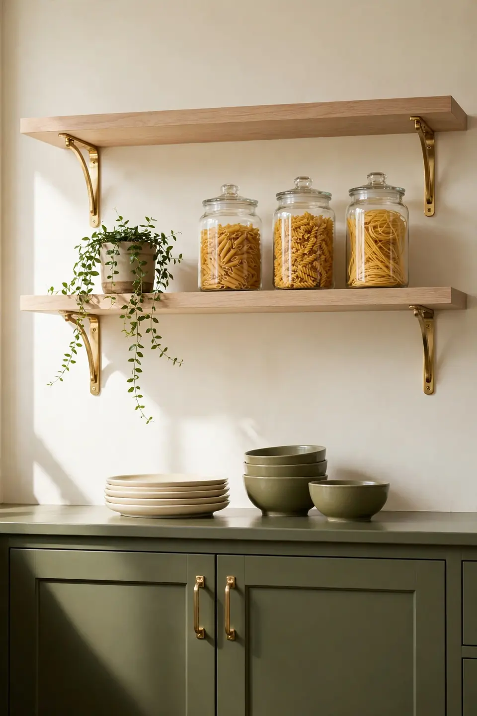
- Start with the largest pieces: plate stacks and serving bowls in cream
- Add olive bowls and jugs as the second layer of color
- Fill clear glass jars with pasta, grains, and dried beans
- Leave one third of each shelf empty for breathing room
- Finish with one trailing plant softening the shelf edge
Open shelves reward editing more than buying. Every visible piece should earn its place by being used weekly, because dust finds display-only objects first. Group by color family rather than by type, cream together and olive together, and the shelf reads as calm blocks of color instead of a jumble of kitchen gear.
Olive Versus Sage Cabinets

| Olive Green | Sage Green |
|---|---|
| Deeper, warmer, more earthy in tone | Paler, cooler, with a grey softness |
| Pairs richly with brass and walnut | Pairs gently with chrome and ash wood |
| Holds its own in large bright kitchens | Suits small kitchens needing light color |
| Reads Mediterranean and grounded | Reads cottage soft and airy |
Both greens love cream walls, so the choice comes down to mood and light. North facing kitchens often prefer olive, whose warmth fights the grey daylight, while sunny rooms can carry sage without it washing out. Paint one door in each shade and live with both for a week; the room will vote clearly.
Brass Hardware Rules

Do:
- Choose brushed or satin brass over mirror polished finishes
- Repeat the same finish on taps, rails, and light fittings
- Scale handles to door size, longer pulls on wide drawers
- Warm the metal story with one brass bowl or tray on display
Don’t:
- Mix brass with chrome in the same sightline
- Fit tiny knobs that disappear against deep olive paint
- Polish brass weekly until it looks brand new and brash
- Let hardware outshine the cabinets it serves
Brass and olive share the same warm family, so the pairing feels grown rather than matched. A soft brushed finish keeps the metal humble against matte paint. In my experience, hardware is where a budget kitchen gains its most expensive looking detail, provided one finish runs through the whole room.
Budget Paint Refresh Facts

Cost: Low, since two tins of paint carry the whole transformation
Time: One weekend including drying time between coats
Skill Level: Beginner, with sanding and patience as the main tasks
Best For: Sound cabinets in a dated, cold color
Paint is the hardest working budget tool in this palette. Olive on the doors and cream on the walls changes every photograph of the room, while handles and counters can stay untouched until funds allow. Degrease and sand properly before the first coat; preparation, not paint price, decides whether the finish lasts five years or five months of daily family cooking and steamy winter washing up sessions.
Butcher Block Counter Warmth
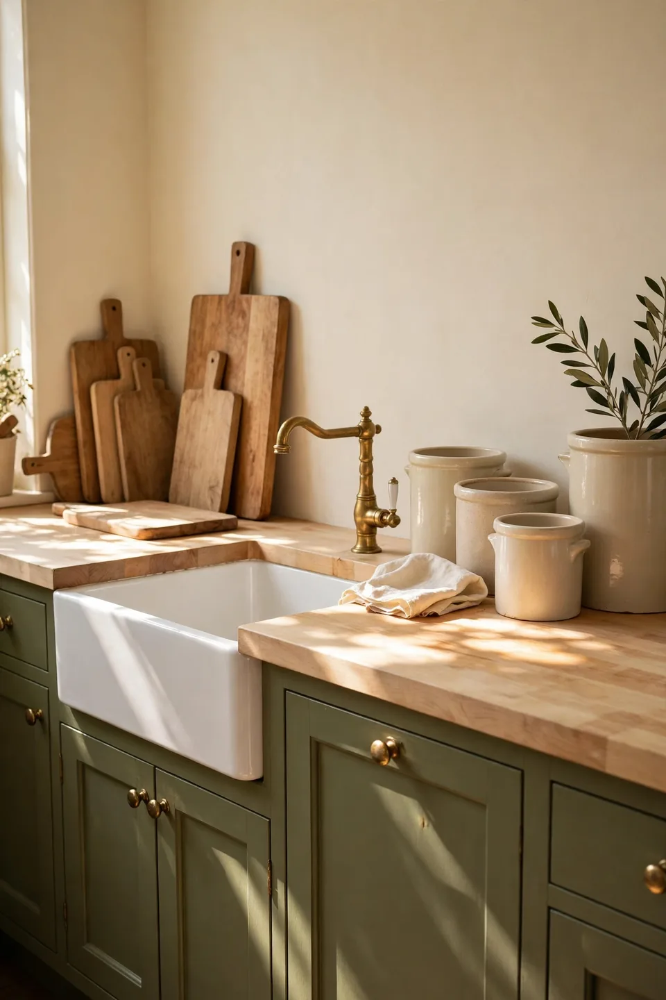
Pale butcher block is the bridge between olive cabinets and cream walls. Its honey grain warms the green without competing with it, and the surface forgives daily cooking better than stone look laminates that chip at the edges. Sealed with oil rather than gloss, the wood keeps a soft matte glow that suits the palette’s calm.
Care stays simple: oil the surface twice a year, wipe spills before they sit, and keep one end clear as the permanent chopping zone. The same love of honest, layered materials drives modern bohemian dining room inspiration, where wood and woven texture do the decorating. Choose boards and bowls in the same pale tone so small pieces extend the counter’s story.
Linen Cafe Curtain Panels
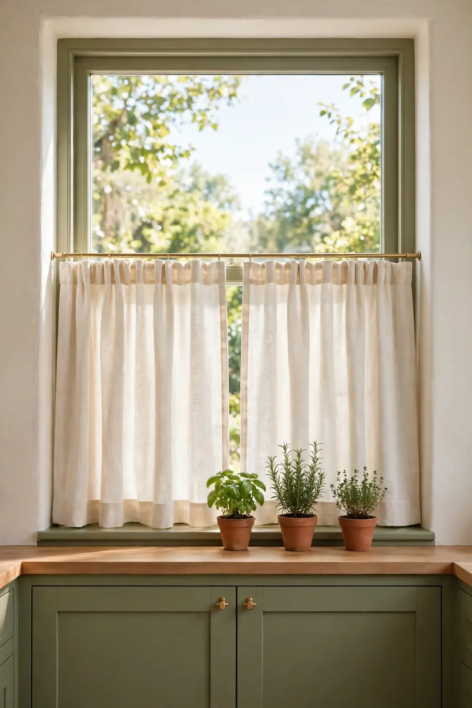
- Hang cafe panels on the lower half of the window only
- Choose natural cream linen with a loose, visible weave
- Fit a slim brass rod inside the window frame
- Let panels end just below the sill for a tidy line
- Keep the upper glass bare so daylight floods the worktop
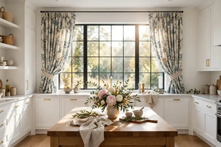
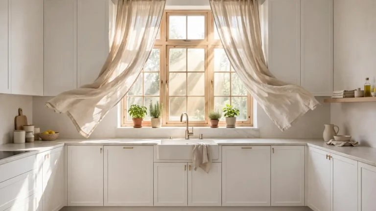
Half curtains solve the kitchen window problem neatly: privacy at counter height, full light where cooking happens. Cream linen softens the view of fences and bins without dimming the room, and the fabric’s gentle movement keeps a still kitchen feeling alive. Wash them with the tea towels; linen only improves with age.
Herb Garden Windowsill Rows
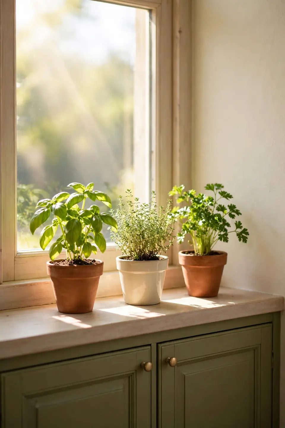
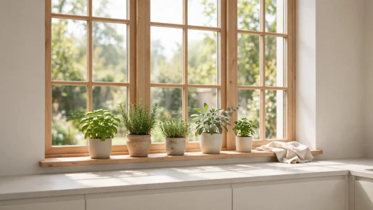
Quick Tip: Line the sill with pots in one family, terracotta and cream clay, all at the same height, and the herb row reads as decor instead of clutter. Basil, thyme, and parsley cover most weeknight cooking, and snipping from the row while a pan heats up feels like the kitchen is providing, not just storing.
Herbs are the one living color that suits olive paint perfectly, since leaf green sits a half step brighter than the cabinets. Rotate pots weekly toward the light so plants grow evenly, and keep a small watering can on the sill as a reminder. Dried herbs in glass jars carry the theme through winter.
Dingy Rental Kitchen Rescue

BEFORE: The rental kitchen was all dingy white: yellowed cabinets, a stained sink, and one bare bulb glaring off every surface. Nothing could be painted, nothing could be replaced, and the room felt borrowed in the worst way, temporary and unloved.
AFTER: Cream linen curtains, an olive runner, and pale wood boards layered warmth over the white shell. Olive stoneware and green herbs repeated the color story on every shelf, and the kitchen finally felt claimed rather than endured.
Rental rules force the smartest decorating, because everything added must leave with you. Textiles, boards, and crockery carry the whole cream and olive story here, no paint required. Photograph the room before moving anything in; landlords and future you both appreciate the proof.
Breakfast Nook Building Steps

- Claim one sunny corner and measure it honestly before buying
- Build or buy a bench with storage under the seat
- Cushion the bench in washable olive fabric
- Add a pale wood table sized for daily meals, not banquets
- Hang one brass pendant low over the table center
A nook turns leftover corner space into the most used seat in the house, and cream and olive green kitchen decor gives it a calm, garden room mood. Keep tabletop dressing minimal, one vase of greenery and stoneware mugs, so the spot resets in seconds between meals, homework, laptops, and slow Sunday morning coffee refills together.
Matte Versus Glossy Olive
| Matte Olive | Glossy Olive |
|---|---|
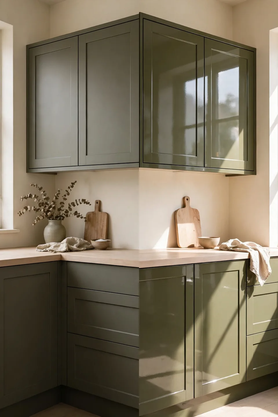
| Soft, chalky, and calm under all light | Shiny, sharp, and mirror like on doors |
| Hides fingerprints and small scuffs well | Shows every mark and needs daily wiping |
| Suits farmhouse and earthy schemes | Suits sleek, modern, handle free schemes |
| Feels warm beside cream and wood | Feels cooler beside cream and steel |
Finish changes the color as much as the paint name does. Matte olive absorbs light and sits quietly beside cream, which is why most earthy kitchens choose it. Gloss has one strong case: a dark, windowless kitchen where reflected light genuinely helps. Judge sample doors at night under your own bulbs before deciding.
Woven Texture Layer Rules
Do:
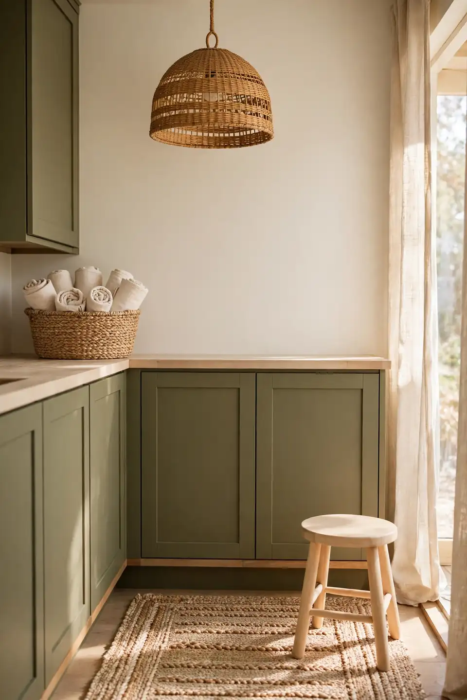
- Layer three woven textures at most per room
- Spread them high, middle, and low: shade, basket, runner
- Keep weave colors in the pale honey family
- Let one smooth surface sit beside every woven one
Don’t:
- Stack basket on basket until the corner looks stored
- Mix dark stained rattan with pale seagrass randomly
- Hang woven shades where steam rises daily
- Forget dust: shake pieces outside every month
Woven texture is the palette’s pattern, adding interest without a single printed motif. Against smooth cream walls and matte olive doors, seagrass and rattan supply the grain the eye wants. Keep the count disciplined and each piece reads as chosen; overdo it and the kitchen drifts toward storage.
Small Kitchen Color Facts
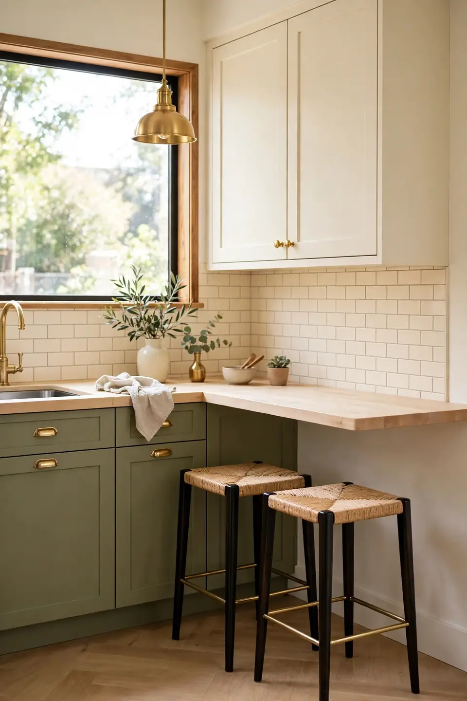
Cost: Low to moderate, since paint and textiles do most of the work
Time: Two weekends for painting cabinets and walls properly
Skill Level: Beginner friendly, with careful masking as the key skill
Best For: Compact kitchens that feel cold, white, and boxy
Two tone cabinets are the small kitchen’s best friend: olive below grounds the room, cream above keeps eye level bright and open. The split also hides real life gracefully, since darker lowers forgive scuffs from bags and shoes. I’ve seen this work well in many cases where a full color drench would have shrunk the room into a dark green box.
Farmhouse Apron Sink Moment
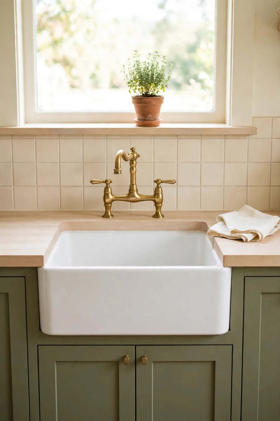
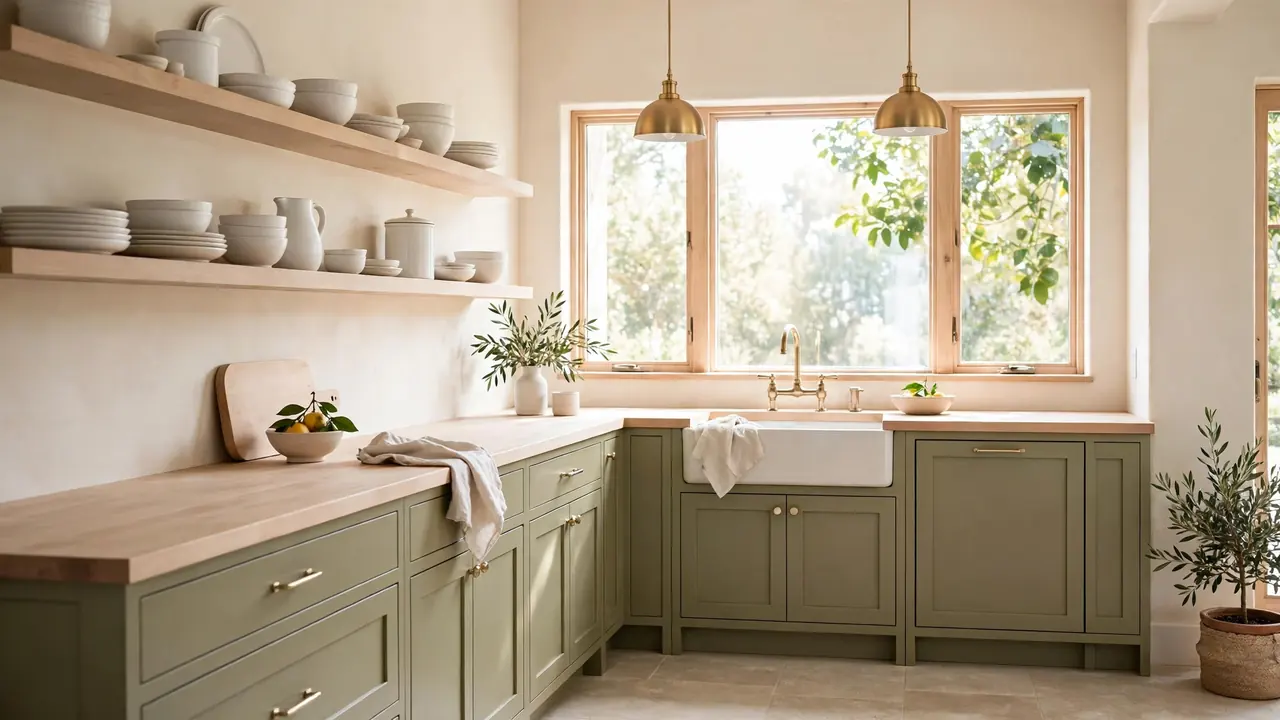
A broad white apron sink gives the cream and olive palette its classic farmhouse anchor. The ceramic front breaks the olive cabinet run with a clean, honest shape, and a brass bridge faucet above it ties the sink to the hardware story. Positioned under the window, the whole washing up zone becomes the kitchen’s prettiest working corner.
Practical details protect the look: a sink grid stops pans scratching the base, and a cream linen towel on the oven rail nearby echoes the ceramic’s softness. Keep the sill above spare, one herb pot and nothing more, so the sink stays the hero. Daily dishes look oddly good in a sink this handsome.
Open Pantry Shelf Order
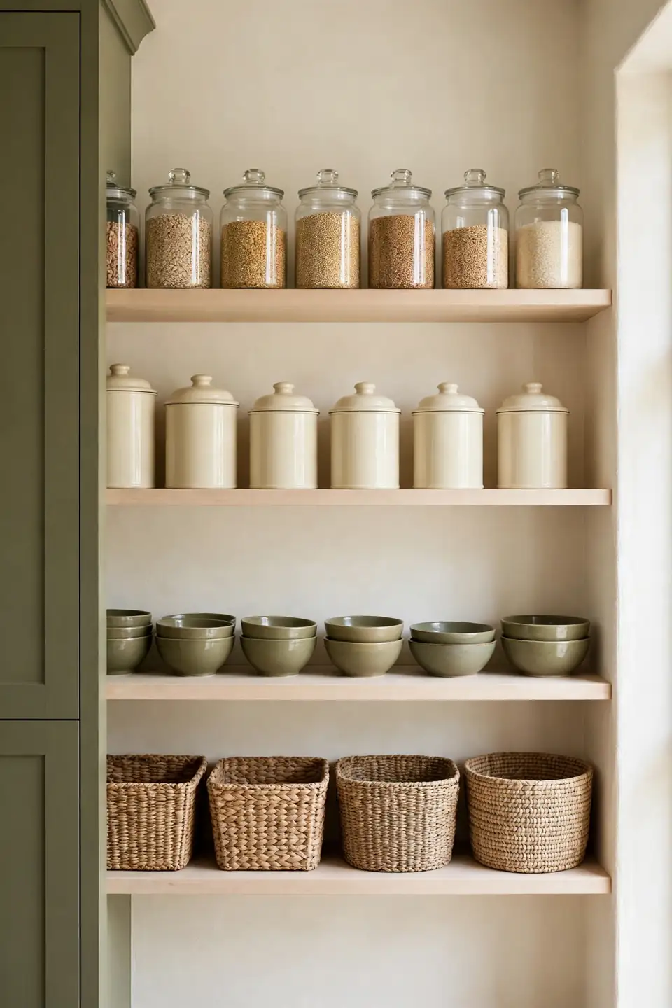
- Decant grains and pasta into matching clear glass jars
- Group cream canisters for flour, sugar, and tea together
- Keep olive bowls and jugs as the color layer between jars
- Reserve the lowest shelf for woven baskets hiding packets
- Leave the top shelf for rarely used serving pieces
An open pantry works only when order is visible at a glance. Matching jars turn stored food into calm rows of texture and tone, while baskets swallow the visual noise of half open packets. Label jar bases rather than fronts if handwriting jars your calm; the system matters far more than the labels themselves ever will.
Cream Tile Backsplash Glow
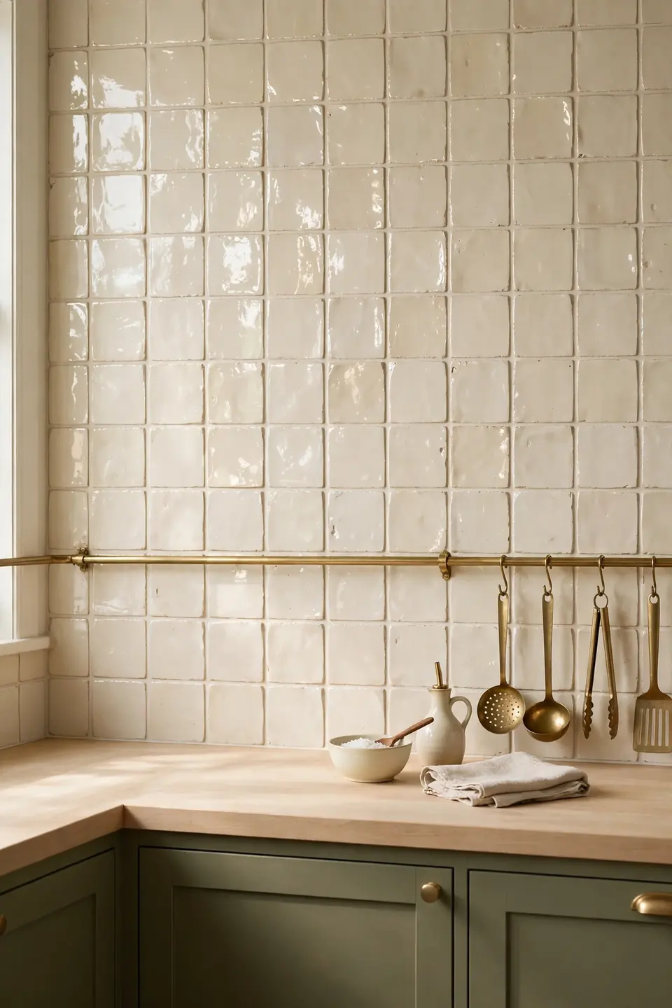
Quick Tip: Choose cream tiles with a handmade look and slight gloss variation, laid in a simple stack or brick pattern. The uneven surface bounces light around the worktop in small sparkles, so the backsplash glows instead of glaring, and olive cabinets below look deeper by contrast.
Grout color decides whether the wall reads as one soft sheet or a busy grid. A grout one shade darker than the tile gives gentle definition without stripes, while bright white grout chops the wall into boxes. Seal the grout behind the hob properly; cooking steam and splashes test this hardest working wall every single day.
Weekend Cabinet Paint Makeover
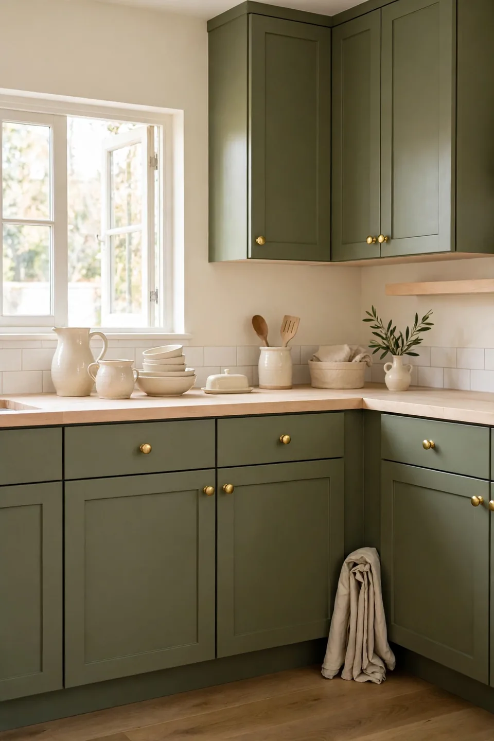
BEFORE: Friday evening found tired orange pine cabinets, magnolia walls yellowed with cooking years, and plastic handles cracking at the screws. The kitchen worked, but nobody photographed it, and guests always drifted to the living room within minutes.
AFTER: By Sunday night the doors were olive, the walls warm cream, and new brass knobs caught the evening light. The same pine boxes underneath now read as a deliberate earthy scheme, and guests settled at the counter without being asked.
The makeover succeeds because nothing structural changed, only color fields and handles. Doors come off Friday, get sanded and primed Saturday morning, and take two topcoats before Sunday lunch. Number every door and its hinges in pencil; that small habit saves the entire Sunday evening.
Pendant Light Pairing Steps
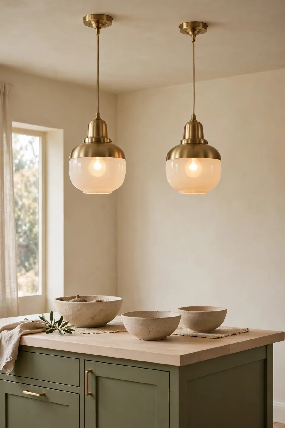
- Measure the island or table length before choosing shades
- Hang two pendants for runs up to five feet, three beyond
- Set shade bottoms thirty inches above the worktop
- Match metal to the cabinet hardware finish
- Fit warm bulbs so olive paint stays rich at night
Pendants are the kitchen’s jewelry, and brass with cream glass repeats both palette colors at ceiling height. Even spacing matters more than shade size; uneven drops nag at the eye daily. Put pendants on a dimmer so prep work gets full light and evening meals get the soft, warm version of the same hardworking room.
Wood Tone Pairing Guide
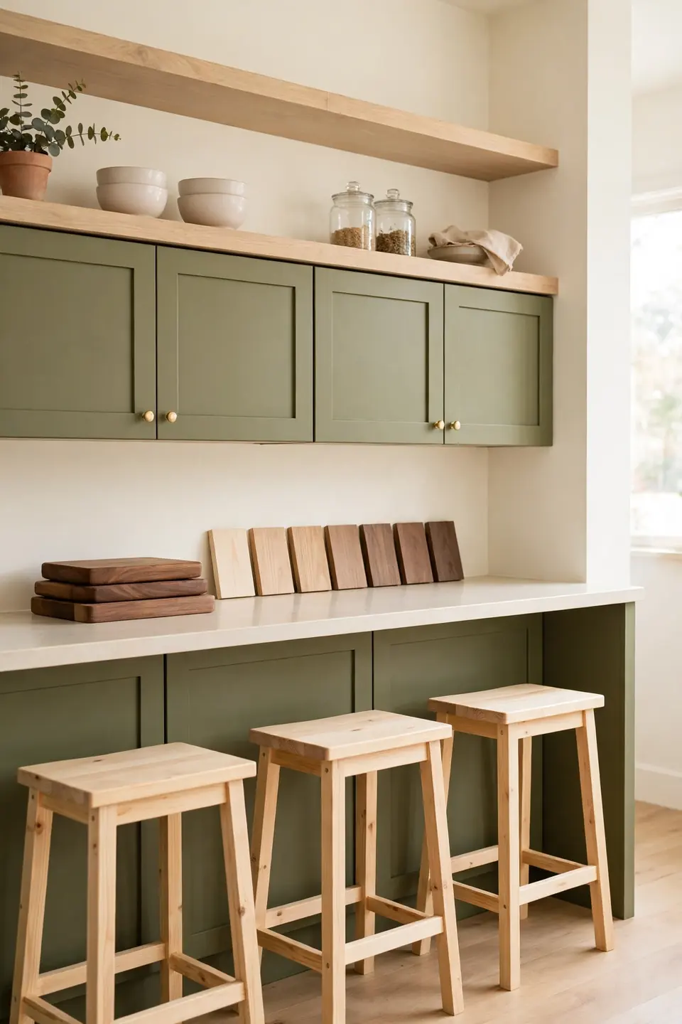
| Pale Oak | Warm Walnut |
|---|---|
| Light honey tone that lifts olive paint | Deep brown tone that grounds olive paint |
| Best for counters, shelves, and stools | Best for boards, bowls, and small accents |
| Keeps small kitchens feeling open | Adds richness to large pale kitchens |
| Pairs with brushed brass softly | Pairs with aged brass boldly |
One main wood plus one accent wood is the safe formula. Pale oak doing the large surfaces keeps the room bright, while walnut in boards and bowls adds the depth that stops cream and olive from feeling washed out. Repeat each tone at least twice so no piece looks like a stranger.
Evening Ambience Layer Rules
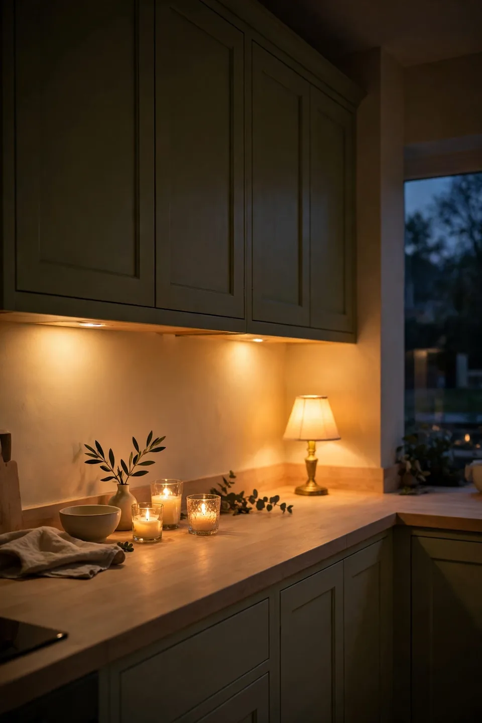
Do:
- Fit warm under cabinet strips for counter level glow
- Place one small lamp on the counter for living room softness
- Choose bulbs in the warm range for every fitting
- Let candles in glass holders finish the lowest layer
Don’t:
- Rely on one ceiling light after dark
- Use cool blue bulbs that turn olive grey
- Leave glossy surfaces to bounce harsh reflections
- Light the kitchen like a shop at closing time
Evening is the palette’s finest hour. Warm light deepens olive into something almost forest like, while cream walls hold a gentle glow that keeps the room welcoming. Layer the light low and warm, and the kitchen stops being a workspace at six and becomes the house’s evening hearth.
Conclusion
Warm cream and soft olive ask very little from a kitchen and give a great deal back: calmer mornings, softer light, and surfaces that forgive everyday cooking. Start with one surface, a cabinet run or a single wall, then let cream and olive green kitchen decor spread slowly through textiles, stoneware, and small brass touches. Save this list to Pinterest before your next paint run, live with each change for a week, and share your favorite corner with a friend who cooks. I’ve noticed kitchens built on two honest colors stay loved far longer than kitchens built on trends.