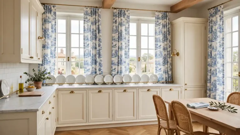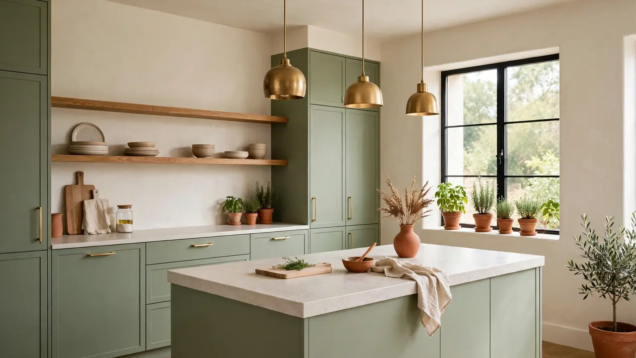
20 Earthy Modern Kitchen Color Schemes for Natural Warmth
Earth tones can make a modern kitchen feel grounded instead of cold, and the secret is layering them in the right order. Strong earthy modern kitchen color schemes start with one calm base, usually warm white or pale stone, then build color through cabinets, wood, and tile. Nothing needs to be bold everywhere; two or three earthy notes, repeated quietly, do the work.
Down the hall, the plum and cream bedroom decorating ideas show the same layering trick in a softer palette. In the kitchen, begin with cabinets in sage, clay, or warm greige, then echo the tone in a rug, a set of bowls, or the stools at the island. In my experience, earthy schemes fail when every surface competes; they succeed when one color leads and the rest support. The twenty schemes below pair each lead color with the wood, stone, and metal that flatter it most.
Sage Green Cabinet Calm
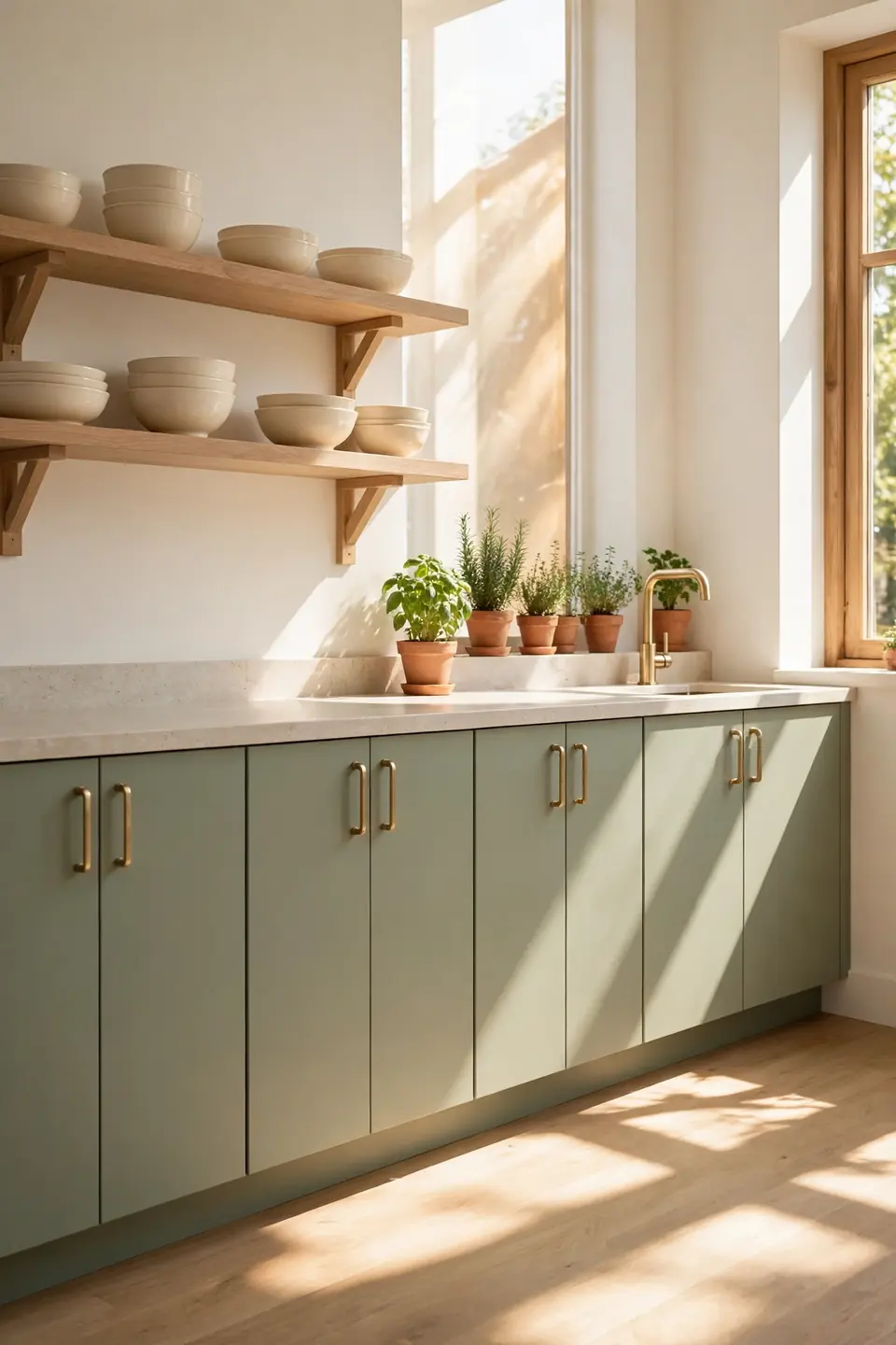
Soft sage on flat front cabinets is the gentlest way into an earthy palette. The green reads calm against warm white walls, and it shifts with the light, pale at breakfast and deeper by dinner. Keep counters pale stone so the color stays the quiet lead.
Brass handles warm the green without pushing it sweet, and light oak shelves stop the run from feeling like one solid block. I’ve noticed sage hides everyday splashes better than white ever does, which matters in a busy cooking zone. One potted herb on the sill echoes the tone and keeps the scheme feeling alive rather than painted on.
Warm Oak Wood Tones
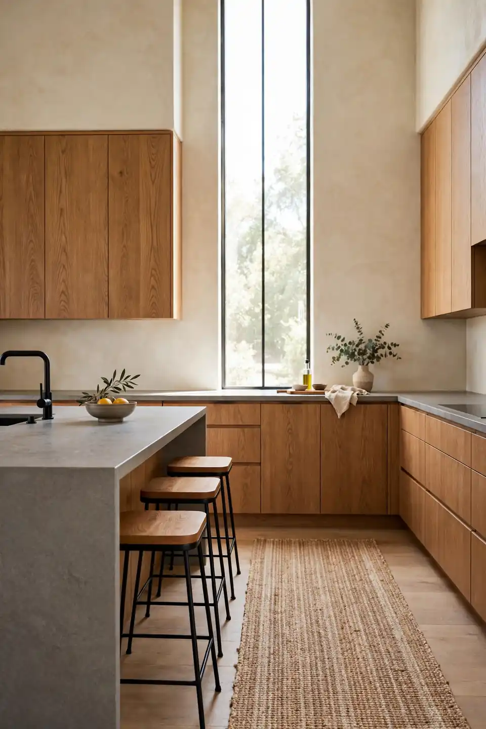
- Run warm oak on slab cabinet doors from floor to ceiling
- Pair the wood with cream plaster walls, never stark white
- Choose a honed stone counter with soft gray veining
- Repeat the oak in stool seats and one cutting board stack
- Keep metals matte black or aged brass for contrast
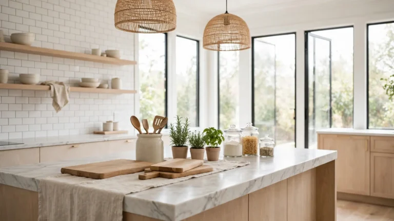
Wood carries an earthy scheme when paint steps back, and oak gives warmth without the heaviness of darker walnut. Grain direction matters: run it vertical on tall doors so the room feels taller. A woven runner underfoot softens the echo, warms bare feet at the sink, and ties the floor into the palette.
Terracotta Backsplash Earthy Glow
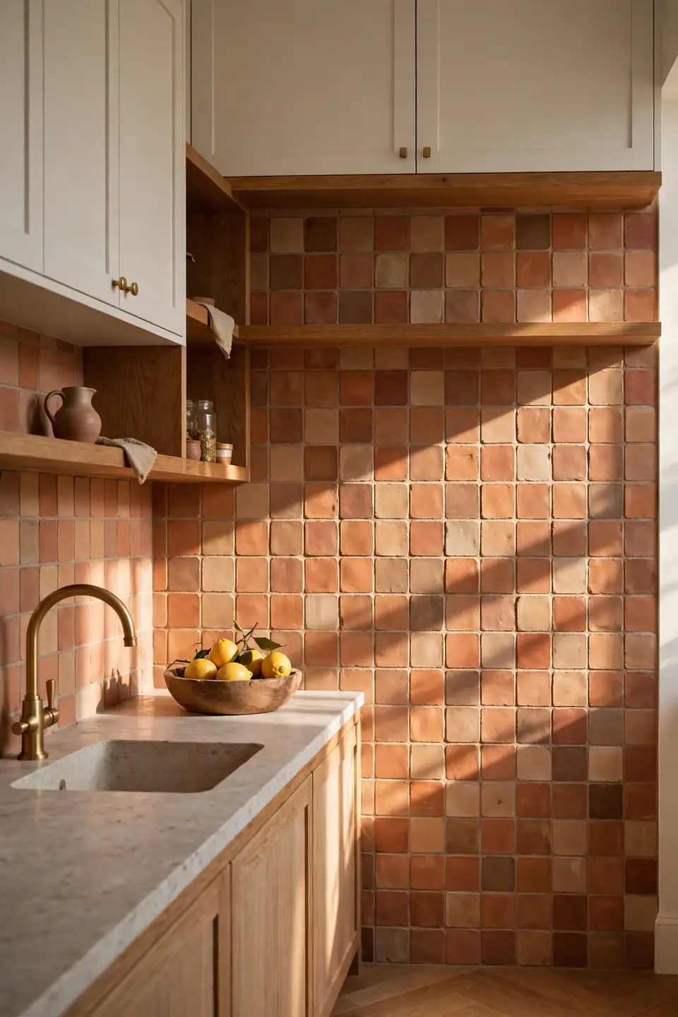
Quick Tip: Lay handmade terracotta tiles in a simple stacked pattern and seal them twice before grouting. The varied clay tones do the decorating, so keep grout lines thin and warm gray, and let each tile keep its own shade instead of sorting them into perfect color order on the wall.
Terracotta glows hardest beside warm white cabinets, where nothing competes with its fired color. Oak shelves and a brass faucet pull the orange down into friendly territory. Keep the counter styling spare: one wooden bowl, one plant, nothing more, and the tiles carry the whole wall with real ease.
Clay Plaster Wall Finish
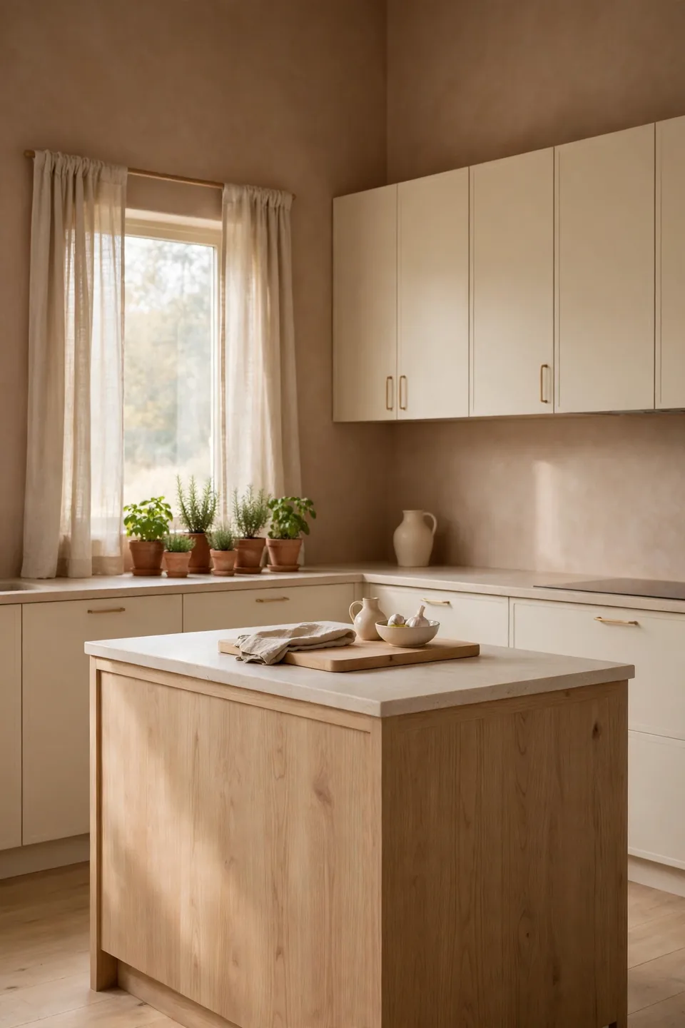
BEFORE: The kitchen wore bright white paint on every wall, and the cream cabinets vanished against it. Midday light bounced hard off the surfaces, and the room felt like a showroom nobody cooked in.
AFTER: Clay toned plaster wrapped the walls in a soft, chalky warmth. The same cream cabinets now read rich against the deeper ground, oak stools glow, and the whole room settles into a calm, earthy hush by late afternoon.
Plaster finishes earn their keep through texture as much as color, since tiny shadows move across the surface all day. Sample the tone on the wall that gets the least light first, because clay deepens in shade. Seal it well behind the range so cooking splashes wipe clean.
Olive Island Color Pop
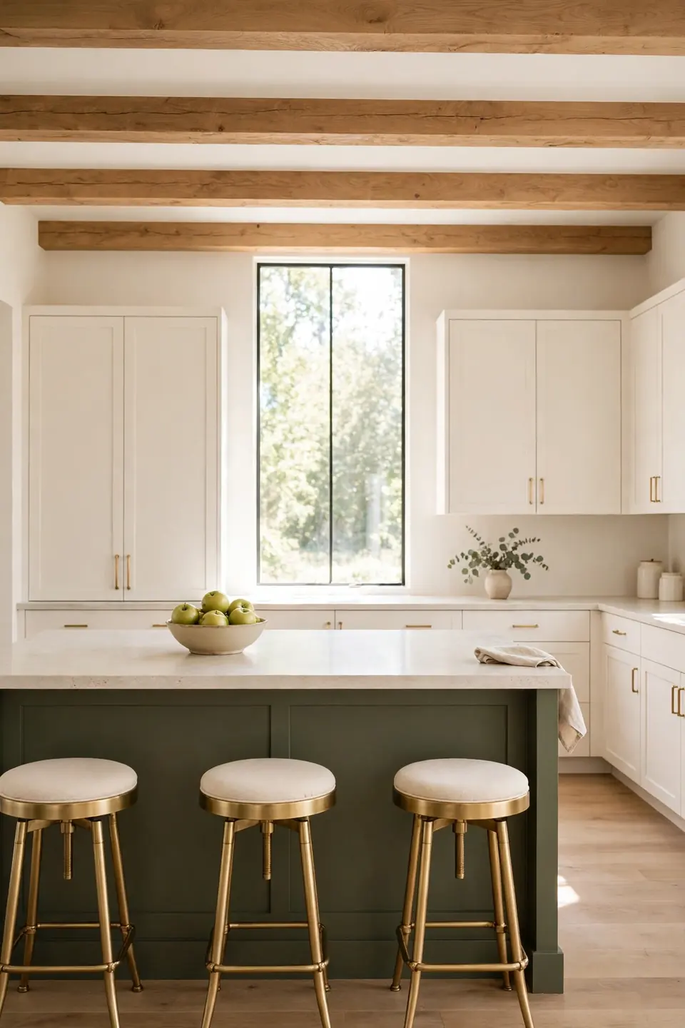
- Paint only the island a deep olive and leave the perimeter warm white
- Sand and prime the island panels so the dark color grips evenly
- Apply two thin coats, letting each dry a full day between
- Swap island hardware to aged brass for warmth against the green
- Echo the olive in one plant, one towel, and one bowl
One painted island gives a plain kitchen its earthy anchor without the cost of a full refit. Olive sits comfortably between sage and forest, deep enough to ground white cabinets yet soft beside oak floors. Keep the counter pale so the color reads as furniture, not as a dark block.
Cream And Stone Balance
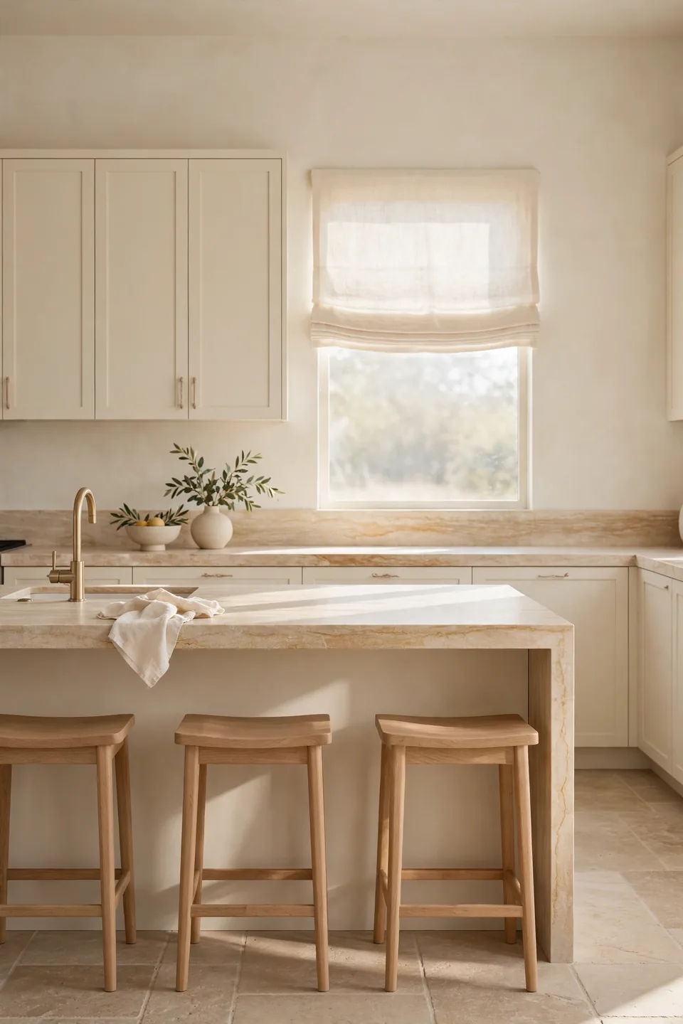
| Cream Cabinets With Natural Stone | Gray Cabinets With Polished Quartz |
|---|---|
| Warm beige veining warms the whole room | Cool gray veins can chill the palette |
| Matte stone hides crumbs and water marks | Polished tops show every fingerprint |
| Cream paint flatters oak and brass tones | Gray suits chrome and black metals |
| Feels collected and calm over many years | Reads sleek and current for modern tastes |
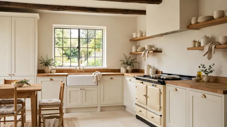
Cream and stone is the quiet backbone of half the earthy kitchens worth saving. The stone brings pattern so the paint can stay plain, and warm veining lets oak stools and brass taps belong. Choose honed finishes over polished ones, and the room keeps its soft, grounded mood even under bright midday sun.
Charcoal Lower Cabinet Depth
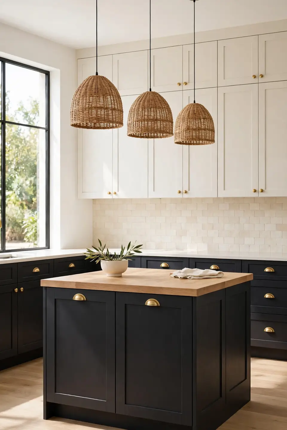
Do:
- Ground the lowers in charcoal and keep uppers warm white
- Use brass or oak handles to warm the dark paint
- Carry the charcoal onto the island base only
- Light the worktop well so depth never feels heavy
Don’t:
- Paint every cabinet charcoal in a small dark room
- Pair charcoal with cold blue white walls
- Add black counters that swallow the contrast
- Skip under cabinet lights over dark worktops
Charcoal works as an earthy neutral when it stays low, anchoring the room like soil under lighter layers above. Warm white uppers keep the ceiling feeling high, while oak counters bridge the two tones. That’s why many experts recommend charcoal for kitchens that feel floaty and need weight at floor level.
Sand Toned Open Shelving
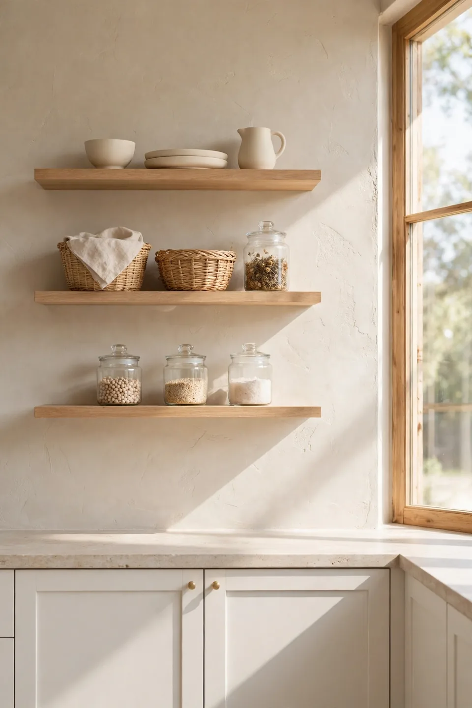
Cost: Low, since oak boards and brackets cost far less than wall cabinets
Time: One weekend to fit shelves and style them in calm groups
Skill Level: Beginner with a drill, a level, and stud finding patience
Best For: Small kitchens where closed uppers make walls feel crowded
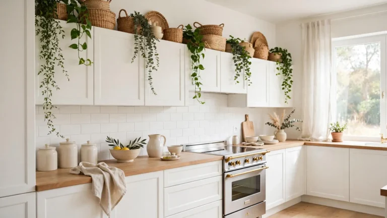
Open shelves in sand and oak keep an earthy kitchen breathing, showing stoneware and baskets instead of cabinet fronts. Group pieces by tone, cream with cream and wood with wood, and leave gaps so the wall shows through. Dusting takes minutes weekly, and the display changes with seasons, harvest bowls to spring branches, at no cost.
Muted Mustard Morning Light
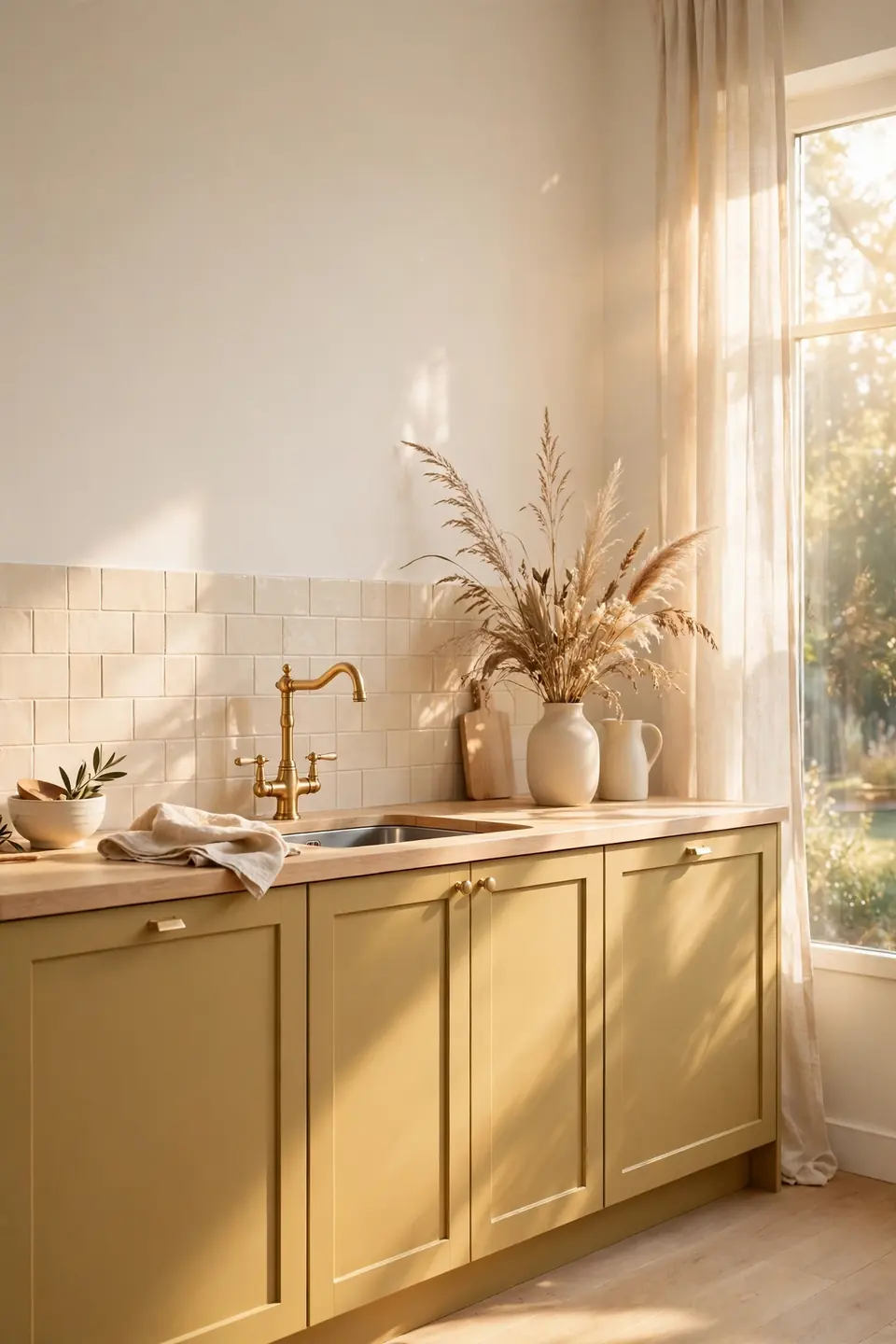
Muted mustard brings the warmth of late afternoon into kitchens that face away from the sun. Kept on the lower cabinets only, it glows under pale oak counters without turning the room yellow. Warm white walls hold the balance and keep mornings feeling fresh.
Brass taps deepen the mustard kindly, while a cream tile backsplash gives the color a calm neighbor. I’ve seen this work well in many cases where north facing rooms felt gray for half the year. Test the shade on a big board first; mustard shifts fast between daylight and evening bulbs, and the right one stays honeyed in both.
Walnut And White Pairing
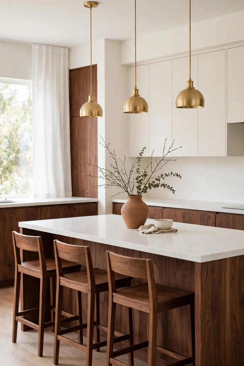
- Use walnut on the island and lower cabinets for depth
- Keep uppers and walls warm white to hold the light
- Choose a white stone counter with faint warm veining
- Repeat walnut in stools, boards, and one picture frame
- Add clay or stone accessories to soften the contrast
Walnut and white is the pairing readers save most when they study earthy modern kitchen color schemes in real homes. The dark wood gives modern lines their warmth, while white stops the room from closing in. Keep the walnut grain matte and the white slightly creamy, and the contrast reads rich instead of stark on long winter evenings.
Brick Red Range Moment
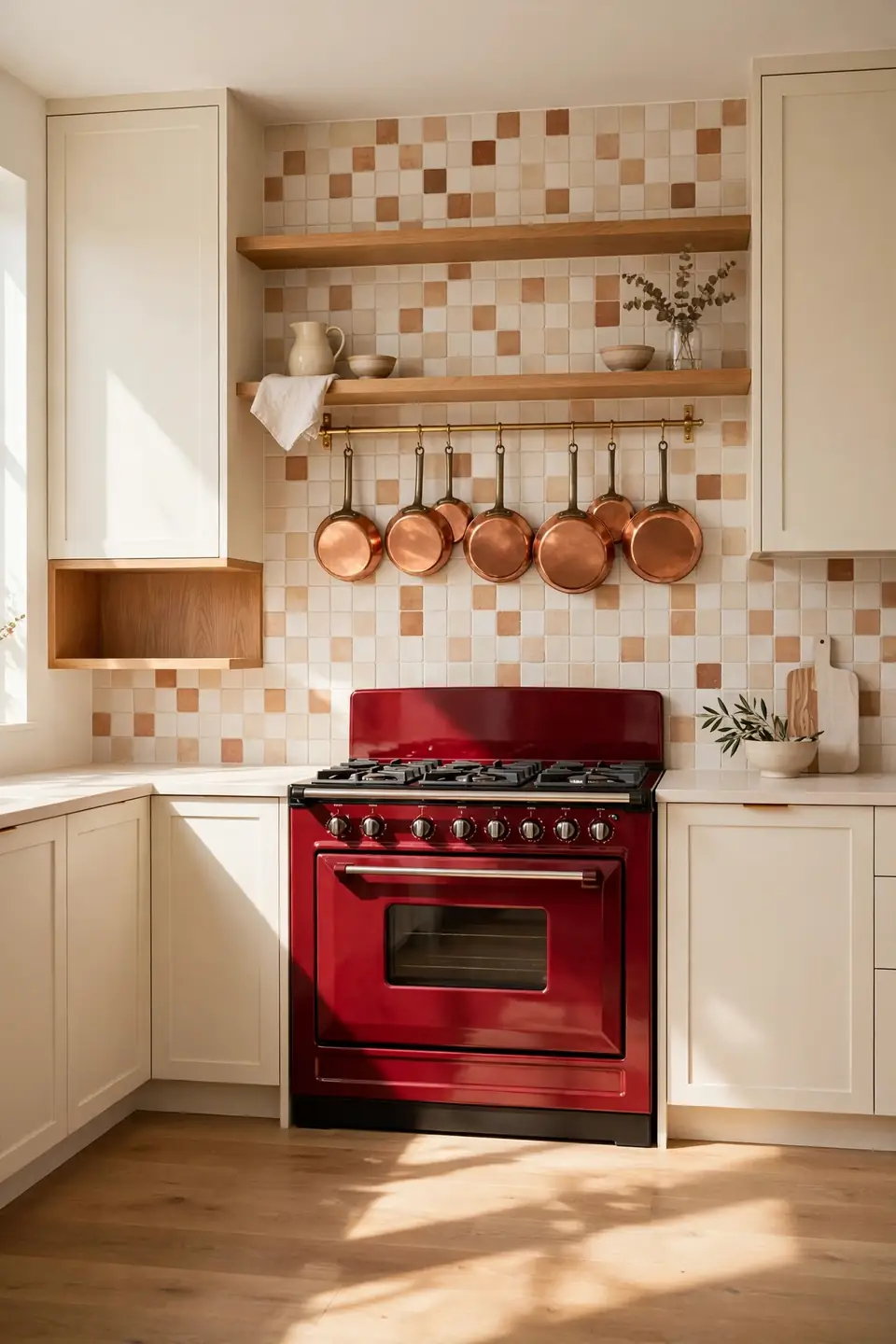
Quick Tip: Let one brick red appliance or painted range hood carry the bold color, then keep every cabinet around it cream. A single strong note reads deliberate and cheerful, while red on cabinets as well turns the whole wall loud and hard to live with daily.
Brick red earns its place in earthy kitchens because it comes straight from clay and kiln colors. Copper pans and brass rails echo its warmth in smaller doses around the room. The modern coastal dining room decor next door uses the same one strong note idea with coral, kept just as restrained in that bright room.
Taupe Greige Cabinet Blend
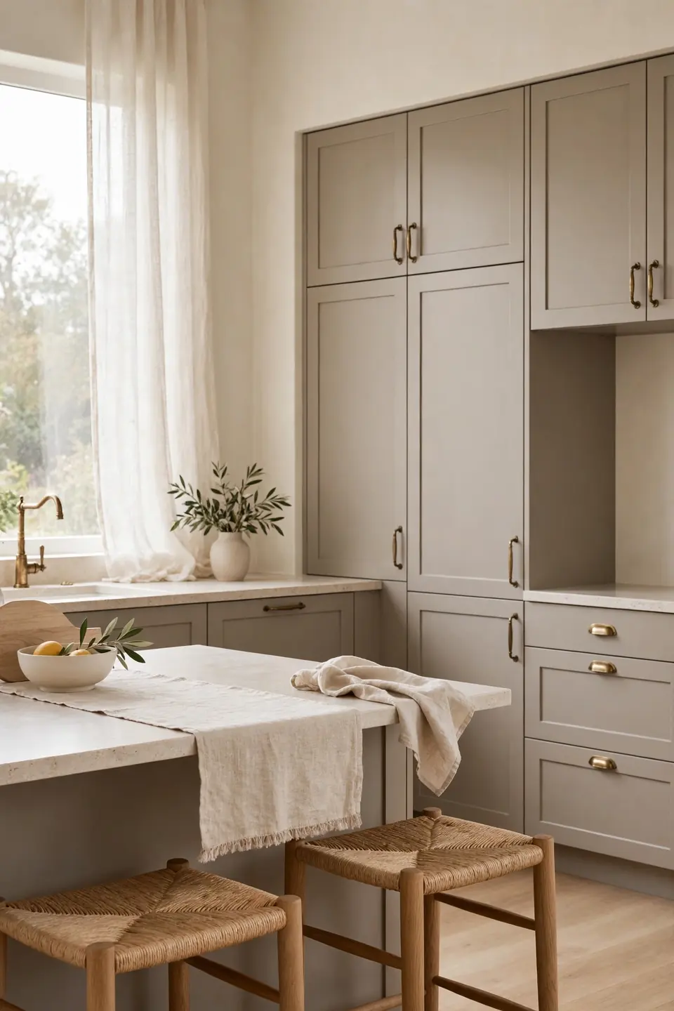
BEFORE: Cool gray cabinets made the kitchen feel like an office, and the white counters added glare. Oak stools looked orange against the gray, and no textile in the room could warm it up.
AFTER: A taupe greige repaint shifted the cabinets toward warm stone, and suddenly the oak read golden instead of orange. Cream walls, brass handles, and a linen runner finished the change, and the kitchen feels calm at every hour now.
Greige succeeds where pure gray fails because its beige base shakes hands with wood, stone, and brass at once. Buy sample pots from two brands, since greige shifts greener or pinker between makers. Paint one door, live with it through a full day of light, and only then commit the whole run.
Forest Green Pantry Door
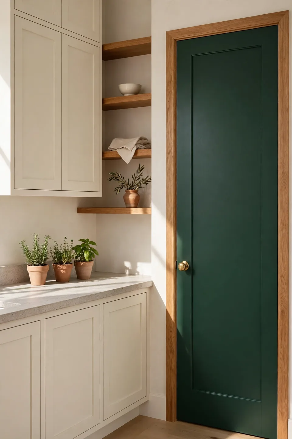
- Choose one door only, the pantry or larder, for the deep color
- Fill and sand old marks so the dark paint lies smooth
- Paint the frame the same forest green for a built in look
- Fit a brass knob and hinges that glow against the green
- Hang a small wreath or hook rail to finish the moment
A single forest green door gives a cream kitchen its focal point for the price of one paint pot. The depth makes nearby oak look richer and turns a plain larder into furniture. In my experience, doors take bold color bravely because they are easy to repaint when tastes change next year.
Limestone And Linen Layers
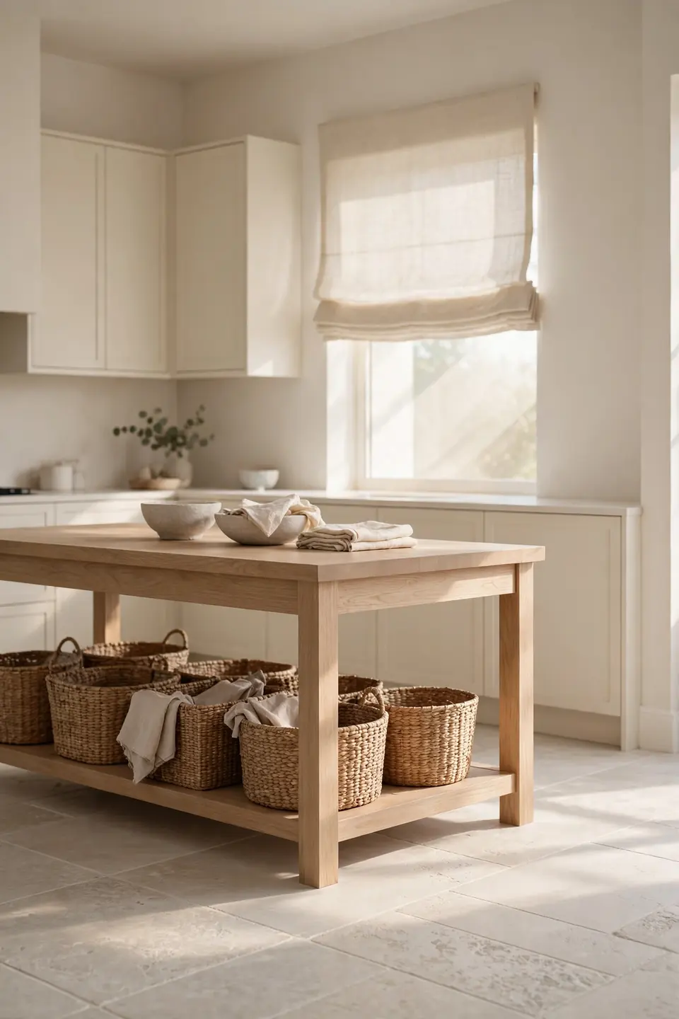
| Limestone Floor With Linen Shade | Gloss Tile Floor With Roller Blind |
|---|---|
| Matte stone keeps the palette grounded | Gloss reflects light and feels colder |
| Natural shade softens hard window light | Roller blind leaves glass bare and stark |
| Both age gently and hide daily dust | Shiny floors show every crumb and streak |
| Suits oak, cream, and clay tones well | Pairs best with chrome and pure white |
Floors and window cloth decide how earthy a kitchen feels underfoot and at eye level. Limestone brings quiet pattern in sand tones, while linen filters light into a soft wash over cream cabinets. Together they calm even a busy family kitchen, and both hide the dust that glossy finishes announce daily.
Bronze Hardware Warm Metal
Do:
- Pick oil rubbed bronze for handles, knobs, and taps
- Repeat the bronze in pendant frames or stool feet
- Let bronze warm sage, cream, and clay cabinets
- Wipe handles weekly so the finish keeps its depth
Don’t:
- Mix bronze with shiny chrome on the same run
- Choose black hardware where bronze warmth is needed
- Add bronze rails and hooks until walls feel busy
- Use harsh cleaners that strip the soft patina
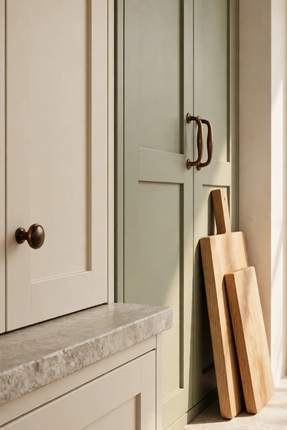
Hardware is the smallest color decision in the kitchen and the one your hands meet fifty times a day. Bronze brings the warmth of old farmhouse metal into modern lines, glowing softly against cream or sage paint. Keep every visible metal in the same family, and the scheme reads settled from the doorway.
Pale Clay Tile Flooring
Cost: Moderate, with porcelain clay look tiles costing less than real terracotta
Time: Two to three days for laying, grouting, and sealing a mid sized floor
Skill Level: Intermediate, though patient beginners manage simple square layouts well
Best For: Busy family kitchens that need warmth without pale floor upkeep
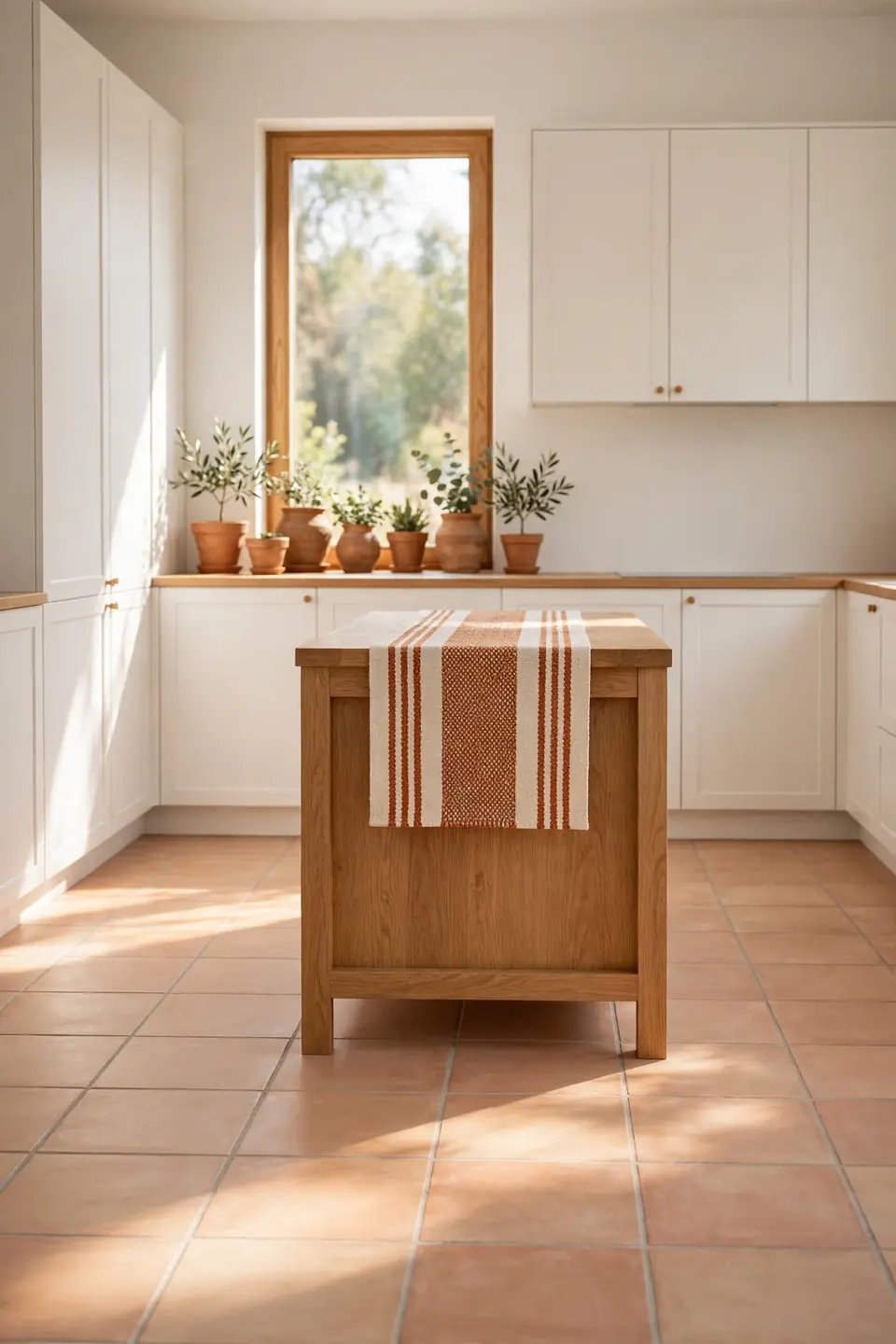
A pale clay floor warms white cabinets from below and hides the crumbs pale tiles confess. Large squares keep grout lines few and the pattern calm under an oak island. Porcelain versions shrug off spills and need no sealing, which suits homes where cooking, baking, and preserving happen three times a day.
Two Tone Earthy Cabinets
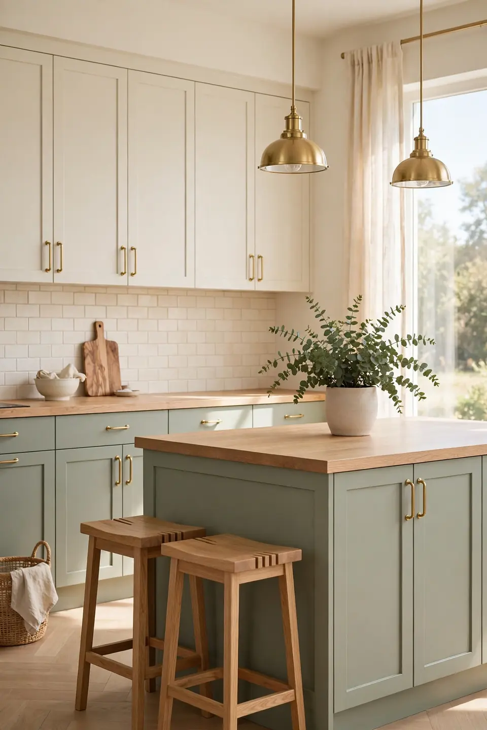
Two tone cabinets let one earthy color lead while cream keeps the room light. Sage below and cream above is the pairing that rarely dates, since the green grounds the working zone and the pale uppers lift the eye. Oak counters stitch the two halves together.
Repeat the lower color in small ways only: a plant pot, a folded towel, the stools’ cushions. I’ve noticed two tone schemes fall apart when a third strong color joins, so keep counters and tile quiet. Brass handles on both colors give the split one shared detail, and the whole run reads as one calm design.
Natural Stone Counter Focus
- Choose one stone slab with warm sand and clay veining
- Keep cabinets plain cream so the pattern leads
- Run the same stone up as a low splashback ledge
- Style the surface with one clay jug and nothing more
- Seal the stone yearly to guard against oil marks
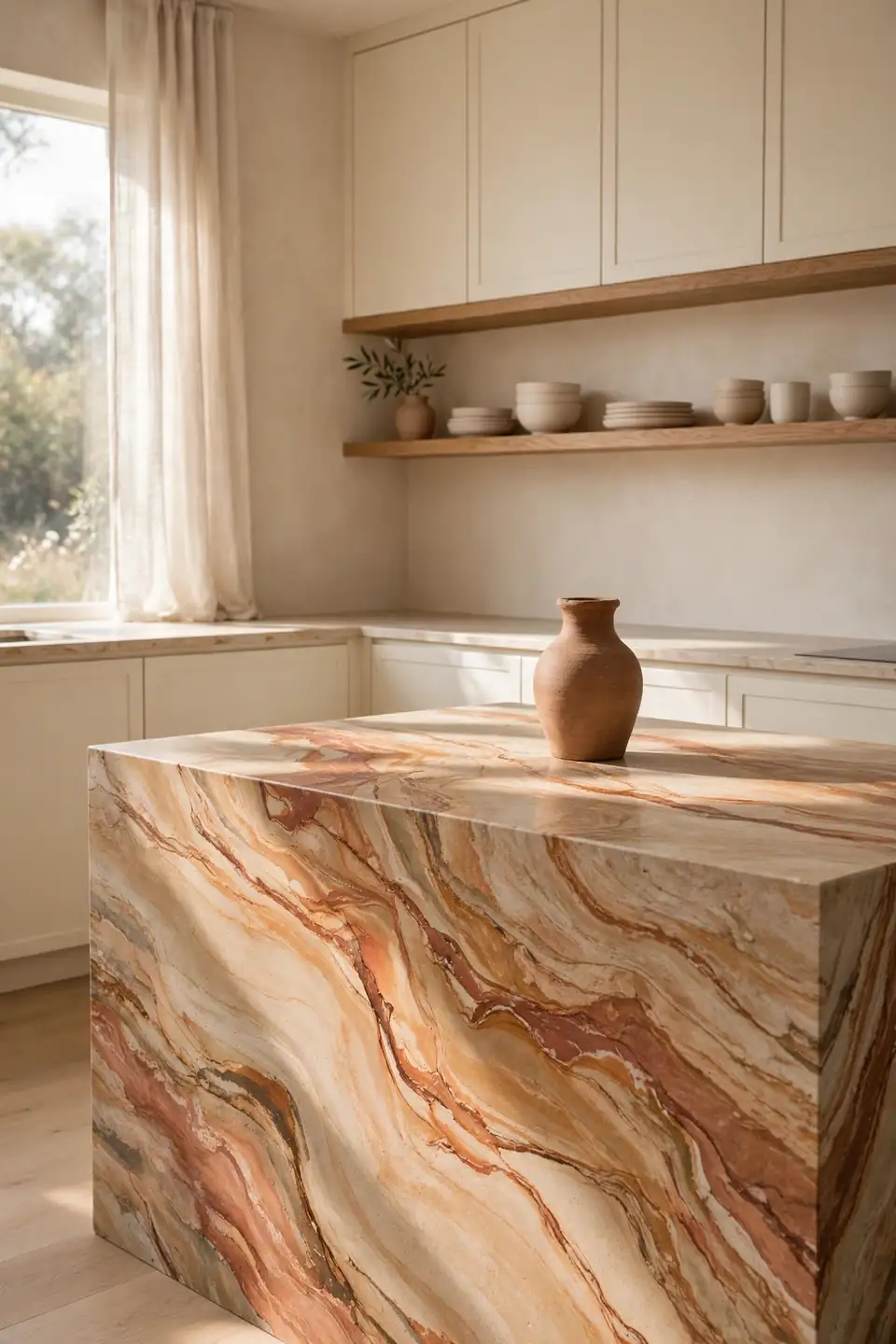
Stone with real movement gives an earthy kitchen its artwork, quarried rather than printed. Cream cabinets step back and let the veining wander, while oak shelves keep the mood warm at the edges. View slabs in daylight before choosing, since stone shifts from gray to warm honey between the yard and your finished counters.
Warm White Wall Base
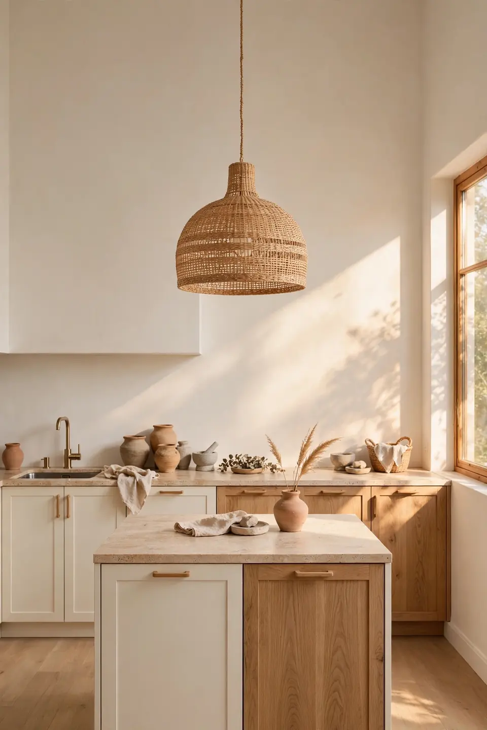
Quick Tip: Test warm white paints as large swatches beside your cabinet color, not alone on a card. Whites with a drop of yellow or clay in the base flatter earthy woods and greens, while blue based whites fight them and turn the whole room quietly cold.
Warm white is the base that lets every earthy tone in this list behave. It keeps small kitchens bright without the glare of pure white, and it forgives mixed woods that cooler whites expose. Paint the ceiling the same warm white, and low rooms feel taller while the cabinet colors stay the focus.
Slate Blue Earthy Contrast
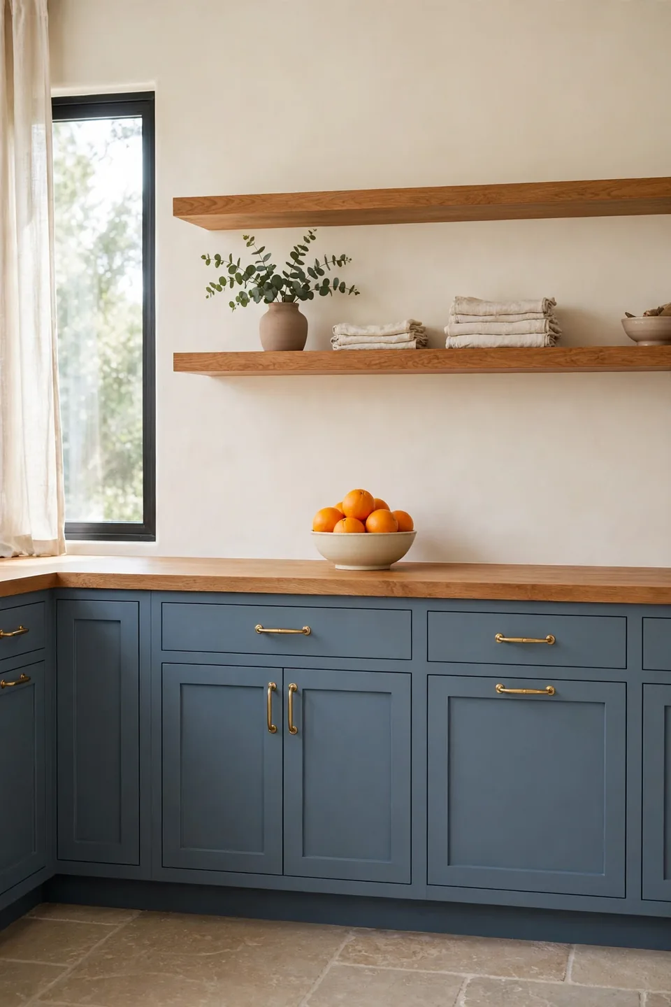
BEFORE: The all cream kitchen felt pleasant but forgettable, with nothing for the eye to land on. Oak counters blended into cream cabinets, and guests remembered the garden view, never the room itself.
AFTER: Slate blue on the cabinets gave the room its calm anchor, and the oak suddenly read warm against the cool depth. Brass handles glowed, cream walls kept the light, and the kitchen now holds its own beside the view.
Slate blue counts as earthy when warm wood and stone share the room, because those tones pull it toward river rock instead of navy paint. Keep the blue gray based and matte. In my experience, one bowl of oranges on the counter proves the pairing daily, since orange and slate sharpen each other kindly.
Conclusion
Warmth in a kitchen rarely comes from one dramatic color; it builds from calm layers chosen in the right order. Pick one lead tone, repeat it three times, and your own earthy modern kitchen color schemes will feel settled rather than staged. Save the palettes you love on Pinterest, test the boldest one on a single door or wall, and live with the light for a week before going further. I’ve seen how one sage cabinet run or a clay toned backsplash can change the whole mood of a cooking space, and that slow, grounded shift is worth enjoying.