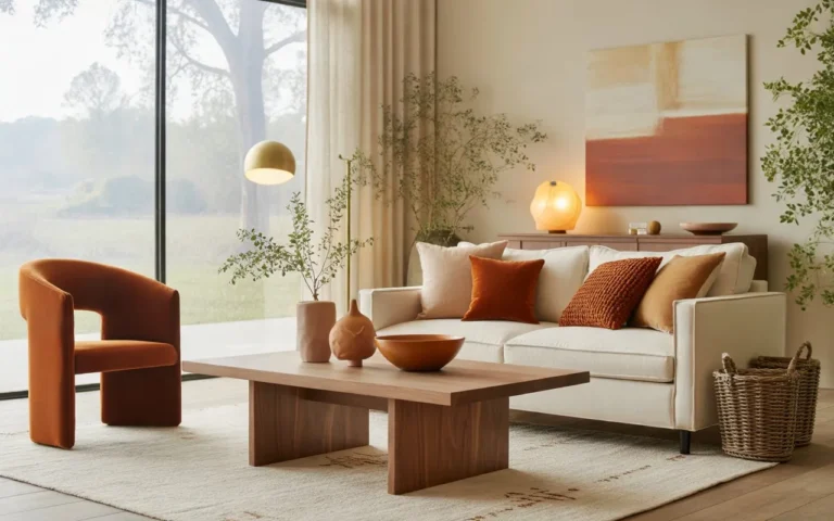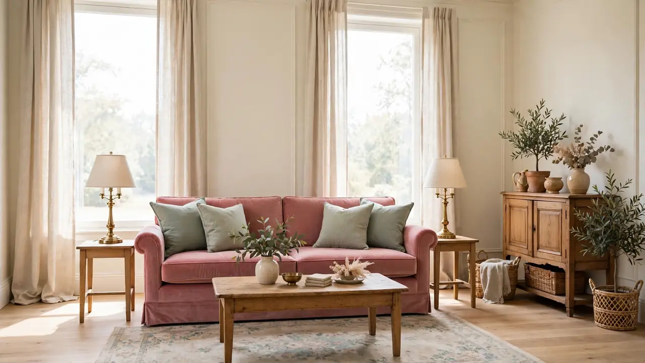
25 Vintage Inspired Living Room Color Palettes for Timeless Appeal
Vintage color has a way of making a living room feel collected rather than decorated in a single weekend. The strongest vintage inspired living room color palettes start with a soft, aged base, usually cream, warm white, or pale stone, then layer two or three muted tones through the sofa, rug, and curtains. Nothing has to match perfectly; gentle fading is exactly what makes the scheme feel lived in.
That same layering works across the hall, where the earthy modern kitchen color schemes pair clay and sage in the same quiet order. In my experience, vintage palettes disappoint when every shade shouts at once, and they shine when one color leads while the rest support in smaller doses. The twenty five palettes below match each lead tone with the woods, fabrics, and metals that flatter it most.
Dusty Rose Velvet Calm
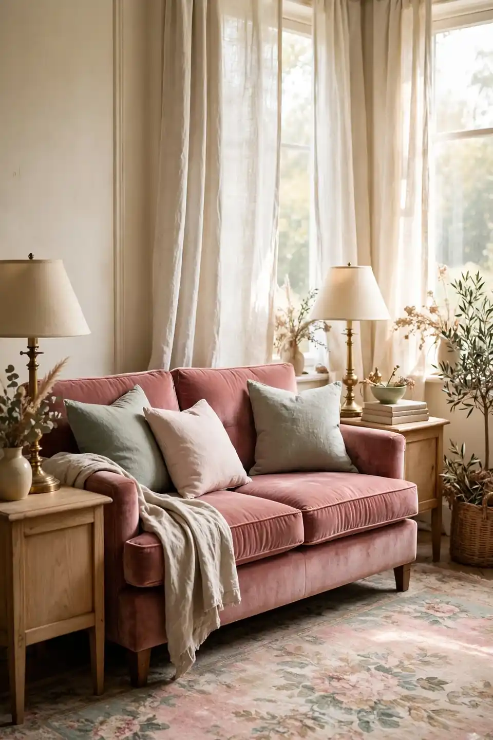
Dusty rose on a velvet sofa gives a vintage room its gentle heartbeat. The pink stays grown up against cream walls because the pile catches light unevenly, deeper in the folds and pale on the arms. A faded floral rug repeats the rose at half strength underfoot.
Brass lamps warm the pink without turning it sweet, and light oak keeps the pairing from drifting too formal. I’ve noticed dusty rose hides the soft wear of daily life better than pale gray ever does. Keep the remaining textiles cream and linen so the sofa stays the one romantic note. A cream cushion or two keeps it from feeling dressed up.
Sage And Cream Serenity
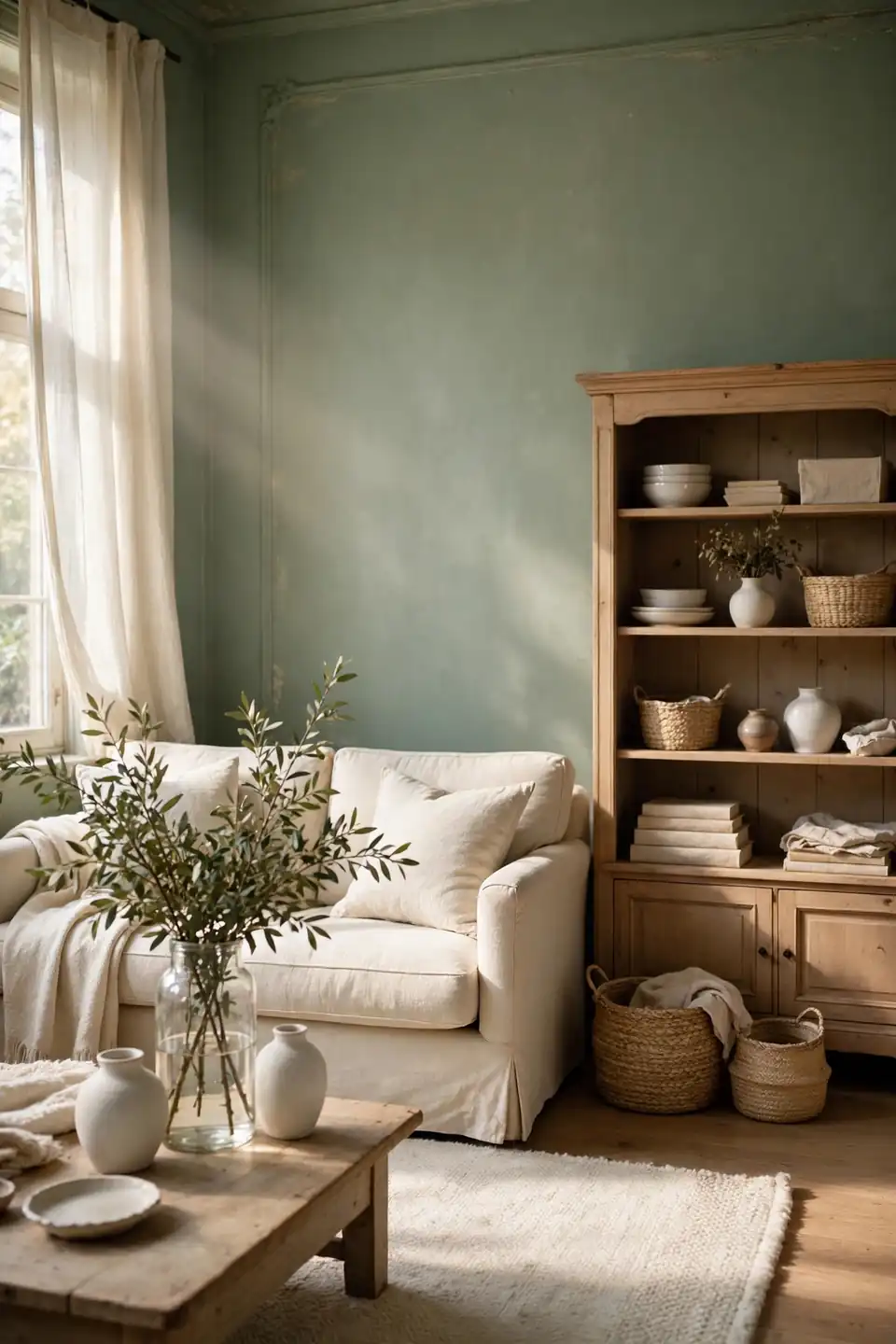
- Paint the walls a gray leaning sage that softens in evening light
- Choose a cream linen sofa as the pale anchor of the room
- Add light wood in the bookcase, stools, and picture frames
- Repeat the sage in two cushions and one woven throw
- Finish with white ceramics and fresh green branches
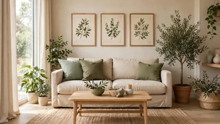
Sage and cream is the quietest vintage pairing because both tones sit close to nature and neither one shouts. The green cools a sunny room while the cream keeps it kind in winter. In my experience, this scheme suits slow rooms best, the kind made for reading, tea, and long talks.
Faded Gold Accent Glow
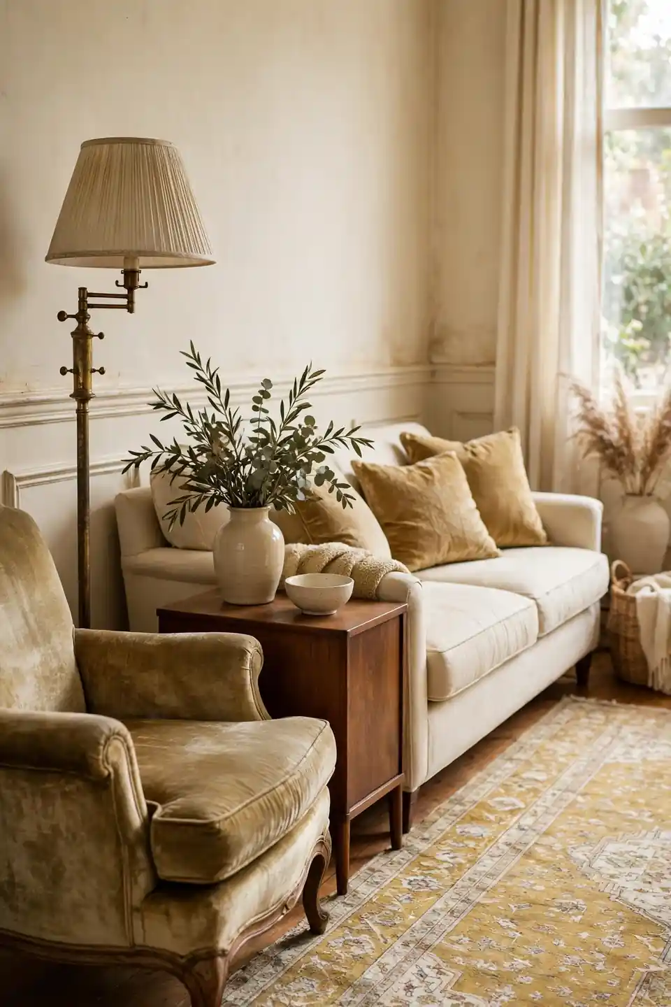
Quick Tip: Keep faded gold in the accent seats and metals only, never on all four walls. One velvet chair, a brass lamp, and two cushions warm a cream room completely, while gold paint everywhere can turn brassy under evening bulbs and cheapen the vintage mood.
Gold reads vintage when it looks slightly worn, so choose aged brass and matte velvet over shiny finishes. A muted Persian style rug ties the metal tones to the floor, and walnut furniture deepens the glow. Small doses also let you shift the mood with the seasons, adding cream linen in summer. The whole mix flatters candlelight on winter evenings too.
Powder Blue Parlour Refresh
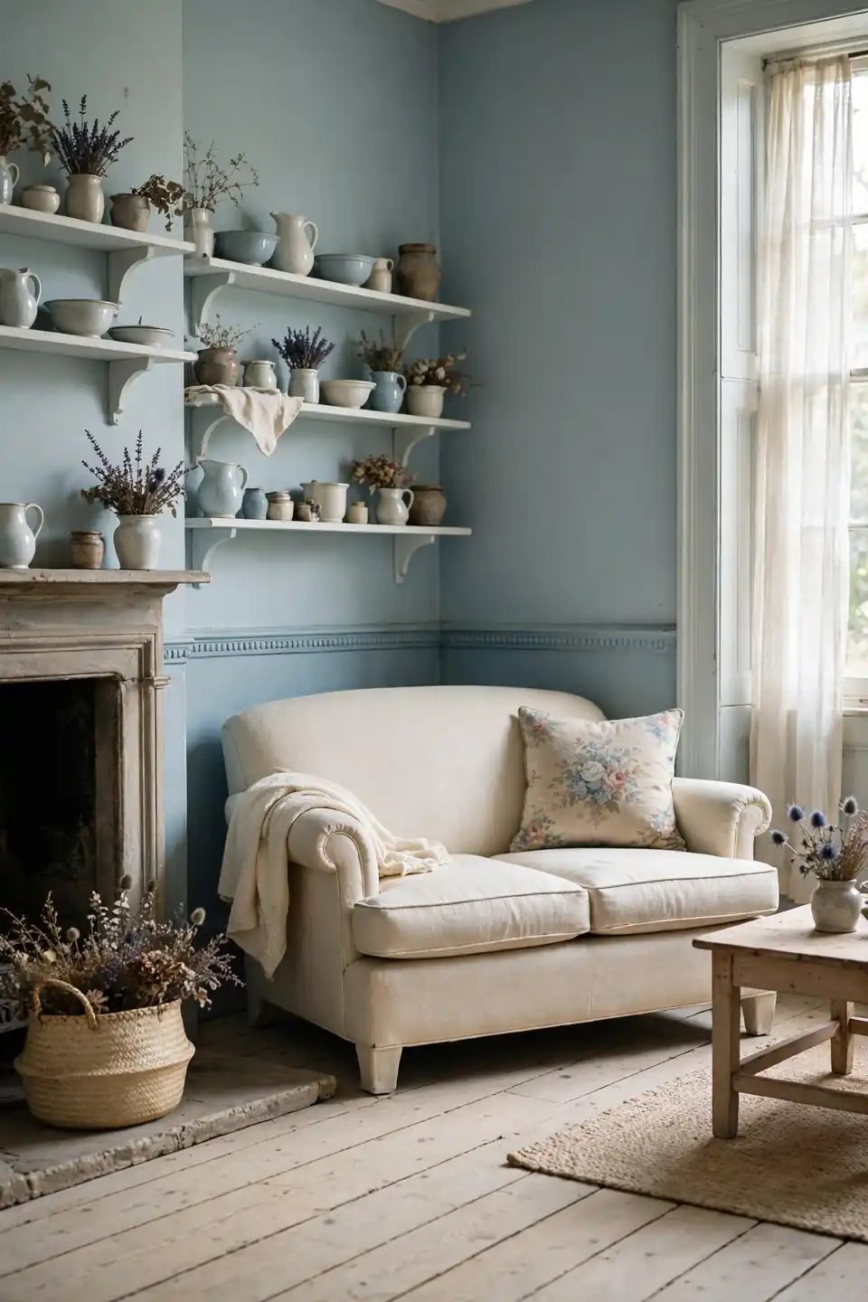
BEFORE: The parlour wore cold gray paint and a navy sofa that swallowed the light. Chrome legs and a black rug pulled the room toward an office feel, and guests perched on the edges instead of settling in.
AFTER: Powder blue walls softened the whole room in a single weekend. The navy sofa went to the den, replaced by a cream loveseat, and pale oak floors now carry the blue down in a washed, friendly way.
Powder blue works as a vintage neutral when it leans gray rather than baby bright. Pair it with cream upholstery, straw baskets, and one piece of dark wood for grounding. In north facing rooms, warm white bulbs stop the blue from turning icy after dark.
Ivory And Walnut Warmth
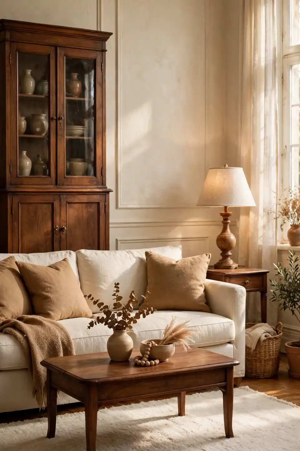
- Start with ivory walls and the palest warm white on the ceiling
- Bring in walnut through the coffee table and one tall cabinet
- Lay a cream wool rug to soften the dark wood contrast
- Add tan leather or camel cushions as the bridging tone
- Repeat walnut in two frames and a turned wood lamp base
Ivory and walnut is the backbone of countless vintage rooms because the contrast feels honest rather than styled. The dark wood reads like furniture that has been in the family for decades. Keep textiles pale and textured, and the scheme stays calm even in a small room.
Muted Teal Heritage Pairing
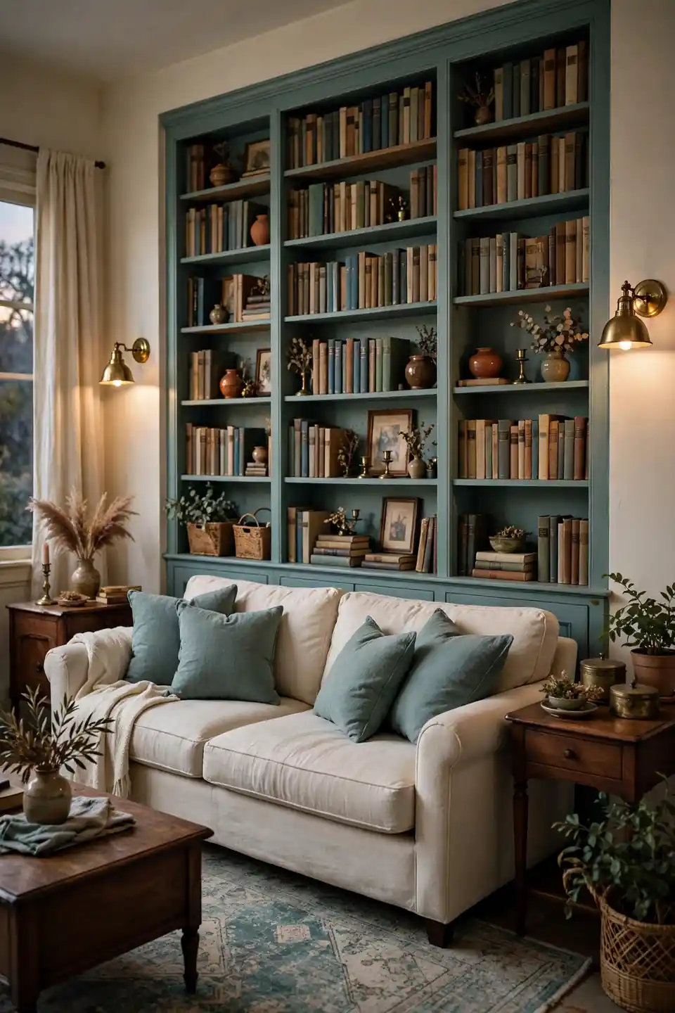
| Muted Teal With Cream | Bright Teal With White |
|---|---|
| Aged teal feels calm and bookish | Bright teal energizes and can feel modern |
| Cream softens teal into a heritage mood | Stark white sharpens teal toward coastal |
| Brass and walnut deepen the pairing | Chrome and glass lighten it |
| Suits libraries, dens, and evening rooms | Suits sunrooms and playful family spaces |
Muted teal earns its vintage feel from the gray hiding inside it. Paint one bookcase wall, keep the rest cream, and let brass sconces warm the depth. That’s why many experts recommend testing teal at dusk, when its true softness shows. One shelf of cream ceramics rests the eye between the books.
Blush And Brass Harmony
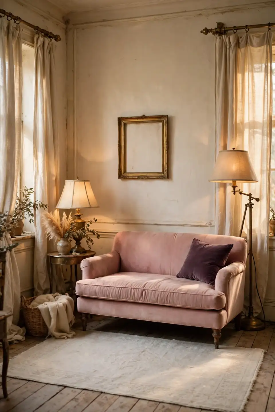
Do:
- Let blush lead on the sofa or two generous armchairs
- Use aged brass for lamps, frames, and curtain rods
- Ground the pink with cream walls and a pale rug
- Add one deep note, plum or walnut, for contrast
Don’t:
- Mix blush with bubblegum pink accessories
- Choose shiny gold metals that fight the softness
- Paint every wall pink in a bright south facing room
- Skip texture, or the scheme turns flat and sugary
Blush and brass is the romantic core of many vintage rooms, warm without weight. The metal keeps the pink tailored, while linen and wool keep it touchable. I’ve seen this work well in many cases where a room needs softness but not sweetness.
Antique White Layered Neutrals
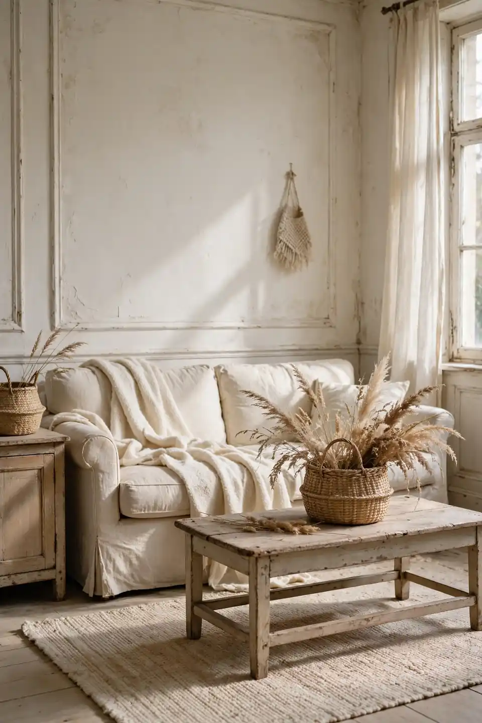
Cost: Low, since warm white paint and secondhand linen cost far less than replacing furniture
Time: One full weekend to paint walls, wash curtains, and restyle every textile
Skill Level: Beginner with a roller, a ladder, and one free afternoon
Best For: Small or shaded rooms where strong color would crowd the walls and steal light
Layered antique whites prove a vintage palette needs no bright color at all. The interest comes from texture, linen against wool, matte paint against worn wood. Keep every white warm rather than blue, and the room glows instead of glaring at noon. A single basket of dried grasses adds the one earthy note.
Olive Green Reading Corner
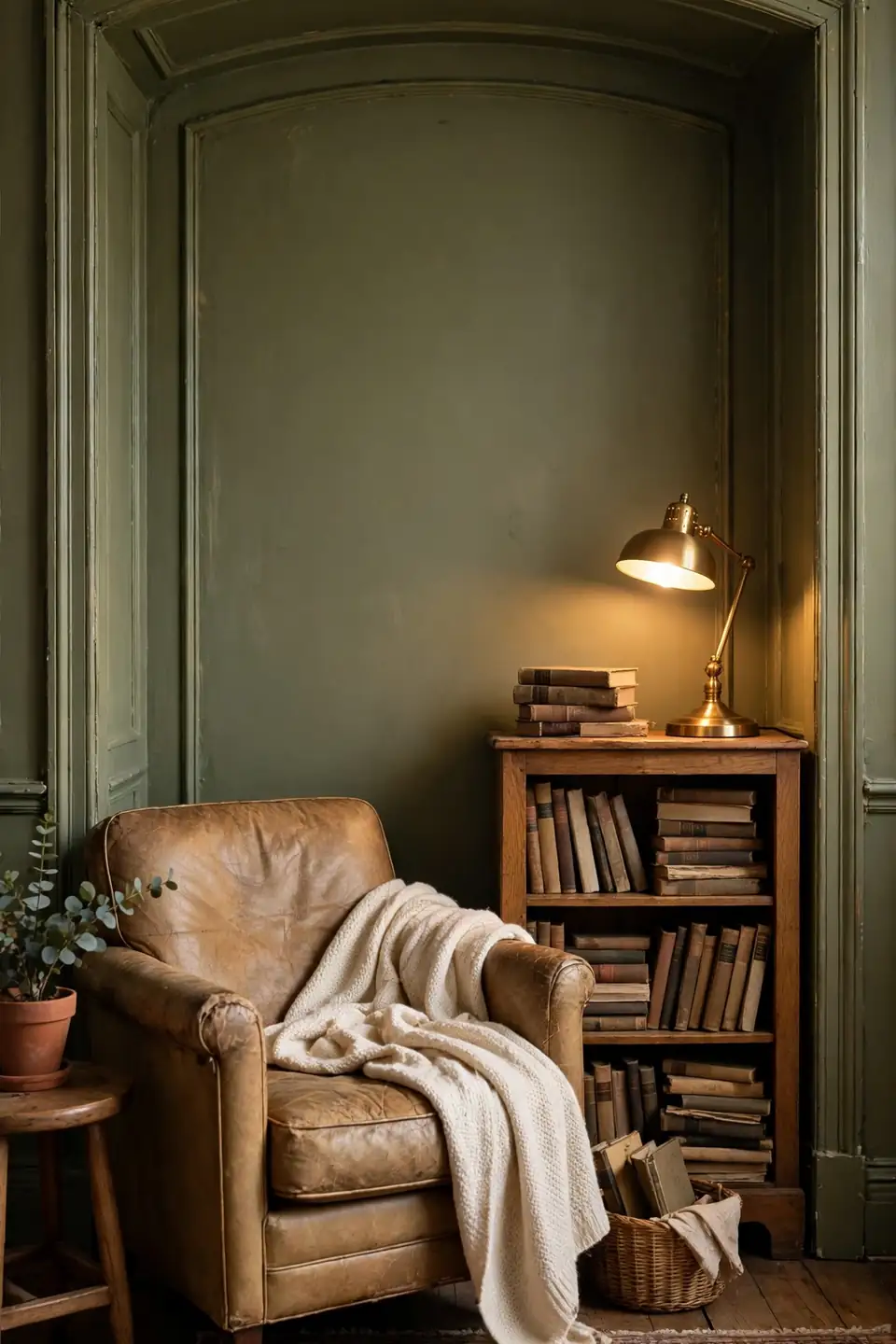
Olive green turns a spare corner into the seat everyone quietly claims. Paint the alcove or one short wall olive, then pull a worn leather chair in front of it with a cream throw over the arm. A small oak bookcase completes the snug, bookish mood.
Olive flatters warm light, so place a brass reading lamp where its glow can pool on the pages. I’ve noticed this corner works best with one deep cushion in rust or mustard for company. Keep the rest of the room cream, and the corner reads like a room within the room. A small side table for tea finishes the scene.
Peach Sorbet Soft Glow
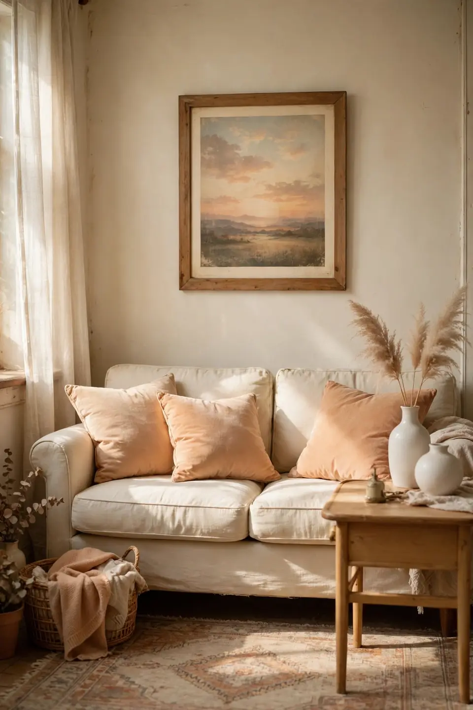
- Choose a peach that leans apricot, never neon or candy bright
- Spread it on cushions and one soft throw before painting anything
- Pair peach with cream upholstery and light beech or oak wood
- Add white ceramics and clear glass to keep the glow airy
- Echo the tone once in artwork with a faded sunset print
Peach sorbet gives a vintage room its morning light feeling, warm and faintly nostalgic. The shade flatters skin tones, which is why guests relax in it without knowing why. In my experience, peach succeeds in small doses repeated calmly, three or four times across the room.
Lavender Mist Quiet Corner
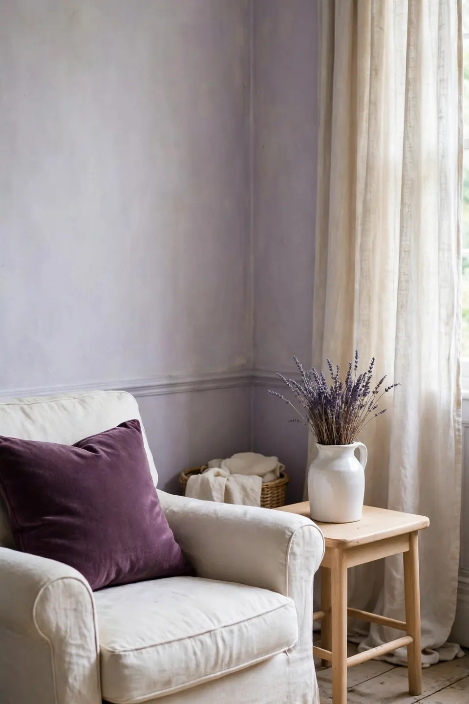
Quick Tip: Test lavender on the wall behind the sofa first, because this shade shifts more than any other vintage tone. Gray leaning lavender stays serene, while blue leaning versions can feel chilly beside cream furniture on cloudy days. Paint a large board and move it around the room for two days before deciding.
Lavender mist suits rooms made for rest, reading, and slow mornings. Pair it with cream linen, pale oak, and one deeper plum cushion to anchor the float. Dried lavender in a white jug on the side table echoes the wall without another drop of paint. A woven basket of folded blankets adds the needed texture.
Terracotta And Linen Blend
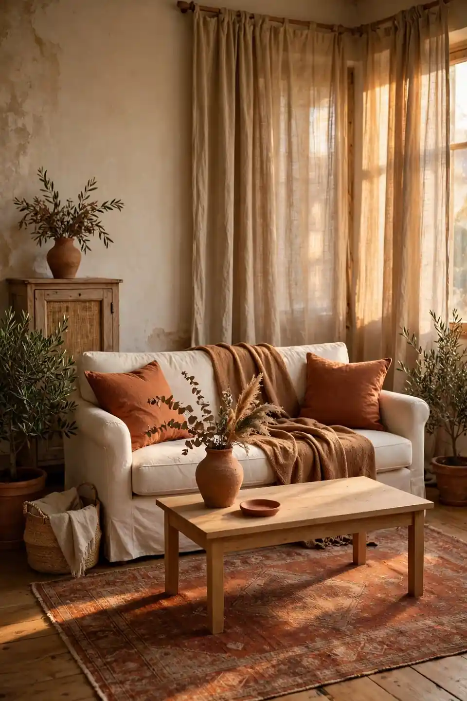
BEFORE: The sitting room felt washed out, with white walls, a white sofa, and pale floors that blurred into one another. Afternoon sun bleached what little color the cushions offered, and the room had no season at all.
AFTER: Terracotta cushions, a clay toned throw, and one rust washed rug grounded the pale shell. Natural linen curtains kept the warmth breathable, and the room finally held the late light instead of reflecting it away.
The plum and cream bedroom decorating ideas use the same trick in a deeper register, proving warm accents rescue pale rooms in any palette. Keep terracotta in textiles first; paint can follow once the tone feels like home.
Celadon Green Classic Calm
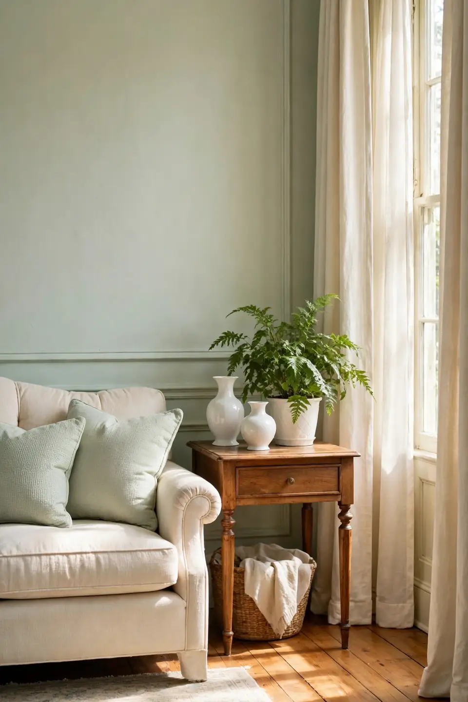
- Paint walls or a bookcase in pale celadon, the gray green of old porcelain
- Anchor the room with a cream sofa and ivory curtains
- Add celadon cushions in a slightly deeper shade than the walls
- Introduce warm wood through a side table and floor lamp stem
- Finish with white porcelain vases and one leafy green plant
Celadon is the green hiding inside most vintage inspired living room color palettes that age gracefully. It never dates because it never shouts. In my experience, celadon pairs best with warm whites and natural fibers, where its cool calm reads as restful rather than cold.
Burgundy And Cream Drama
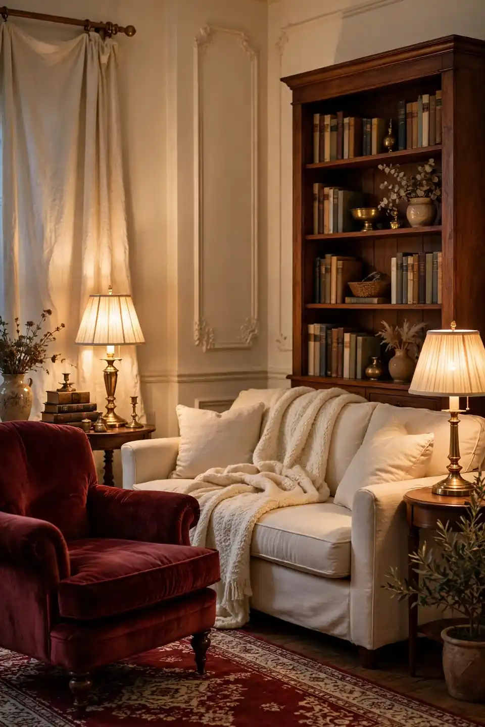
| Burgundy Accents On Cream | Burgundy On Every Wall |
|---|---|
| Rich notes stay jewel like and lively | Full walls can feel heavy by day |
| Cream keeps the room bright for reading | Dark rooms need stronger lighting |
| One chair and cushions carry the drama | Paint commits the whole room at once |
| Easy to soften for spring with linen | Harder to lighten without repainting |
Burgundy brings the drama of old libraries without their gloom when cream carries most of the room. One velvet chair, a bordered rug, and cushions in the same deep red repeat the note three times. Brass lamps warm the red after dark and keep it glowing.
Butter Yellow Sunlit Scheme
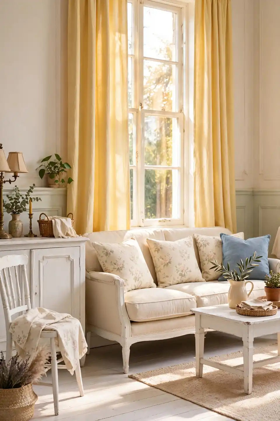
Do:
- Pick a butter yellow softened with cream, never lemon bright
- Use it on one wall, the curtains, or a painted bookcase
- Pair it with white painted wood and pale floral cushions
- Let natural light do half the work in south facing rooms
Don’t:
- Combine butter yellow with orange toned wood everywhere
- Add primary red accents that turn the scheme playful
- Paint the ceiling yellow in a low room
- Forget a cool note; one blue cushion restores balance
Butter yellow is the happiest vintage tone because it mimics sunlight on plaster. It suits rooms that face north and never quite warm up on their own. Keep floors pale and furniture simple, and the yellow feels like a permanent golden hour.
Stone Gray Vintage Balance
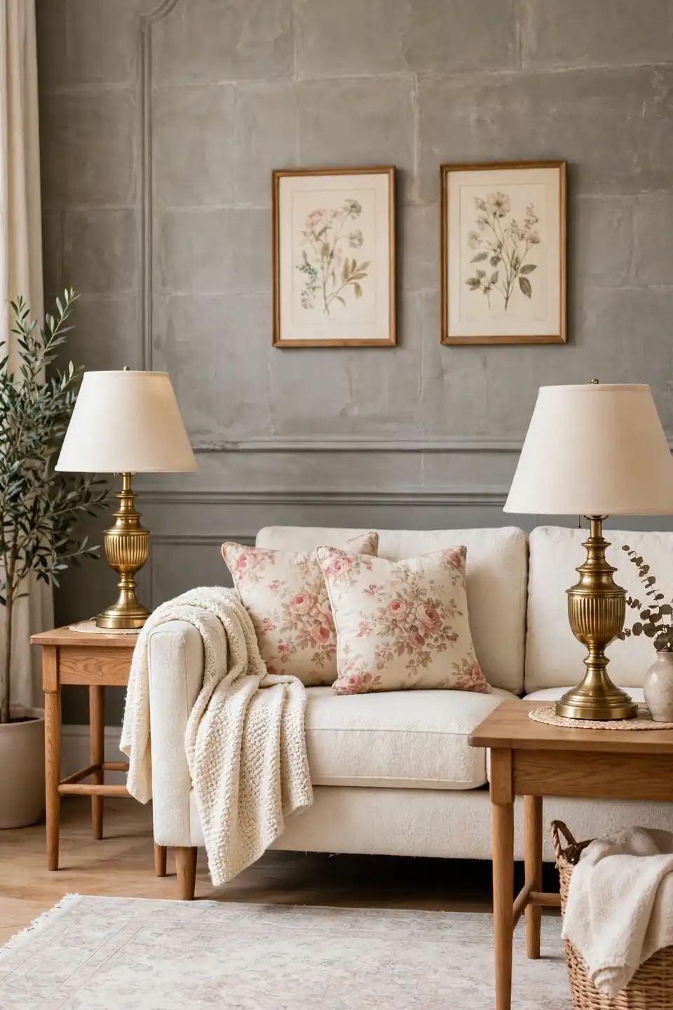
Cost: Low to medium, since gray paint is cheap but good wool and linen cost more
Time: Two full days to paint the walls and swap every textile over
Skill Level: Beginner, as warm gray forgives uneven brushwork far better than white
Best For: Bright rooms where warmer colors would feel too sweet by midday
Stone gray steadies a vintage room full of pattern and keeps florals from turning frilly. Choose a gray with a brown base, often called greige, so it sits kindly beside oak and brass. I’ve noticed gray rooms live or die by their textiles, so spend on wool and linen before anything else.
Rosewood And Pearl Tones
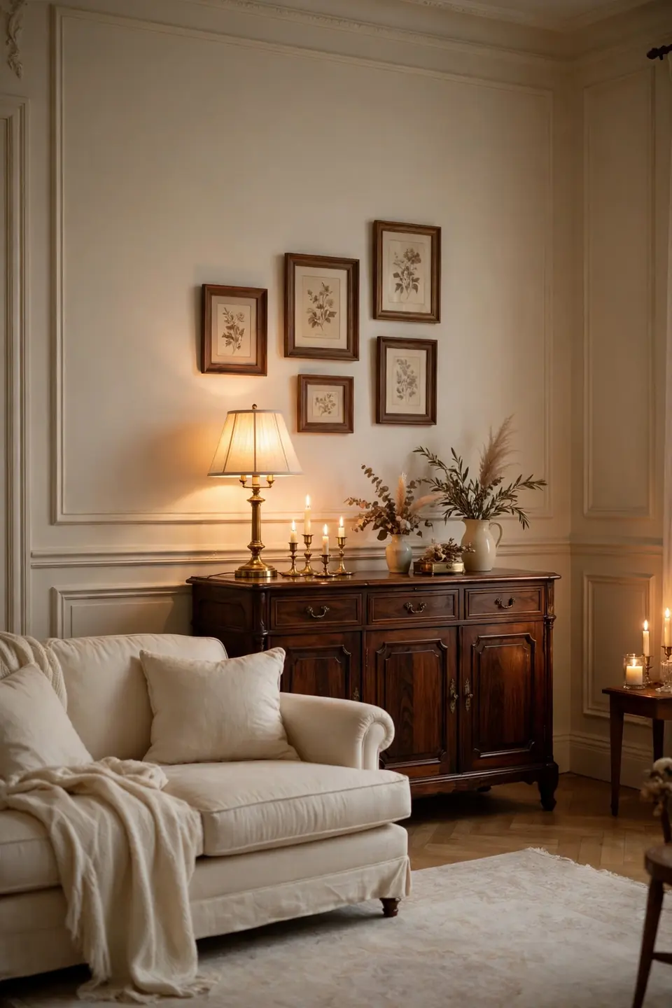
Rosewood furniture brings a deep, reddish brown that modern woods rarely match. Against pearl toned walls, a rosewood sideboard or bookcase reads like an heirloom, rich but never heavy, because the pale ground gives it air. Old pieces often surface at estate sales for less than new flat pack furniture of the same size.
Pearl works because it is white with warmth and a hint of sheen, flattering dark wood the way candlelight does. Add cream cushions, a pale rug, and one brass lamp, and the room feels quietly formal. Keep patterns minimal so the grain stays the decoration. One green plant softens the formality without stealing focus.
Sky Blue Cottage Ease
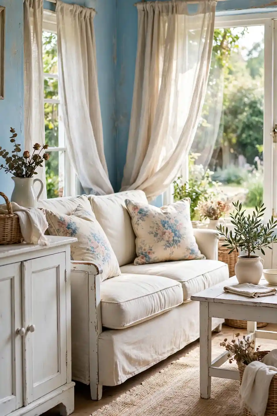
- Wash the walls in a sky blue softened with gray
- Choose white painted furniture for the cottage contrast
- Layer faded floral cushions in blue, rose, and sage
- Use natural jute or pale wool underfoot for warmth
- Hang simple linen curtains that move with the breeze
Sky blue and white is the cottage pairing that never leaves the vintage lists, fresh as painted shutters on an old house. The blue stays gentle when the furniture is white and the floors are pale. One basket of dried flowers adds the earthy note that keeps it grounded. It is the easiest scheme here to refresh each spring.
Apricot And Sage Pairing
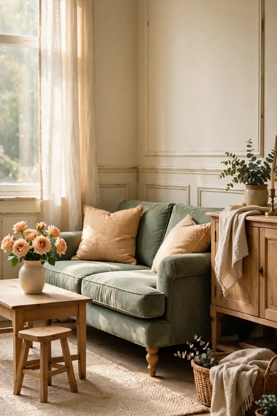
Quick Tip: Let apricot appear in odd numbers, three cushions or one chair plus two vases, while sage holds the larger surfaces. The eye reads repeated small warmth over calm green as deliberate, and the pairing never turns sugary or themed.
Apricot and sage borrow their harmony from the orchard, fruit against leaf. Sage walls or a sage sofa keep the room restful, while apricot wakes it gently at cushion scale. Light oak and cream bridge the two, and the scheme suits rooms that get kind morning light. In my experience, this pairing flatters both old wood floors and pale painted ones.
Mauve And Oak Softness
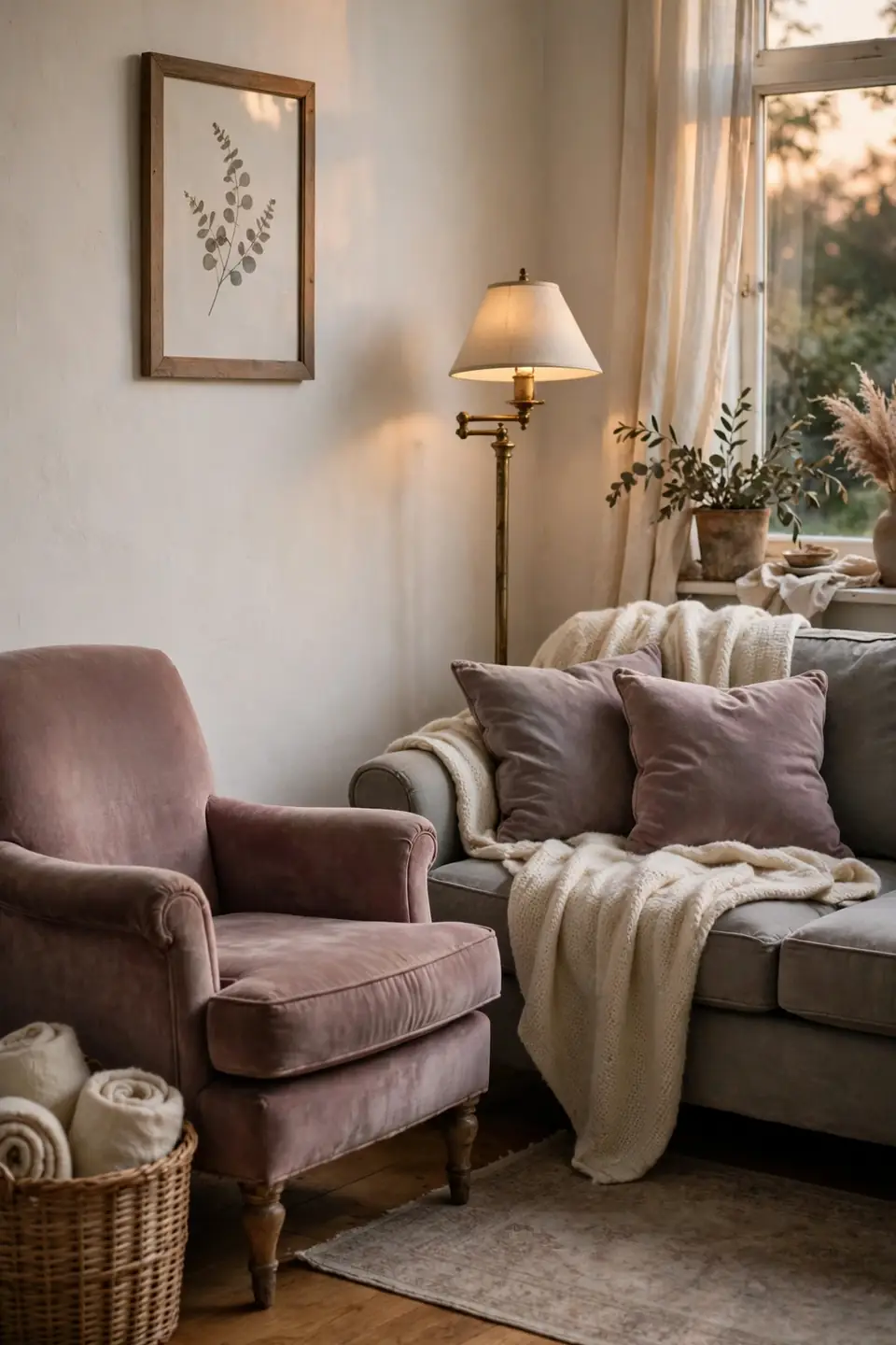
BEFORE: The room paired a gray sofa with gray walls and chrome, and every surface felt cool to the touch. Even the oak floor looked ashen, and the space read modern in a way the owners never wanted.
AFTER: Mauve cushions, a mauve washed throw, and one dusky mauve armchair warmed the gray shell without repainting. Oak regained its honey tone beside the pink purple shade, and brass replaced the chrome in an afternoon.
Mauve is the bridge tone between gray and the warmer vintage shades, which makes it the easiest first step away from a cold scheme. Keep it dusty rather than bright, and support it with oak, brass, and plenty of cream wool.
Cream And Caramel Comfort
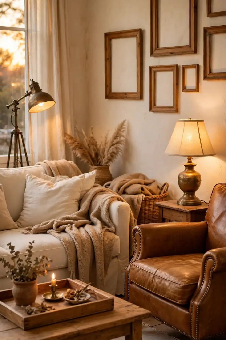
- Base the room in cream walls, cream sofa, and a pale rug
- Add caramel through a leather chair or a tan wool throw
- Deepen one corner with a caramel toned cushion pair
- Warm the metals toward aged brass and antique gold
- Finish with honey toned wood in trays, frames, and bowls
Cream and caramel is the palette of old hotels and railway carriages, all warmth and no sharp edges. The tones sit close together, so texture does the separating, smooth leather against nubby wool. That’s why many experts recommend it for rooms where people gather after dark. Low light from table lamps makes the tones melt together.
Dusty Blue Velvet Depth
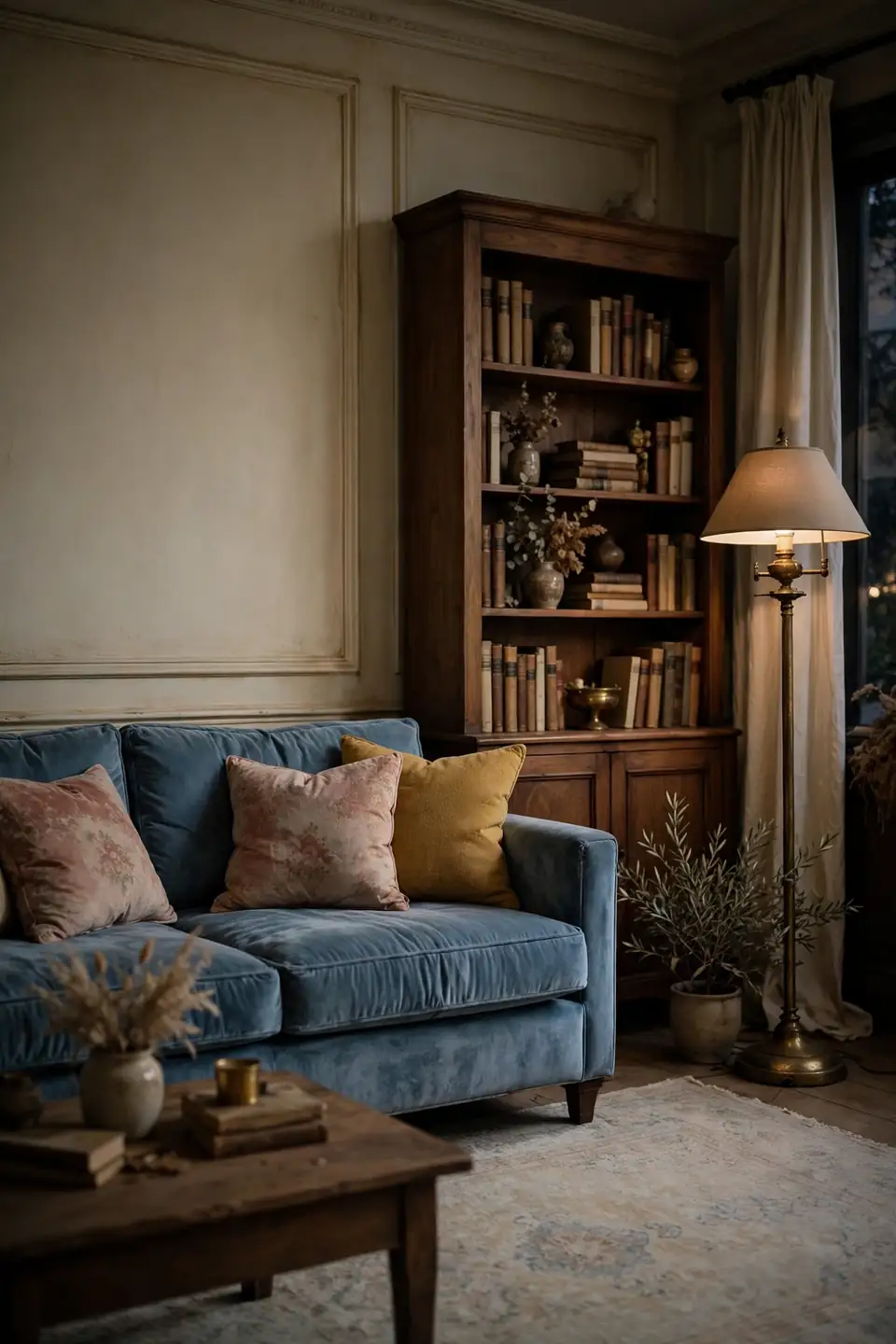
| Dusty Blue Velvet Sofa | Pale Blue Cotton Sofa |
|---|---|
| Deep muted blue anchors a cream room | Pale blue keeps the mood light and airy |
| Velvet pile shifts tone with the light | Cotton stays even and matte all day |
| Brass and walnut flatter the depth | White painted wood suits the pale shade |
| Feels formal enough for evening guests | Feels relaxed for daily family use |
Dusty blue velvet is the evening version of the vintage blue story. Against cream walls it reads deep and calm, and a walnut bookcase beside it completes the library feeling. Choose cushions in faded rose or mustard for the classic vintage counterpoint.
Fern Green Botanical Mood
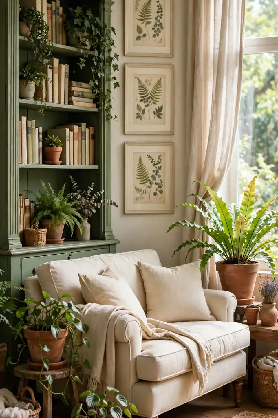
Do:
- Paint one wall or the bookcase in a mid fern green
- Layer real plants in clay pots at three heights
- Choose cream and natural linen for the soft furnishings
- Repeat the green in botanical prints with cream mounts
Don’t:
- Mix fern green with lime or neon green accessories
- Block the window light the plants and paint both need
- Add dark furniture on every side of the green wall
- Use plastic plants that flatten the living mood
Fern green brings the garden room indoors and suits houses with leafy views. The shade sits between sage and forest, deep enough to matter and soft enough to live with. Keep the palette around it pale, and the room breathes like a conservatory.
Champagne And Ivory Shine
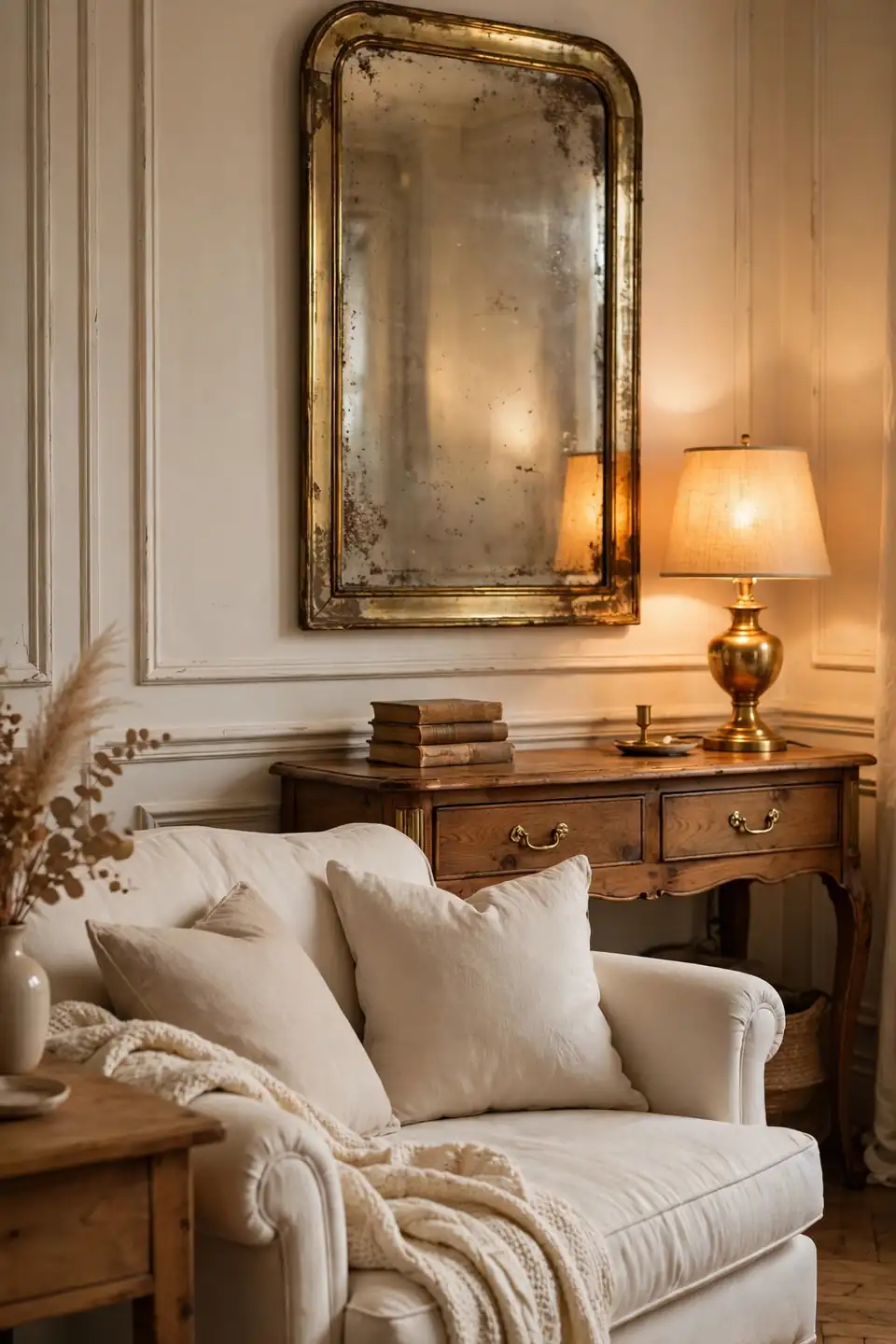
Cost: Medium, since brass and glass accents cost more than paint alone
Time: One weekend to swap metals, hang mirrors, and change the pale textiles
Skill Level: Beginner with a screwdriver for handles, rods, and lamp shades
Best For: Formal sitting rooms that feel flat under evening light
Champagne is gold with its voice lowered, and ivory keeps it from glitz. Together they make a vintage room glow after dark, when brass lamps and a mirror or two multiply the light. Keep fabrics matte, linen and wool, so the shine stays in the metal only. A little shine, kept quiet, is what makes it feel collected.
Heirloom Red Accent Story
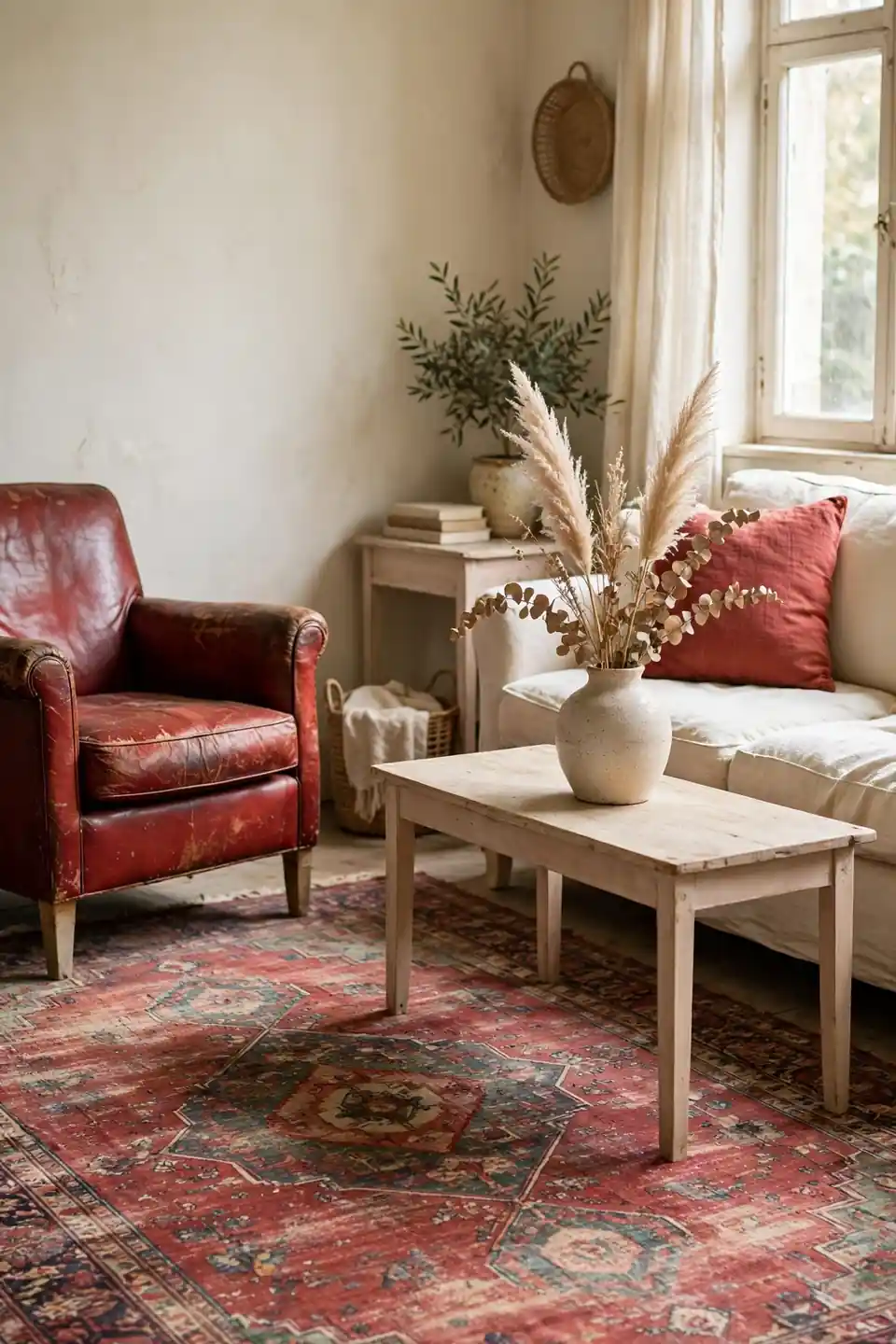
A single heirloom red piece can carry a whole vintage room. An old Persian rug in faded brick red, or a worn red leather chair, gives cream walls and pale wood a story that new furniture cannot fake. Flea markets and family attics are the honest sources for both.
Keep the red aged rather than bright, and repeat it only twice more, in a cushion and a book spine or vase. I’ve seen this work well in many cases where a room felt pretty but forgettable. The faded red supplies the memory, and the calm palette around it supplies the rest.
Conclusion
Timeless rooms rarely come from one bold paint choice; they grow from soft layers chosen in a kind order. Pick one lead tone, repeat it in three places, and your own vintage inspired living room color palettes will feel settled instead of staged. Save the palettes you love on Pinterest, test the deepest shade on cushions before walls, and live with the light for a full week. I’ve seen how one dusty rose sofa or a sage painted bookcase can shift the mood of a whole room, and that gentle change is worth taking slowly.