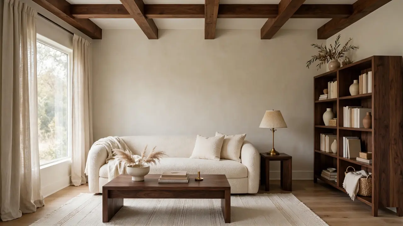
24 Dark Wood and Cream Living Room Decor Ideas for Cozy Contrast
Contrast makes a room memorable, and few pairings do it as calmly as dark wood and cream living room decor. Walnut brings depth, grain, and a sense of permanence, while cream softens every edge with light, warmth, and texture. Together they suit modern, classic, and rustic homes without chasing trends or demanding a full renovation.
Start with the largest pieces, then repeat each tone at least three times so the scheme feels planned from every angle. In my experience, rooms fail when dark furniture gathers on one side and pale fabrics on the other. Balance the weight, vary the textures, and let natural light do the rest. For a softer romantic detour, readers may enjoy vintage French bathroom decor ideas before returning to the living room palette below.
Walnut Sofa Anchor Piece
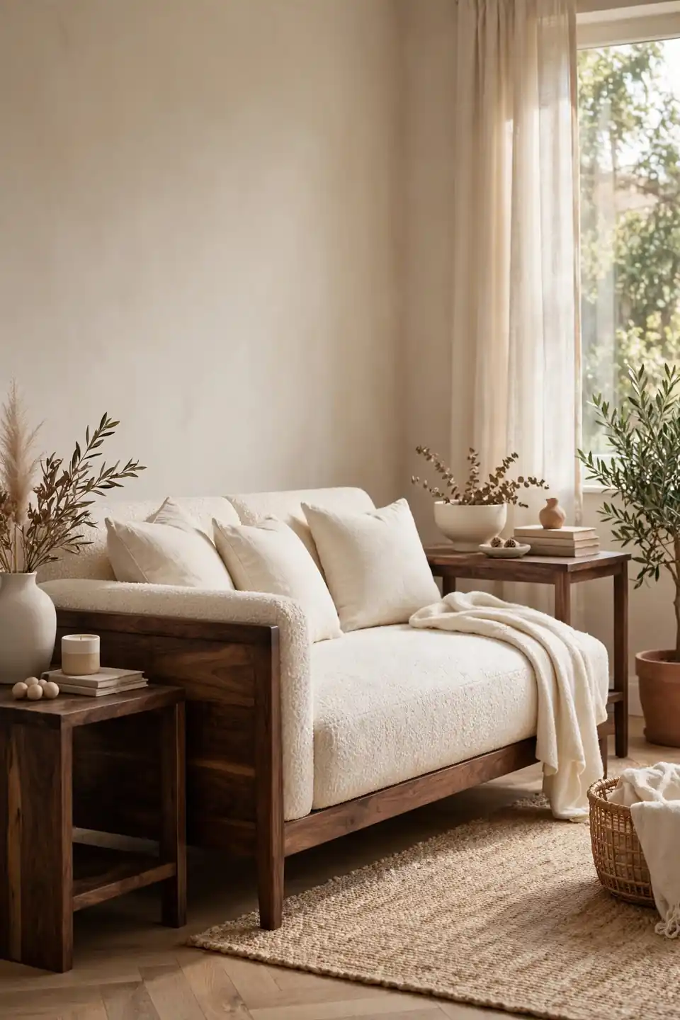
A walnut framed sofa gives the whole room its posture. The dark base grounds pale cushions, stops cream upholstery from floating, and sets a tone that feels grown up without feeling heavy. Choose clean lines, a low profile, and cushions deep enough for real lounging on slow evenings.
Keep the wood visible rather than draping every edge in throws. One cream blanket folded along the back is enough. I’ve noticed that walnut reads richest beside matte fabrics like boucle, linen, and washed cotton, because soft textures let the grain carry the shine in the pairing. Leave breathing room around the frame.
Cream Walls Warm Backdrop
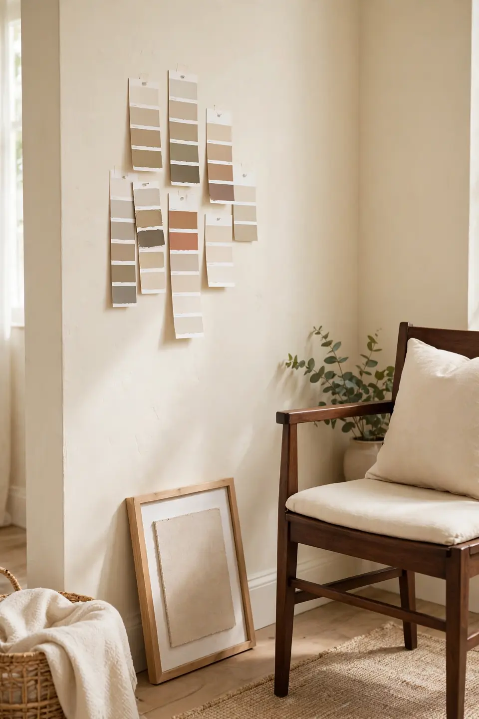
- Pick warm white or pale cream paint with a yellow or pink undertone, never a blue grey base.
- Test two shades on the largest wall and watch them at breakfast, noon, and lamp lit evening.
- Paint trim the same cream for a soft envelope, or one shade lighter for gentle definition.
- Balance the pale walls with walnut furniture on at least two sides of the room.
- Keep artwork mats cream so frames in dark wood read as one planned family.
Cream walls succeed when they look intentional, not leftover. The shade should flatter skin, soften daylight, and give dark furniture a calm field to stand against. In my experience, a warm cream also forgives mixed wood tones better than stark white, which can make walnut look orange.
Dark Wood Ceiling Beams
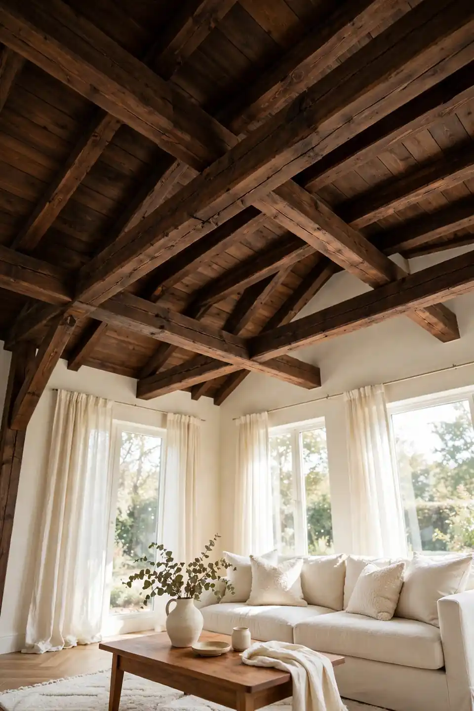
Quick Tip: Keep beams matte and slightly lighter than the darkest furniture. A soft walnut stain shows grain, avoids a cave effect, and still delivers the strong horizontal lines that make ceilings feel crafted rather than plain.
Beams earn their keep in rooms with plain ceilings and tall walls, where they lower the visual height and add architecture in one move. Faux beams in hollow walnut veneer weigh little and hide wiring for ceiling lights. Space them evenly, align them with windows or the sofa axis, and stop at three to five runs so the ceiling feels structured, not striped.
Layered Cream Textile Mix
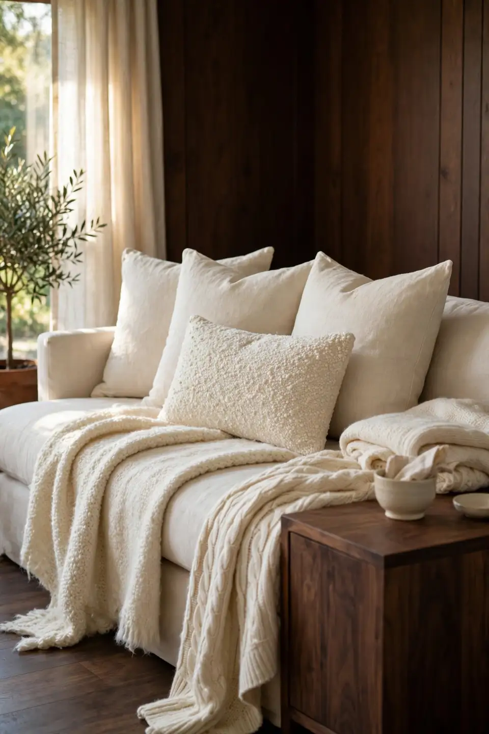
BEFORE: The sofa wore one flat cream cushion, the chairs were bare, and every fabric in the room shared the same smooth finish. The palette looked right on paper, yet the seating felt cold and oddly unfinished.
AFTER: Boucle cushions, a washed linen throw, and a nubby wool blanket now layer across the seats in three cream shades. The walnut frame shows between the fabrics, and the whole corner invites people to sit down and stay.
Texture is how a two color scheme avoids monotony. Mix one nubby fabric, one smooth fabric, and one woven fabric, then repeat each texture twice in the room. Natural fibers age kindly, hold dye softly, and keep cream from reading as one flat block of beige.
Walnut Coffee Table Styling
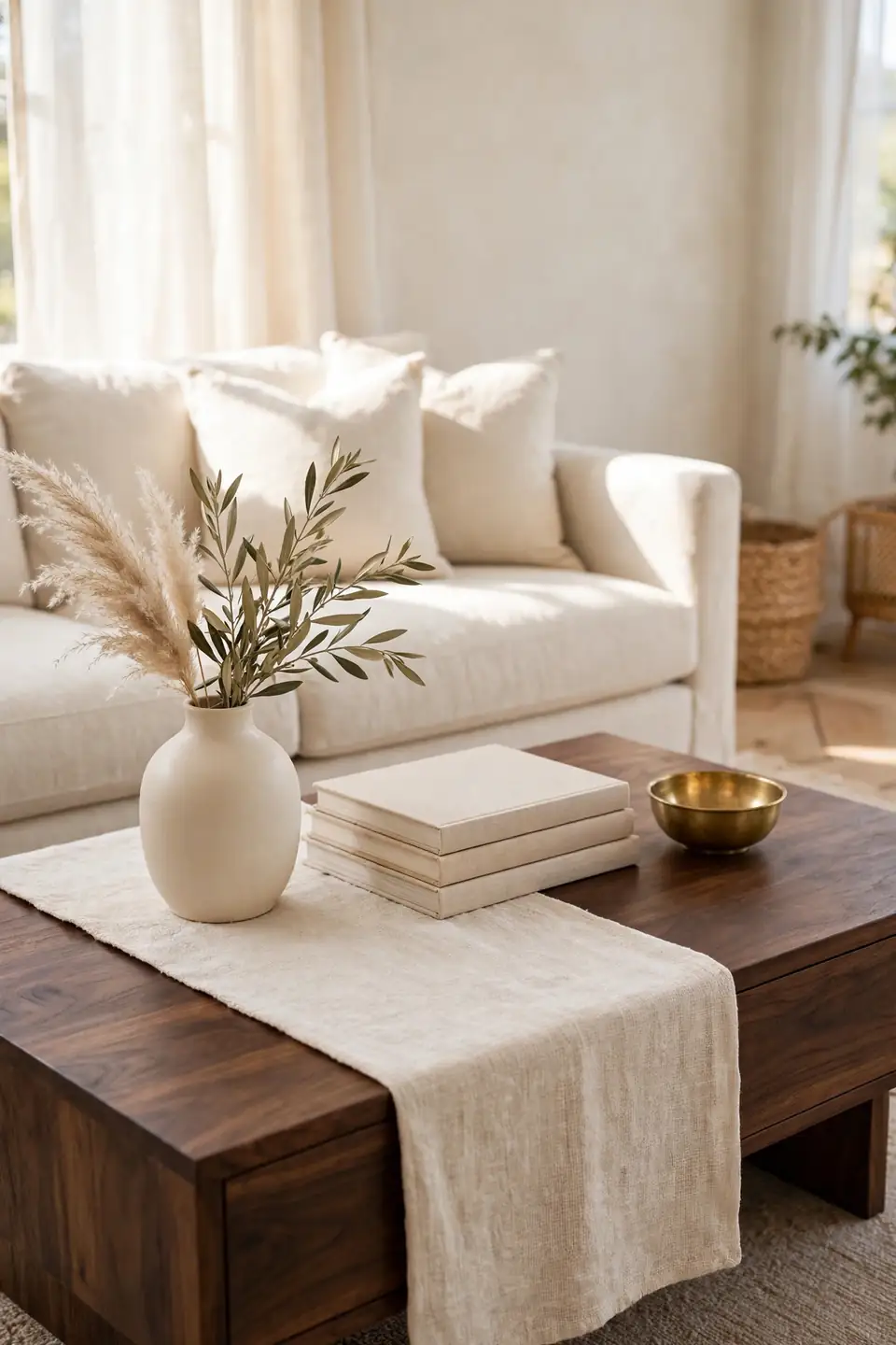
- Start with a cream linen runner that leaves dark wood visible at both ends of the table.
- Stack two neutral books with plain covers and offset them toward one corner.
- Place a cream ceramic vase with dried grasses for height without color noise.
- Add one small brass or stone bowl to hold remotes and coasters.
- Leave the front third empty so knees, trays, and feet have honest room.
A styled table still has to work on movie night. Keep daily objects inside the bowl, flowers low enough for conversation, and one clear landing zone for mugs. Walnut rewards restraint, because the grain itself is already the pattern on the surface.
Wood Tone Comparison Guide

| Detail | Dark Walnut | Pale Oak |
|---|---|---|
| Feel | Deep, calm, formal warmth | Light, casual, airy softness |
| Grain | Strong grain, rich brown depth | Fine grain, honey pale finish |
| Pairs with | Cream boucle, brass, leather | White linen, rattan, stone |
| Best for | Anchors, beams, bookcases | Side tables, stools, frames |
| Care | Dust weekly, oil yearly | Wipe gently, seal lightly |
Neither tone wins on its own; placement decides. Dark walnut belongs on the largest pieces, where its weight organizes the room, while pale oak works as relief on small surfaces that sit between dark masses. Keep the ratio near seventy percent dark to thirty percent light, and repeat each tone at least twice so nothing looks borrowed from another home. That rhythm keeps the contrast calm.
Balanced Contrast Ground Rules
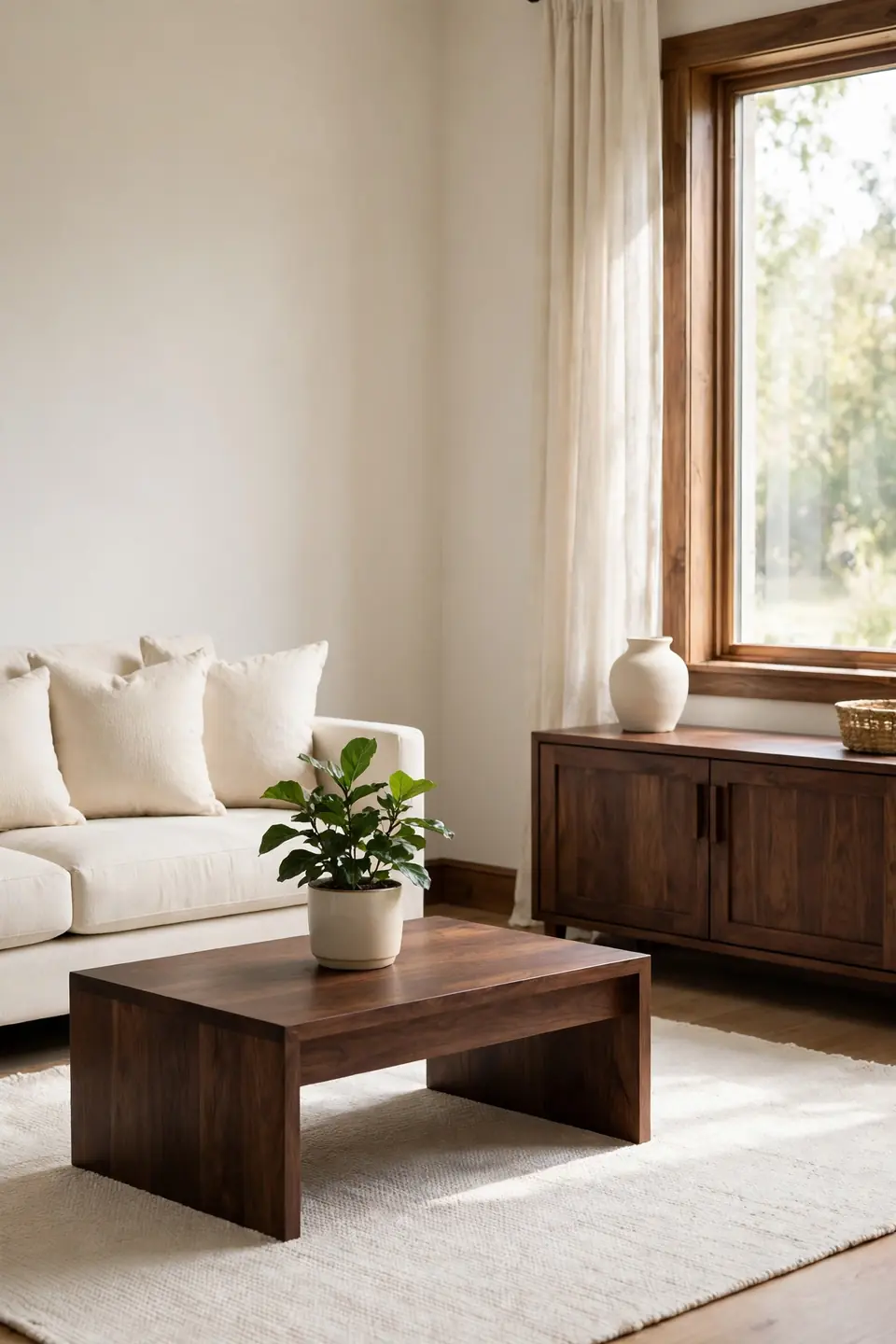
Do:
- Repeat dark wood at high, middle, and low levels in the room.
- Let cream lead on the largest soft surfaces, especially sofa and rug.
- Bridge the tones with brass, stone, or woven natural fibers.
- Check the balance from the doorway, where imbalance shows first.
Don’t:
- Cluster every dark piece along one wall like a showroom row.
- Choose cream shades that fight, mixing pink beige with grey beige.
- Rely on one dark accent to carry the whole scheme.
- Cover dark wood with clutter until the grain disappears.
Balance is a rhythm, not a measurement. Step back, squint, and look for dark shapes spaced like beats across the room, with cream resting quietly between them. When one side feels heavier, move a lamp or basket before buying anything.
Quick Facts Palette Ratios
Cost: Flexible, paint and textiles lead
Time: One weekend for core changes
Skill Level: Beginner friendly with planning
Best For: Rooms that feel cold or flat
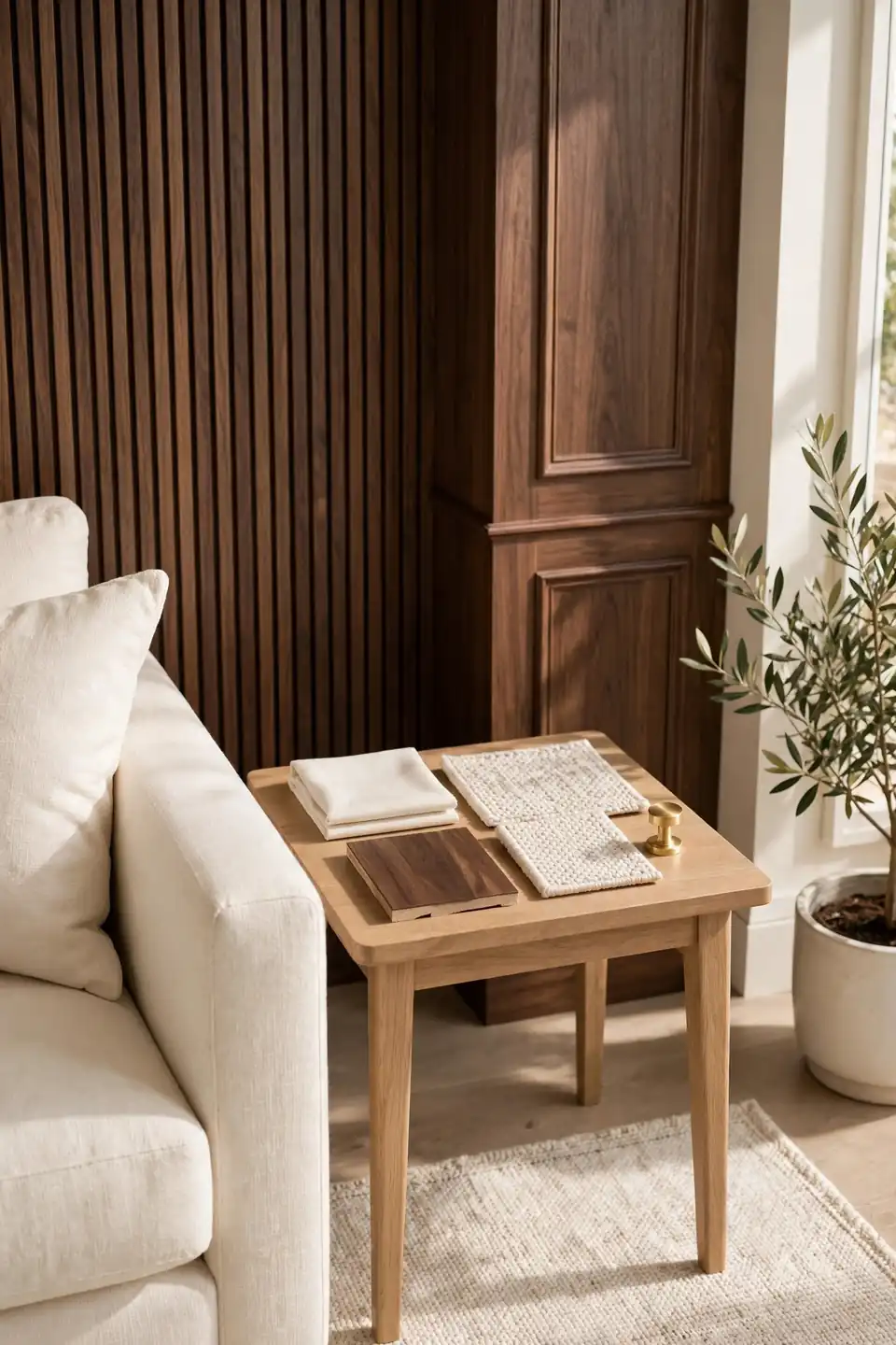
Ratios give beginners a safe starting point. Aim for roughly sixty percent cream across walls, rug, and upholstery, thirty percent dark wood across furniture and frames, and ten percent warm accents in brass, leather, and woven fiber. The numbers flex with light: north facing rooms often need more cream, while sun filled rooms can carry extra walnut without gloom. I’ve seen this work well in many cases where owners changed ratios slowly, living with each step for a week before adding more dark pieces.
Ivory Rug Grounding Layer

A pale rug changes how every dark leg and frame lands. Ivory pile softens the geometry of walnut furniture, catches daylight at floor level, and gives the seating group one shared foundation. Choose a size that reaches under the front legs of every seat. It also quiets footsteps.
This is where dark wood and cream living room decor proves its patience, because the rug must stay light under daily life. Pick wool or a washable flatweave with a heathered pattern that hides crumbs between cleans. A subtle border in warm beige frames the arrangement without adding a new color. The border also helps align furniture.
Dark Wood Bookcase Wall
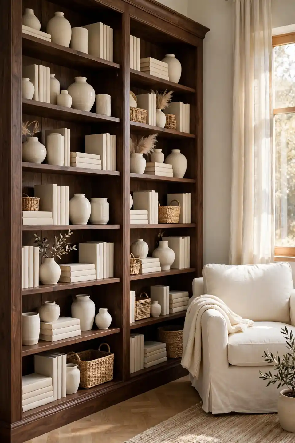
- Paint the wall behind shelves the same cream as the room for depth without darkness.
- Fill only two thirds of each shelf, leaving air around vases and stacks.
- Stand cream ceramics beside dark spines so every shelf carries both tones.
- Lay some books flat as plinths for small bowls, plants, and framed prints.
- Light the top shelf with a small warm lamp or picture light.
A bookcase wall succeeds when it reads as furniture, not storage overflow. Group objects in threes, keep colors quiet, and leave one shelf almost empty near eye level. That pause makes the walnut feel deliberate and gives the eye a place to rest.
Cream Curtains Window Light

Quick Tip: Hang curtains six inches above the frame and let the hems kiss the floor. The long cream fall stretches the wall, softens hard window edges, and glows gently when backlit by afternoon sun.
Cream linen filters light instead of blocking it, which matters in rooms where dark furniture drinks brightness. Choose unlined panels for glow or lined panels for privacy, and keep the fabric matte so it never competes with wood grain. Wide panels that stack onto the wall, not the glass, keep every ray available through the day. The effect feels calm all day. Sheers alone rarely suit street facing rooms.
Walnut Console Entry Moment

BEFORE: The wall behind the sofa stood empty, coats landed on chair backs, and the room had no graceful pause between the door and the seating. Guests stepped straight into the conversation area without any sense of arrival.
AFTER: A slim walnut console now stands behind the sofa with a cream lamp, one woven basket below, and a round mirror above. Keys land in a small stone bowl, and the seating side stays clear for conversation.
A console divides open rooms without walls and gives lamps a home at the right height. Readers who enjoy calm color stories will also like Mediterranean living room color palette for sunlit inspiration beyond this scheme. Keep the styling low so sightlines stay open.
Brass Accent Warm Shine

- Choose one brass finish and repeat it on lamp bases, frames, and hardware.
- Place brass at three heights: ceiling or wall, table level, and floor level.
- Keep each brass piece small so the metal glints instead of shouting.
- Polish only the pieces meant to shine, leaving others softly aged.
- Stand back and remove one piece if the room starts to sparkle everywhere.
Brass is the bridge metal between walnut and cream, warm enough for the wood and bright enough for the fabric. Aged finishes suit this palette better than mirror shine, because they glow under lamps without turning the room formal. A little metal goes a long way here.
Leather Wood Material Pairing

| Detail | Cognac Leather | Cream Fabric |
|---|---|---|
| Feel | Warm, relaxed, gently worn | Soft, pale, calm and light |
| Care | Wipe spills, condition twice yearly | Vacuum weekly, wash covers seasonally |
| Aging | Deepens in tone with use | Brightens rooms, shows marks sooner |
| Best seat | Armchair, ottoman, bench | Sofa, cushions, curtains |
Leather earns its place as the middle tone of the palette. It sits between walnut and cream in depth, adds a worn touch that new furniture lacks, and stands up to feet on ottomans and dogs on rainy days. Keep leather to one or two pieces, then let cream fabric carry the rest of the seating so the room stays light on its feet. That restraint keeps the contrast friendly.
Plaid Wool Throw Layers

Do:
- Choose plaid in cream, camel, and brown so the pattern stays inside the palette.
- Fold throws lengthwise over sofa arms to show the pattern in one stripe.
- Pair plaid with plain boucle and linen so patterns never compete.
- Repeat the throw colors once more in a cushion or rug border.
Don’t:
- Mix plaid with florals and stripes in the same seating group.
- Drape throws over every seat until the sofa disappears.
- Pick high contrast black checks that harden the whole scheme.
- Hide frayed edges; mend them before they spread.
A single plaid throw adds the heritage note that plain rooms miss. Wool drapes with weight, holds a fold, and feels honest beside walnut. Keep the scale medium, because tiny checks buzz and giant checks swallow sofas.
Palette Ratio Quick Facts

Cost: Low to moderate by phase
Time: Two weekends for full room
Skill Level: Beginner with patience
Best For: Long narrow living rooms
Long rooms reward a clear ratio because repetition pulls the eye from end to end. Place a dark piece near each short wall, keep the long walls cream, and run the rug lengthwise to stretch the floor. Small repeats matter more than one giant gesture: matching walnut frames at both ends, cream cushions on every seat, and brass appearing twice. I’ve noticed that narrow rooms feel wider when the darkest tones sit low, so keep tall storage lighter in finish or paint the upper walls a shade paler than the seating walls.
Cream Cushion Cloud Sofa

Few sights say comfort like a sofa buried in cream cushions. Layers of ivory, oat, and pale stone pillows soften the straight lines of dark furniture and invite long conversations. Vary the shapes: two large squares, one lumbar, and one small round pillow for movement. The mix should look collected, not matched.
Keep the inserts plump and the covers washable, because pale cushions only look luxurious when they hold their shape. Rotate and fluff them weekly. Behind the softness, a walnut frame or dark side tables keep the arrangement grounded, so the cloud never drifts into blandness. Choose covers with texture, not prints.
Dark Wood Accent Wall

- Choose vertical walnut slats or wide planks for a calm, architectural rhythm.
- Keep the wall behind the sofa, where cream upholstery can glow against the grain.
- Stop the treatment at one wall so the room keeps its light.
- Fit warm picture lights or sconces to wash the grain with soft light.
- Leave the surface bare or add one large cream toned artwork only.
A dark wall changes the room’s center of gravity, so plan the rest of the palette around it. Cream seating, pale rugs, and light curtains must carry the remaining three walls. Done once and done well, the wall becomes the backdrop every photograph of the room will love.
Woven Basket Storage Style

Quick Tip: Match basket tones to the middle shade of the wood grain. Seagrass, rattan, and willow in honey tones bridge walnut and cream without adding a single new color to the room.
Baskets hide the honest clutter of daily life: throws, remotes, chargers, and the book someone swears they were reading. Cluster three sizes near the sofa, keep lids on the busiest one, and let one basket stay open for quick tosses. Natural fibers add the handmade texture that smooth furniture needs, and their soft edges keep the room feeling relaxed beside strong walnut lines. Replace tired baskets before they sag.
Candlelit Evening Layering

BEFORE: One ceiling light flattened the room at night, walnut turned black, and the cream sofa looked grey under the glare. Evenings felt bright in the wrong way, and nobody lingered after dinner.
AFTER: Lamps at three heights now pool warm light across the wood grain, while candles on the coffee table add a gentle flicker. The cream fabrics glow softly, and the room feels smaller in the kindest way.
Layer light the way you layer fabric. A floor lamp for reading, table lamps for faces, and candles for sparkle give the palette its evening life. Warm bulbs between 2700K and 3000K keep walnut rich and cream golden, never yellow or cold.
Pattern Mixing Made Easy

- Start with one medium scale pattern, such as a plaid throw or striped cushion.
- Add a second pattern at half that scale, in the same cream and brown family.
- Give every pattern a plain resting place beside it, like a solid boucle cushion.
- Repeat each pattern once across the room so the mix looks planned.
- Remove the loudest piece if your eye cannot settle anywhere.
Pattern works when color stays disciplined. Keep the palette to cream, walnut brown, and one warm accent, then let scale do the talking. From the doorway, the mix should read as texture first and pattern second, a quiet order that suits daily life.
Sofa Fabric Choice Guide
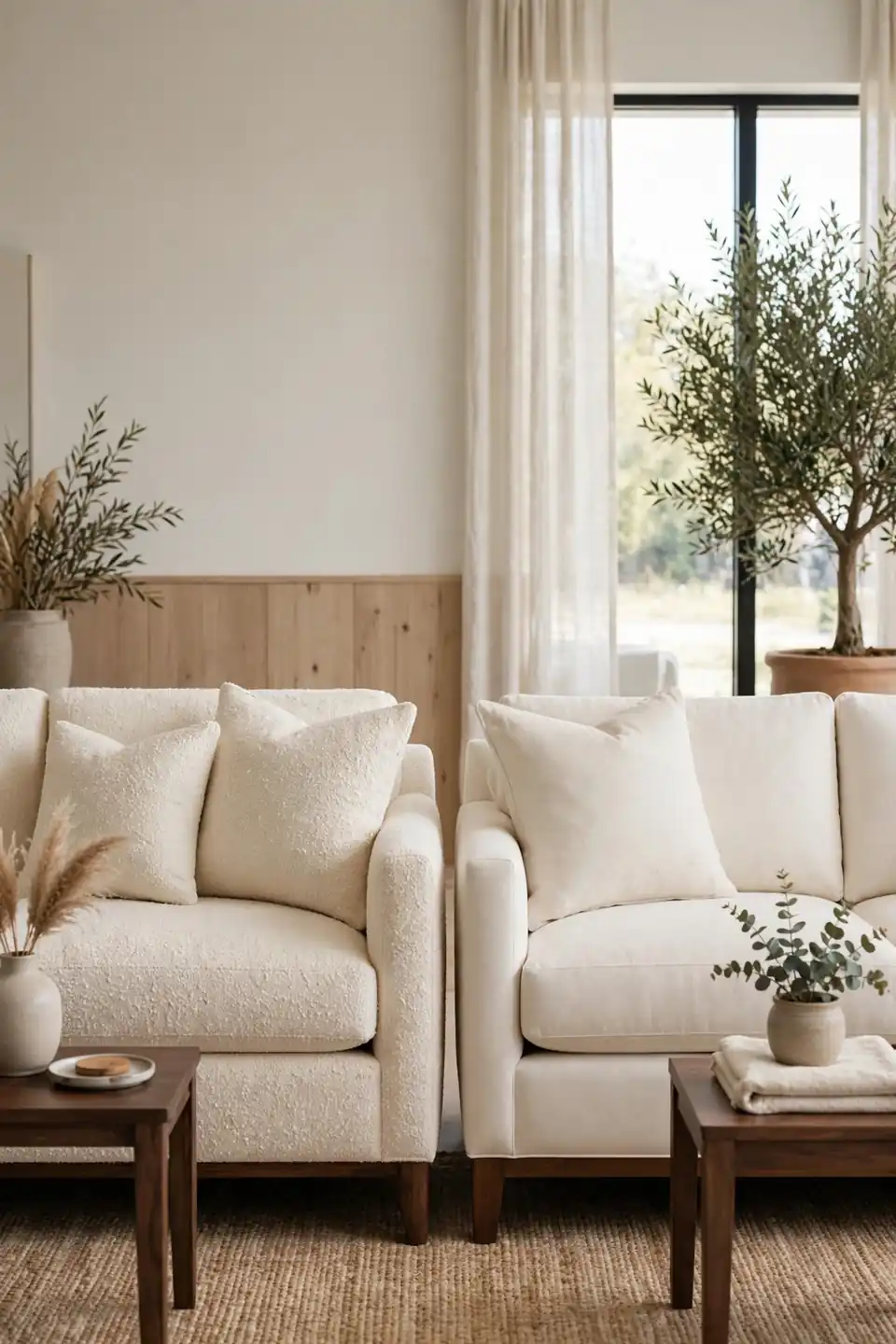
| Detail | Cream Boucle | Cream Linen |
|---|---|---|
| Texture | Nubby loops, deep cozy pile | Smooth weave, relaxed natural slubs |
| Care | Brush gently, spot clean quickly | Machine wash covers where fitted |
| Warmth | High, suits winter rooms | Light, suits bright summer rooms |
| Best match | Walnut frames, brass lamps | Oak tables, woven baskets |
Fabric decides how cream behaves in daily life. Boucle hides crumbs, forgives pet hair, and makes dark frames feel plush and modern. Linen wrinkles kindly, breathes in warm weather, and keeps a formal walnut room from stiffening. Households with toddlers often choose linen covers they can wash, while quiet reading rooms enjoy boucle that asks for almost nothing. Either way, order large swatches and live with them beside the wood for a full week before deciding.
Gallery Wall Dark Frames
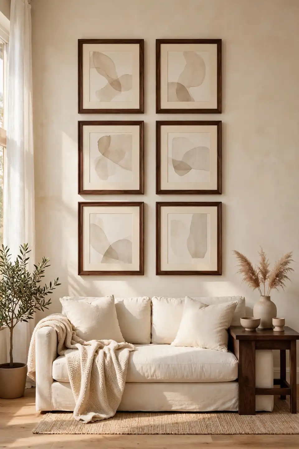
Do:
- Choose walnut frames in one finish so the grid reads as a single piece.
- Use cream mats wide enough to give every print a calm border.
- Hang the center of the group at standing eye level above the sofa.
- Mix abstract prints, sketches, and one landscape for gentle variety.
Don’t:
- Scatter small frames without a grid, which reads as clutter.
- Mix black, gold, and walnut frames in one tight group.
- Choose glass with glare in bright rooms; matte glazing is kinder.
- Hang pieces so high that the wall feels top heavy.
Dark frames turn a pale wall into a rhythm of windows, each one echoing the furniture below. Keep spacing even and let the sofa width set the grid width. The result feels collected and calm.
Reading Corner Cozy Finish

Cost: Low if the chair already exists
Time: One afternoon to arrange
Skill Level: Beginner, no tools needed
Best For: Corners beside bookcases or windows
Every living room deserves one corner that belongs to a single person and a good book. Angle the chair toward the room, set the lamp over the shoulder, and keep the side table close enough for tea without reaching. A cream throw over the chair arm repeats the sofa fabric, while the walnut table ties the corner to the main scheme. That’s why many experts recommend finishing corners last, after the big pieces settle, because small corners reveal what the room still needs.
Conclusion
Dark wood gives a room its bones, and cream gives it breath. Work through these ideas one corner at a time, repeat each tone with intention, and photograph the room as you go to spot imbalance early. The beauty of dark wood and cream living room decor is how gracefully it grows with you, from a single walnut table to a full wall of shelves. Save your favorite ideas to Pinterest, try the smallest change first this weekend, and share the corner that finally feels right. I’ve seen how small changes like these can shift the whole mood of a home.