20 Blue Toile de Jouy Bedroom Decor Ideas for French Charm
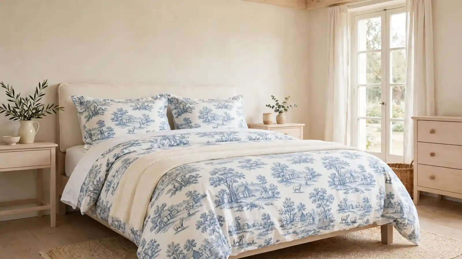
Blue and white scenes of country lanes, garden gates, and quiet shepherds have lined French bedrooms for more than two centuries, and the print still feels calm today. The charm of blue toile de Jouy bedroom decor is its restraint: one romantic pattern carried on the bed, softened by cream walls, plain linen, and pale wood that never fights for attention.
Below are twenty ways to build that look around the bed, from a full duvet set to a single patterned lampshade. The layering rules mirror those behind modern rustic bathroom design inspiration: repeat one honest material, keep the rest quiet, and let daylight do the polishing. In my experience, toile rewards patience; add the print in two or three places, live with it for a week, and only then decide whether the room wants more.
Classic Toile Duvet Set
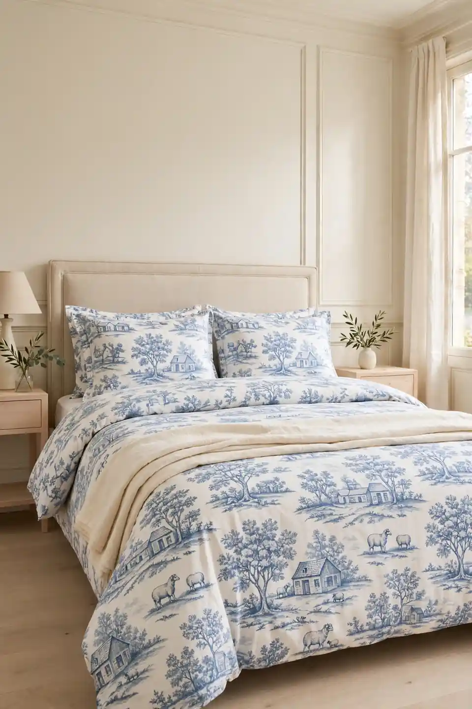
A full toile duvet set is the fastest route to a French bedroom, because the bed takes up the most visual space in the room. Choose a soft cornflower blue on warm white, with scenes spaced wide apart so the pattern reads calm rather than busy from the doorway.
Fold the duvet down by a third and lay a plain cream throw across the foot, giving the eye a quiet place to land. Keep pillow shams in the same print and sheets plain white; mixing a second pattern here usually tips the bed from romantic to restless by bedtime. Wash pieces together so they fade evenly.
Layered Pillow Print Mix
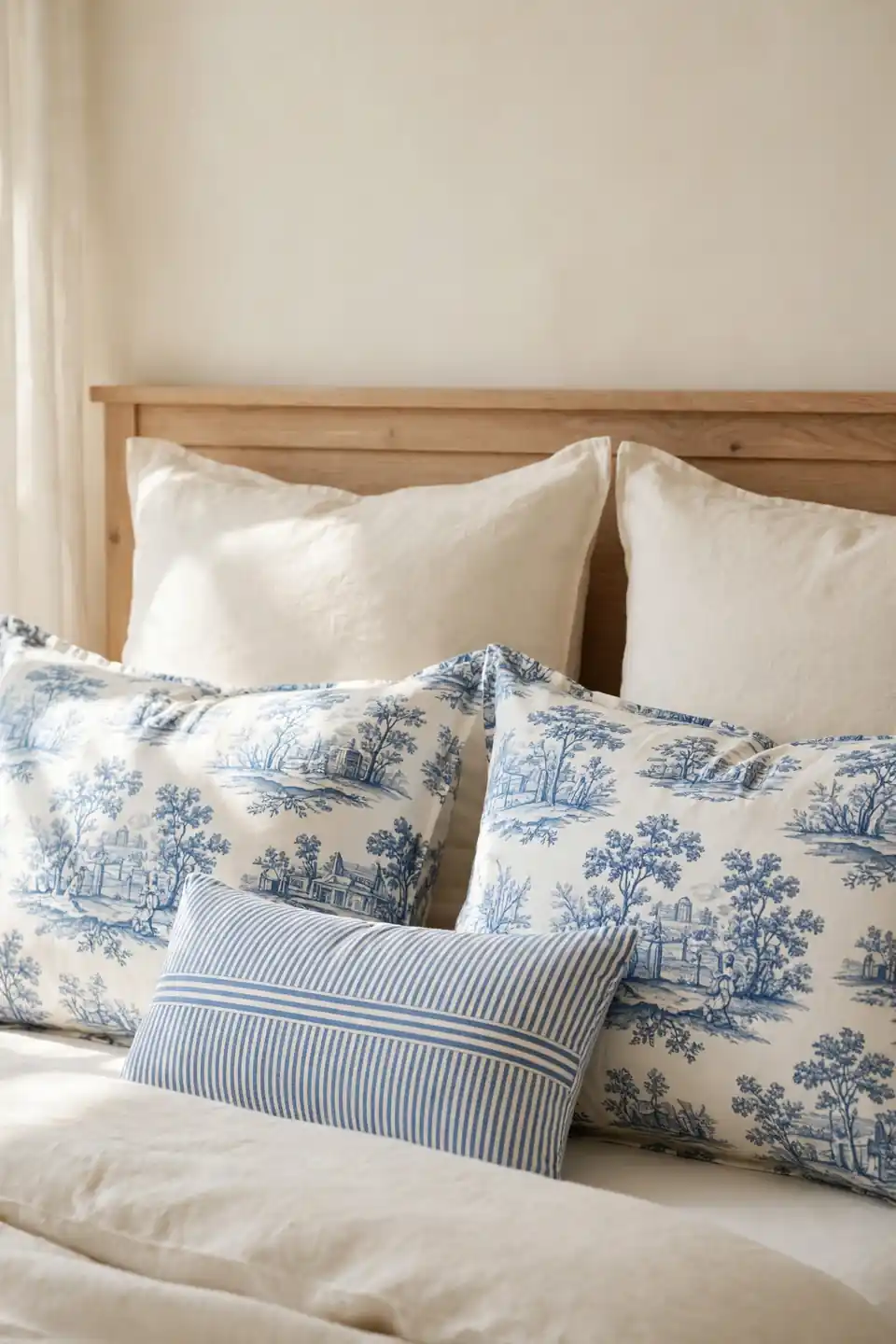
- Start with two plain cream Euro shams standing against the headboard.
- Add the printed sleeping pillows in front, scenes facing outward.
- Place one small lumbar cushion in a ticking stripe for contrast.
- Keep every pillow plump; flat cushions make prints look tired.
- Stop at three layers so the bed still invites sleep.
Pillow layering works because the eye reads depth before detail, and a shallow stack of cream, print, and stripe feels generous without bulk. I have noticed guests always touch the front cushion first, so give that smallest piece the softest fabric you own, washed linen or brushed cotton with a gentle hand.
Toile Curtains Frame Light

Quick Tip: Hang toile curtains high and wide, close to the ceiling and beyond the frame, so the full pastoral scene shows even when panels are open. Half hidden prints look like an accident; fully shown scenes read as deliberate design.
Curtains carry the print at eye level, balancing the bed without touching it. Line them in plain cream cotton so sunlight filtering through stays warm instead of blue, and let hems just kiss the floor. A bedroom where the pattern appears at the window and on the bed feels finished from every angle, even before furniture arrives. Choose brass or pale wood rods, too, since quiet hardware lets the scenes hold the eye without a fight.
Plain Walls Pattern Patience
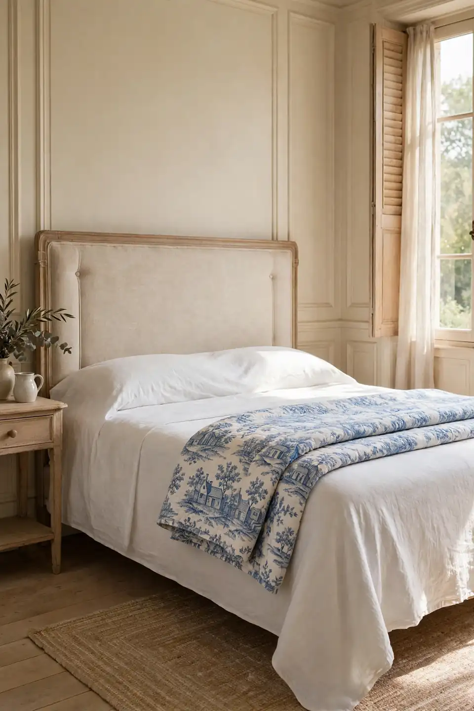
BEFORE: The walls wore a cool grey paint that fought the warm wood floor, and plain white bedding left the room feeling borrowed. Nothing was wrong exactly, yet nothing felt chosen either.
AFTER: Warm cream paint softened every wall, and the bed gained a toile quilt folded over plain white sheets. The same furniture suddenly looked older in the best way, like pieces collected over years.
Paint is the cheapest patience in decorating; it asks only for one weekend and a steady ladder. Cream works behind toile because the print already carries blue, and warm walls stop that blue from turning icy at dusk. Live with the new color for a full week of mornings before judging, since bedrooms are mostly seen in early light.
Canopy Bed French Style
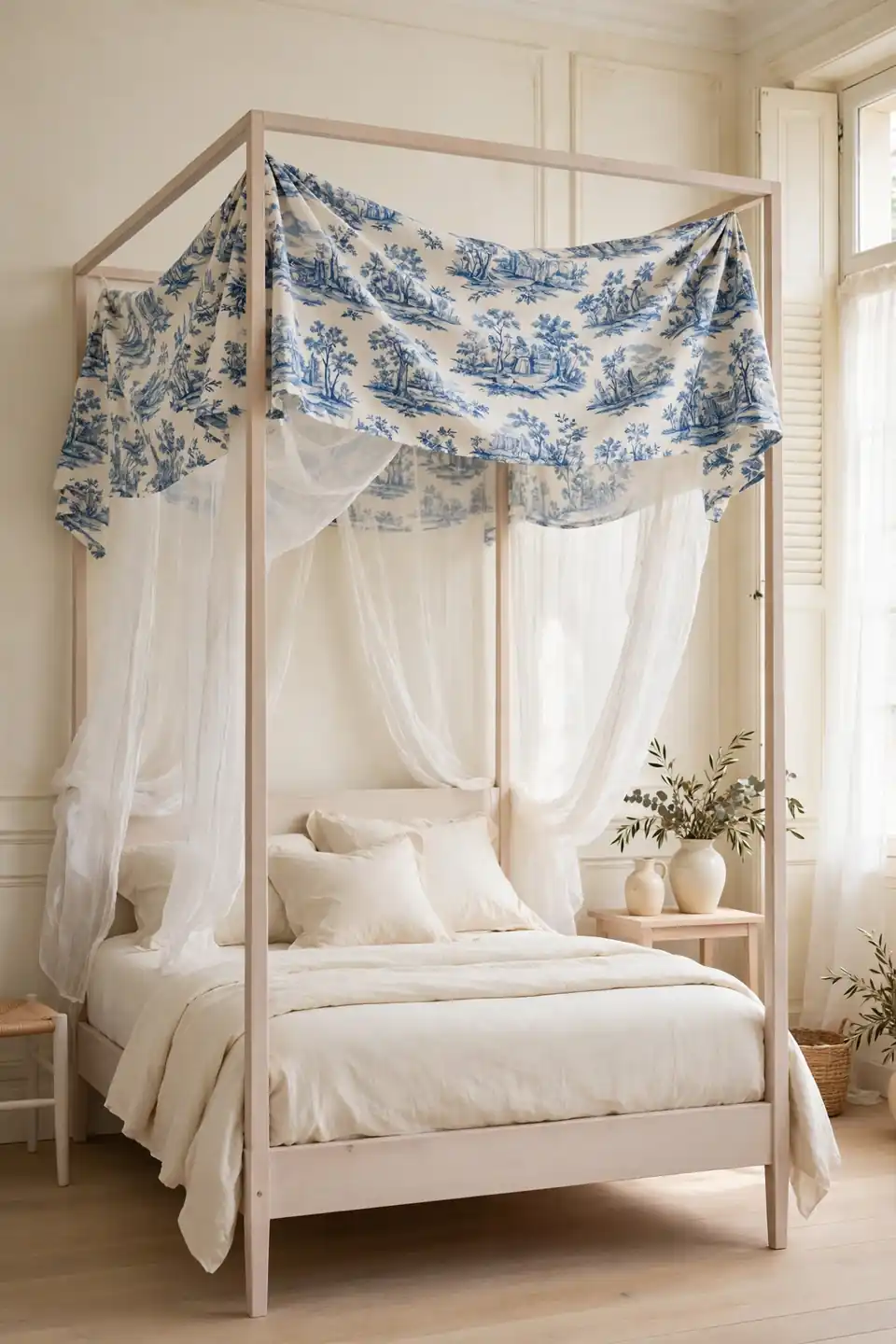
- Measure the ceiling height; a canopy needs clearance above the top rail.
- Choose a slim black metal or pale wood frame with simple lines.
- Drape toile only across the head third, never the whole frame.
- Add plain gauze behind the print to soften morning light.
- Keep the bedcover plain cream so the canopy stays the crown.
A canopy turns an ordinary bed into the room’s architecture, and toile at the top edge frames sleep like a picture. Keep every other textile quiet and the effect stays romantic rather than theatrical. Tall sleepers should test the drape with cheap muslin first, because fabric that grazes hair at midnight quickly loses its charm.
Toile Versus Plain Bedding
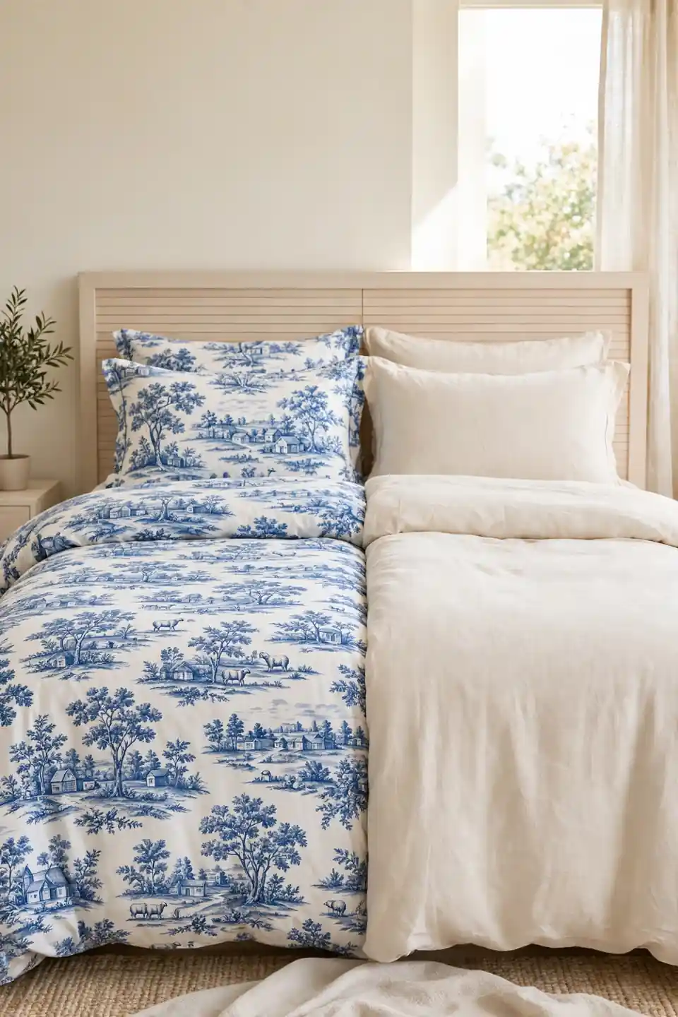
| Feature | Toile Bedding | Plain Bedding |
|---|---|---|
| First impression | Romantic, storied | Calm, minimal |
| Pattern load | Carries whole bed | Needs accents |
| Upkeep | Hides small marks | Shows every crease |
| Best mood | French country charm | Quiet modern rest |
Neither choice wins for every sleeper, and the wisest rooms often keep one of each, swapping with the seasons. Toile hides the small realities of daily life, a coffee splash or a cat’s muddy paw, far better than plain white. Plain bedding, though, gives the pattern at the curtains room to sing. If budget allows only one splurge, buy the print for the duvet and keep sheets plain forever; the bed’s face is what photographs and what guests remember.
Vintage Wood Furniture Pairing
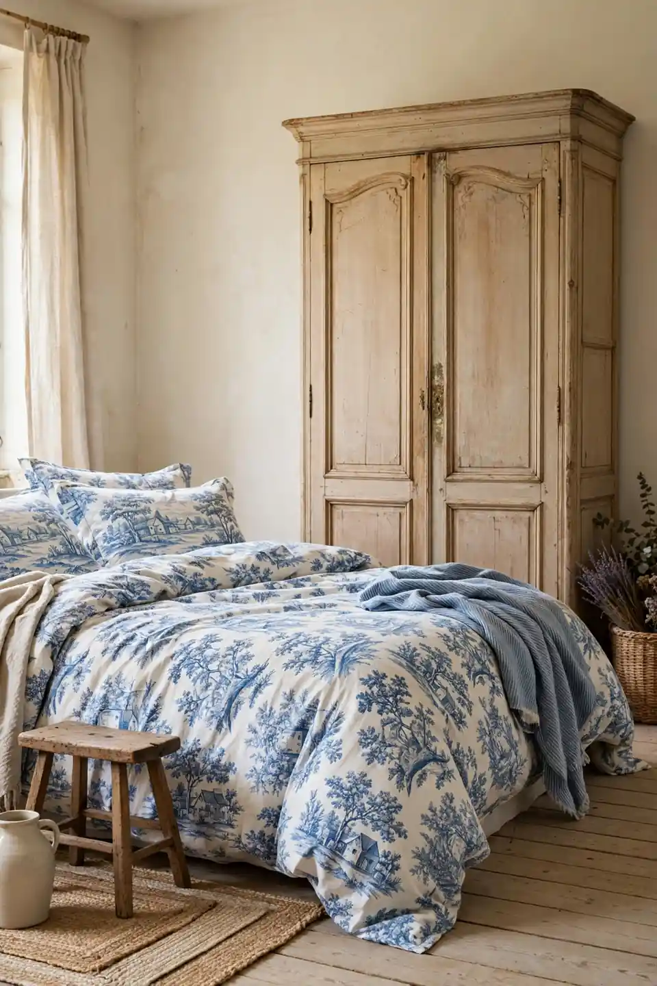
Do:
- Pair the print with pale oak, pine, or painted cream wood.
- Let one armoire or dresser carry age and gentle wear.
- Repeat the wood tone in a small stool or frame.
- Wax wood yearly so its warmth keeps pace with fabric.
Don’t:
- Match every furniture piece in one dark heavy set.
- Place glossy modern lacquer beside romantic pastoral print.
- Cover worn wood with busy runners and clutter.
- Buy faux distressed pieces that imitate age badly.
Toile was printed for country houses, so it relaxes beside honest wood and looks uneasy beside chrome and glass. In my experience, one genuinely old piece steadies a whole room of new furniture, because age gives the pattern a believable story to sit inside.
Small Room Toile Rules
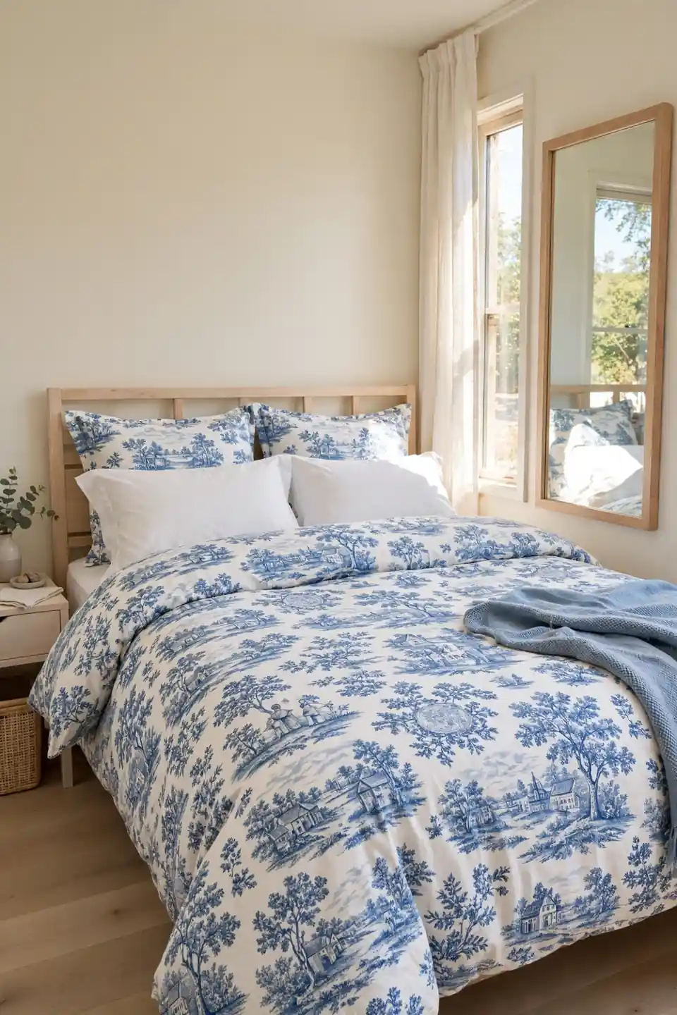
Cost: Low to mid
Time: One weekend
Skill Level: Beginner friendly
Best For: Compact bedrooms
Small bedrooms punish clutter but reward one brave pattern, and toile earns its place by staying in a single color family. Keep the print only on the bed and one curtain pair, then paint everything else the same warm cream so walls step back. Mirrors help when placed beside the window rather than opposite the bed, bouncing daylight across the pattern without doubling it visually. I have seen this work well in many cases: the room reads furnished, not crowded, and the bed becomes a deliberate centerpiece instead of the thing the room apologizes for.
Toile Accent Wall Behind Bed
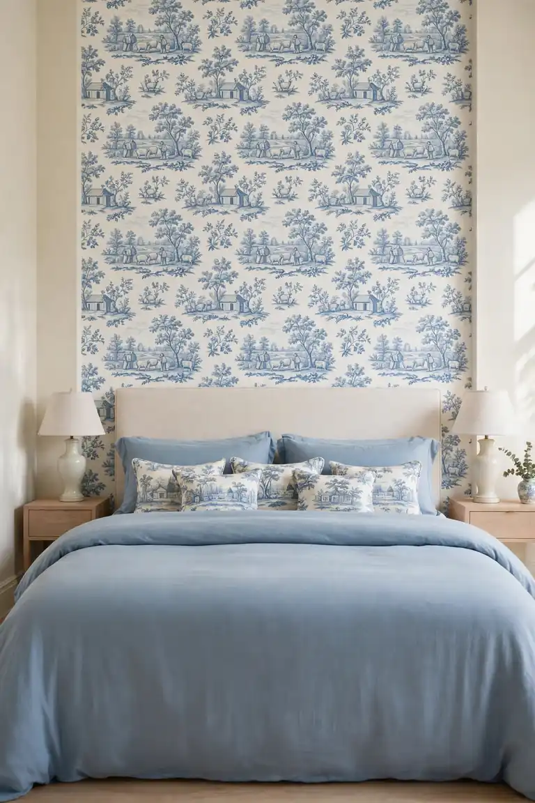
Paper the wall behind the bed in toile and the room gains a mural scaled exactly to its hero. Choose a pattern repeat smaller than your palm so scenes stay delicate at pillow distance, and let the other three walls rest in warm cream.
A papered headboard wall pairs best with plain bedding in the same blue family, a solid duvet with printed cushions rather than print on print. Keep bedside lamps simple and pale, because the wall is already telling stories; it needs lighting, not competition, after dark. Measure the pattern repeat before ordering rolls, too, because a scene sliced mid figure near the ceiling looks careless every time you glance up from the pillow.
Cream Balance Softens Blue
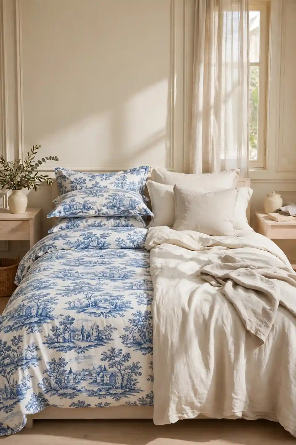
- Keep at least half the textiles plain cream or warm white.
- Use cream on the largest quiet surface, usually the walls.
- Break the blue with natural linen in an oatmeal tone.
- Add one pale wood tone to warm the cool palette.
- Let the print cluster near the bed, not everywhere.
Balance is arithmetic the eye does instantly: every square of pattern wants a square of calm beside it. The same thinking warms the burnt orange and cream bedroom ideas saved for autumn, where cream keeps a strong color graceful. When a toile room feels loud, the fix is rarely less print; it is almost always more cream placed closer to the bed.
Matching Toile Bed Skirt
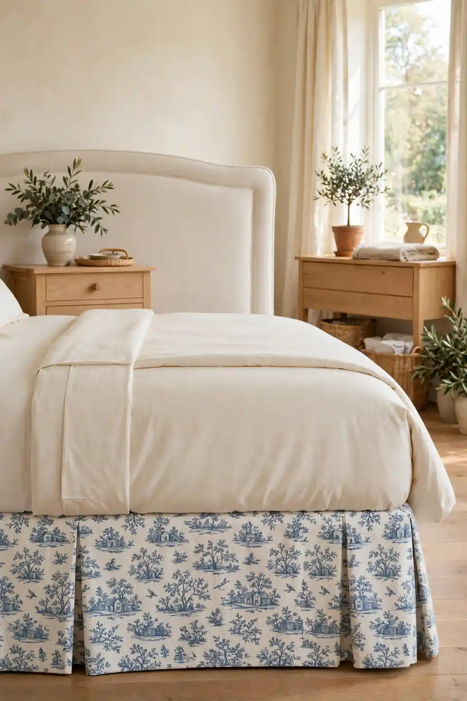
Quick Tip: Choose a bed skirt in the same toile as the duvet but a smaller scale of the print if you can find it. Matching scales exactly can look like a costume; a gentler repeat reads as tailoring.
A printed bed skirt hides the storage boxes and spare blankets most bedrooms quietly keep underneath, turning dead space into part of the design. It also grounds pale bedding, giving the bed a finished hem like a well made dress. Choose a tailored flat panel over gathered ruffles unless the room leans fully romantic, and iron the front pleat before guests arrive.
Guest Room French Refresh

BEFORE: The guest room held a spare bed with mismatched sheets, one flat pillow, and a chair that collected laundry. Visitors slept fine and remembered nothing about the room at all.
AFTER: A toile quilt, two plump cushions, and a small vase of dried lavender changed the welcome entirely. The bed now looks made with intention, and the room finally photographs like the rest of the house.
Guests judge a room in the first ten seconds, mostly by the bed. This is where blue toile de Jouy bedroom decor does its kindest work, because the print feels personal without a single framed photograph. Add a carafe of water and one good book, and visitors will mention the bed at breakfast.
Reading Corner Pastoral Touch

- Place a cushioned chair where morning light lands first.
- Drape a toile throw over one arm, pattern facing out.
- Set a small pale wood table within easy reach.
- Add a plain cream cushion behind your back.
- Keep a slim lamp with a fabric shade nearby.
A reading corner gives the print a second home away from the bed, and repetition is what turns a fabric into a theme. Keep the chair’s own upholstery plain so the throw can change with mood or season. Ten quiet minutes here each morning will do more for the room’s reputation than any single purchase.
Cotton Versus Linen Toile

| Feature | Cotton Toile | Linen Toile |
|---|---|---|
| Feel | Smooth, crisp hand | Soft, slubbed texture |
| Care | Machine wash easy | Gentler wash cycle |
| Print look | Sharp fine lines | Softer faded charm |
| Price | Friendly budgets | Costs a little more |
Cotton is the practical workhorse, washing well and holding the print’s fine ink lines like a page in a book. Linen trades that sharpness for softness, its slubbed weave making scenes look gently aged from the first night. That’s why many experts recommend cotton for the duvet, which faces the room, and linen for cushions, which meet skin more often. Touch both in store with the back of your hand; bedrooms are judged by skin more than eyes.
Blue Palette Depth Tricks

Do:
- Layer two blues, cornflower and dusty navy, in one room.
- Let the darkest blue appear only in small accents.
- Repeat each blue at least twice so it feels chosen.
- Test swatches at dawn and dusk before committing.
Don’t:
- Scatter five different blues hoping they blend.
- Pair icy blue with stark white walls.
- Put the darkest fabric where daylight never reaches.
- Forget warm wood; cool palettes need one warm note.
Depth comes from neighbors, not numbers: two blues placed side by side look richer than five blues scattered apart. Keep the deeper tone low in the room, on cushions and throws, and the lighter tone high, at curtains and walls, and the eye reads the gradient as height.
Budget Toile Starter Pieces
Cost: Low, thrift friendly
Time: One shopping trip
Skill Level: None needed
Best For: First attempts
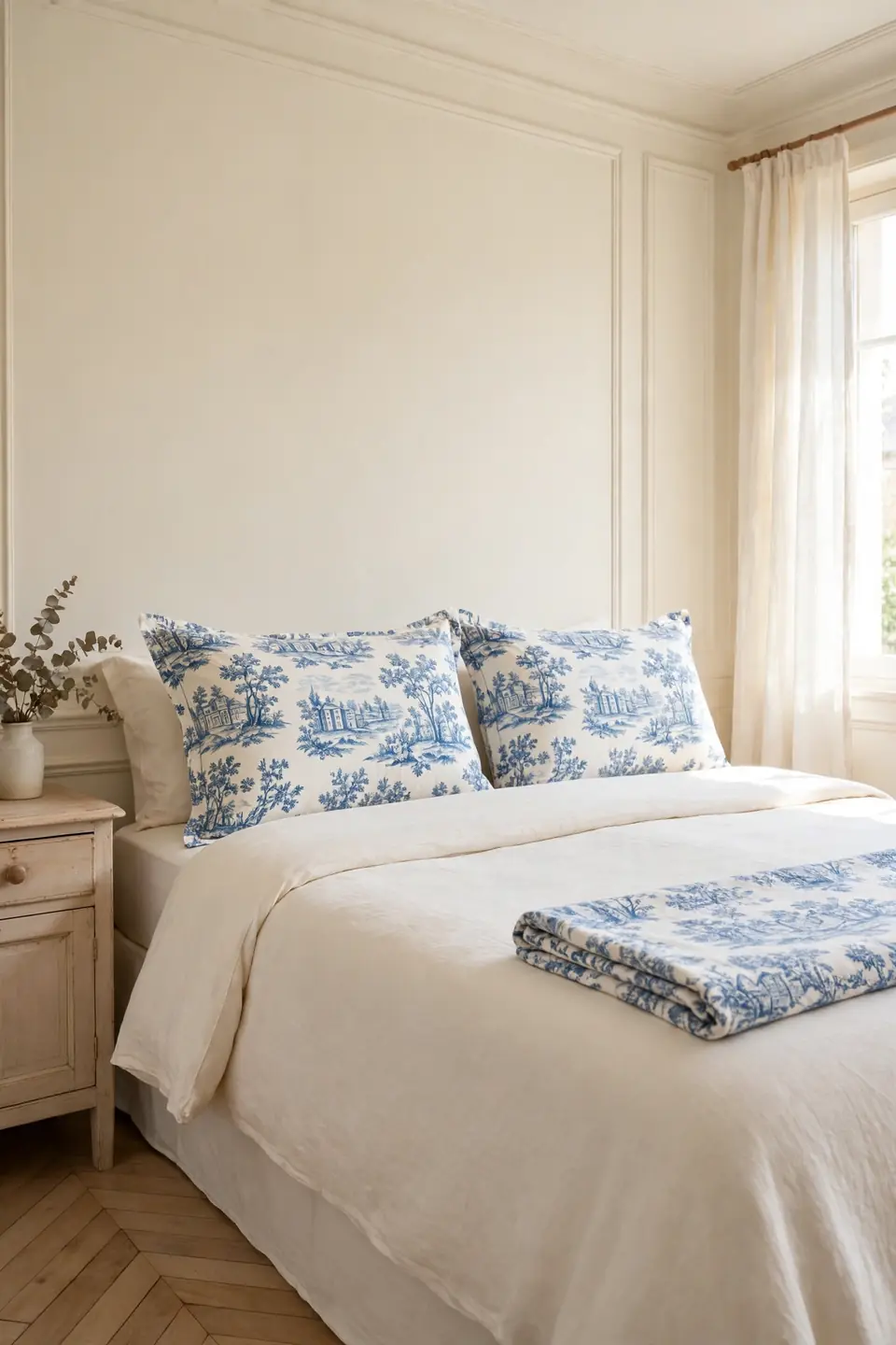
Start with the pieces that touch the bed and nothing else: one printed pillow sham pair and a folded throw will tell you within a week whether toile suits your light. Vintage shops are kind hunting grounds, since faded prints blend with cream better than brand new ones and cost a fraction of retail. If the starter pieces earn their place, add curtains next and the duvet last; that order spends the least money for the most visible change, and each step stays reversible. Sell or gift what does not work rather than storing guilt in a drawer.
Toile Throw Blanket Layers

A single toile throw across plain bedding is the smallest commitment with the largest effect, folding the whole French story into one movable layer. Drape it diagonally across a corner rather than straight across the foot, and the bed instantly looks styled instead of stored.
Choose a throw with a plain cream reverse so you can flip the mood on laundry day or when guests prefer quiet. In summer the throw alone over a white sheet keeps the pattern present without warmth, which is exactly the flexibility small budgets and small rooms both need. Wash the throw rarely and air it on the line often, and its blue will stay bright season after season.
Ruffled Sham Vintage Charm
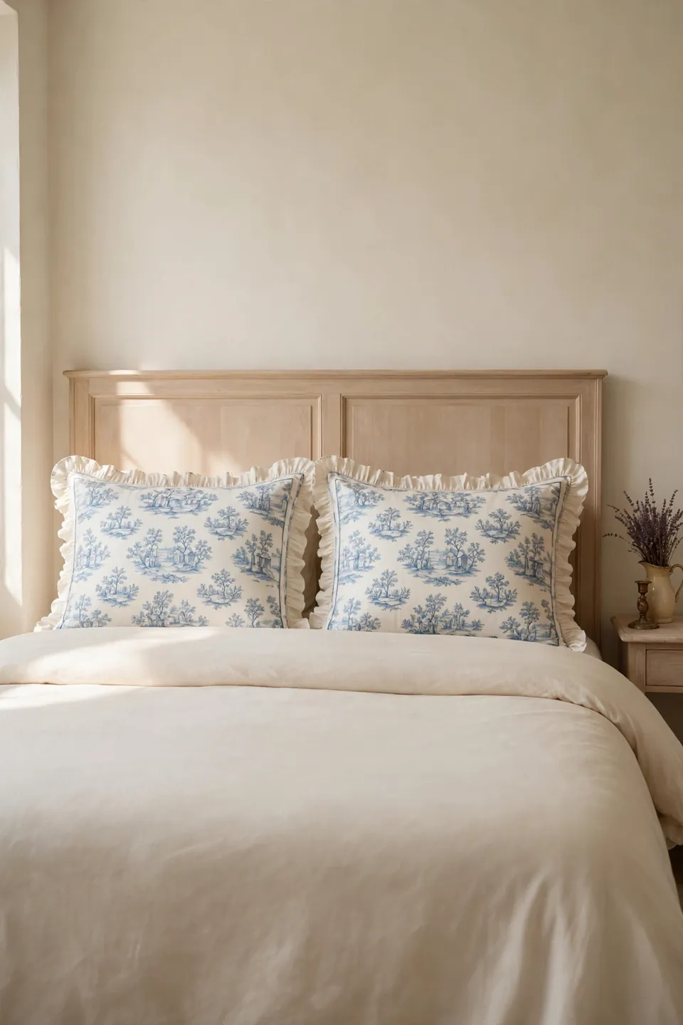
- Pick shams with a narrow ruffle, never a wide floppy edge.
- Match the ruffle print exactly to the duvet scene scale.
- Iron ruffles flat; crushed frills read as untidy, not vintage.
- Stand shams upright so the ruffle catches side light.
- Limit ruffles to the shams; one frill per bed is plenty.
Ruffles walk a fine line between heirloom and costume, and the width of the frill decides which side you land on. I have noticed that a slim ruffle in good cotton reads as tailored in daylight, while wide synthetic frills shine and sag. Keep the rest of the bed plain and neat, and this single romantic detail will carry the vintage note for the whole room.
Toile Lampshade Soft Glow

Quick Tip: Cover plain lampshades with toile offcuts using a simple roll and glue edge, testing the fabric against the lit bulb first. Backlit scenes glow like stained glass, and thin cotton shows the print at its prettiest.
Lamplight is where toile turns theatrical in the best way, the blue deepening and the little scenes glowing at bedtime. Keep bulbs warm white; cool bulbs push the print toward grey and steal the romance you bought it for. A matched pair on both nightstands doubles the effect for very little money, especially when the shades are the only print beyond the bed itself.
Modern Mix Toile Update

BEFORE: The bedroom mixed toile with chrome lamps, a glass table, and stark white walls. Every piece was pretty alone, yet together they argued, and the bed looked dressed for a different house.
AFTER: Cream walls, a pale wood nightstand, and warm brass lamps calmed the argument completely. The same toile bedding now reads intentional, framed by quiet modern shapes that respect its age.
Toile does not demand a period room; it demands respectful neighbors. Clean modern shapes in pale finishes let the old pattern feel fresh instead of themed, which is how the print keeps surviving every trend cycle. Edit one clashing piece at a time and photograph between changes, because the room will tell you plainly when it has settled.
Conclusion
Twenty small decisions add up to one calm French bedroom, and none of them ask for a renovation. Start with the bed, balance every print with cream, and let pale wood keep the blue warm; that is the whole recipe behind lasting blue toile de Jouy bedroom decor. I have seen how a single patterned layer can soften the way a room feels at dawn. Save your favorite ideas to a Pinterest board before you shop, try one this weekend, and share the corner that turns out best. The print has charmed bedrooms for centuries, and yours can be next.