22 Green Kitchen Cabinet Combinations for Fresh Style
Green kitchens are having a well deserved moment, and the right green kitchen cabinet combinations can turn an ordinary cooking space into the heart of your home. From soft sage to deep emerald, green brings nature indoors in a way that feels both fresh and timeless. I’ve noticed that green cabinetry photographs beautifully and hides everyday wear far better than white. Whether you love bold contrast or quiet harmony, there is a green pairing that fits your style and budget. Below you will find twenty two tested combinations that balance color, light, and practicality. Each idea includes exact pairings so you can shop with confidence.
Before you pick a shade, look at your kitchen’s natural light and existing finishes. North facing rooms do best with warmer greens like olive or moss, while sunny spaces can handle cooler sage or mint. If you love contrast, these two tone kitchen cabinet ideas show how to mix green with a second color for extra depth. Now let us walk through twenty two fresh combinations, from subtle to striking.
Sage Upper Charm
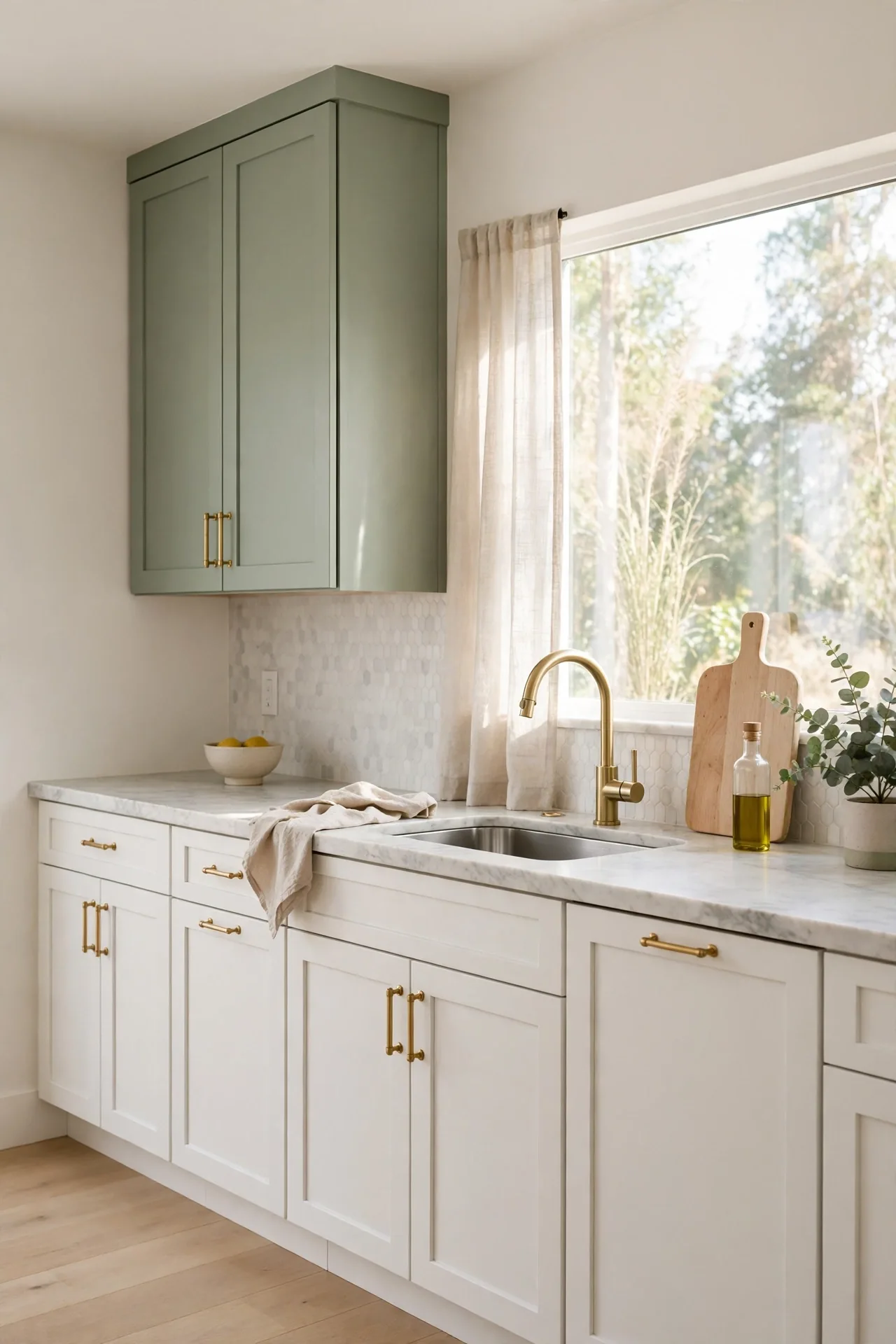
Sage green upper cabinets soften a kitchen instantly. The muted gray green tone reads calm against white walls and keeps the room feeling open. In my experience, pairing sage uppers with crisp white lowers creates balance without visual weight. The color hides minor smudges better than pure white, which helps in busy cooking zones.
Keep counters light to let the sage tone lead. Butcher block or white quartz both work beautifully with this shade. Add brushed brass pulls for warmth that complements the green. Finish with a simple white subway backsplash so the uppers stay the focal point. This pairing suits both modern and cottage kitchens.
Emerald Island Drama
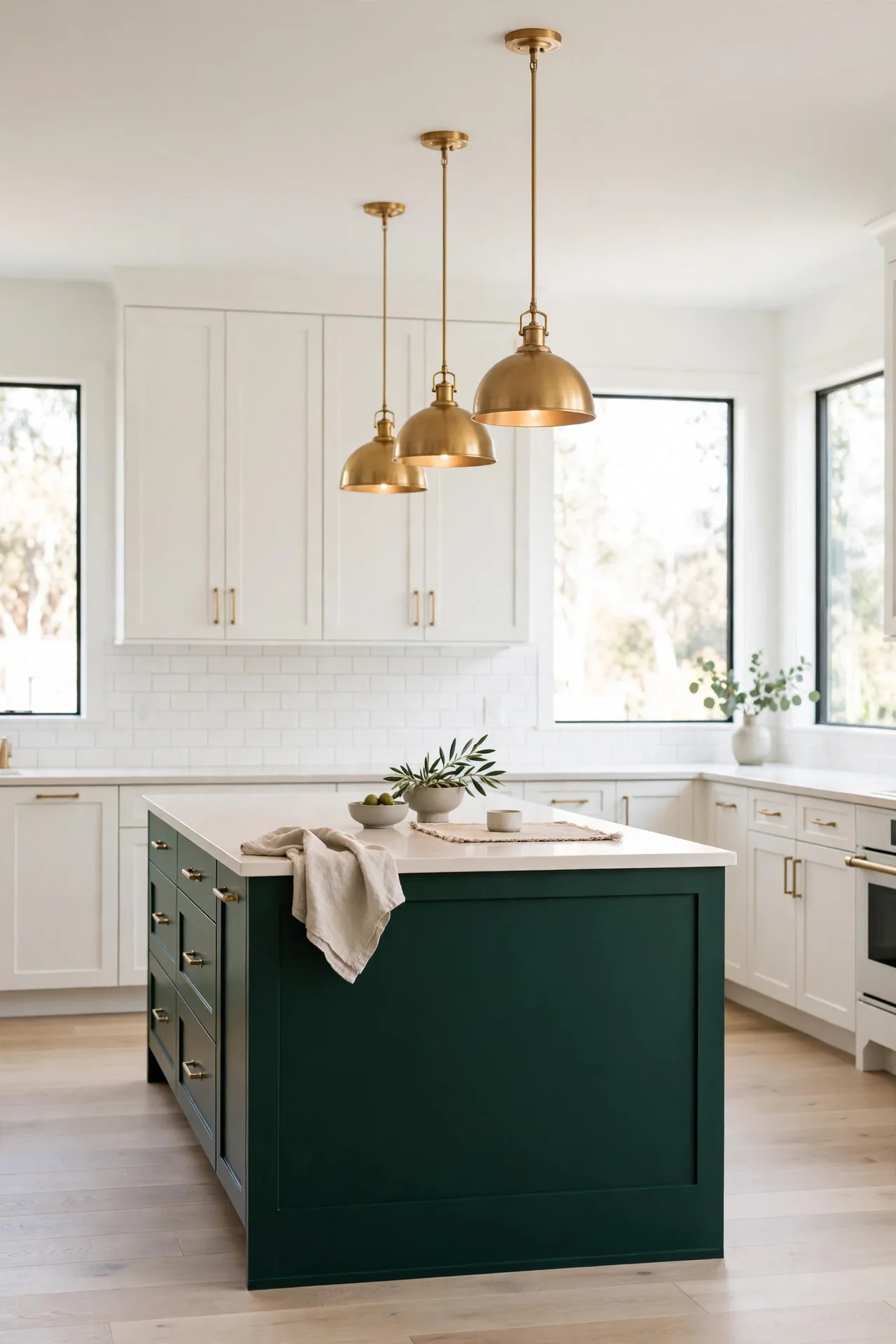
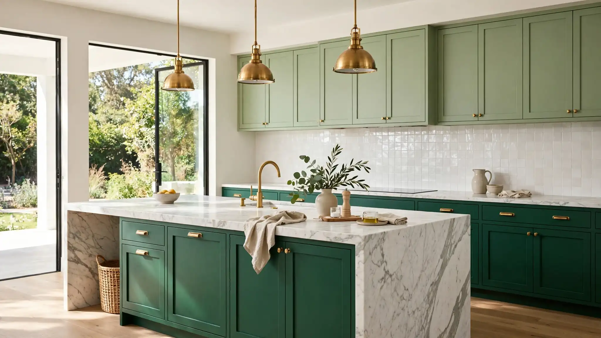
- Paint only the island in deep emerald and keep perimeter cabinets white for instant contrast.
- Choose a waterfall quartz edge so the green reads rich against the pale stone.
- Hang two brass pendants above the island to warm up the dark tone.
- Repeat the emerald in small doses, like bar stools or a runner, for cohesion.
An emerald island anchors the whole kitchen and gives guests a natural gathering spot. The dark tone grounds the room while white cabinets keep it bright. I’ve seen this work well in many cases where homeowners want drama without repainting everything. Seal the island paint with a durable topcoat for lasting color.
Olive Lower Cabinets
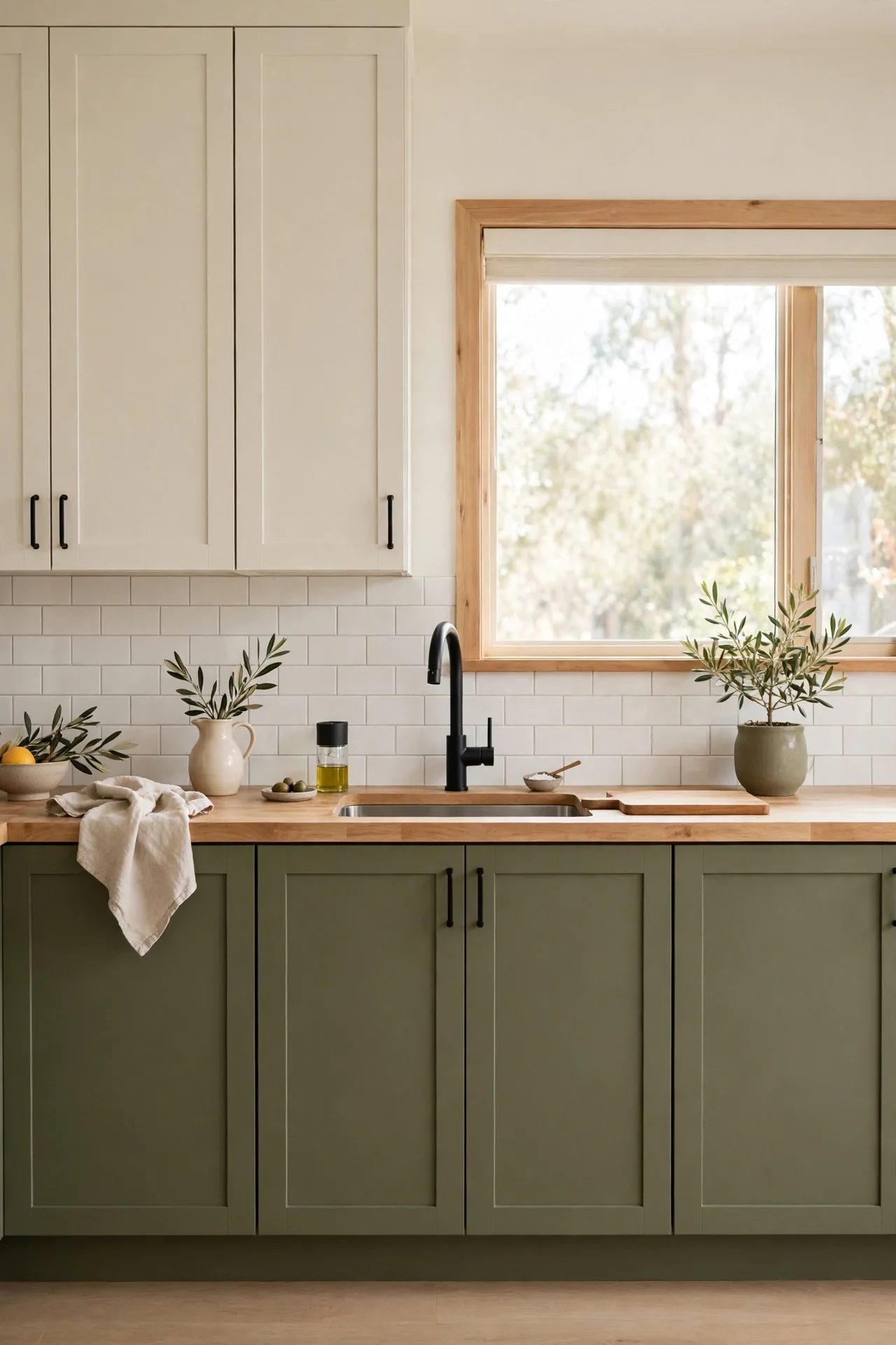
Quick Tip: Olive green lowers pair best with warm whites, not stark blue whites. The yellow undertone in olive can clash with cool whites, so sample creamy shades like Swiss Coffee or White Dove first. Test paint swatches on the cabinet doors and view them in morning and evening light before committing.
Olive lowers bring an earthy calm that works in both rustic and modern kitchens. The tone feels collected rather than trendy, so it ages gracefully. Pair with butcher block counters and oil rubbed bronze hardware for a warm, layered look. Keep upper cabinets light to balance the deeper base color.
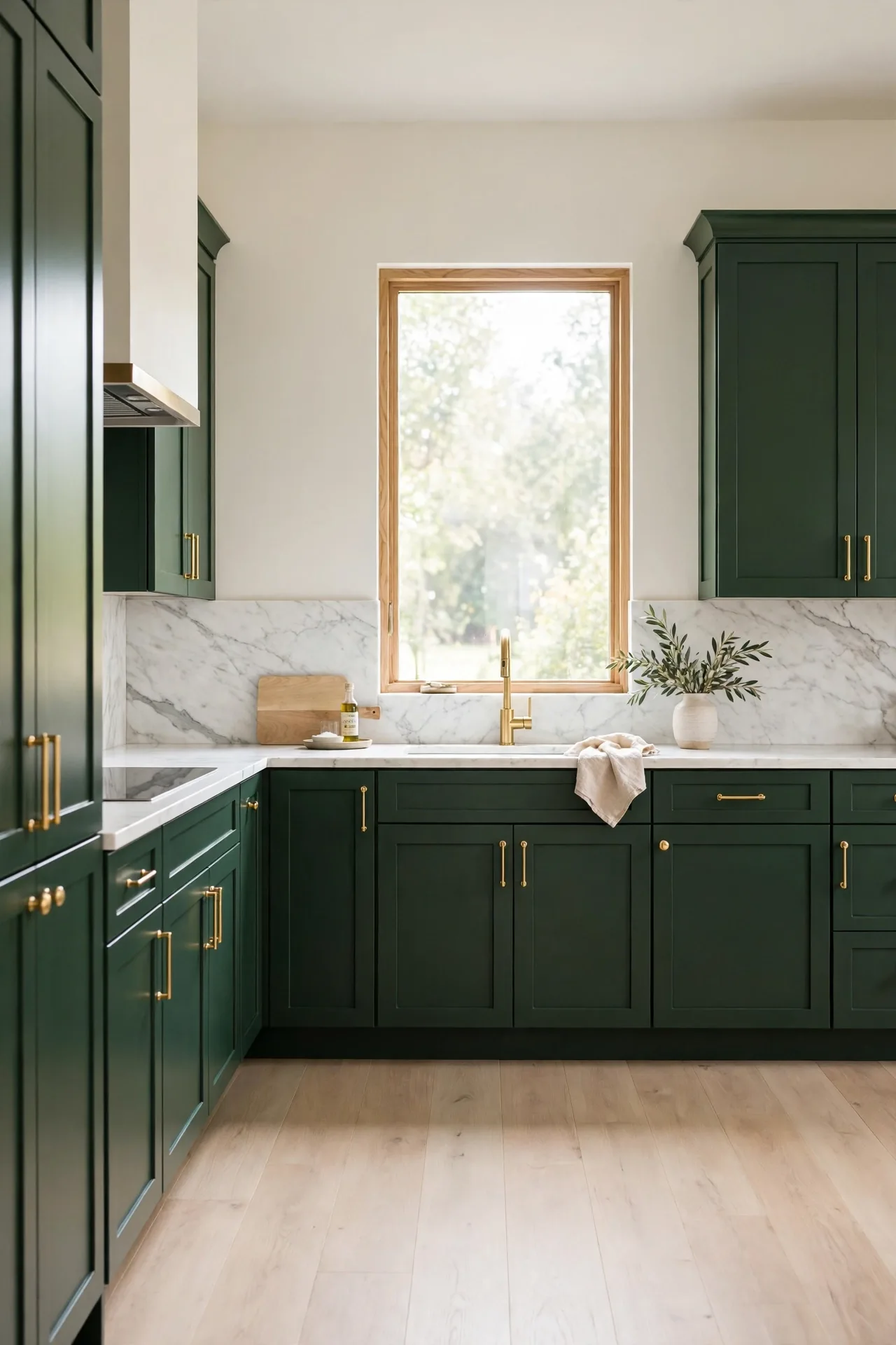
Forest Green Focus
BEFORE: Plain white cabinets feel safe but forgettable, and the kitchen lacks any personality. Everything blends together, and the space reads more like a showroom than a home.
AFTER: Deep forest green cabinets wrap the room in rich, woodsy color. Brass hardware pops against the dark tone, and the kitchen finally feels designed instead of default.
Forest green works as a full commitment color for confident decorators. It pairs beautifully with marble, warm wood, and aged brass. Keep lighting warm to prevent the deep tone from feeling cold. That’s why many experts recommend testing dark greens in your actual light before painting every cabinet.
Mint Backsplash Pairing
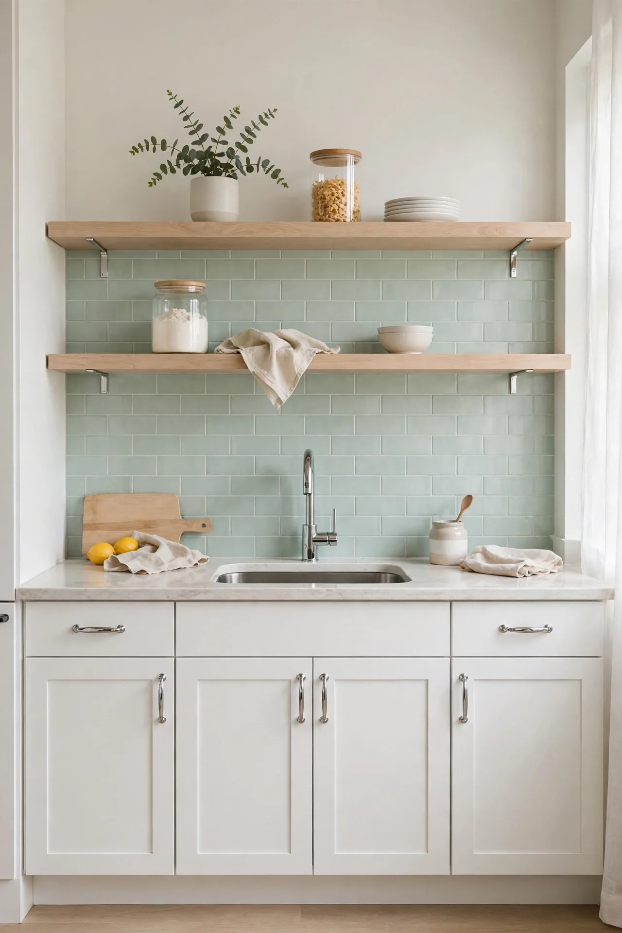
- Choose handmade-look mint tiles with slight color variation for depth.
- Pair with simple white shaker cabinets so the tile stays the star.
- Use light gray grout to keep the look soft and easy to clean.
- Extend the tile to the ceiling behind open shelves for extra impact.
- Add under cabinet lighting to make the mint tiles glow after dark.
A mint backsplash adds color without the commitment of painted cabinets. The pale green reflects light and makes small kitchens feel larger. I’ve noticed this pairing works especially well in rentals and first homes. Seal the grout yearly to keep the fresh look intact.
Hunter Green Elegance
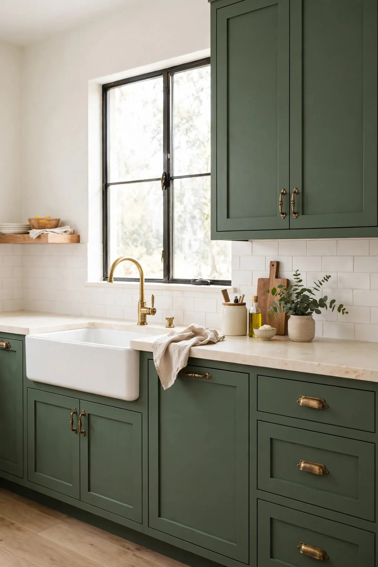
| Finish | Look | Best With |
| Matte hunter green | Soft, modern | Brass hardware |
| Glossy hunter green | Rich, classic | Marble counters |
| Two-tone hunter | Balanced | White uppers |
| Hunter island only | Modern | White perimeter |
Hunter green brings timeless elegance that suits traditional and transitional kitchens. The deep tone feels established, like it has always belonged in the room. Pair with honed marble counters and classic bin pulls for heritage charm. Keep walls warm white so the green stays rich rather than heavy. Test the shade against your flooring first, since hunter green shifts noticeably with undertones. This shade rewards patience, so live with samples for a few days.
Pistachio Pantry Pop
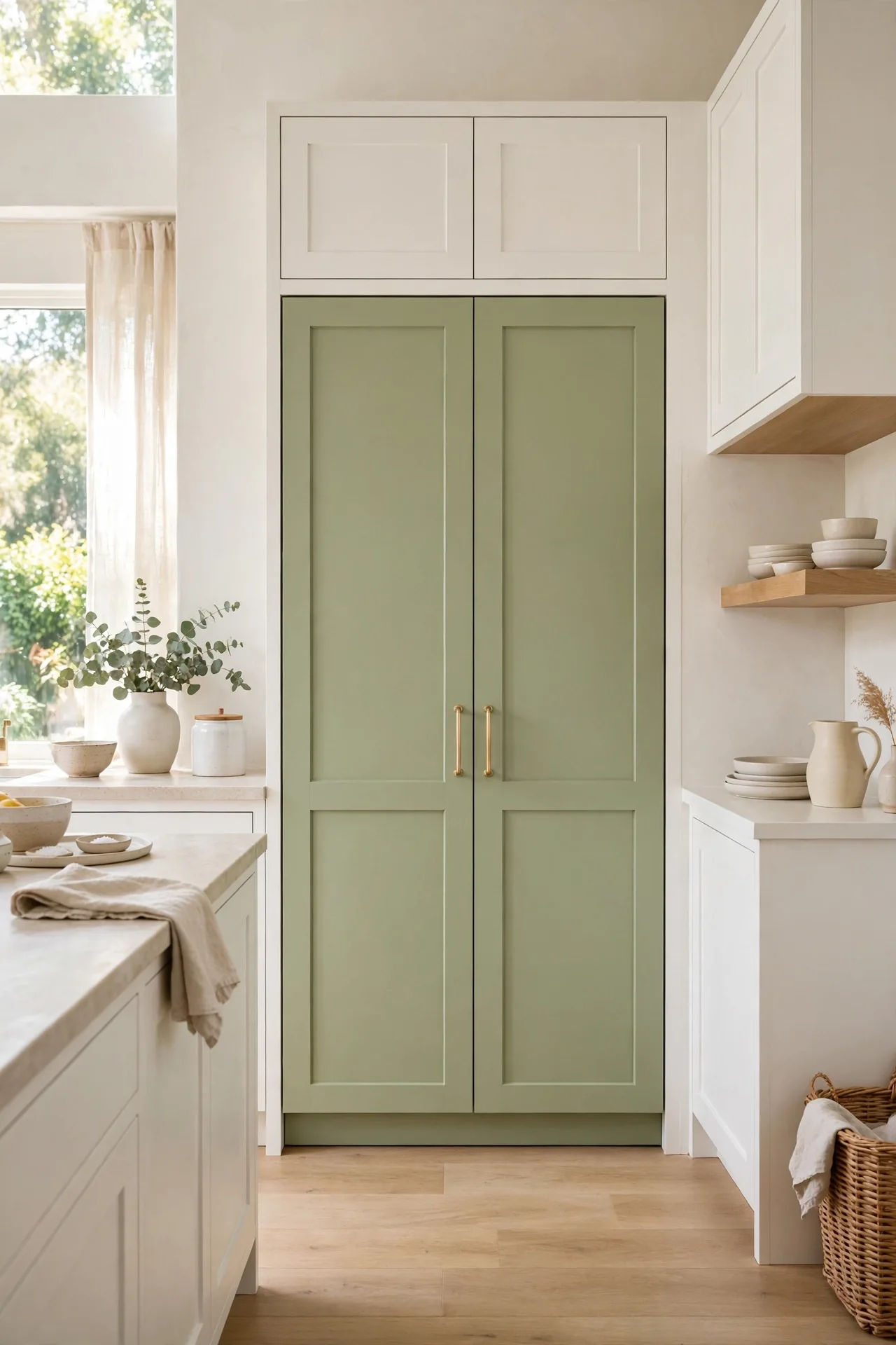
DO: Paint a freestanding pantry or hutch in pistachio for a low risk color pop.
DO: Echo the shade in small accessories like a kettle or storage jars.
DO: Balance the sweetness with matte black or bronze hardware.
DON’T: Paint every cabinet pistachio; the soft tone works best as an accent.
DON’T: Pair with neon or high gloss finishes that fight its gentle vibe.
DON’T: Forget primer, since light greens need an even base to glow.
A pistachio pantry delivers cheerful color without overwhelming the kitchen. The pale green feels fresh and playful, perfect for casual family spaces. Keep surrounding cabinets white or cream so the pantry stays the happy focal point. This trick costs little but transforms the room’s mood completely.
Dark Green Drama
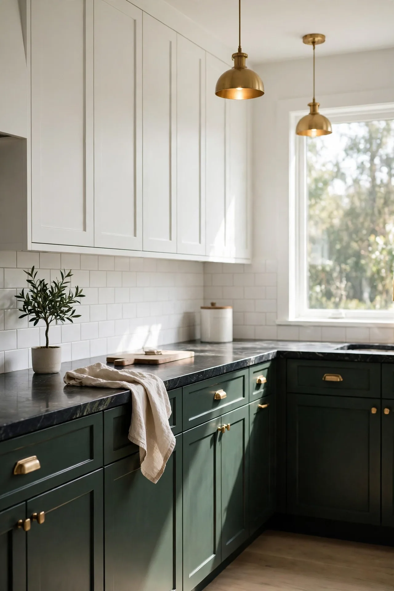
Cost: Medium | Time: One weekend | Skill Level: Intermediate | Best For: Bold transformations
Dark green cabinets create instant drama and sophistication. The near black green tone adds depth that flat black cannot match. Pair with warm metals and pale counters to keep the look balanced. Good lighting is essential, so add under cabinet strips and a statement pendant. This bold choice suits homeowners who want their kitchen to feel intentional and unforgettable. Choose a satin finish that reflects just enough light to show the green undertone. Pair dark lowers with white uppers to keep the room balanced and bright. Add potted herbs on the sill for a touch of living green.
Moss Cabinet Warmth
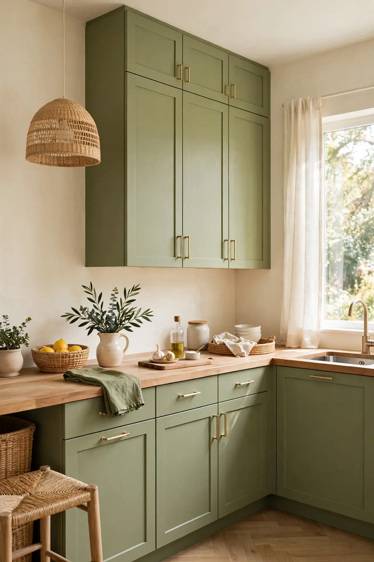
Moss green cabinets wrap a kitchen in earthy warmth. The grayed green tone feels organic and grounding, like bringing the garden indoors. It pairs naturally with wood, stone, and cream finishes. In my experience, moss works beautifully in kitchens with lots of natural texture. It works in both small galley kitchens and large open plans.
Style with open wood shelves and handmade ceramics for a collected feel. Keep hardware simple, like aged bronze or matte black. Add a jute runner to reinforce the natural vibe. This combination creates a kitchen that feels calm, warm, and welcoming. A vintage rug in muted tones completes the earthy, collected look.
Teal Green Twist
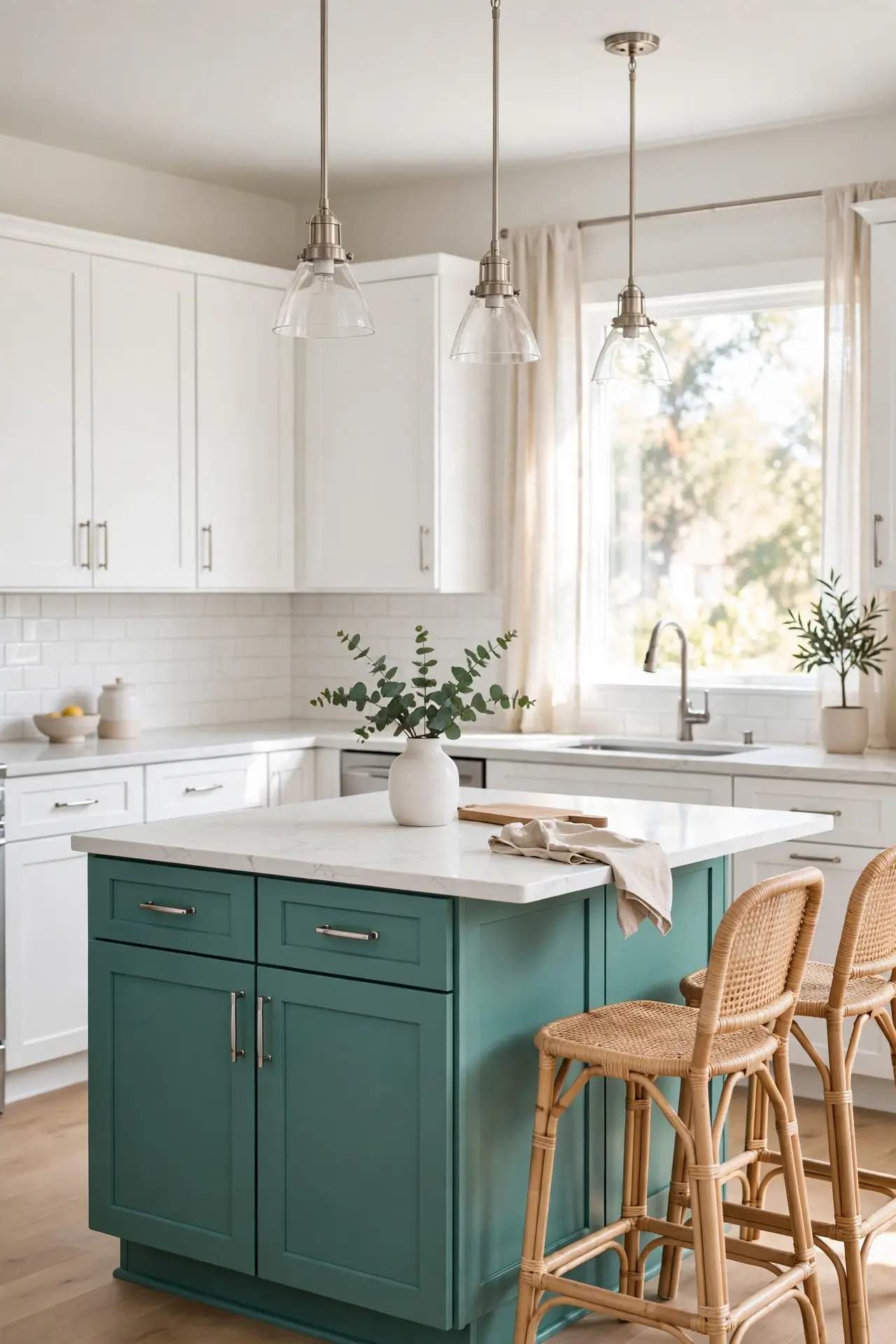
- Use teal on the island only for a jewel toned focal point.
- Balance the blue green with warm white perimeter cabinets.
- Add brushed gold hardware to bridge the cool and warm tones.
- Repeat teal in textiles like a runner or seat cushions.
- Keep walls a warm white so the teal island stays the hero.
Teal green adds playful energy while staying sophisticated. The blue undertone keeps it fresh and coastal in feel. This twist works well in kitchens that need personality without going dark. Keep the rest of the palette simple so the teal can shine. This color loves natural light, so position the island near windows when possible.
Soft Celadon Calm
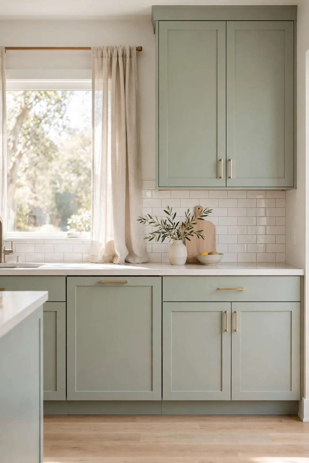
Quick Tip: Celadon looks best with warm lighting, since cool bulbs can make it appear gray. Choose bulbs around 2700K for a cozy glow that flatters the pale green. Layer under cabinet lights with pendants so the color stays luminous after dark. Avoid pairing celadon with stark white, which can make it look washed out.
Soft celadon cabinets create a spa like calm in the kitchen. The pale gray green tone soothes without disappearing. Pair with white quartz and light oak for an airy feel. This gentle shade suits small kitchens, where it reflects light and keeps the space feeling open. A soft patterned rug adds comfort without disturbing the calm.
Deep Jade Accents
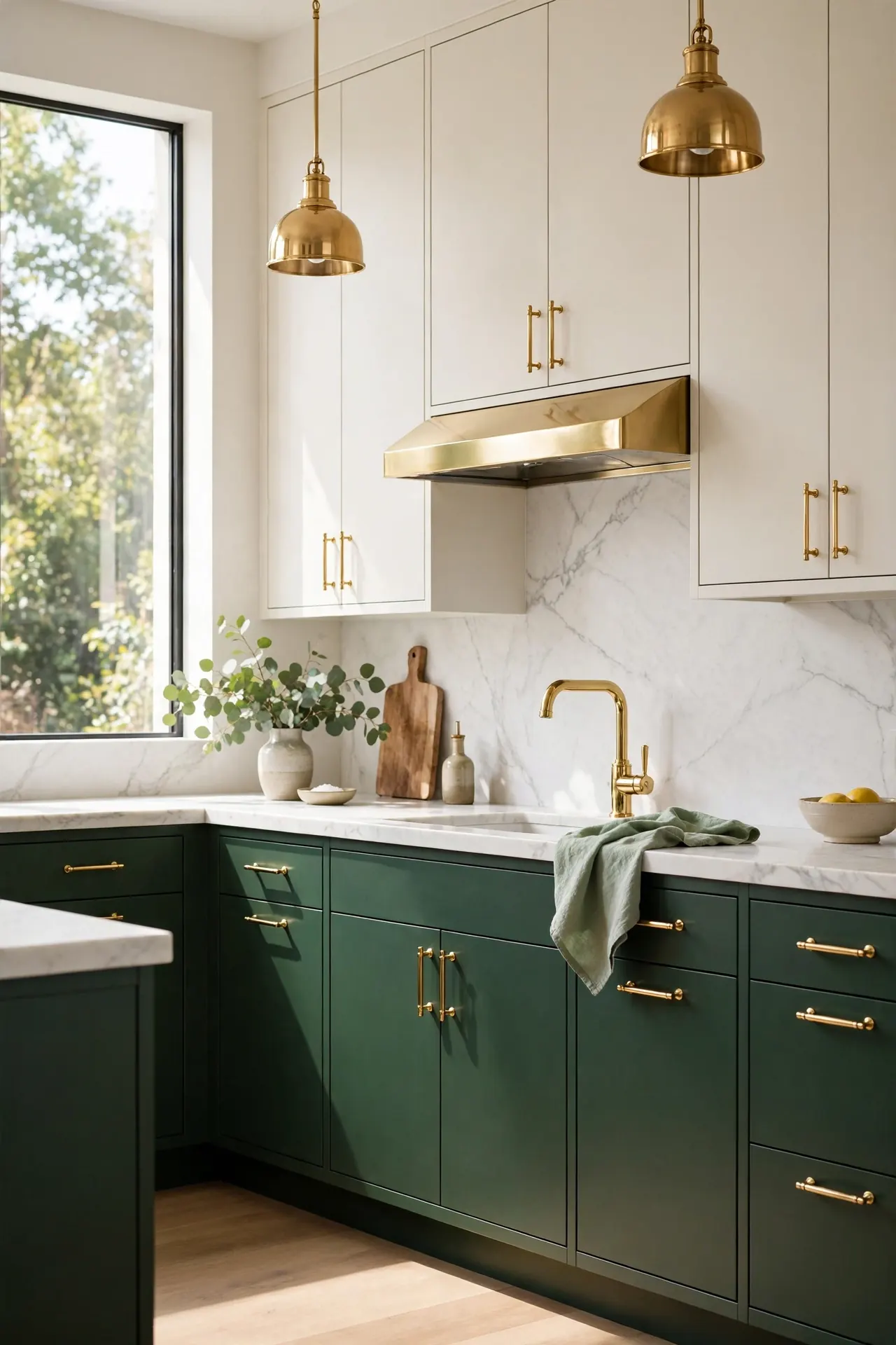
BEFORE: The kitchen feels flat with all white cabinets and chrome hardware. Nothing draws the eye, and the space lacks warmth or character.
AFTER: Deep jade base cabinets ground the room with jewel toned richness. Brass hardware glows against the green, and the kitchen gains instant luxury.
Deep jade works best as an accent on lowers or an island. The saturated tone needs breathing room, so keep uppers light. Pair with marble and warm metals for a high end look. That’s why many experts recommend using jewel tones in doses rather than everywhere. A jade island with waterfall edges makes the strongest statement.
Seafoam Fresh Pairing
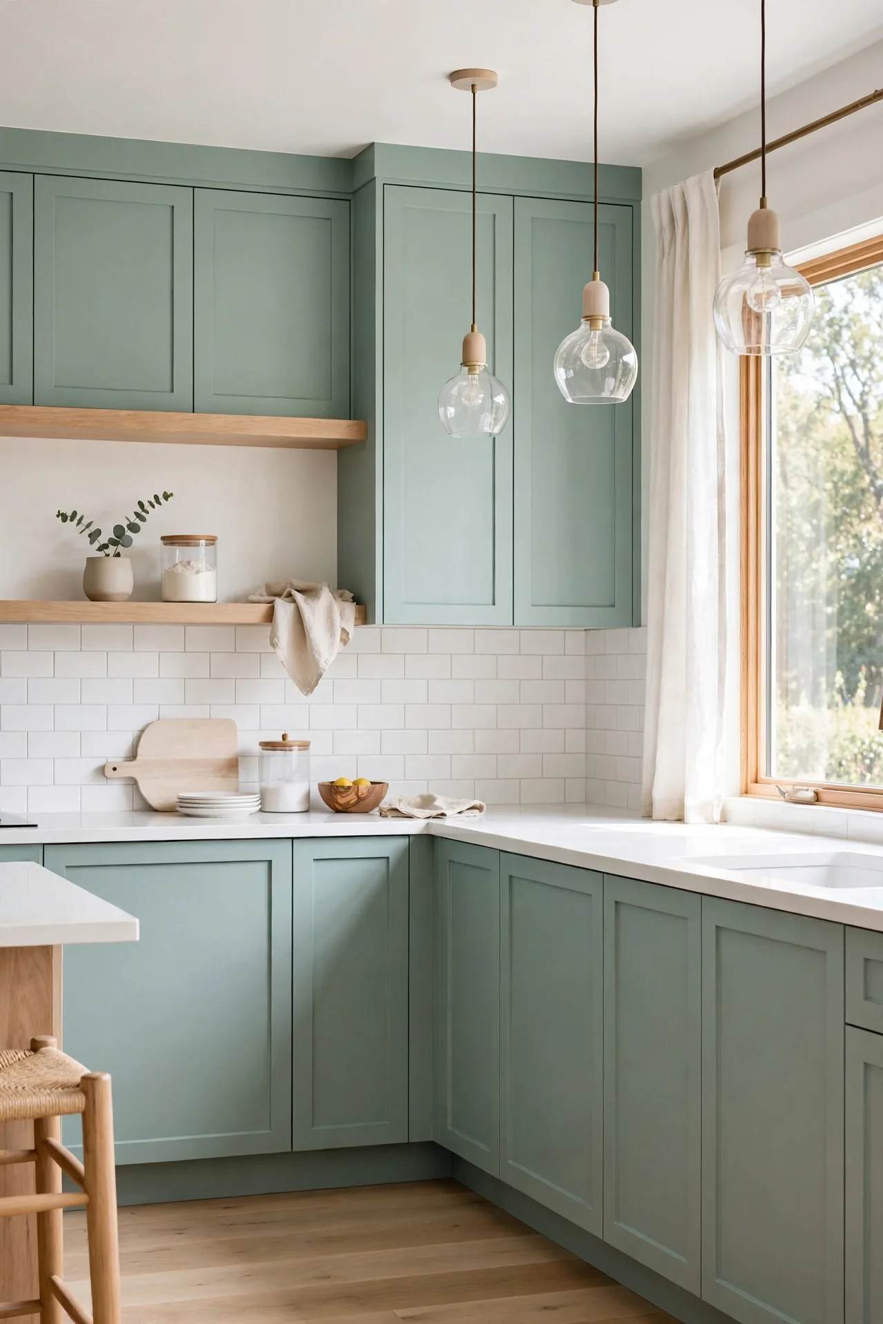
- Paint cabinets in soft seafoam green with a satin finish.
- Choose white quartz counters to keep the look crisp.
- Add pale wood open shelves for warmth and display space.
- Finish with polished nickel hardware for a clean shine.
- Add woven bar stools to reinforce the breezy coastal mood.
Seafoam green brings breezy, coastal freshness to any kitchen. The light tone keeps small spaces feeling open and bright. I’ve noticed this pairing delights homeowners who want color without darkness. Wipe cabinets regularly, since pale greens show splatters more than dark shades. This fresh pairing suits beach houses and bright family kitchens alike.
Fern Green Warmth
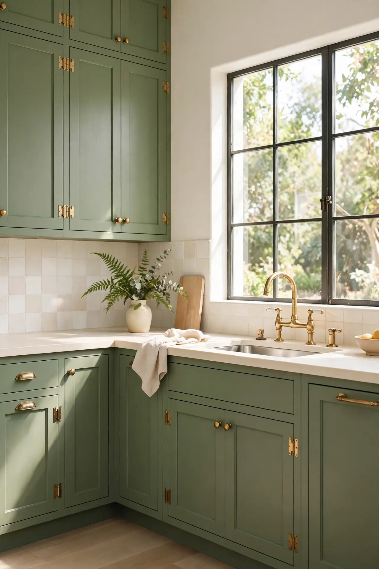
| Application | Effect | Pair With |
| Full fern cabinets | Cozy, enveloping | Cream counters |
| Fern island | Focused pop | White perimeter |
| Fern pantry wall | Charming accent | Oak floors |
| Fern plus brass | Warm luxury | Marble backsplash |
| Fern backsplash | Subtle color | Neutral cabinets |
Fern green offers warmth that cooler greens cannot match. The yellow undertone feels sunny and welcoming, even on cloudy days. Pair with cream, brass, and natural wood for a layered look. Keep the palette warm throughout so the fern tone feels intentional. This shade suits farmhouse and cottage kitchens beautifully. Add copper accents for extra warmth against the green. Style with wooden cutting boards and ceramic crocks for farmhouse charm.
Bottle Green Richness
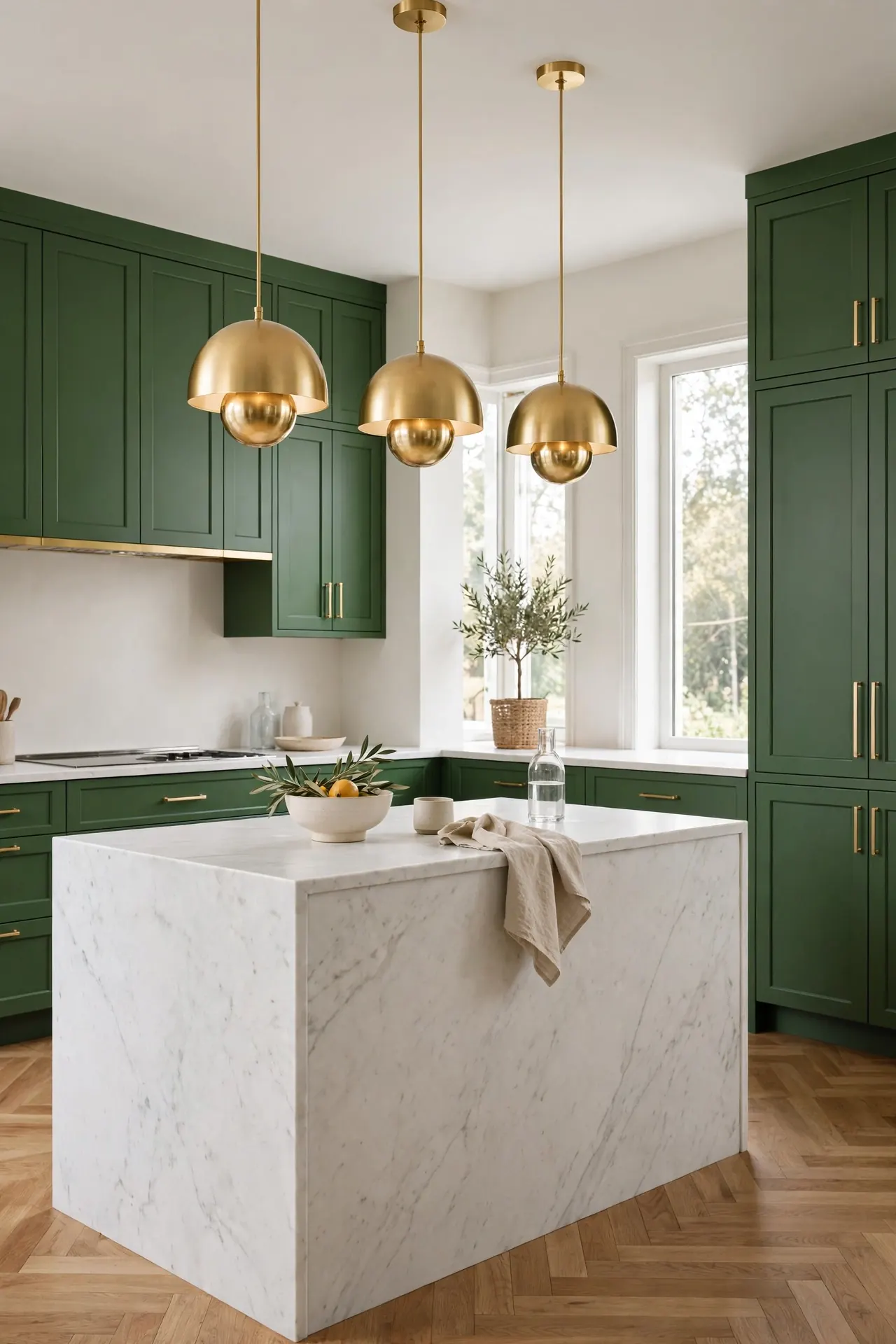
DO: Use bottle green on lower cabinets to ground a tall kitchen.
DO: Pair with honed black granite for a moody, cohesive look.
DO: Add glass front uppers to lighten the deep tone.
DON’T: Combine with dark floors, which can make the room feel cave like.
DON’T: Skimp on lighting; deep green needs generous illumination.
DON’T: Mix with competing bold colors that fight for attention.
Bottle green delivers old world richness with modern polish. The deep tone feels luxurious against marble and brass. Keep ceilings and uppers light to balance the depth. This combination creates a kitchen that feels both historic and completely current.
Avocado Retro Charm
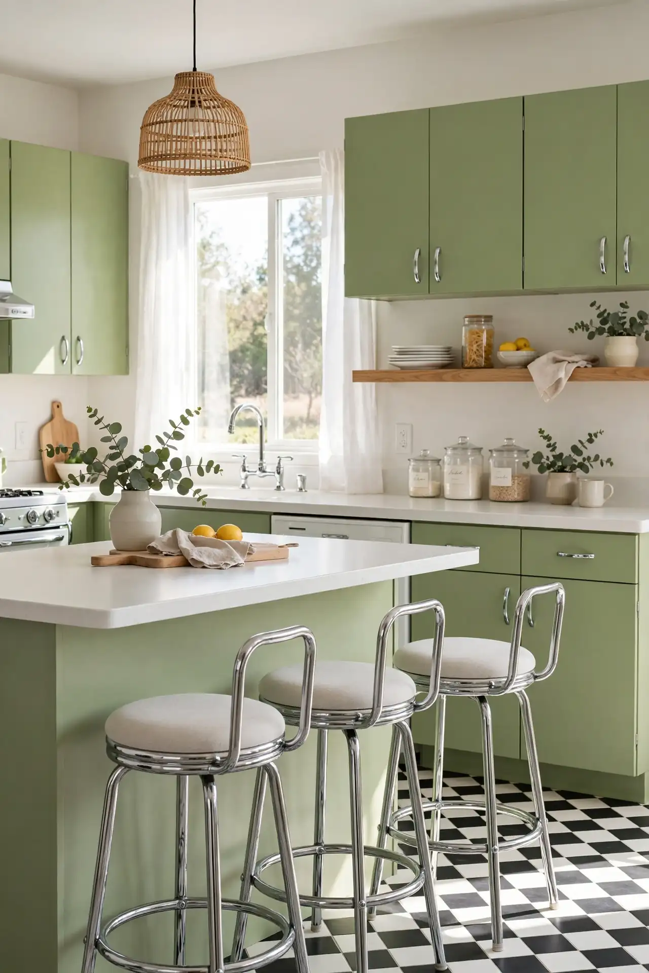
Cost: Low | Time: One weekend | Skill Level: Beginner | Best For: Retro lovers
Avocado green brings playful retro charm straight from the seventies. The yellow green tone feels cheerful and nostalgic. Pair with white appliances and chrome details for authentic vintage vibes. Keep the rest simple so the color reads fun, not dated. This bold throwback suits homeowners with a sense of humor. Hunt vintage shops for authentic chrome and laminate pieces. A starburst clock or retro radio completes the playful theme. Keep counters clear so the cheerful color takes center stage. This look rewards bold styling, so have fun with it.
Eucalyptus Soft Touch
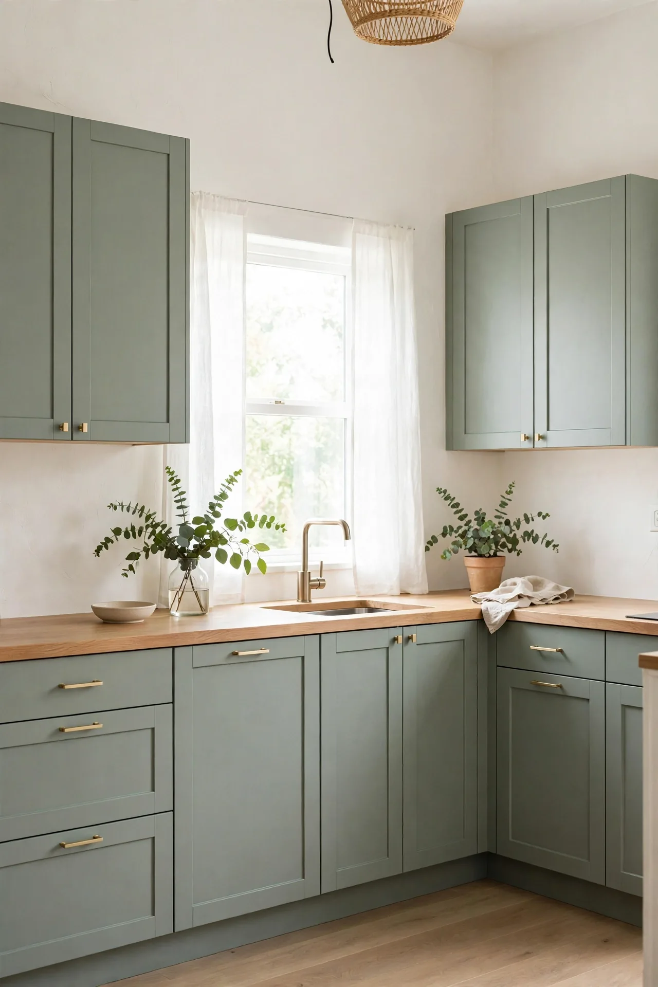
Eucalyptus green offers the softest take on green cabinetry. The gray green tone whispers rather than shouts, creating serene kitchens. It blends beautifully with beige, cream, and light wood. In my experience, this shade pleases even color shy homeowners. It never shouts, yet the kitchen never feels plain.
Layer with natural textures like linen, rattan, and unfinished wood. Keep hardware minimal in brushed nickel or soft brass. Add plenty of plants to echo the botanical tone. The result is a kitchen that feels like a deep breath. A simple white backsplash keeps the focus on the gentle green. This is minimalism with warmth.
Pine Green Pairing
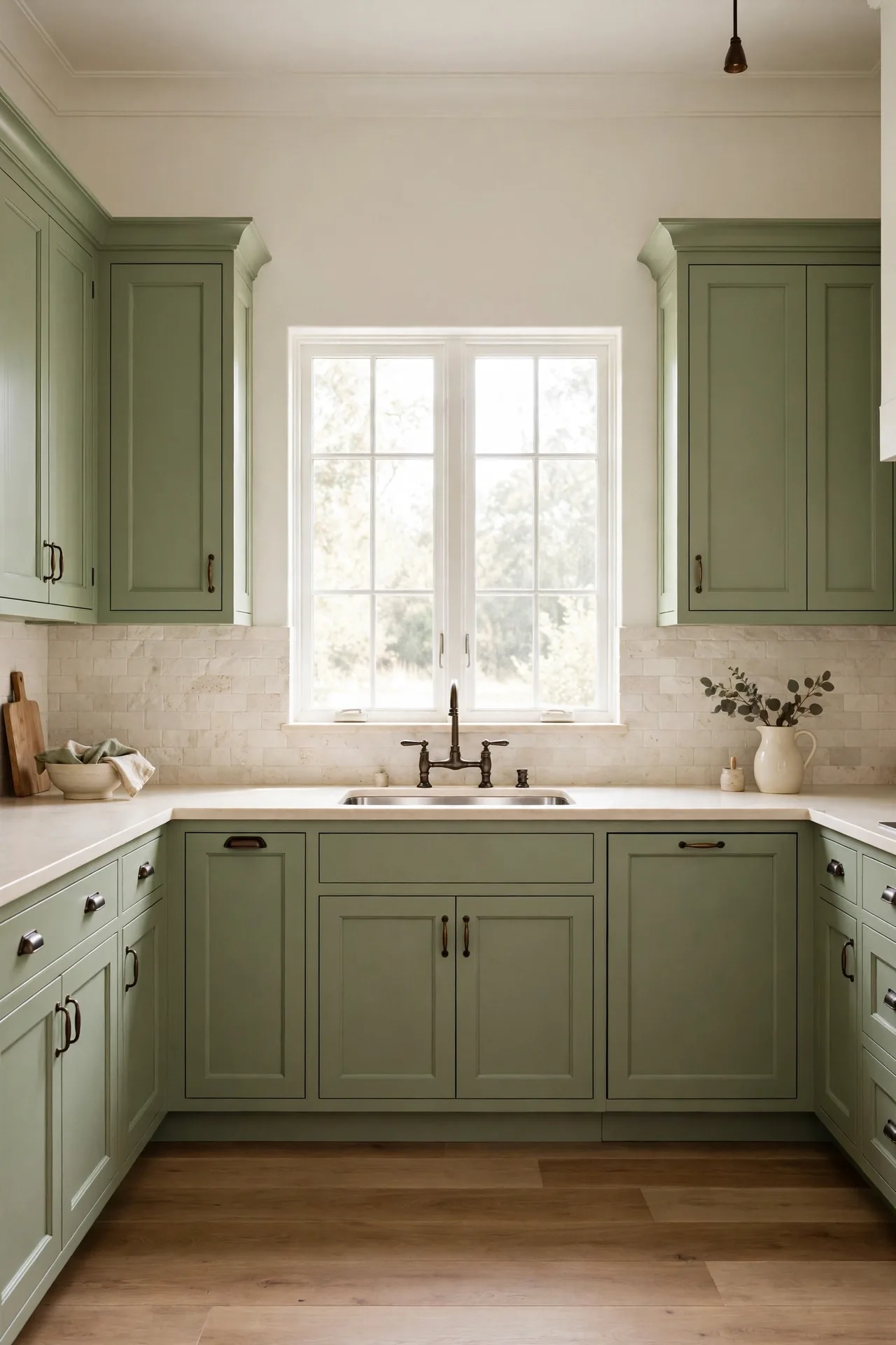
- Pair pine green cabinets with warm white walls for classic contrast.
- Choose dark bronze hardware to echo the woodsy green tone.
- Add a cream stone backsplash for timeless, natural texture.
- Style open shelves with wood and ceramic for organic warmth.
- Add a Persian style runner for classic pattern and warmth.
Pine green pairs beautifully with natural materials and warm neutrals. The deep woodland tone feels timeless and sturdy. If you love rich cabinet colors, these navy blue kitchen cabinet ideas offer a similarly moody alternative. Keep lighting warm so the deep green glows rather than recedes. The deep tone hides wear beautifully in busy family kitchens.
Chartreuse Accent Pop

Quick Tip: Chartreuse is powerful, so limit it to one zone like a coffee bar or island. The yellow green energizes instantly, but too much can overwhelm. Balance with plenty of white and natural wood to keep the pop playful. Sample the shade on a large board first, since screens lie about yellow greens.
A chartreuse accent adds electric energy to a neutral kitchen. The vivid tone feels modern and daring. Use it where you want a jolt of joy, like a bar area or pantry door. Keep everything else calm so the accent stays a delightful surprise. Guests will remember this playful detail long after they leave.
Willow Green Serenity
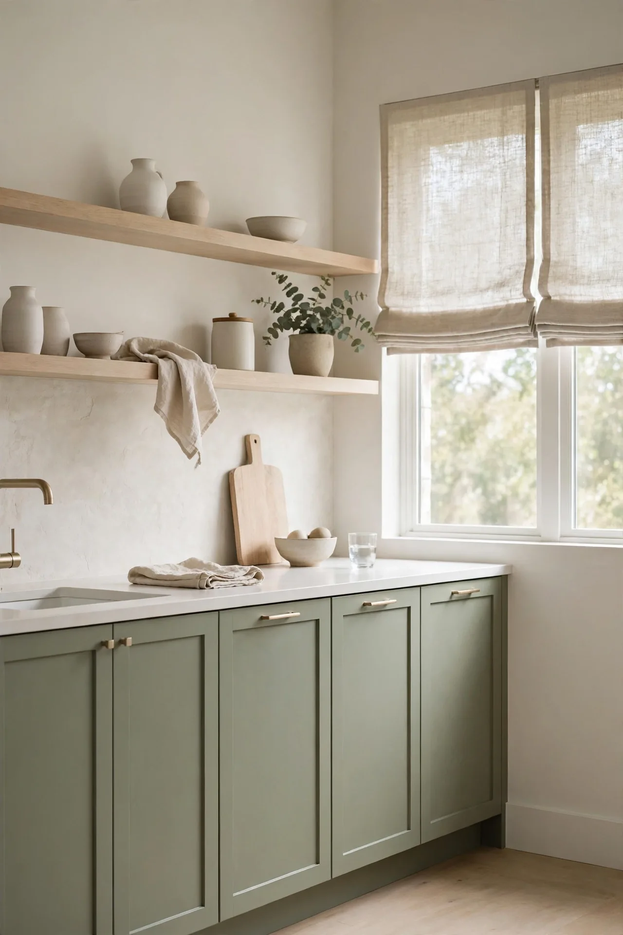
BEFORE: The kitchen feels stark and cold with gray cabinets and steel finishes. The space works hard but never invites lingering.
AFTER: Willow green cabinets soften every edge with gentle, watery color. Natural wood and cream textiles complete the calm, and the kitchen becomes a retreat.
Willow green suits homeowners craving tranquility. The muted blue green tone calms without feeling sleepy. Pair with light wood and soft textiles for a serene effect. Keep clutter minimal so the peaceful palette can truly shine. Add sheer curtains to filter light softly across the green. A small vase of branches reinforces the natural, watery mood.
Basil Fresh Cabinets
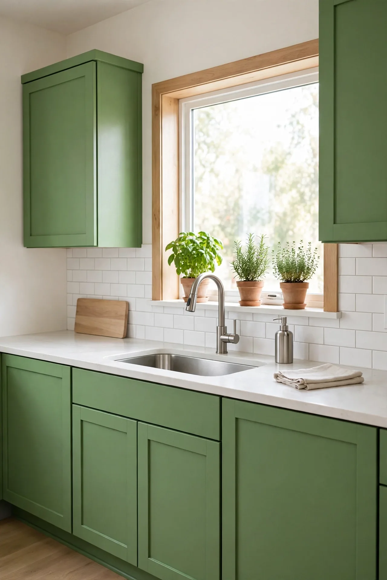
- Select a fresh basil green paint with a satin sheen.
- Pair with white uppers to keep the look bright and balanced.
- Add stainless appliances for a crisp, modern edge.
- Style with potted herbs that echo the cabinet color.
- Finish with simple bar pulls in brushed nickel.
- Keep counters mostly clear to let the fresh color breathe.
Basil green brings garden fresh vibrancy to the kitchen. The lively tone energizes without overwhelming. I’ve seen this work well in many cases where families want a cheerful cooking space. Choose a scrubbable paint finish, since bright greens show fingerprints near handles. This cheerful shade makes morning coffee feel like an event.
Cypress Dark Elegance
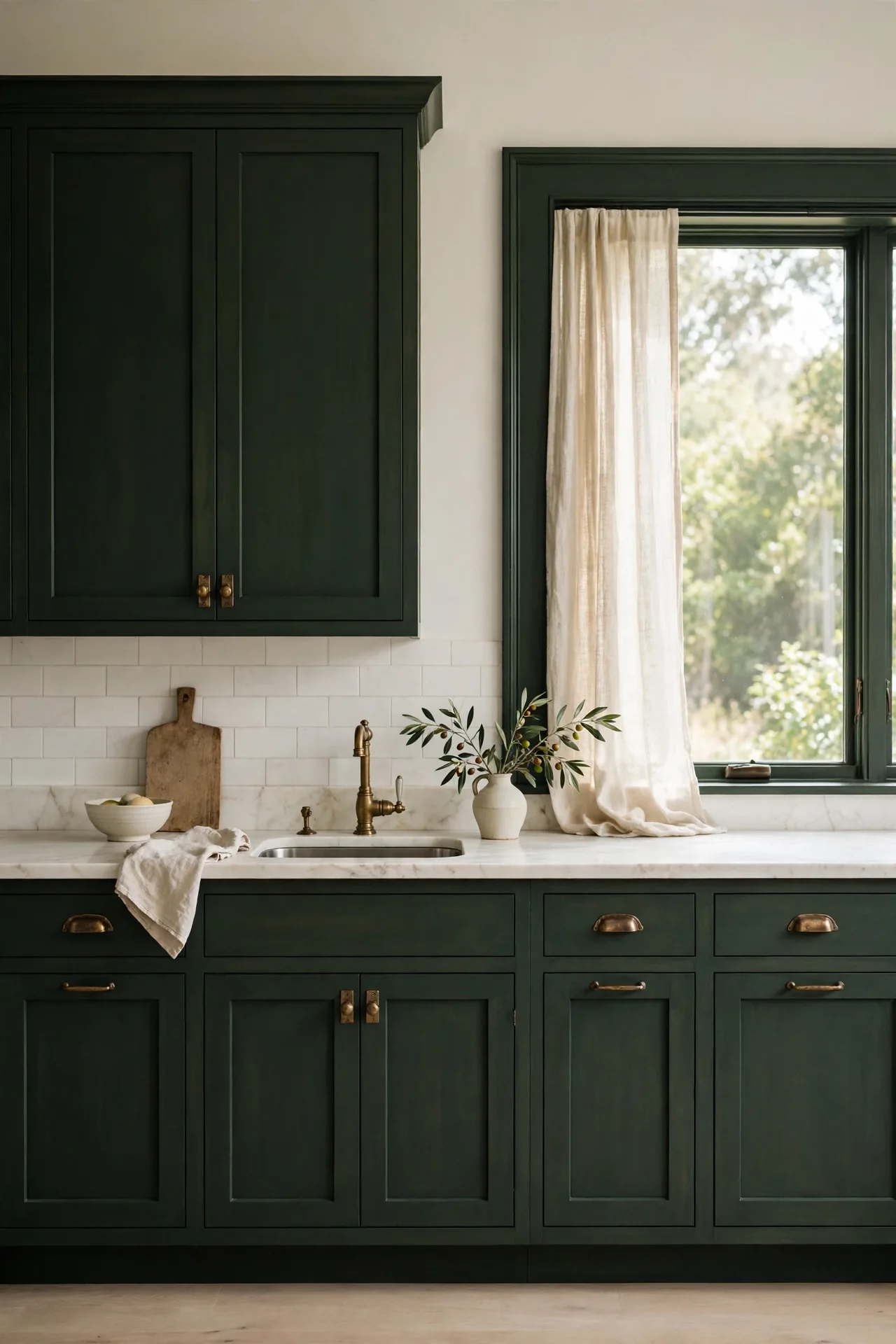
| Element | Choice | Why It Works |
| Cabinets | Dark cypress green | Rich, enveloping depth |
| Counters | Ivory marble | Lightens the mood |
| Hardware | Aged brass | Warm metallic glow |
| Backsplash | Cream handmade tile | Soft artisanal texture |
| Lighting | Warm pendants | Softens dark tones |
Cypress green delivers dark elegance without the harshness of black. The deep tone feels sophisticated and enveloping. Pair with ivory, brass, and handmade textures for quiet luxury. Keep the layout uncluttered so the rich color remains the star. This refined combination suits formal and modern kitchens alike. Add a large mirror or glass fronts to bounce light around. The result feels like a private club, refined and calm.
Conclusion
Choosing the right green comes down to light, mood, and the finishes you already love. These green kitchen cabinet combinations prove that green works in every kitchen style, from soft sage farmhouses to dramatic emerald showpieces. I’ve seen how small changes like these can completely shift the way a space feels each morning. Start with one combination that matches your light and budget, then build around it. Save this guide on Pinterest for your remodel planning, and share it with a friend dreaming of a colorful kitchen. Your fresh new kitchen is closer than you think. Your dream kitchen starts with a single confident color choice.