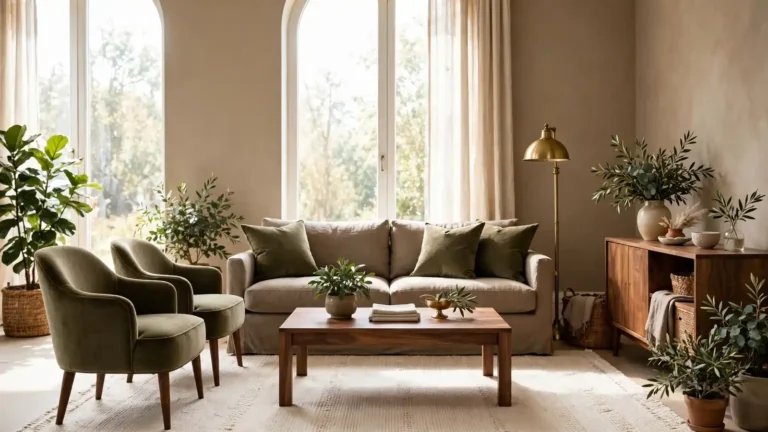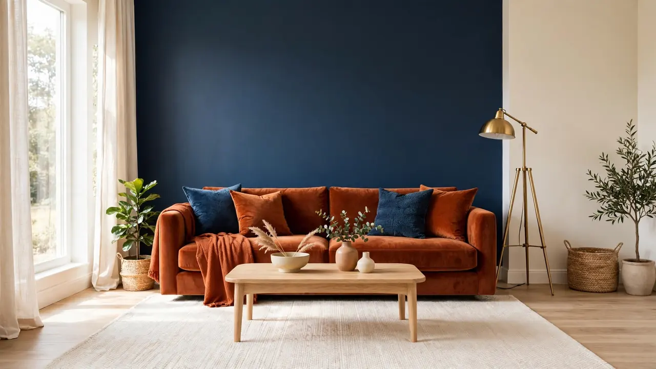
21 Rust and Navy Blue Living Room Decor Ideas for Rich Contrast
Rust and navy sound like rivals, yet together they make one of the richest pairings a living room can wear. Warm rust and navy blue living room decor works because the two colors balance each other: rust brings sunset warmth, navy brings depth and calm. Add cream walls and light wood, and the contrast turns elegant instead of loud. The twenty one rooms ahead show exactly how to dose each color with confidence.
None of these rooms shout. Each one layers the pairing in a different proportion, so small apartments and big open plans both find a version that fits. Wood, wool, brass, and leather keep the palette grounded, the same way modern lodge interior design ideas use stone and timber to steady a room. Start with the sofa, because the biggest seat in the room sets the color ratio for everything else that follows.
Rust Velvet Sofa
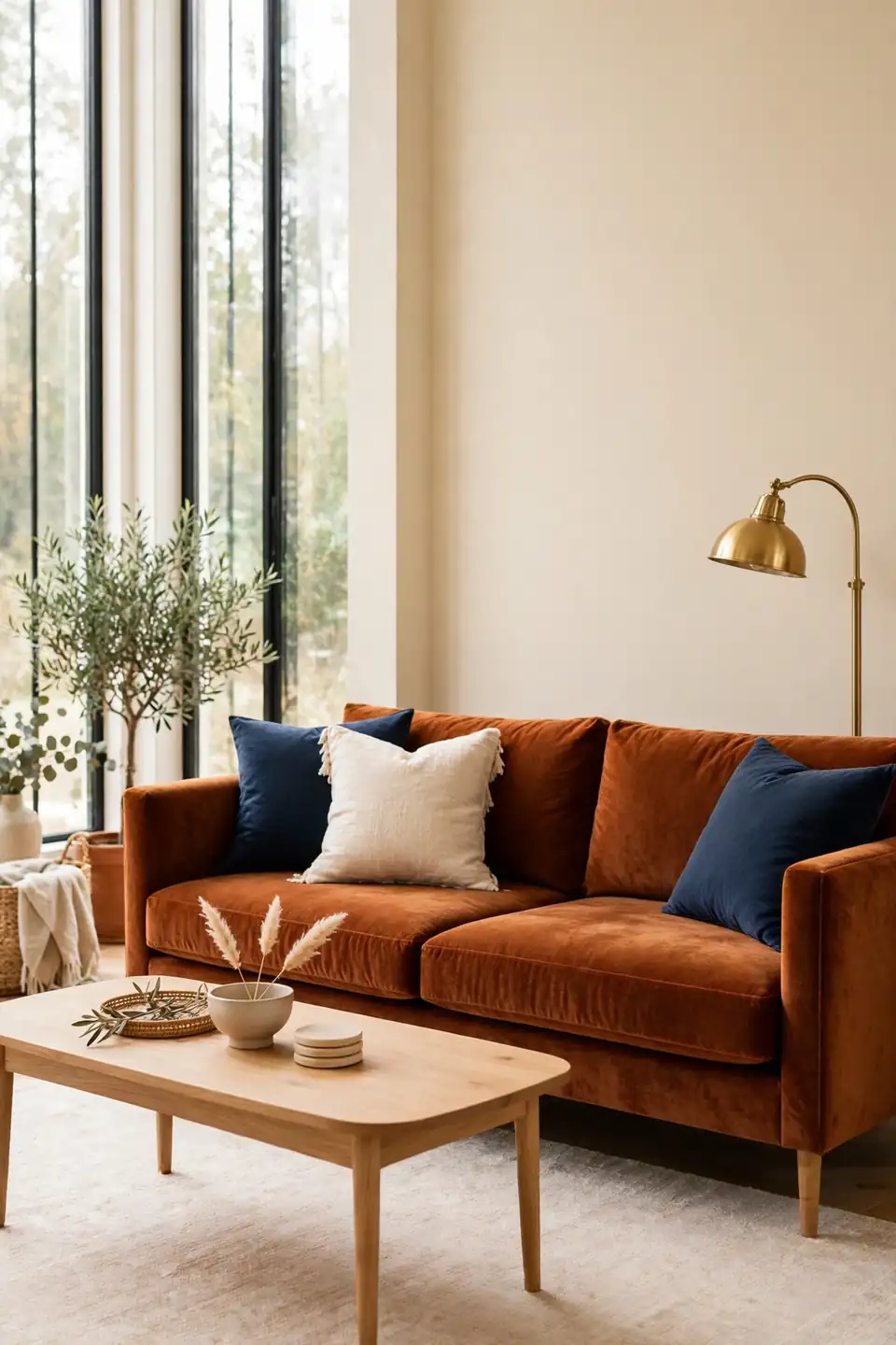
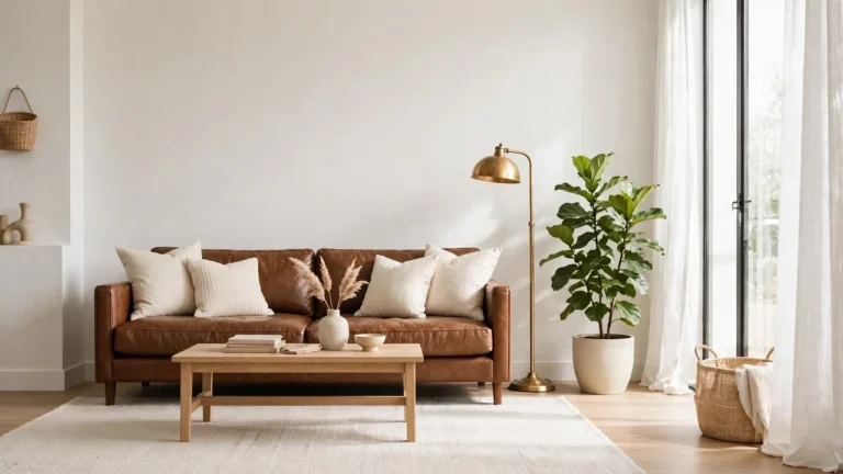
A rust velvet sofa is the boldest way to open this pairing, and it earns the attention honestly. Velvet catches window light and shifts from burnt orange to deep terracotta across the day, so the sofa never looks flat. Keep the cushions simple in cream linen, and let one navy throw fold over the arm to set up the contrast.
Placement decides how strong the rust reads. Centered on the longest wall, the sofa becomes the room’s anchor and everything else can stay quiet. A light wood coffee table and a pale rug keep the base calm under all that warmth. In my experience, one strong sofa beats five small rust accessories every single time.
Navy Accent Wall
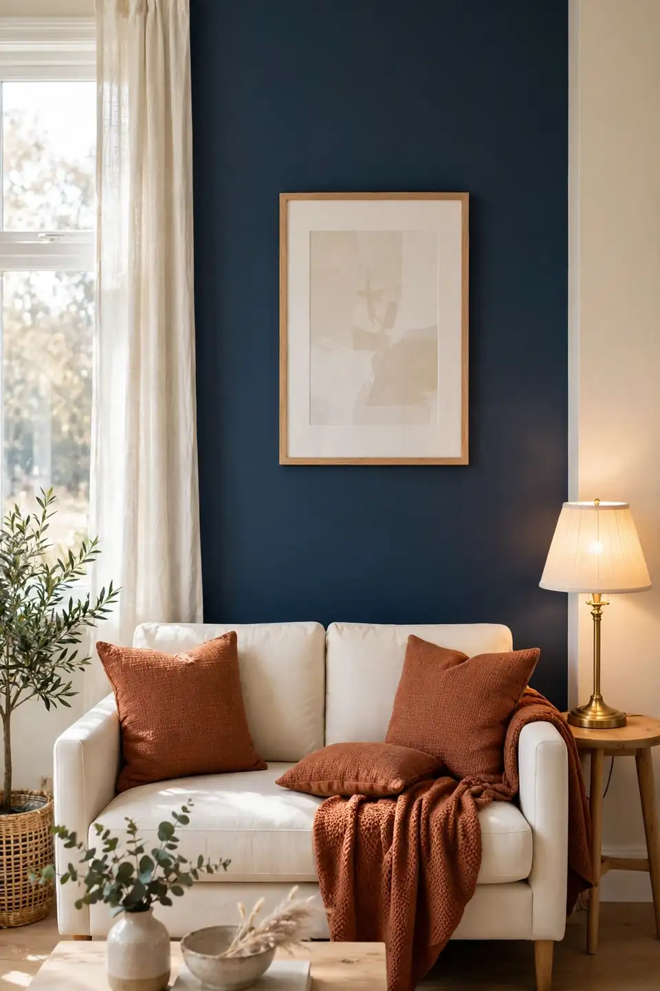
- Paint the wall behind the sofa for instant depth
- Choose a matte finish so navy reads soft, not shiny
- Leave the other three walls warm cream or ivory
- Hang one large light artwork to break the darkness
- Repeat navy once more in a cushion or lamp base
One navy wall changes the temperature of the whole room without a single new furniture purchase. The trick is contrast placement: rust and warm wood sit in front of the dark wall, pale pieces sit on the cream sides. That split keeps navy feeling tailored instead of heavy, even in a small room with modest windows and low ceilings.
Layered Patterned Rug
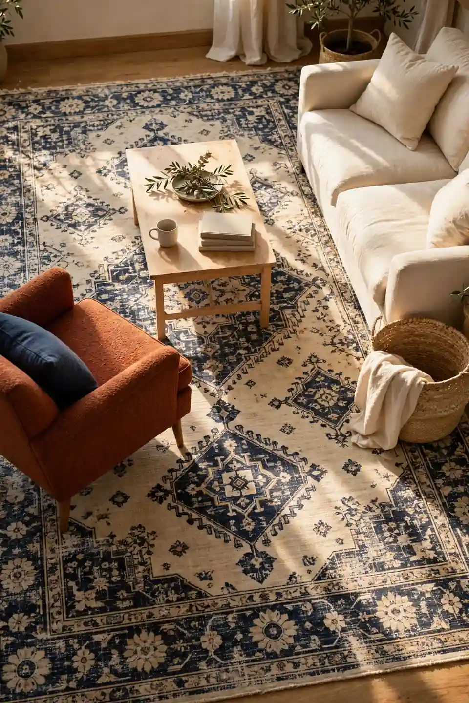
Quick Tip: Lay a cream and navy patterned rug first, then pull your rust shades straight from its pattern. When the rug holds both colors, every cushion and throw you add later looks chosen rather than matched, and swapping accents next season stays simple. Order the largest size the budget allows; a small rug shrinks the room faster than dark paint ever could.
A patterned rug is the cheapest peace treaty between two strong colors. The pattern breaks rust and navy into small doses, so the eye reads texture instead of blocks. Choose a flat weave for high traffic rooms, and size up: the front legs of every seat should land on the rug.
Warm Wood Balance
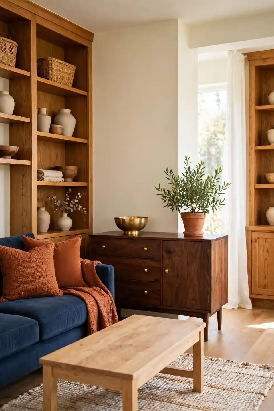
BEFORE: The room felt cold and split. Navy cushions sat on a grey sofa, rust appeared in one lonely pillow, and pale laminate floors washed every color out before the light could warm them.
AFTER: Warm oak shelves, a walnut sideboard, and honey toned floorboards now bridge the two colors. Rust glows against the grain, navy deepens beside it, and the room finally reads as one clear idea.
Wood is the translator in this palette because both colors live in nature beside it. Match the wood tone to the rust family, warm and mid toned, and navy will deepen without turning icy. Keep metal accents minimal here; the grain is already doing the decorating.
Brass Accent Touches
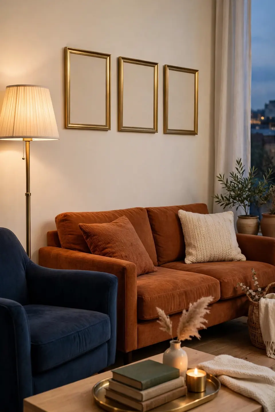
- Swap one lamp for a brushed brass floor lamp beside the main chair
- Add brass picture frames above the sofa, aligned with its edges
- Place a brass tray on the coffee table to hold books and remotes
- Fit brass handles on the media console and sideboard doors
- Stop at four touches per room so each one stays noticeable
Brass works here because it sits between the two colors in temperature, warmer than navy, cooler than rust. Small hits of it catch light and make both colors look richer by comparison. Keep the finish brushed rather than polished; a soft sheen feels collected, while mirror shine tips the room toward formal.
Velvet Versus Linen
| Velvet | Linen |
|---|---|
| Feels plush and rich in rust tones | Feels airy and relaxed in navy |
| Catches light and shifts shade hourly | Stays even and calm all day |
| Needs brushing and gentle spot cleaning | Washes easily and dries fast |
| Suits formal rooms and bold schemes | Suits casual rooms and family wear |
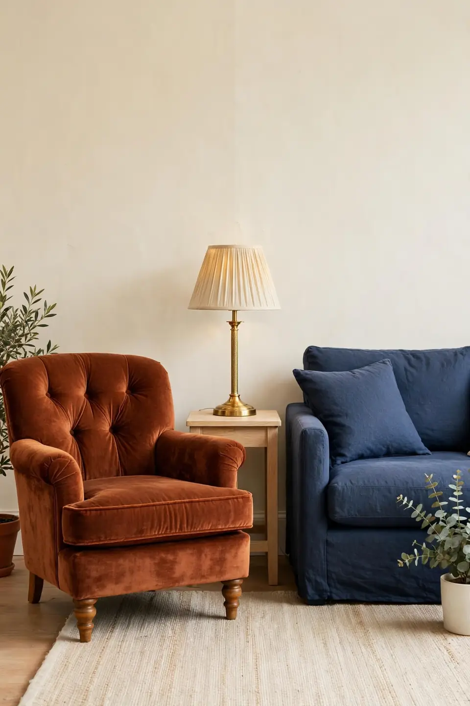
Most rooms in this palette end up mixing the two, and that mix is the real answer. Velvet carries the statement piece, usually the sofa or two chairs, while linen handles curtains, cushions, and everyday seating. The pairing keeps rust luminous and navy breathable in the same square footage and the same decorating budget.
Cream Backdrop Calm
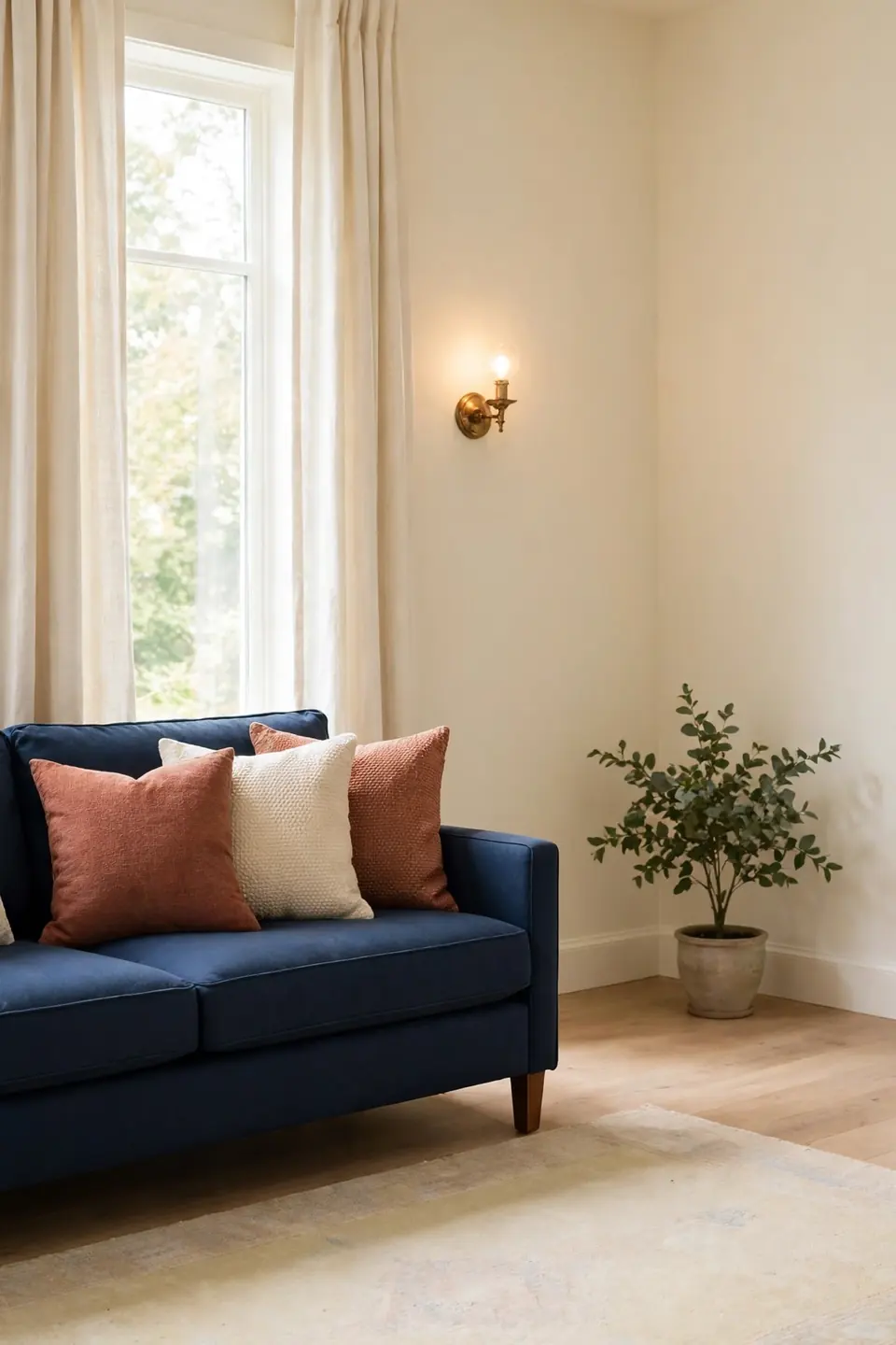
Do:
- Paint walls warm cream to soften contrast
- Choose cream curtains that pool slightly
- Layer two cream textures on every seat
- Keep the ceiling one shade lighter still
Don’t:
- Reach for stark icy white paint anywhere
- Fill every surface with bold color
- Mix three different cream tones randomly
- Block windows with heavy dark drapes
Cream is the referee that lets rust and navy share a room without a fight. Against cream, rust reads warmer and navy reads deeper, yet neither shouts. Bare cream corners are fine too; empty space around strong color is what keeps the scheme feeling designed rather than decorated all at once.
Budget Contrast Refresh
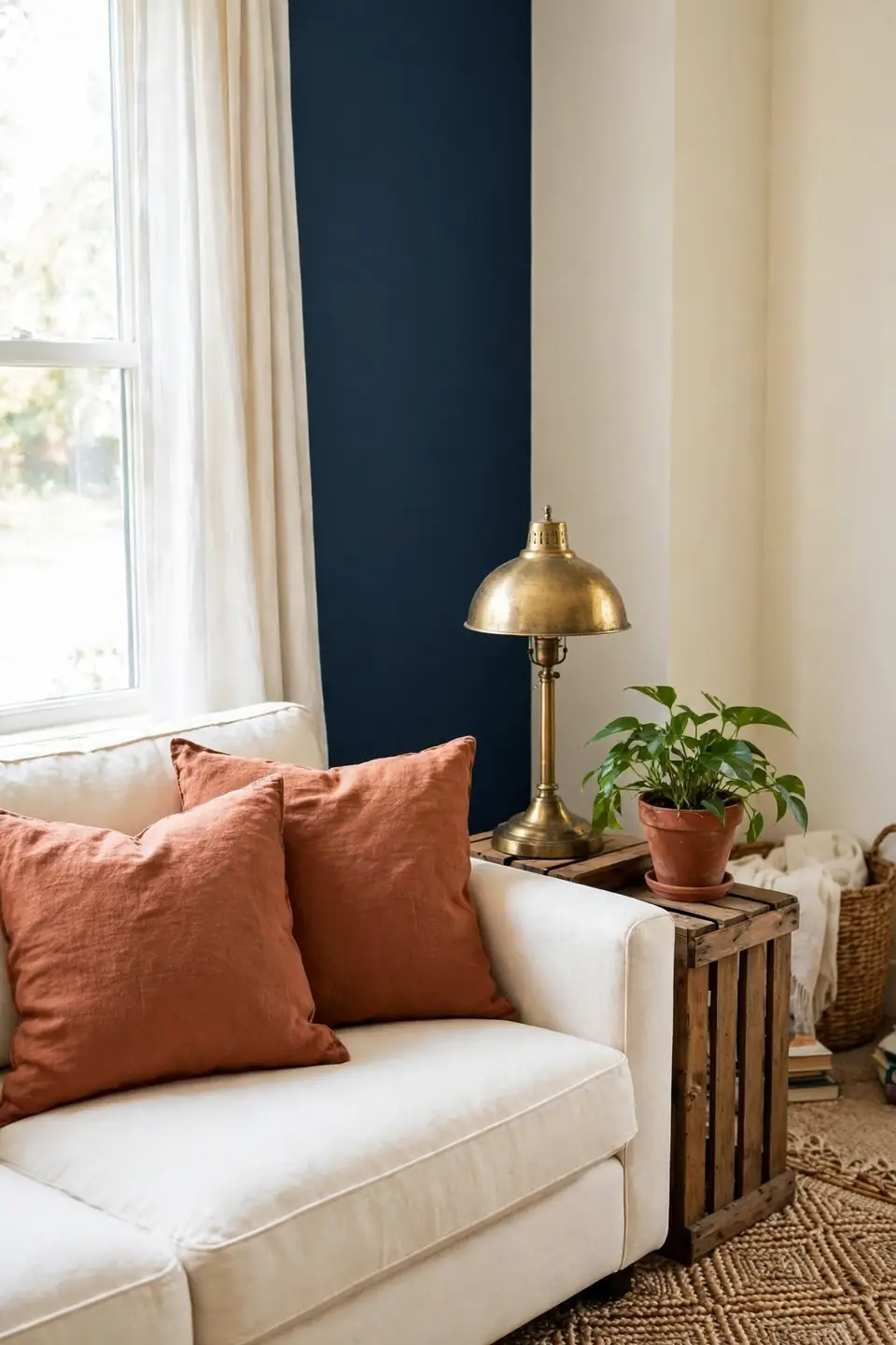
Cost: Low, since paint, cushions, and thrift finds carry the change
Time: One weekend for painting, one evening for styling
Skill Level: Beginner, needing only a roller, tape, and patience
Best For: Small living rooms that feel flat and grey
Strong color pairs forgive small budgets because the contrast itself does the decorating. One tin of navy paint, two rust cushion covers, and a secondhand brass lamp change a room more than a costly beige sofa ever will. Shop the home first: move the warmest rug and the darkest throw into the same room tonight, and live with the pairing for a week before spending anything at all.
Leather And Wool Mix
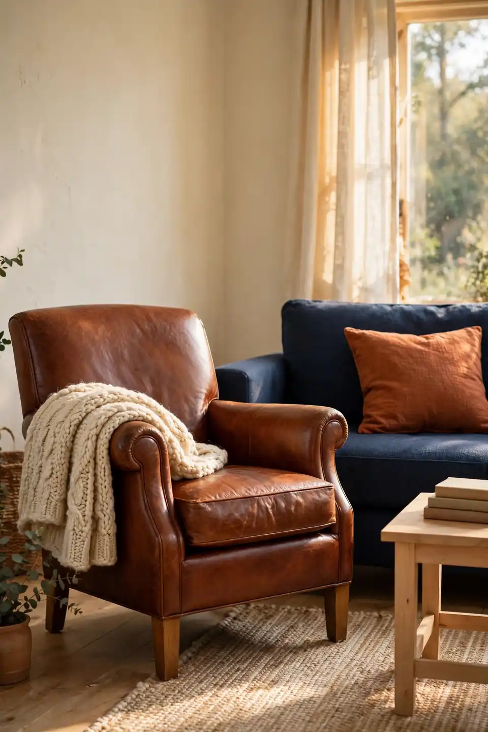
Cognac leather and cream wool were made for this palette. A leather chair in a warm rust family tone sits beside the navy sofa like they were bought together, while a chunky wool throw softens the leather’s shine. The mix keeps the room tactile, which strong color needs to stay livable through everyday use.
Balance the two textures by weight. Leather carries the large shapes, chairs and ottomans, while wool handles the soft layers guests actually touch. The same confidence with one strong surface drives black and white checkerboard bathroom ideas, where pattern does the heavy lifting in a tiny space. Start small if you are unsure: one leather cushion resting on a wool covered chair works.
Gallery Wall Arrangement
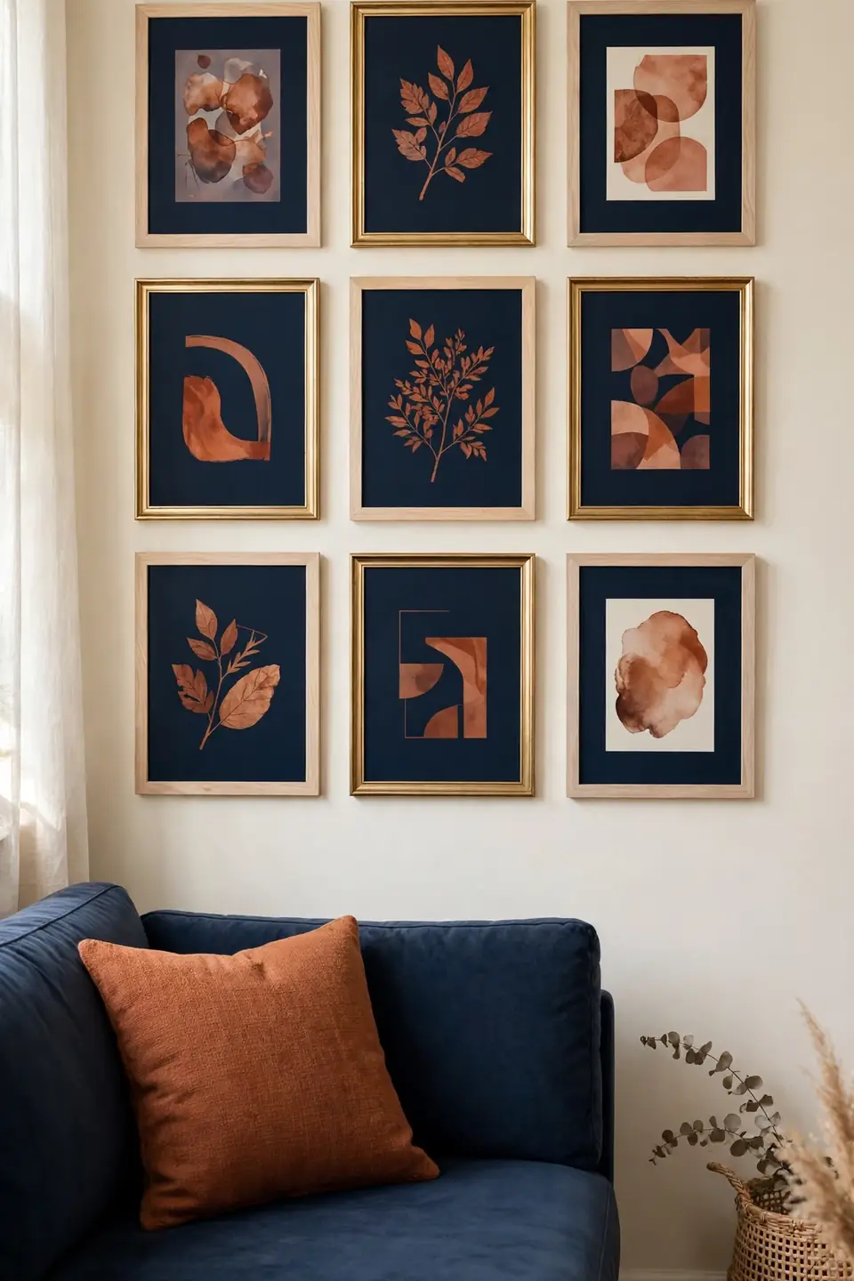
- Mix rust toned prints with deep navy mats and frames
- Keep frames in two finishes only, wood and brass
- Hang the center of the whole group at seated eye level
- Leave two inches between frames for breathing room
- Add one textile piece, like a small woven hanging
A gallery wall lets you test the palette before committing to paint or furniture. Small doses of rust in prints, balanced by navy mats, show how the colors behave in your light across the day. Lay the arrangement on the floor first, photograph it, then hang; the camera catches spacing mistakes the eye forgives.
Reading Corner Glow
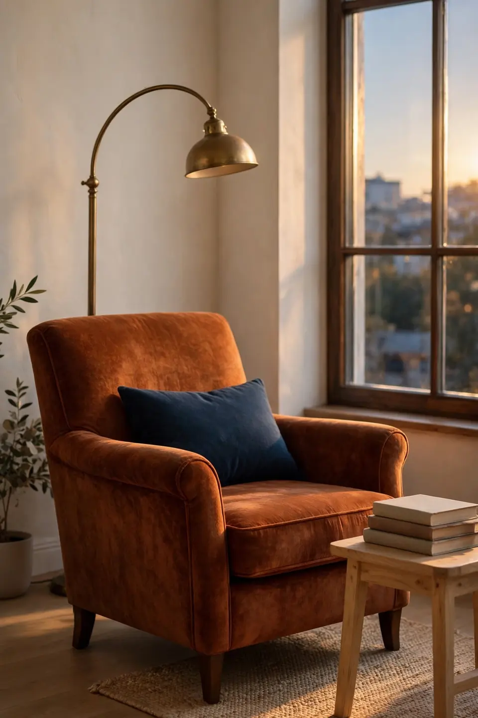
Quick Tip: Angle a rust armchair toward the window and park a brass floor lamp behind its shoulder. The chair claims the corner, the lamp pools warm light on the page, and a navy cushion ties the corner back to the sofa across the room. Choose a bulb at 2700K so the rust fabric glows instead of glaring.
Every bold room needs one quiet corner that proves the palette can whisper. A single chair, a small side table, and a folded wool throw are enough furniture. Keep books stacked in cream and rust covers, and the corner stays styled even on the days it is actually used for reading.
Small Space Contrast
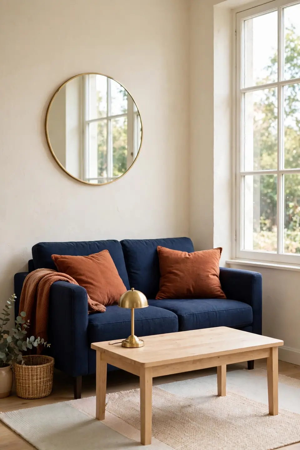
BEFORE: The small room felt washed out and timid. Pale grey walls, a beige sofa, and white cushions blurred into one another, and the single window light had nothing rich to land on.
AFTER: A navy loveseat and rust cushions now give the eye a clear path around the room. Cream walls stayed, light wood replaced the dark table, and the space feels deliberate instead of decorated by accident.
Small rooms take strong color better than large ones, because the walls sit closer and the contrast reads as coziness. Keep the floor pale, repeat each color at least twice, and the pairing will look planned from the doorway. Mirrors opposite the window double the effect for free.
Curtain Layering Steps
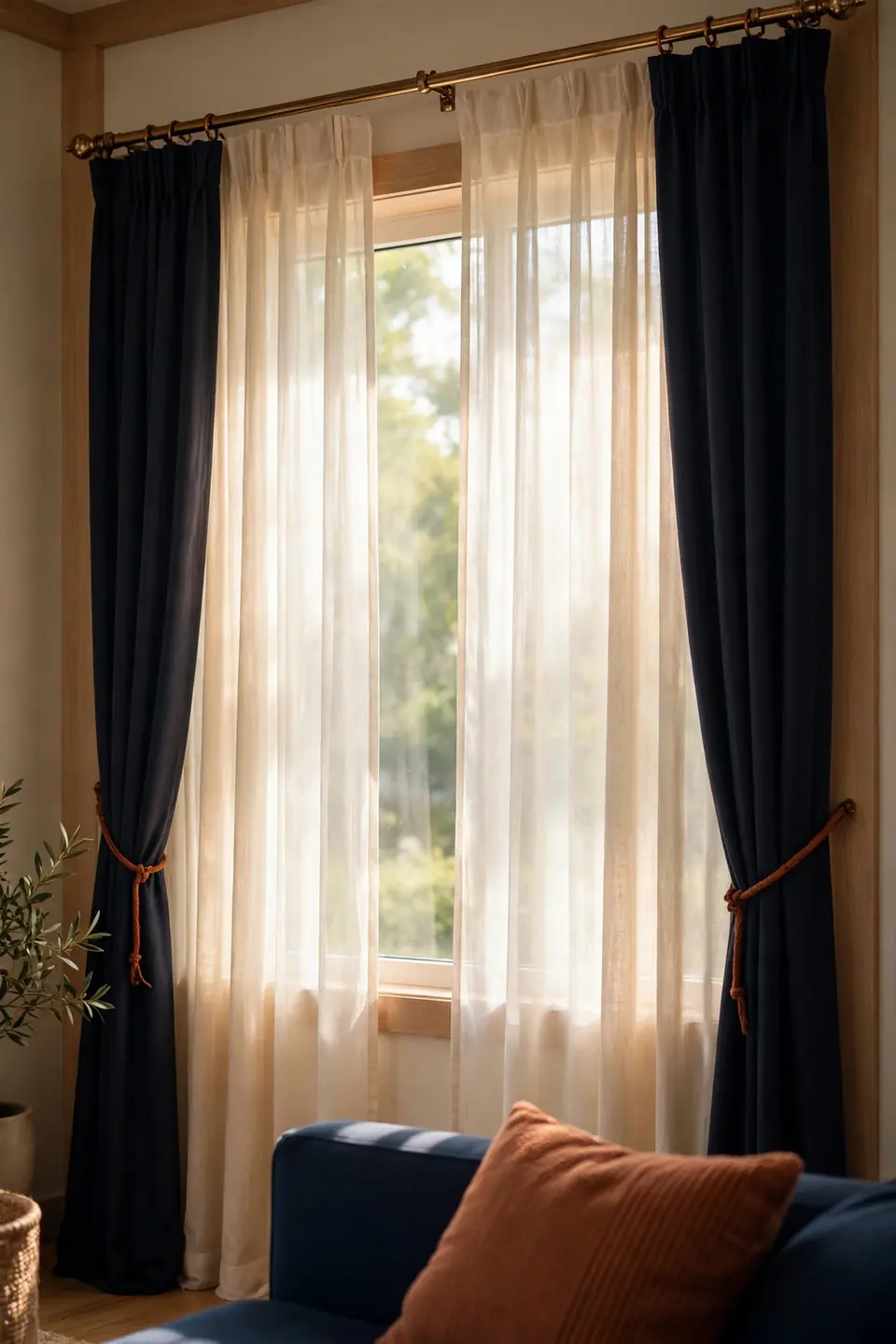
- Hang cream sheers on the inner rod for soft daylight privacy
- Add navy blackout panels on the outer rod for night
- Mount the rod six inches above the window frame
- Let panels just kiss the floor instead of pooling
- Tie back with rust cord for a warm finishing note
Layered curtains are where rust and navy blue living room decor earns its evening mood. Sheers keep days bright and private, navy panels frame the window like artwork after dark, and the rust tiebacks stop the stack from feeling formal. Match the rod finish to your lamp metal so the window joins the room’s story.
Rug Size Guide
| Compact Rug | Generous Rug |
|---|---|
| Leaves floor border wide around edges | Anchors the whole seating group firmly |
| Suits rentals and tight budgets well | Makes small rooms feel bigger instantly |
| Shows more patterned color per view | Calms busy patterns across the floor |
| Moves easily between rooms and homes | Stays put as the room’s foundation |
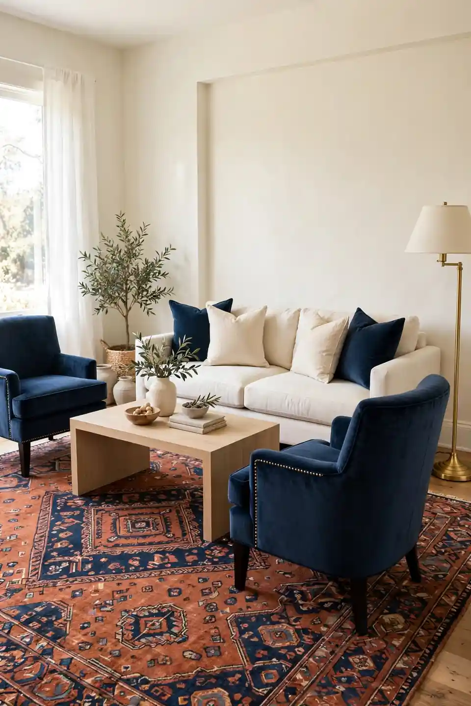
In a rust and navy scheme, size decides whether the rug reads as an accent or as the floor plan itself. Bold patterns behave better large, where the repeat can breathe, while small rugs concentrate color under the coffee table. Measure the seating group, then buy for that footprint, not for the room’s total size.
Lighting Warmth Rules
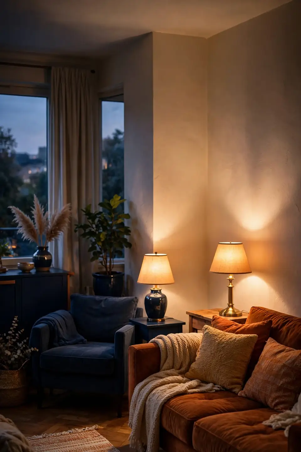
Do:
- Choose bulbs between 2700K and 3000K always
- Layer table, floor, and overhead light sources
- Place warm lamps beside the navy pieces
- Put dimmers on the main ceiling light
Don’t:
- Use cool daylight bulbs in this palette
- Leave the rust sofa in shadowed corners
- Mix silver fixtures with warm brass ones
- Light the whole room from one source only
Light can rescue or ruin this pairing faster than any paint choice. Navy under warm light turns rich and velvety; under cool light it goes flat and grey. Rust behaves the opposite way, glowing at dusk and dulling at noon. I’ve noticed the room looks best an hour before sunset, when both colors meet halfway.
Paint Pairing Facts
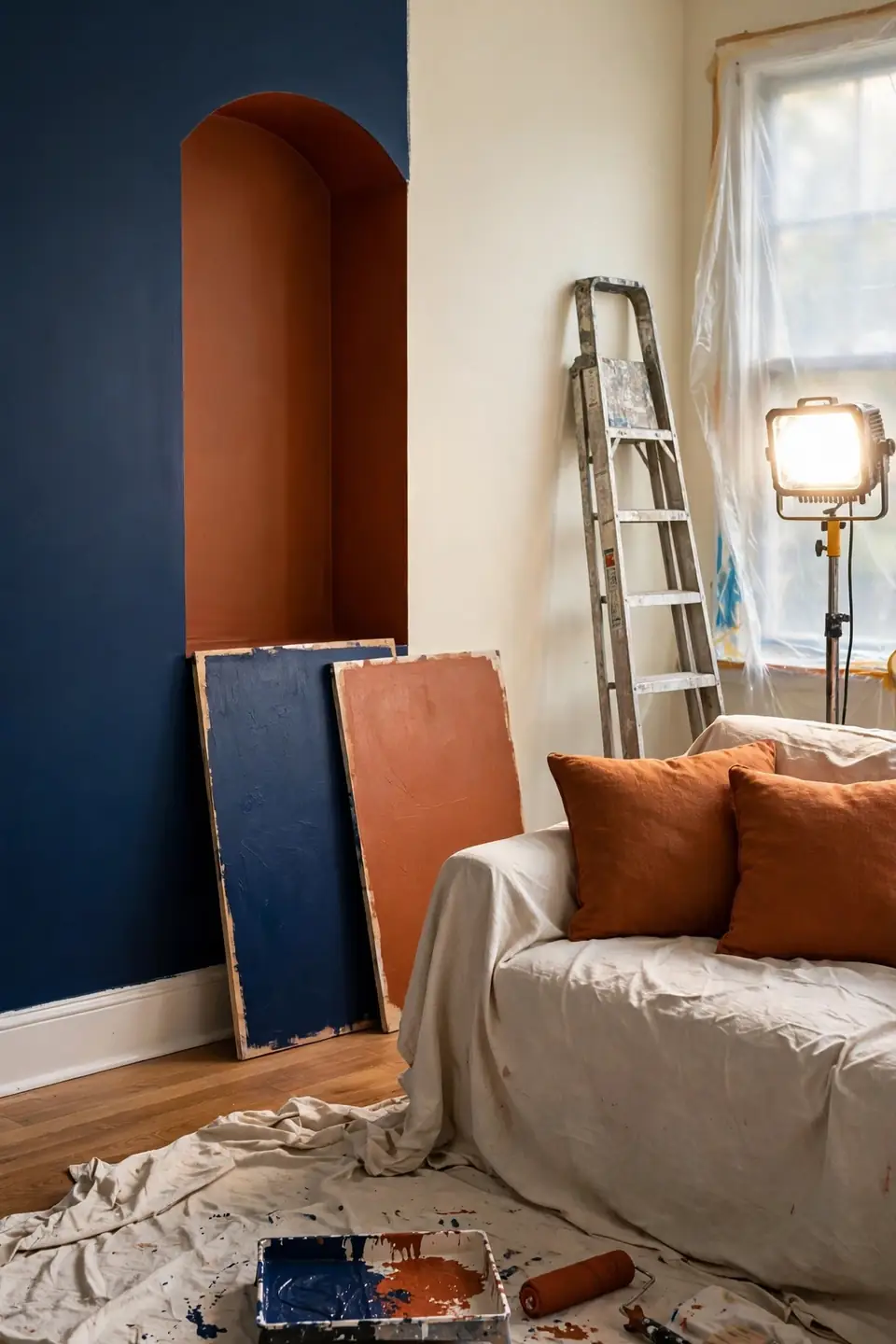
Cost: Moderate, since two bold paints cover feature areas only
Time: Two days including drying time between coats
Skill Level: Confident beginner, with tape lines as the main challenge
Best For: Rooms with cream walls that need one strong move
Paint is the fastest route into this palette, and the safest order is navy first, rust second. Navy on the largest wall sets the depth, then rust on a door, alcove, or fireplace surround adds warmth in a controlled dose. Keep both paints in one finish so the contrast comes from color, not shine. Test both shades on a board at breakfast and dusk before opening the big tins.
Bookshelf Styling Depth
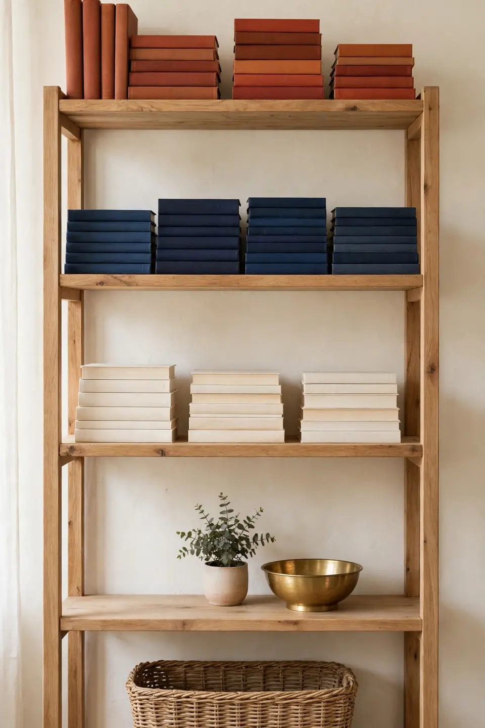
Open shelves show whether a palette is truly balanced. Stack books in rust, navy, and cream cover groups, turning spines into quiet color blocks. Leave one shelf in three nearly empty, holding only a brass object or a small plant, so the strong colors get room to breathe between groups.
Work shelf by shelf instead of styling the whole unit at once. Each shelf should hold both colors at least once, plus one natural texture, wood, woven, or stone. Step back after every shelf and squint; the blocks should read even from the doorway. That quick test catches a lopsided shelf before it nags at you for months.
Throw Pillow Formula
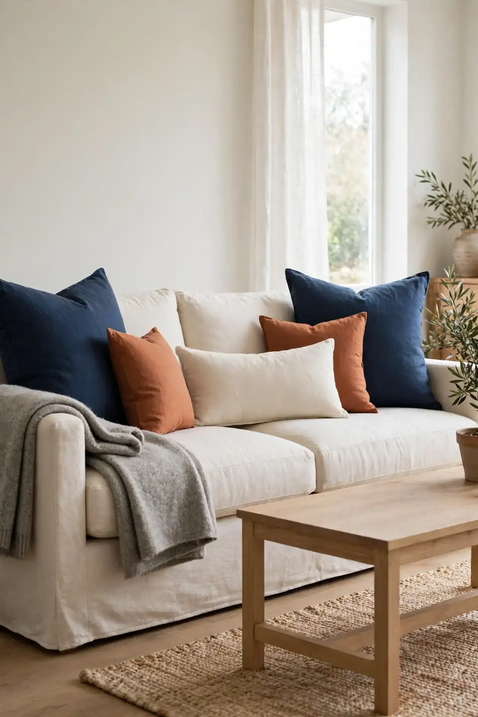
- Start with two large navy pillows at the corners
- Add two rust pillows in a smaller size beside them
- Finish with one cream lumbar across the middle
- Mix one pattern for every two solid pillows
- Keep inserts one size up for a full look
A fixed formula ends the pillow guessing that makes bold sofas look messy. Big to small, dark to warm to pale, the arrangement reads deliberate from the doorway and stays comfortable in real life. Swap only the rust pair with the seasons, terracotta in summer, burnt orange by winter, and the sofa feels new twice a year.
Fireplace Mantel Moment
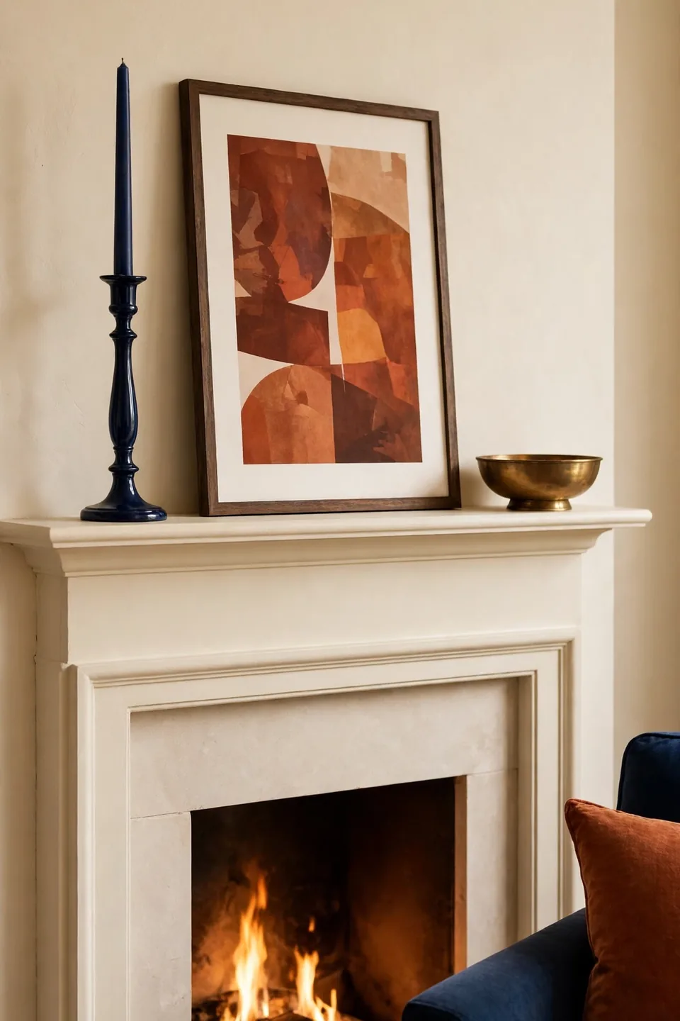
Quick Tip: Style the mantel in three heights: tall navy candlesticks, a mid level framed print with rust tones, and one low brass bowl. Odd numbers and mixed heights keep strong colors playful, and the eye travels instead of landing on one loud object. Keep the center of the mantel empty so the arrangement can breathe.
The mantel is the room’s billboard, so it should carry the palette in miniature. Against cream walls and a pale surround, navy and rust objects read like a planned exhibit rather than clutter. Restyle it with the seasons using pieces already in the room; the formula holds while the objects rotate.
Entry Corner Welcome
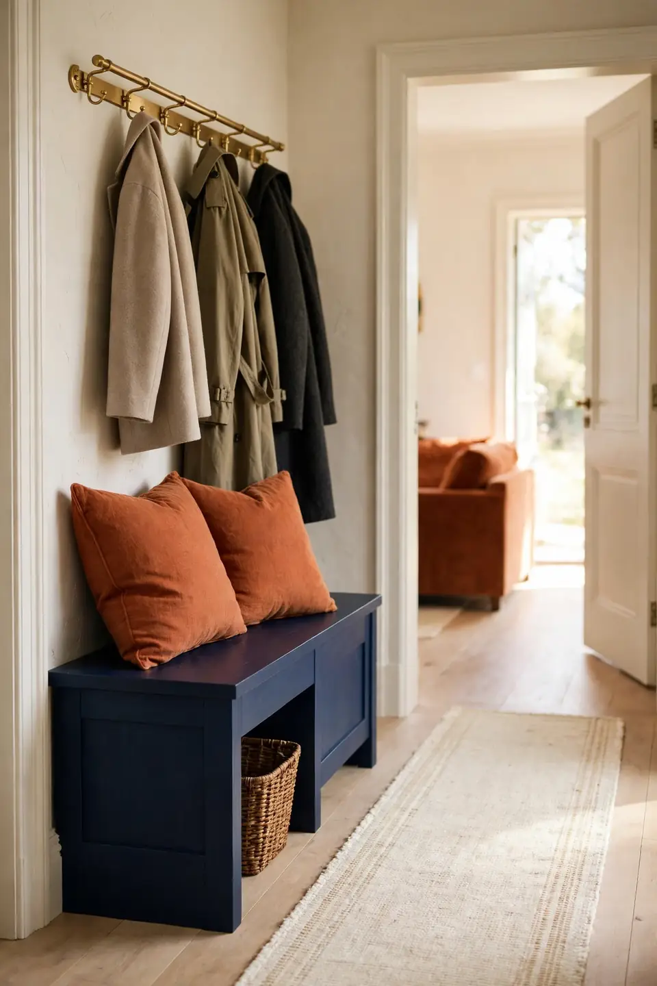
BEFORE: Guests stepped into a blank corner with a coat pile and no color at all. The living room’s rust and navy started ten feet in, so the entry felt like a different, forgotten home.
AFTER: A navy bench with rust cushions now greets everyone at the door. One brass hook rail and a cream runner pull the corner into the room’s palette, and coats land in order instead of piles.
First corners set expectations for bold rooms. When the entry repeats the living room colors in small doses, guests read the whole home as one confident idea. Keep the doses functional, bench, hooks, runner, and the styling never feels like decoration for its own sake.
Weekend Refresh Plan
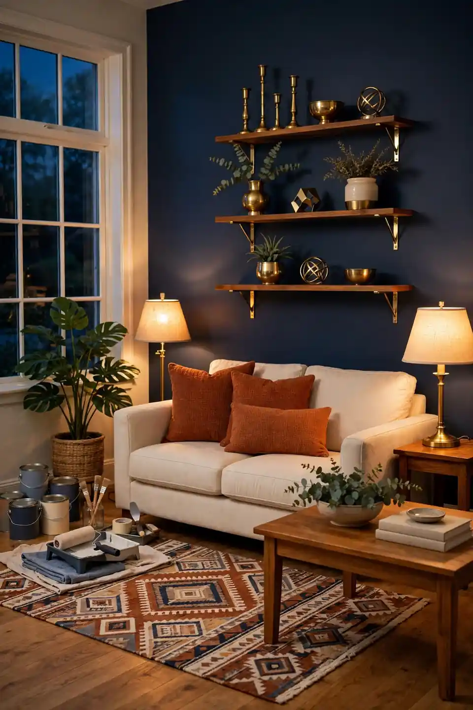
- Friday evening, clear the room and clean every surface
- Saturday morning, paint the accent wall or alcove
- Saturday afternoon, swap cushions, throws, and the rug
- Sunday morning, hang art and place the brass accents
- Sunday evening, light the lamps and judge the balance
A full contrast refresh fits one weekend when the order is right: surfaces first, color second, styling last. Shopping stays short because the palette makes decisions for you; anything rust, navy, cream, or brass belongs, and everything else stays in the store. Finish by photographing the room from the doorway. The photo shows balance honestly, and small fixes on Sunday night beat regrets on Monday.
Conclusion
Rich contrast does not need a big budget or a big room; it needs balance. Let rust carry the warmth, navy carry the depth, and cream and wood carry the peace between them, and rust and navy blue living room decor will reward you every single evening. Pick one idea, start with the largest piece of furniture, and build outward slowly. Save this list to Pinterest before your next shopping trip, try the pairing in one corner first, and share the result with a friend who loves bold color. I’ve noticed rooms done this way feel finished long before they are full.