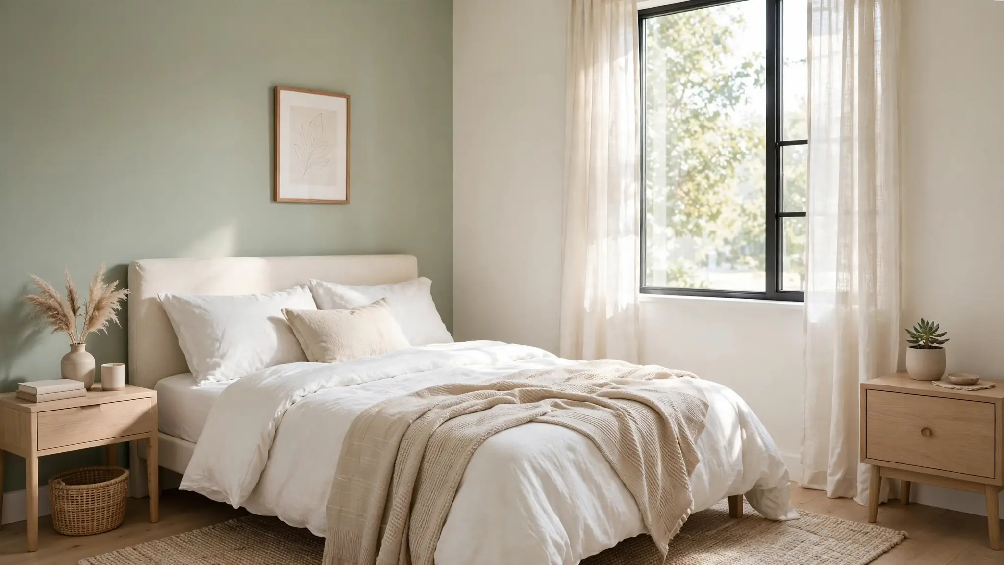
23 Small Bedroom Calming Color Palettes for Serene Sleep
Your bedroom should feel like a deep exhale at the end of a long day, and small bedroom calming color palettes make that feeling possible even in the tiniest rooms. In my experience, color shapes sleep quality more than most people realize, and the right shade can make a compact bedroom feel wonderfully restful. These 23 calming palettes are chosen specifically for small bedrooms, balancing soothing tones with clever tricks that keep tight spaces feeling open and airy. You will discover soft neutrals, gentle greens, dreamy blues, and warm earthy shades, each paired with practical tips for bedding, lighting, and furniture. For more small-space inspiration beyond the bedroom, see my one wall kitchen upgrades. Let’s find the palette that helps you sleep beautifully.
Soft Sage Retreat
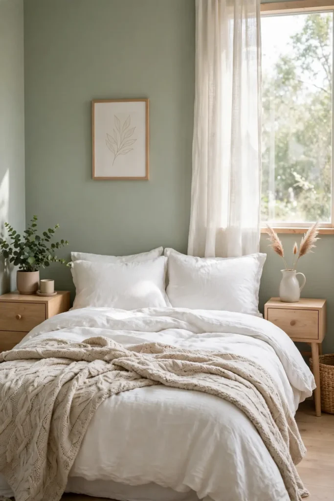
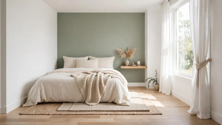
Sage green sits at the perfect crossroads of nature and neutrality, which explains why designers reach for it in compact bedrooms. The muted tone brings the outdoors inside without overwhelming tight walls. Pair sage walls with crisp white bedding and light oak furniture to keep the room feeling open and fresh.
I’ve noticed that sage shifts beautifully with the light, soft at sunrise and cozy by lamplight. Layer texture through linen curtains, a nubby wool throw, and woven baskets to add depth. Keep the ceiling bright white so the small room lifts upward. Finish with one leafy plant for a living touch that echoes the wall color.
Warm Greige Layers
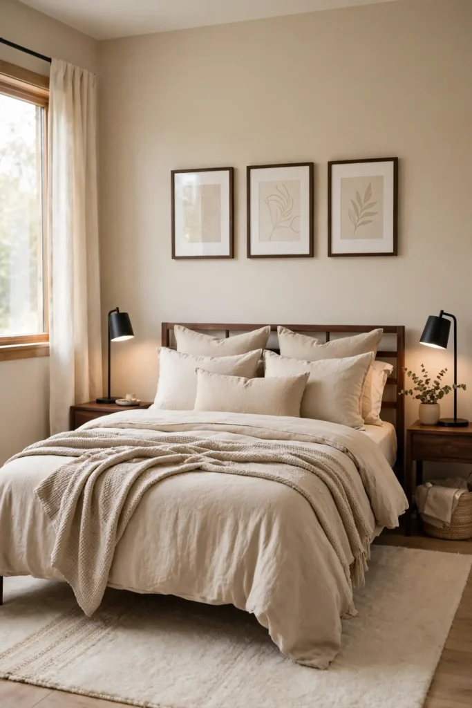
- Greige merges gray and beige into a warm neutral that flatters wood tones. Paint all four walls for a cocooning effect.
- Layer three greige tones through walls, bedding, and curtains. The tonal look keeps small rooms calm and cohesive.
- Add matte black hardware or dark walnut frames for contrast. Small dark accents sharpen softness without disturbing peace.
- Choose warm white trim over stark white to keep the glow. Finish with a cream rug to anchor the bed.
I’ve seen this work well in many cases where renters need a safe but soulful choice. Greige hides minor wall flaws better than pure white, which matters in older apartments. Keep lighting warm at 2700K so the beige notes glow. The result feels like a warm hug every evening.
Misty Blue Haven

Quick Tip: Misty blue lowers perceived room temperature, so balance it with warm wood and brass. Paint the wall behind the bed in the deepest misty tone, then fade to paler blues on the remaining walls. This gradient gently tricks the eye into seeing more depth.
Blue is the sleep color because it nudges the mind toward rest. In small bedrooms, misty shades work better than saturated navy, which can close walls in. Pair the palette with white ceilings and sheer curtains that filter daylight. I’ve noticed that blue bedrooms photograph well. Add silver or chrome accents to complete the look.
Creamy White Sanctuary

BEFORE: Stark white walls can feel cold and clinical in a small bedroom, especially under harsh overhead lighting. The space looks flat, with no visual warmth to invite rest.
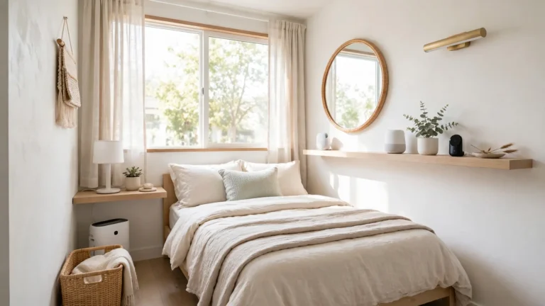
AFTER: Creamy white walls glow softly, wrapping the room in warmth while keeping it bright. The small bedroom suddenly feels like a sunlit sanctuary, calm and welcoming.
Creamy whites carry yellow undertones that flatter skin and wood alike. Choose a shade with warmth on the swatch, then pair it with natural linen bedding and rattan accents. I’ve seen this work well in many cases where all-white felt too stark. Keep trim in the same creamy family for a cocooning finish.
Dusty Rose Whispers
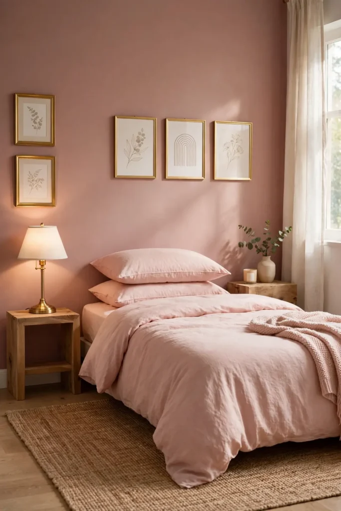
- Paint three walls in a whisper-soft blush, keeping the fourth wall white to avoid overwhelming the small space.
- Choose bedding in deeper rose tones to layer richness without painting every surface pink.
- Add brass or gold accents through lamps and frames, since warm metals flatter pink beautifully.
- Ground the sweetness with a natural jute rug and raw wood nightstands for balance.
Dusty rose brings a gentle romance that never shouts. That’s why many experts recommend it for bedrooms needing softness without a juvenile feel. The muted tone pairs well with gray, which keeps it grown-up. In my experience, rose looks best in rooms with warm sun. Finish with dried flowers for a touch that never wilts.
Pale Lavender Nights
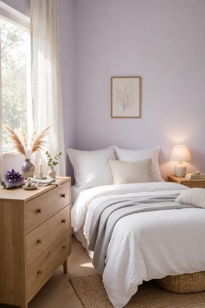
| Feature | Pale Lavender | Deep Purple |
|---|---|---|
| Wall feel | Airy and open, visually expands | Cozy and enclosed, shrinks space |
| Light needs | Glows even in dim rooms | Demands strong natural light |
| Best pairing | Crisp white and soft silver | Rich gold and dark charcoal |
| Mood | Calm, dreamy, restful | Dramatic, bold, intense |
Lavender sits between pink and blue, borrowing calm from both sides. In small bedrooms, the palest versions keep walls receding instead of closing in. Pair with crisp white bedding and light gray throws for a cloudlike bed. I’ve noticed lavender looks stunning beside natural wood, which warms its cool edge. Keep lighting soft and layered.
Oatmeal Beige Warmth
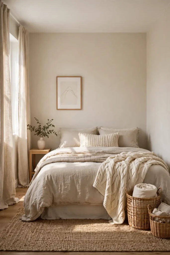
DO:
- Do layer three beige tones for depth without contrast.
- Do choose warm LED bulbs to enhance the coziness.
- Do add woven textures like jute, rattan, and boucle.
- Do keep the ceiling bright white to lift the room.
DON’T:
- Don’t pair beige with cool gray, which turns it muddy.
- Don’t use flat paint everywhere; mix eggshell and matte.
- Don’t forget greenery, which keeps beige feeling alive.
Oatmeal beige is the quiet neutral that warms without demanding attention. It wraps small bedrooms in softness, especially layered tone on tone. In my experience, beige needs texture to avoid flatness, so pile on knits and weaves. The shade flatters every wood from pale ash to deep walnut. Finish with cream bedding for inviting rest.
Seafoam Green Breeze

Cost: Low, since two gallons of paint cover most small bedrooms | Time: One relaxed weekend including drying | Skill Level: Beginner friendly, very forgiving shade | Best For: Coastal homes and rooms craving fresh air
Seafoam green carries the freshness of ocean air into the bedroom. The blue-green balance keeps it lively yet restful, never tipping too cold or too bright. In small spaces, seafoam pairs beautifully with sandy beige and crisp white for a beachy feel. I’ve seen this work well in many cases where owners wanted color without commitment. Keep furniture light and leggy so the airy palette breathes. Add a single coral or peach accent for a sunset-over-water moment.
Buttery Morning Light
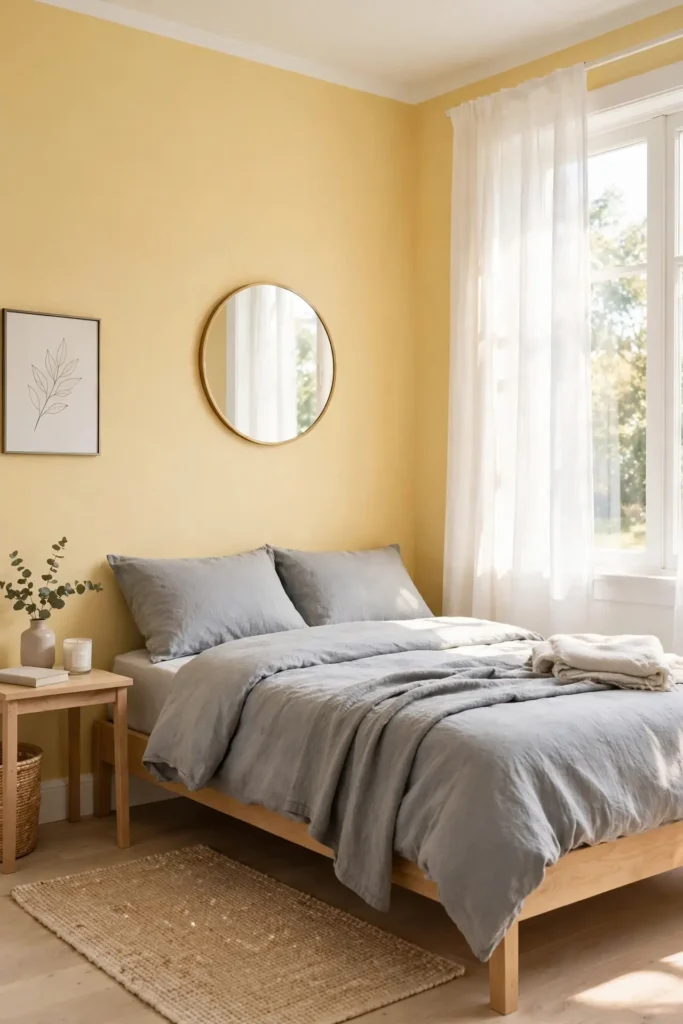
Buttery yellow captures morning sunshine and holds it in the room all day. The warm tone wakes up north-facing bedrooms that never get direct sun. Keep the yellow soft and muted, closer to cream than to school-bus bright. Pair with white trim and light wood for a fresh, happy feel. This shade makes small bedrooms feel like perpetual spring.
I’ve noticed that yellow bedrooms lift moods on dark winter mornings. Balance the warmth with cool gray bedding to keep it sophisticated. Add mirrors opposite windows to bounce the sunny tone around. Avoid pairing with orange, which can turn the palette loud. Finish with white curtains that glow like sunlight through butter.
Powder Blue Dreams

- Powder blue recalls clear skies and slows racing thoughts. Paint the ceiling too for a cocoon of calm.
- Layer white, cream, and pale gray bedding over blue walls. The soft stack looks like clouds.
- Choose brushed nickel or chrome fixtures to echo the cool tone. Metals keep the palette crisp.
- Add one navy accent, like a throw pillow, for gentle contrast. A little depth sharpens the dreaminess.
Powder blue is the shade of nursery calm, all grown up. It quiets noise, which helps small bedrooms feel less cluttered. In my experience, blue walls make white bedding look crisper and inviting. Keep artwork minimal so the color does the talking. The result is a bedroom that feels like sleeping inside a morning sky.
Warm Taupe Embrace
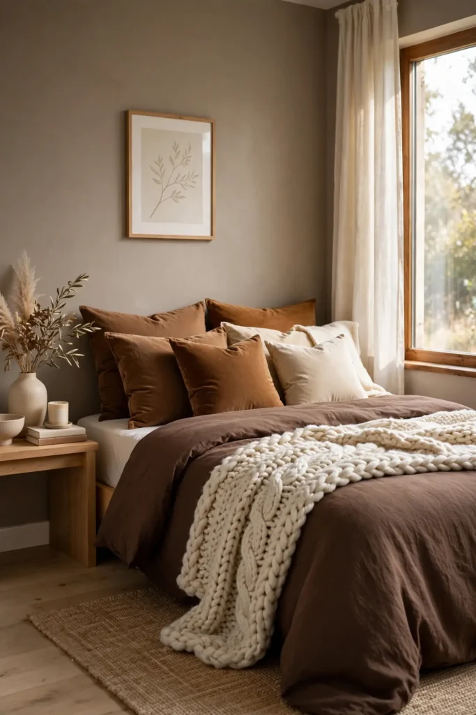
Quick Tip: Warm taupe bridges gray and brown, so it pairs with almost any wood tone. Test three swatches on the wall and live with them for two days before committing. Choose the one that looks best in both daylight and lamplight. This patient step prevents costly repaints.
Taupe blends gray calm with brown warmth in perfect balance. The mix flatters small bedrooms because it never feels cold or stark. Layer chocolate, caramel, and cream textiles for a rich tonal bed. That’s why many experts recommend taupe for calm, luxurious rooms. Add texture through velvet cushions and a chunky knit throw.
Blush Petal Softness

BEFORE: Bare beige walls can feel flat and forgettable, giving the small bedroom no personality. The room looks unfinished, like a rental waiting for its first touch.
AFTER: Blush petal walls add a whisper of color that warms without overwhelming. The small bedroom suddenly feels styled and intentional, softly romantic.
Blush works as a neutral when kept pale and dusty. Pair it with warm whites and natural wood to keep the look grounded. I’ve noticed blush flatters every skin tone, which makes morning routines feel kinder. Avoid hot pinks, which energize instead of calm. Add gold accents and white bedding to complete the gentle glow.
Eucalyptus Leaf Tones
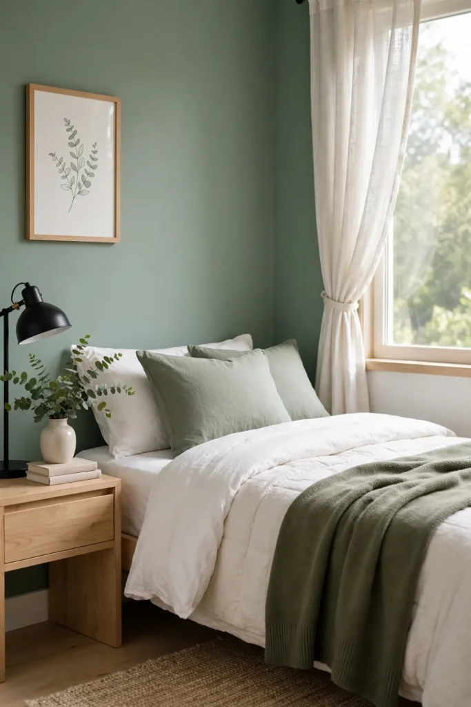
- Start with a pale eucalyptus on the walls, keeping it gray enough to read as neutral.
- Bring in real eucalyptus stems in a vase to echo the wall color naturally.
- Layer sage and olive textiles on the bed for tonal depth.
- Add black accents through frames or lamp bases to sharpen the softness.
Eucalyptus green feels like a breath of fresh air. The gray undertone keeps it sophisticated, never minty or bright. In small bedrooms, this shade pairs beautifully with warm whites and light woods. In my experience, green walls make sleep come easier, perhaps because they echo nature. Keep the palette tonal and quiet for maximum restfulness.
Ivory Linen Freshness
| Feature | Ivory Linen Walls | Stark White Walls |
|---|---|---|
| Warmth | Soft golden glow, inviting | Cool crisp feel, energizing |
| Wall flaws | Forgiving finish hides small marks | Reveals every bump and imperfection |
| Best pairing | Natural wood, rattan, and jute | Chrome, black, and sharp contrasts |
| Mood | Relaxed, organic, lived-in | Modern, minimal, gallery-like |
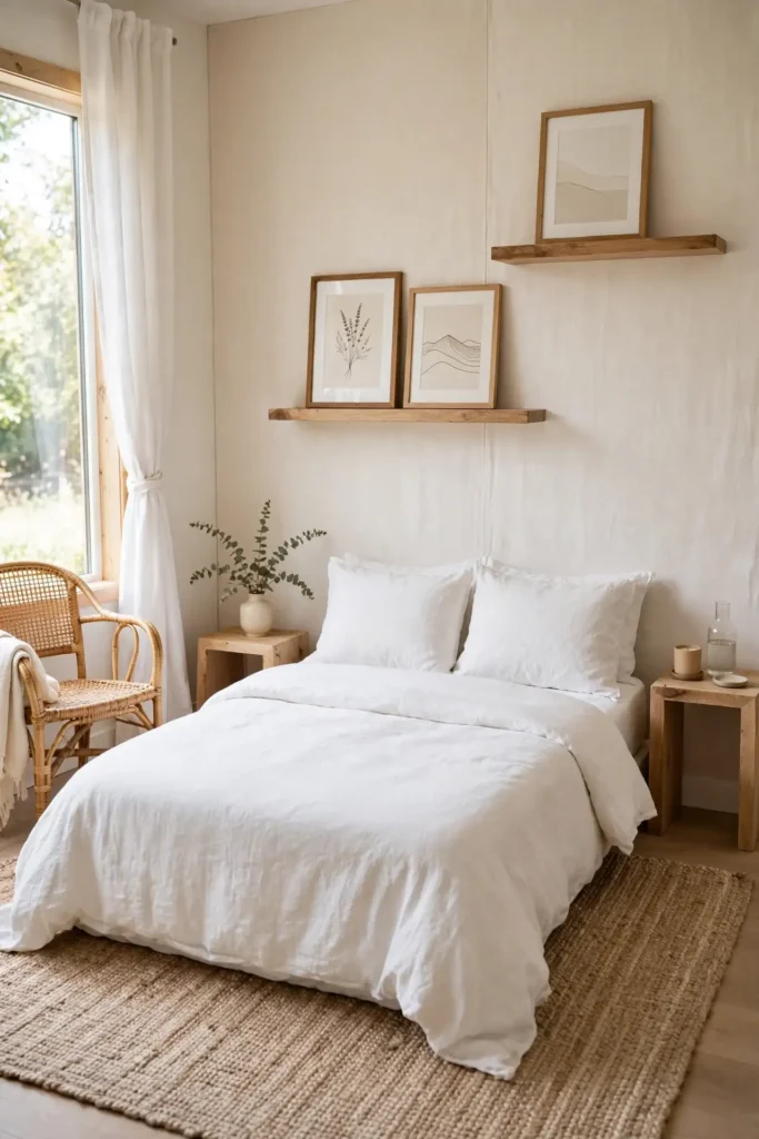
Ivory linen is white with the chill taken off. The creamy undertone keeps small bedrooms bright while adding soul that stark white lacks. Pair with natural textures like rattan, jute, and raw wood for an organic bedroom. Display framed prints on floating shelves instead of crowding the walls. I’ve seen this work well in many cases where renters feared white would feel cold. The result is fresh, never sterile.
Terracotta Sun Accents

DO:
- Do use terracotta as an accent wall behind the bed.
- Do pair it with warm whites and natural wood.
- Do add woven textures to echo its earthiness.
DON’T:
- Don’t paint all four walls terracotta in a tiny room.
- Don’t mix with cool grays, which clash harshly.
- Don’t forget soft lighting to keep it cozy.
Terracotta brings sun-baked warmth that feels like a Mediterranean holiday. As an accent, it adds soul without shrinking the small bedroom. I’ve noticed terracotta glows beautifully in evening lamplight, turning the room golden. Balance its richness with plenty of creamy white. The earthy tone grounds the space, making sleep feel deep and rooted.
Sky Blue Openness
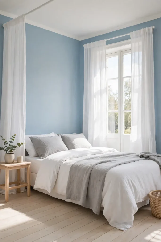
Cost: Low, since two gallons cover most small bedrooms fully | Time: One relaxed weekend including drying time | Skill Level: Beginner friendly and very forgiving | Best For: Low-ceiling rooms that need visual lift
Sky blue does what windows do: it opens the room upward. The airy shade makes low ceilings feel higher and tight walls recede. In small bedrooms, pair sky blue walls with white ceilings and pale wood floors for maximum lift. Keep bedding simple in white and soft gray so the walls star. I’ve seen this work well in many cases where rooms felt boxy and closed. Add sheer curtains that let daylight pour through. The whole room breathes easier.
Sand Dune Neutrals
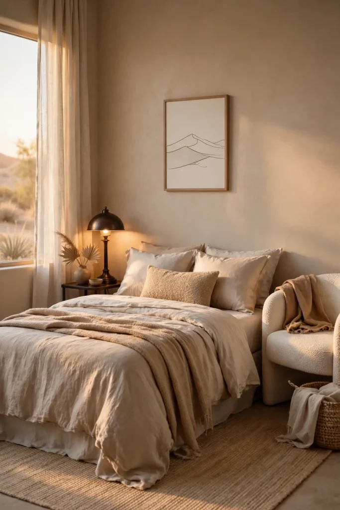
Sand dune neutrals capture the quiet of desert landscapes. The warm beige-pink tone flatters small bedrooms with gentle, enveloping color. Layer three sand tones through walls, bedding, and curtains for depth. Pair with dark bronze accents to keep the palette from washing out. This shade feels like warm earth under bare feet.
I’ve noticed sand tones look richer in rooms with warm lighting. Switch bulbs to 2700K to enhance the golden notes. Add texture through boucle, linen, and raw silk for a tactile bed. Keep artwork minimal so the color story stays clear. The result is a bedroom that feels like a permanent golden hour.
Lilac Gray Harmony
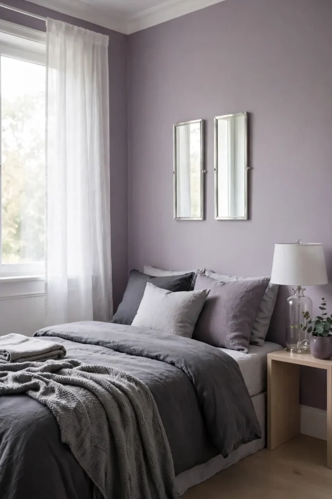
- Lilac gray merges purple calm with neutral versatility. The dusty tone suits bedrooms that need softness without sweetness.
- Paint walls lilac gray and layer charcoal bedding for contrast. The dark bed grounds the pale walls.
- Add silver mirrors and glass lamps to bounce light around. Reflective surfaces keep the small room bright.
- Choose white trim to sharpen the edges crisply. Clean lines prevent the dusty tone from feeling muddy.
Lilac gray is the thinking person’s pastel, subtle and smart. It brings just enough color to feel intentional while staying neutral enough for any decor. In my experience, this shade flatters both warm and cool wood tones. Keep the palette tonal with gray textiles in three depths. The harmony feels easy and deeply restful.
Honey Oat Warmth
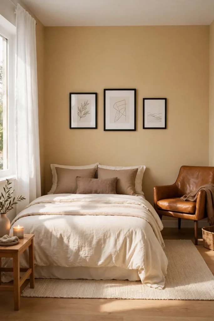
Quick Tip: Honey oat is beige with golden sunshine stirred in. Use it on walls to make north-facing bedrooms feel sun-kissed. Pair with cream bedding and caramel leather accents for a rich, layered look. Keep the ceiling white so the warmth never feels heavy. Test a large swatch first, since honey tones intensify on big walls.
Honey oat wraps the bedroom in golden warmth like late afternoon light. The shade flatters small rooms because it glows without shouting. That’s why many experts recommend warm neutrals for bedrooms lacking natural sun. Layer cream, caramel, and soft brown textiles for depth. Add black accents sparingly to keep the sweetness grounded.
Aqua Mist Coolness

BEFORE: Flat gray walls can feel dull and lifeless, draining energy from the small bedroom. The space looks gray in the boring sense, not the elegant one.
AFTER: Aqua mist walls bring a breath of fresh color that wakes gray up. The small bedroom feels crisp and clean, like air after rain.
Aqua mist is gray’s livelier cousin, with just enough blue-green to feel fresh. The pale tone keeps small bedrooms bright while adding personality. Pair with white bedding and natural wood for a clean coastal feel. I’ve noticed aqua looks lovely beside brass fixtures, which warm its cool edge. Keep the palette light and breathy for calm.
Charcoal Slate Depth

- Paint just one wall charcoal, keeping the other three pale for balance.
- Choose the wall behind the bed as the dark anchor.
- Layer pale gray and white bedding to pop against the dark.
- Add warm brass lamps to keep the charcoal cozy, not cold.
Charcoal slate brings drama that small bedrooms can absolutely handle. The dark wall recedes visually, which paradoxically makes the room feel deeper. That’s why many experts recommend one dark wall in tiny spaces. Keep the remaining walls pale and the ceiling bright white. I’ve seen this work well in many cases where owners feared dark colors. The contrast makes the bed the undeniable star.
Peach Sorbet Glow

| Feature | Peach Sorbet Walls | Plain Beige Walls |
|---|---|---|
| Glow | Warm and radiant, sun-kissed | Flat and neutral, steady |
| Best light | Glows in afternoon sun | Works in any light |
| Best pairing | Cream, soft gold, white | Warm brown, black accents |
| Mood | Happy, gentle, uplifting | Calm, quiet, grounded |
Peach sorbet is happiness in paint form, soft and glowing. The warm pink-orange blend flatters small bedrooms with a gentle radiance. Pair with cream bedding and light wood for a fresh, fruity feel. In my experience, peach looks best in rooms with warm natural light. Keep accents soft and tonal to let the walls shine. The glow feels like permanent golden hour.
Olive Branch Grounding
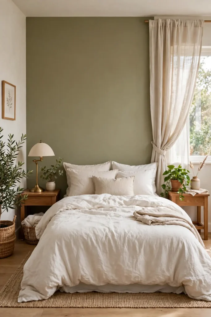
DO:
- Do choose muted olive, not bright army green.
- Do pair with warm whites and natural linen.
- Do add black accents for sophisticated contrast.
DON’T:
- Don’t use olive in rooms with no natural light.
- Don’t pair with cool grays, which turn it murky.
- Don’t forget plants to echo the green naturally.
Olive green grounds a bedroom like roots ground a tree. The earthy tone brings nature inside, which calms busy minds beautifully. In small bedrooms, keep olive to one wall or soft furnishings to avoid heaviness. I’ve noticed olive pairs wonderfully with brass and warm wood. The result feels organic, steady, and deeply restful.
Conclusion
These small bedroom calming color palettes prove that tiny rooms can deliver the deepest rest. Choose the palette that speaks to you, start with a single wall or fresh bedding, and let the calm build from there. I’ve seen how small changes like these can completely shift the way a space feels. Save your favorites on Pinterest for your next paint weekend, try one idea at a time, and share your serene makeover to inspire others. Your perfect palette is waiting, and better sleep is closer than you think. Sweet dreams start with the right shade, so pick yours and sleep beautifully.
2 Comments