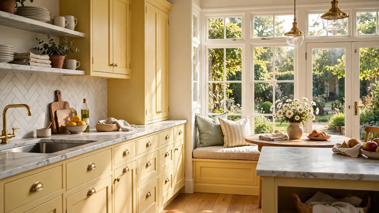
23 Butter Yellow Kitchen Cabinet Ideas for Joyful Style
There is a reason butter yellow kitchen cabinet ideas keep popping up in the happiest kitchens on Pinterest. The color feels like morning light poured into paint, warm and gentle without ever shouting. I have noticed that even one bank of buttery cabinets can lift the whole mood of a kitchen, the way sunshine through a window changes how breakfast tastes.
In this collection, you will find 23 ways to bring that glow home, from pale washes to rich golden tones. If you love warm natural materials too, these natural wood kitchen cabinet ideas pair beautifully with yellow for an extra cozy feel. Pick the shade that matches your light, then let the color do the happy work.
Soft Butter Uppers

Painting just the uppers in soft butter keeps the sunshine where your eyes land most. The pale yellow catches daylight and bounces it around, which makes the whole kitchen feel brighter without a full repaint. It works especially well when the lowers stay creamy white for balance.
This is the gentlest way to try the trend. If you tire of color easily, a soft buttery tone reads almost neutral in the evening light. I have seen renters use peel and stick panels for the same effect, which proves you do not need a permanent commitment to get the glow.
Sunny Shaker Style
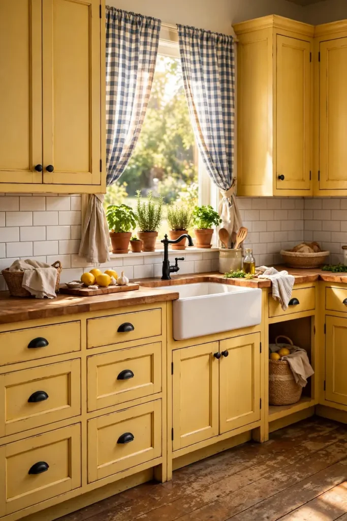
- Shaker doors give yellow a timeless frame. The simple recessed panel keeps the color feeling classic instead of trendy.
- Pick a mid-tone butter shade so the cabinets read sunny in daylight and mellow at night. Very pale tones can wash out under bright bulbs.
- Black hardware adds definition. Cup pulls and knobs in matte black keep the yellow from floating away visually.
- Repeat the yellow in small doses elsewhere. A painted stool or a striped runner ties the room together.
- Seal the paint well around the sink and stove. Kitchens are steamy places and good prep keeps the finish fresh for years.
Shaker and butter yellow are a natural match because both feel friendly and unpretentious. The style has been around for centuries, which means your sunny kitchen will still look right in a decade. I have noticed this combo photographs beautifully, so expect compliments from guests and followers alike.
Creamy Yellow Islands

Quick Tip: Test the island color with a large painted board before you commit. Yellow shifts a lot between morning and evening light, so lean the board against the island spot and check it at breakfast, lunch, and dinner.
An island in creamy yellow becomes the heart of the kitchen without overwhelming it. The surrounding white cabinets let the island shine like a piece of furniture. I have seen families gather around yellow islands the way they gather around a campfire, drawn in by the warmth. It turns cooking into a social event.
Pale Lemon Pairing
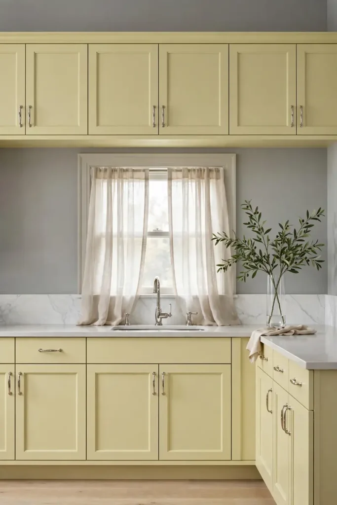
BEFORE: The all-white kitchen felt clean but a little flat, like a beautiful photo with the saturation turned down. It was pleasant yet forgettable, and nothing in it sparked joy.
AFTER: Pale lemon cabinets now add just enough color to wake the room up. The gray walls keep it sophisticated, and the whole space feels like spring arrived early and decided to stay.
Pale lemon is the introvert of the yellow family, quiet but full of character. It pairs best with cool grays and soft whites that let its warmth show. I have noticed this shade works wonders in north-facing kitchens, where it borrows sunshine the windows cannot provide.
Buttery Beadboard Charm
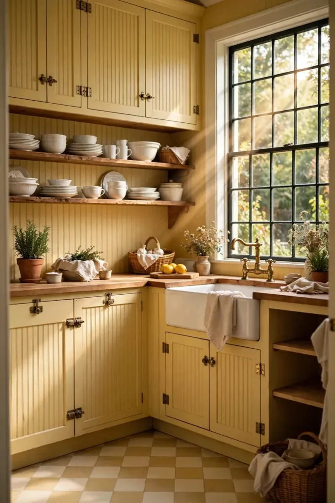
- Start with beadboard on the island or a single run of lowers. The texture adds cottage character without a full kitchen commitment.
- Choose a warm butter tone that leans golden, not green. Green undertones can look sickly next to food, while golden ones feel appetizing.
- Pair it with simple vintage style hardware. Brass latches and cup pulls suit beadboard better than sleek modern bars.
- Keep counters light and simple. Butcher block or white quartz lets the textured cabinets stay the star.
Beadboard gives butter yellow a handmade, storybook quality that flat doors cannot match. The little grooves catch light and shadow all day long. I have seen this look steal hearts in small cottages, where every detail counts and charm matters more than square footage.
Two-Tone Sunshine
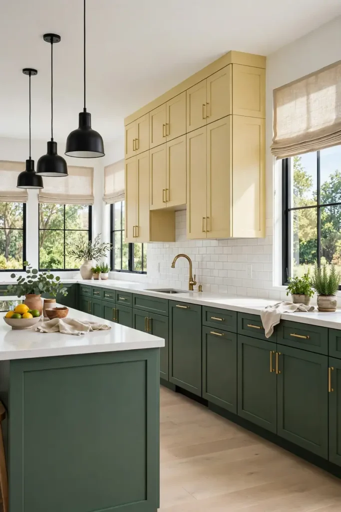
| Yellow Uppers | Colored Lowers | |
| Feel | Bright and uplifting above | Grounded and rich below |
| Best with | Sage, navy, or forest green | Cream, white, or soft gray |
| Light tip | Reflects daylight downward | Hides scuffs near the floor |
| Mood | Cheerful and airy | Calm and anchored |
Two-tone kitchens work when the pairing feels intentional. Keep yellow on top where it lifts the room, and let a deeper color handle the hardworking lower zone. I have noticed sage green is the favorite partner, since the two colors sit opposite just enough to make each other glow.
Vintage Butter Glow
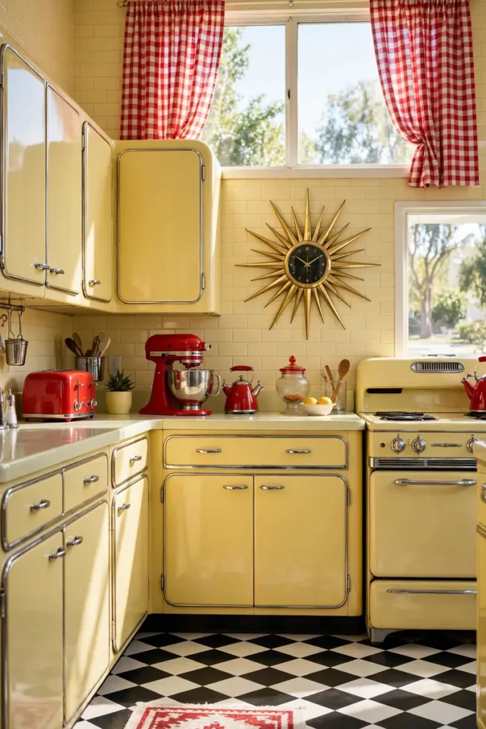
DO:
- Do hunt for true vintage pieces at salvage shops. Old metal cabinets in butter yellow have a patina new paint cannot fake.
- Do add one or two retro accents, like a sunburst clock or a chrome toaster. Small nods beat a full theme.
- Do keep the walls simple. Cream or soft white lets the vintage yellow shine.
- Do check old cabinets for lead paint before sanding. Safety first, then style.
DON’T:
- Do not mix too many retro colors at once. Butter yellow plus one accent is plenty.
- Do not forget modern function. Vintage looks should still hide a dishwasher and decent storage.
- Do not paint over great original chrome trim. That detail is the whole point.
- Do not skip a clear topcoat on high-touch areas. It protects the finish from daily wear.
Vintage butter yellow carries the optimism of mid-century kitchens without feeling like a costume. The color was born in an era that believed the future would be bright. I have seen these kitchens make people smile before they even notice the details, which tells you the glow is doing its job.
Modern Muted Mustard
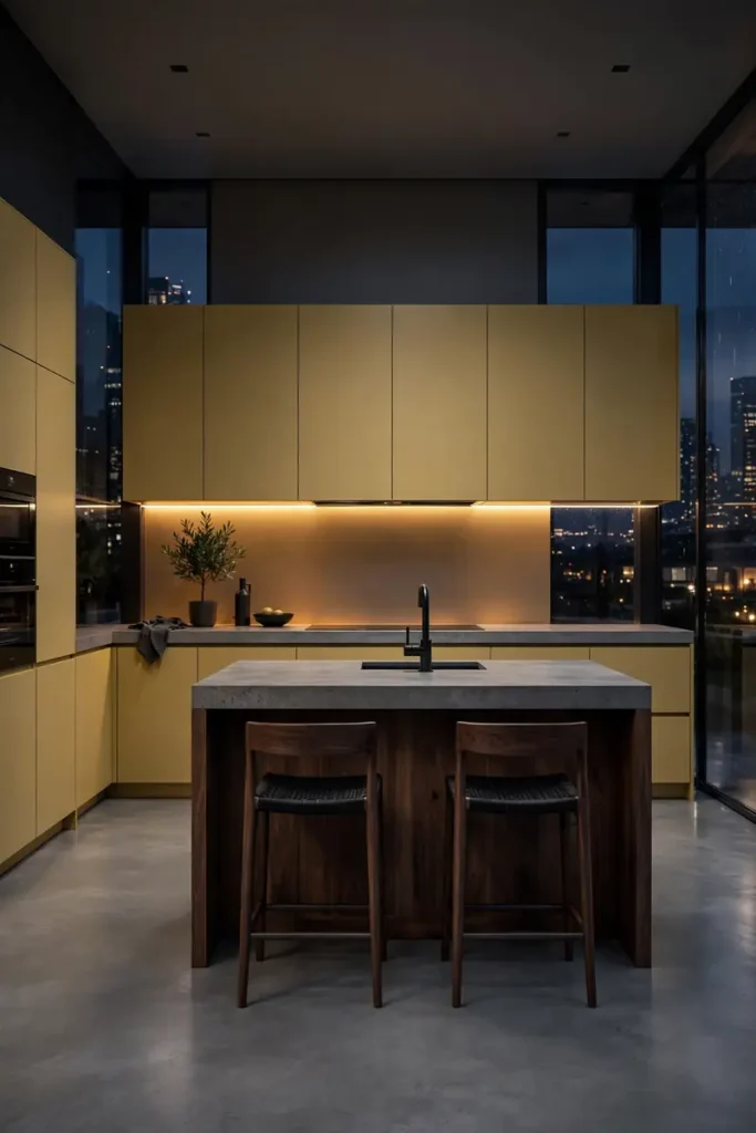
Cost: Medium to high | Time: Two to four weeks | Skill Level: Professional install | Best For: Bold modern kitchens
Muted mustard takes yellow into grown-up territory. The deeper, earthier tone feels confident next to concrete and dark wood. I have noticed designers reaching for it when clients want color without cuteness. It is yellow with a leather jacket on, and it pulls the look off beautifully.
Honeyed Cabinet Wash
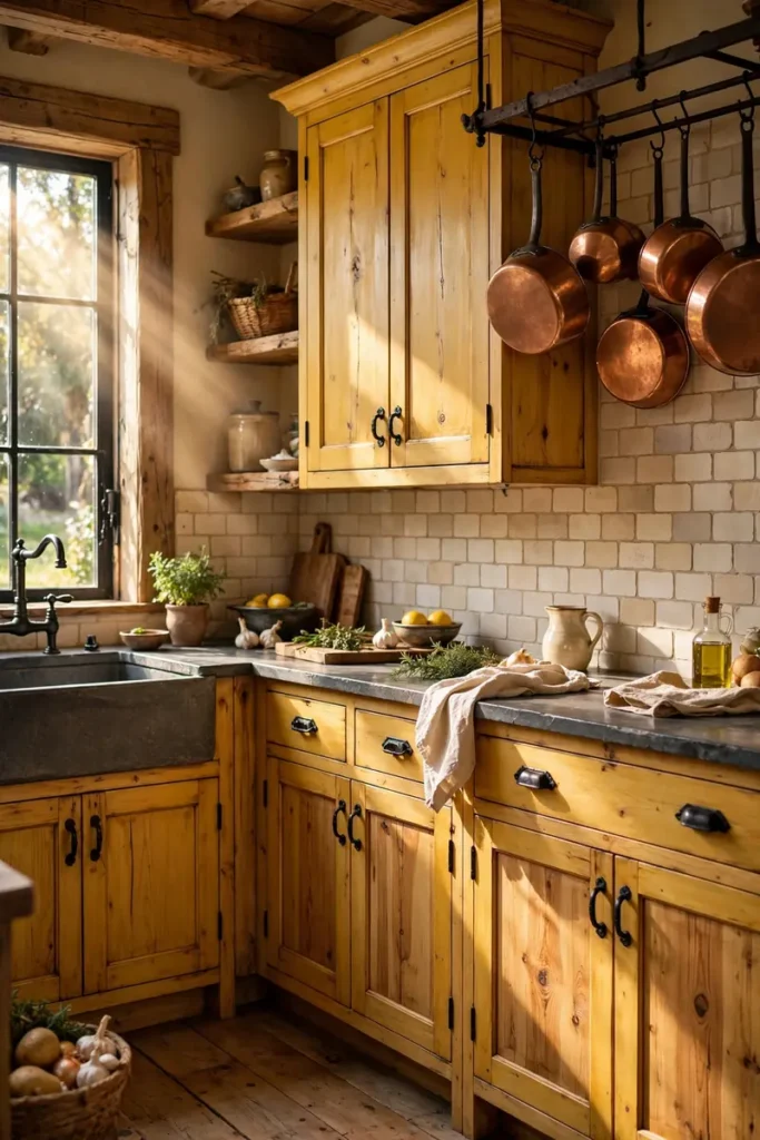
A color wash lets the wood grain peek through the yellow, which gives you the best of both worlds. The translucent finish feels handmade and warm, like honey spread thin over toast. It suits rustic and farmhouse kitchens where perfect paint would look out of place.
The key is thin, even coats and a light hand with the brush. Two sheer layers beat one thick one every time. I have seen DIYers get beautiful results on oak and pine, since open grains drink up the wash and glow from within. Patience pays off here.
Cheerful Corner Nook
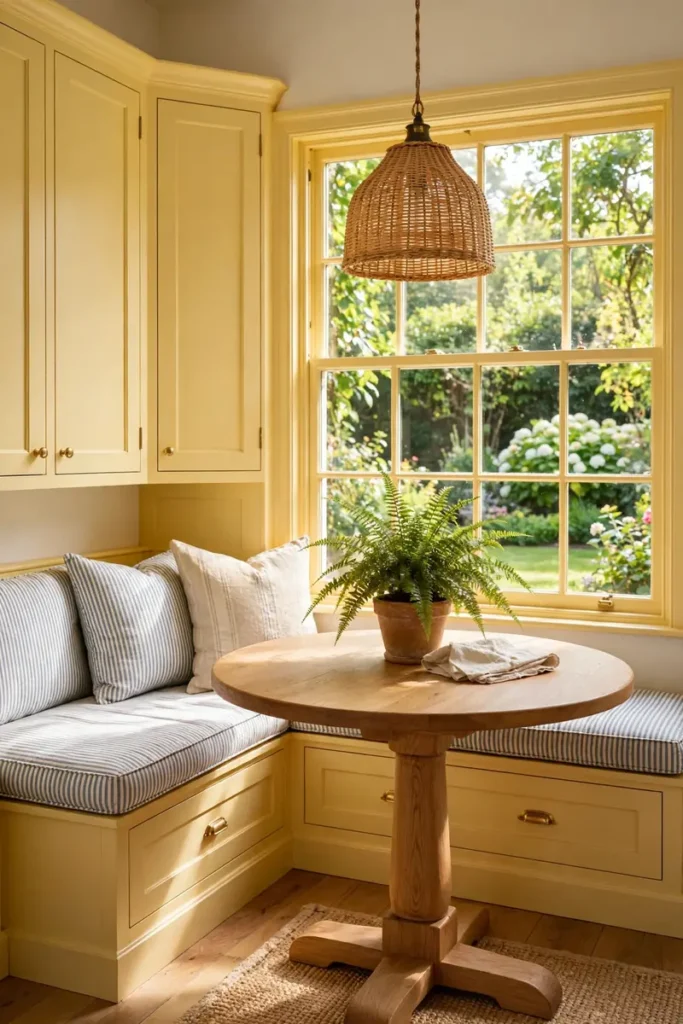
- Wrap the yellow around a corner to create a breakfast nook zone. The color defines the space better than any rug could.
- Add a built-in banquette in a coordinating fabric. Stripes or small florals keep the cottage feeling alive.
- Hang a woven pendant low over the table. Natural texture balances the painted color beautifully.
- Keep the window dressing light. Sheer curtains let the garden view join the cheerful palette.
Corner nooks painted in butter yellow become the spot everyone fights over at breakfast. The color wraps you like a warm hug while you drink your coffee. I have noticed kids do homework here without being asked, which might be the highest praise a kitchen corner can earn. If your kitchen opens into the living area, keep the sunshine flowing with these fall living room decor ideas.
Warm Apron Accents

Quick Tip: Let a white apron sink be the crisp contrast to your yellow cabinets. The bright white frame makes the butter tone look richer, the way a white mat makes a painting pop. Keep the sink simple so the color story stays clear.
Apron sinks and butter yellow share farmhouse roots, so they feel like old friends. The deep basin handles big pots while the yellow keeps the mood light. I have seen this pairing in cottages and new builds alike, and it never fails to feel welcoming. Some matches are just meant to be.
Gingham Curtain Match
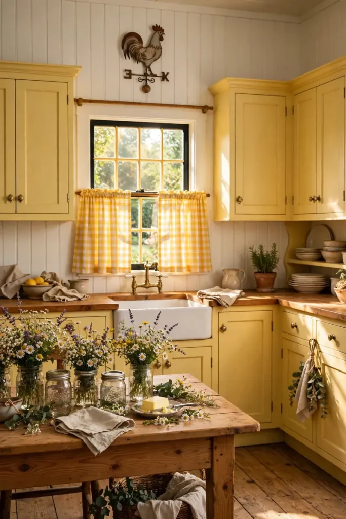
BEFORE: The plain white curtains disappeared against the walls, and the kitchen felt polite but plain. It was fine, yet nothing in it made you want to linger.
AFTER: Yellow gingham curtains now echo the cabinets and the whole room sings. The checkered pattern adds playfulness, and suddenly the kitchen feels like the heart of a storybook home.
Matching curtains to cabinets is a small move with outsized charm. Gingham in particular suits butter yellow because both carry vintage picnic memories. I have noticed guests always comment on the curtains first, which proves textiles do heavy lifting in a kitchen. Do not underestimate fabric.
Open Shelf Sunshine
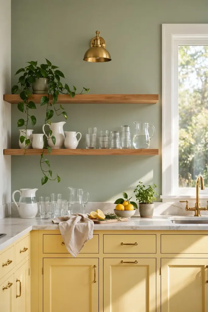
- Keep yellow on the lowers and open the uppers up. Wood shelves lighten the wall and let the color breathe.
- Style shelves with white and glass. Pale dishes reflect light and keep the sunny feeling going.
- Add one living plant per shelf. Green leaves pop beautifully against butter yellow.
- Edit ruthlessly twice a year. Open shelves only stay sunny when they stay tidy.
Open shelves above butter yellow lowers create a lovely rhythm of color and air. The eye moves from solid sunshine below to breezy openness above. I have seen small kitchens feel twice as big with this trick, since the wall opens up while the color keeps things cozy.
Brass Hardware Pop
| Brass | Black | |
| Feel | Warm, luxe, glowing | Crisp, graphic, modern |
| Best with | Soft butter, cream tones | Bold mustard, deep gold |
| Upkeep | Patina develops over time | Wipe clean, stays matte |
| Cost | Higher, jewelry-like | Budget friendly |
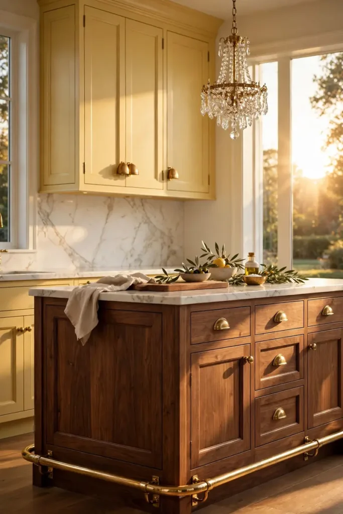
Brass hardware on butter yellow is like sunshine wearing jewelry. The warm metals melt into the color while still catching the light. I have noticed unlacquered brass ages into a soft glow that suits yellow perfectly, so choose it if you love a lived-in look. Black works too when you want sharper contrast.
Soft Serve Neutrals
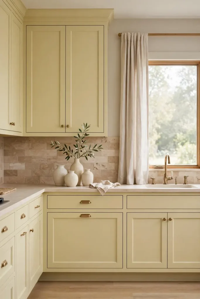
DO:
- Do surround pale yellow with warm neutrals like greige, oatmeal, and stone. They soften the color into pure calm.
- Do choose natural textures. Linen, travertine, and light oak all speak the same quiet language.
- Do keep the palette tight. Three neutrals plus the yellow is plenty for a serene room.
- Do add one organic shape, like a round mirror or arched niche. Curves keep neutrals from feeling flat.
DON’T:
- Do not pair pale yellow with cool gray. The clash can make the yellow look dingy.
- Do not add bright white everywhere. Soft whites blend better than stark ones.
- Do not forget warm lighting. Bulbs around 2700K keep the whole palette glowing.
- Do not over-accessorize. Neutrals need breathing room to work their magic.
Soft neutrals let butter yellow whisper instead of sing, and sometimes that is exactly right. The result feels like an exhale, calm and warm at once. I have seen this palette soothe even the busiest households, since the kitchen stops demanding attention and starts giving comfort instead.
Cottage Core Yellow
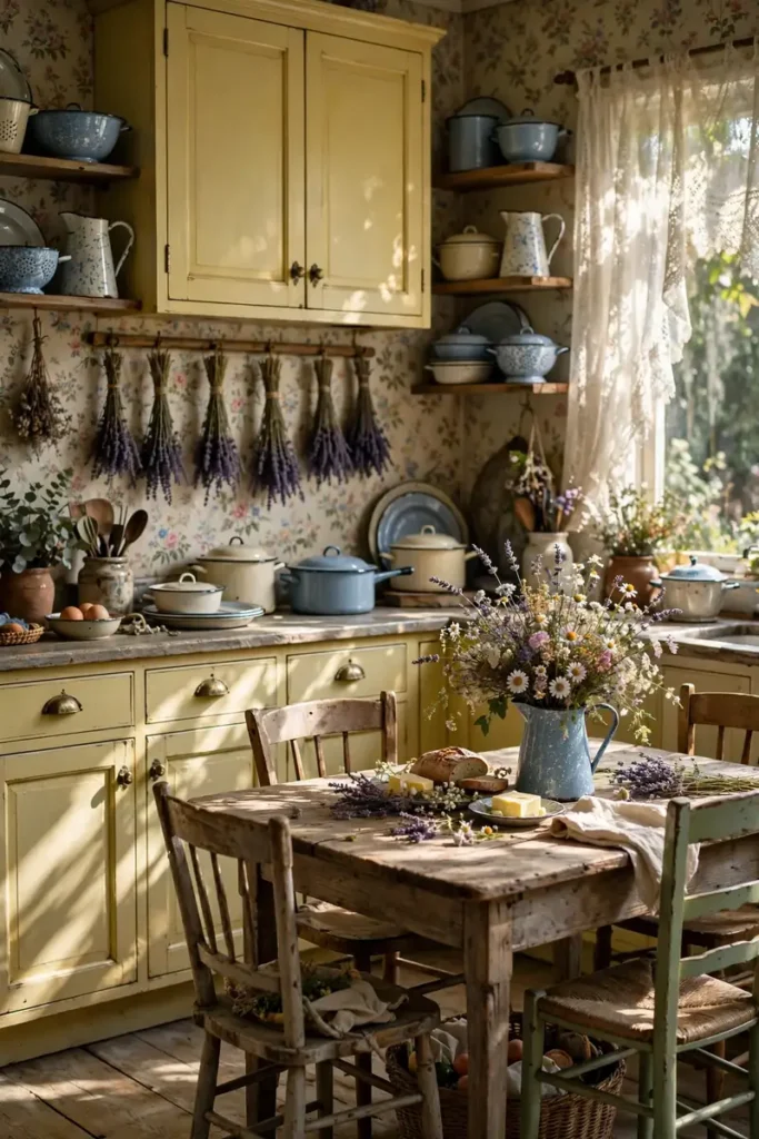
Cost: Low to medium | Time: One to two weekends | Skill Level: Beginner friendly | Best For: Romantic cottage kitchens
Cottagecore and butter yellow were made for each other. The color loves floral wallpaper, dried flowers, and well-worn wood. I have noticed this style makes people slow down, since every corner invites a closer look. It is nostalgia you can cook in, and it never feels forced when the details are honest.
Lemon Zest Backsplash
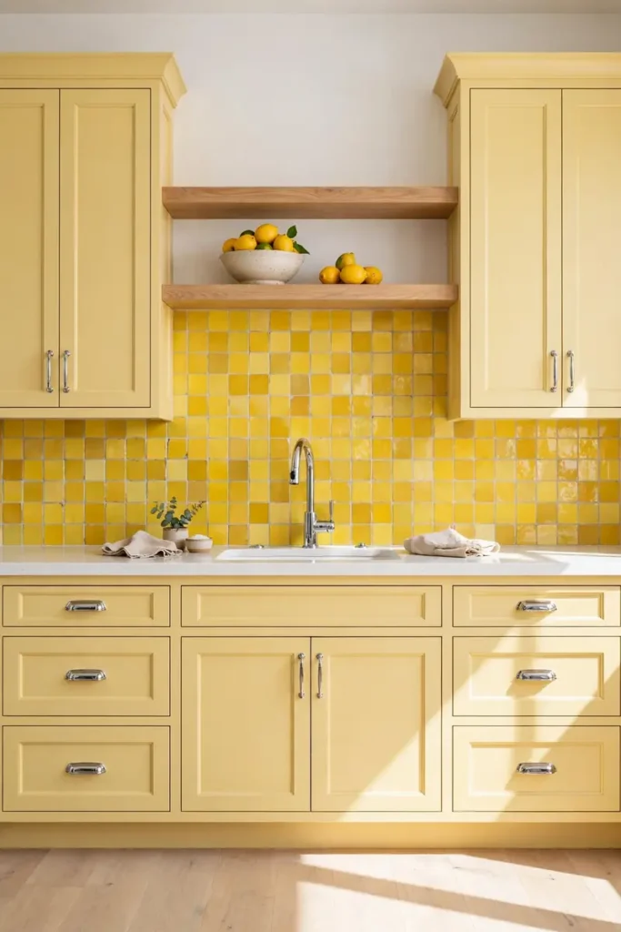
A lemon zest backsplash doubles down on the sunshine in the best way. Handmade tiles with slight color variation keep it artisanal instead of loud. I have seen this in galley kitchens where the extra brightness makes the narrow space feel wider and more awake.
Keep the cabinets a touch softer than the tile so the two yellows layer instead of clash. The contrast in texture matters more than the contrast in color. I have noticed glossy tile against satin cabinets creates depth that flat paint alone cannot achieve. Shine is a design tool too.
Farmhouse Butter Blend

- Blend butter yellow with reclaimed wood for instant farmhouse soul. Beams and wide plank floors ground the cheerful color.
- Choose black accents for definition. Lantern pendants and iron hardware keep the look from going too sweet.
- Mix in galvanized metal touches. The cool zinc balances all that warmth beautifully.
- Leave some wood natural. Not everything needs paint, and the mix feels collected over time.
Farmhouse style gives butter yellow a hardworking context that keeps it honest. The color stops being just pretty and starts feeling purposeful. I have seen these kitchens become the true heart of the home, where homework, harvest, and holidays all happen around the same sunny cabinets.
Quiet Yellow Luxury
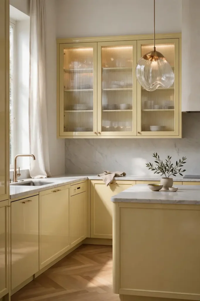
Quick Tip: For a luxury feel, choose a lacquered finish in the palest butter tone. The subtle sheen reads expensive, and the quiet color lets the materials do the talking. Pair it with marble and champagne bronze, then step back and let the calm impress.
Quiet luxury proves yellow does not have to shout to be stunning. In a restrained palette, butter becomes a whisper of warmth that elevates everything around it. I have noticed high-end designers using it as a neutral, which tells you how versatile this color truly is. Understated can still be unforgettable.
Sunbeam Breakfast Bar
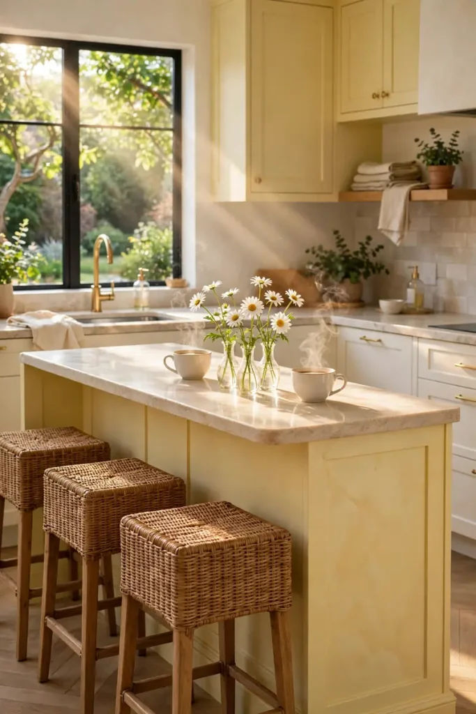
BEFORE: The plain peninsula was just a pass-through, useful but invisible. Nobody lingered there, and mornings felt rushed and gray.
AFTER: Painted butter yellow, the breakfast bar now glows like a sunbeam and everyone claims a stool. Coffee tastes better in a sunny spot, and slow mornings suddenly feel possible.
A breakfast bar is the perfect small canvas for butter yellow. It is one surface, low risk, high reward. I have seen renters do this with removable panels and landlords never knew. When the stakes are low, the joy can be high, so this is the ideal first step into color.
Mellow Marigold Mix
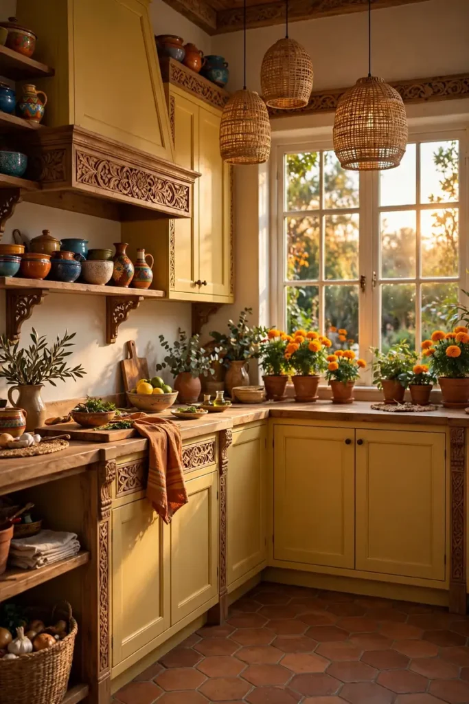
- Push the yellow toward marigold for an earthier, spicier feel. It suits Mediterranean and global styles beautifully.
- Pair it with terracotta floors or tiles. The two warm tones harmonize like they grew in the same garden.
- Add carved wood and woven textures. Natural crafts keep the rich color feeling grounded.
- Bring in living plants. Green leaves are the perfect cool note against all that warmth.
Marigold takes butter yellow on a world tour. The deeper golden tone carries spice-market energy that pale butter cannot. I have seen it transform plain kitchens into places that feel traveled and storied. If your style leans global, this is your yellow.
Classic Cream Contrast
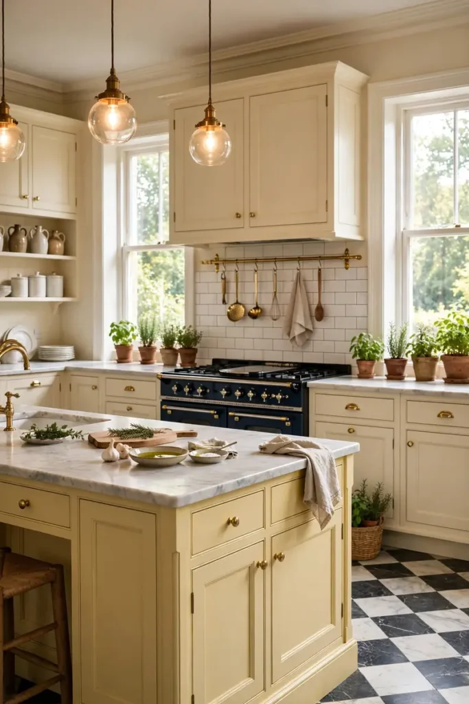
| Butter Yellow | Classic Cream | |
| Energy | Sunny and playful | Calm and timeless |
| Best spot | Island or feature run | Perimeter cabinets |
| Pairs with | Brass, warm wood | Any metal, any style |
| Longevity | Trend-aware choice | Never dates |
Cream is the safety net that lets butter yellow take a joyful leap. Use cream on the perimeter and save the yellow for the island, where it behaves like a beautiful piece of furniture. I have noticed this is the combination designers recommend to nervous clients, and it wins them over every single time.
Joyful Finishing Touches
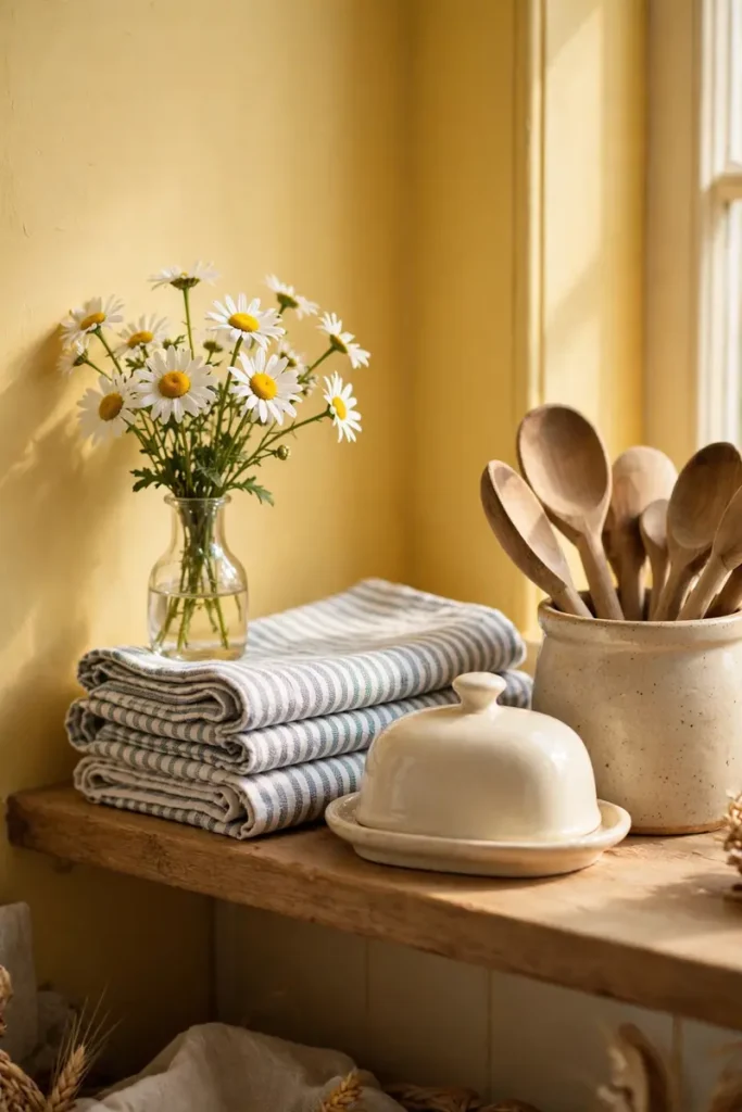
DO:
- Do finish with fresh flowers. Daisies or marigolds echo the cabinets for almost no money.
- Do fold striped tea towels over the oven handle. Textiles are the cheapest way to repeat a color.
- Do display a pretty butter dish. It is on theme and genuinely useful.
- Do keep counters mostly clear. Yellow shines brightest with breathing room around it.
DON’T:
- Do not clutter the shelves. A few loved pieces beat a crowded display.
- Do not introduce competing brights. Let yellow be the star of the show.
- Do not forget the ceiling. A soft white keeps the sunny feeling floating upward.
- Do not skip the final wipe-down. Clean surfaces make color look its best.
Finishing touches are where a yellow kitchen goes from nice to unforgettable. Fresh flowers, folded linens, and one perfect ceramic piece tell visitors this kitchen is loved. I have seen these small details photographed more than the cabinets themselves, which proves styling is the secret ingredient. Joy lives in the details.
Conclusion
These 23 ideas show that butter yellow kitchen cabinet ideas are really about choosing happiness as a design strategy. Whether you paint a single island or go all in on sunny shaker doors, the color brings a warmth that white simply cannot match.
Save this collection to your kitchen board on Pinterest so it is ready when inspiration strikes. Try the breakfast bar trick this weekend and watch how the room changes. I have seen how one sunny surface can shift the whole feeling of a home, and your kitchen deserves that glow. Share it with someone who needs a little more sunshine.
One Comment