24 Taupe and Cream Bedroom Decor Ideas for a Calm, Cozy Retreat
Some bedrooms feel calm the moment the door opens, and the secret is rarely the furniture. It is the warmth in the walls and bedding, the exact balance that taupe and cream bedroom decor gets right. Taupe brings the depth of a warm grey brown, cream keeps everything light, and together they build a room that slows your breathing.
Neutrals this soft reward layering more than shopping. Texture does the talking: linen, wool, washed cotton, a woven throw at the foot of the bed. In my experience, readers who love this palette also fall for a sage green interior color palette in the next room, since both schemes share the same gentle, natural calm. Start with the bed, keep the walls warm, and let cream do the brightening.
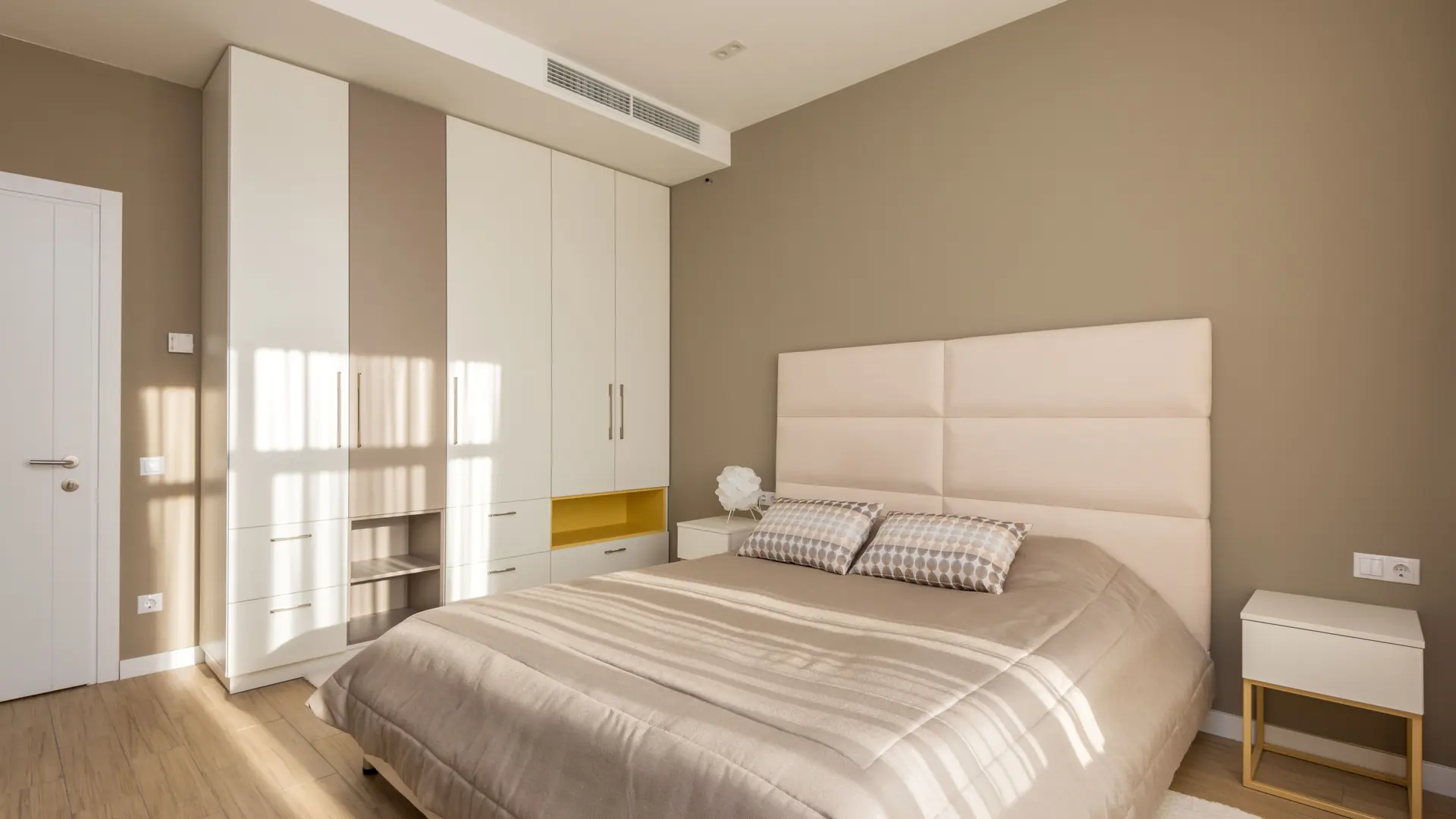
Taupe Walls, Cream Bedding
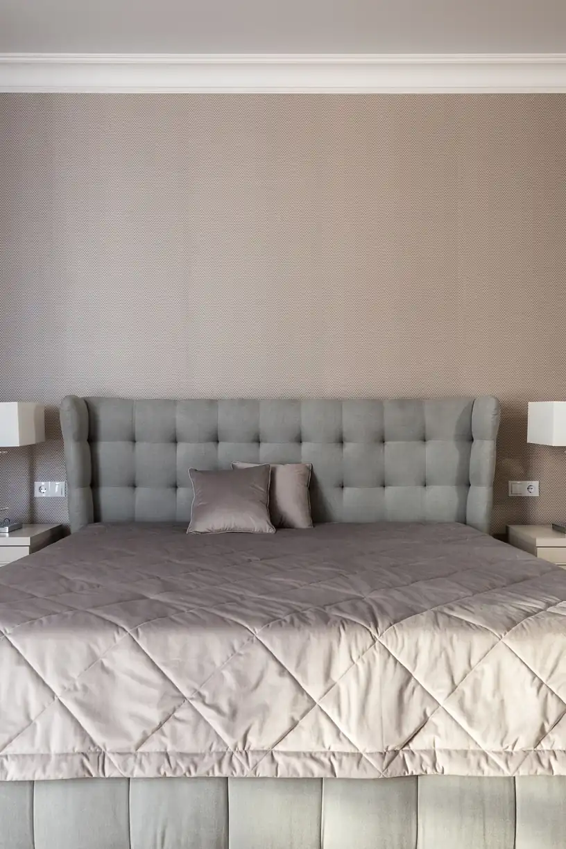
Credit : Max Vakhtbovych
Warm walls change everything a bedroom asks of you at night. Taupe sits between grey and brown, so it reads calm in daylight and cocooning after dark, never cold and never muddy. Against it, cream bedding looks brighter without any glare, and the bed becomes the soft landing the whole room promised.
Paint the full room rather than one wall when the ceiling is low; the wrap of color makes the space feel intentional instead of patched. I’ve noticed cream linen photographs paler than it looks in person, so choose bedding one shade deeper than the sample card suggests. The result holds from bright mornings to soft lamplight.
Layered Cream Linen Layers
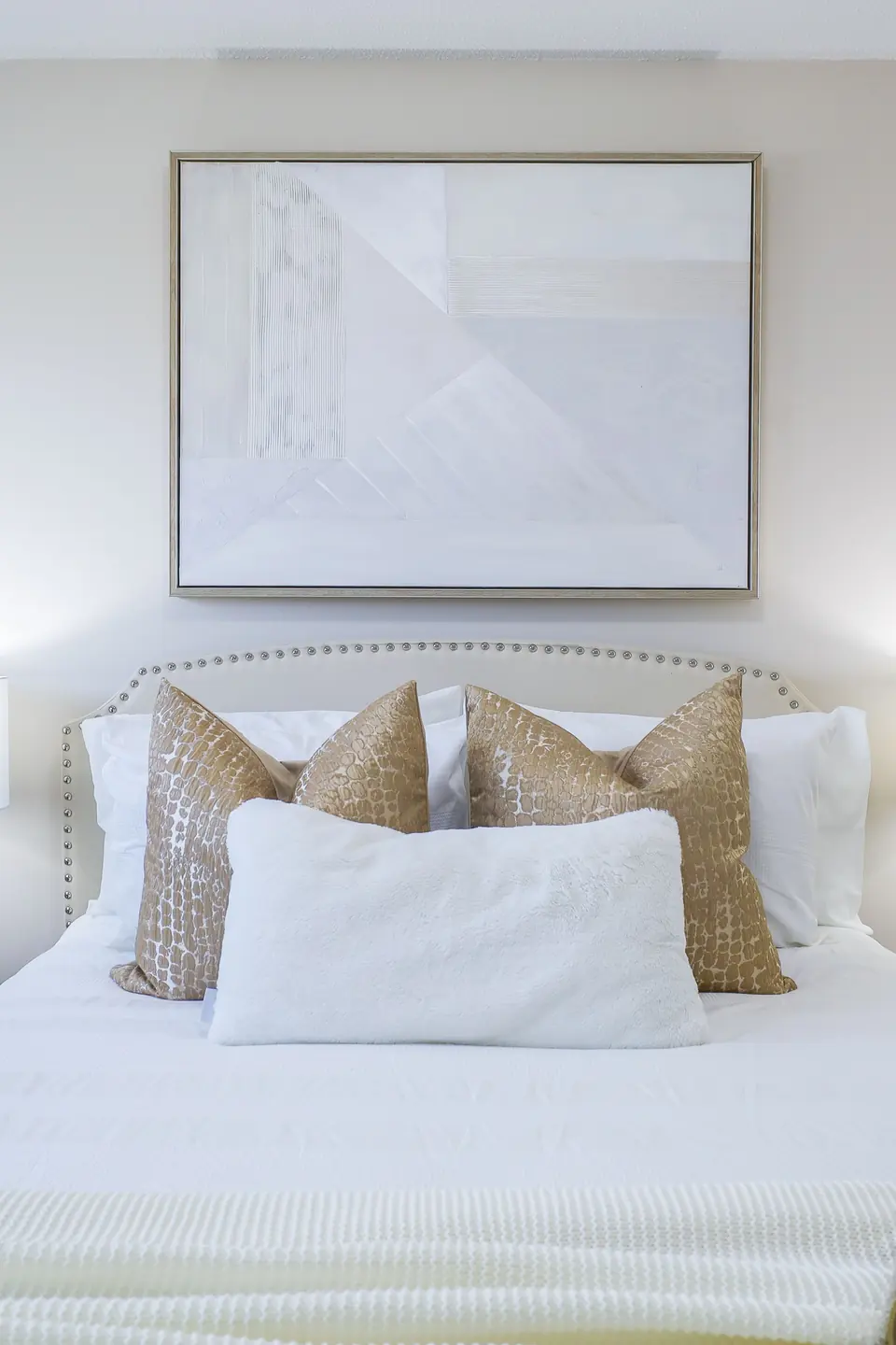
Credit : Elias Storm
- Start with a cream base sheet and duvet in washed linen or cotton percale
- Fold a taupe quilt or coverlet across the lower third of the bed
- Stack sleeping pillows upright, then two cream cushions, then one taupe lumbar
- Finish with a knitted throw draped loosely over one corner, never centered
Layers work because each one catches light differently. Matte linen beside a slight sheen on the quilt gives the bed depth without a single pattern. Keep every layer in the same warm family and the bed reads generous and calm, the kind guests photograph before they sit down. Restraint keeps it elegant: one pattern at most, and only in a cushion.
Taupe Upholstered Headboard
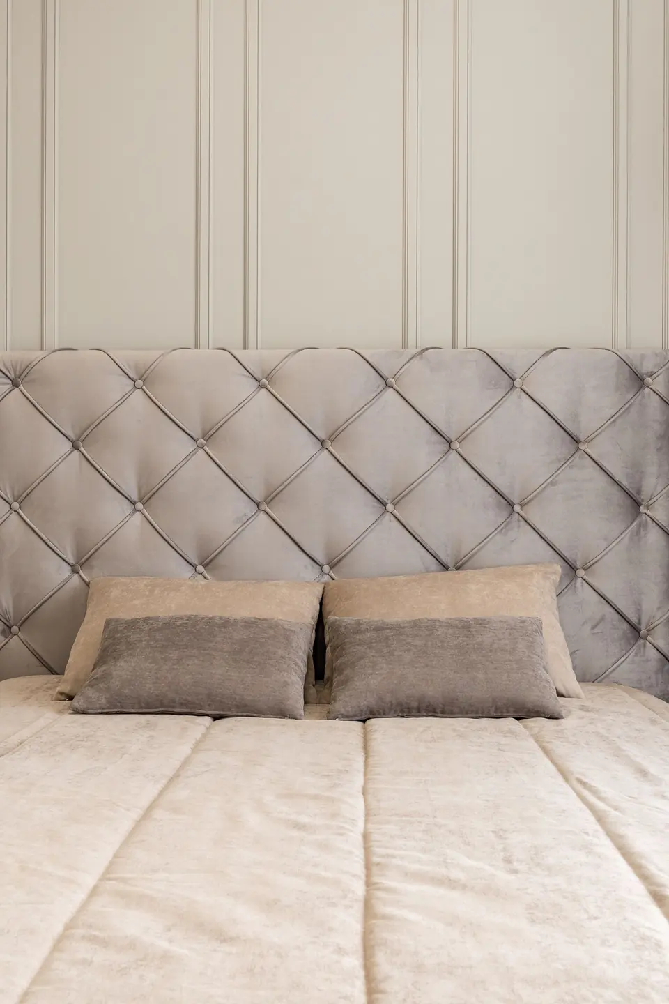
Credit : Max Vakhtbovych
Quick Tip: Hold headboard fabric samples against the wall at night, not in the shop. Taupe velvet and linen both shift warmer under lamplight, and the sample that looks dull at noon often turns rich by nine. Pin the finalists to the bed frame for two evenings before ordering.
An upholstered headboard earns its place in a neutral room because it adds softness where the eye lands first. Tall panels suit high ceilings; a low, wide shape flatters smaller rooms. Keep the fabric plain and let the stitching, buttons, or channels supply the detail. Measure the wall before ordering; the headboard should run wider than the mattress by a hand’s width on each side for balance.
Cold White To Warm Taupe
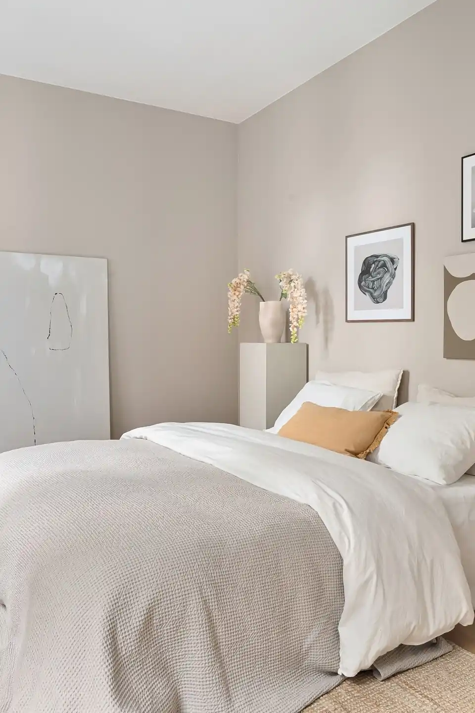
Credit : Lisa Anna
BEFORE: The room wore bright white walls, a white duvet, and cool grey cushions. Every surface bounced light, the bed looked flat, and winter mornings felt sharper than they needed to. Nothing matched badly; everything simply felt cold.
AFTER: Taupe paint wrapped the walls, and cream bedding replaced the stark white set. The same furniture suddenly looked warmer, the cushions turned honey toned, and the bed read as a place to linger. Morning light now lands softly instead of glaring.
Paint did ninety percent of this work, which is why the swap suits renters with permission and owners on a budget alike. Warm neutrals forgive older furniture, so the room improves without a single big purchase.
Layering Neutrals, Step By Step
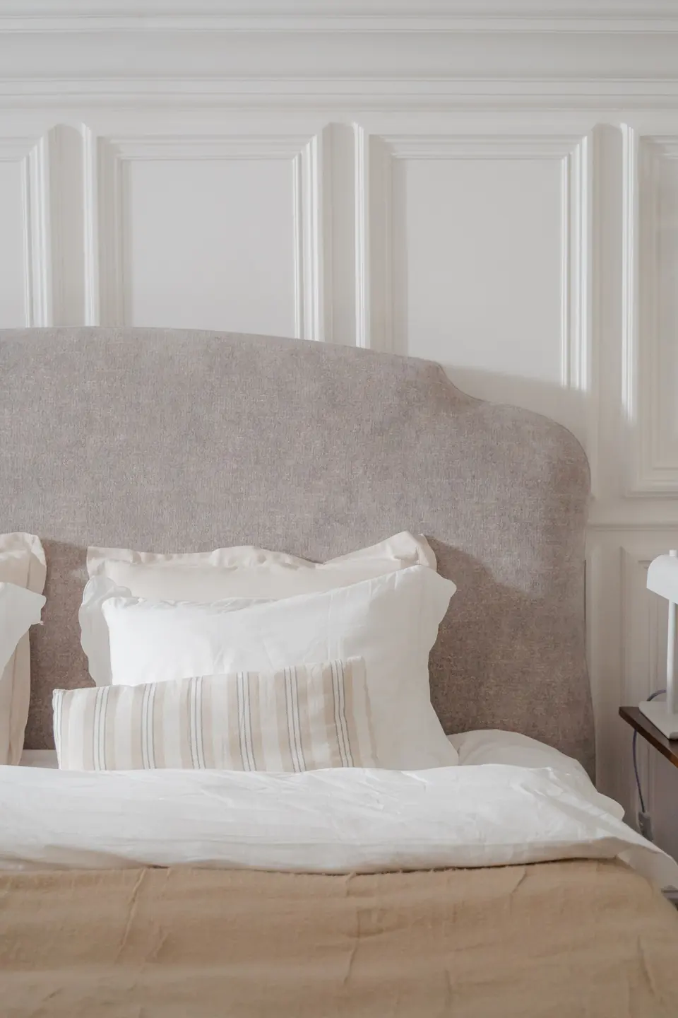
Credit : Ron Lach
- Lay the cream fitted sheet and flat sheet, corners tucked tight for a smooth base
- Spread the cream duvet and fold the top quarter back to show the sheet beneath
- Add a taupe quilt folded in thirds across the foot of the bed
- Stand sleeping pillows against the headboard, cream shams in front of them
- Place one textured lumbar cushion last, off center by a few inches
Five layers sound like effort, yet the bed still makes in under three minutes once the order becomes habit. The sequence matters more than the price of any piece. Photograph your finished bed; the camera shows lopsided layers your eyes forgive.
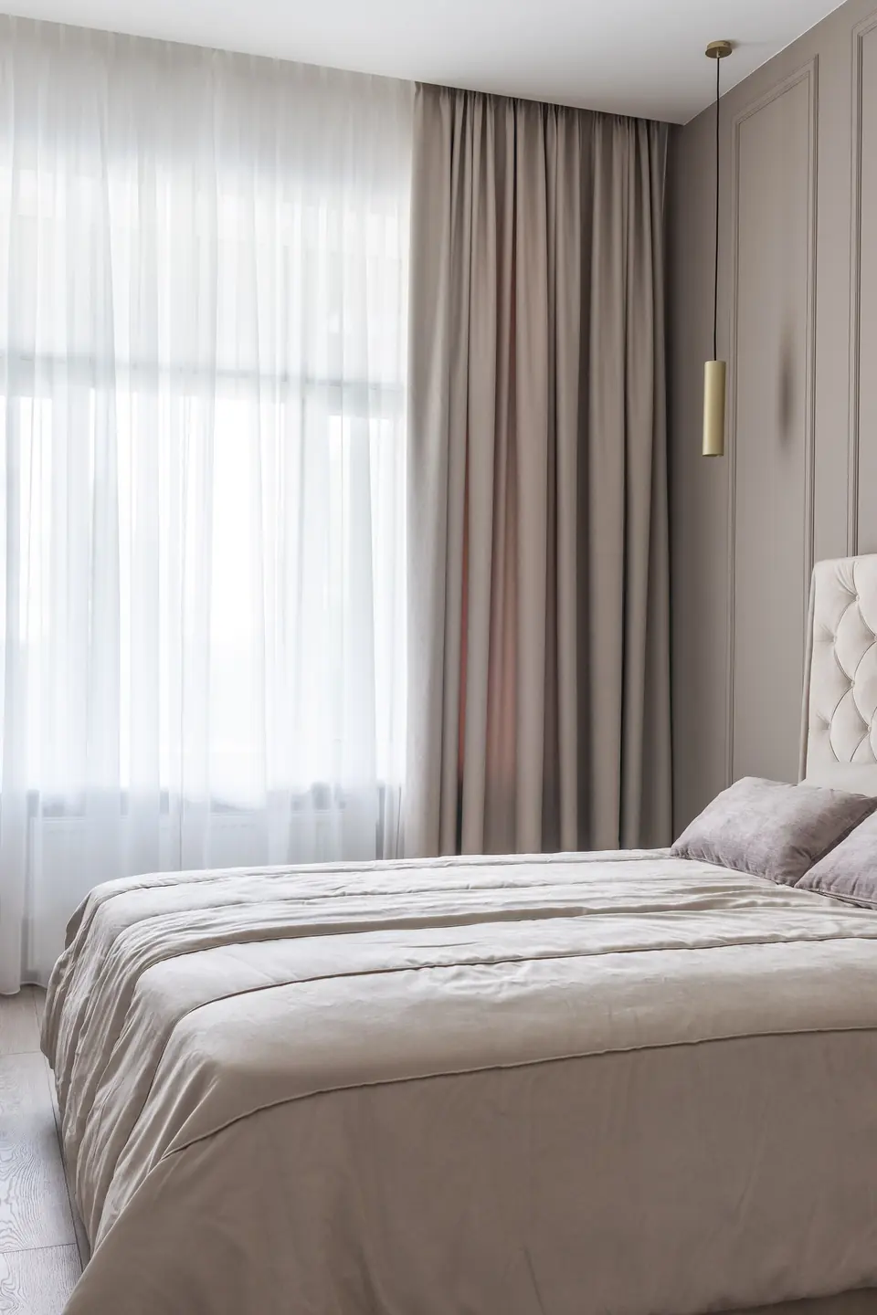
Taupe Versus Greige Walls
Credit : Max Vakhtbovych
| Feature | Taupe | Greige |
|---|---|---|
| Undertone | Warm brown base | Cool grey base |
| Mood | Cozy and grounded | Crisp and airy |
| Pairs With | Cream, oak, brass | White, chrome, glass |
| Best For | Low light bedrooms | Sunny south rooms |
Both shades live in the same family, yet they steer a bedroom toward different weather. Taupe leans warm and earthy, which is why it flatters cream bedding and wood. Greige leans cooler and cleaner, better beside white linen and chrome. Test both on the wall behind the bed before deciding; that wall sets the temperature for every morning. Large swatches, viewed at breakfast and again at dusk, settle the argument honestly.
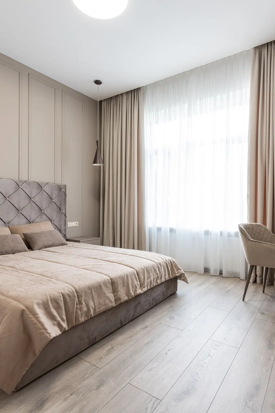
Cream Curtains, Softer Light
Credit : Max Vakhtbovych
Do:
- Hang panels from ceiling height so the cream fabric lengthens the whole wall
- Choose lined linen that filters light into a soft, warm glow
- Let hems kiss the floor for a calm, finished edge
Don’t:
- Mix bright white curtains with taupe walls; the contrast turns chilly
- Stop panels at the window sill in a bedroom meant for rest
- Pair cream curtains with cool grey bedding in the same room
Curtains carry more wall area than most people realize, so their tone quietly sets the room’s temperature. Cream panels beside taupe walls keep mornings gentle and evenings golden. I’ve seen this work well in many cases where paint alone could not soften a boxy room.
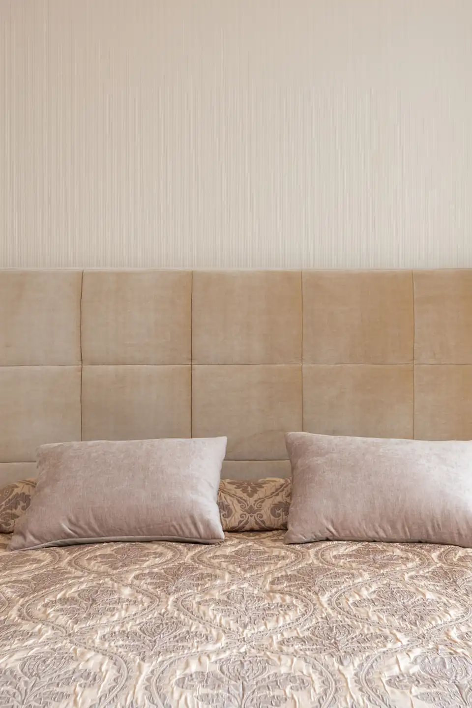
Taupe Bedroom Quick Facts
Credit : Max Vakhtbovych
Cost: Paint, bedding, and curtains refresh most rooms for a moderate budget.
Time: One weekend covers painting and dressing the bed.
Skill Level: Beginner friendly; no special tools beyond a roller and drill.
Best For: Renters and owners craving calm without bold color.
Facts like these explain why this pairing keeps returning to saved boards. Nothing here depends on trends or rare pieces. Warm walls, soft bedding, filtered light: the recipe repeats in any size of room, and it survives style swings because it was never chasing them. Renters can borrow the same recipe with bedding and curtains alone, skipping paint entirely, and still land most of the effect by the end of one afternoon.
Woven Texture, Taupe Tones
Credit : Letícia Alvares
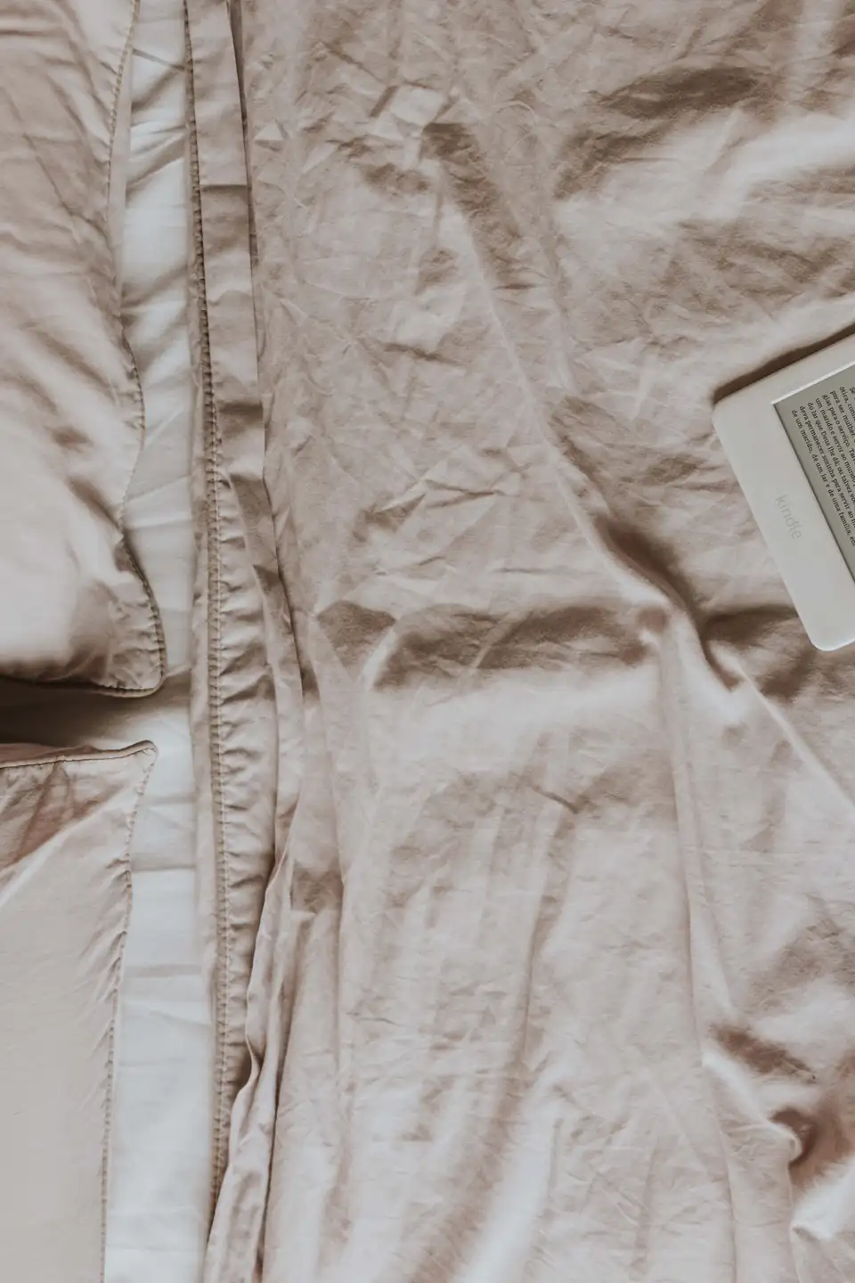
Flat neutrals bore quickly; woven ones never do. A slubby linen duvet, a nubby wool throw, and a cane or rattan tray give taupe and cream bedroom decor its quiet richness. Your hands read the room before your eyes do, and every surface invites touch instead of just looking tidy from the doorway.
Keep the palette tight and let texture carry the variety. Three textures per surface is a workable ceiling: more turns busy, fewer turns flat. Natural fibers also age gracefully, softening with every wash, so the room improves through the year instead of wearing out. Wool, linen, and cotton also share one virtue: they all look better slightly rumpled than pressed flat.
Cream Rug, Warmer Floors
Credit : Max Vakhtbovych
- Size the rug so front bed legs and both nightstands rest on it
- Pick a low, dense pile in cream with a faint taupe border or fleck
- Layer a smaller woven runner over the rug on the waking side
- Vacuum with suction only; beaters fray natural fibers quickly
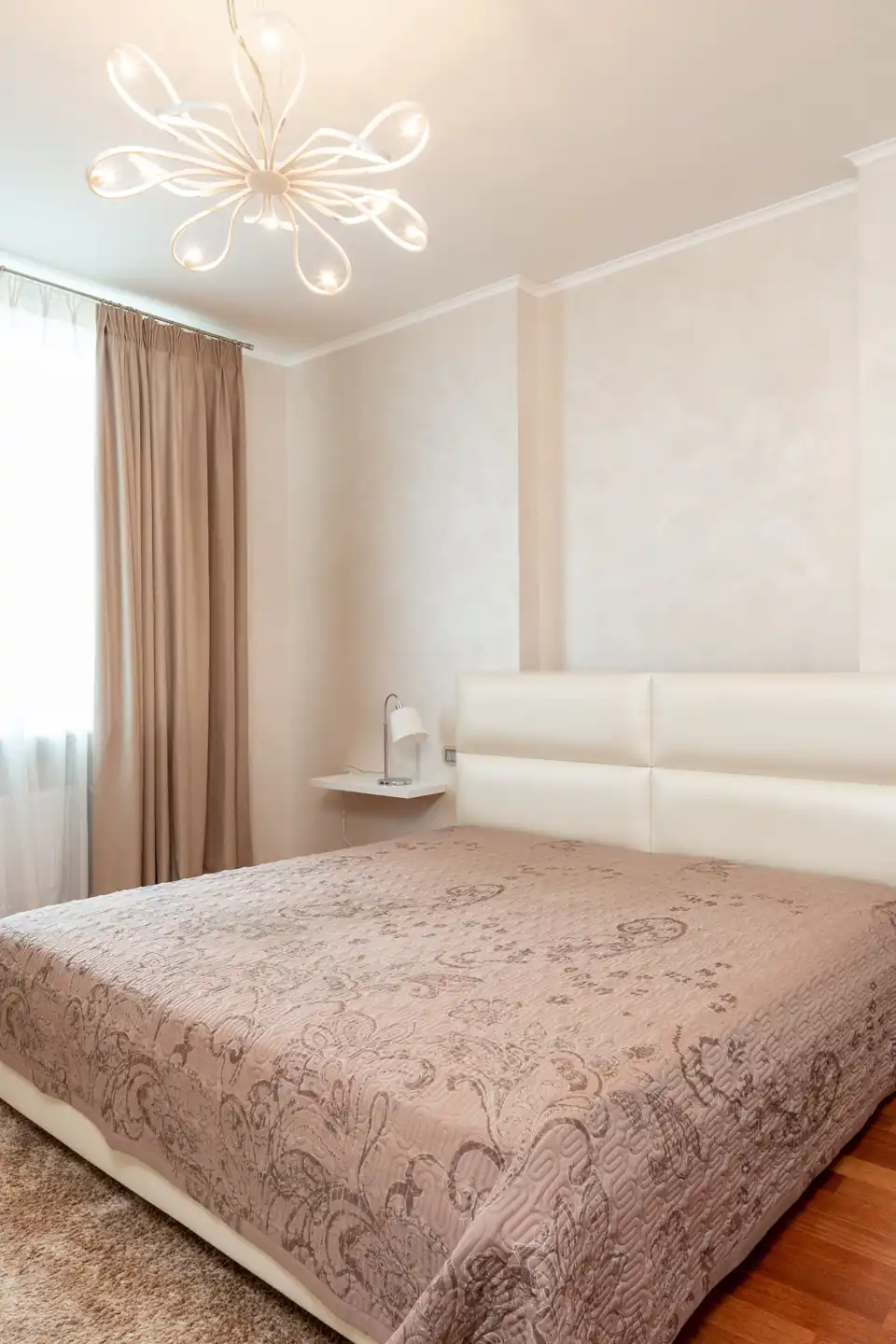
Bare feet decide whether a bedroom feels kind at six in the morning. A cream rug under the bed warms the first step of the day and muffles sound at night. Against taupe walls and wood floors, that pale rectangle also frames the bed like a picture. Wool blends shed less and hold their edge longer, which matters most in the walkway beside the bed.
One Taupe Accent Wall
Credit : Max Vakhtbovych
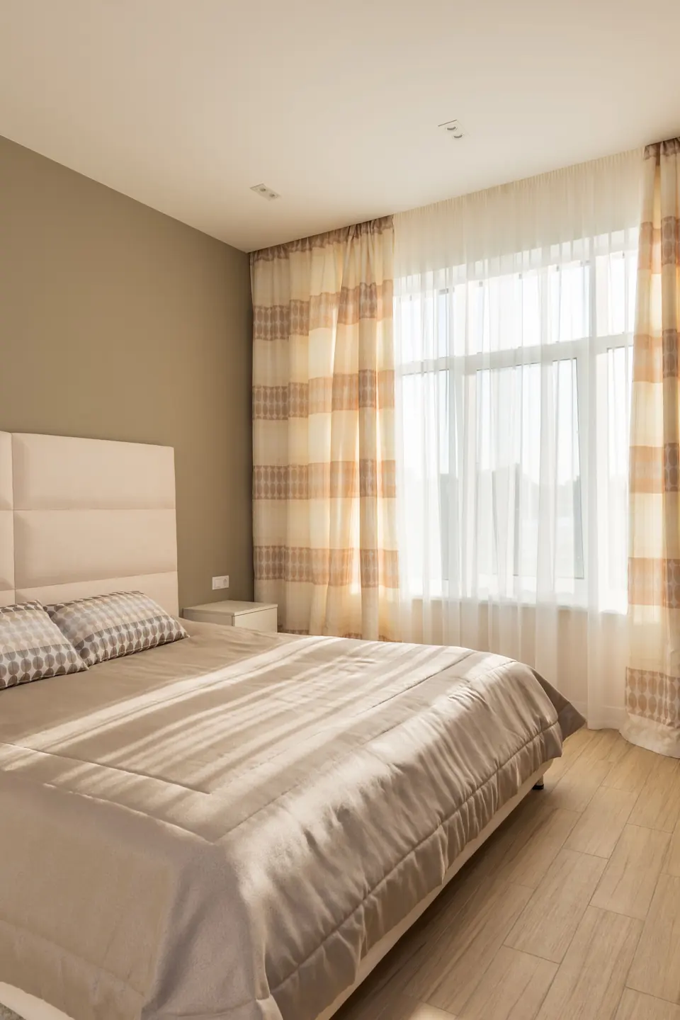
Quick Tip: Paint the wall the headboard touches, and stop there. One taupe wall behind the bed gives the room its depth cue, while cream on the remaining walls keeps the space bright. Carry the taupe onto the skirting board for a finished, deliberate edge.
Accent walls fail when the color appears nowhere else. Repeat taupe in two small places, a cushion and a lampshade, and the wall reads as the anchor of a scheme rather than a leftover decision. The bed stays the hero either way. Sample the shade on a full poster board first and live with it through one cloudy day before the roller comes out.
Dull Beige To Taupe Depth
Credit : Wilcle Nunes
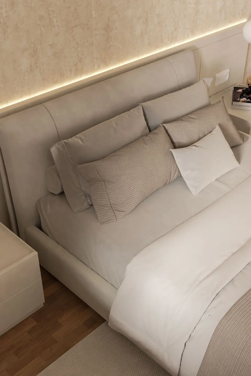
BEFORE: Beige walls, beige carpet, and a beige bedspread blurred into one flat tone. The room was not ugly; it was forgettable, a space guests described as fine. Light came in and had nothing to catch on.
AFTER: A deeper taupe on the walls separated every layer at last. Cream bedding stepped forward, the wood furniture regained its grain, and the old beige carpet settled quietly under the new contrast. The room finally had a mood worth naming.
Depth, not darkness, was the missing ingredient. Moving two shades deeper than the original beige kept the room’s calm while giving it a spine. That’s why many experts recommend contrast within a family before reaching for new colors.
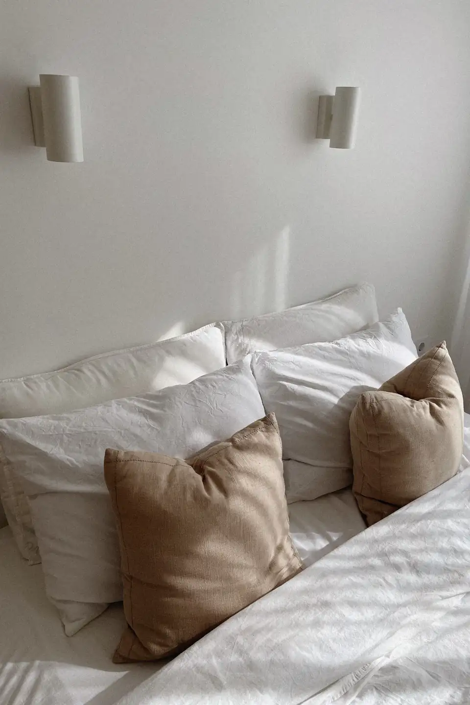
Dress The Bed In Layers
Credit : Aljona Ovtšinnikova
- Shake the duvet by the window or door to restore its loft
- Smooth the cream top sheet and fold it over the duvet edge
- Stand euro pillows at the back, sleeping pillows angled in front
- Run a taupe throw along the foot, one corner pulled longer
- Set a small tray with a book and carafe on the waking side
A dressed bed changes how the whole day starts; the room looks handled before coffee. The routine takes minutes, and guests read the care instantly. In my experience, households keep habits that look this good long after stricter routines fade. The bed also photographs honestly at this point, which helps when a room refresh needs a second opinion.
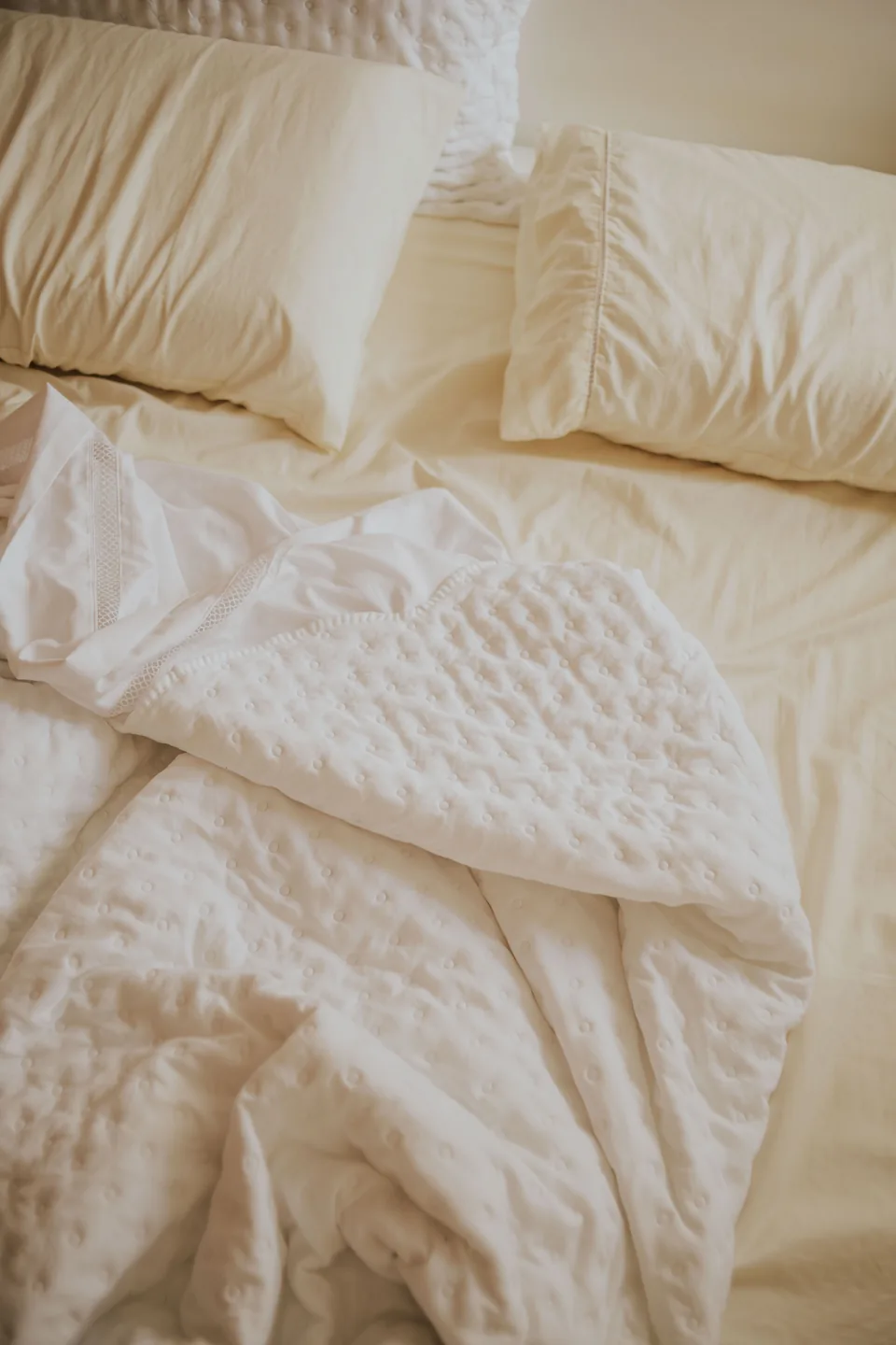
Linen Versus Cotton Bedding
Credit : Letícia Alvares
| Feature | Linen | Cotton Percale |
|---|---|---|
| Feel | Textured, relaxed, breathable | Smooth, crisp, cool |
| Care | Softens with every wash | Needs ironing for crispness |
| Look | Lived in and calm | Hotel neat and bright |
| Best For | Year round layering | Summer weight bedding |
Neither fabric wins outright; they set different moods on the same warm base. Linen forgives wrinkles and suits the relaxed spirit of this palette, while percale gives a cleaner line for guest rooms. Many homes mix both, linen on the main bed and cotton where a crisper welcome matters most. Weight matters too: a heavier duvet insert fills linen generously, while percale shows its crispness best with a lighter fill through the warmer months.
Nightstands Styled In Taupe

Credit : Anna Vlasova
Do:
- Match lamp height to the headboard so light pools where reading happens
- Keep one natural object per stand: a stone, a shell, a small plant
- Hide chargers in a drawer or behind a stack of two books
Don’t:
- Crowd the surface with frames, bottles, and remotes at once
- Use bright white bulbs that fight the warm palette at night
- Let the two stands match so exactly that the room feels staged
Nightstands are the room’s handshake, seen up close and used half asleep. Warm wood, a soft lamp, and one honest object per side beat a styled display every time. The taupe wall behind them does the decorating.
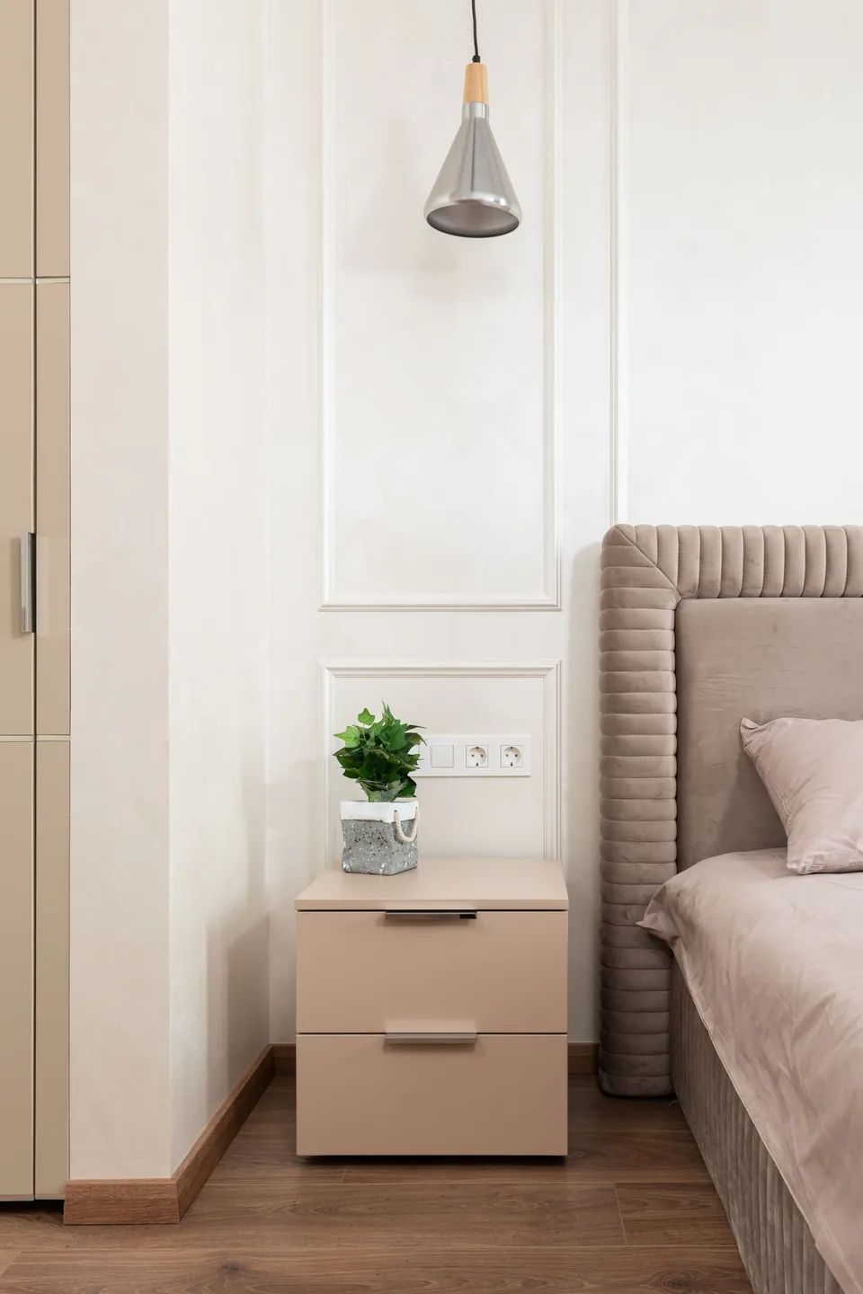
Small Taupe Bedroom Facts
Credit : Max Vakhtbovych
Cost: One tin of paint plus cream bedding updates a small room cheaply.
Time: A single day, since small walls dry and dress fast.
Skill Level: Beginner; cutting in is the only fiddly part.
Best For: Box rooms, guest corners, and narrow rentals.
Small rooms gain the most from this pairing because taupe recedes gently while cream bounces the little light available. A large bed still fits the scheme; in a tight room, the bed is the room, so dress it fully and skip extra furniture. Hang one mirror opposite the window and even a north facing box room borrows enough light to feel gentle by day.
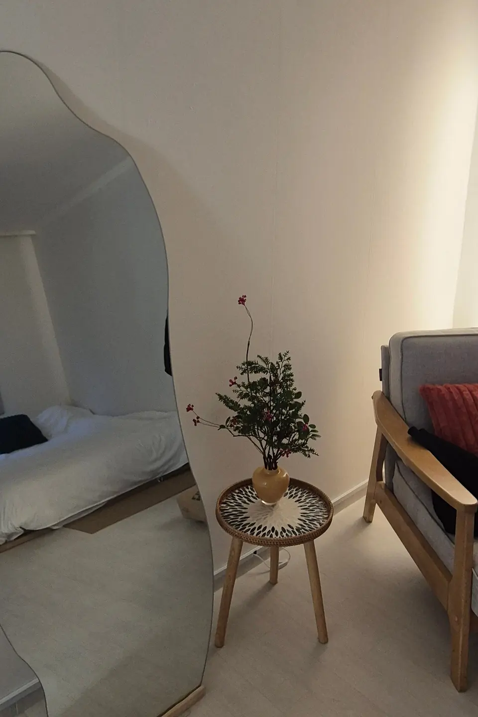
A Cream Reading Corner
Credit : 폭 폭
Every calm bedroom deserves one chair that belongs to nobody’s routine. A cream armchair in the corner, a small taupe cushion at the back, and a lamp with a warm shade build a reading spot that pulls you in before bed. The corner earns its keep on slow Sundays too.
Corners like this borrow their logic from living rooms, and the layering behind mushroom color living room decor translates directly: soft neutrals, honest textures, one warm metal. Add a footstool or a folded throw within reach, and the corner starts competing with the bed for your evenings. A small side table completes the setup; books behave better stacked than scattered.
Light Wood Warms Taupe
Credit : Max Vakhtbovych
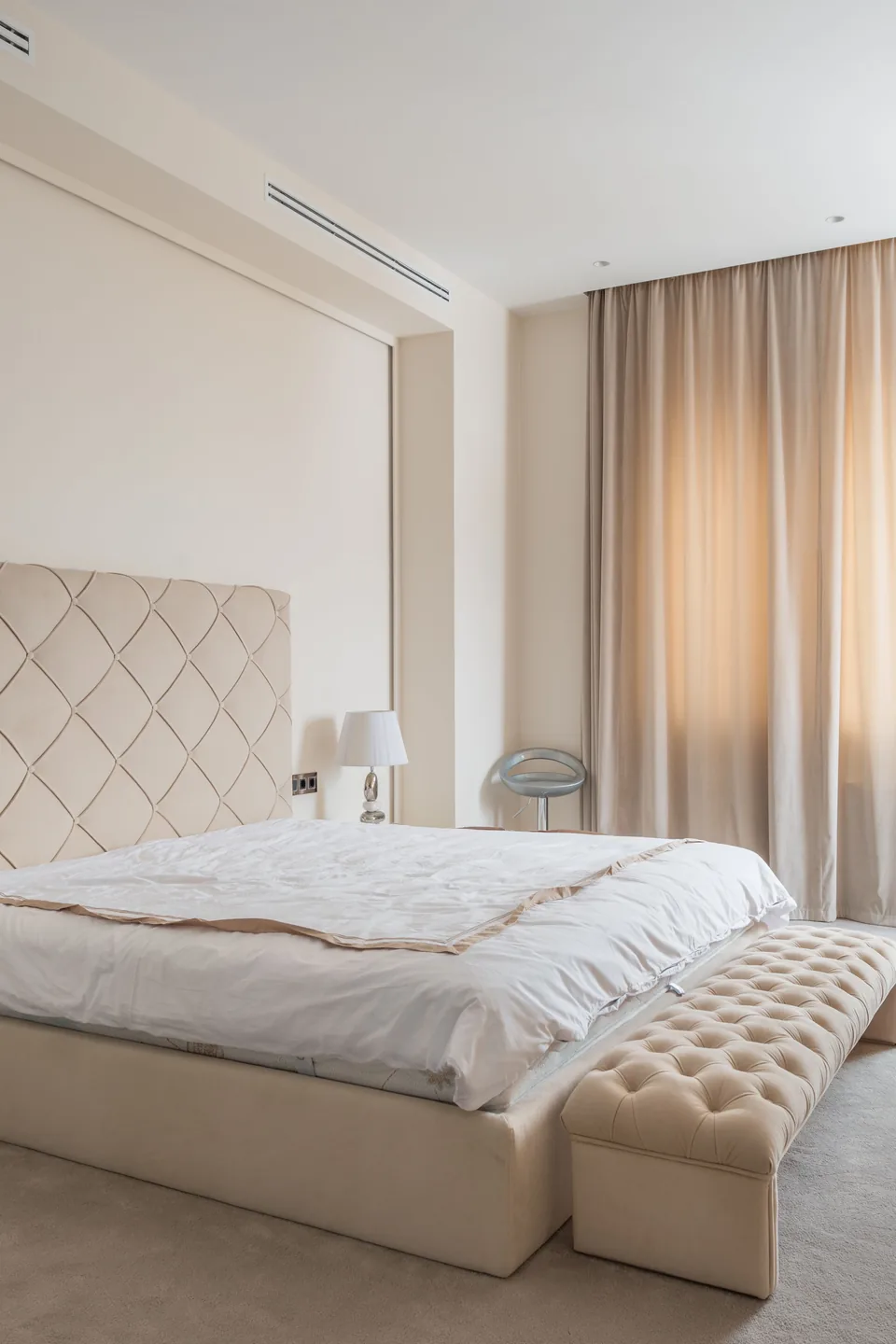
- Choose pale oak or ash for bed frames beside taupe walls
- Repeat the same wood tone twice, frame and bench, for a calm rhythm
- Sand and oil older pine pieces to lift their color toward honey
- Pair wood with cream textiles so grain stays the warmest note
Wood is the bridge between taupe and cream, warmer than one and deeper than the other. Light timber keeps the bridge airy, so the room reads Scandinavian calm rather than rustic heavy. Keep metal accents brushed and warm to sit quietly beside it. One caution: very orange pine fights the palette, so tone it down with a white wax before blaming the walls.
Throws And Cushions, Layered
Credit : Max Vakhtbovych
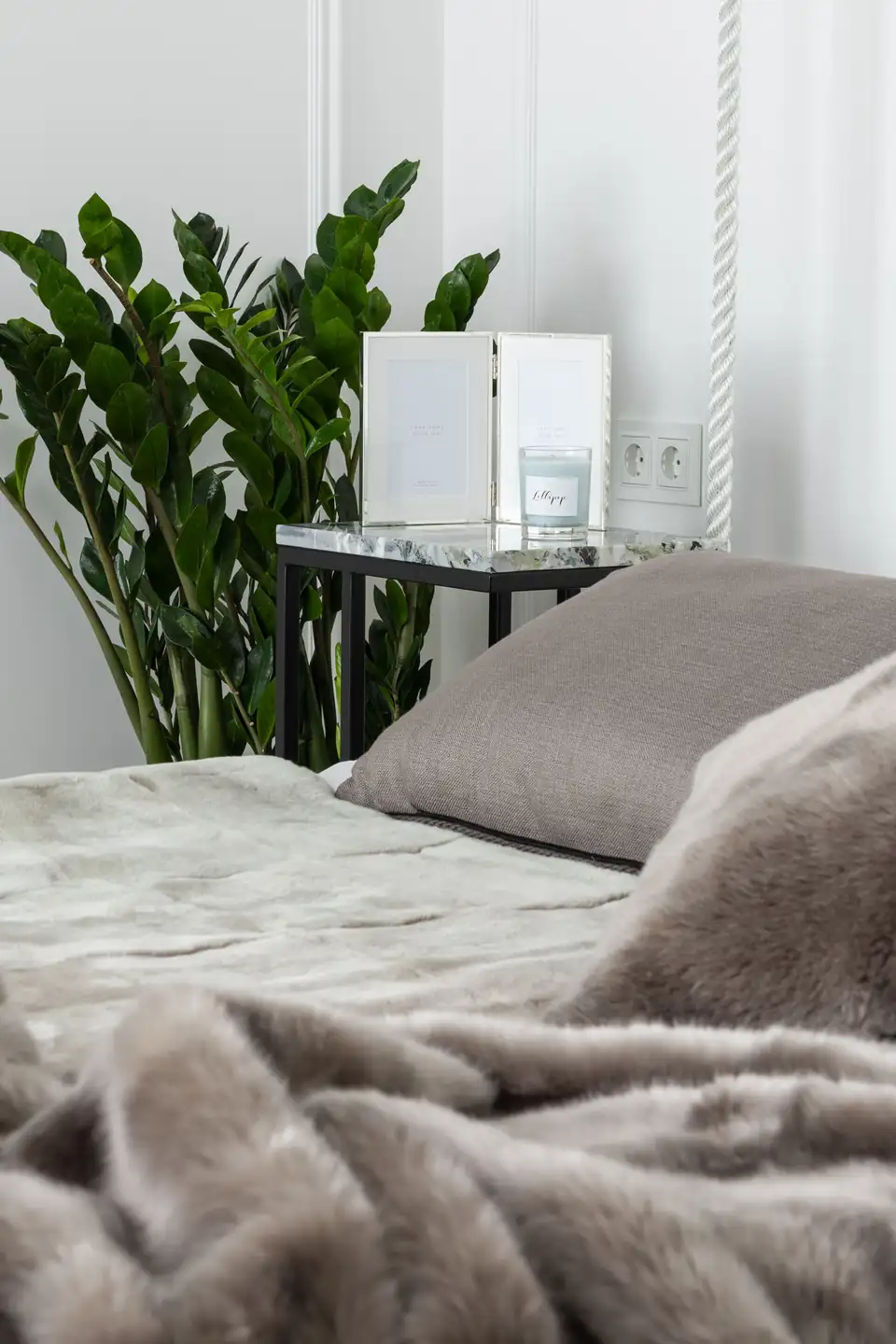
Quick Tip: Work in odd numbers and mixed weights. Three cushions, one chunky knit throw, one smooth cotton layer: the eye reads the variety as richness. Photograph the bed from the doorway; whichever piece shouts loudest goes back in the cupboard.
Throws and cushions are the cheapest way to test how deep your taupe should go. Start pale, then swap one cushion cover darker each season. The bed becomes a slow experiment that never risks the walls, and the room keeps changing without a single repaint. Retire one layer in summer rather than swapping the whole scheme; the bones of the bed stay the same all year.
Cold Grey To Taupe Calm
Credit : Ushindi Namegabe
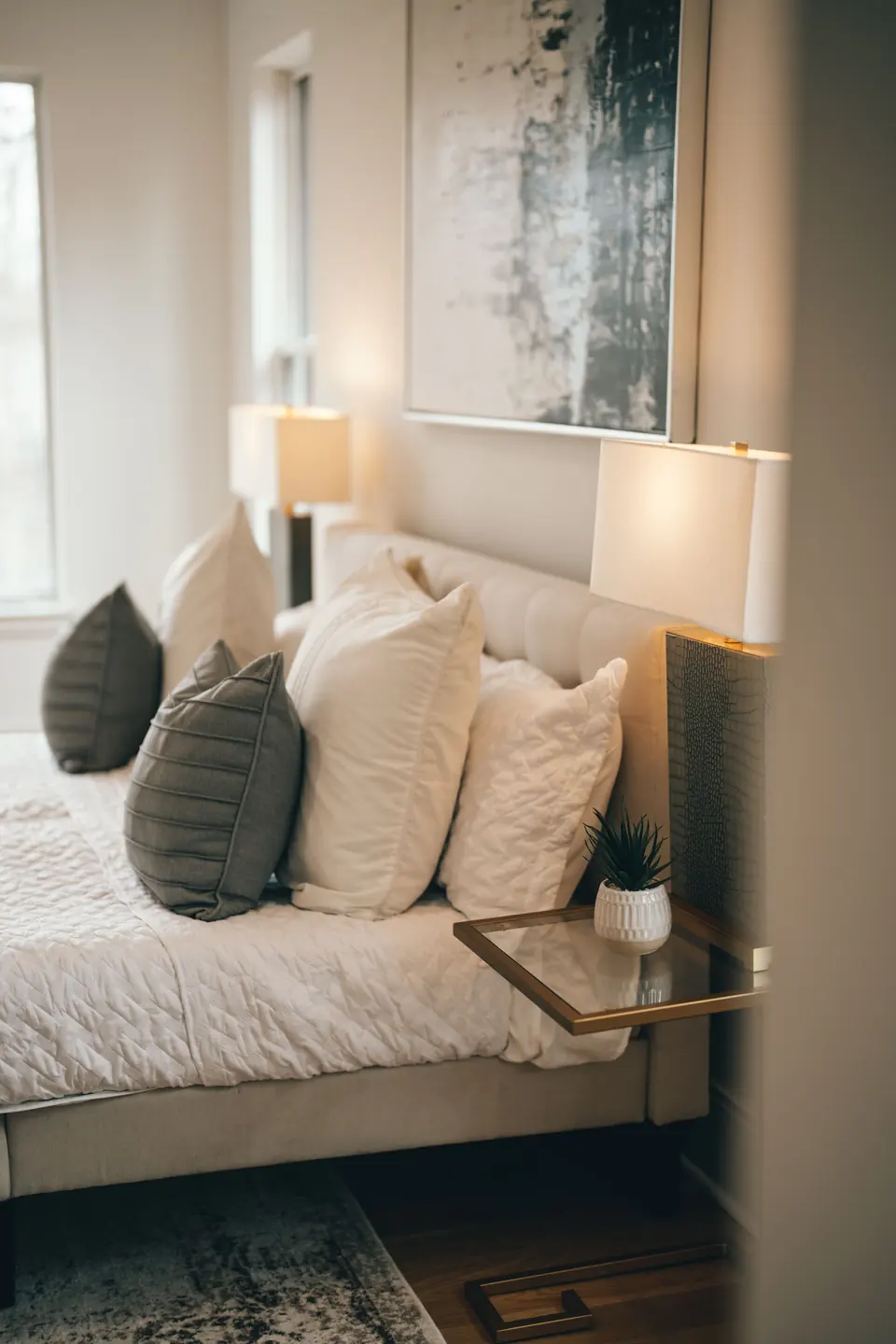
BEFORE: Grey walls and a grey upholstered bed promised calm and delivered chill. The room photographed beautifully at noon and felt like a waiting room by eight. Guests kept their socks on.
AFTER: Taupe replaced the grey on walls and cushions, and cream wool joined the bed. The same daylight now reads golden, the bed invites rather than displays, and evenings in the room run long. Nothing structural changed; only the temperature did.
Grey is not the enemy; undertone is. A grey with brown in it behaves like taupe and warms everything it touches. Check paint codes for warm bases before blaming the color family for a cold room.
Calmer Mornings, Better Light
Credit : McFollis
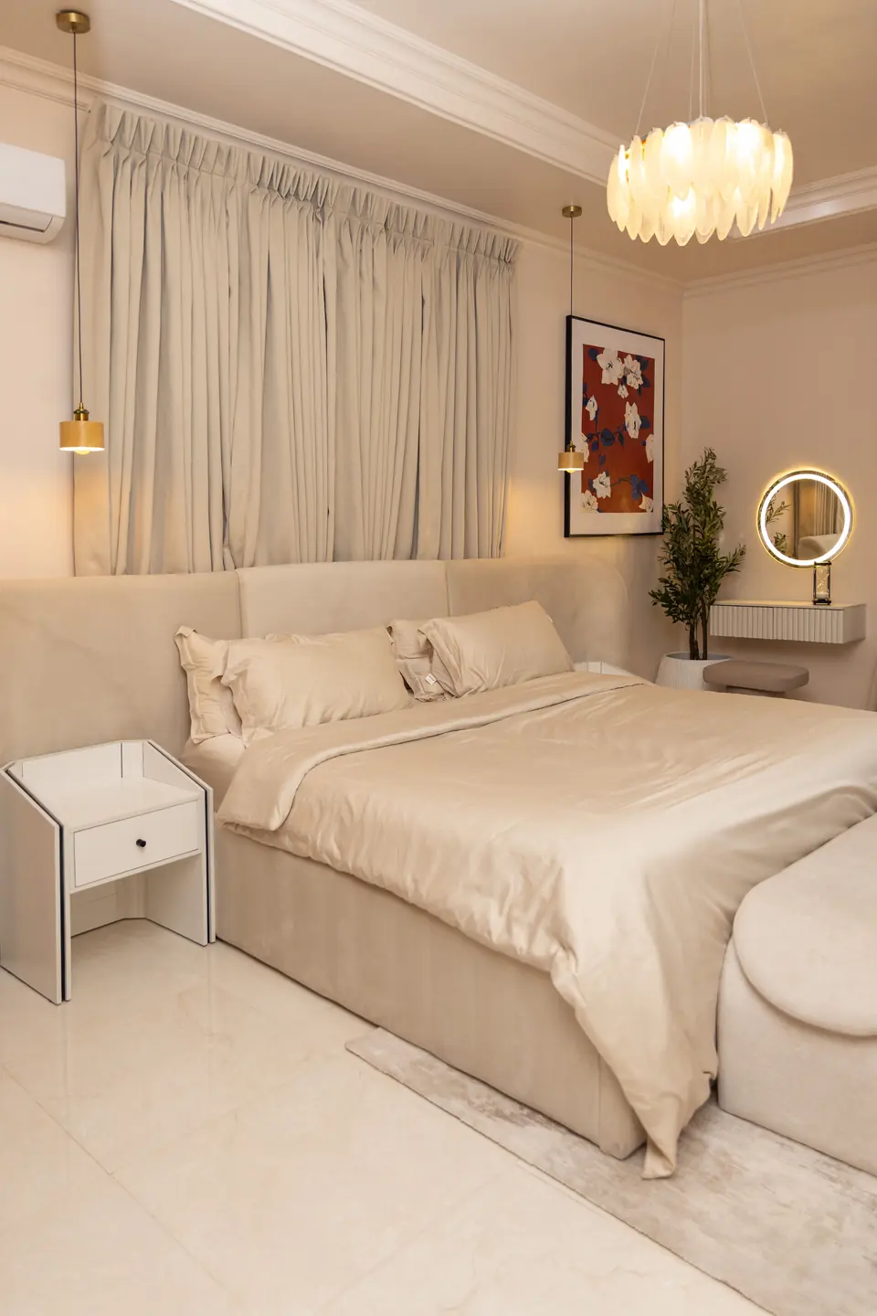
- Open curtains fully before anything else; morning light sets the palette glowing
- Make the bed in the five layer order while the kettle heats
- Set tonight’s book and water carafe on the nightstand now, not later
- Fold the throw over the chair so the bed stays clean lined all day
- Leave the door open; a dressed room improves the whole hallway
Routines stick when the room rewards them, and this soft scheme pays you back in calm before the day starts asking questions. Five small acts, none longer than a minute, keep the retreat feeling deliberate instead of accidental. None of it asks for willpower once the room starts looking this settled by seven each morning.
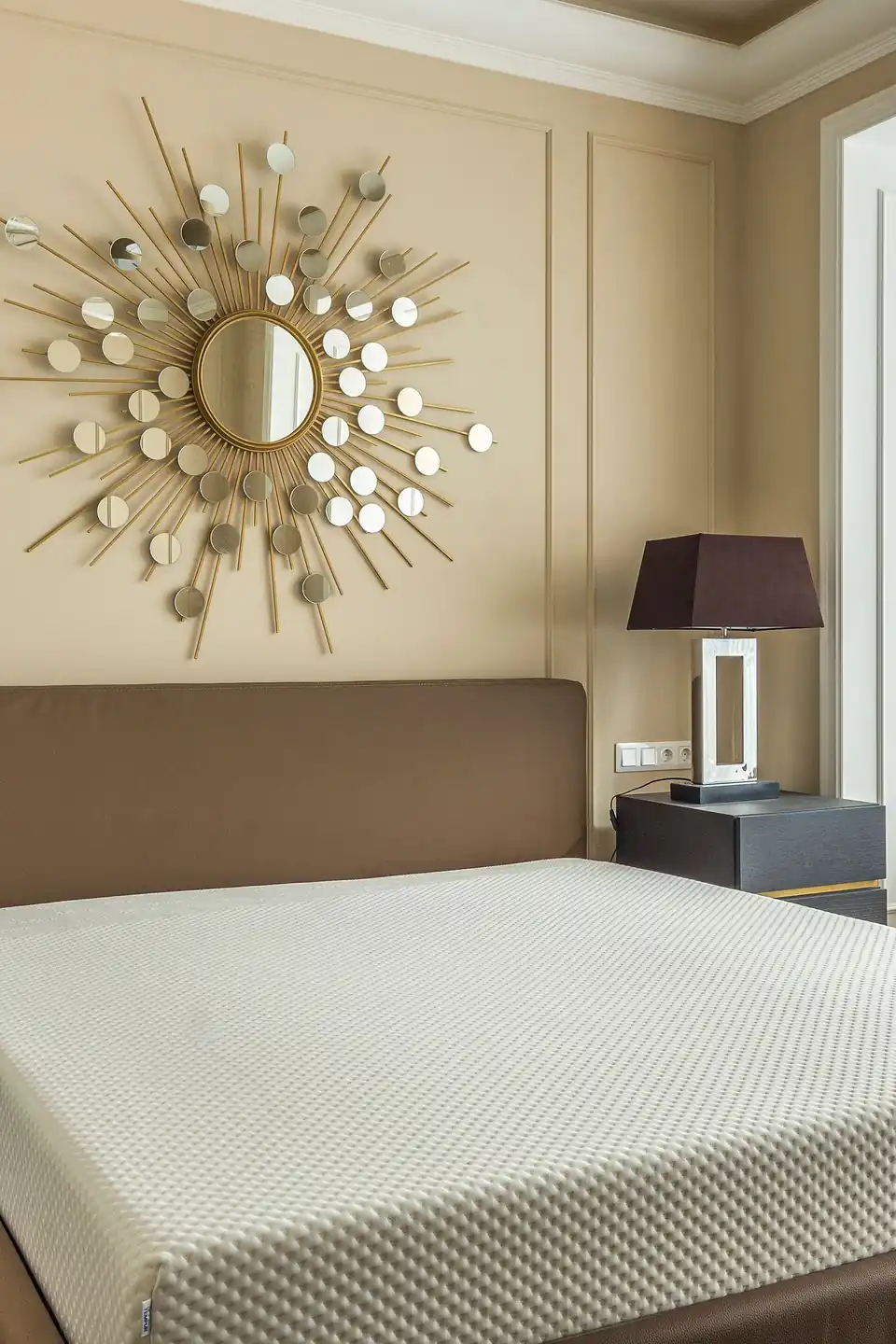
Matte Paint Versus Limewash
Credit : Max Vakhtbovych
| Feature | Matte Paint | Limewash |
|---|---|---|
| Finish | Flat and even | Cloudy, brushed texture |
| Application | Two coats, one day | Two coats, brushwork visible |
| Cost | Lower per tin | Higher, thinner coverage |
| Best For | Smooth modern walls | Old plaster, soft mood |
Limewash gives taupe a weathered softness that flat paint cannot fake, with brush marks that shift through the day. Matte paint wins on speed, price, and touch ups. Behind a bed, where light grazes the wall at low angles, the limewash texture shows its value most. Under lamplight the difference narrows, so judge both finishes at breakfast before spending on either one for the whole room.
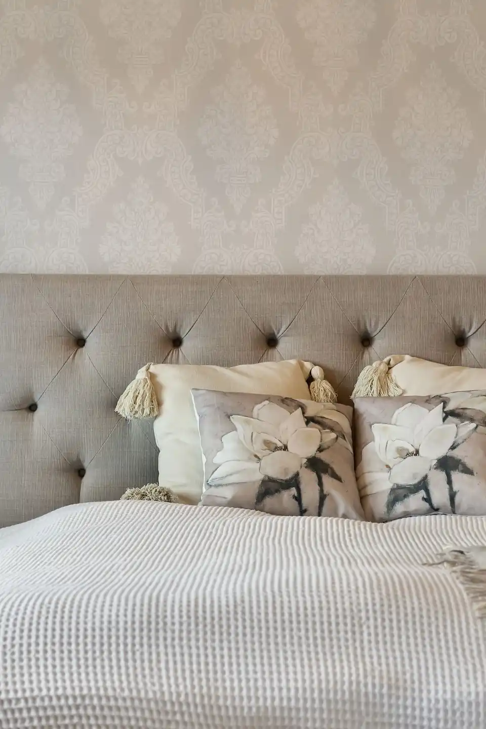
Guest Room Ground Rules
Credit : Lisa Anna
Do:
- Leave one drawer and a foot of hanging space empty for guests
- Set a carafe, glass, and folded spare throw on the nightstand
- Layer the bed for two temperatures: light quilt plus warm throw
Don’t:
- Fill the room with family photos that make guests feel watched
- Scent the room heavily; clean and neutral wins every time
- Hide the spare blankets where only family would find them
Guests remember how a room treated them at midnight, not how it looked at noon. Warm taupe walls, cream bedding, and everything within reach turn a spare room into quiet hospitality. Keep a small basket of chargers and tissues by the bed.
Taupe Palette Quick Facts

Credit : Ansar Muhammad
Cost: The palette leans on paint and textiles, the two cheapest levers.
Time: Most rooms settle within one weekend of steady work.
Skill Level: Beginner to intermediate, depending on paint finish.
Best For: Calm seekers, light sleepers, and neutral lovers.
Underneath every idea here sits one promise: warmth without noise. Taupe and cream ask little, forgive much, and age slowly. Rooms built on them stay welcoming through trends, seasons, and the changing cast of furniture that real life brings through the door. Start with whichever change touches the bed first; the walls can wait a week, and the calm cannot wait at all.
Conclusion
A calm bedroom rarely needs more things; it needs warmer decisions. These ideas show how taupe and cream bedroom decor turns plain rooms into retreats through tone, texture, and light rather than spending. Save the list to your Pinterest boards, start with the bed or the wall behind it, and give the scheme one full week of mornings before judging it. The palette asks for no boldness, only warmth, patience, and a willingness to let soft colors do slow, quiet work. Calm this steady does not shout. It simply stays, and so will you, lingering a little longer each evening in a room that finally feels like rest.