22 Striped Wallpaper Powder Room Ideas for Timeless Style
A powder room is the smallest stage in the house, and it rewards bold choices more than any other room. Great striped wallpaper powder room inspiration starts with one simple truth: stripes give tiny walls structure, height, and rhythm that flat paint simply cannot match. This list gathers twenty two timeless ways to use them, from quiet cream pinstripes to confident navy statements that guests remember long after they leave.
Each idea below comes with honest guidance on scale, color, and styling, plus the mistakes worth avoiding before paste ever touches paper. If you are still shaping the rest of your home, the calm palette behind modern farmhouse breakfast nook ideas shows how the same creams and warm woods work at a larger scale. Pick one direction, order samples, and let your smallest room make the strongest impression in the house.
Classic Cream Pinstripes
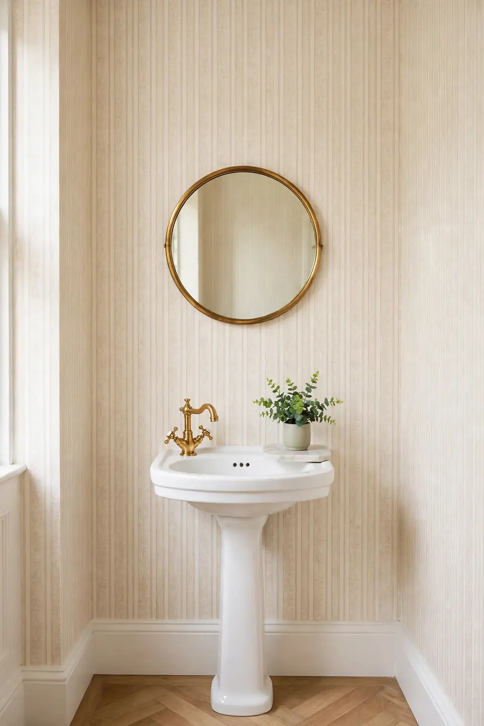
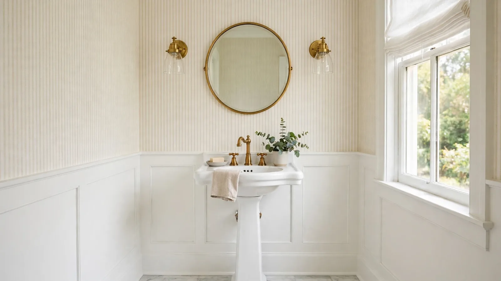
Cream pinstripes have a quiet way of making a tiny powder room feel tailored and calm. Thin vertical lines stretch the walls upward, so low ceilings look taller without any construction. Pair the paper with a white pedestal sink and a round brass mirror, and the whole room reads soft, bright, and pulled together.
Keep the palette tight for the best result. Warm white towels, a small marble tray, and one green plant are honestly all the styling this look needs. I’ve noticed pinstripes also hide minor wall flaws better than flat paint, which makes them a smart pick for older homes with uneven plaster.
Sage Green Vertical Stripes
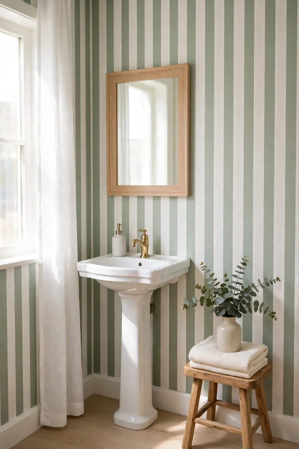
- Pick a sage with gray undertones so the green stays calm in artificial light.
- Run stripes vertically to lift the ceiling and stretch a compact footprint.
- Match grout and trim to the cream stripe for a seamless, quiet background.
- Style with light wood, woven textures, and one brass accent for warmth.
Soft green is the shade guests mention most after visiting our powder room. It feels fresh without shouting, and it pairs with almost any metal finish. The same calm palette carries into rest spaces beautifully, and pistachio green bedroom decor leans on that same gentle green family for a restful, layered look.
Dusty Blue Ticking Stripes

Quick Tip: Order one extra roll of ticking stripe paper. The narrow repeat makes pattern matching easy, but a spare roll saves you if a strip tears during hanging or a pipe needs repair later on.
Ticking stripes borrow their look from vintage mattress fabric, and that heritage gives a powder room instant character. Dusty blue against warm white feels coastal without any themed accessories. A petite sink, a brass faucet, and a simple woven basket complete the scene. The pattern is forgiving, too, since slight misalignments disappear inside the woven look of the design itself. It suits both farmhouses and city apartments with equal ease.
Bold Navy Statement Stripes

BEFORE: The room was a plain white box with a builder grade sink and a tired mirror. Nothing held the eye, the walls felt cold, and guests never lingered long enough to notice the space at all.
AFTER: Wide navy and white stripes now wrap the walls, and the room feels deliberate and tailored. Brass fixtures glow against the deep blue, the white sink looks crisper, and the whole space reads like a boutique hotel powder room.
Bold stripes work because the room is small; the pattern becomes the event. Keep the floor light and the accessories few, since the walls do the heavy lifting. I’ve tried this pairing in a rental, and even removable navy stripe paper delivered the same tailored punch.
Half Wall Stripe Balance
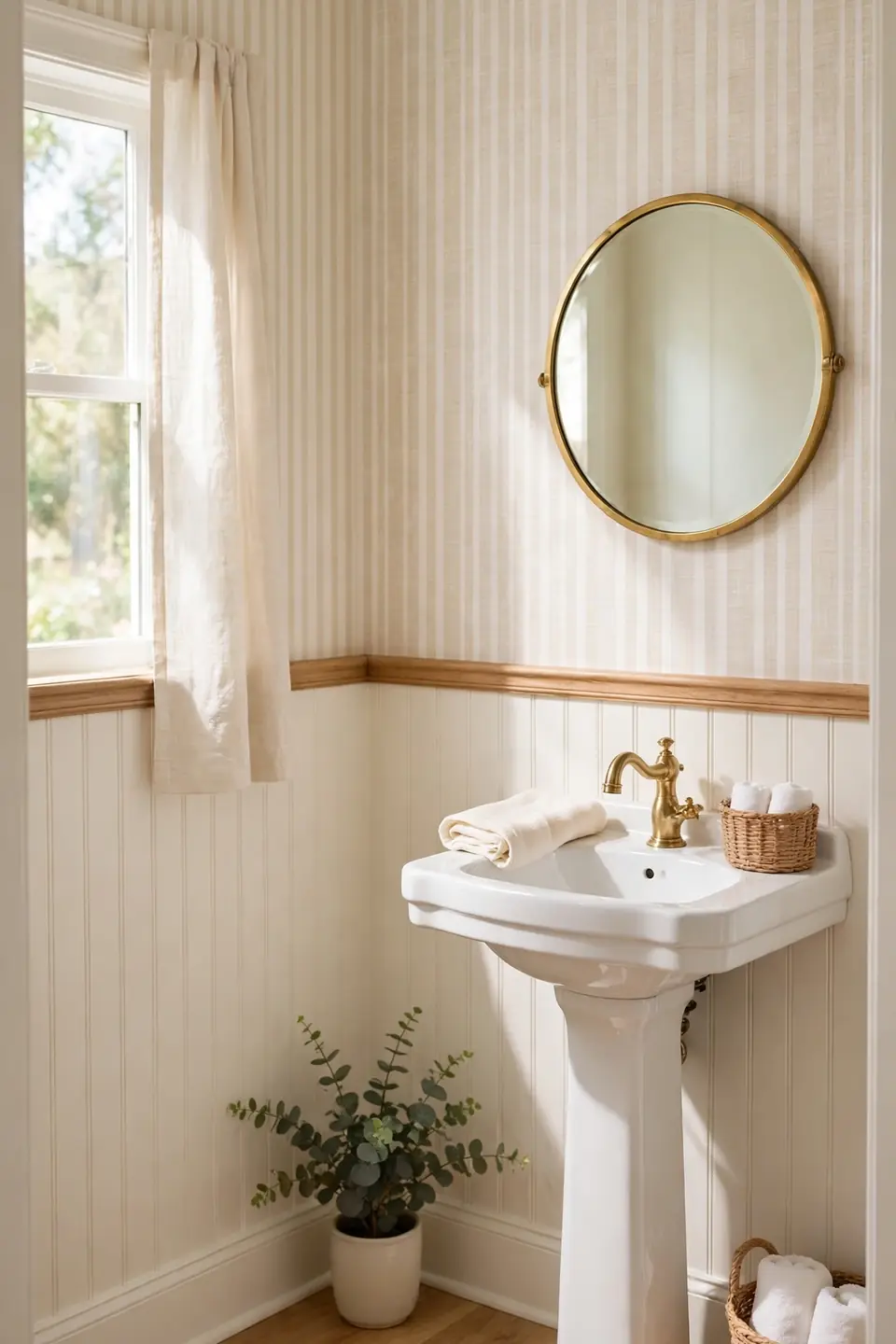
- Measure the wall height and mark a level line where the stripes will stop, usually just above sink height.
- Install beadboard or a simple chair rail along that line, then paint it warm white.
- Hang the striped paper above the rail, trimming carefully at the molding edge.
- Caulk the seam, touch up the paint, and let everything dry overnight.
Half wall stripes give you pattern without the full room commitment, and the painted lower half handles splashes better than paper near the sink. The split also stretches a wallpaper budget across two rooms. It is the layout I recommend most for first time wallpaper users.
Wide Versus Narrow Stripes

| Feature | Wide Stripes | Narrow Stripes |
|---|---|---|
| Visual effect | Bold and graphic | Soft and textured |
| Ceiling feel | Needs height to breathe | Lifts low ceilings |
| Wall flaws | Shows every bump | Hides minor flaws |
| Hanging effort | Fewer seams, faster | More seams, slower |
| Style partners | Brass and marble | Wood and linen |
Neither width wins outright, because the room itself decides. Wide stripes need breathing space and straight walls, while narrow stripes forgive crooked corners and busy little rooms. Order one sample of each, tape both up for a full day, and watch how the light moves across them. The better choice usually announces itself by evening.
Beige Tone on Tone

Do:
- Layer two beiges a shade apart so the stripes read in changing light.
- Bring in texture with stone, linen, and unglazed ceramics at the sink.
- Use warm bulbs so the beige stays golden rather than gray.
Don’t:
- Mix cool gray towels into the scheme; they fight the warm base.
- Skip contrast entirely, or the room falls flat and blurry.
- Use glossy paper, which turns subtle stripes harsh under sconces.
Tone on tone stripes are the quiet achievers of powder room design. They give walls movement without color commitment, which makes them ideal for homes that lean neutral everywhere else. In my experience, this is the scheme guests describe as calm, even when they cannot name why.
Striped Ceiling Surprise
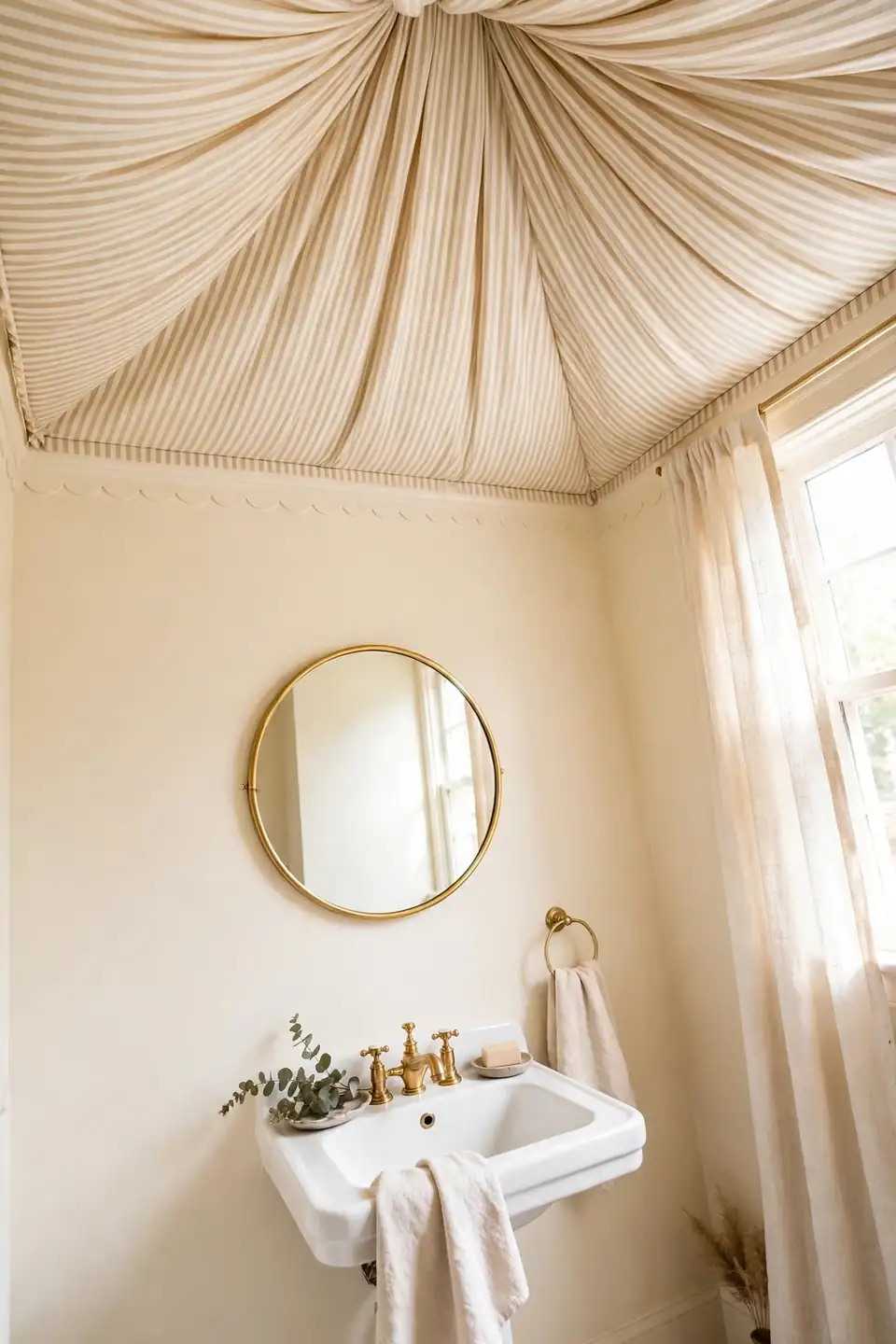
Cost: One roll often covers a small ceiling
Time: Half a day with a helper
Skill Level: Confident beginner
Best For: Plain walls that need no pattern
Works In: Windowless powder rooms
Stripes on the ceiling flip the usual formula and leave the walls free for art, a beautiful mirror, or nothing at all. The effect feels like a striped canopy when you look up, playful yet surprisingly classic. Keep the wall color pulled from the paler stripe so the room stays tied together, and choose a simple light fixture that does not compete with the pattern overhead. Guests always look up twice.
Blush Pink Soft Stripes
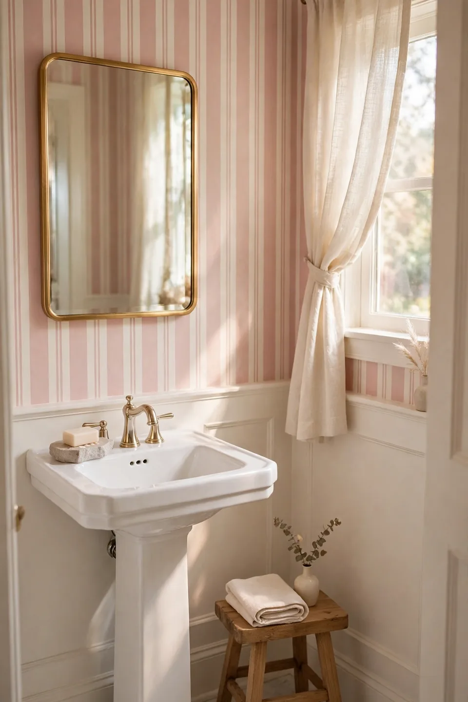
Blush pink stripes bring gentle warmth to a powder room without turning it sugary or childish. Soft rose lines against a creamy base flatter skin tones in the mirror, which guests quietly appreciate. A gold framed mirror and white sink keep the palette grown up, calm, and quietly romantic.
Balance the sweetness with one grounded texture. A woven basket, a stone soap dish, or a small wooden stool adds the contrast this look needs to feel finished. In my experience, blush reads best in warm daylight, so test a sample near the window before you commit to full rolls. The overall effect stays soft, never loud.
Chevron Stripe Twist

- Keep chevrons small in scale so the zigzag reads as texture, not noise.
- Limit the pattern to all four walls only in rooms with tall ceilings.
- Choose matte paper; shine exaggerates every angle and makes seams obvious.
- Ground the movement with a plain stone sink and simple round mirror.
Chevron is the playful cousin of the classic stripe, and it suits powder rooms because the space is small enough to handle the energy. One wall of chevron with three calm walls also works if full coverage feels bold. Start with a large sample and live with it for two days.
Gold Foil Stripe Glam
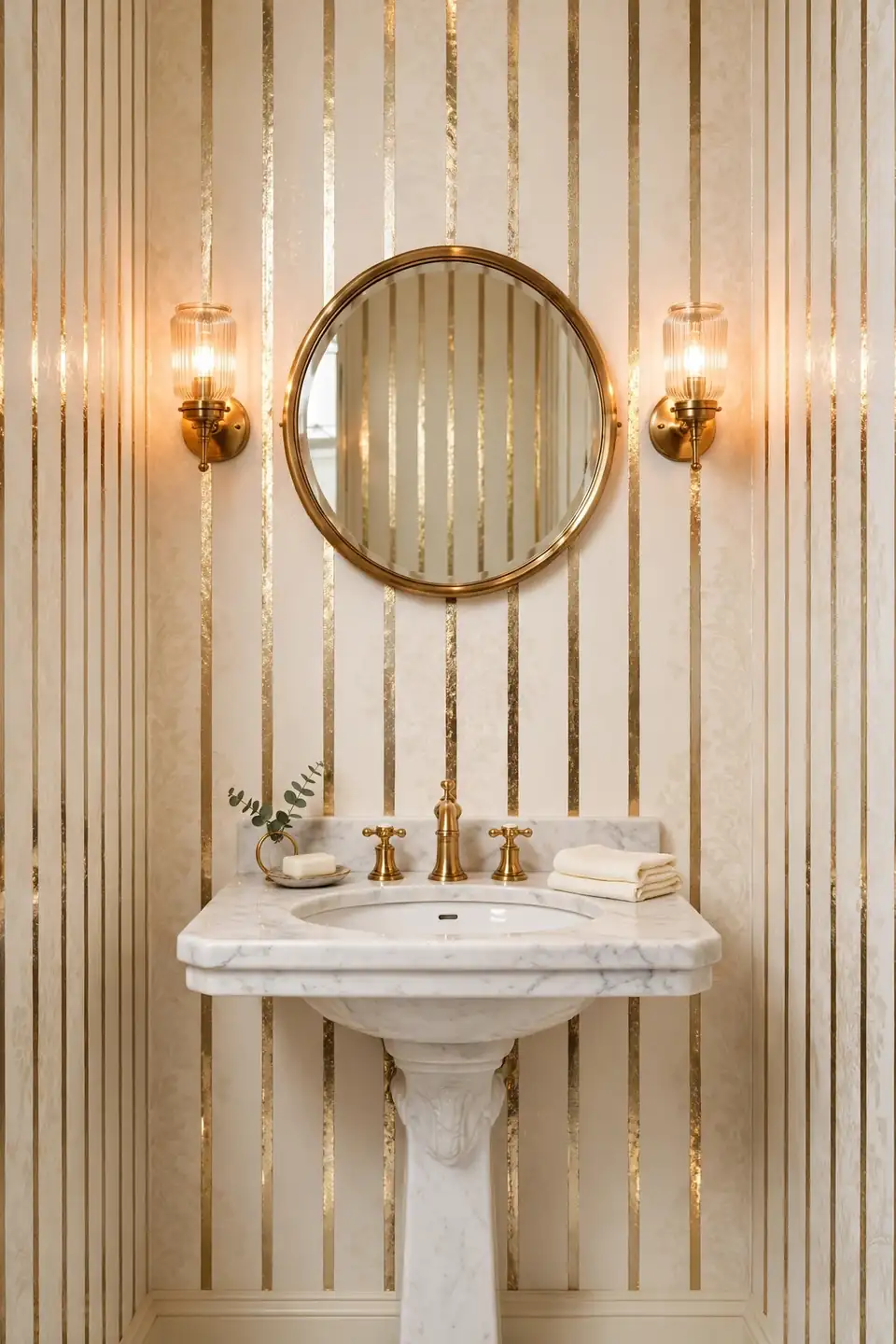
Quick Tip: Hang foil stripe paper on the smoothest wall you have, and use a soft squeegee instead of a brush. Foil shows every bump beneath it, and gentle pressure keeps the metallic lines unbroken and mirror bright from floor to ceiling.
Thin gold lines on a cream ground catch lamplight like jewelry, turning a small powder room into a tiny jewel box. Keep the sink simple and the mirror round, since the walls already carry the sparkle. Warm bulbs matter here; cool light turns gold stripes brassy and harsh, while warm light keeps them soft and rich and welcoming at night.
Coastal Blue White Stripes
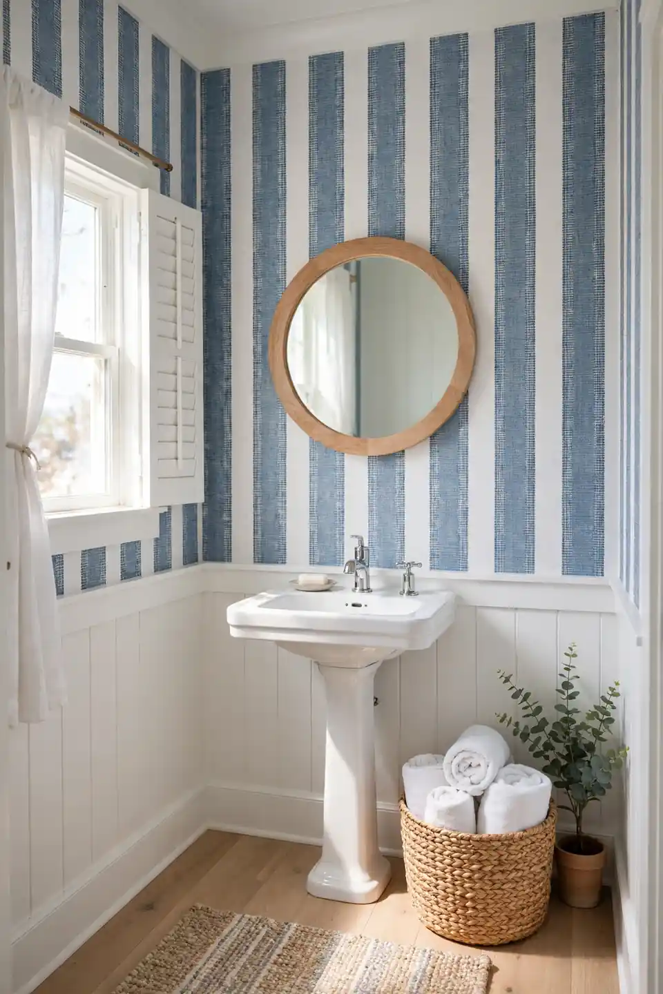
BEFORE: A beige powder room with a chipped vanity and a single bare bulb felt more like a closet than a guest space. The walls were blank, the mood was flat, and the room did nothing for the house around it.
AFTER: Blue and white stripes now climb the walls like a cabana awning, and the room feels breezy and bright. A light wood mirror, a white sink, and a woven basket finish the coastal mood without a single themed accessory in sight.
Coastal stripes succeed when the blue stays slightly dusty rather than bright. That softness keeps the room calm through winter, not just in summer. Add one piece of driftwood toned decor if you like, then stop; the stripes already tell the story.
Wallpaper Above Wainscoting

- Paint existing wainscoting a warm white and let it cure fully before papering above it.
- Measure from the top of the chair rail to the ceiling and cut strips with extra length.
- Start papering in the least visible corner so the final seam hides behind the door swing.
- Smooth each strip downward, trim at the rail, and wipe paste before it dries.
Wainscoting protects the lower wall from bags, mops, and splash marks, while stripes above do the decorative work. That division is exactly why the look has lasted a century in guest baths. Choose a stripe color pulled from somewhere else in the house so the rooms feel connected.
Vertical Versus Horizontal Stripes
| Feature | Vertical Stripes | Horizontal Stripes |
|---|---|---|
| Main effect | Adds height | Adds width |
| Ceiling feel | Taller and airier | Lower and cozier |
| Best rooms | Low ceilings | Narrow footprints |
| Hanging notes | Standard and forgiving | Needs careful leveling |
| Pattern mood | Classic and calm | Fresh and modern |
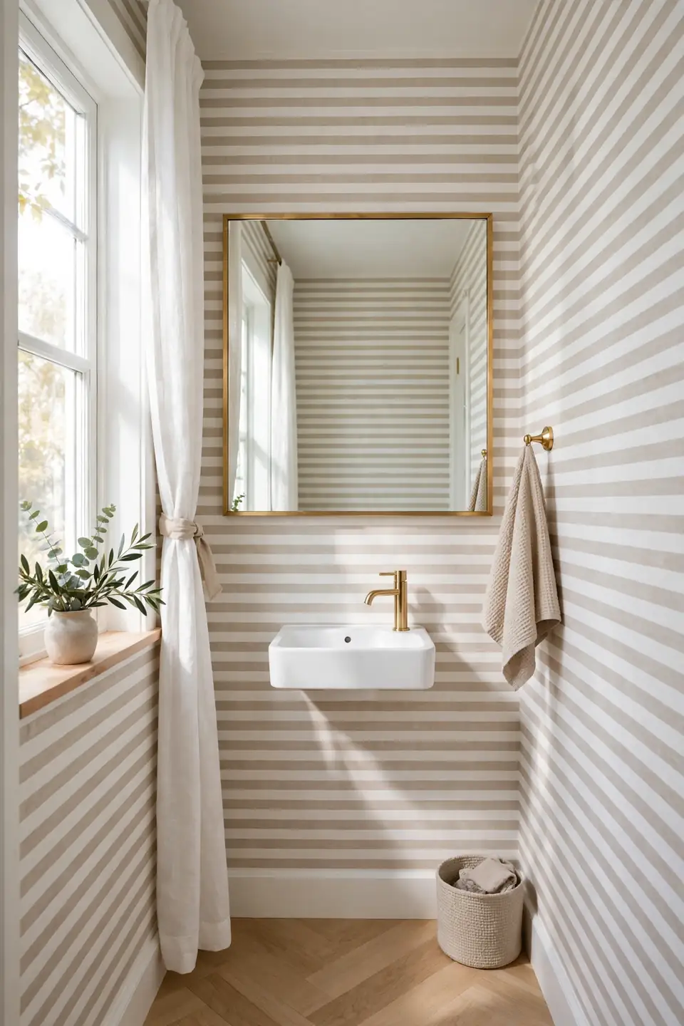
Horizontal stripes are the underused option in powder rooms, and they shine in narrow spaces where width matters more than height. They do demand a level starting line, since any slope shows quickly across a short wall. Vertical stripes remain the safer classic for most homes. Pick the direction your room lacks rather than the one trending this season, and the result will age gracefully for years.
Charcoal Stripe Drama

Do:
- Balance charcoal with plenty of white in the stripe itself.
- Choose brass or warm gold fixtures to keep the dark tone friendly.
- Light the mirror from both sides so faces stay flattering.
Don’t:
- Pair charcoal stripes with a dark floor; the room caves in.
- Add black accessories everywhere, which turns drama into gloom.
- Use cool white bulbs that make charcoal read blue and cold.
Charcoal stripes deliver the drama of a dark powder room while the white between lines keeps the space breathable. The look suits evening entertaining homes especially well, where lamplight plays across the pattern. Start with the mirror wall if full coverage feels brave, then decide about the rest.
Vintage Floral Stripe Mix

Cost: Mid range for quality prints
Time: One relaxed weekend
Skill Level: Beginner friendly
Best For: Cottage and vintage homes
Result: Soft, romantic, and structured
Patterns that weave tiny floral sprigs between stripes carry a century of decorating history, and they still feel fresh in a small powder room. The flowers soften the geometry, while the stripes keep the sweetness structured. Pull one color from the floral for towels and a soap dish, and the room feels collected rather than matched. Older homes wear this pattern especially well, since it echoes the wallpapers these houses were built with and loved for generations.
Pinstripe Border Detailing

A slim border along the top of pinstripe wallpaper gives a powder room the finished feel of a tailored suit. The border frames the pattern, hides the line where paper meets ceiling, and adds a layer of classic detail. Choose a border in a slightly deeper shade than the stripe for quiet definition.
Borders also help renters and cautious decorators. You can run pinstripes only partway up the wall, cap them with a border strip, and paint the rest a matching cream. That split keeps costs low and the look intentional. I’ve seen this work well in many cases where full height paper felt like too much commitment.
Mint Green Fresh Stripes

- Choose a mint with a hint of gray so it reads fresh, not candy sweet.
- Pair mint stripes with white fixtures to keep the room feeling airy and clean.
- Add one natural texture, like a rattan basket or a light oak stool.
- Repeat the mint in a hand towel so the color feels planned, not random.
Mint is where many people land when they search for striped wallpaper powder room inspiration that feels bright but gentle. The shade wakes up a windowless room and flatters morning light from a small frosted pane. Keep accessories white and simple, and the freshness lasts for years.
Striped Mirror Frame Pairing

Quick Tip: Hang the mirror so its center sits at eye level for most guests, around 150 centimeters from the floor. A mirror placed too high above a pedestal sink makes even beautiful striped walls feel disconnected from the fixtures below.
The mirror is the one piece that can make or break a striped powder room. A round frame softens strict vertical lines, while a rectangular frame doubles down on the structure. Brass ties the mirror to the faucet, and sconces on either side spread light evenly. Stand back and check the reflection; the stripes should frame the mirror, not fight it.
Terracotta Warm Stripes
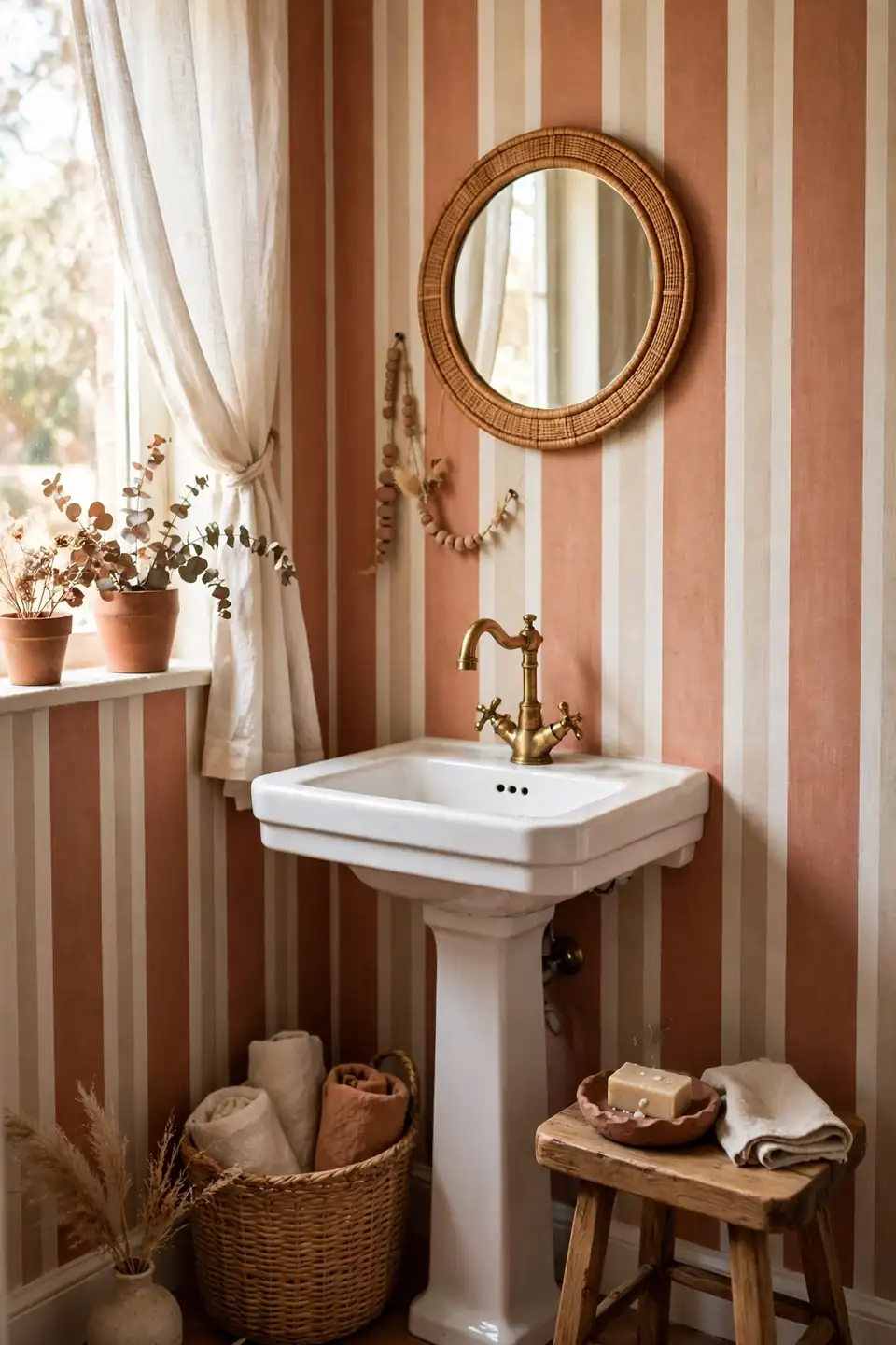
BEFORE: The powder room felt chilly and unfinished, with gray paint that made the small space look smaller. A plain mirror and cold light gave guests nothing warm to land on, and the room stayed purely functional.
AFTER: Terracotta and cream stripes now wrap the walls in sunset warmth. A wooden stool, a clay soap dish, and a brass faucet deepen the earthy mood, and the room finally feels like part of the home’s story.
Earthy stripes pair naturally with handmade textures, so reach for clay, rattan, and unglazed stone when you style the sink area. Keep metals warm and lighting soft. The result feels collected over time rather than decorated in a single weekend.
Small Room Stripe Tricks

- Choose vertical stripes in a narrow to medium width to stretch the walls upward.
- Keep the stripe colors close in tone so the pattern whispers instead of shouting.
- Hang a large mirror to double the pattern and bounce light into corners.
- Pick a compact sink and wall mounted faucet to free up floor space.
Tiny powder rooms reward restraint more than any other space in the house. Every item should earn its place, from the soap dish to the spare roll basket. When the pattern, mirror, and fixtures all pull in the same direction, even a closet sized room feels generous and calm.
Timeless Black White Stripes
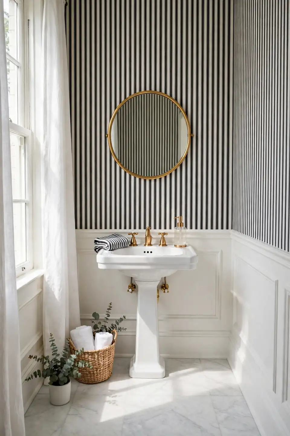
| Feature | Bold Black Stripes | Soft Gray Stripes |
|---|---|---|
| Contrast level | High and dramatic | Low and gentle |
| Light needs | Strong natural light | Works in dim rooms |
| Style mood | Boutique and tailored | Calm and classic |
| Care level | Shows dust sooner | Hides dust well |
| Mirror pairing | Round brass mirror | Simple wood frame |
Black and white is the stripe pairing that never dates, and it flatters both vintage fixtures and modern ones. In a small powder room the contrast reads as confidence rather than chaos. Add brass or warm wood to soften the edge, keep the floor pale, and let the walls carry the pattern with pride.
Conclusion
Stripes have dressed beautiful rooms for centuries, and they are not going anywhere. Whether you choose whisper soft beige or bold black and white, the right pattern turns a forgotten half bath into a room guests actually remember. Start with samples, trust the light in your own space, and hang each strip with patience. My favorite striped wallpaper powder room inspiration comes from real rooms rather than catalogs, so save these ideas on Pinterest, try one wall first if you feel cautious, and share your finished powder room with someone who needs the encouragement today.