25 Kitchen Cabinet Colors for a Fresh, Trendy Makeover
A fresh coat of paint on cabinets is the fastest way to change how a kitchen feels, and choosing the right kitchen cabinet colors sets the entire mood of the room. I’ve watched plain builder kitchens turn into magazine-worthy spaces with nothing more than two gallons of sage green or navy paint. The color you pick touches every meal, every coffee, every late-night snack, so it deserves real thought.
This roundup gathers twenty-five fresh shades that actually work in real homes, from timeless whites to moody charcoals and warm terracottas. Along the way you’ll find pairing tips, finish advice, and the small mistakes that waste money. If you loved our kitchen window decor guide, you’ll find these paint ideas pair beautifully with styled windows. Let’s find the shade that makes your kitchen feel brand new.
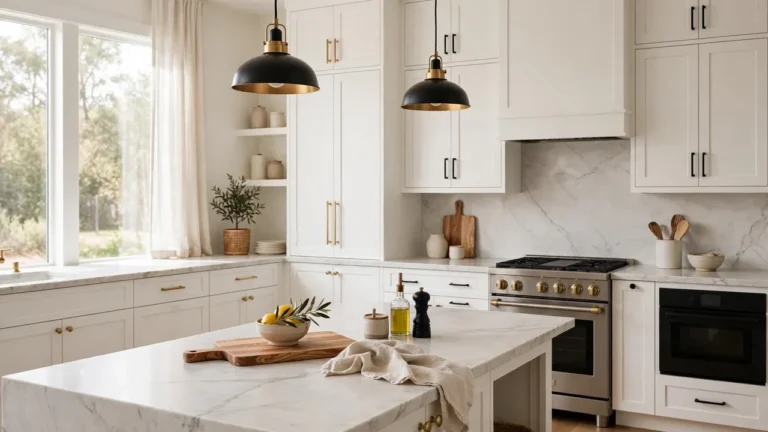
Crisp White Shakers
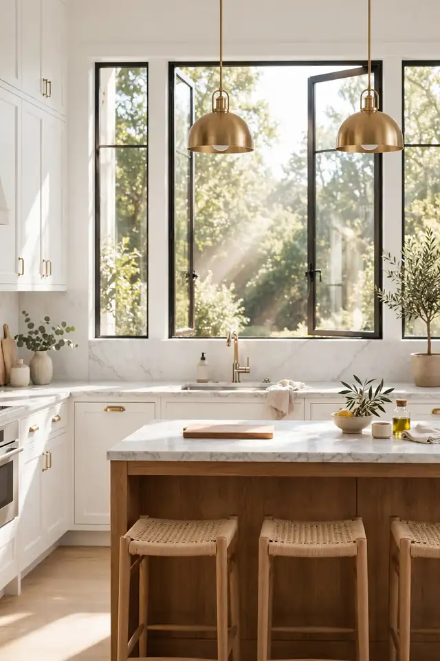
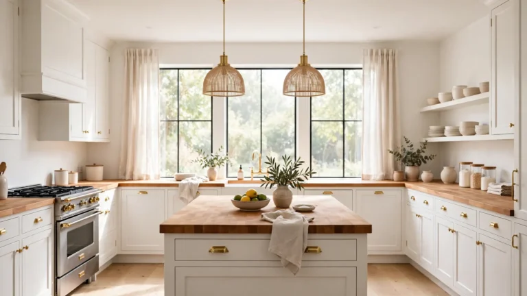
Morning light pours across white shaker doors and the whole kitchen feels twice its size. That is the magic of crisp white: it bounces light into every corner and makes a modest galley feel open and calm. Pair the cabinets with brushed brass pulls and a warm wood island, and the look stays fresh instead of sterile. In my experience, white shakers age better than any trend color.
Sample paint on a door front and live with it for three days. Watch how it shifts from bright morning sun to amber evening lamplight. A slightly warm white avoids the hospital chill of pure blue-white, and a satin finish wipes clean after splatters. Keep counters light and let one bold rug add the personality.
Navy Blue Drama
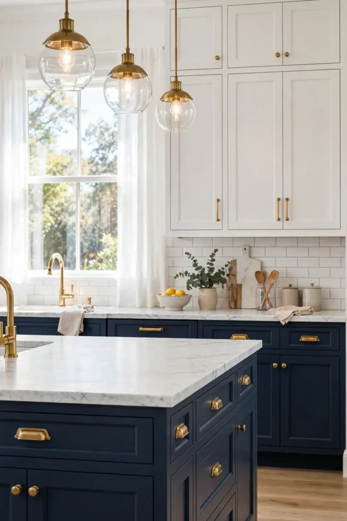
- Pair navy lowers with white uppers to keep the room balanced and bright.
- Brass or gold hardware pops against deep blue and adds welcome warmth.
- A navy island grounds an open kitchen and defines the cooking zone.
- Matte finishes hide fingerprints better than high gloss on dark doors.
- Test the shade at night, since navy can read almost black under warm bulbs.
Navy brings the drama of a restaurant kitchen home without feeling fussy. It hides smudges from little hands better than white, and it makes marble veining look expensive. I’ve noticed navy works best when the room gets decent daylight, otherwise it can feel heavy. Pair it with light floors and pale countertops to keep the balance, and the result feels both bold and timeless.
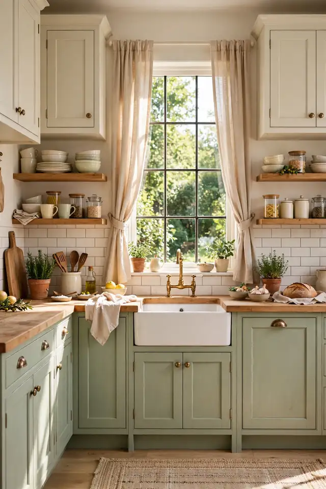
Sage Green Calm
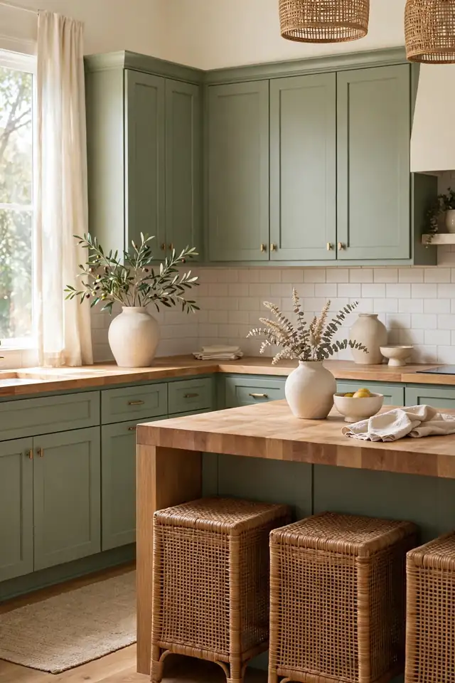
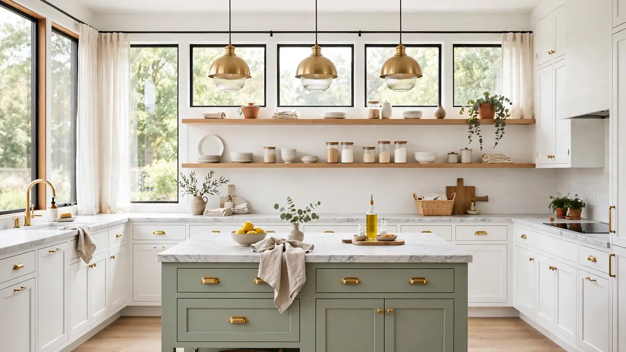
Quick Tip: Sage green sits between gray and green, so it pairs with almost any wood tone. Try it with oak floors and cream walls for a calm, collected kitchen that never fights the rest of the house.
Sage is the introvert of kitchen cabinet colors: quiet, steady, and easy to live with for years. It softens stainless steel, flatters butcher block, and never screams for attention. That is why designers reach for it in rentals and forever homes alike. Sample two shades, because one leans gray and the other leans mint, and the undertone changes everything. Pick the gray-leaning one for a more grown-up, timeless result.
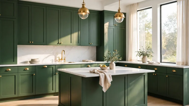
Forest Green Depth
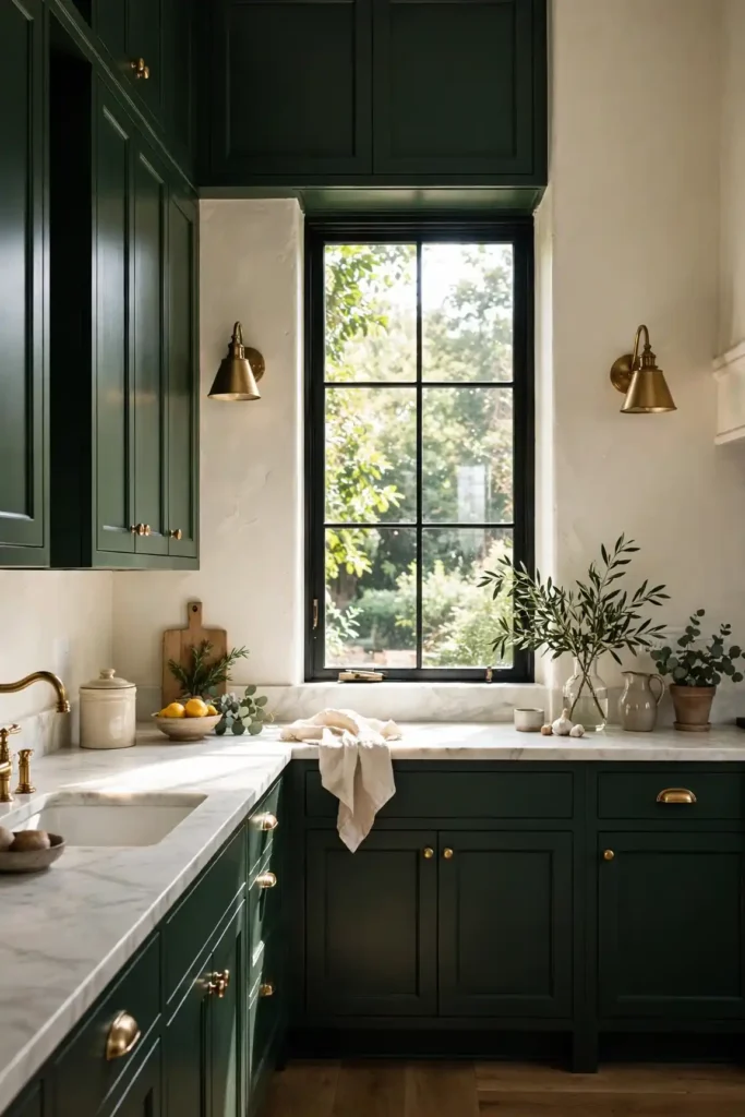
BEFORE: The kitchen felt flat and dated with honey oak cabinets that yellowed in the afternoon sun. Every surface competed, and the small window left the room feeling dim and closed in.
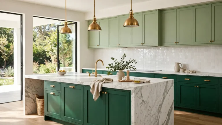
AFTER: Deep forest green doors turned the same footprint into a moody jewel box. Brass sconces glow against the color, and the oak floors suddenly look rich instead of tired.
Forest green rewards good lighting, so add under-cabinet strips before you paint. The color deepens in shadow and glows near windows, which gives the kitchen a living, shifting character. Keep the palette tight: cream walls, one metal finish, wood accents. I’ve seen this work well in many cases where homeowners wanted drama without a full renovation. Two coats of quality enamel and the transformation feels permanent.
Matte Black Edge
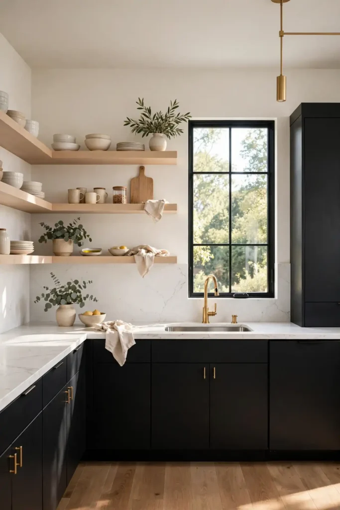
- Choose a true matte or eggshell finish so fingerprints stay invisible.
- Pair black lowers with pale uppers or open shelving for contrast.
- Add warm metals like brass or copper to stop the room feeling cold.
- Seal with a durable cabinet enamel made for high-touch surfaces.
Matte black cabinets photograph like a dream and make a kitchen feel instantly modern. The trick is balance: too much black in a dark room feels like a cave, so borrow light from pale counters and reflective backsplash tile. I’ve tried this in a north-facing kitchen and the matte finish made all the difference. It reads as confident rather than harsh, especially against warm wood floors.
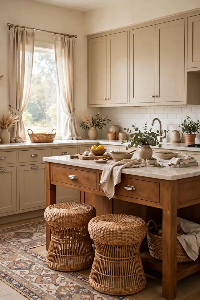
Warm Beige Layers
| Warm Beige | Cool Gray | |
|---|---|---|
| Mood | Cozy and welcoming | Crisp and modern |
| Pairs With | Oak, brass, cream | Chrome, white, walnut |
| Best Light | North-facing rooms | Bright south light |
| Maintenance | Hides dust well | Shows smudges more |
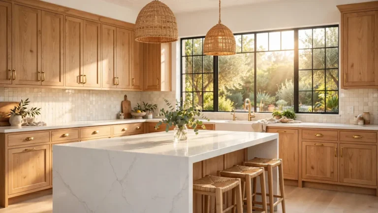
Warm beige is the quiet luxury pick for people who find white too stark and gray too cold. It layers beautifully with cream, caramel, and soft white, which means you can mix wood tones without clashing. In my experience, beige cabinets photograph warm and welcoming, never flat. Keep hardware simple, brushed nickel or antique brass, and let texture do the talking through linen curtains and woven stools.
Charming kitchen cabinet colors
DO:
- Do test large swatches on real cabinet doors, not paper cards.
- Do check the color in morning, noon, and evening light first.
- Do pick a durable cabinet-grade enamel that resists chips and grease.
DON’T:
- Don’t choose from a phone screen; screens lie about undertones.
- Don’t paint over grease; degrease and sand or the finish will peel.
- Don’t skip primer on raw wood, or old color will bleed through.
The prettiest store shade can turn muddy if the undertone fights your floors. That is why sampling beats guessing. Take a week, live with three contenders, and watch them in every light. The right choice keeps looking better, while the wrong one nags you daily. Patience now saves a full repaint later.
Soft Gray Tones
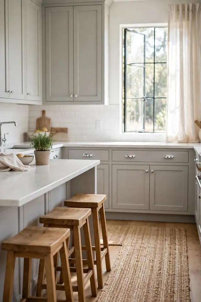
Cost: Low to moderate | Time: One weekend | Skill Level: Beginner-friendly | Best For: Small kitchens
Soft gray is the diplomat of the kitchen: it gets along with every countertop and never starts an argument with the flooring. It hides dust better than white and feels calmer than beige in north light. Pair it with chrome for a crisp look or black hardware for contrast. I’ve noticed gray works best when you add one warm element, like wood stools or a jute runner, so the room stays inviting rather than office-like. For extra warmth, try honey-toned wood shelves against the gray; the contrast feels considered without trying hard. Keep counters light and hardware consistent, and this hardworking neutral will carry the kitchen for years.
Olive Green Warmth
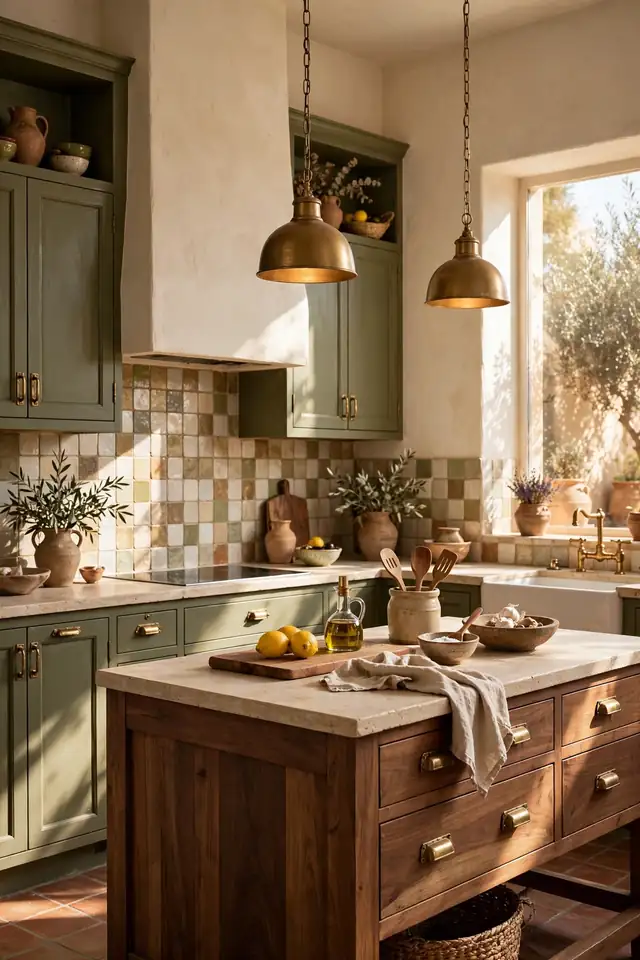
Olive green brings the garden indoors without going full forest. It has a warm, earthy pull that flatters brass, leather, and walnut, which makes it a natural fit for kitchens that lean rustic or Mediterranean. Against cream plaster walls, olive doors look sunbaked and relaxed. The color hides everyday wear gracefully, so it suits busy family kitchens where perfection is not the goal.
Pair olive with unlacquered brass that will patina over time, and the kitchen gains character with age. Keep the backsplash simple, handmade-look tile or warm white subway, so the cabinets stay the star. If your kitchen runs dark, add glass uppers or open shelves to break up the mass. The result feels collected and warm, like a kitchen that has been loved for decades.
Creamy Vintage Charm

- Cream softens the contrast with white appliances better than stark white.
- Aged brass cup pulls complete the vintage farmhouse look.
- Butcher block counters keep the palette warm and unfussy.
- A satin finish shows fewer brush marks than flat on cream doors.
Creamy cabinets feel like a hug from a well-loved kitchen. They warm up cool northern light and make stainless steel look intentional rather than industrial. The vintage charm comes from the details: bin pulls, beadboard panels, a plate rack. I’ve seen this work well in many cases where homeowners wanted character without a gut renovation. Keep walls a whisper darker than the cabinets for depth.
Deep Teal Pop
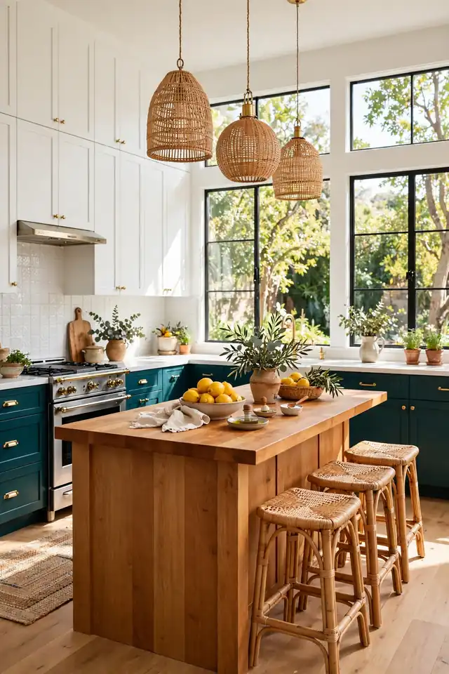
Quick Tip: Deep teal loves natural light, so give it a window or glass doors nearby. In a dark galley it can sink toward black, but beside daylight it glows like the ocean.
Teal is the extrovert among kitchen cabinet colors: bold, joyful, and impossible to ignore. It pairs surprisingly well with warm wood and rattan, which keeps the energy grounded. Use it on an island or a single bank of lowers if full-room teal feels like too much commitment. The payoff is a kitchen with real personality, the kind guests remember. Finish with simple hardware so the color carries the show.
Greige Blend Balance
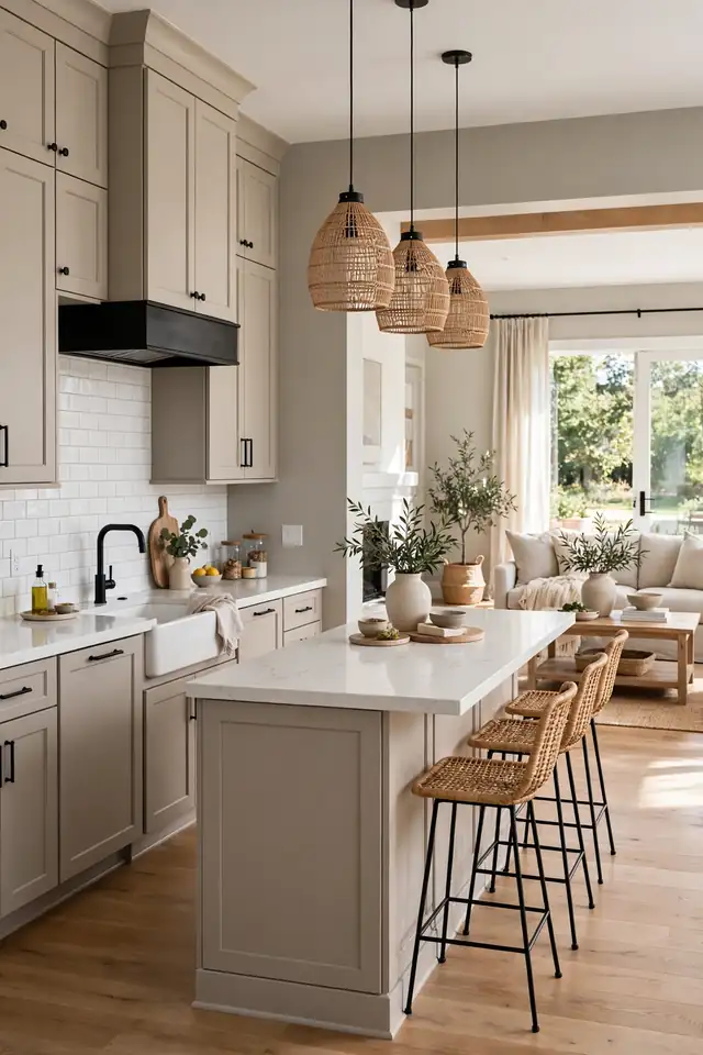
BEFORE: The kitchen swung between icy gray walls and yellow oak floors, and nothing felt connected. The old white cabinets looked dingy against both, and the room never felt finished.
AFTER: Greige cabinets bridged the gap, pulling the gray and the oak into one calm palette. Suddenly the floors looked intentional and the walls felt warm.
Greige is the peacemaker shade for kitchens caught between warm and cool elements. It borrows the best of both, which makes it forgiving in open plans where the kitchen meets the living room. Sample carefully, because greige shifts with light: morning gray, evening taupe. Pick the version that flatters your floors at midday, when you use the kitchen most.
Terracotta Spice Tones
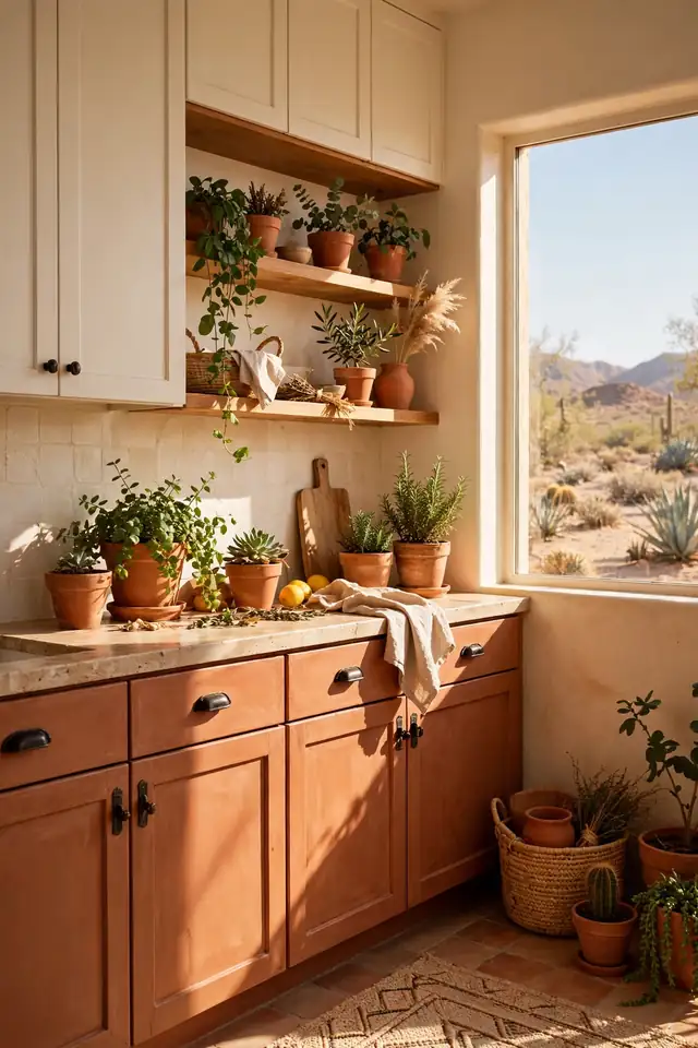
- Use terracotta on lower cabinets only to keep the color grounded.
- Pair with creamy whites and natural wood for a sunbaked feel.
- Choose simple black or bronze hardware for a modern edge.
- Add green plants nearby; the contrast makes both pop.
Terracotta brings desert warmth into the hardest-working room of the house. It glows in afternoon sun and makes white dishes look artful on open shelves. The key is restraint: let it anchor the lowers while uppers stay light. I’ve noticed this shade earns compliments from guests who cannot quite name why the kitchen feels so welcoming. It is the color of slow Sunday sauces and long lunches.
Pale Blue Air
| Pale Blue | Crisp White | |
|---|---|---|
| Feel | Soft and breezy | Clean and bright |
| Best Style | Coastal, cottage | Any style |
| Forgiveness | Hides glare | Shows every mark |
| Pairing | Warm wood, brass | Any hardware |
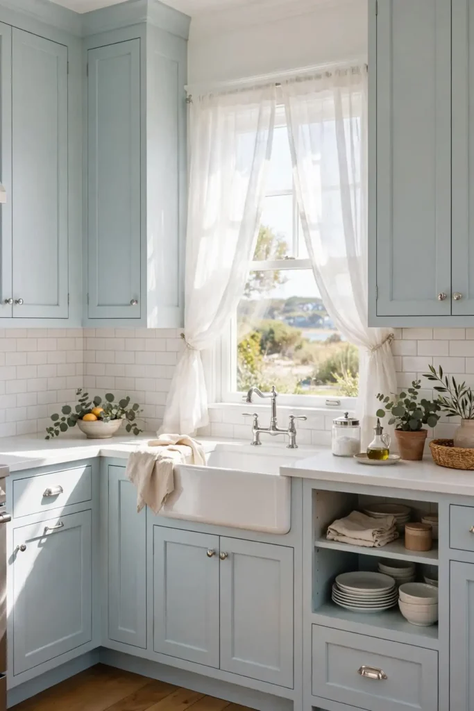
Pale blue is white’s softer cousin, with all the airiness and none of the glare. It suits coastal and cottage kitchens, and it makes small spaces feel breezy. Pair it with white trim for a classic look or warm wood for something more relaxed. The color stays fresh for years because it never tries too hard. Keep the hardware simple and let the calm do the work. A beadboard backsplash or shiplap accent leans into the cottage charm. This is an easy color to live with, which is exactly why it endures.
Emerald Jewel Tones
DO:
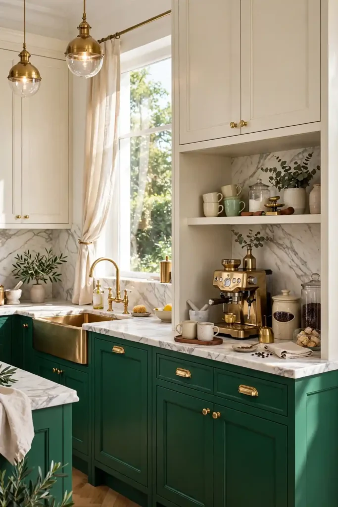
- Do balance emerald with plenty of warm wood and soft white.
- Do use it where daylight hits, so the green stays jewel-like.
- Do keep surrounding patterns quiet so the color leads.
DON’T:
- Don’t pair it with cool gray walls, which can make it look murky.
- Don’t forget under-cabinet lighting; emerald drinks light.
- Don’t mix it with red accents unless you want a holiday look year-round.
Emerald turns an ordinary kitchen into something custom and collected, with the richness of a gemstone against marble and brass. If you built a kitchen coffee bar ideas nook nearby, emerald makes that corner feel like a jewel box. The color rewards confidence, so commit fully on the lowers and keep the rest calm.
Mushroom Taupe Calm
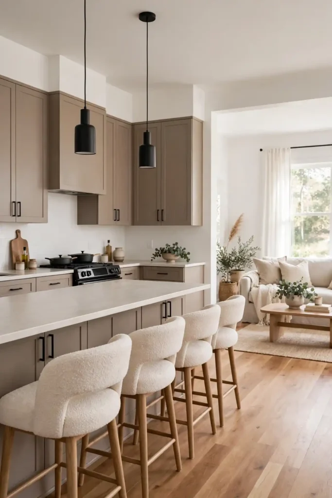
Cost: Moderate | Time: One weekend | Skill Level: Beginner | Best For: Open-plan kitchens
Mushroom taupe is the quiet overachiever of kitchen cabinet colors, warm enough for wood floors and calm enough for white walls. It suits open plans where the kitchen must blend with the living room, because it never shouts across the space. Pair it with black hardware for definition or champagne bronze for softness. In my experience, this is the shade people choose when they want the kitchen to feel settled for a decade. Add texture through boucle stools or a nubby rug to keep the neutral from feeling flat. It is the definition of quiet confidence.
Burgundy Wine Accent
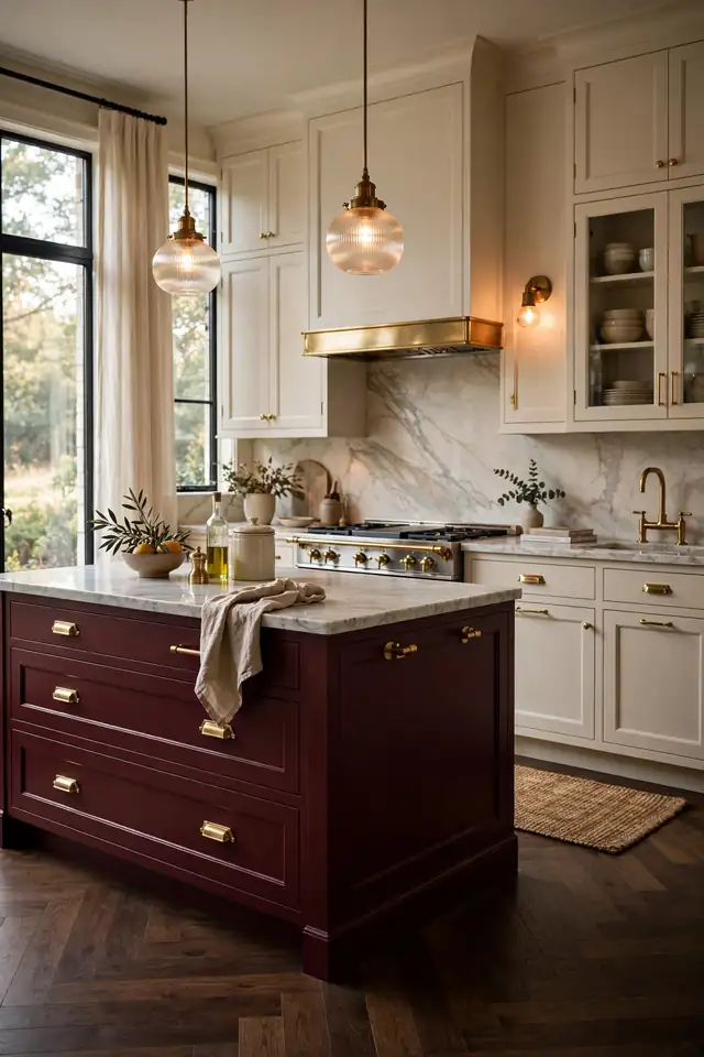
Burgundy brings the richness of a wine cellar to the kitchen, deep and a little bit daring. It flatters marble, brass, and dark wood, and it makes a white range look like a deliberate centerpiece. Use it on the island or a hutch-style pantry wall rather than the whole room, and it reads as luxe instead of loud. Evening light makes it glow like candlelight.
Keep the surrounding palette restrained: cream walls, simple hardware, one warm metal. Too many competing colors will fight the burgundy instead of framing it. I’ve noticed this shade suits cooks who treat the kitchen as a stage, because it photographs beautifully and feels special daily. It is a bold choice that rewards the brave with a kitchen nobody forgets.
Two-Tone Color Combos
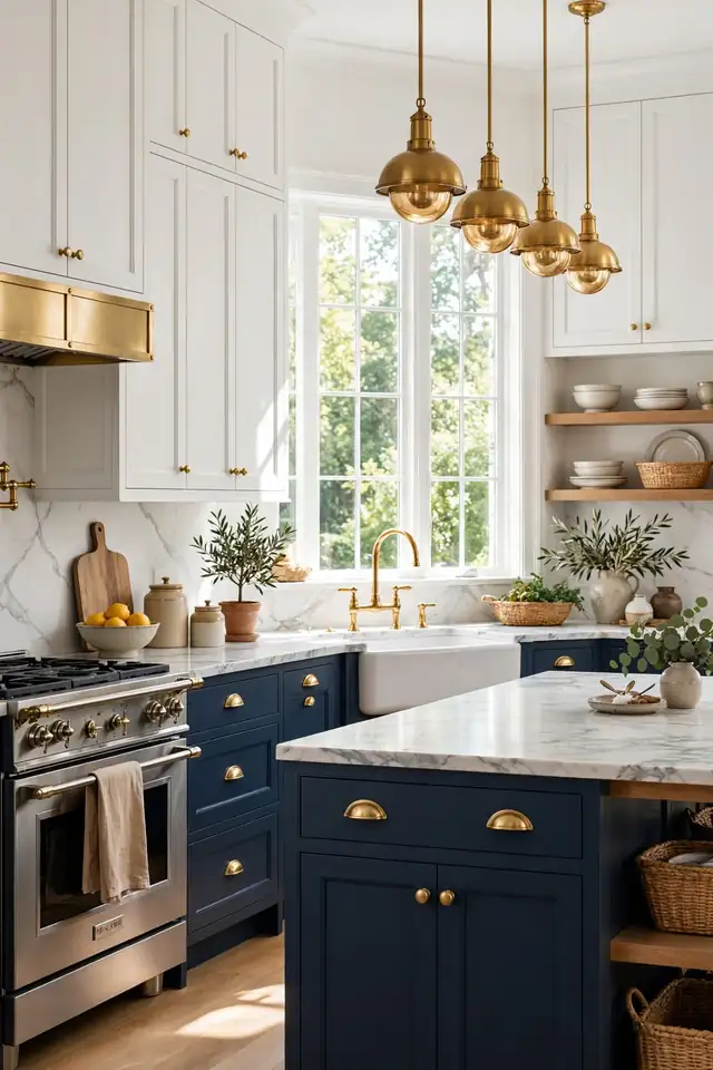
- Dark lowers with light uppers keep the room grounded yet airy.
- Match the island to the lowers for a cohesive anchor.
- Keep hardware consistent across both tones for unity.
- Limit the palette to two cabinet colors plus one neutral wall.
Two-tone cabinets give you the best of both worlds: drama below, lightness above. The combination adds custom-cabinet character without custom-cabinet prices. Navy and white is the classic, but green and cream or black and wood feel fresh right now. The trick is proportion: let one color dominate and the other accent. Done well, it looks intentional and designed rather than indecisive.
Butter Yellow Cheer
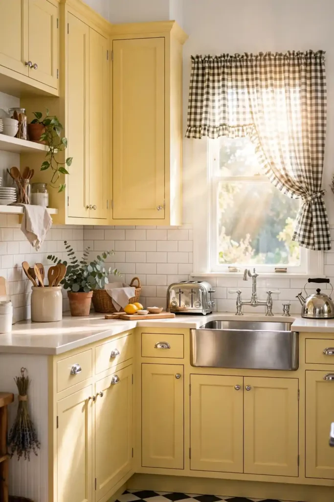
Quick Tip: Butter yellow needs restraint elsewhere, so keep walls white and counters pale. A little goes a long way, and the kitchen will feel sunny even on gray mornings.
Butter yellow is pure optimism in paint form. It wakes up a dark kitchen and makes morning coffee taste better, or at least feel that way. The retro charm suits farmhouse and cottage styles, especially with chrome or white hardware. Keep the shade soft rather than school-bus bright, and it stays cheerful without shouting. This is the color for people who want their kitchen to smile back. Pair it with checkered floors or gingham textiles to lean into the retro charm. Small doses, like a yellow island with white perimeter cabinets, deliver sunshine without overwhelm.
Dusty Rose Blush
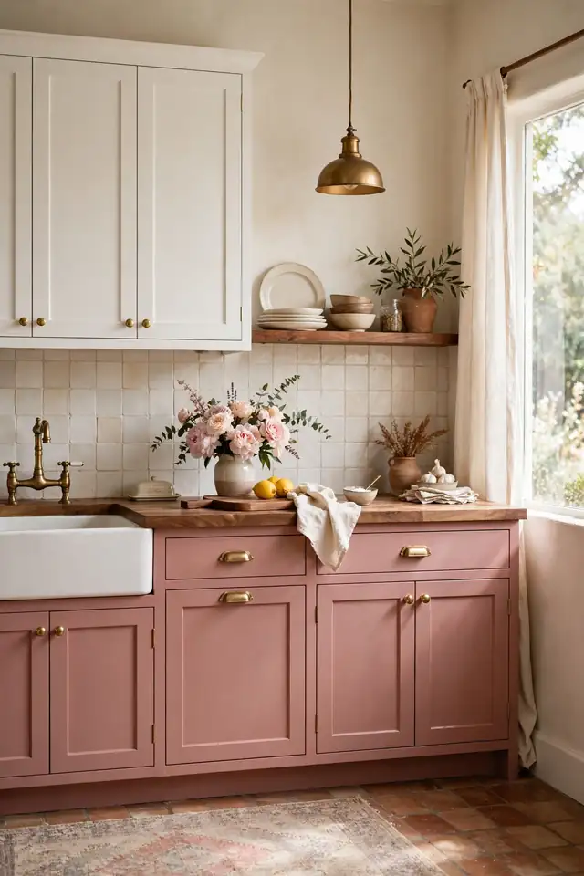
BEFORE: The all-white kitchen felt cold and a little clinical, despite good light and nice floors. It looked fine in photos but felt unwelcoming in person, like a showroom nobody lived in.
AFTER: Dusty rose lowers warmed the whole room without going pink. The space finally felt personal, soft, and lived-in, while the white uppers kept it bright.
Dusty rose is blush for grown-ups: warm, muted, and quietly romantic. It pairs with brass, cream, and walnut for a soft vintage feel. Use it where you want warmth without the weight of red or terracotta. I’ve seen this work well in many cases where a kitchen needed personality but the homeowner feared bold color. It is gentle, but it is definitely not boring.
Slate Blue Calm
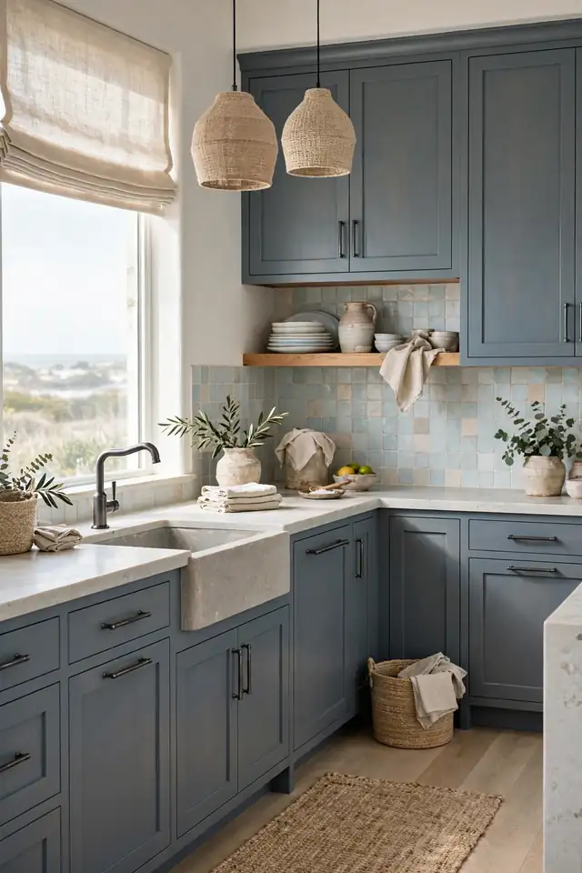
- Pick a slate blue with gray undertones for a calm, modern feel.
- Pair with white oak floors and pale stone counters.
- Use black or gunmetal hardware for quiet contrast.
- Add texture with linen, jute, and handmade tile.
Slate blue sits comfortably among kitchen cabinet colors that feel current yet calm. It has the serenity of the coast without the theme-park vibe, and it works in both modern and traditional kitchens. The gray undertone keeps it sophisticated, while the blue keeps it interesting. Layer in natural textures and the room feels collected over time, not decorated overnight. It is an easy shade to love for years.
Classic Hunter Green
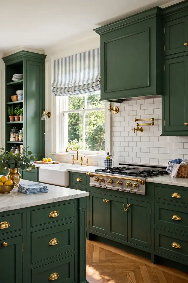
| Hunter Green | Sage Green | |
|---|---|---|
| Depth | Deep and formal | Soft and casual |
| Best Room | Traditional kitchens | Farmhouse, rentals |
| Hardware | Polished brass | Aged brass, black |
| Mood | Clubby and rich | Calm and collected |
Hunter green is the preppy classic that never really leaves. It suits traditional kitchens with brass hardware and marble counters, and it looks sharp against white subway tile. Deeper than sage and more formal than olive, it brings a clubby richness that feels established. Pair it with warm metals and let the color do the heavy lifting. This is the shade for a kitchen meant to host holidays for decades.
Warm Putty Gray
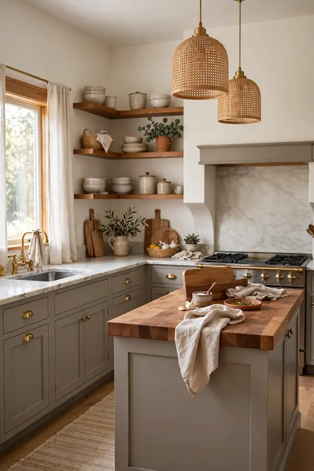
DO:
- Do pair putty gray with warm whites, not stark ones.
- Do add wood tones to keep it cozy.
- Do choose satin finish for easy cleaning.
DON’T:
- Don’t use it in rooms with only cool northern light without warm accents.
- Don’t pair with silver chrome if you want warmth; choose brass.
- Don’t forget to sample; putty shifts between gray and beige.
Warm putty gray is the sweater-weather shade of the kitchen world. It wraps the room in softness and works with nearly every style from farmhouse to transitional. The warmth keeps it from feeling flat, which is the risk with cooler grays. I’ve noticed it flatters both marble and butcher block, a rare trick. Keep the styling simple and let the color’s quiet comfort lead.
Midnight Blue Luxe
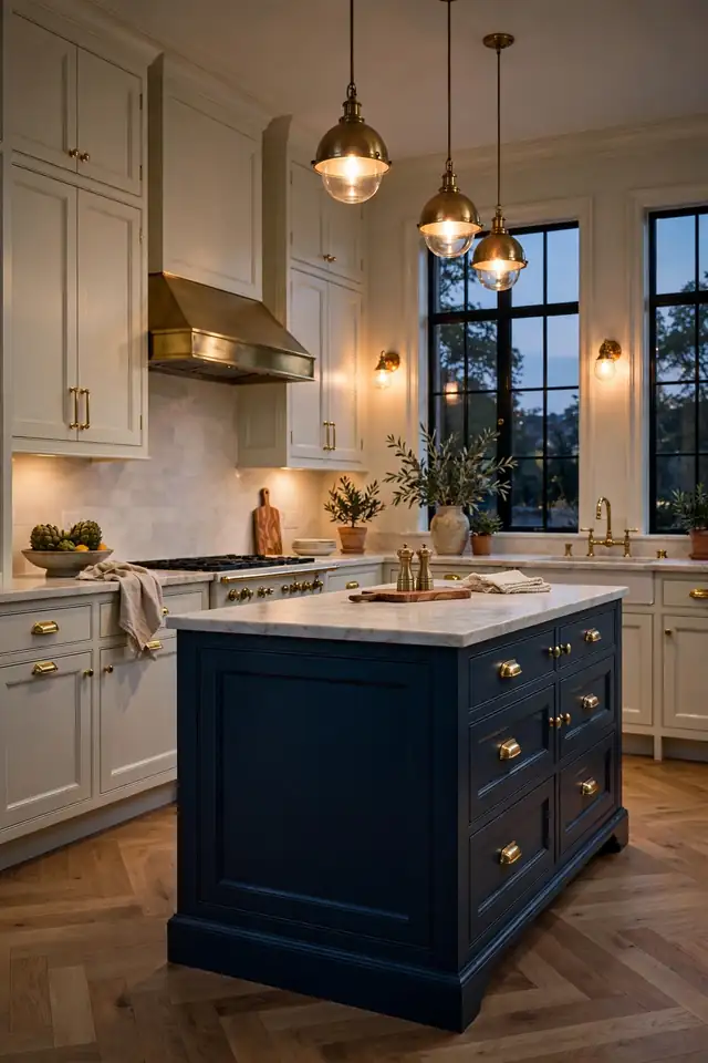
Cost: Moderate | Time: One weekend | Skill Level: Intermediate | Best For: Statement islands
Midnight blue is navy after dark: deeper, moodier, and unapologetically luxe. It turns an island into furniture and makes brass hardware gleam like jewelry. Use it where you want maximum impact with minimum fuss, since one painted island changes the whole room. Pair with pale surroundings so the depth reads as drama, not darkness. This is the shade for kitchens that entertain after sunset. A waterfall stone countertop in white or pale gray keeps the look light on top and dramatic below. Add dimmable pendants above, and the island becomes the evening gathering spot.
Charcoal Gray Depth
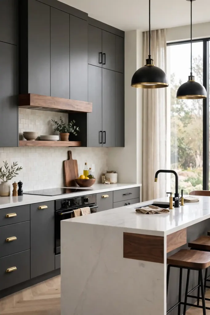
Charcoal gray is the tailored suit of kitchen colors: sharp, modern, and quietly confident. It hides wear better than black while keeping the same sleek edge, and it pairs with everything from concrete to walnut. In a well-lit kitchen it reads as sophisticated; in a darker one it turns deliciously moody. Either way, it looks intentional and designed.
Balance charcoal with light counters and a pale backsplash so the room breathes. Warm metals like brass or copper keep it from feeling industrial, while black hardware doubles down on the modern edge. That’s why many experts recommend testing it beside your actual flooring first. Done right, charcoal feels less like a trend and more like a permanent upgrade.
Conclusion
Choosing from these kitchen cabinet colors comes down to how you want the room to feel at 7 a.m. and at 7 p.m. Light shades open up small spaces, deep tones add drama to rooms with good light, and warm neutrals keep everything cozy in between. I’ve seen how small changes like these can completely shift the way a space feels. Pick your favorite, test a sample door, and paint with confidence. Then pin your top three to Pinterest, share the makeover with a friend, and enjoy a kitchen that finally feels like yours.