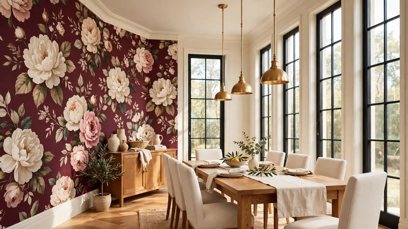
22 Burgundy Floral Wallpaper Dining Room Ideas for Dramatic Charm
Deep red blooms climbing a dining wall change the mood before the first plate lands. The strongest burgundy floral wallpaper dining room ideas treat the paper as the room’s main piece of art, then let cream paint, warm wood, and brass keep the drama feeling generous rather than heavy. In my experience, guests remember the wall long after they forget the menu, and hosts start planning dinners just to use the room.
Warmth at the table can come from pattern as easily as from stone or wood. Rooms built on natural travertine coffee table styling prove that one honest surface can anchor a whole scheme, and a floral wall does the same work vertically. The twenty two ideas ahead cover placement, pairings, lighting, and care, so the paper you love can carry weekday breakfasts and holiday dinners alike.
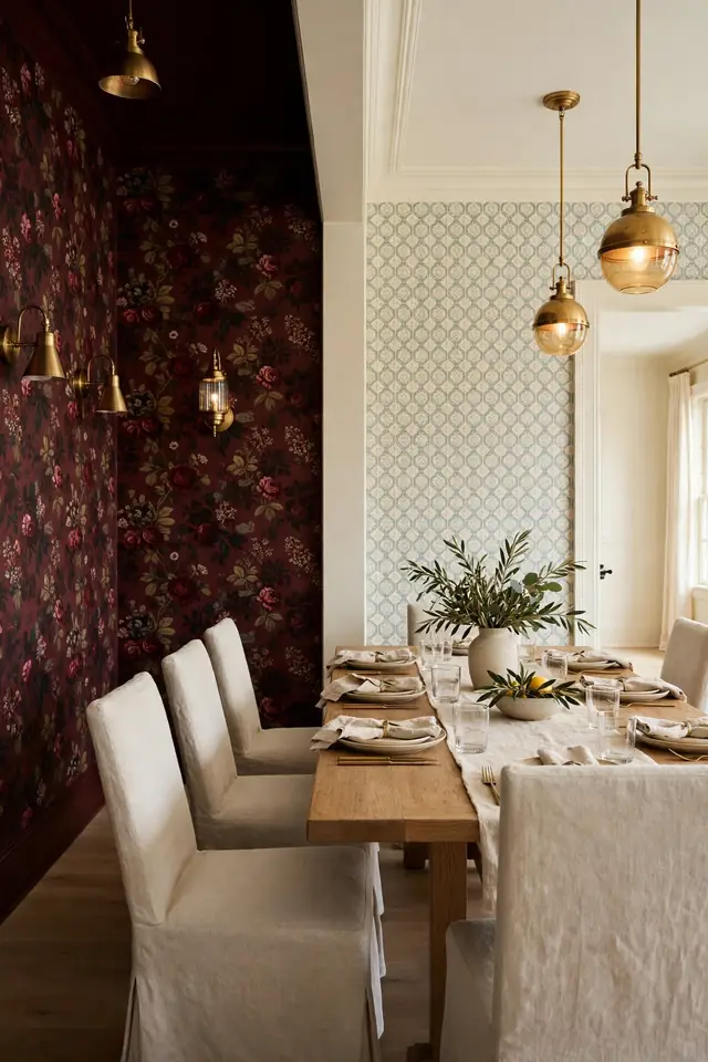
Grand Floral Feature Wall
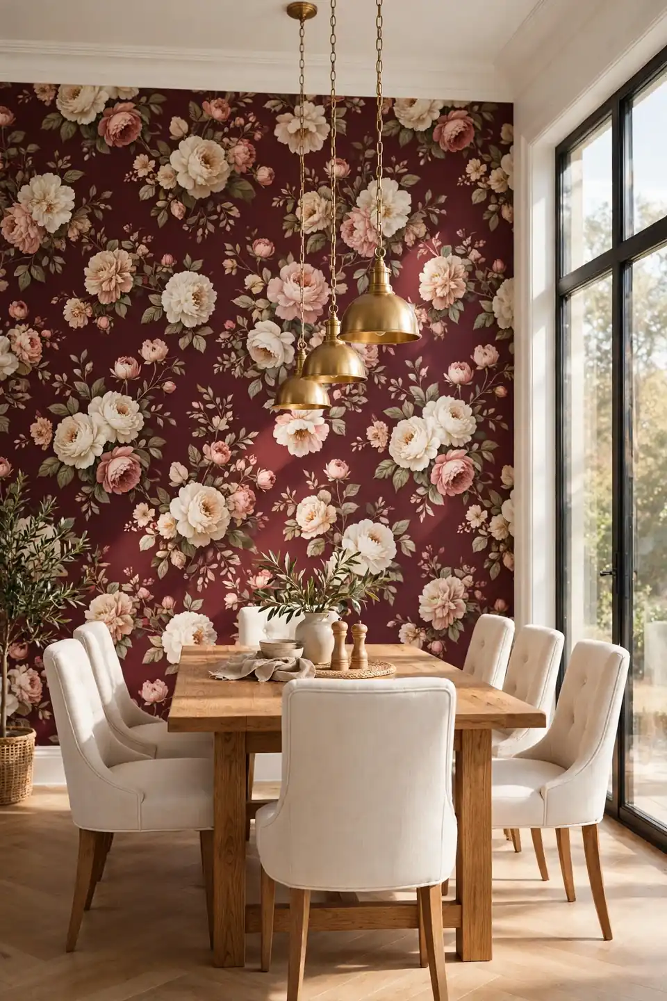
One wall of oversized blooms gives a dining room a focal point that no sideboard arrangement can match. Paper all four walls only in a large room; in most homes the long wall behind the table carries the pattern best, because seated guests face it for the whole meal and holidays.
Cream on the remaining walls keeps the burgundy from closing in, and a pale ceiling lifts the whole scheme. I’ve noticed that a single patterned wall also makes art placement easier: the paper becomes the picture, and the other walls can stay calm with one mirror or a pair of sconces and nothing else competing.
Cream Wainscot Balance

- Run chair rail height wainscot in warm cream beneath the paper line.
- Paint the trim and panels one shade deeper than the ceiling.
- Let the floral pattern start above the rail where candlelight reaches it.
- Choose flat or eggshell paint so the woodwork stays quiet beside the blooms.
- Carry the same cream onto the ceiling for a soft, wrapped feeling.
Wainscot earns its keep at chair height, where chair backs bump and scrape during long dinners. The painted panels take the knocks while the paper stays pristine above them. In older homes the rail also hides the join between uneven plaster and new work, a practical bonus hiding inside a classic look.
Brass Sconce Glow
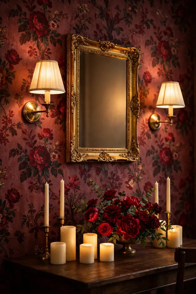
Quick Tip: Mount sconces so the shade center sits at eye level when seated, roughly forty eight inches from the floor in most dining rooms. Warm bulbs around 2700K keep burgundy tones rich instead of muddy, and a dimmer lets dinner light drop low without going dark.
Brass was made for this palette: its warm metal echoes the golden centers hidden inside many burgundy blooms. Place a pair flanking a mirror or sideboard rather than scattering singles, since pairs read as architecture while singles read as decoration. The glow also softens the paper’s contrast after dark. Candlelight then only has to help, not carry the room.
Dated Nook Makeover
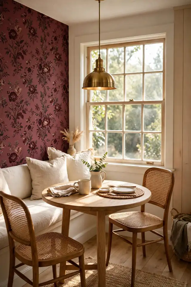
BEFORE: The breakfast end of the room held white walls, a tired print curtain, and a table that floated without an anchor. Morning light washed everything flat, and the corner read as leftover space rather than a place anyone chose to sit.
AFTER: One wall of burgundy floral paper now backs the table, a cream bench tucks beneath it, and a brass pendant hangs low over the center. The corner pulls people in, and coffee tastes better simply because the seat finally feels chosen.
Small corners respond fastest to pattern because the paper only has to cover one short wall. Measure twice and order one extra roll for the pattern repeat; floral designs eat more paper than plain ones. The whole change fits in a weekend, including drying time.
Wallpaper Placement Steps
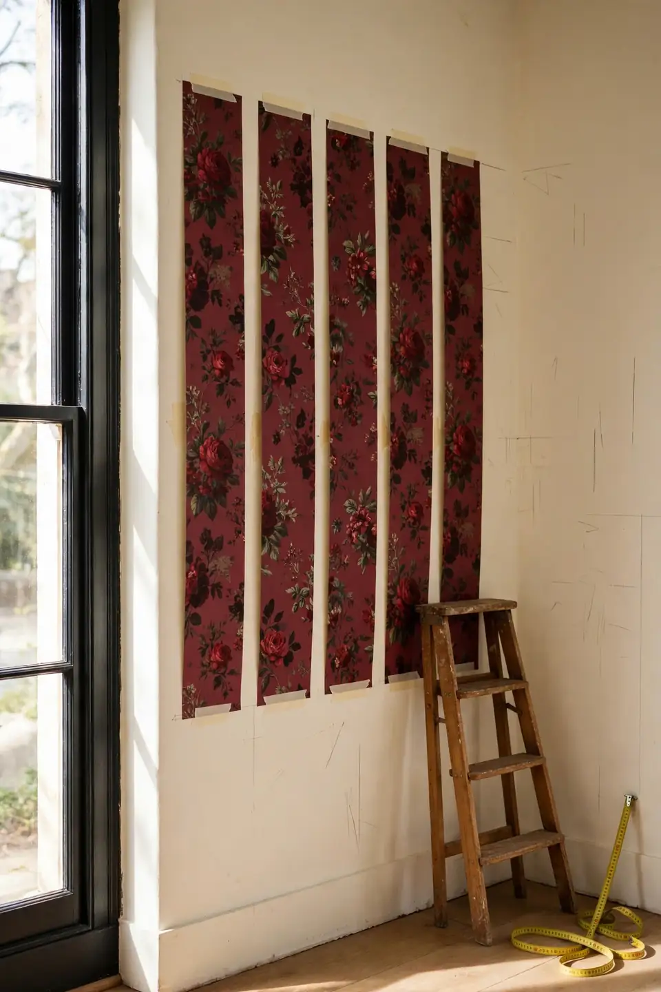
- Pick the wall guests face while seated; pattern belongs in the main sightline.
- Measure height and width, then add ten percent for the floral repeat.
- Paint the remaining walls a cream pulled from the lightest bloom.
- Hang a wide sample for one full day before ordering rolls.
- Mark the starting corner where the pattern break will hide best.
A sample day matters more than any swatch book. Light moves across a dining room from breakfast to candlelight, and burgundy shifts with it, glowing at noon and deepening at night. Live with the sample through both before the full order goes in.
Full Wall Versus Accent
| Detail | Full Pattern | One Accent Wall |
|---|---|---|
| Coverage | Every wall wrapped in blooms | One wall behind the table |
| Cost | Four or more rolls | One to two rolls |
| Mood | Immersive, cocoon like, dramatic | Bold focus, calmer edges |
| Care | More seams to match | Easier repairs and swaps |
| Light | Needs strong daylight daily | Forgiving in dim rooms |
Larger rooms with high ceilings can carry pattern on every wall without feeling closed in, especially with cream woodwork breaking the field. Smaller rooms usually shine with one accent wall, where the blooms stay a backdrop rather than a surround. Square footage, not courage, should make this call.
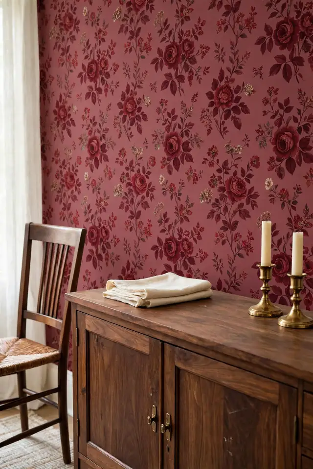
Care And Cleaning Rules
Do:
- Dust the paper monthly with a dry soft cloth.
- Blot spills at once; never soak the printed surface.
- Keep chairs two inches clear of the wall.
- Touch up scuffs on trim, not on the blooms.
Don’t:
- Avoid steam cleaners anywhere near the paper seams.
- Skip scented sprays that settle into the pattern.
- Never hang heavy frames through the paper alone.
- Let direct sun hit one panel all day.
Vinyl coated papers forgive a damp cloth; traditional printed papers want dusting only. Check the roll label before the first cleaning, not after a stain. Gentle habits keep deep reds from fading unevenly, panel by panel, year after year.
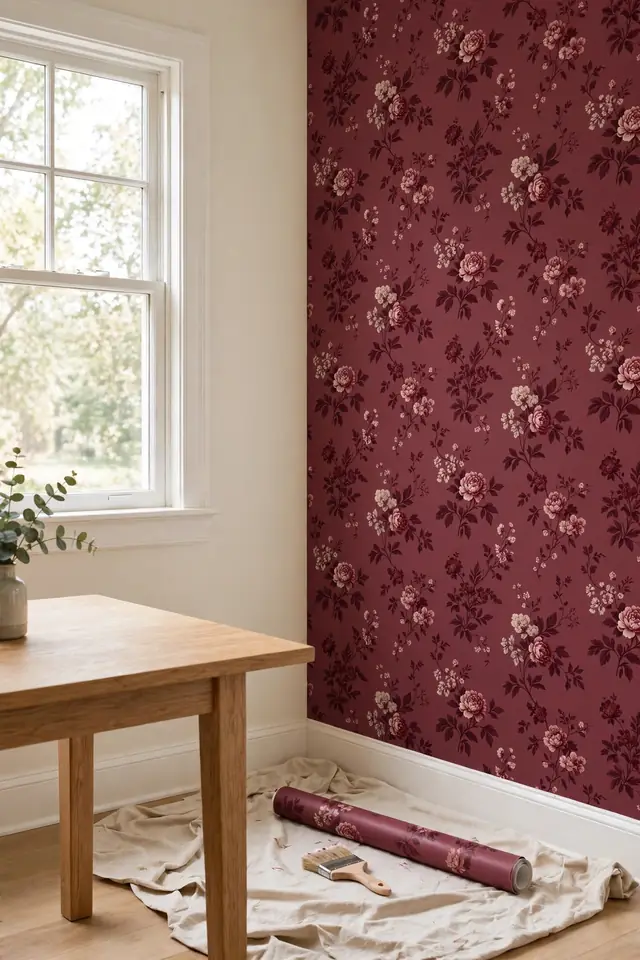
Budget Reality Check
Cost: Mid range rolls plus paste; one accent wall keeps the total bill pleasantly low
Time: One full weekend for an accent wall, including drying hours
Skill Level: Confident beginner; seams and repeats reward real patience
Best For: Pattern lovers who want drama without a full renovation
Paper beats a full repaint plus art purchase in most dining rooms, because the wall itself becomes the decoration. Spend the savings on better lighting instead: dimmers and warm bulbs change how the pattern reads every single evening. Buy one extra roll now; dye lots shift, and a later match may never come.
Velvet Chair Pairing
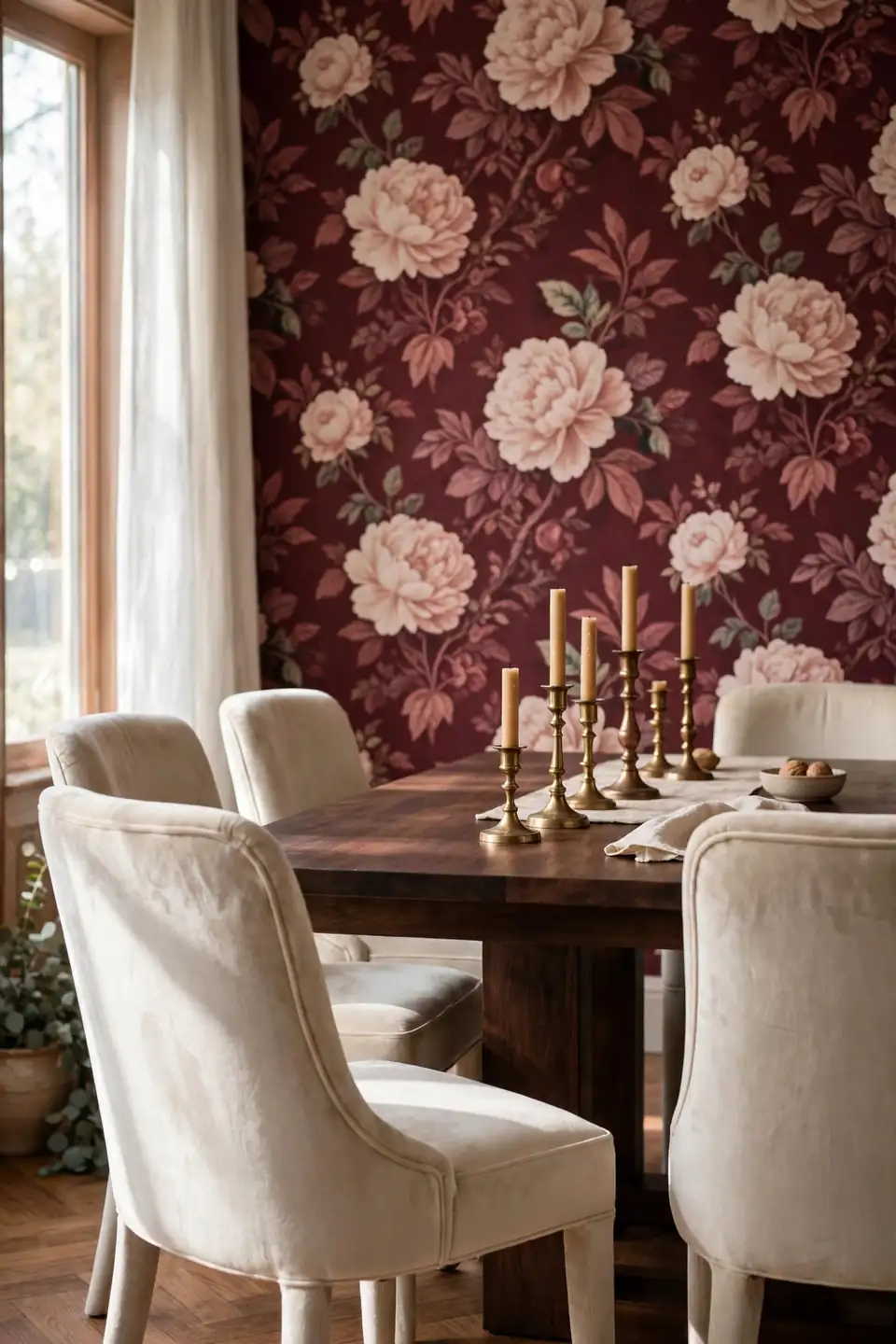
Velvet dining chairs in cream or soft blush pull the pale tones out of the wallpaper and give the pattern somewhere to land. Apricot and dusty rose work too, pulled straight from the bloom centers. Six matching chairs feel formal; four chairs plus a bench on the window side loosen the room for family dinners.
This is where burgundy floral wallpaper dining room ideas earn their keep at real meals: velvet forgives the formality, wipes clean with a brush, and photographs beautifully beside candlelight. In my experience, guests linger longer in soft chairs, and long dinners are the entire point of a dramatic dining room.
Dark Wood Table Styling

- Choose walnut or stained oak dark enough to anchor the pattern.
- Run a cream linen runner down the center, never a busy print.
- Set brass or clear glass at each place, nothing heavily colored.
- Keep the centerpiece low: three candles or one shallow bowl.
- Leave bare wood showing at both ends of the table.
Dark wood grounds a floral wall the way a frame grounds a painting. Pale tables can float and feel temporary against deep red blooms, while walnut carries visual weight equal to the pattern. Wax the top twice a year and the surface glows under candlelight without a cloth.
Ceiling Height Illusion
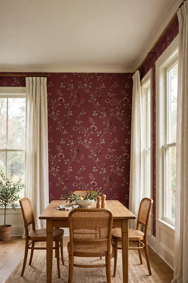
Quick Tip: Hang the paper so the largest blooms sit just above eye level, then paint the ceiling the palest cream from the pattern. The eye reads the pale ceiling as extra height, and the room feels taller by dinner. Choose patterns with upward trailing vines for the strongest lift.
Vertical floral trails pull the gaze upward, which is free height in rooms that measure under nine feet. Keep curtains mounted close to the ceiling line as well, so the window wall agrees with the paper wall. Crown molding in cream gives the pattern a clean stopping point. Rooms under eight feet benefit most of all.
Candlelit Dinner Drama
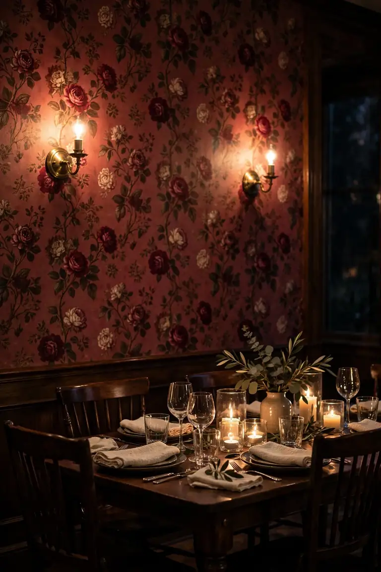
BEFORE: Under the old lighting the floral wall looked flat and slightly dull at night. The overhead bulb threw hard shadows, the pattern turned muddy, and dinners felt like eating in a showroom after closing time.
AFTER: Three light layers changed everything: dimmed sconces wash the blooms, candles pool gold on the table, and the paper glows like a painted backdrop. Guests lean in, voices drop, and the room finally matches the food.
Plan the lighting before the paper goes up, because sconce wiring hides neatly behind new work. Burgundy rewards low, warm light and punishes cool overhead bulbs. That’s why many experts recommend testing the paper sample under evening light, not just noon sun.
Pattern Matching Made Simple
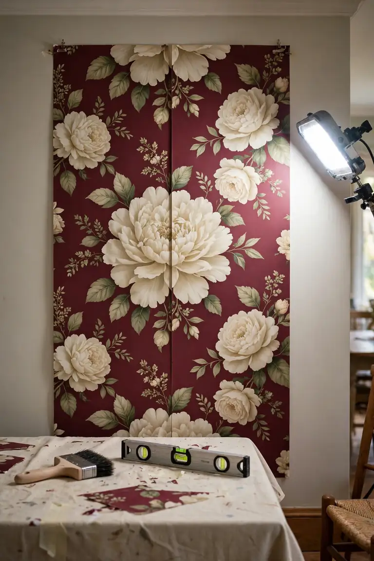
- Buy every roll from one dye lot; check the batch numbers.
- Cut the first strip long and mark the repeat with tape.
- Match blooms at eye level, where seated guests look longest.
- Butt seams gently; never stretch the paper into place.
- Trim top and bottom only after the strip hangs true.
Large florals forgive small errors because the eye follows blooms, not seams. Stand back every two strips and check the pattern from the doorway. A helper calling directions from six feet away saves more paper than any tool in the box. Patience at the seams is invisible later, while rushed joins show forever.
Peel Stick Versus Paste

| Detail | Peel And Stick | Traditional Paste |
|---|---|---|
| Commitment | Removable, renter friendly option | Long term, firmer hold |
| Seams | Can shrink and gap slightly | Stable once fully dried |
| Cost | Higher per roll price | Lower paper, more tools |
| Finish | Smooth matte, thinner feel | Deep print, cloth like texture |
Renters and serial redecorators get real freedom from peel and stick, with removal measured in minutes. Owners planning a decade with the same blooms should choose paste for its hold and print depth. Order samples of both and hang them side by side for a week. Either way, the pattern does the decorating once it is up.
Lighting Layer Plan

Do:
- Layer sconces, a pendant, and candles at dinner.
- Put every fixed light on its own dimmer.
- Choose warm bulbs between 2200K and 2700K always.
- Wash one wall evenly; avoid single hot spots.
Don’t:
- Avoid cool white bulbs against deep red paper.
- Skip a lone ceiling light as the plan.
- Never aim spotlights straight at the blooms.
- Let bare bulbs glare into seated guests’ eyes.
Three layers at three heights keep the pattern alive after dark: low candle glow, mid level sconce wash, and a soft pendant above the table. One layer alone always leaves the room feeling unfinished. Test the mix at a real dinner before judging it.
Vintage Mirror Pairing

Cost: Thrifted gilt mirrors run low; new replicas cost far more money
Time: One afternoon of hunting, one unhurried hour of hanging
Skill Level: Beginner, with a stud finder and steady patience
Best For: Dark corners and narrow walls that need borrowed light
A gilt mirror on the wall opposite the paper doubles the blooms without buying another roll. The reflection also carries candlelight into corners the sconces miss. Hang it at seated eye level so diners catch the pattern over each other’s shoulders, a small trick that makes modest rooms feel grand. Thrift stores near old neighborhoods hide the best frames.
Rug Choice Grounding

A flat cream or jute rug under the table calms the floor so the wall can sing. Patterned rugs under patterned paper fight for the same attention, and the room ends up tired instead of dramatic. Choose a rug large enough for chairs to slide back without catching the edge at every meal.
Natural fibers also tie the room to sunlit schemes like modern Mediterranean dining room inspiration, where jute, linen, and stone share one calm palette. Burgundy blooms above a quiet rug read as rich, not loud, and the table stays the social center it should be. Guests feel the calm before they can name it.
Burgundy With Soft Neutrals
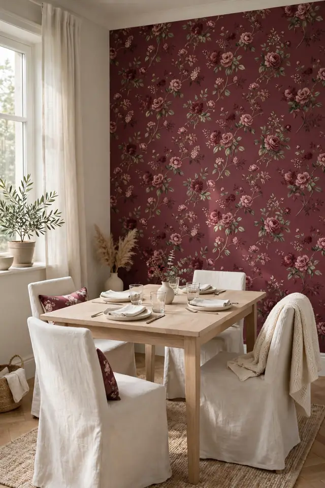
- Pull cushion and napkin colors straight from the bloom centers.
- Keep large pieces neutral: cream chairs, pale oak, natural linen.
- Repeat one soft tone at least three times in the room.
- Let burgundy live on the wall and in small accents only.
- Add black in tiny doses: frames, candle cups, chair legs.
Neutrals are not the absence of color here; they are the frame that lets burgundy behave like art. Rooms that stack red on red lose the floral detail entirely. One cream throw over a chair back can soften a whole wall of blooms. Restraint is what makes the drama feel expensive.
Chair Rail Split Walls
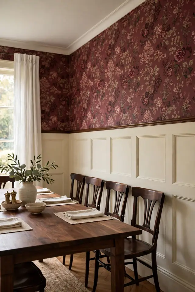
Quick Tip: Set the chair rail at thirty two to thirty six inches, paint everything below it cream, and let the floral paper run from rail to ceiling. Chair backs then strike paint, never paper, during crowded dinners. The split also halves the paper bill for the room.
Split walls suit long narrow dining rooms, where full pattern on every side can feel like a tunnel. The cream lower half reflects light at table height, while the blooms crown the room above seated heads. Cap the rail with a slightly wider molding for a finished, deliberate line that catches the evening light.
Holiday Table Layers

BEFORE: Last December the table wore a red cloth over red paper, and the whole setting blurred into one dark block. Candles disappeared against the wall, and photos of the meal looked flat and heavy.
AFTER: This year a cream cloth, bare wood chargers, and green napkins separate the table from the blooms behind it. The wallpaper now reads as a backdrop in every photo, and the food finally takes the foreground.
Holiday styling against floral paper is mostly subtraction: fewer colors, more texture, and height from candles instead of tall arrangements. Pine, cedar, and plain glass keep the season present without competing with the wall. Store one cream cloth just for this room.
Small Room Bravery

- Choose large scale blooms; small prints buzz in tight rooms.
- Paper the shortest wall to widen the whole room visually.
- Keep the table pale and the chairs low backed.
- Hang one mirror to borrow light from the window.
- Stop adding decor once the patterned wall is up.
Small dining rooms gain the most from one brave wall, because the pattern gives the eye somewhere generous to rest. Crowding a tiny room with timid choices keeps it tiny. Brave beats timid at this size. One strong wall, calm furniture, and clear surfaces make eight chairs feel like an occasion worth dressing for.
Floral Scale Comparison

| Detail | Large Scale Blooms | Small Scale Print |
|---|---|---|
| Bloom Size | Blooms wider than a hand | Dense sprigs, tighter repeat |
| Mood | Calm drama, gallery feeling | Busy energy, cottage feeling |
| Best Room | Dining rooms over twelve feet | Nooks and breakfast corners |
| Light | Holds up in bright rooms | Softens under low light |
| Care | Seams hide between blooms | Repeats show every slip |
Stand six feet back from both samples before deciding; scale reads honestly only at dining distance. Large blooms usually win in true dining rooms, where guests sit far from the wall. Small prints save their charm for nooks, where faces stay close to the pattern.
Conclusion
Twenty two ideas, one clear lesson: a floral wall works hardest when everything else in the room supports it quietly. Cream paint, warm wood, layered light, and calm floors turn burgundy floral wallpaper dining room ideas from a bold risk into the most loved corner of the house. I’ve seen this wall end arguments about paint colors for good. Start with one wall, live with it through a week of dinners, and let the compliments settle the question. Save your favorite ideas on Pinterest, share them with anyone who calls burgundy too much, and set the first dinner date tonight.