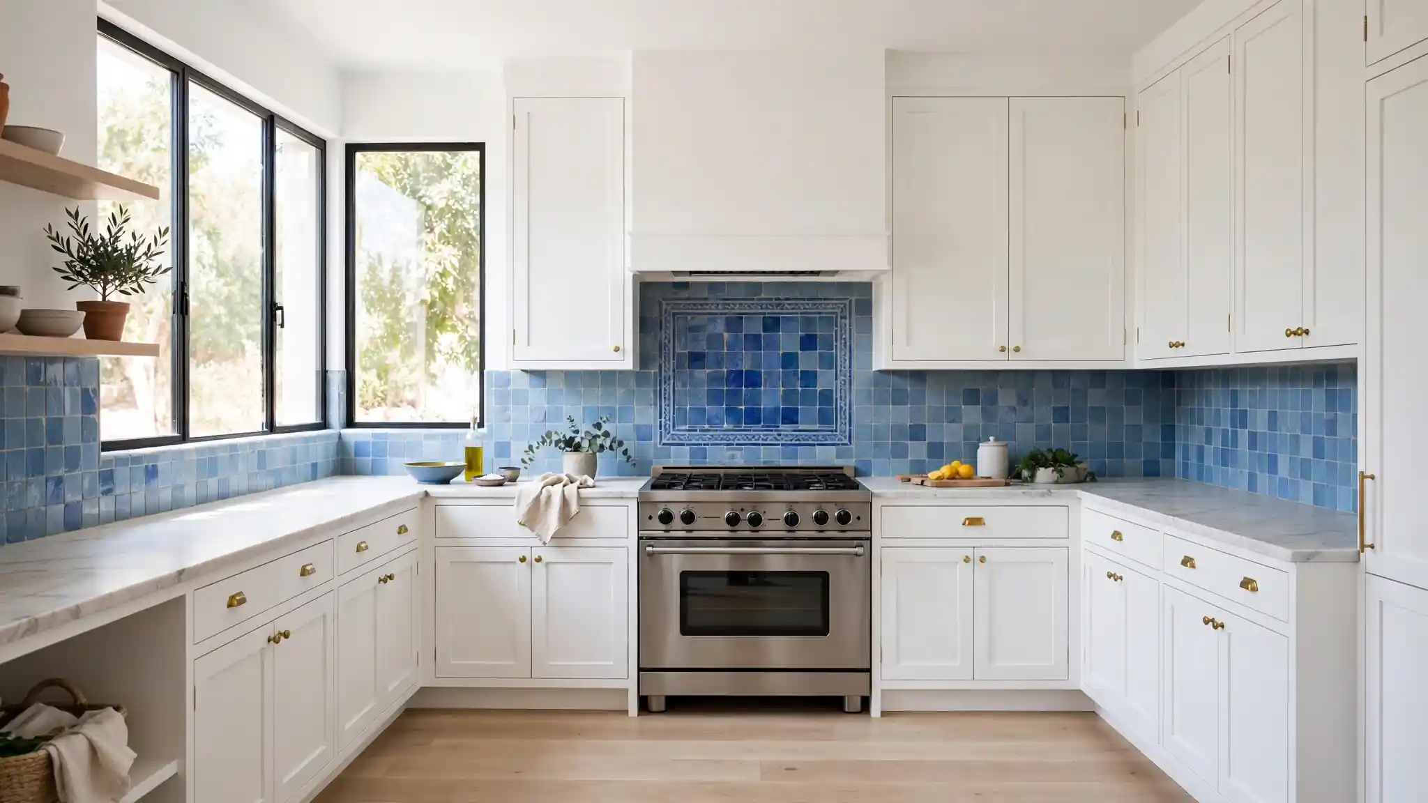
25 Blue Zellige Tile Kitchen Backsplash Ideas for Artistic Style
Few materials change a kitchen as fast as handmade tile. When I first saw blue zellige tile kitchen backsplash ideas in a friend’s remodel, the walls looked like moving water, and I knew plain subway tile would never do again. Each zellige square carries slight color shifts and a glassy glaze that catches light differently through the day. If your kitchen feels flat, this is the upgrade that fixes it.
Zellige comes from Moroccan craft traditions, and the blue palette ranges from pale sea glass to deep ocean ink. It pairs with almost any cabinet color, which makes it a safe bet for resale too. For a softer take on bold color, these vintage pink kitchen decor ideas show how pastels warm a kitchen. Below are 25 ways to use blue zellige, from full-height drama to small artistic accents.
Ocean Wave Shimmer
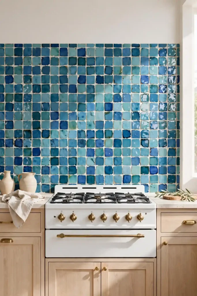
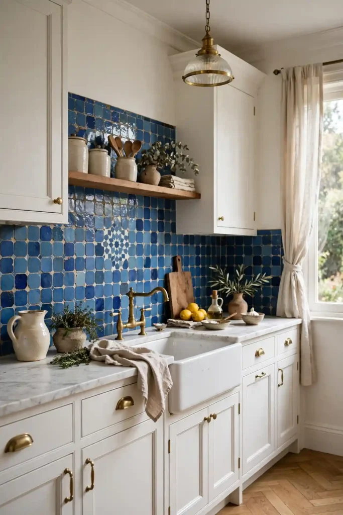
Glossy zellige in layered blues turns a plain wall into something that feels alive. I recommend choosing three shades, from pale aqua to deep teal, and letting your tiler blend them randomly across the field. The uneven glaze catches under-cabinet lighting and throws soft ripples across the surface. It reads coastal without a single seashell in sight.
Keep cabinets quiet so the tile stays the star. White or pale oak lowers let the blue carry the whole design, and simple brass pulls echo the watery tones. In my experience, a high-gloss finish wipes clean easily, which matters behind a busy range. Seal the grout once a year and the shimmer stays fresh.
Classic Subway Stack
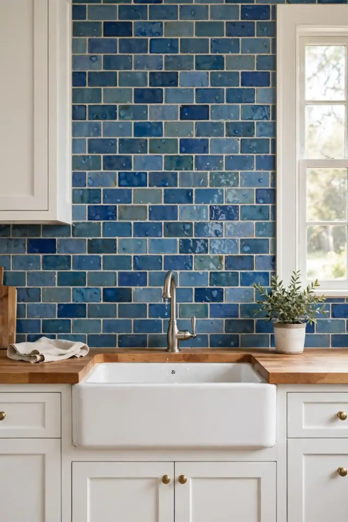
- Lay 2×6 blue zellige in a running bond for a familiar shape with handmade soul.
- Pick a mid-tone denim blue so grout lines read soft, not stark.
- Use a matching blue grout to let the glaze variation lead.
- Stop the tile at the cabinet line for a clean, budget-friendly finish.
- Pair with matte black faucets to sharpen the vintage feel.
The subway layout suits renters and first-time renovators because any tiler can install it fast. I have seen this work well in many cases where the budget was tight but the result still looked custom. Keep the palette to one blue family so the handmade texture does the talking. It is the easiest entry point into zellige.
Herringbone Artistry
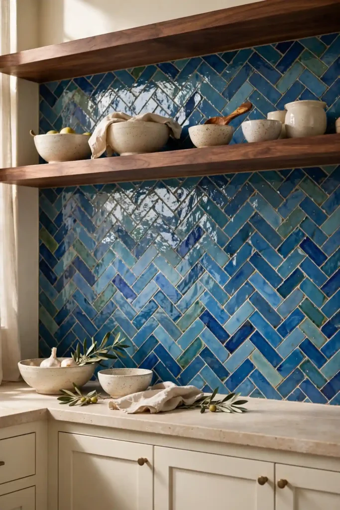
Quick Tip: Herringbone doubles your tile order and your labor cost, so measure twice. Dry-lay a section on the floor first to check the angle reads the way you want. A 45-degree herringbone in glossy blue zellige looks like woven fabric, and the pattern hides small lippage between handmade tiles.
Choose a narrow 2×8 tile for the sharpest zigzag. I suggest keeping the surrounding palette calm, since herringbone already brings plenty of movement. Cream cabinets and quiet counters let the pattern breathe. Order 15 percent extra for cuts, since herringbone wastes more than straight layouts. This layout turns a small backsplash zone into the clear focal point of the room.
Full Height Drama
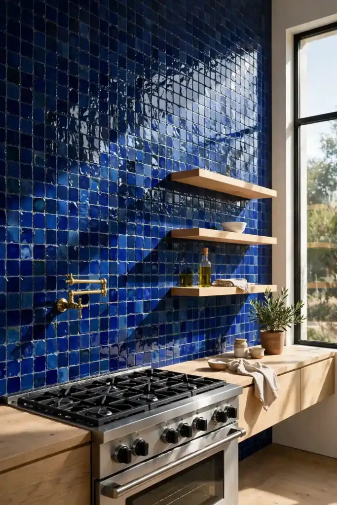
BEFORE: The kitchen had a short 4-inch backsplash strip that made the tall wall feel unfinished. The eye stopped halfway up, and the room felt smaller than it was.
AFTER: Running blue zellige from counter to ceiling pulls the gaze upward and makes the ceiling feel higher. The deep cobalt glaze turns the whole wall into art, and open shelves break the expanse just enough.
Full-height tile works best behind a range or sink where the wall is wide. I recommend a deeper blue here so the large field feels rich rather than busy. Budget for extra tile and labor, since tall walls show every flaw. The payoff is a kitchen that feels designed, not decorated.
Soft Sea Glass
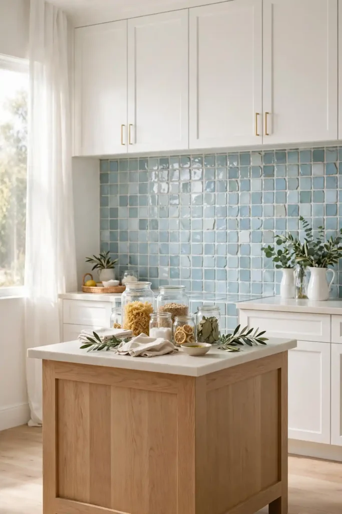
- Choose the palest blue zellige you can find, almost white with a hint of aqua.
- Install in a simple stacked grid so the color stays whisper-quiet.
- Use white grout to keep the field light and seamless.
- Pair with pale oak or white cabinets for an airy finish.
Pale zellige suits small or dark kitchens because it reflects light instead of absorbing it. I have noticed the frosty glaze reads almost like sea glass up close, which adds craft without visual weight. Keep hardware simple and let the texture carry the interest. It is calm color for people who fear commitment.
Classic blue zellige tile kitchen backsplash ideas
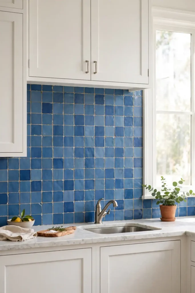
| Layout | Offset pattern | Stacked grid |
| Feel | Traditional and relaxed, hides handmade variation well | Modern and graphic, shows off each tile |
| Best cabinets | White shaker for a timeless cottage feel | Flat-panel oak for a clean modern look |
| Grout choice | Light gray grout softens the joints | Tone-matched blue grout for a seamless field |
The classic approach never dates because it borrows from centuries of tile craft. I suggest a medium blue that sits between bright and moody, so it works in both sunny and north-facing kitchens. Keep counters light and hardware simple so the tile stays the hero. This is the version I recommend when resale matters most, since buyers love classic blue.
Brass Trim Frame
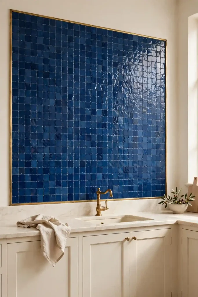
DO: Use a slim brass Schluter strip to frame the tile field like art. Match the trim finish to your faucet for a pulled-together look. Keep the frame line straight and level; it will show every wobble.
DON’T: Mix brass trim with chrome fixtures in the same sightline. Don’t run the trim around inside corners; end it cleanly at cabinet edges. Don’t choose an overly wide profile that fights the handmade tile.
A metal frame gives zellige a tailored edge that plain tile edges lack. I recommend this trick when the backsplash meets painted drywall, since the trim hides the raw tile edge beautifully. It adds a jewelry-like finish for very little cost. Small detail, big polish.
Open Shelf Pairing
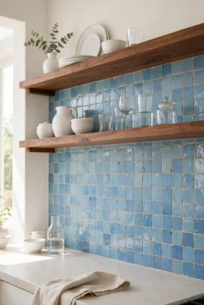
Cost: Medium, mostly tile and two brackets per shelf
Time: One weekend for tile plus one day for shelves
Skill Level: Intermediate; shelves need solid stud anchoring
Best For: Small kitchens needing display space
Open shelves over blue zellige double the visual interest without crowding the wall. I suggest walnut or white oak shelves, since warm wood calms the cool tile. Style with white dishes so the blue peeks through between objects. Keep the styling loose and let a few pieces overlap. The whole wall feels collected, not staged, and the shelves give everyday dishes a proper home. It is storage that behaves like decor.
Moody Midnight Blue
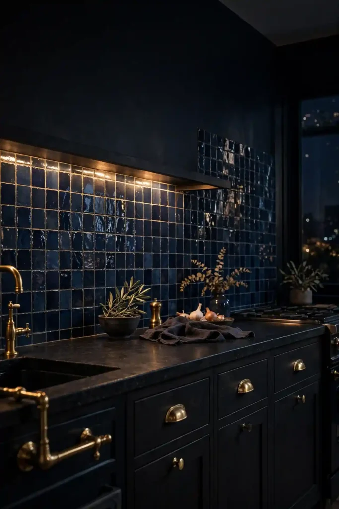
Deep navy zellige brings evening drama to a kitchen that gets strong daylight. I have found that blue zellige tile kitchen backsplash ideas in the darkest shades behave almost like a neutral, pairing with black, white, brass, and wood at once. The glossy surface keeps the dark color from feeling heavy by bouncing light around. It is bold without shouting.
Balance the depth with warm lighting and pale counters. Under-cabinet LEDs are non-negotiable here, since they wake up the glaze after dark. Keep upper cabinets light or open so the room breathes. This is the palette for cooks who want their kitchen to feel like a moody restaurant.
White Oak Contrast
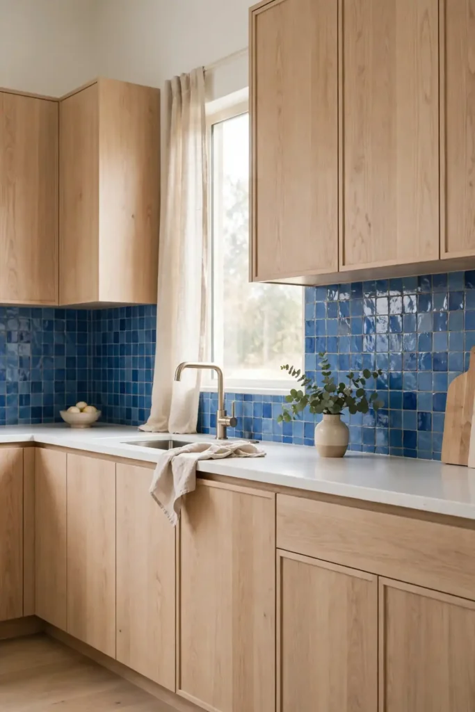
- Pair medium blue zellige with rift-sawn white oak for warm-cool tension.
- Keep the tile field simple so the wood grain stays visible.
- Use a light grout to separate tile from cabinet cleanly.
- Choose unlacquered brass pulls that will patina over time.
- Repeat the oak on a floating shelf or island panel.
White oak and blue is the combination I specify most for modern kitchens. The wood warms the cool tile, and both materials age gracefully together. I have seen this work well in many cases where clients feared blue would feel cold. Keep counters quiet and the pairing does all the work.
Handmade Tile Mix
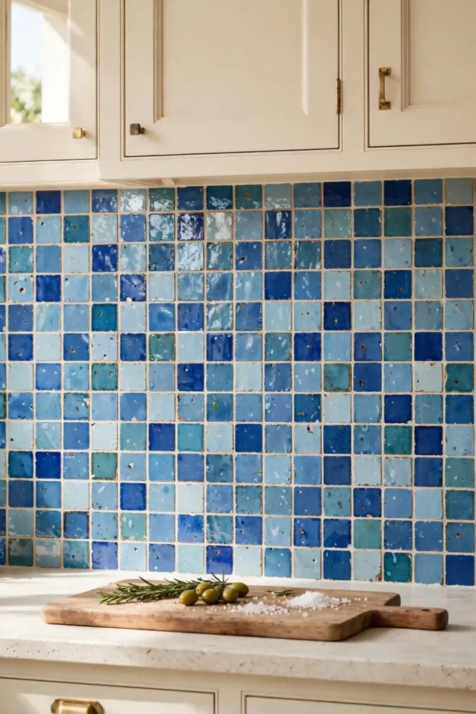
Quick Tip: Ask your supplier for a “blend” box that mixes three to five blue shades. Open all boxes and shuffle tiles before installing so no single shade clusters. A true handmade mix should look random, never striped. Step back every few rows to check the balance.
Blended zellige hides dye-lot differences and makes repairs invisible later. I recommend this approach for DIY-friendly installs, since small placement mistakes disappear into the variation. Keep grout neutral and let the tile carry the pattern. Save a few spare tiles from each shade for future repairs. It is the most forgiving way to use handmade tile.
Bold blue zellige tile kitchen backsplash ideas
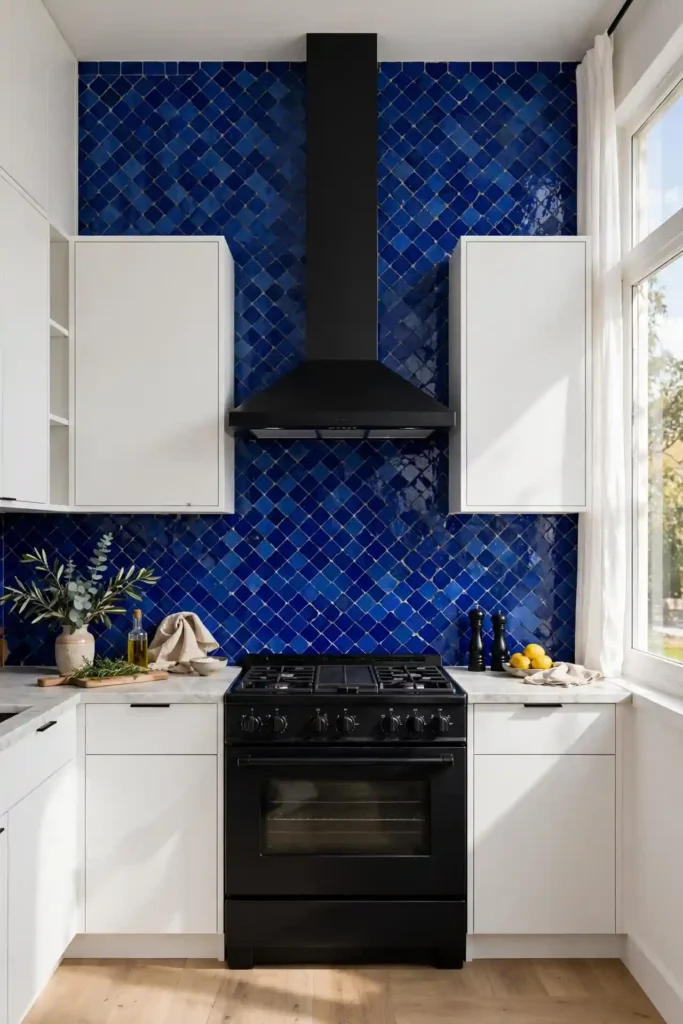
BEFORE: The all-white kitchen felt sterile, like a showroom nobody cooked in. Every surface matched, and nothing drew the eye.
AFTER: A vivid cobalt zellige backsplash gave the room a pulse. The handmade variation keeps the strong color from feeling flat, and the white cabinets now look crisp instead of bland.
Going bold works when the rest of the kitchen stays quiet. I suggest committing to one saturated blue and editing everything else back. Keep small appliances off the counter so the tile reads uninterrupted. Bold tile rewards brave choices and punishes half measures, so go all in. A single bold move beats three timid ones every time.
Moroccan Star Motif
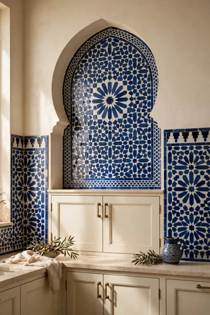
- Order a star-and-cross mosaic sheet in blue and white zellige. Confirm the sheet size matches your range width before you buy.
- Use it as a centered panel behind the range, framed by plain field tile. Keep the panel no wider than the cooktop for balance.
- Keep the surrounding tile in a solid blue so the motif pops. A quiet field makes the pattern read as intentional art.
- Seal well, since mosaic sheets have more grout lines to protect. Reseal once a year in a hardworking kitchen.
A star motif nods to zellige’s Moroccan roots without turning the kitchen into a theme. I recommend limiting the pattern to one panel so it reads as art. The geometry pairs beautifully with simple shaker cabinets. It is heritage detail scaled for modern life.
Vertical Stack Elegance
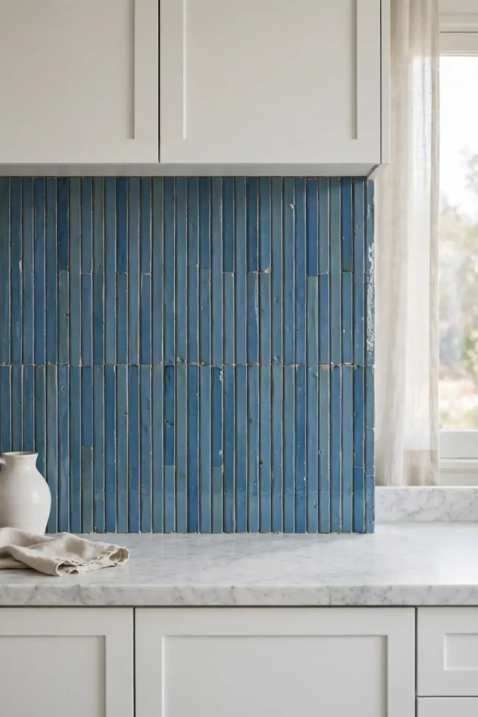
| Tile size | 2×8 vertical | 2×6 vertical |
| Effect | Taller feel with a crisp modern edge | Softer rhythm with a classic hand |
| Best with | High ceilings and minimal uppers | Standard 8-foot walls and shaker cabinets |
| Watch for | Strict plumb lines; drift shows fast | Grout color must match tile closely |
Vertical stacking draws the eye up and makes standard ceilings feel taller. I suggest this layout for galley kitchens where every inch of height counts. For cabinet pairings, these navy blue kitchen cabinet ideas show how deep blues ground a tall tile field. Keep the grout tight and the lines will look razor sharp. It is a simple rotation with a big payoff.
Two Tone Border
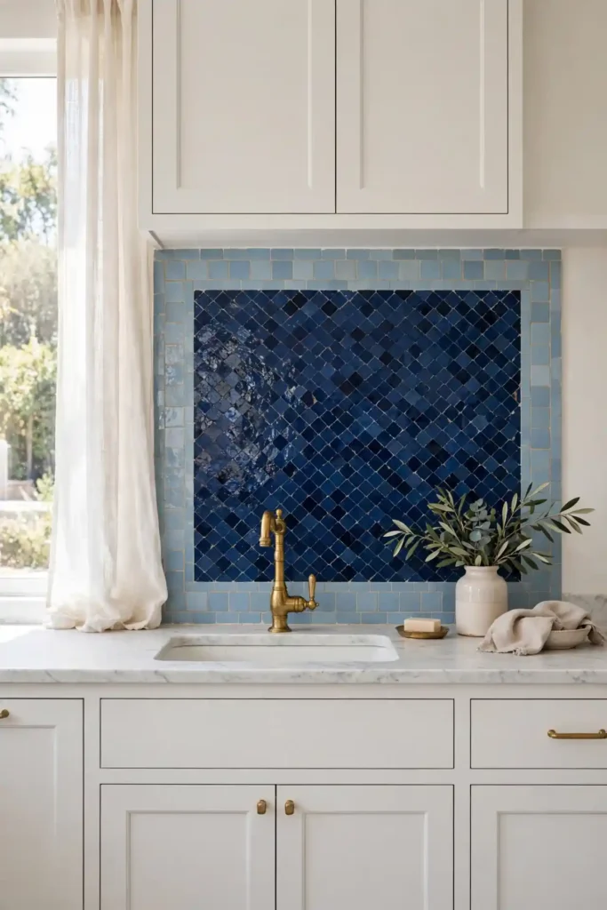
DO: Run one row of pale blue zellige as a border around a deeper field. Keep the border at the top edge or around a window for a framed look. Match the border shade to your lightest cabinet tone.
DON’T: Border every edge; it gets fussy fast. Don’t mix more than two blues in one field. Don’t use a border color that fights your countertop veining.
A two-tone border adds craft without the cost of a full pattern. I recommend this when you love zellige but want a quieter result. The pale edge lifts the deep field and defines the tile zone crisply. It is custom detail on a stock budget.
Marble Counter Harmony
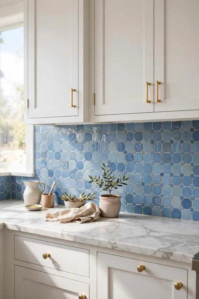
Cost: High, with stone counters and pro tile labor
Time: Two weeks including counter templating
Skill Level: Pro install for both stone and zellige
Best For: Luxury remodels with natural stone counters
Marble and zellige are both natural materials with movement, so they flatter each other. I suggest a softer blue here so the marble veining stays readable. Keep the palette to blue, white, and one metal for a calm luxury feel. In my experience, honed marble with glossy zellige gives the best light play. Order the marble first, then pull your blue from its veining. It is a pairing that never looks trendy, only timeless.
Deep Sea Palette
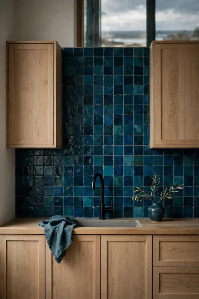
Teal-leaning zellige sits between blue and green, which makes it play well with plants and wood. I have tried this shade in kitchens where pure blue felt too cold, and the green undertone warmed everything up. The deep color hides cooking splashes better than pale tile, a practical win behind any range.
Pair deep sea tones with light oak to keep the room from going dark. I recommend matte black fixtures here, since they echo the depth of the tile. When blue zellige tile kitchen backsplash ideas lean teal, they suit both modern and coastal homes. It is the chameleon of the blue family.
Soft blue zellige tile kitchen backsplash ideas
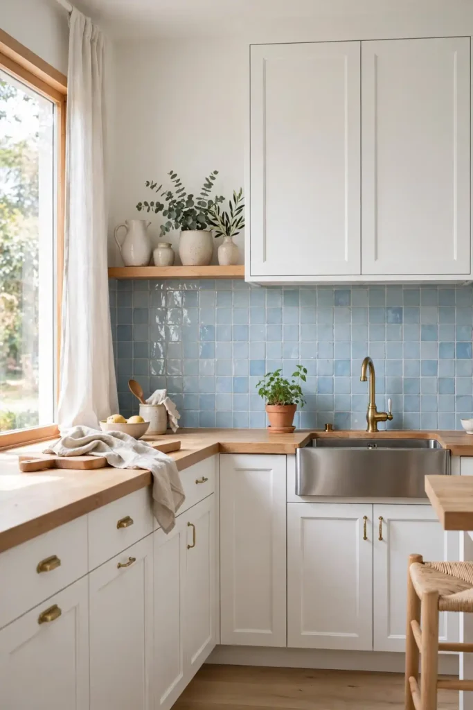
- Choose powder blue zellige for the gentlest take on the trend. It reads as a whisper of color, not a statement.
- Pair with white shaker cabinets to keep the room bright. The pale tile and white cabinetry blend into one calm field.
- Use white grout so the pale tile reads almost seamless. Tight joints keep the handmade edges from looking busy.
- Add light wood stools to warm the cool palette.
- Keep counters white or pale gray for an airy finish.
Soft blue suits kitchens that need calm more than drama. I recommend this shade for open-plan spaces sharing sightlines with living areas. The pale glaze still shows handmade character up close.
Gold Grout Glow
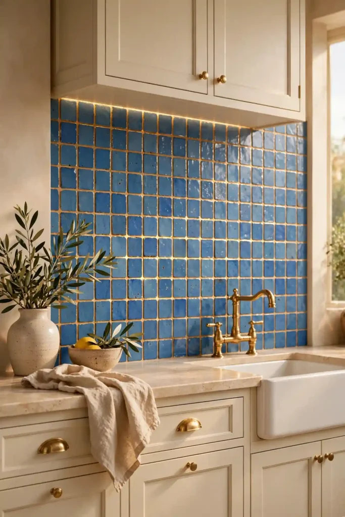
Quick Tip: A warm metallic grout makes blue tile glow like stained glass. Use an epoxy grout in a champagne tone for durability and stain resistance. Test a small area first, since metallic grouts read darker when wet. Wipe tiles carefully during install so the grout stays in the joints, not on the glaze.
Gold grout turns the grout lines into jewelry rather than background. I suggest this for small backsplash areas where the detail gets noticed. Keep the tile a medium blue so the contrast stays elegant. The metallic grout costs more, but a little goes a long way. It is a small splurge with an outsized payoff.
Cottage Blue Charm
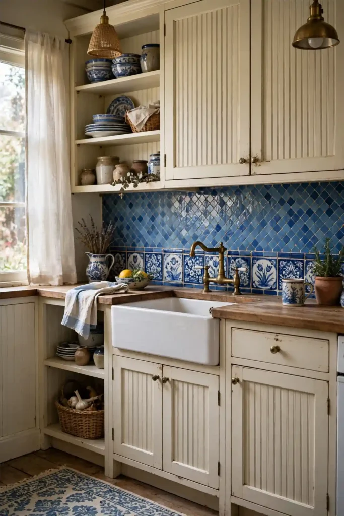
BEFORE: The cottage kitchen had white beadboard everywhere and felt washed out. The charm was there, but the color was missing.
AFTER: Delft-blue zellige behind the range gave the room its missing heart. The handmade tiles echo vintage pottery, and the beadboard now looks intentional instead of plain. The blue repeats in small doses, like the kettle and linens, to tie it all together.
Cottage kitchens love zellige because both celebrate craft over perfection. I recommend a mid blue with visible variation here, since it reads vintage rather than new. Pair with unlacquered brass and the patina will build together. It is old-soul style with new-tile durability.
Dark Grout Definition
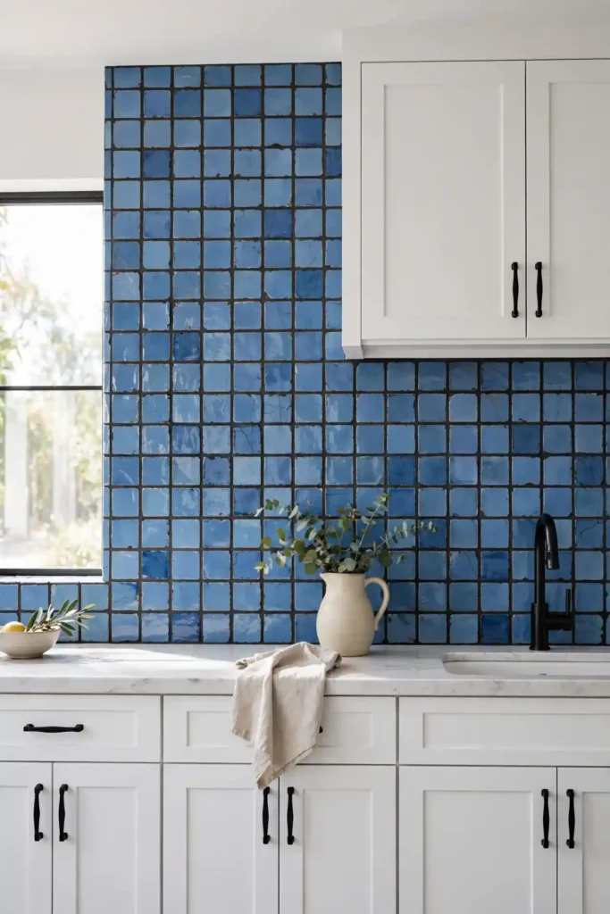
- Pick a charcoal grout two shades darker than your tile. Too black looks harsh; too close disappears.
- Use it with a stacked or grid layout so the lines form a pattern. Running bond softens the graphic effect.
- Seal the grout after curing to keep the dark color even. Dark grout can blotch if it dries unevenly.
- Pair with black hardware to echo the graphic lines. The repetition makes the design feel deliberate.
Dark grout outlines each handmade tile like a hand-drawn grid. I suggest this when you want the tile layout itself to be the pattern. It also hides stains far better than white grout behind a hardworking range. Keep the tile color medium so the contrast stays crisp, not harsh.
Window Wall Splash
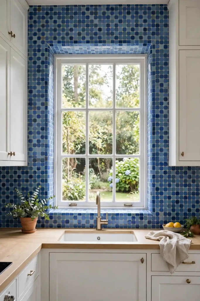
| Approach | Tile around window | Stop at window trim |
| Look | Seamless and custom, like the wall was built for tile | Clean and simpler with a crisp painted edge |
| Cost | Higher labor for tricky jamb cuts | Lower labor, fewer cuts |
| Best when | The window is the focal point | The budget is tight |
Tiling around the window turns the whole wall into one flowing surface. I recommend wrapping the tile into the window jamb for a truly custom feel. The blue frames the outdoor view like art. Budget extra labor for the fiddly cuts, since windows are never perfectly square. The result looks original to the house.
Penny Round Blend
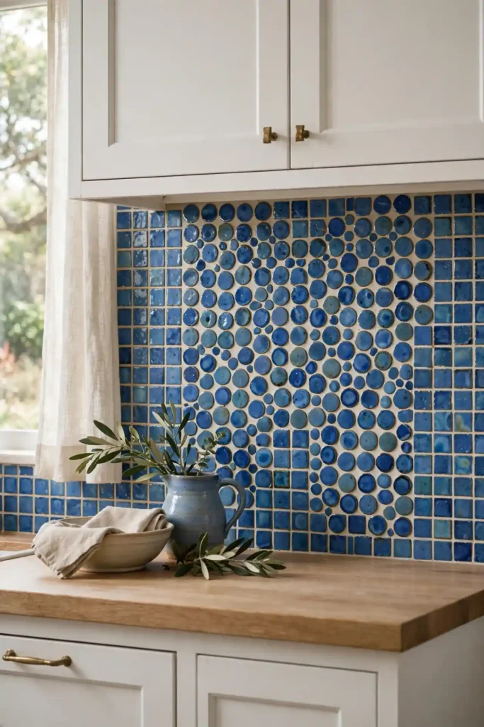
DO: Mix penny rounds with square zellige in the same blue family for texture play. Keep both shapes in similar glaze finishes so they read as one design. Use the rounds as an accent band or niche inset.
DON’T: Mix more than two shapes in one backsplash. Don’t pair glossy rounds with matte squares; the finish clash looks accidental. Don’t forget the extra grout that rounds require.
Shape mixing adds a playful layer that square tile alone can’t give. I recommend this for eclectic kitchens where strict grids feel too stiff. Keep the color family tight so the shapes, not the hues, provide the variety. It is subtle mischief done well.
Timeless blue zellige tile kitchen backsplash ideas
Cost: Medium-high for handmade tile plus pro labor
Time: One to two weeks from demo to grout
Skill Level: Pro recommended; handmade tile punishes shortcuts
Best For: Forever homes and careful renovators
The timeless version of this trend skips extremes: medium blue, simple layout, quiet grout. I have seen this work well in many cases where homeowners feared tile trends would date. Handmade zellige has centuries of history, which is why it outlasts every fad. Choose the middle path and the kitchen will look right for decades. It is the safe bet that never feels safe or boring. Your future self will thank you.
Artistic Focal Niche
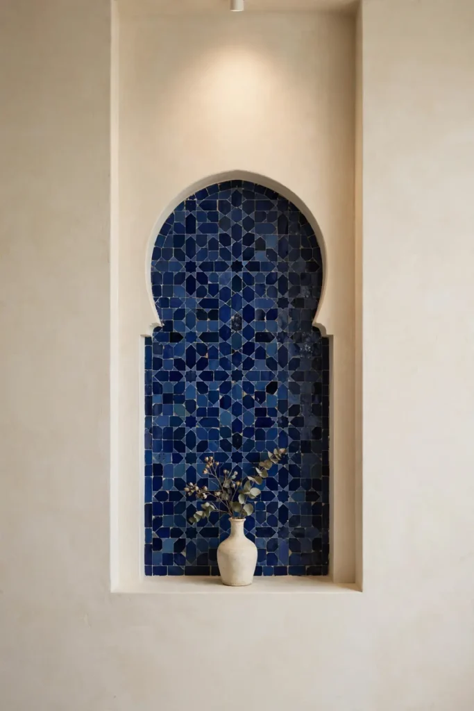
A tiled niche turns an awkward wall recess into a gallery moment. I suggest lining the inside with your deepest blue zellige and adding a small picture light above. Style it with one sculptural vase and nothing else, since restraint makes it read as art. The glossy tile catches the light beautifully in a small space.
Use a niche to test zellige before committing to a full backsplash. It takes one box of tile and an afternoon, yet it shows you how the glaze behaves in your light. In my experience, renters can even do a faux niche with a framed tile panel. Small canvas, real impact.
Conclusion
Blue zellige brings something no factory tile can: the human touch, visible in every uneven glaze and soft color shift. Whether you choose pale sea glass or deep midnight, these blue zellige tile kitchen backsplash ideas prove that a backsplash can be the soul of a kitchen. Start with the shade that makes you stop scrolling, then build the room around it.
Save your favorites on Pinterest before you visit the tile shop, and bring cabinet samples to compare in person. I’ve seen how small changes like these can completely shift the way a space feels. Try one idea this season and watch your kitchen come alive.
One Comment