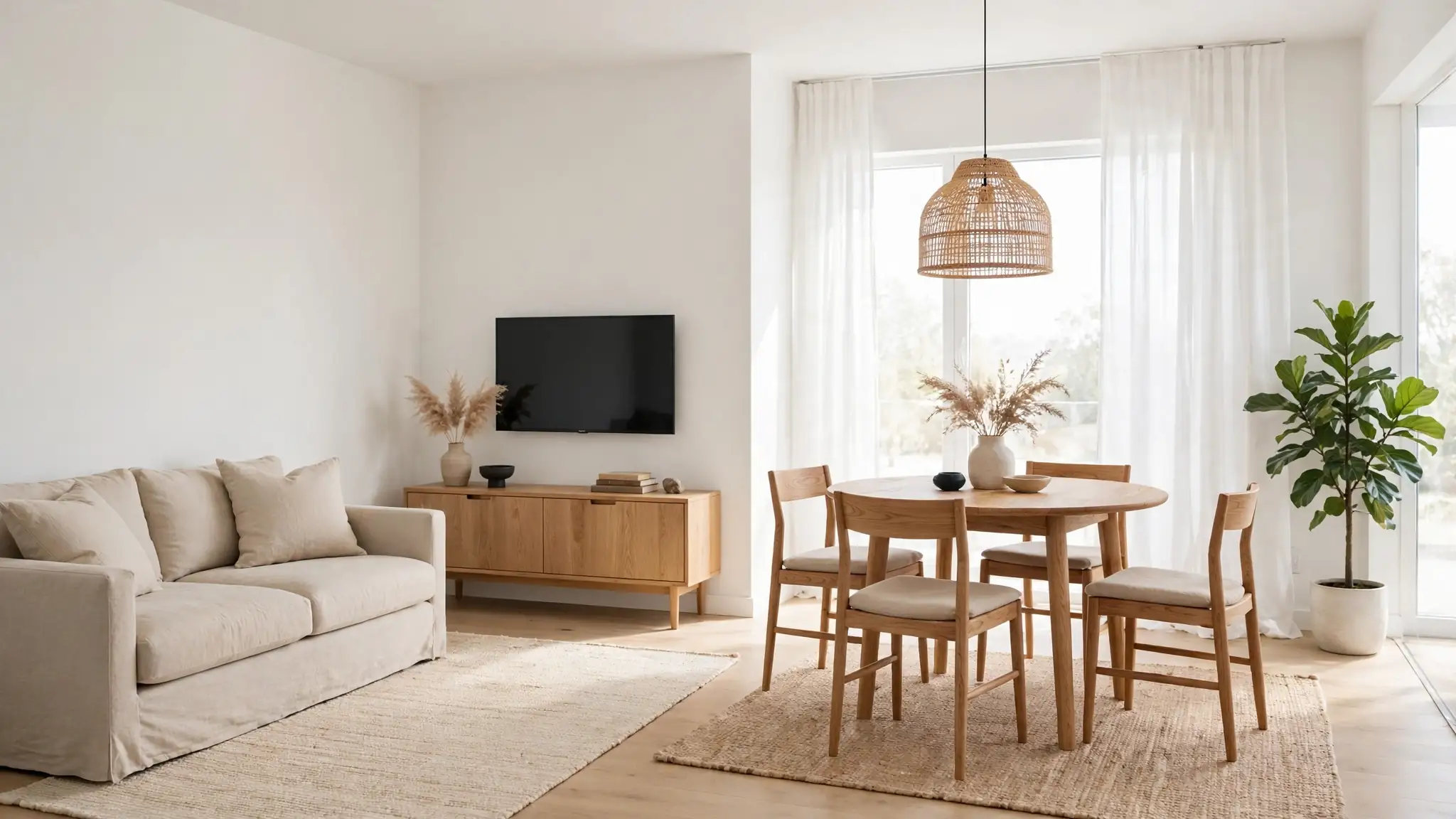
23 Small Living Room Dining Room Combo Ideas That Feel Spacious
One open room doing the job of two is the reality for millions of renters and homeowners, and small living room dining room combo ideas turn that challenge into your home’s hardest working space. I’ve noticed the rooms that pull it off share one secret: every piece earns its spot twice. A sofa back marks the lounge zone, a round table squeezes in four diners, and the right rug tells your eye where living ends and dining begins. Small does not mean cramped. With smart layouts, slim furniture, and a few lighting tricks, a single rectangle can feel like two complete, comfortable rooms.
Fresh off the holidays, many of us are rethinking how our tables get used, and our recent roundup of christmas gingerbread house ideas showed how a dining surface can double as the home’s creative hub. That same double duty thinking powers the ideas below. Each one is chosen for real small rooms, not showroom floor plans, so you can mix and match until the layout clicks.
Rug Defined Zones
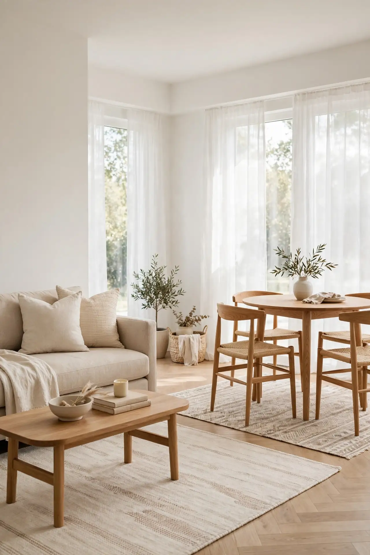
A large rug is the fastest way to tell your brain there are two rooms instead of one. Lay one generous rug under the sofa and coffee table, then leave the dining half on bare floor or a second, smaller rug in a matching pattern. The visual line it creates reads instantly, even in a wide open rectangle. Rooms without that anchor feel like one big blur.
Keep the living rug big enough that sofa and chair front legs sit on it, grounding the grouping. In the dining zone, pick a rug at least 24 inches wider than the table on all sides so chairs stay on fabric when pulled out. Match tones across both rugs and the whole space feels planned, not pieced together.
Slim Round Table
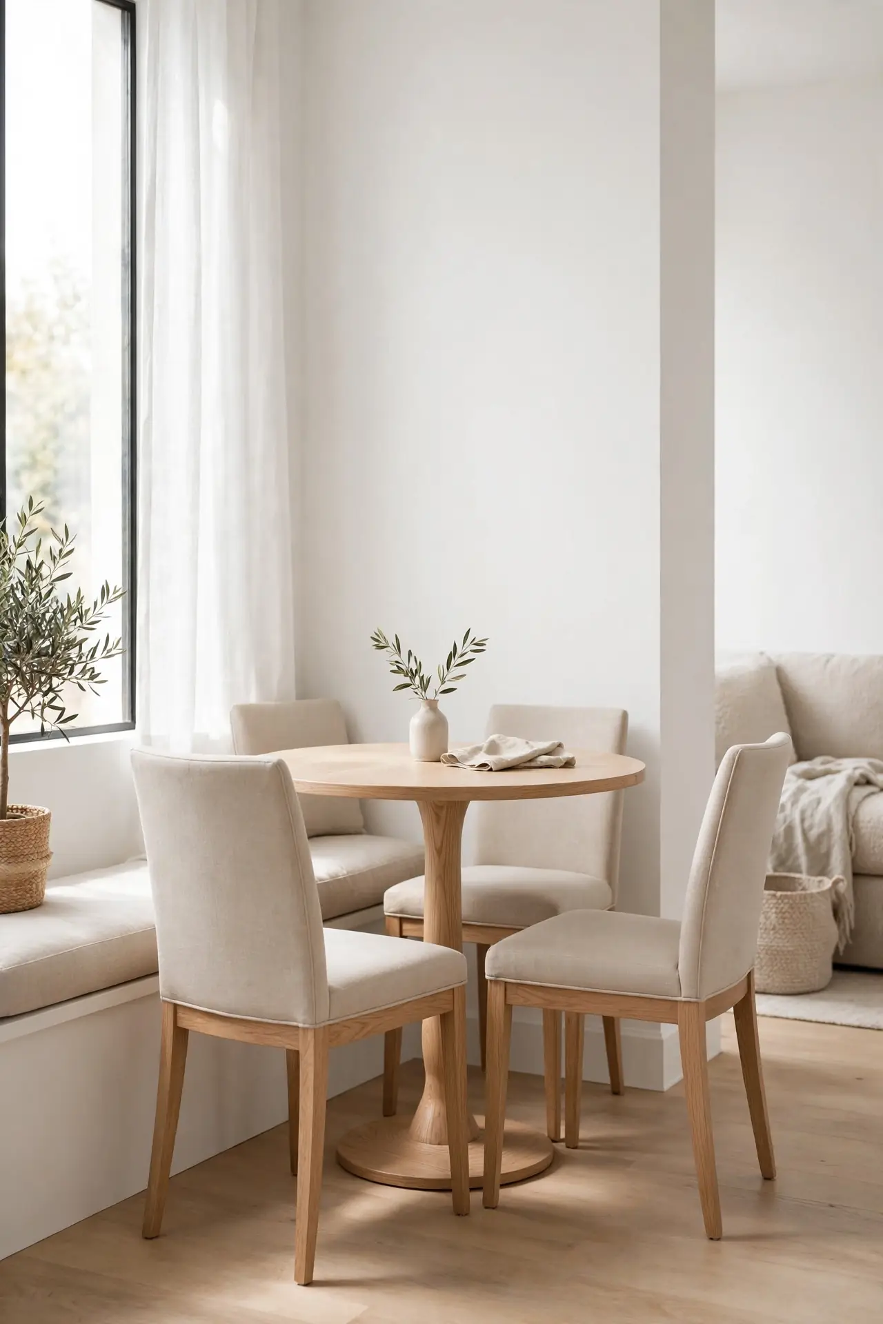
- A 36 to 42 inch round table seats four without the hard corners that block traffic.
- Pedestal bases beat four legs in tight rooms because chairs tuck in closer on every side.
- Choose a light finish like white oak or birch so the table visually recedes instead of looming.
- Add one bench on the wall side and you gain a seat without the footprint of two chairs.
Round tables are unsung heroes of shared rooms. Their curves let foot traffic slide past corners, which matters when the path to the sofa crosses the dining zone. I’ve seen a small round table change how a whole room flows in an afternoon. Pick one with a leaf if you host, and weeknights stay compact while dinner parties still happen.
Sofa Back Divider
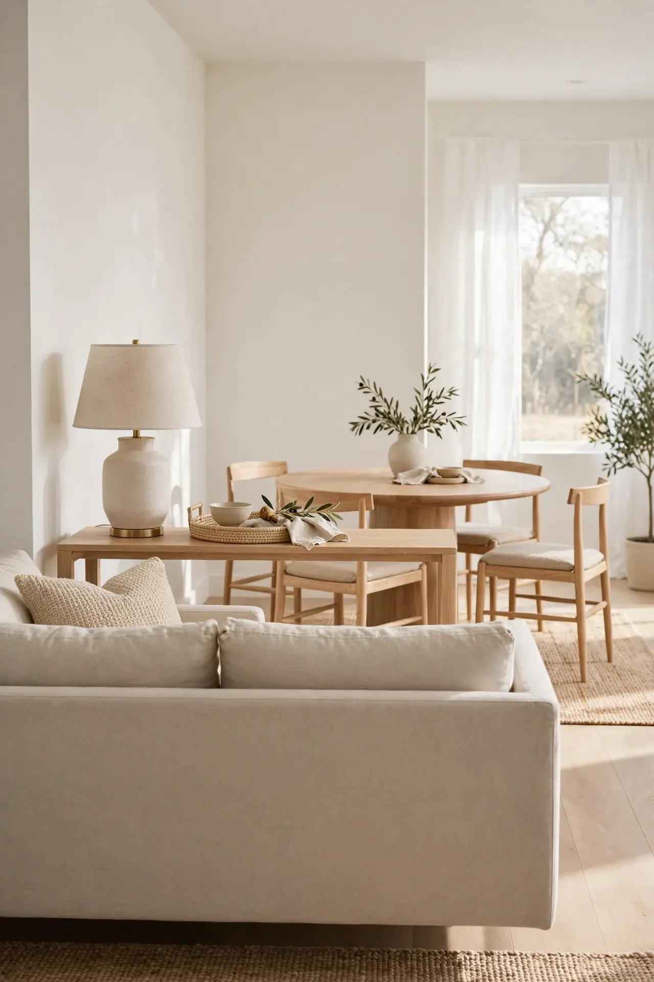
Quick Tip: Float the sofa with its back to the dining area instead of pushing it against a wall. The sofa back becomes a natural room divider, and adding a slim console table behind it creates a surface for lamps or keys. Keep the console under 10 inches deep so it never eats walking space.
This one move creates two zones without building a single wall. The sofa signals where lounging happens, and guests instinctively read the space behind it as a separate area. I’ve seen this work well in many cases, especially in long rectangles where the sofa naturally lands mid-room. Face a pair of chairs toward the sofa to close the conversation circle, and the dining table gets its own clear territory.
Open Shelf Divider
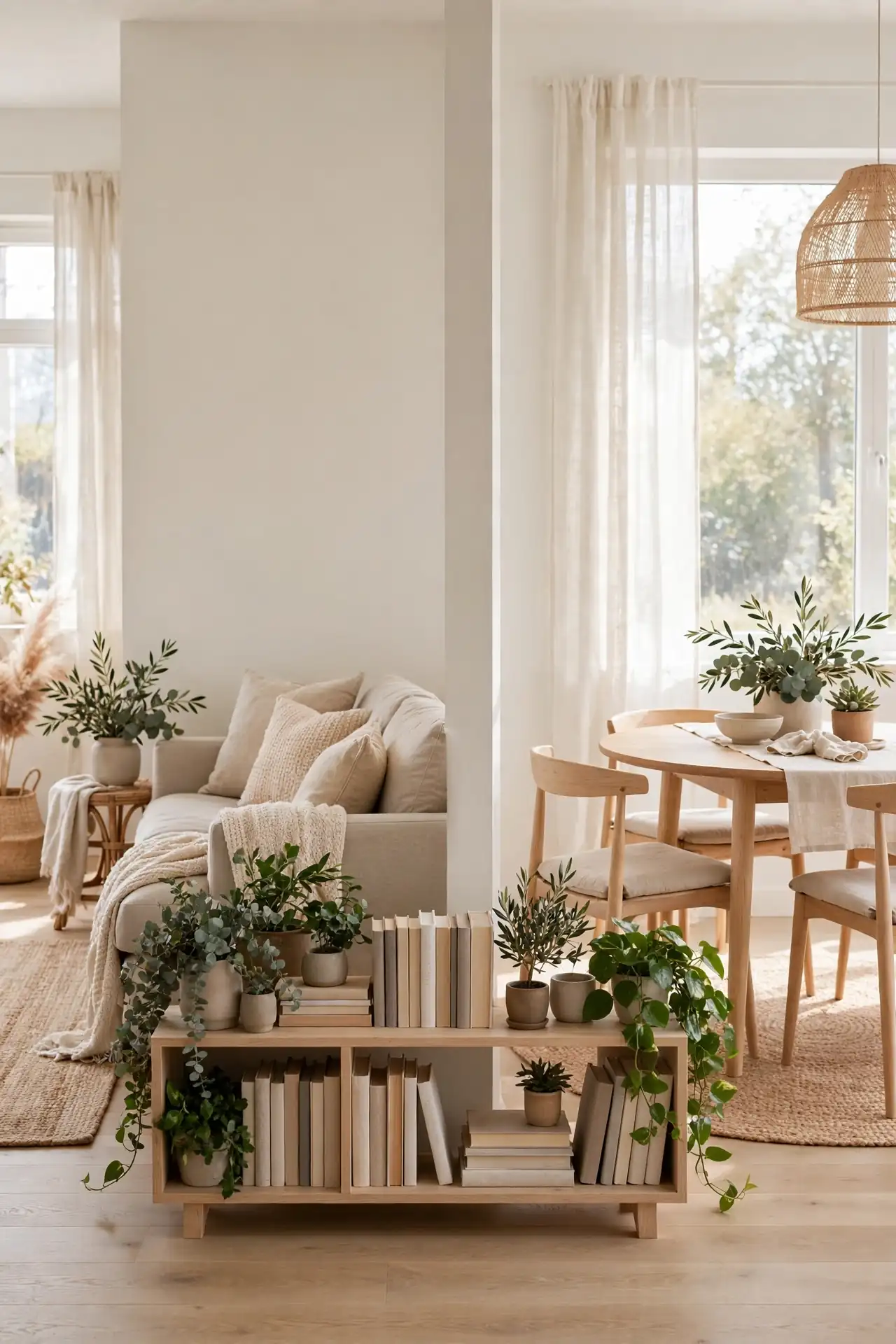
BEFORE: The living and dining furniture lined the same long wall, leaving a wide empty middle that collected clutter. Without any marker, the room felt like one unfinished hallway instead of two useful spaces.
AFTER: A low open bookshelf now stands between the zones, styled with books and plants on both sides. Each side of the room finally has its own identity, and the shelf adds storage the small room was missing.
Open shelving works because it divides without darkening. Light still travels through, so the room keeps its airy feel while each zone gains a backdrop. Pick a unit no taller than the sofa to protect sightlines. I’ve noticed styling both faces matters: one side holds living room books, the other corrals dining extras like napkins and candles.
Banquette Bench Seating
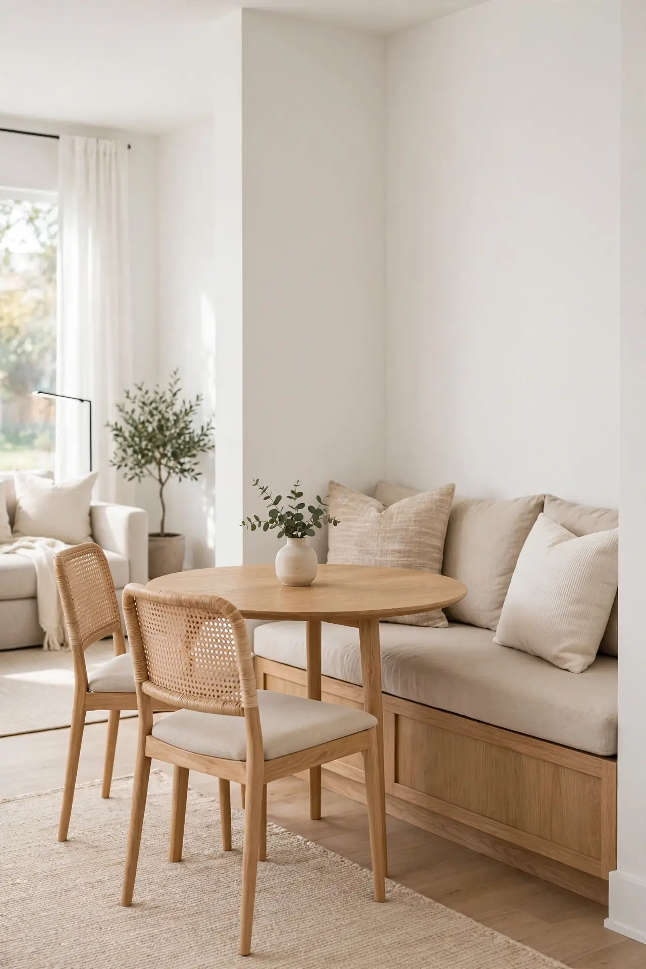
- Push a bench or banquette against the wall where dining chairs would crowd the walking path.
- Pair it with a slim table and two chairs on the open side for flexible seating.
- Add seat cushions in a washable fabric and a couple of lumbar pillows for real comfort.
- Slide storage baskets underneath for linens, board games, or the kids’ art supplies.
Banquettes squeeze maximum seating into minimum square footage because nobody needs chair pulling clearance on the wall side. That saved space often makes the difference between a cramped squeeze and a relaxed dinner. I’ve noticed families love this setup since kids slide in easily and cleanup is simple. Build the bench at standard dining height, 18 inches, so it pairs with any table you already own.
Mirror Wall Magic
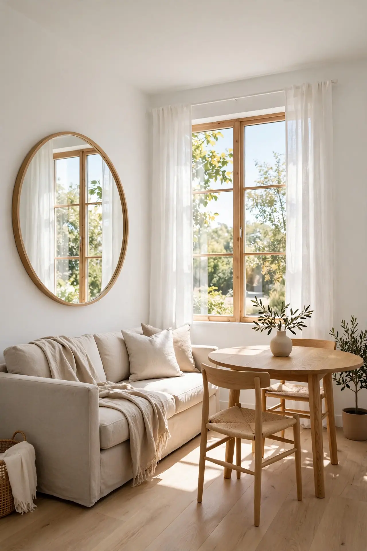
| Feature | With Mirror | Without Mirror |
|---|---|---|
| Light | Bounces daylight deep into the room | Stays dim in the far corner |
| Perceived size | Room reads nearly twice as wide | Walls feel close and boxy |
| Cost | One large mirror, moderate spend | Needs more lamps and paint instead |
| Placement | Opposite the window for max effect | Art fills the wall but adds no depth |
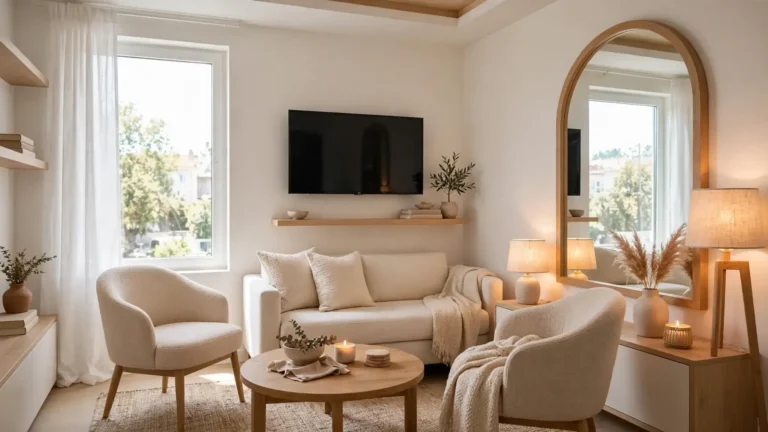
Mirrors are the oldest small room trick because they genuinely work. One large mirror opposite the window doubles the daylight and fakes extra square footage your floor plan never had. Skip a grid of small mirrors, which can read busy; one clean oversized piece keeps the look calm. Lean it on a console or hang it low over the dining sideboard so it reflects the prettiest part of the room.
Console Double Duty
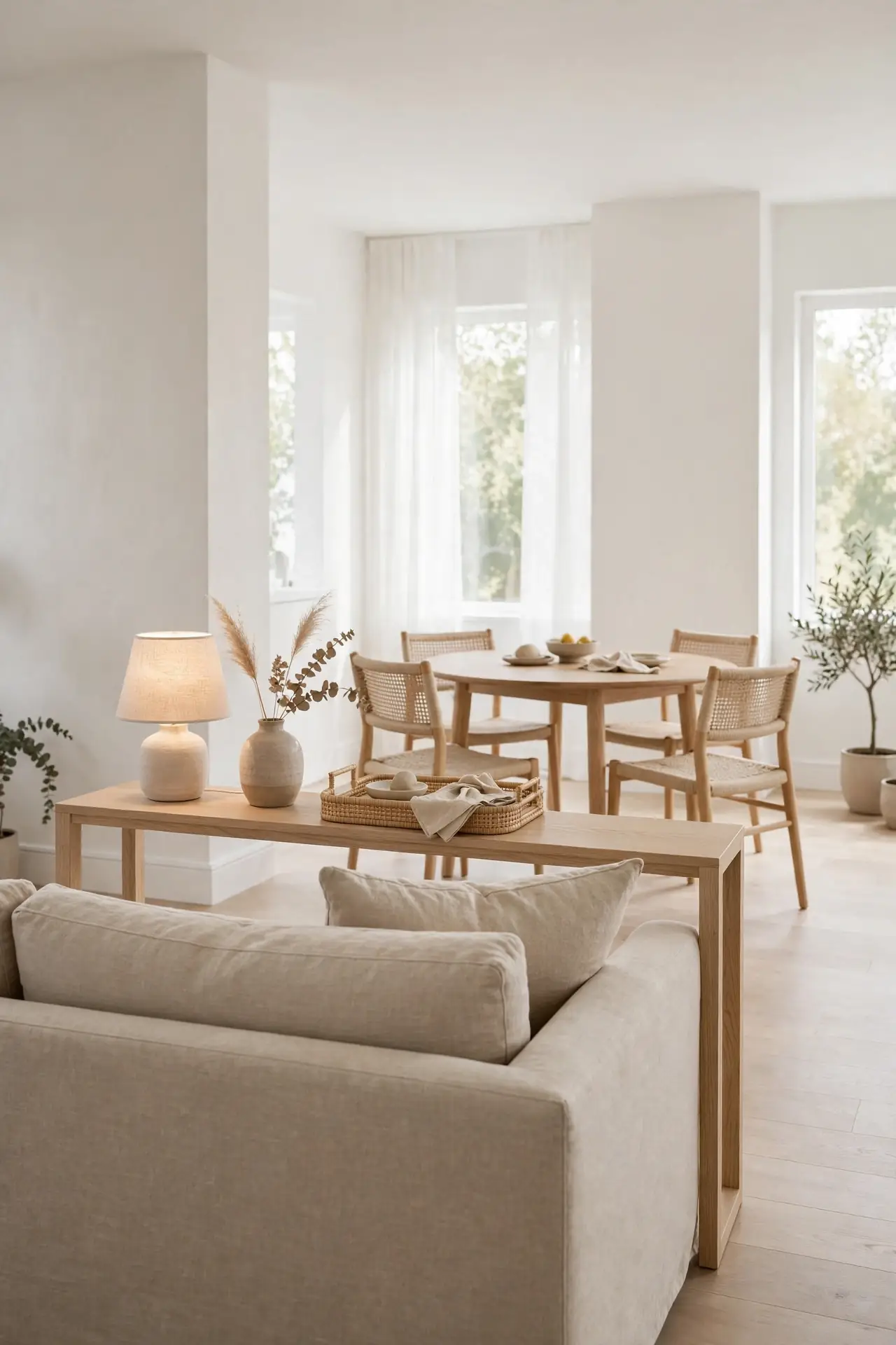
DO:
- Pick a console slim enough for behind the sofa, never blocking the walkway.
- Use the top for a living zone lamp and a tray that corrals dining clutter.
- Choose one with drawers or a lower shelf for placemats, chargers, and remotes.
DON’T:
- Skip deep sideboards that jut into traffic.
- Do not let it become a junk drop; a tidy tray keeps the surface working.
- Match it exactly to other pieces; slight contrast keeps the look lively.
A console behind the sofa is the hardest working piece in a combo room. It gives the living side a lamp and the dining side a landing spot in about ten inches of depth. Happy combo households have one piece doing this double shift. Style it once; it serves both zones daily.
Sheer Curtain Light
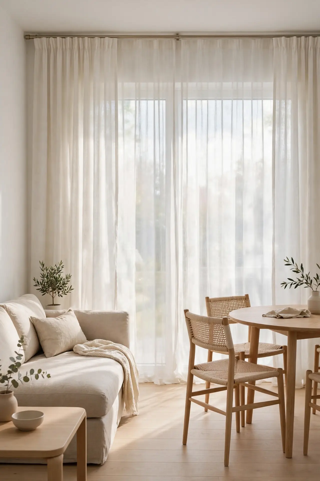
Best For: Rooms with one good window that both zones share.
Cost: Low, panels are affordable.
Time: One afternoon to hang.
Result: Softer light that reaches both zones.
Heavy drapes chop a small room into shadows, but sheer curtains filter daylight across the whole space at once. Hang the rod wide and high, nearly at the ceiling, so the window reads larger and light washes both zones evenly. I’ve noticed white or ivory sheers keep the palette calm while still giving privacy at night. Layer them over simple blinds and you control glare at dusk without ever closing off the room.
Nesting Table Sets
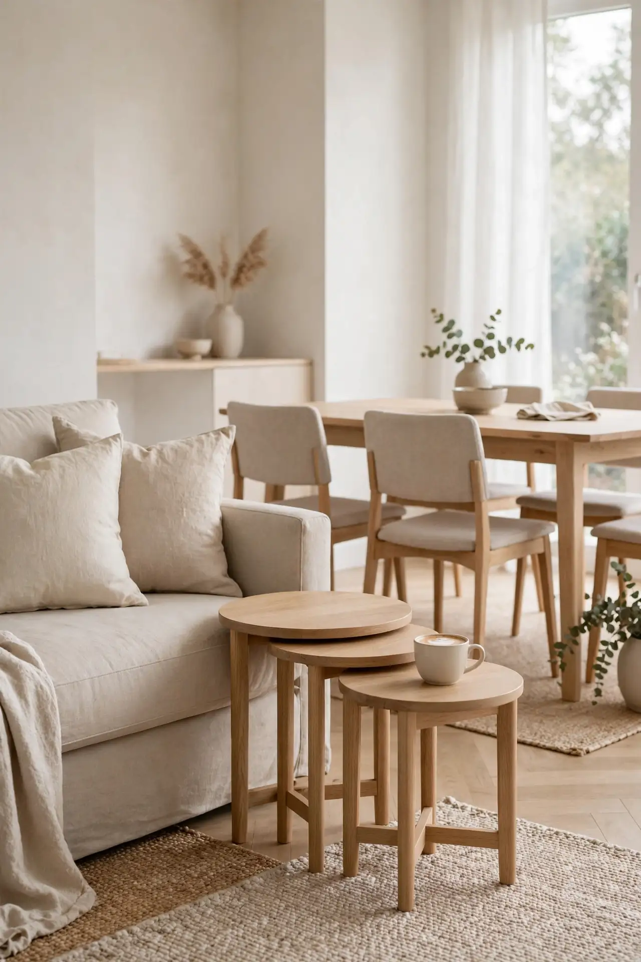
Nesting tables are surface area on demand. Spread them out when guests arrive with drinks in the living zone, then tuck them together into one slim footprint when dinner needs the floor space. Two or three graduated tables take up less room than a single chunky side table while offering more flexibility.
Look for sets with clean lines and light finishes so they disappear visually when nested. I’ve noticed the best sets pull double duty as extra dining surface during parties: one nested table becomes a drink station by the wall. Keep the shapes round or oval in tight layouts to protect shins and sightlines.
Pendant Zone Markers
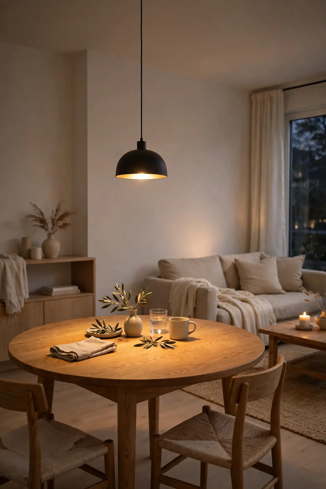
- Hang one pendant over the dining table, centered, so the eye instantly knows where meals happen.
- Choose a shade with an open bottom so light pools on the table instead of glaring into eyes.
- Hang it 30 to 34 inches above the tabletop, low enough to define the zone but high enough to see across.
- Add a dimmer switch so the same pendant shifts from bright homework light to soft dinner glow.
Lighting is zoning you can see. One pendant over the table tells everyone the dining area has its own address in the room, no walls required. I’ve noticed this one fixture matters more than furniture for how separate the zones feel. Keep living zone lighting warm and low so the two areas read as different moods after dark.
Tall Storage Towers
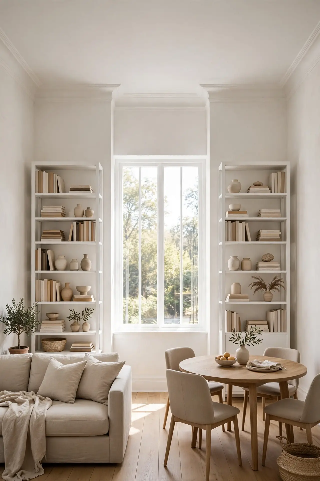
Quick Tip: Use the vertical space your room is already paying for. A tall, narrow bookcase or cabinet draws the eye upward, which makes ceilings feel higher and floors feel less crowded. Anchor it to the wall for safety, and keep the top third styled lightly so it never looms.
Small rooms run out of floor fast, but walls are free real estate. One slim tower can swallow books, barware, and board games that would otherwise sprawl across every surface. I’ve noticed matching a pair of towers on either side of a window creates symmetry that calms a busy combo room. Keep the finish light and the shelves tidy, and storage becomes decor instead of clutter.
Glass Top Dining
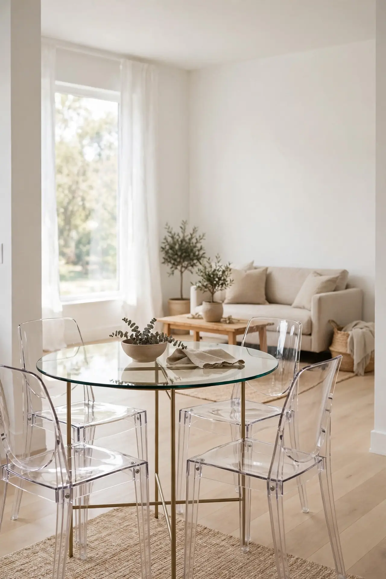
BEFORE: A solid wood table dominated the room’s center, blocking sightlines and making the space feel chopped in half. Every glance across the room stopped at its heavy top.
AFTER: A glass top table with slim metal legs lets the eye travel straight through to the living zone. The dining area still seats four, but the room reads as one connected space.
Transparent surfaces cheat the eye in the best way. Glass tabletops, acrylic chairs, and open-leg designs all let light and sightlines pass through, so furniture stops visually hogging square footage. I’ve seen this work well in many cases where a room felt full but was not actually crowded. Pair glass with warm wood elsewhere so the look stays cozy, not cold.
Curved Sofa Flow
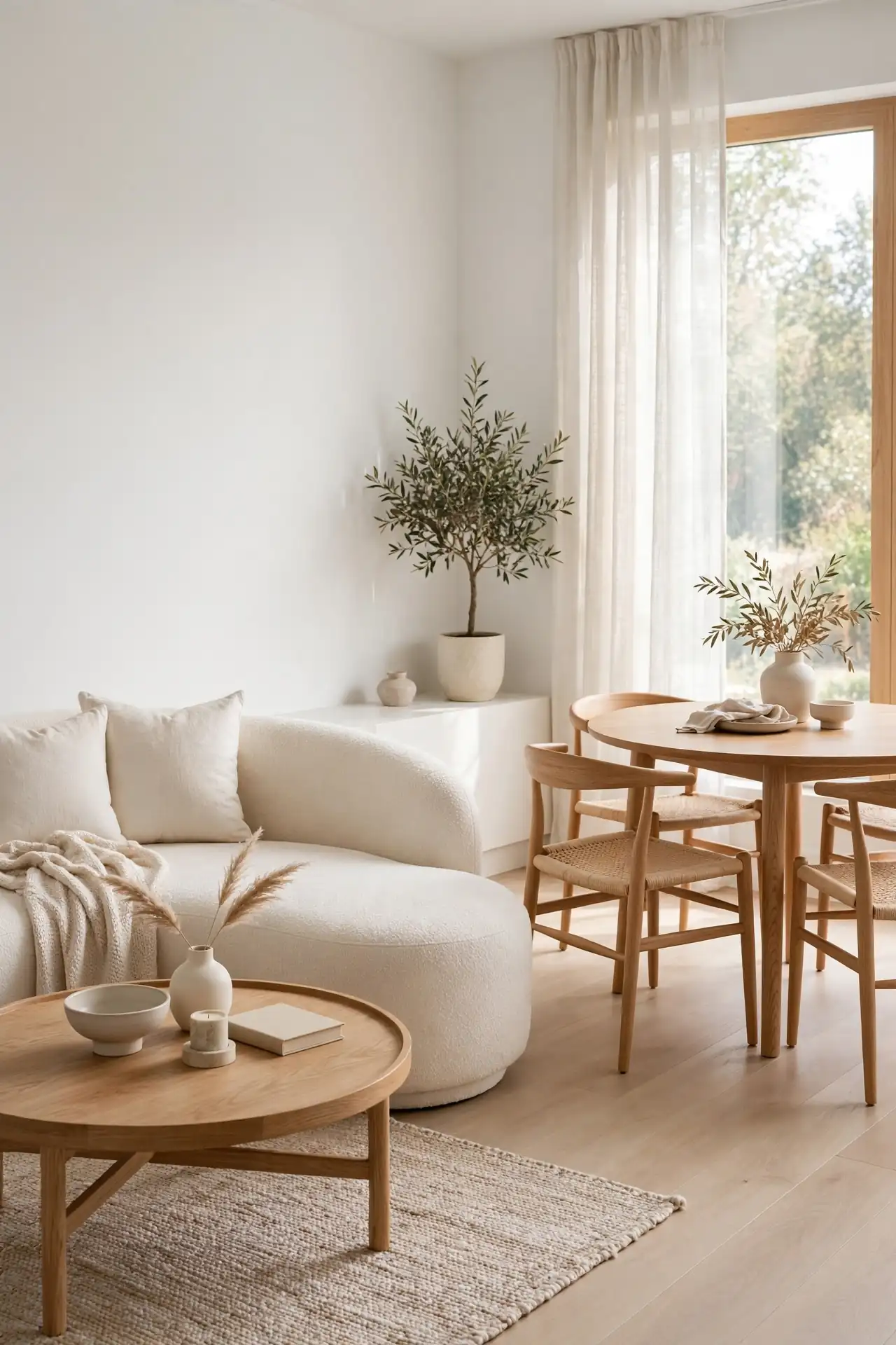
- Swap a boxy sectional for a sofa with a gentle curve or rounded arms.
- Angle it slightly toward the dining zone to open the walking path behind it.
- Echo the curve with a round coffee table and round dining table for rhythm.
- Keep the back low so sightlines travel across the whole room.
Curves keep bodies and eyes moving instead of crashing into corners. A curved sofa softens the boundary between zones and makes tight paths feel generous, which boxy furniture never does. I’ve noticed round shapes photograph beautifully too, a bonus for Pinterest-minded stylists. One curved piece is enough; mix it with straight lines elsewhere so the room stays balanced.
One Color Story
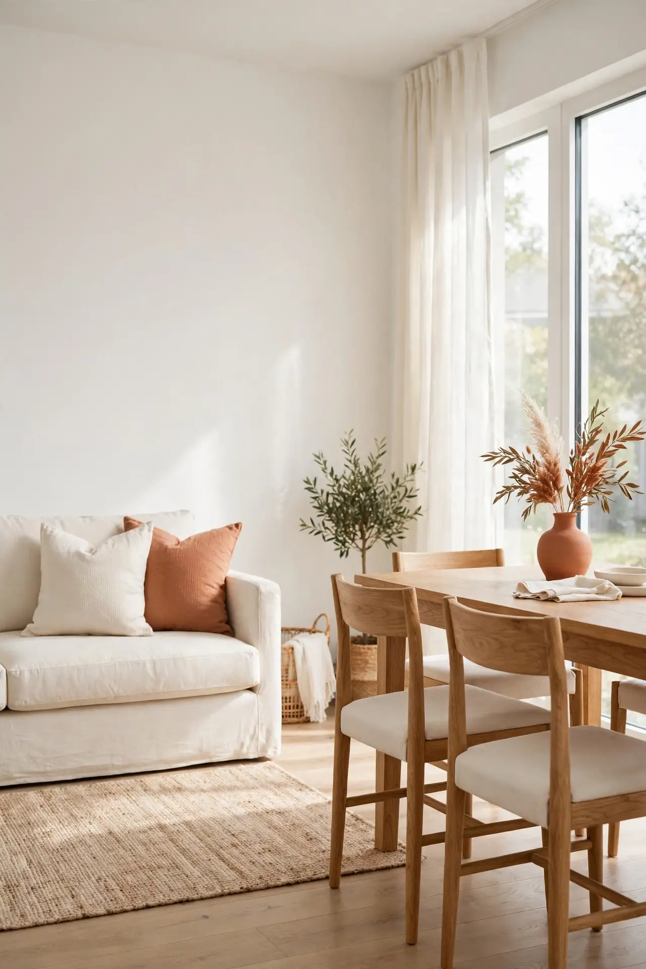
| Element | Cohesive Palette | Mixed Palette |
|---|---|---|
| Walls | One warm white throughout | Accent walls chop the room up |
| Furniture | Two to three tones, repeated | Every piece a different color |
| Textiles | Shared accent color in both zones | Clashing patterns fight each other |
| Result | One calm, larger feeling space | Busy look that shrinks the room |
Color is the glue that makes two zones feel like one intentional room. When walls, large furniture, and textiles share a tight palette, the eye glides across boundaries instead of stopping at them. That’s why many experts recommend starting with one neutral base and repeating a single accent in both areas. A unified palette is often what makes combo layouts feel bigger than their square footage suggests.
Gallery Wall Anchor
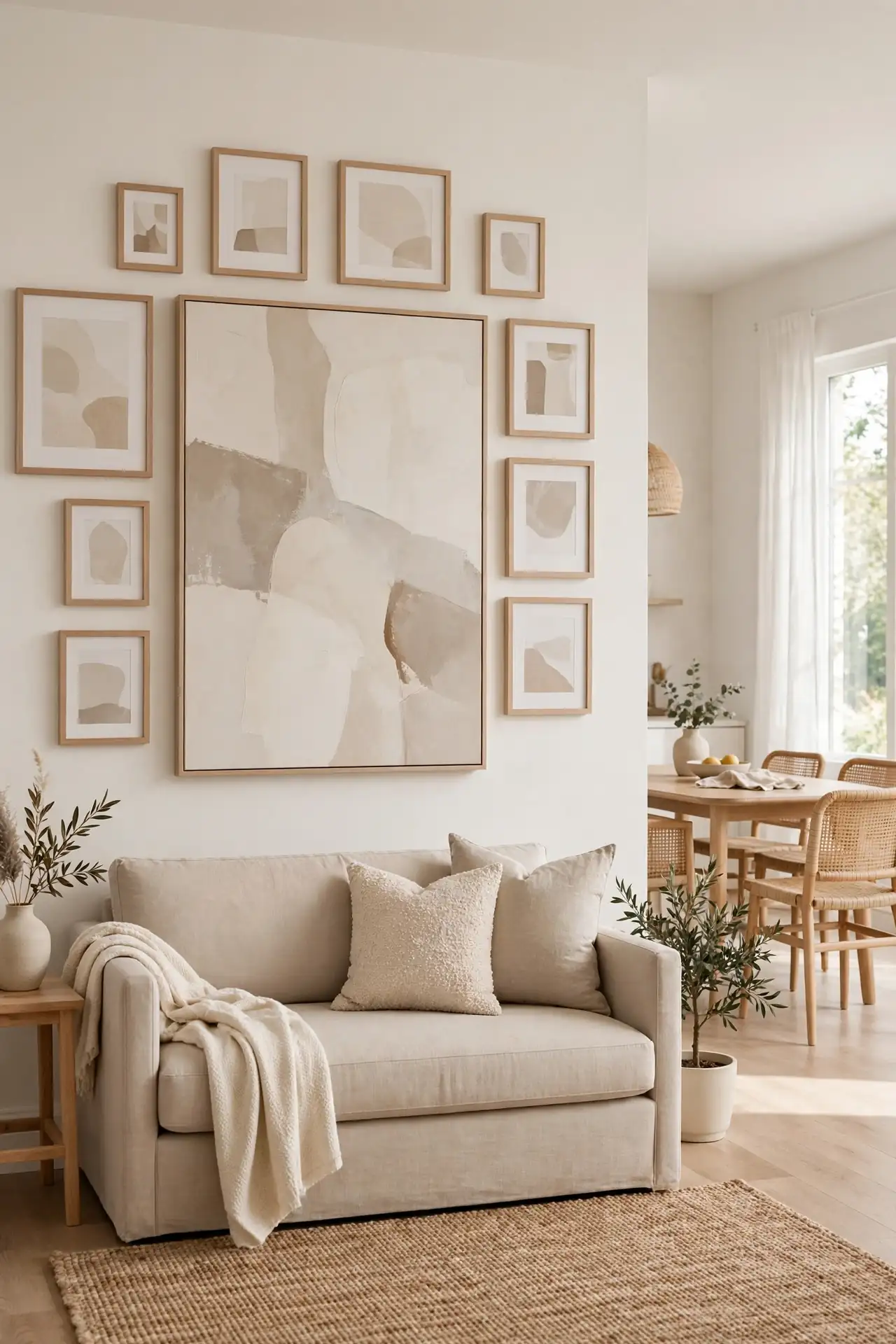
DO:
- Build the gallery on the living zone wall to give the lounge its own focal point.
- Mix frame sizes but keep one frame color for instant cohesion.
- Include one oversized piece to anchor the arrangement.
DON’T:
- Keep small frames out of the dining zone; they dilute the zoning effect.
- Hang art above eye level and it disconnects from the furniture.
- Use heavy dark frames in a light room; they drag the whole wall down.
A gallery wall gives the living zone its own personality. That visual weight tells guests where to settle in, while the dining area stays calm and uncluttered. I’ve noticed starting the arrangement at sofa back height and building upward keeps everything connected. Map it on the floor with painter’s tape first; hanging takes minutes.
Drop Leaf Table
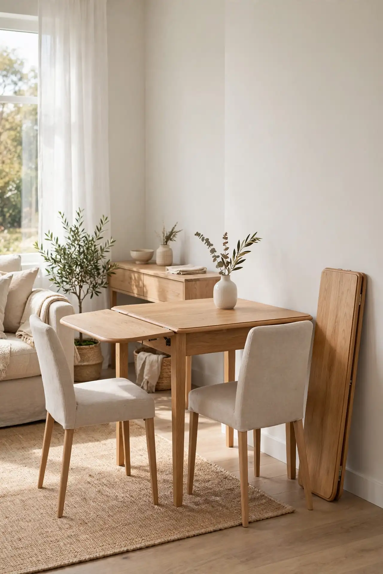
Best For: Daily two-person dining that sometimes hosts six.
Cost: Moderate, widely available secondhand.
Time: One afternoon to style and position.
Result: A table that grows only when you need it to.
A drop-leaf table is the ultimate compromise between daily comfort and occasional hosting. Folded down, it hugs the wall as a console; opened up, it seats a real dinner party. I’ve noticed this piece alone can decide whether a combo room works, since it removes the biggest space hog on demand. Look for sturdy hinges and a finish you love, because this table will be the room’s shape-shifter for years.
Low Profile Seating
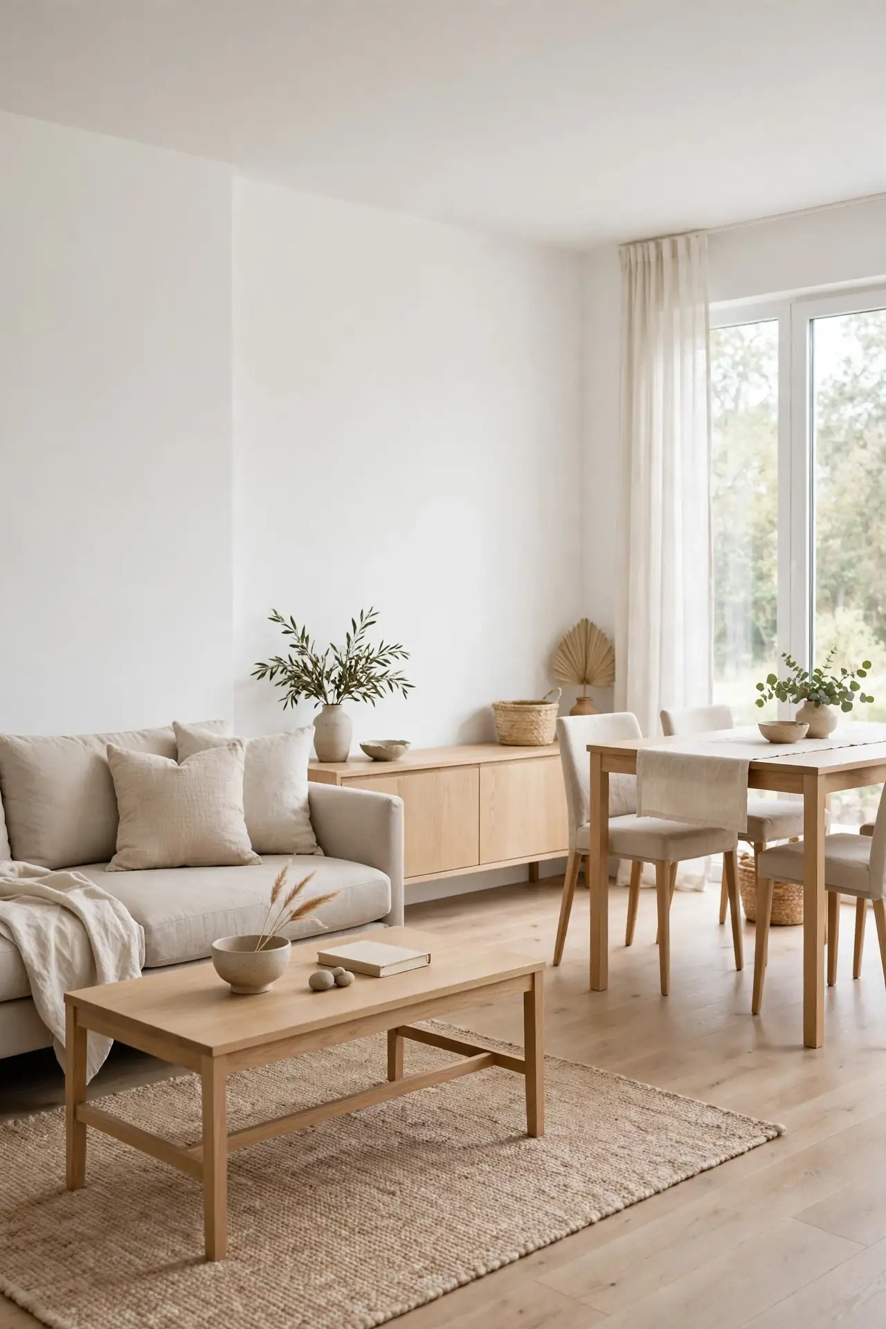
Low furniture keeps sightlines open across the room, which is half the battle in a small combo space. A low-back sofa, armless dining chairs, and a slim coffee table all let the eye travel wall to wall without hitting visual speed bumps. The room instantly reads wider, even though not a single wall moved.
This trick pairs beautifully with TV walls, and our guide on how to decorate around a tv shows how low media consoles keep the living zone feeling open. Choose seating with legs rather than skirts so floor shows beneath, another quiet square-footage cheat. Keep cushions firm and supportive; low should never mean uncomfortable.
Corner Dining Nook
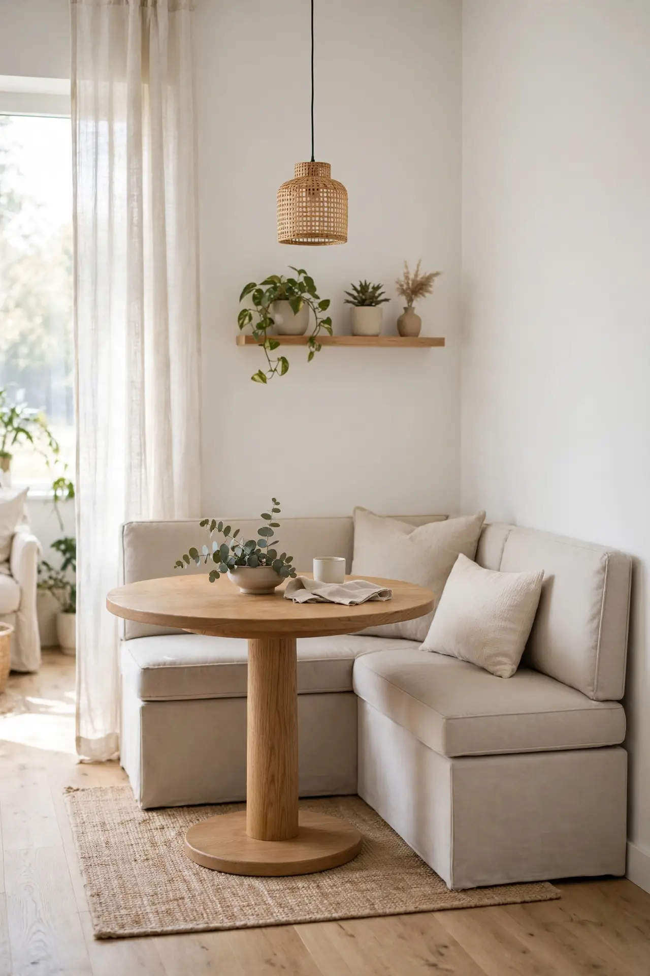
- Claim an underused corner with an L-shaped bench to seat four where two chairs felt tight.
- A round pedestal table fits corners best, leaving the walking lane along the room’s edge clear.
- Add a pendant or wall sconce above the nook so it feels like a destination, not an afterthought.
- Cushion the bench in wipeable fabric since corner spots become the family’s favorite seats.
Corners are free square footage most layouts waste. Tucking dining into one turns dead space into the coziest seat in the house, and it pulls the table out of the room’s main traffic flow. I’ve noticed nooks become instant favorites for morning coffee and homework alike. Build the bench to standard seat height and the nook works with any table you love.
Rolling Bar Cart
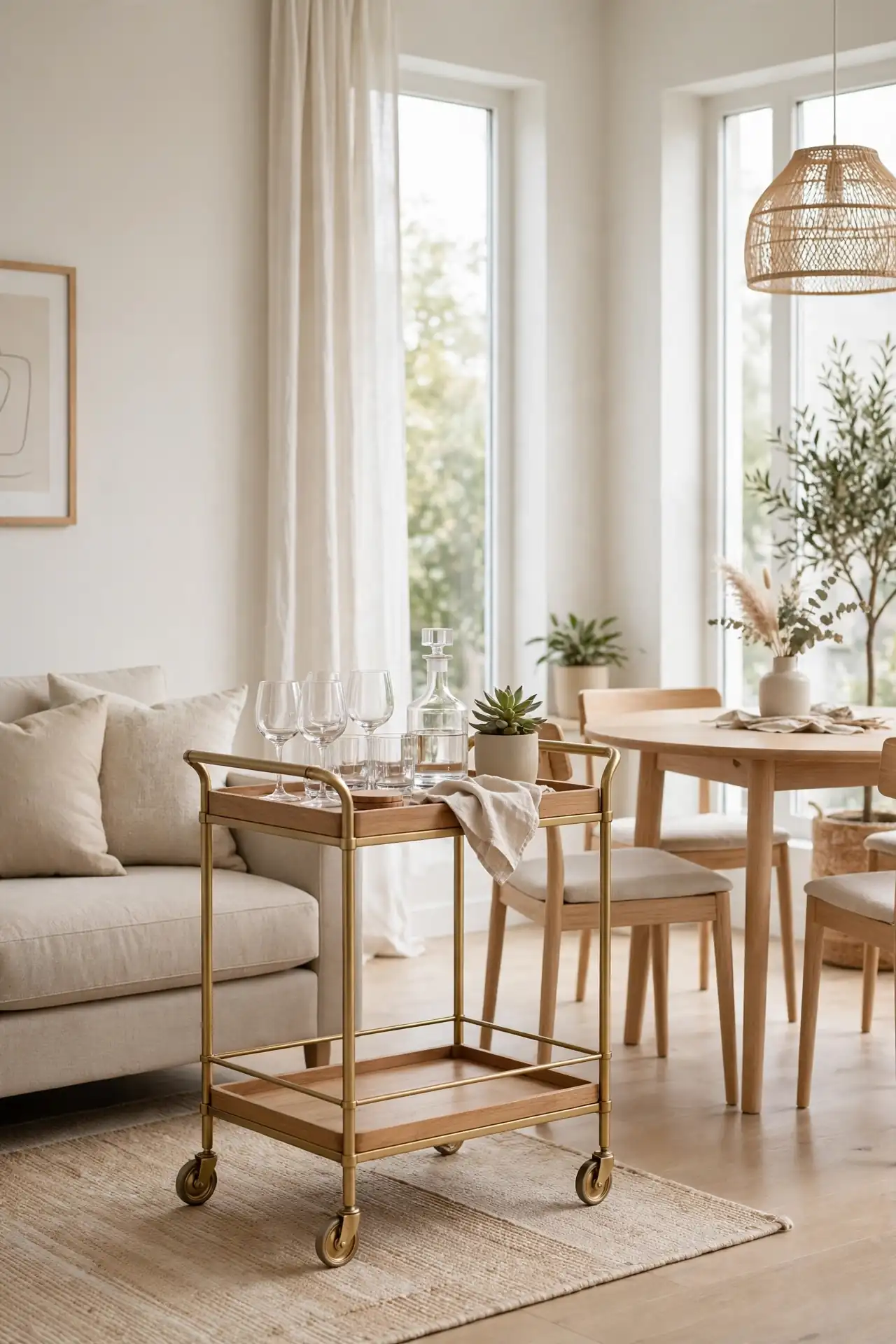
Quick Tip: A bar cart is a side table, serving station, and storage tower on wheels. Roll it beside the sofa for movie-night drinks, then wheel it to the table when dinner is served. Stock the top with what you reach for daily and the lower shelves with party extras so it earns its footprint twice over.
Wheels change everything in a small room because furniture stops being stuck. A cart that serves the living zone at 7 p.m. and the dining zone at 8 p.m. replaces two separate pieces. I’ve noticed brass or light-wood carts blend with almost any palette, so this one purchase survives future redecorating. Keep it styled but not crowded; breathing room is what makes a cart feel chic.
Matching Wood Tones
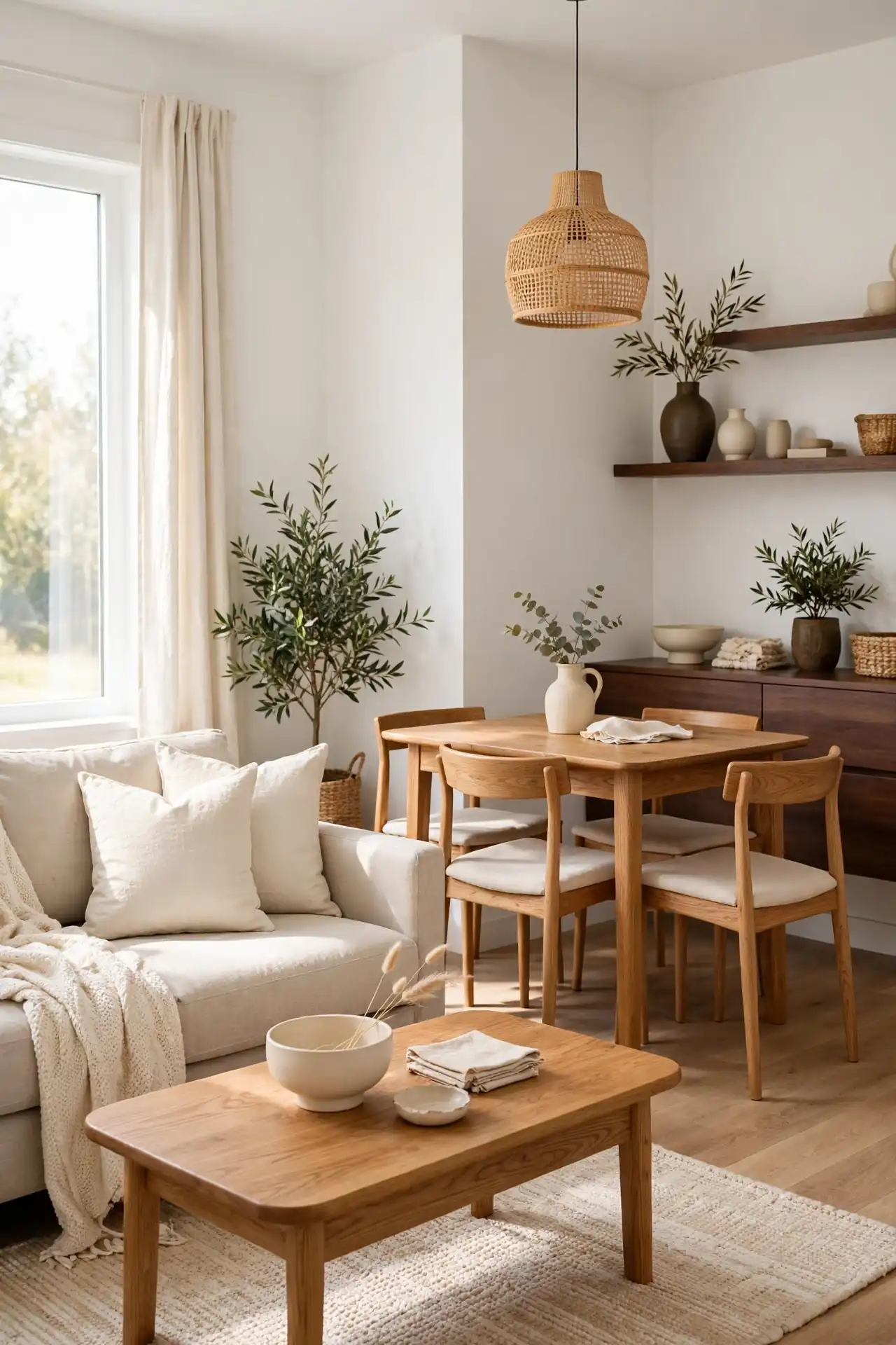
BEFORE: The oak coffee table, walnut dining table, and pine shelf each shouted a different style. Nothing matched, so the small room felt like a furniture showroom clearance aisle.
AFTER: Repeating two wood tones, warm oak and a darker walnut, across both zones tied everything together. The room finally reads as one designed space instead of a collection of pieces.
Repeating finishes is the quietest way to unify a combo room. When the dining table echoes the coffee table’s wood, the eye connects the zones instead of bouncing between strangers. I’ve noticed two tones are the sweet spot: one light, one dark, repeated at least twice each. Stain mismatched thrift finds to match, and a disjointed room pulls together in a single weekend.
Layered Light Plan
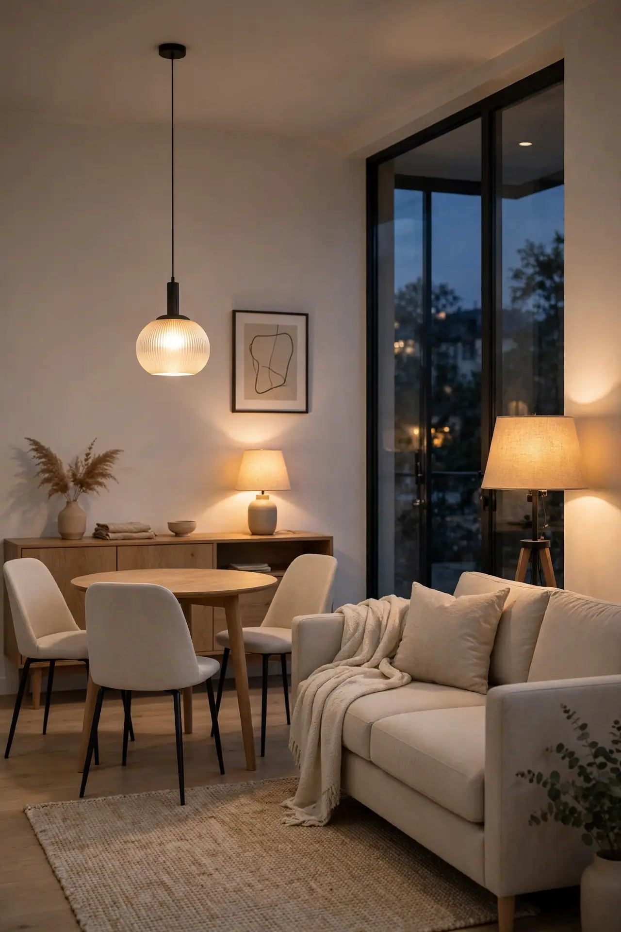
- Start with one overhead fixture per zone: a pendant over dining, a flush mount or arc over living.
- Add a floor lamp beside the sofa for warm, low evening light.
- Place a small table lamp on the dining console or sideboard for dinner glow.
- Put the dining pendant on a dimmer so one room can shift moods without rewiring.
One ceiling light flattens a combo room, but three layers give each zone its own personality after dark. Overhead fixtures handle tasks, while lamps add the warmth that makes a small room feel inviting instead of exposed. I’ve noticed guests linger longer in rooms with layered light because every corner feels considered. Keep bulbs warm white throughout so the zones feel related, not rival.
Armless Chair Picks
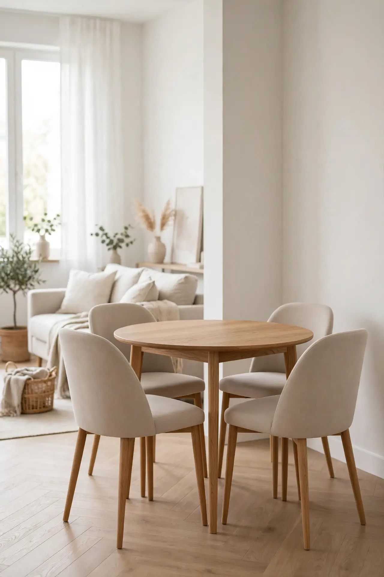
| Feature | Armless Dining Chairs | Traditional Armchairs |
|---|---|---|
| Footprint | Slim, tuck fully under the table | Arms demand extra inches per side |
| Flexibility | Move easily between zones | Heavy and awkward to reposition |
| Sightlines | Low profile keeps views open | High arms block the room visually |
| Best for | Daily use in tight layouts | Spacious rooms with room to spare |
Arms are luxury that small rooms cannot always afford. Armless dining chairs slide completely under the table when not in use, reclaiming precious floor for the living zone’s traffic. I’ve noticed upholstered armless chairs still feel plush and intentional, especially in performance fabrics. Choose a set with interesting backs since that is the view the living zone gets most.
High Hung Drapes
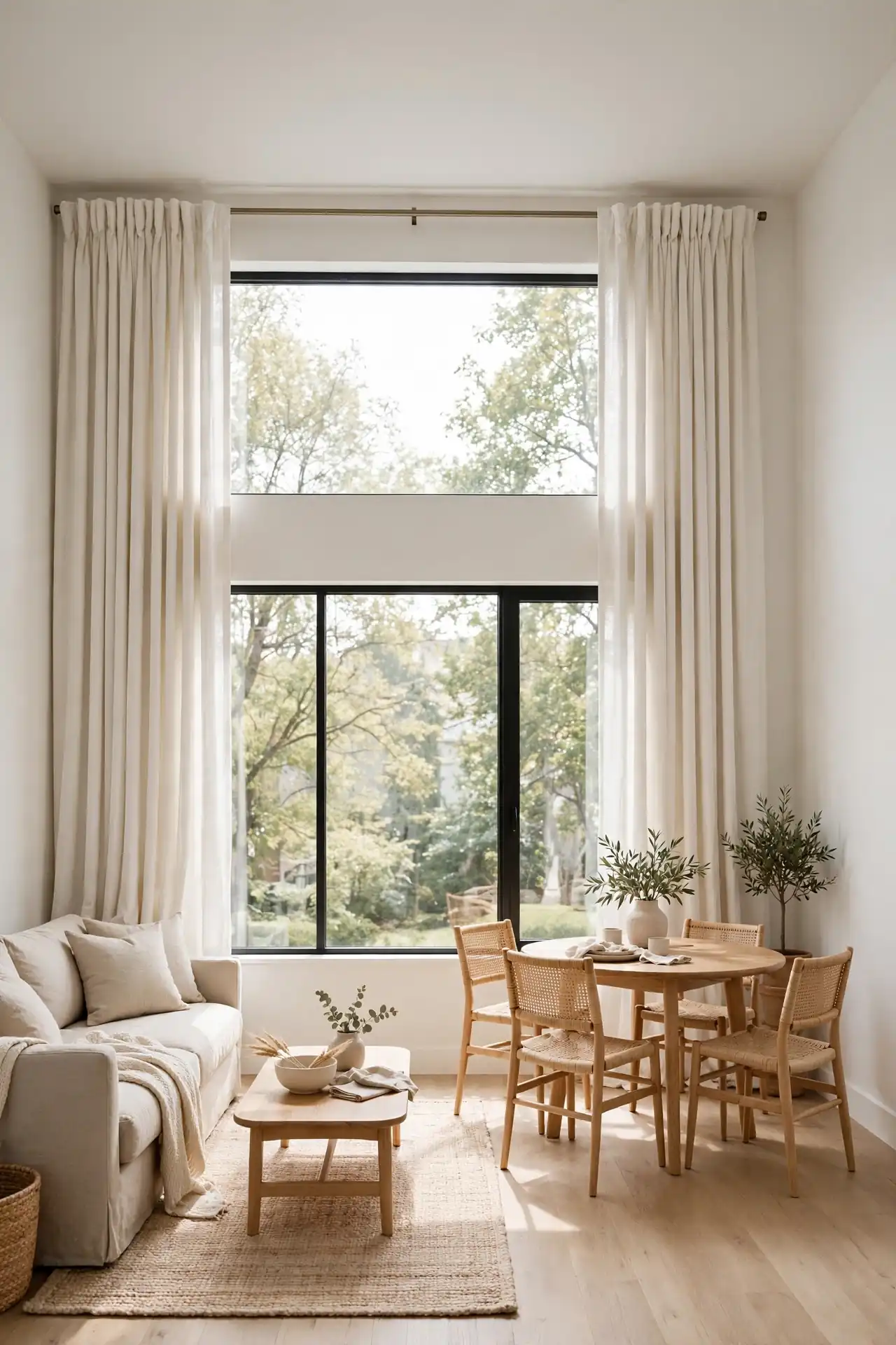
DO:
- Mount rods 4 to 6 inches below the ceiling, not at the window frame.
- Extend rods 6 to 10 inches past each side so panels stack off the glass.
- Choose floor-kissing length so fabric draws the eye from ceiling to floor.
DON’T:
- Hang panels at frame height; it visually lowers the ceiling.
- Pick short cafe curtains that chop the window and the wall in half.
- Skip heavy dark fabrics that swallow shared daylight.
Curtains hung high and wide make windows look grander and ceilings taller. Stacking panels off the glass also floods both zones with more daylight during the day. I’ve noticed this is the cheapest ceiling-height illusion in decorating, often under a hundred dollars. Iron the panels once and the tailored look pulls the whole room together.
Conclusion
Your combo room is ready for its double life. These small living room dining room combo ideas prove one rectangle can hold relaxed movie nights and proper sit-down dinners without feeling squeezed. Start with the change that excites you most: maybe the rug that draws the line, or the pendant that gives dining its own glow. I’ve seen how small changes like these can completely shift the way a space feels. Save this guide to your Pinterest boards for your next furniture shuffle, then enjoy the room that finally does it all.
2 Comments