24 Bathroom Paint Color Ideas for a Fresh, Spa-Like Makeover
A fresh coat of paint is the fastest makeover a bathroom can get, and the right shade changes everything from morning light to mirror checks. These bathroom paint color ideas cover soft spa tones, deep dramatic walls, and warm neutrals that flatter every skin tone. Paint costs less than tile, takes a weekend, and can be redone the moment your taste shifts.
Start by reading your light. North facing rooms cool every color down, while small windowless baths need shades that bounce what little light they have. In my experience, testing three large swatches for two full days beats any fan deck guess. The same calm first thinking that shapes mudroom decorating ideas works here too: plan the palette around daily routines, then let color do the heavy lifting. Ahead are twenty four shades and strategies, each with the finish, fixtures, and styling that make it sing.
Soft Sage Green Calm

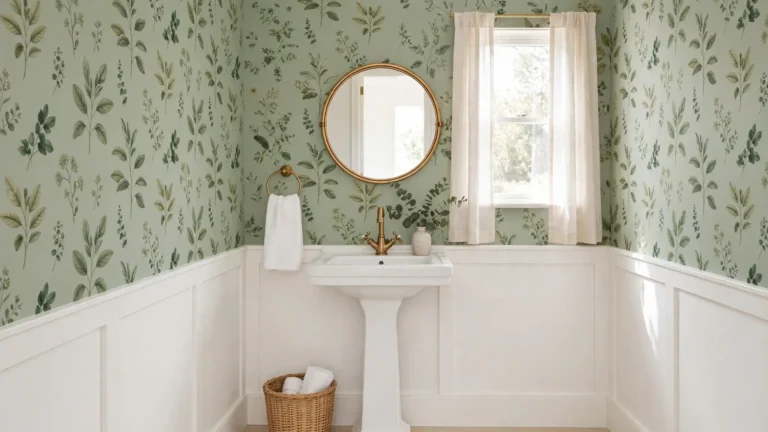
Sage green sits in that rare sweet spot between color and neutral, so a bathroom wrapped in it feels calm without going bland. The gray undertone keeps it sophisticated next to white porcelain, and it flatters skin in the mirror instead of fighting it. Pair it with brushed nickel or chrome for a clean, spa leaning finish.
Warm the room up with a light oak vanity and cream towels so the green never reads cold. A woven basket and a small potted eucalyptus on the counter echo the botanical feel without crowding the sink. I’ve noticed sage hides water spots and toothpaste splashes better than bright white, which makes busy family mornings noticeably calmer.
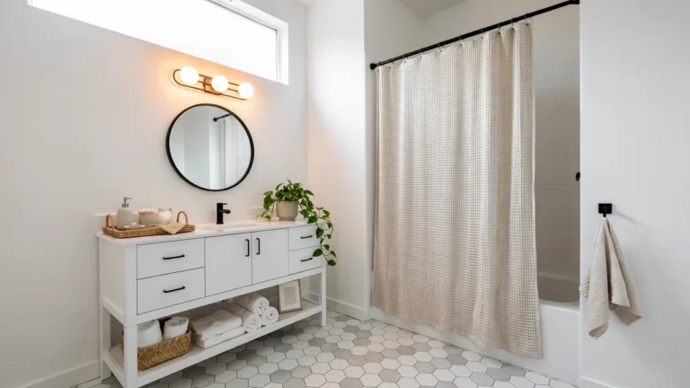
Crisp White Spa Fresh
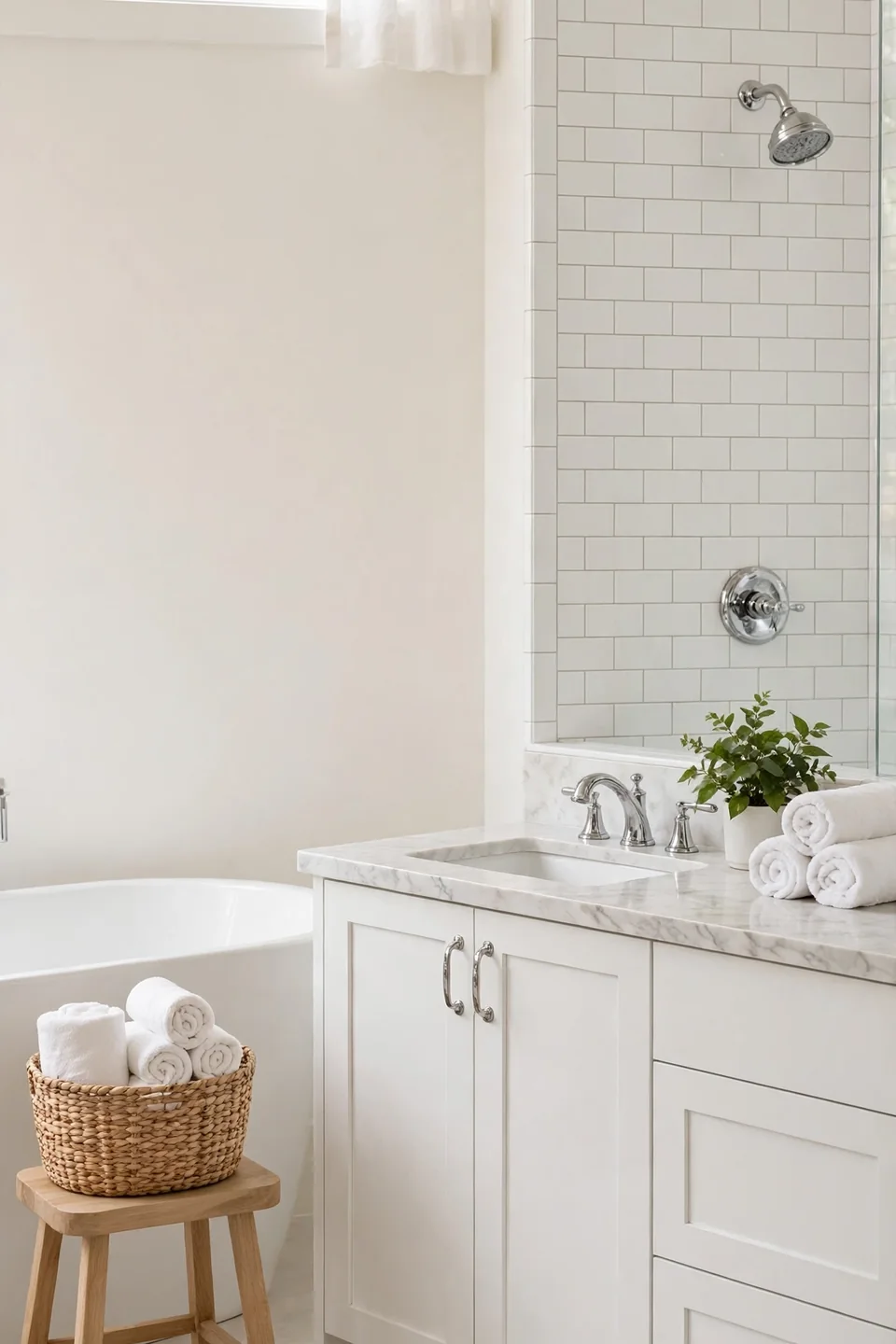
- Pick a warm leaning white, creamy or linen based, so cool daylight never turns the walls blue.
- Layer three whites: matte walls, satin trim, and a glossier vanity for quiet depth.
- Ground the brightness with light wood, woven baskets, and black or brass hardware.
- Choose pale gray grout over stark white so tile lines soften into the walls.
- Set one green plant on the vanity to keep the room from feeling clinical.
White works hardest in small bathrooms, bouncing light into corners and making dated tile look deliberate. Renters lean on it to calm busy floors they cannot change. Keep leftover paint labeled for touch ups, because scuffs show faster on pale walls than mid tones.
Pale Blue Retreat Tone
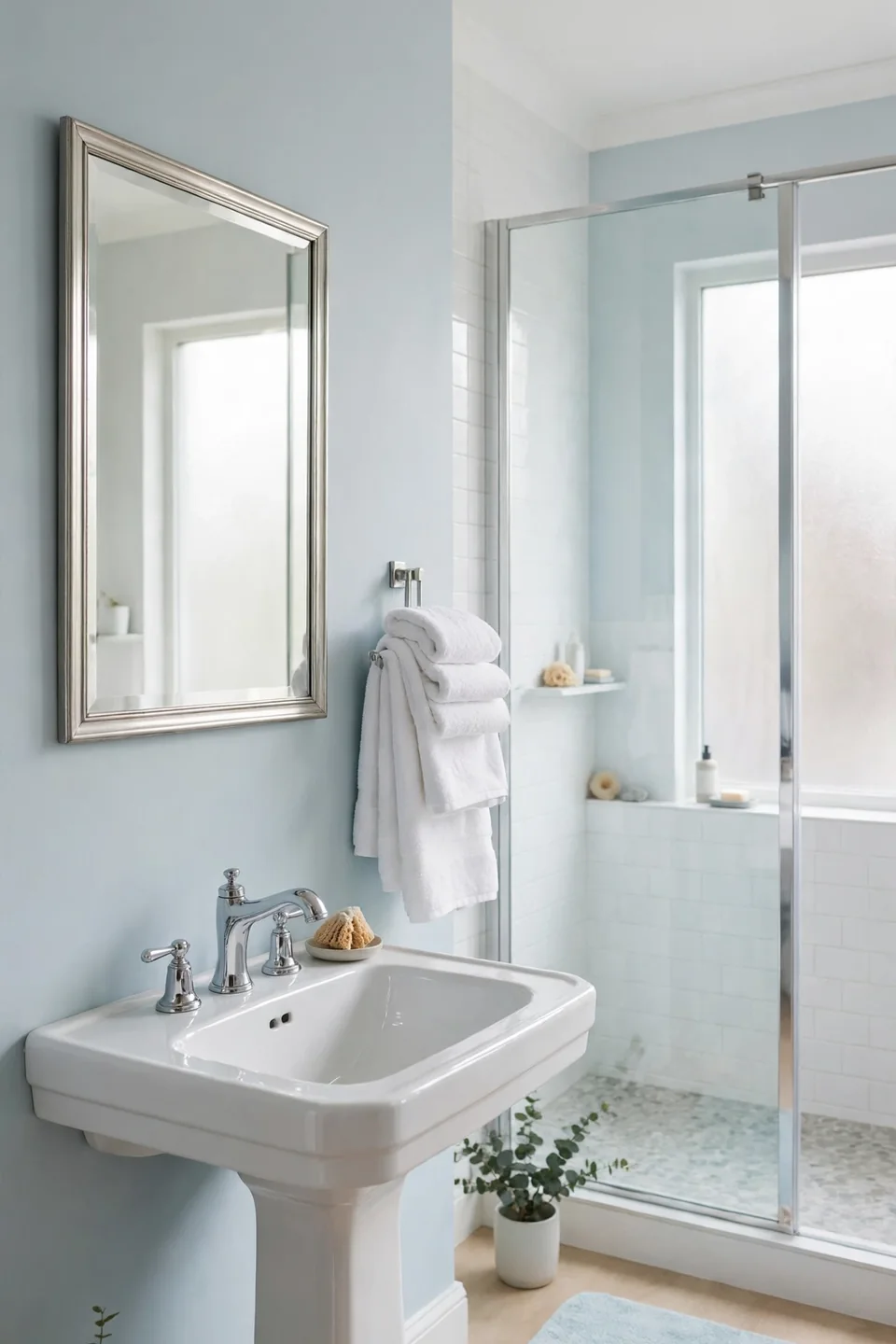
Quick Tip: Hold blue swatches against your actual towels and tile at night under warm bulbs before committing. Blues shift more than any other family after dark, and a shade that reads airy at noon can turn icy by nine in the evening.
Pale blue has a clean water association that suits bathrooms instinctively, and it pairs naturally with white fixtures and chrome. Keep the ceiling bright white to lift the color, and repeat the tone in a bath mat or shower curtain at half strength. Guest baths especially benefit, since visitors read pale blue as fresh and cared for within seconds. Silver toned mirrors sharpen the effect.
Deep Navy Drama Walls
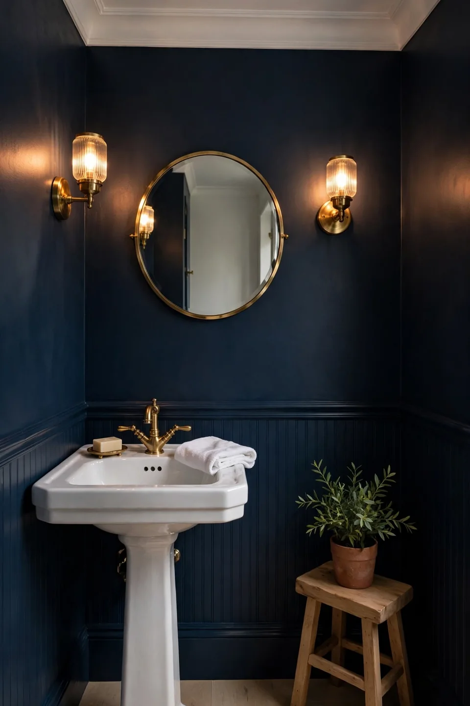
BEFORE: The powder room felt like an afterthought, with builder beige walls, a dim bulb, and a mirror that swallowed what little light existed. Guests used it quickly and nobody remembered a single thing about the space.
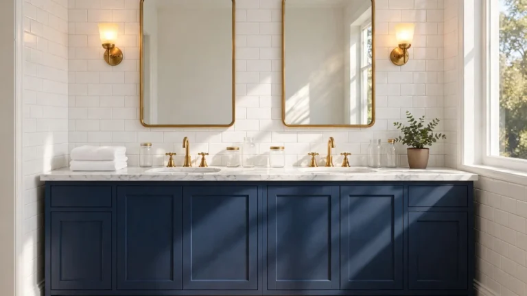
AFTER: Two coats of deep navy turned the same walls into a jewel box. Brass sconces now glow against the dark paint, the mirror reads like art, and a white pedestal sink pops forward like it was spotlit on purpose.
Dark colors shrink wrap a small room in a good way, blurring corners so the eye stops measuring square footage. Keep fixtures bright white and metals warm, and navy reads tailored instead of gloomy. It also hides a multitude of wall flaws that pale paint would spotlight.
Warm Greige Balance
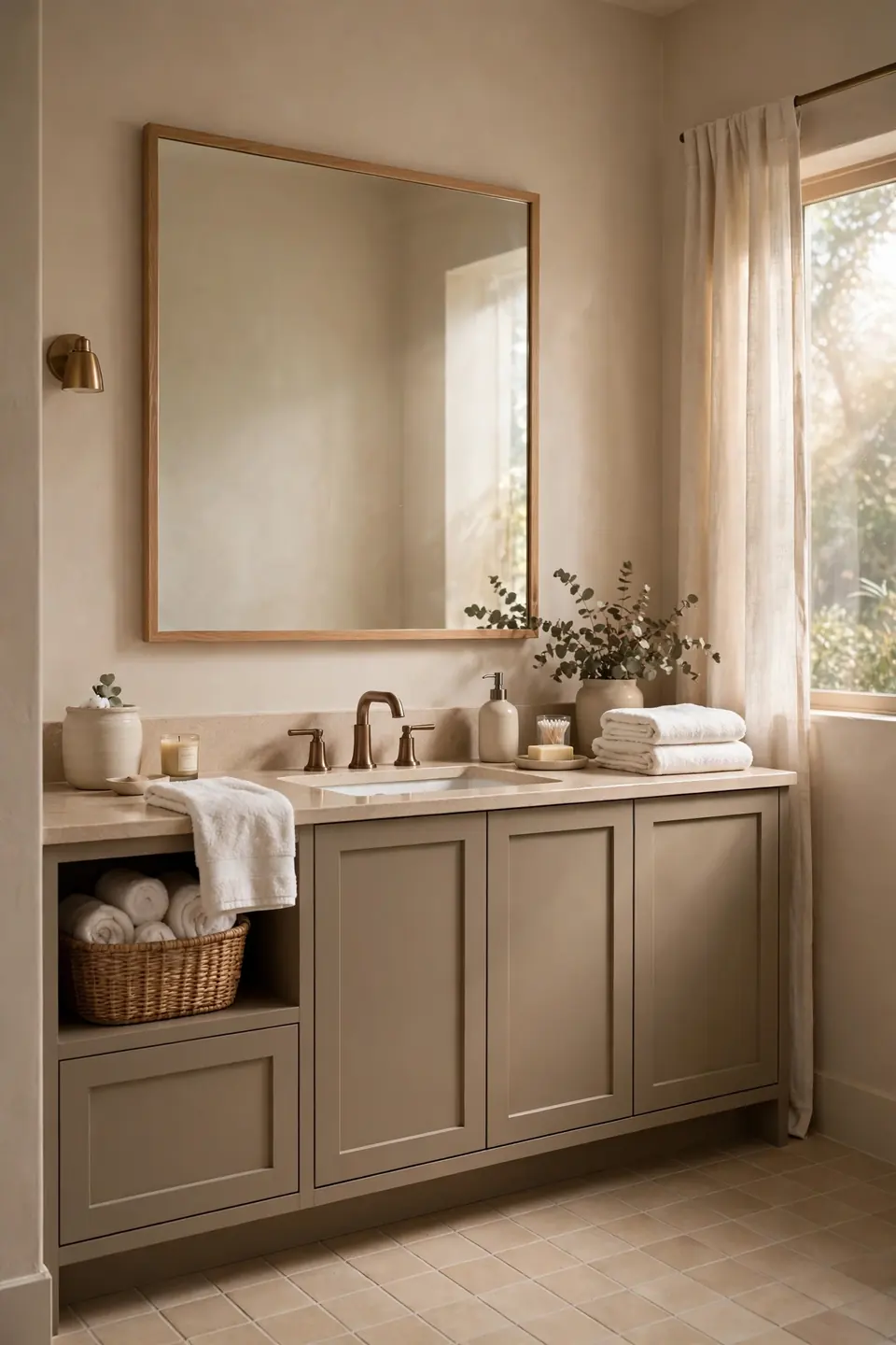
- Tape three greige swatches beside the mirror: one gray leaning, one balanced, one beige leaning.
- Check each swatch morning, noon, and night, since greige swings with the light.
- Match the winner to your floor undertone; warm floors want the beige leaning strip.
- Paint the vanity two shades deeper than the walls for a tonal, built in look.
- Finish with warm white towels and brushed bronze hardware to lock in the warmth.
Greige survives trends because it borrows the best of both camps: gray’s calm and beige’s warmth. It also bridges chrome fixtures and wood tones that refuse to match anything else in the house. In my experience, greige is the shade landlords and sellers reach for when a bathroom must please absolutely everybody.
Charcoal Versus Black
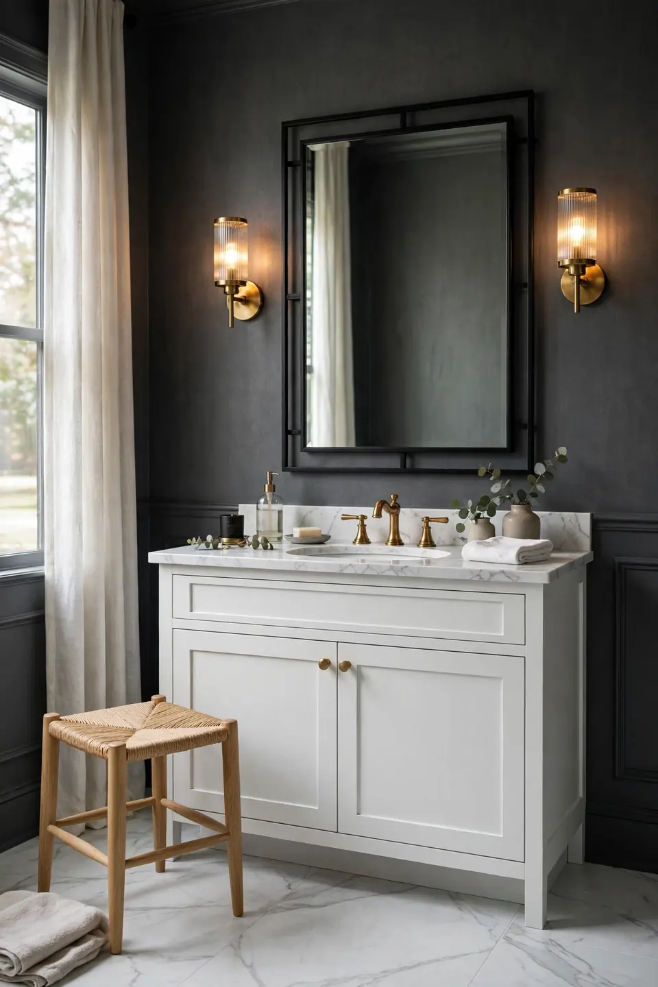
| Feature | Charcoal | Black |
|---|---|---|
| Mood | Soft drama, forgiving | Bold, high contrast |
| Light Effect | Absorbs gently | Absorbs strongly |
| Pairing | Brass and oak | Chrome and marble |
| Upkeep | Hides smudges well | Shows every water spot |
Charcoal delivers most of black’s drama with half the risk, which is why designers reach for it in family bathrooms. True black earns its place in powder rooms where mood beats mirror accuracy. Either way, bump up your bulb wattage and add a second light source, because dark walls drink light for breakfast. Test both on the wall behind the toilet, the spot nobody stares at directly, and live with the pair for a weekend before the full commitment happens.
Blush Pink Soft Glow
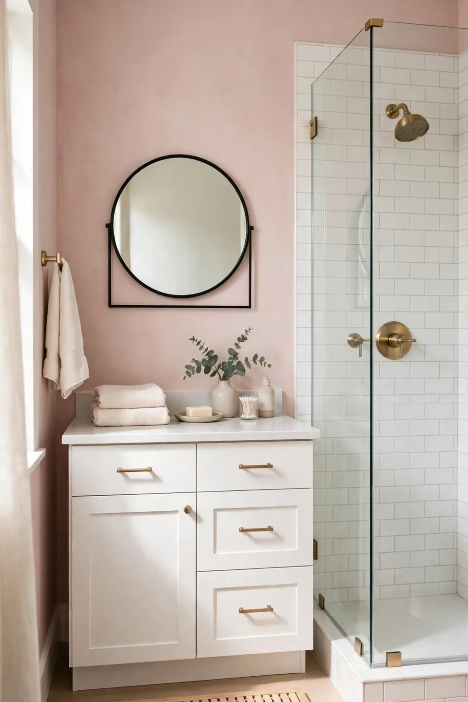
Do:
- Choose dusty, muted blush over bubblegum shades for a grown up result.
- Pair blush walls with white tile and brushed brass for warmth.
- Repeat the tone once more in towels or a bath mat.
- Balance the sweetness with a black framed mirror or sconces.
Don’t:
- Stack pink on pink in every accessory until the room turns saccharine.
- Pair blush with cool gray tile, which makes both colors look muddy.
- Paint a large windowless bath fully pink without a white ceiling break.
Blush flatters every skin tone at the mirror, which alone earns it a place here. It reads romantic in primary baths, playful in kids’ spaces, and needs no new tile to work. Keep floors pale and the color feels designed, never themed.
Seafoam Mint Freshness
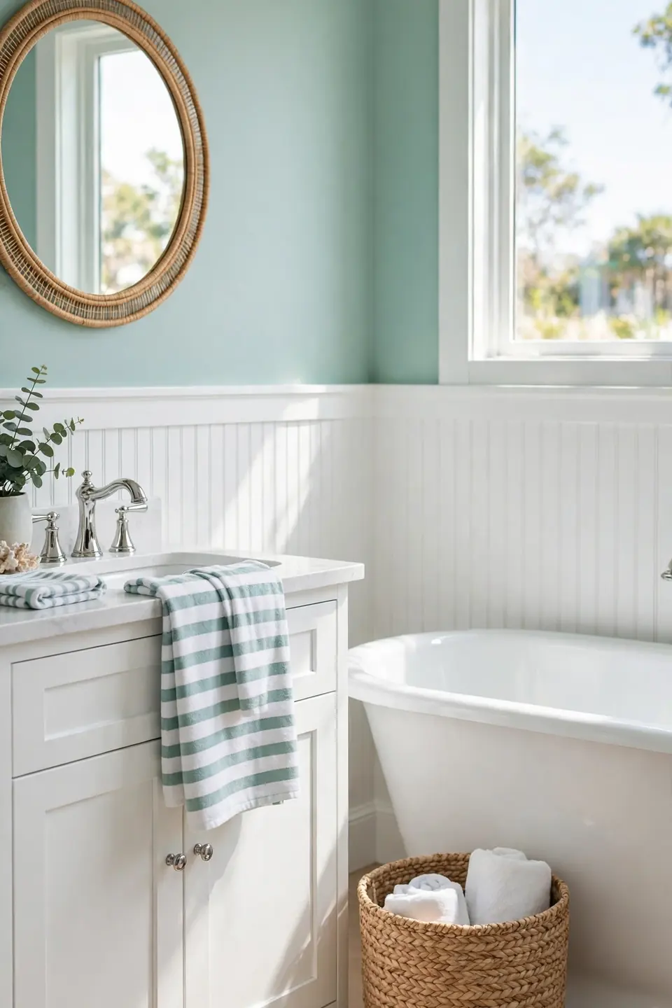
Cost: Two gallons and tape, about $70 to $110
Time: One Saturday, six hours with dry time
Skill Level: Beginner, forgiving color for first timers
Best For: Small baths craving a fresh, airy lift
Seafoam walks the line between green and blue, so it borrows calm from both and brightens dim rooms without the chill of pure blue. White beadboard or wainscoting on the lower wall gives seafoam a cottage frame, and chrome fixtures keep the look crisp. The same fresh, welcoming first impression that guides front porch decorating ideas applies at the bathroom door: one cheerful color, repeated twice, nothing more. Add a striped towel in white and seafoam to finish the echo.
Creamy Beige Warmth
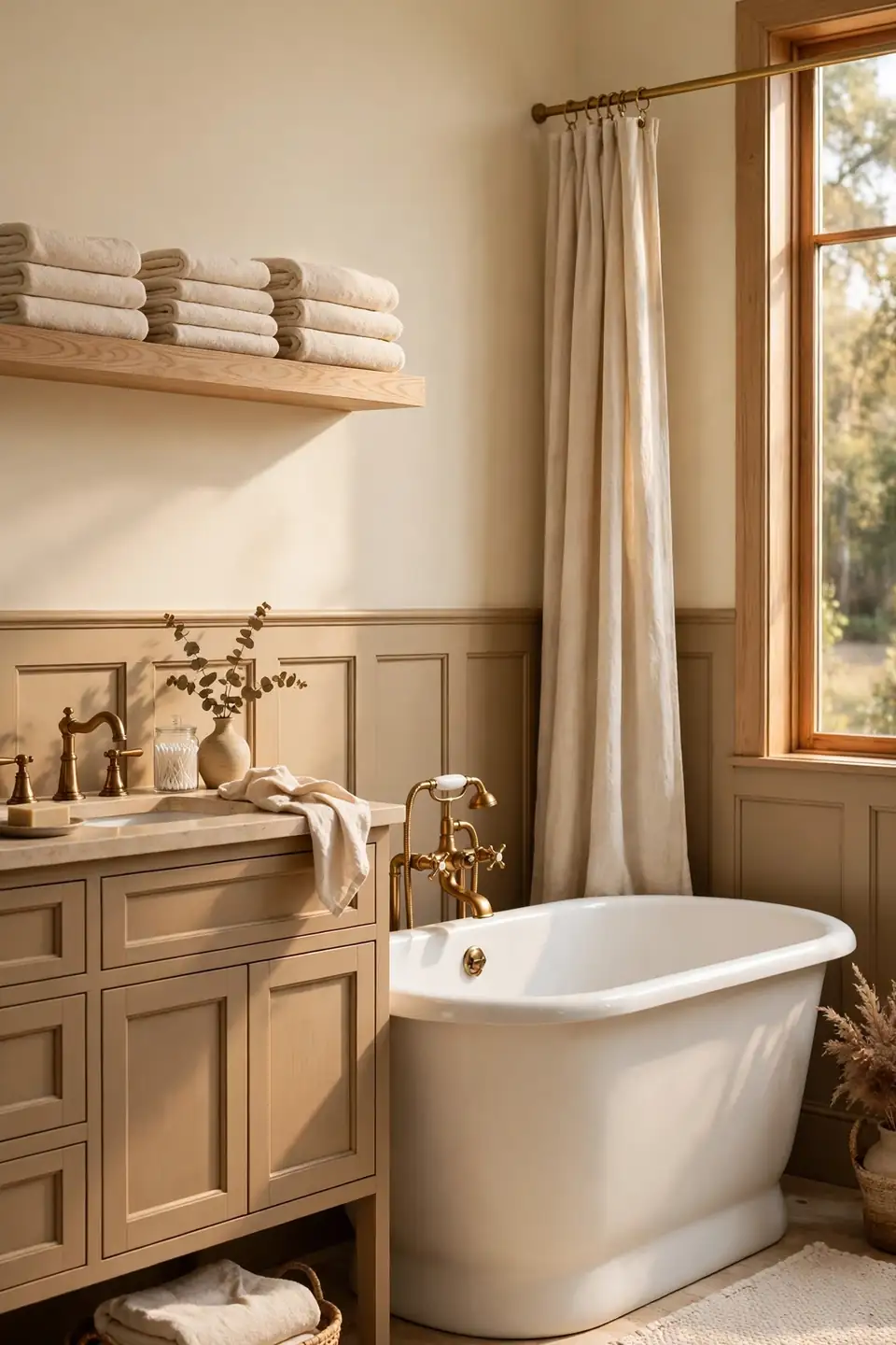
Beige got a bad reputation during the builder grade years, but the new creamy versions carry pink and gold undertones that feel rich instead of rental. A warm beige wall turns a plain white tub and toilet set into a composed scene. It also welcomes wood tones, from pale oak shelves to dark walnut frames.
Layer two beige depths, lighter on walls and deeper on the vanity or door, to keep the palette awake. Linen shower curtains and unlacquered brass keep the warmth story going. That’s why many experts recommend beige for resale: buyers read it as clean, calm, and ready to personalize, and almost nobody objects to living with it.
Two Tone Wall Split
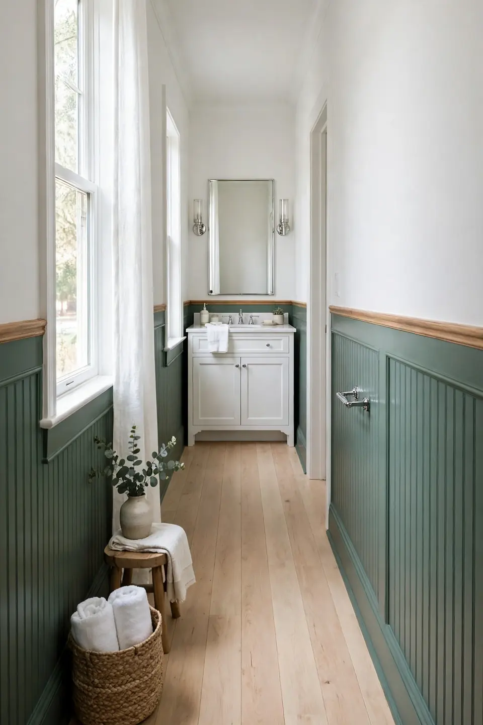
- Run the darker shade up to chair rail height, about 36 to 40 inches.
- Keep the lighter shade above to hold onto brightness where faces meet the mirror.
- Divide the zones with a slim painted trim strip or beadboard for a finished edge.
- Choose two shades from the same paint strip so the undertones never fight.
- Repeat the darker tone on the vanity or door to tie the split together.
Two tone walls solve the classic bathroom dilemma: craving color while fearing a dark, shrunken room. The darker base grounds fixtures and hides splashes near the sink, while the pale upper half keeps the ceiling feeling high. Long narrow baths gain the most, since a single flat color there reads like a hallway.
Terracotta Clay Warmth

Quick Tip: Terracotta darkens as it dries, so judge the color from a fully dry two coat sample, never the wet edge. Paint a foam board, let it cure overnight, and lean it behind the sink before opening the full can.
Clay tones bring the warmth of sun baked pottery into bathrooms that feel cold and clinical. Terracotta loves white fixtures, creamy tile, and natural wood, and it turns brass hardware into a glow rather than a shine. Keep decor minimal and let the wall carry the room; a single green plant against that earthy backdrop looks like a magazine cover. Start with the wall behind the vanity.
Moody Forest Green
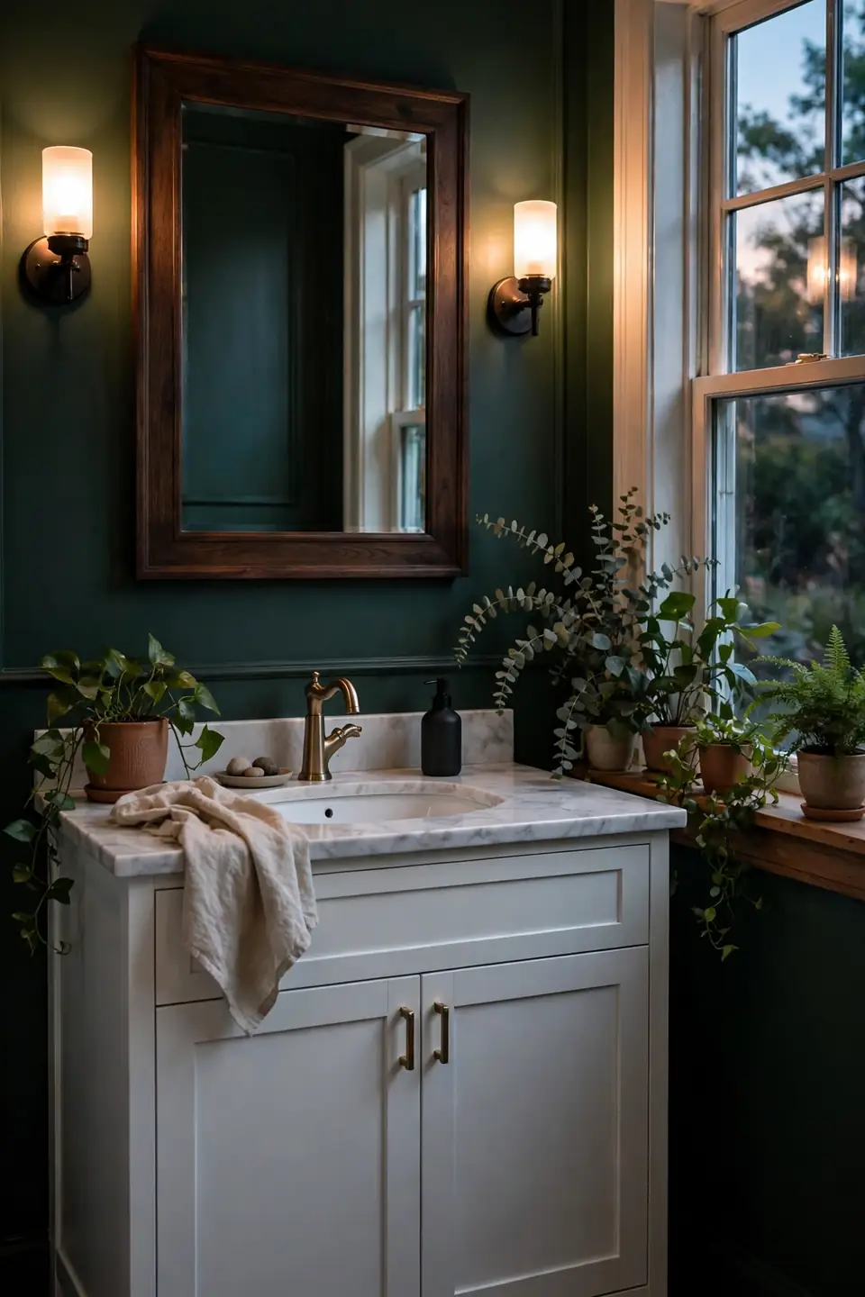
BEFORE: Pale gray walls made this north facing bathroom feel chilly at every hour, and the white vanity disappeared into the wall behind it. Morning routines happened under a flat, shadowy light that flattered nobody.
AFTER: Forest green walls wrapped the room in depth, the vanity now stands out in crisp relief, and warm bulbs feel like candlelight against the dark green. Plants on the sill look twice as alive against the richer backdrop.
Deep green anchors the strongest bathroom paint color ideas because it pairs with everything already in the room: white porcelain, warm wood, black, brass, or chrome. Choose a green with a blue base for a cooler feel or a yellow base for warmth. Satin finish keeps the depth while shrugging off steam.
Blue Gray Powder Tone

- Pick a blue gray with more gray than blue for a calm, tailored base.
- Sample beside the mirror and check your reflection; this shade lives or dies by skin tone.
- Roll two coats in satin finish so steam wipes off without dulling the color.
- Trim in bright white to sharpen the soft edge between wall and ceiling.
- Style with silver toned metals and one navy towel set for depth.
Blue gray behaves like a tailored shirt: crisp, calm, and appropriate everywhere. It cools down sun baked south facing baths and adds polish to powder rooms with zero natural light. I’ve seen this work well in many cases where homeowners wanted color that would never start an argument at resale time.
Matte Versus Eggshell Finish
| Factor | Matte | Eggshell |
|---|---|---|
| Steam Resistance | Needs ventilation | Wipes clean easily |
| Look | Velvety, hides flaws | Soft sheen, richer color |
| Best Spot | Powder rooms | Full baths and showers |
| Touch Ups | Blend invisibly | Can flash at edges |
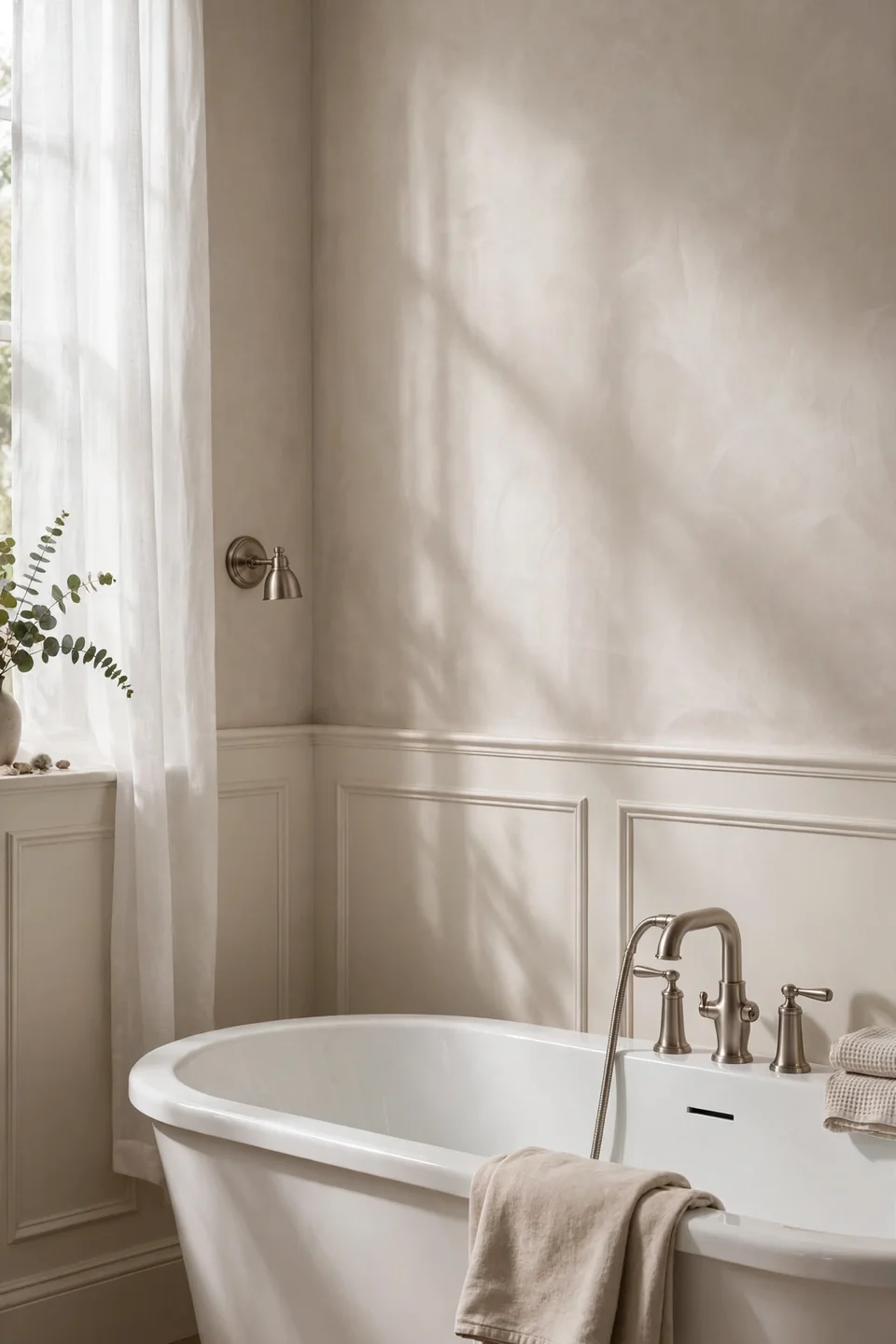
Finish matters as much as color in a room that steams up twice a day. Matte hides wavy drywall and tired plaster beautifully, but repeated moisture can leave it chalky in a busy family bath. Eggshell and satin shed water, wipe clean, and deepen the color you actually chose. Reserve true matte for powder rooms and ceilings, and let the working bathrooms wear the tougher skins. When in doubt, buy the small can of each and paint side by side boards.
Sunny Butter Yellow
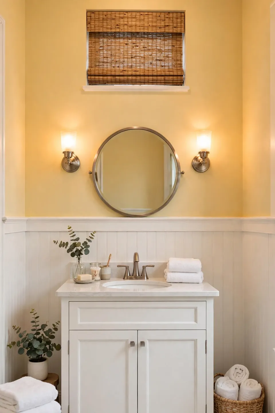
Do:
- Choose a buttery, cream based yellow rather than a lemon bright one.
- Pair yellow walls with white wainscoting to keep the glow controlled.
- Use brushed nickel or chrome to cool the warmth slightly.
- Repeat the shade in a hand towel for a finished echo.
Don’t:
- Paint yellow beside orange toned wood cabinets; the clash turns muddy.
- Go neon in a small bath, where the color bounces back at you.
- Ignore the mirror test; yellow can cast a sallow light on skin.
Yellow manufactures sunshine in windowless bathrooms and wakes up groggy mornings fast. The trick is restraint: soft butter on the walls, white everywhere else, one woven texture for balance. Done right, the room feels like early morning all day.
Dusty Rose Vintage Charm
Cost: One gallon plus primer, about $55 to $85
Time: One afternoon, four hours total
Skill Level: Beginner, an easy first paint project
Best For: Vintage baths with pedestal sinks
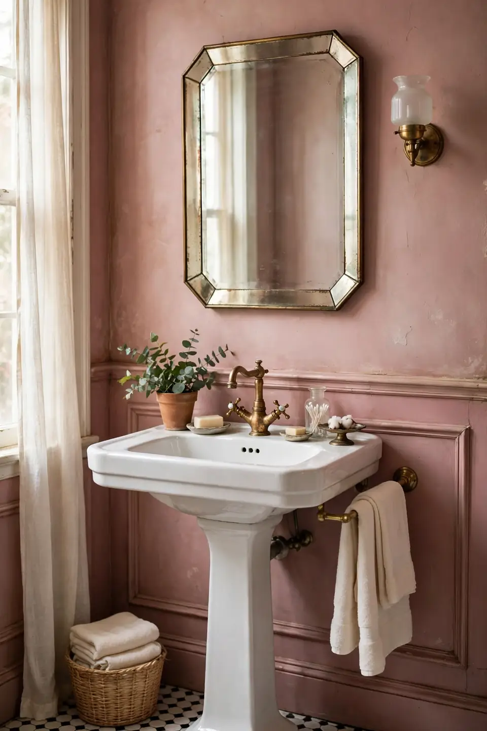
Dusty rose carries a vintage soul that suits pedestal sinks, hex tile floors, and old houses with stories. The grayed undertone keeps it sophisticated, closer to dried petals than bubblegum. Style it with aged brass, a beveled mirror, and cream towels, and the room feels collected rather than decorated. Black and white floor tile under dusty rose walls is a combination that has survived a century of trends, and it still photographs like a dream for guests and listings alike.
Slate Gray Modern Edge
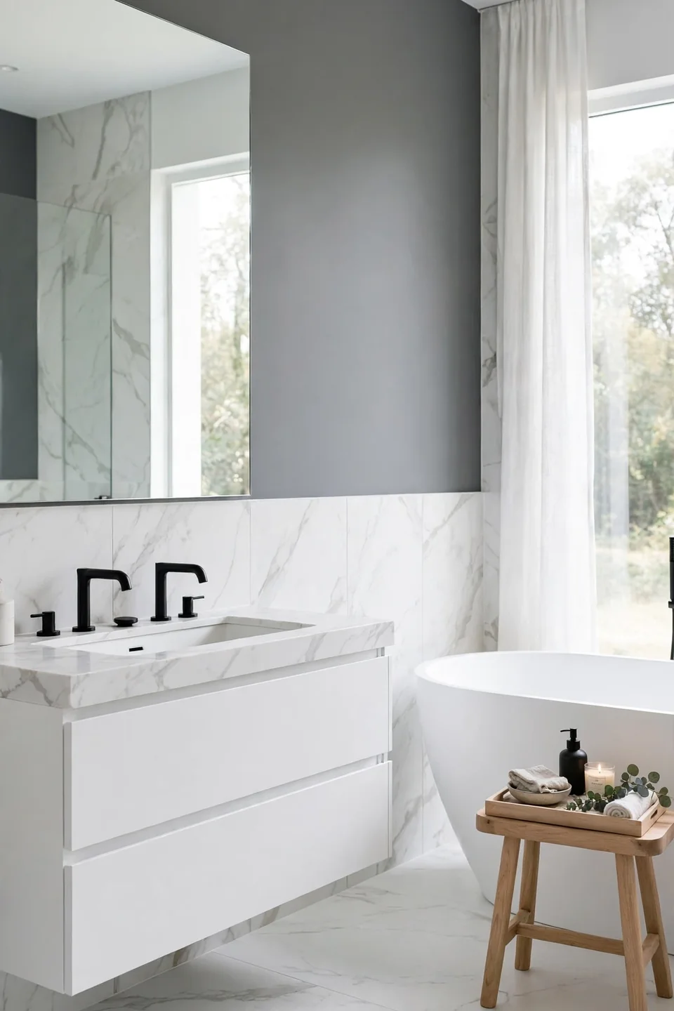
Slate gray brings a tailored, architectural calm to bathrooms that lean modern. Its blue undertone cools warm tile and gives white fixtures a crisp outline, and it pairs with black faucets for a look pulled straight from boutique hotels. The color holds its own next to marble veining without competing for attention.
Keep slate from feeling heavy by choosing the lighter half of the swatch strip and adding warm wood anywhere you can: a stool, a tray, a frame. Big mirrors double the light and soften the mood. Rental friendly versions exist too, since slate reads as a neutral to most landlords checking the walls at move out.
Aqua Coastal Breeze
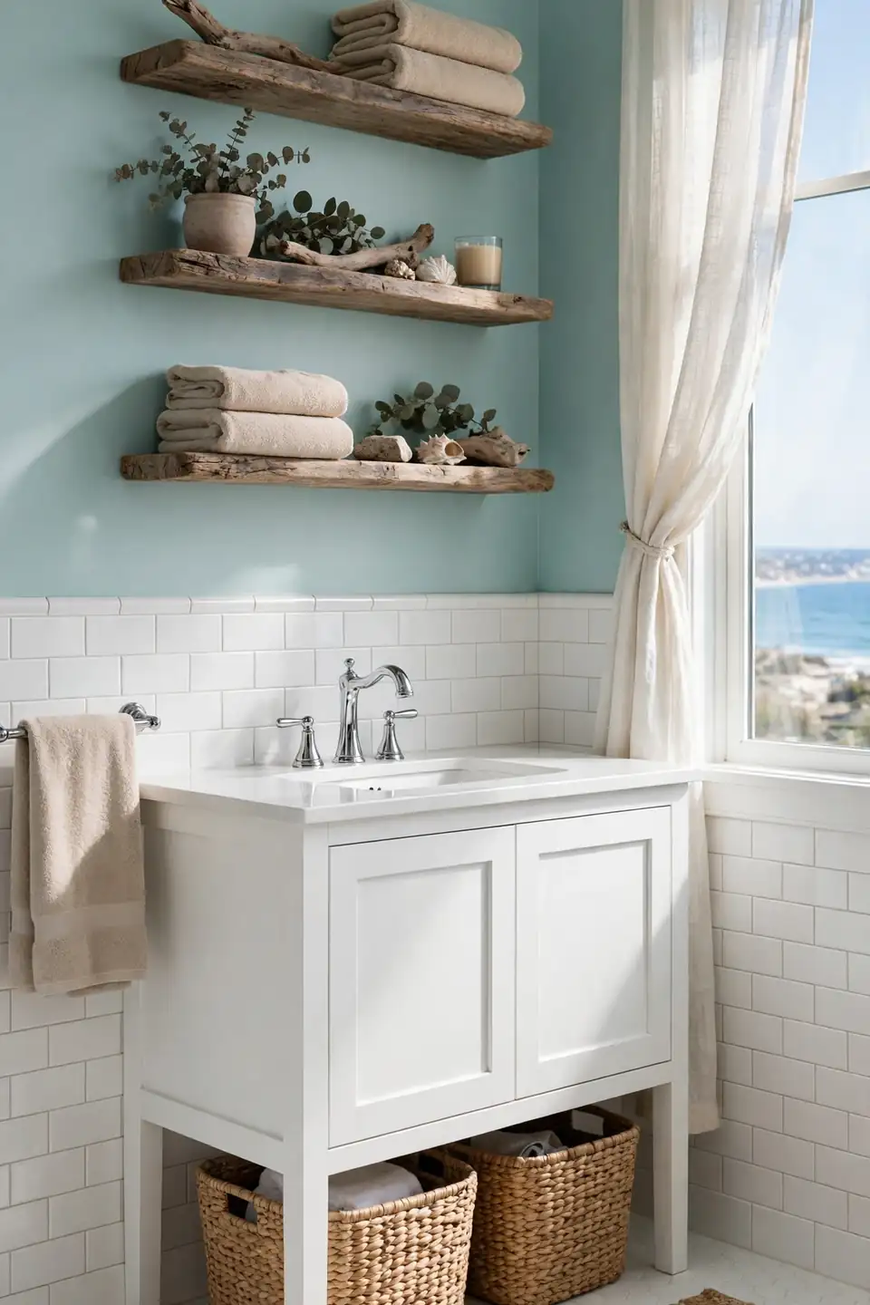
- Choose an aqua with a green base for a beach glass feel that never reads childish.
- Pair aqua walls with sandy beige towels and driftwood toned shelves.
- Keep tile and fixtures bright white so the color stays the star.
- Add woven seagrass baskets to echo the shoreline without theme overload.
- Use chrome hardware for a cool, watery sparkle against the soft color.
Aqua gives landlocked bathrooms a shoreline mood without a single seashell glued to anything. It shines in coastal homes, pool baths, and any room that needs waking up before the coffee kicks in. Keep the palette to aqua, white, and sand, and the room stays breezy instead of busy.
Painted Ceiling Color Pop

Quick Tip: Paint the ceiling color two shades lighter than the wall color, or use the wall color at half strength. A full strength dark ceiling can drop the room visually, while a tinted one adds atmosphere and keeps the height.
Everyone forgets the fifth wall, and that is exactly why it works as a surprise. A soft blue or blush ceiling over white walls draws the eye up, makes a low ceiling feel intentional, and frames a pretty light fixture like a picture. In small baths it delivers color commitment without any of the mirror time risk that colored walls can bring on dark winter mornings.
Black Accent Wall Statement

BEFORE: Four white walls and a white vanity made the bathroom bright but forgettable, a rental grade box with no focal point. The mirror wall, the one seen most, had the least to say.
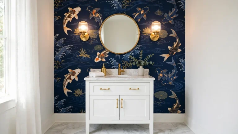
AFTER: One black wall behind the mirror changed the math entirely. The mirror and sconces now float against the dark backdrop, the vanity reads sculptural, and the remaining white walls feel brighter by contrast.
A single dark accent wall delivers drama with an exit plan: one wall is an afternoon to repaint if taste changes. Keep the black slightly soft, closer to charcoal ink than pure jet, and repeat it in a frame or faucet so the move looks deliberate. Accent walls earn their keep behind mirrors and tubs.
Sampling Paint The Smart Way
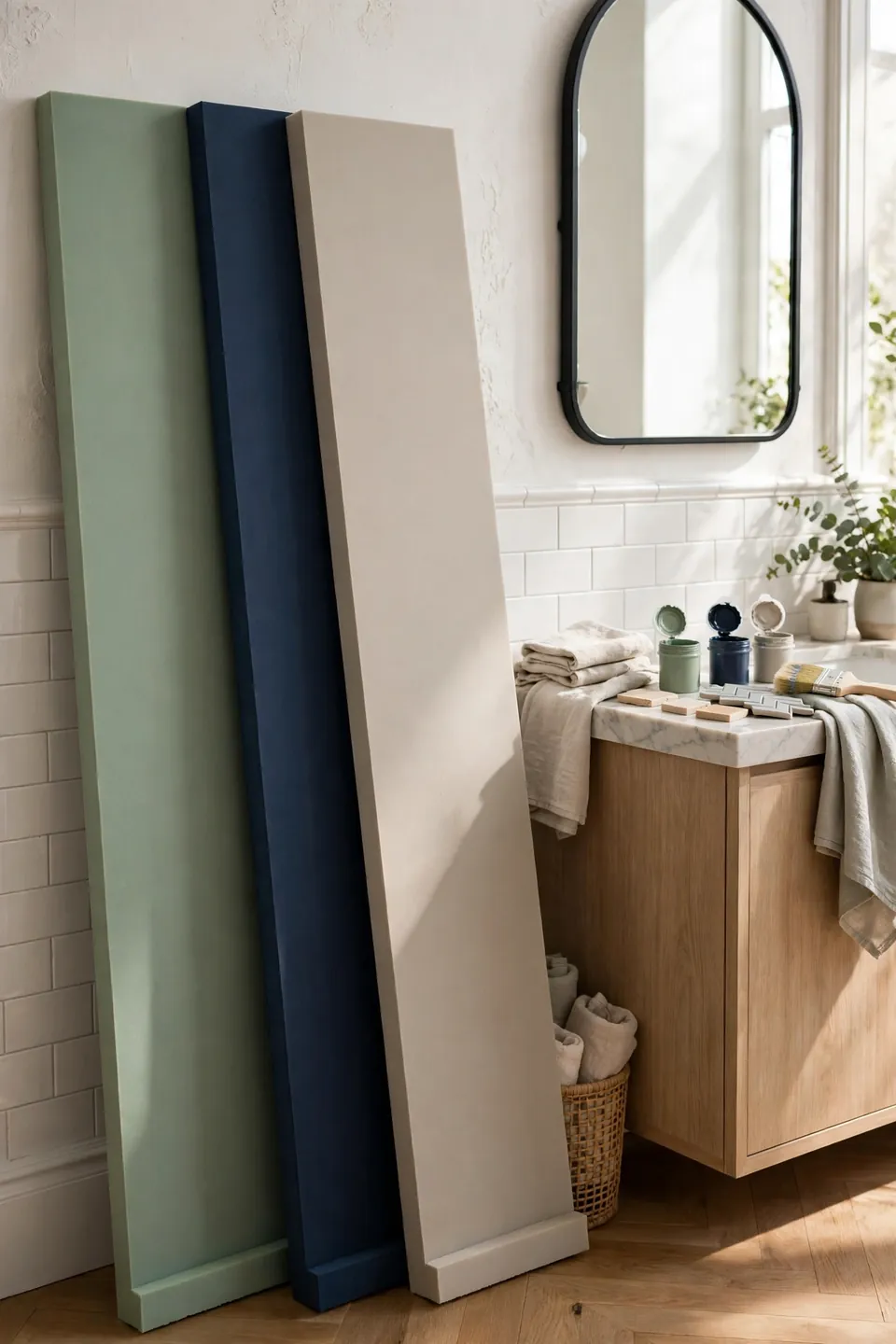
- Buy sample pots of three finalists and brush two large coats on foam boards.
- Move the boards around the room: beside the mirror, behind the tub, across from the window.
- Live with the boards two days, checking morning light and warm evening bulbs.
- Hold towels, tile, and hardware against each board to catch undertone clashes early.
- Pick the shade that flatters your face in the mirror at 7 a.m., not the prettiest chip.
Sampling feels slow until the first wrong gallon teaches the lesson at full price. Boards beat wall swatches because you can test the exact spot where you shave, apply makeup, or check a toddler’s fever. Label each board on the back with the paint name before the guessing games begin.
Warm Whites Versus Cool
| Trait | Warm White | Cool White |
|---|---|---|
| Undertone | Cream and gold hints | Blue and gray hints |
| Light Match | North facing rooms | Sun drenched rooms |
| Skin Effect | Softens and warms | Can look stark |
| Pairs With | Brass and oak | Chrome and marble |
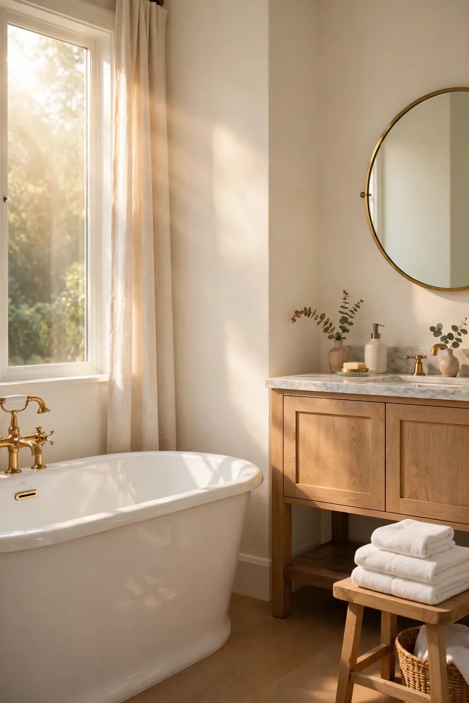
Neither white is wrong; the room decides. Warm whites rescue bathrooms that face north or hide from the sun, wrapping skin in a flattering glow at the mirror. Cool whites sharpen modern spaces with marble and chrome, but they can turn icy under cheap bulbs. Match the white to your light first and your fixtures second, and the whole room settles into place. When torn between two, pick the warmer one; bathrooms reward warmth.
Sage And Brass Pairing
Do:
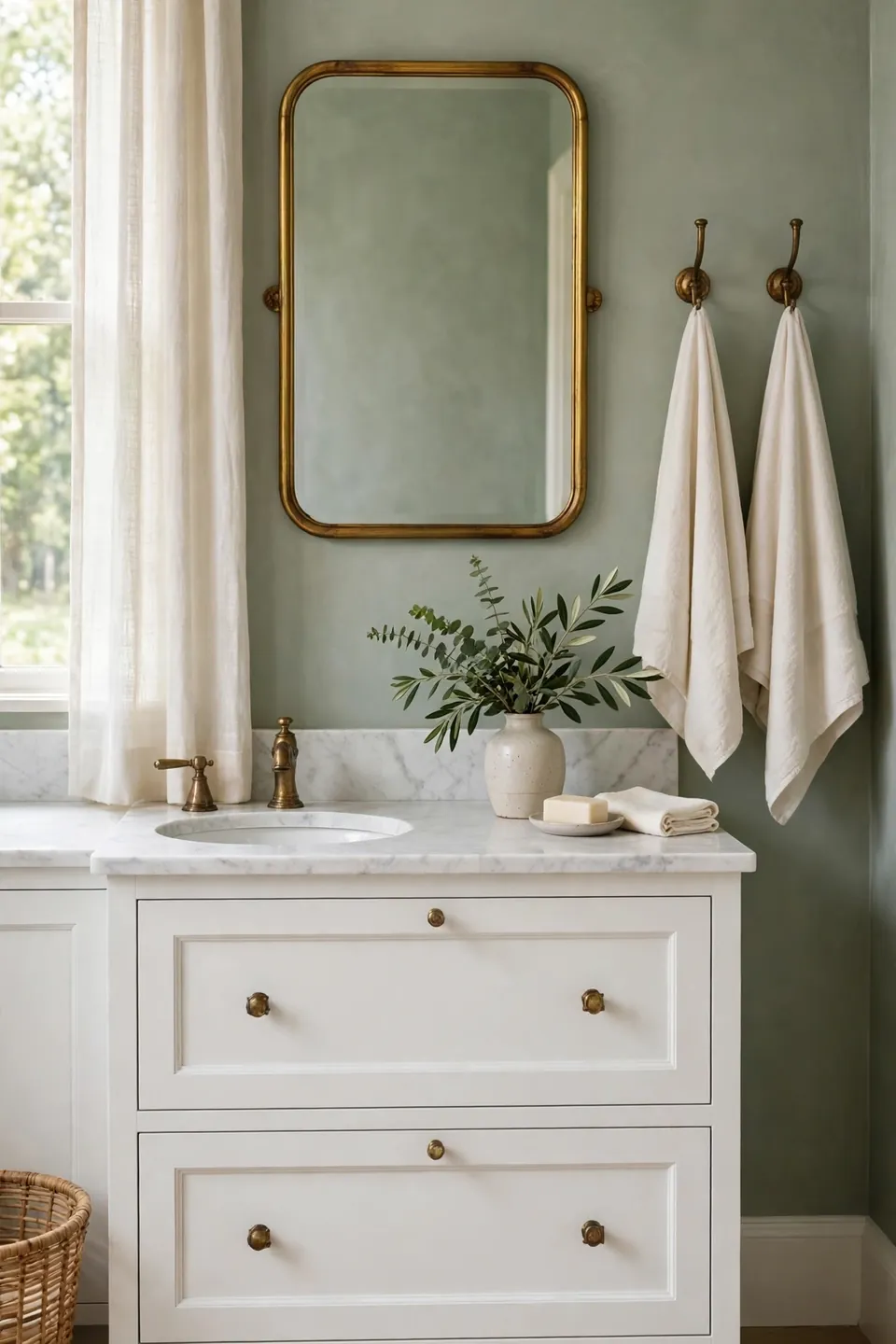
- Let sage walls cool the room while brass fixtures bring the warmth.
- Choose unlacquered brass if you enjoy a living finish that patinas.
- Echo the brass in a mirror frame and towel hooks for rhythm.
- Keep towels cream or white so the metal stays the accent.
Don’t:
- Mix brass with chrome in the same sightline; pick one metal family.
- Overdo gold accessories until the room turns glitzy instead of calm.
- Pair sage with orange toned woods, which fight the cool undertone.
Some pairings become classics because each partner fixes the other’s weakness. Sage alone can drift chilly, and brass alone can feel formal, but together they land in that relaxed, tailored middle. Guest baths wear this pairing especially well.
Dark Paint Small Bathrooms
Cost: One gallon of deep paint, about $45 to $70
Time: Two evenings with dry time between coats
Skill Level: Confident beginner, dark colors show roller marks
Best For: Powder rooms and windowless baths
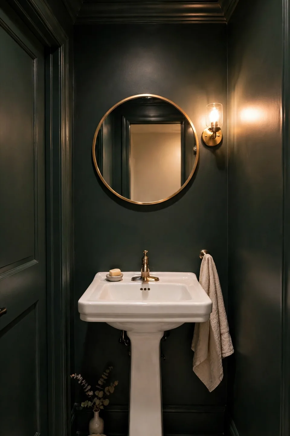
Conventional wisdom says small rooms need pale paint, but dark colors play a smarter trick: they erase corners. When walls, trim, and ceiling share one deep shade, the eye cannot find the edges, and a tiny powder room feels boundless instead of boxed in. Add a bright mirror, warm bulbs, and one light colored hand towel for contrast. Guests walk out talking about the mood, not the square footage, every single time.
Conclusion
Paint asks for one weekend and a modest budget, yet it rewrites the whole bathroom. Whether you land on sage calm, navy drama, or a warm white that finally suits your light, these bathroom paint color ideas give you a tested starting point instead of a guess. Start with samples, trust the mirror test, and pick the shade that makes mornings easier. Small rooms forgive bold choices, and paint forgives everything. Save this pin for your next paint weekend, share it with a friend planning a refresh, and enjoy the first morning in a bathroom that feels brand new.