22 Butter Yellow Bedroom Ideas for a Cheerful, Sunny Glow
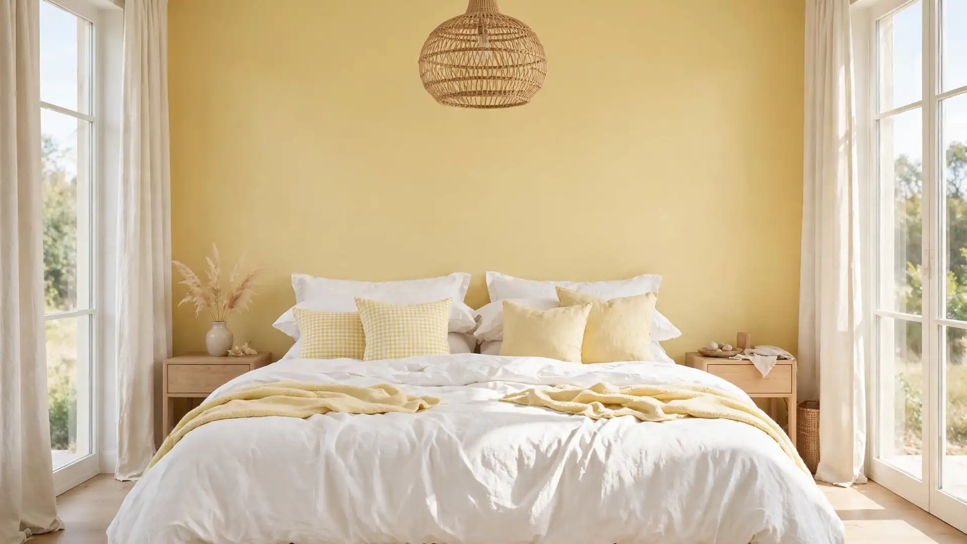
Some colors wake a room up before the coffee is even on. A butter yellow bedroom does exactly that: the walls hold a soft, creamy warmth, the bedding stays light, and the whole space feels like the first hour of a sunny morning, all day long.
The shade works because it is gentle rather than loud. Butter yellow sits between cream and gold, so it pairs with white linen, pale wood, and rattan without shouting over any of them. If high contrast is more your speed, the graphic calm of black white bedrooms shows the opposite end of the spectrum. Here, the mood stays softer: twenty two ideas cover paint, bedding, furniture, and small accents, each one tuned to keep the glow warm instead of sugary. In my experience, the rooms that pull this color off best always give yellow a supporting cast, never the whole stage.
Butter Yellow Accent Wall
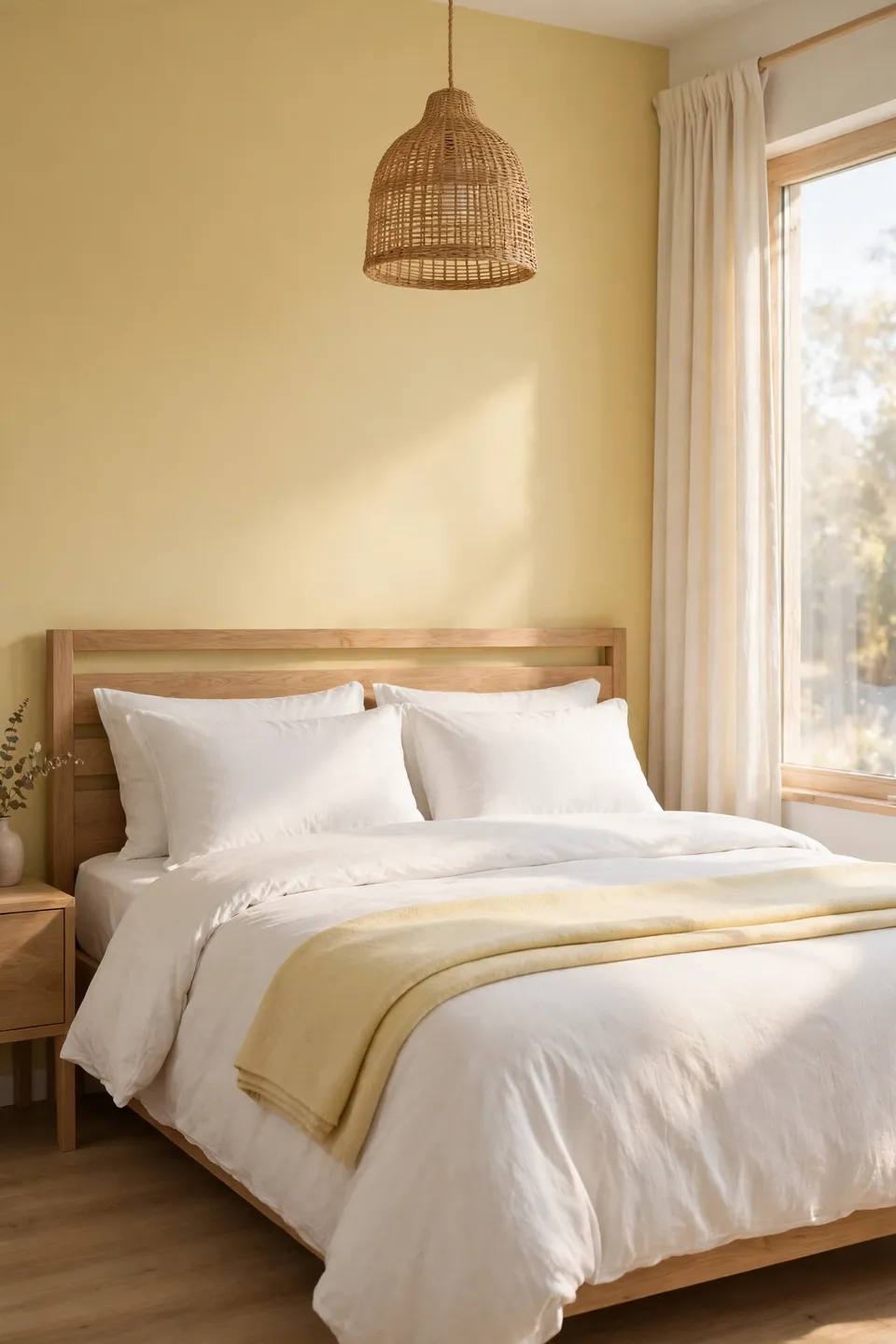
One wall of butter yellow changes the temperature of a whole bedroom without touching a single piece of furniture. Paint the wall behind the bed, keep the other three a warm white, and the bed becomes the natural focal point, framed by color on one side and daylight on the other.
Choose a shade with a creamy base rather than a lemony one, since green undertones turn chilly under evening lamps. Test a large swatch beside the headboard for two full days before committing to the gallon. In my experience, the right butter yellow looks almost neutral at noon and glows like late afternoon sun by dinner.
Layered Yellow Bedding
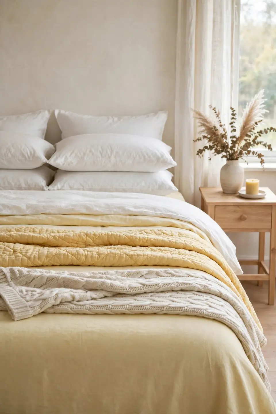
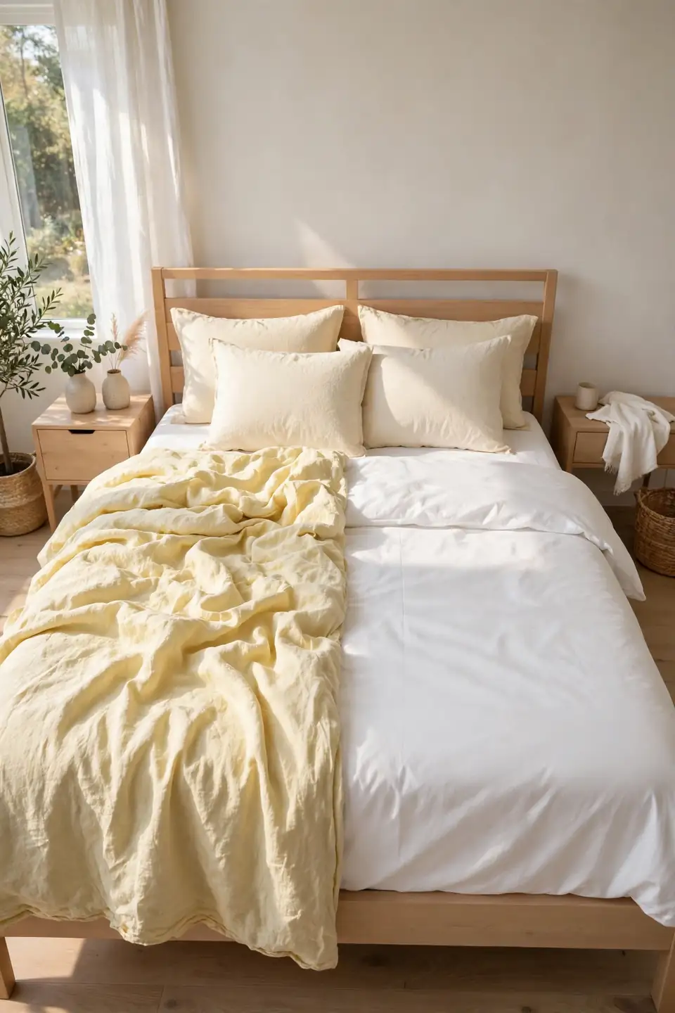
- A white duvet on top keeps the bed bright and easy to wash.
- Pale yellow sheets peek out at the turn down for a soft band of color.
- A butter toned quilt across the middle adds weight without heavy heat.
- One cream knit throw at the foot stops the stack looking flat.
- Swap the quilt for white in summer and the room cools down instantly.
Layering by shade rather than by pattern is the quiet trick here. Keep every yellow within two steps of the others on the paint strip and the bed reads calm instead of busy. Natural fabrics help too: cotton and linen soften the color where shiny synthetics would make it glare.
Pale Yellow Curtains
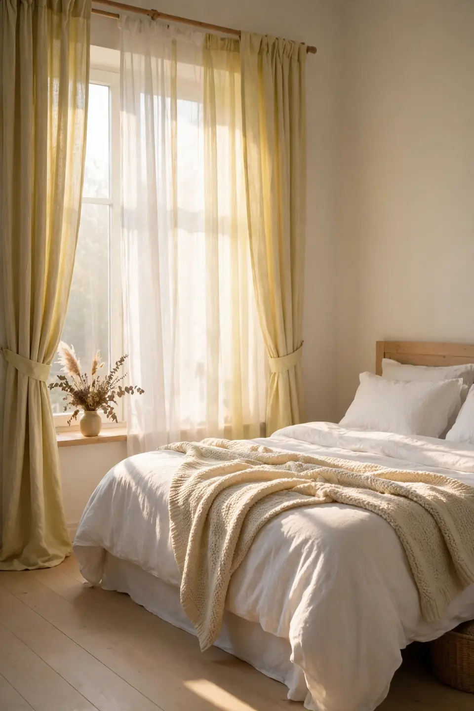
Quick Tip: Hang pale yellow curtains high and wide, with the rod close to the ceiling and panels kissing the floor. Sunlight passing through the fabric tints the whole room gold for an hour each morning, a free filter no paint can copy.
Sheer panels suit rooms that face the morning sun, while lined cotton works where street lamps intrude at night. Either way, keep the curtain color a step paler than the bedding so the window reads as glow, not a second accent wall. White tiebacks keep the look tailored. In my experience, curtain color shows truest at the hour you wake up, so judge fabric in morning light, never under shop lights.
White Bedding Sunny Throw
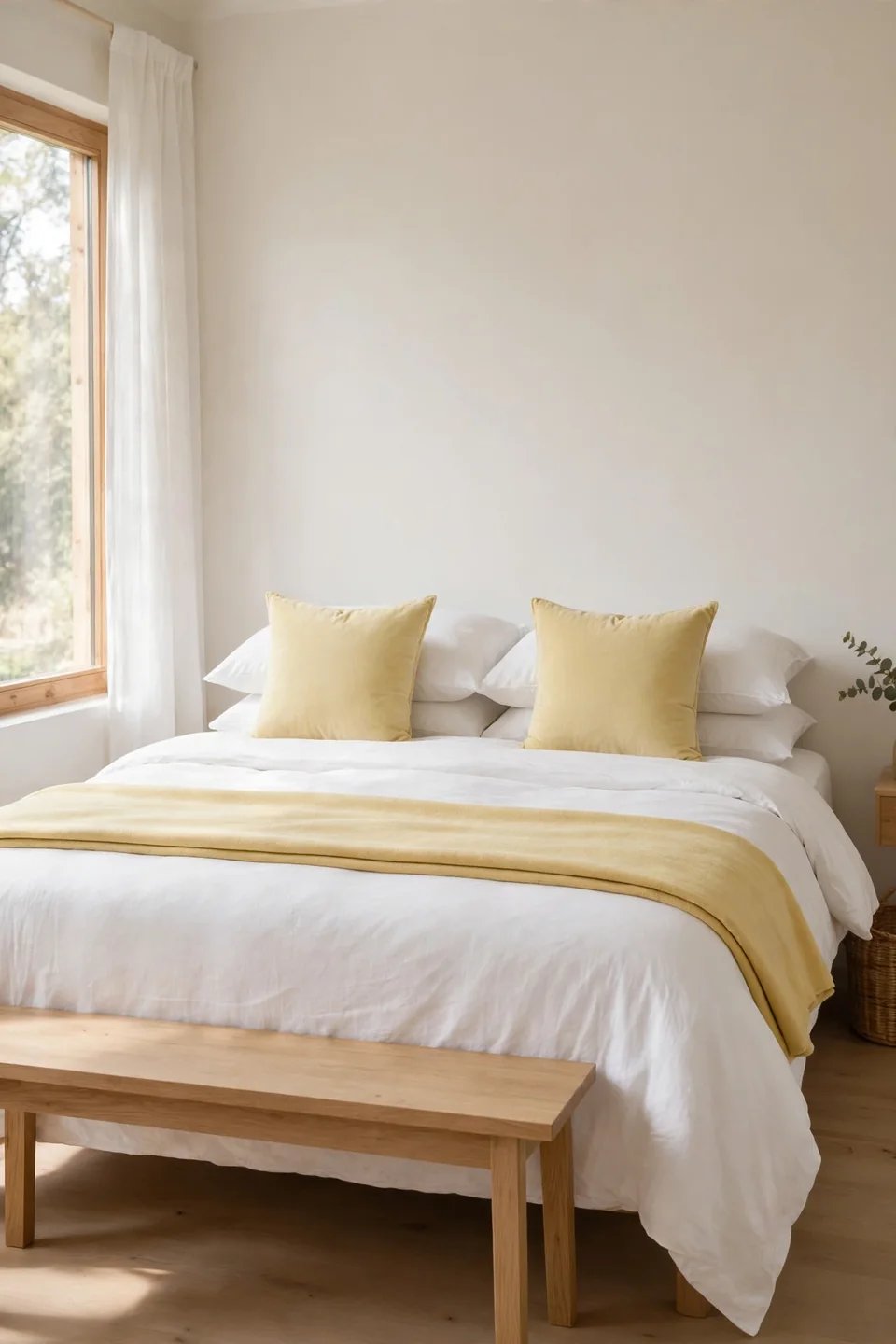
BEFORE: The bed wore plain white bedding against white walls, clean but cold, like a hotel room nobody had checked into yet. Nothing in the room suggested morning, warmth, or a favorite color.
AFTER: A butter yellow throw folded across the foot and two pale yellow cushions changed the temperature instantly. The white still does the calming work, but now the bed greets you holding a little stored sunlight.
A throw is the lowest commitment test of this palette: one piece, no paint, no sewing, nothing permanent. Choose a woven texture rather than a flat knit so the yellow shows depth inside its folds. Fold it in thirds with a straight edge and the bed looks styled in under a minute.
Painted Vintage Dresser

- Sand the dresser lightly and wipe away every trace of dust.
- Prime with a stain blocking coat so old varnish cannot bleed through.
- Paint two thin coats of butter yellow, sanding gently between them.
- Let the final coat cure a full day before adding hardware.
- Fit brass or ceramic knobs for a soft vintage finish.
A painted dresser carries the color into the room’s furniture, which keeps yellow from living only on walls and fabric. Hunt for solid wood pieces with good drawers rather than perfect looks; paint forgives scratches but not wobbly joints. The result reads cheerful, not childish.
Gingham Meets Floral Prints
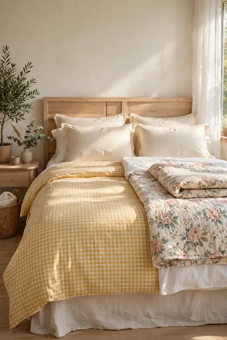
| Feature | Gingham | Floral |
|---|---|---|
| Pattern scale | Small, even checks | Loose, scattered blooms |
| Mood | Neat and tailored | Romantic and relaxed |
| Best layer | Duvet cover or sheets | Quilt or one cushion |
| Pairing | Plain white linen | Plain cream cotton |
| Care | Cotton, washes easily | Prints hide wrinkles well |
| Season feel | Spring fresh all year | Fullest in summer months |
Gingham and floral are the two classic partners for this palette, and they behave very differently on the same bed. Checks read neat and tailored, while florals read romantic and loose. Pick one as the lead pattern and let the other appear just once, on a cushion or a folded throw at the foot.
Rattan Cane Accent Pieces
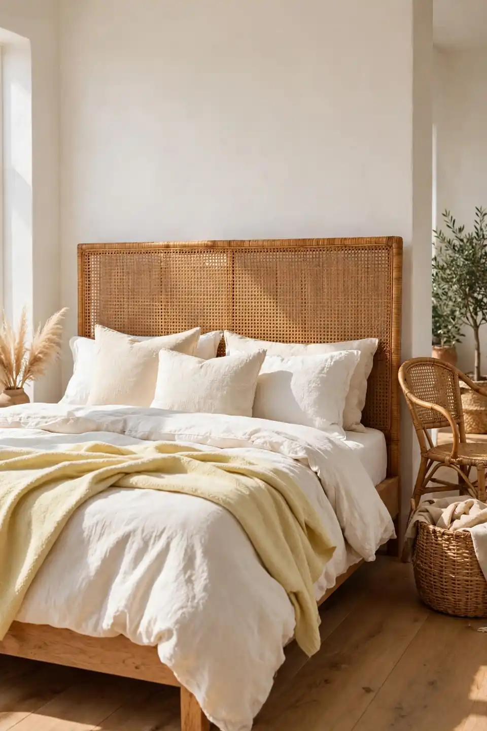
Do:
- Choose one cane headboard or chair as the texture anchor.
- Pair rattan with white linen for a fresh contrast.
- Repeat the honey tone in a basket or frame.
- Keep pieces light enough to move with the seasons.
Don’t:
- Fill every corner with wicker until it reads themed.
- Mix dark mahogany with pale cane in one view.
- Place rattan where morning sun will bleach it unevenly.
- Buy brittle vintage cane without testing the weave.
Natural cane brings the outdoors into a yellow room and stops the palette feeling sugary. Its woven grid adds pattern without adding another color, which is exactly what a soft scheme needs. One strong piece beats four small ones scattered around.
Sunny Reading Corner

Cost: $60 to $180 for chair and lamp | Time: One afternoon | Skill Level: Beginner, no tools needed | Best For: An empty corner by the window
Every sunny bedroom deserves one chair that is not the bed. Place a small upholstered chair at an angle near the window, add a butter yellow cushion and a cream throw, and the corner starts pulling its weight as a reading spot, a dressing perch, and the place laundry chairs go to retire. A slim floor lamp with a warm bulb extends the corner past sunset. Keep a small stack of books on a stool beside it; a corner that holds a habit gets used, while a corner that only looks pretty gets ignored.
Painterly Floral Wall Art
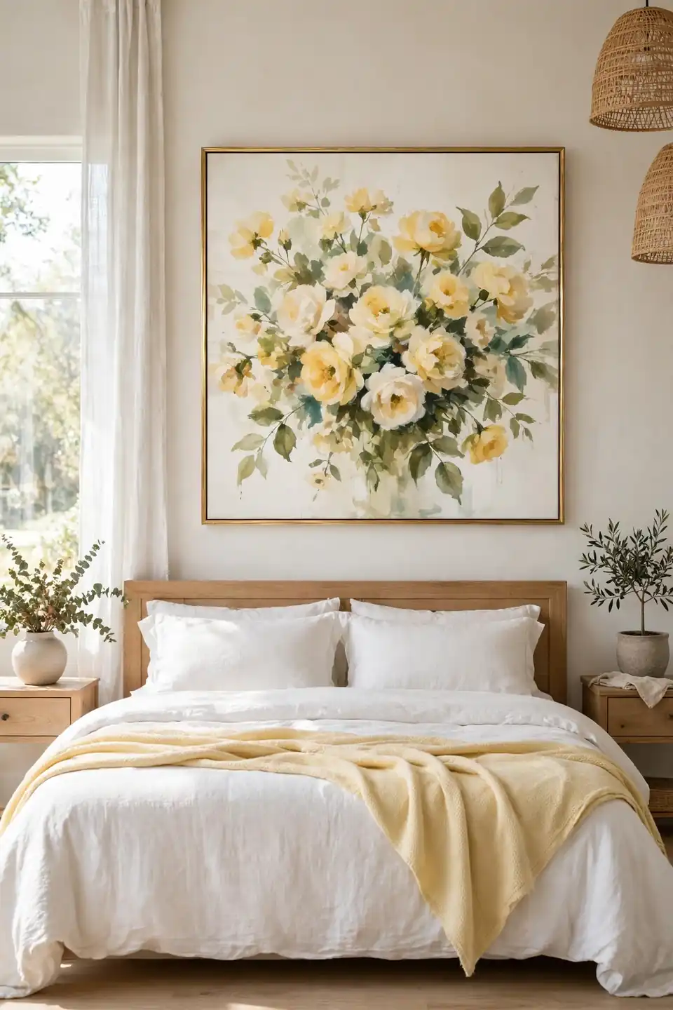
A single large floral print above the bed gives the room a garden without a single petal to sweep up. Choose painterly blooms in butter yellow, cream, and soft green, printed large enough that the brushwork shows from the doorway. A thin gold or pale wood frame keeps the mood light.
Art is where this palette can go slightly deeper in tone, since a picture covers less wall than paint. That balance is what makes a butter yellow bedroom feel collected rather than themed: the walls whisper, the art speaks. Hang the frame so its center sits at eye level from the bed, not from standing height.
Creamy White Balance
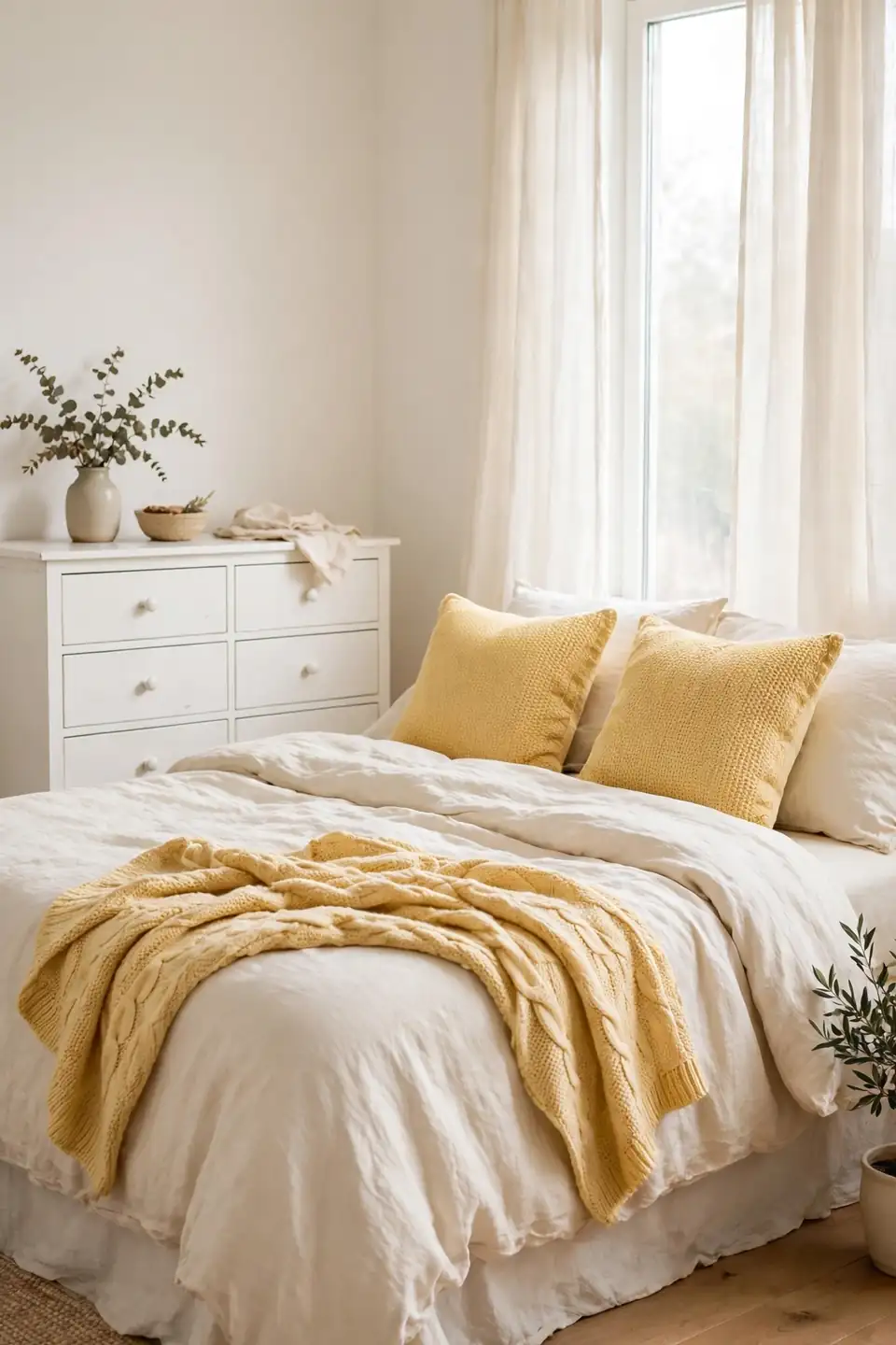
- Warm white walls keep butter yellow from sliding into neon.
- Cream bedding tones the color down at sleeping height.
- White painted furniture lightens the lower half of the room.
- Ivory curtains diffuse daylight into a soft, even glow.
- A white ceiling lifts the whole palette like a reflector.
Yellow needs a quiet partner, and warm white is the one that never competes for attention. Split the room roughly seventy thirty, white in the lead, and the yellow moments land like patches of sunshine rather than a theme park. Cool blue whites fight this palette at every hour, so always test white paint beside the yellow swatch before buying either one.
Warm Brass Table Lamps
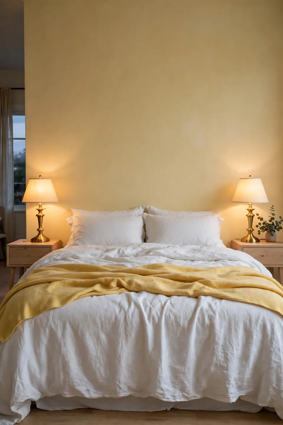
Quick Tip: Fit warm white bulbs, around 2700K, in brass bedside lamps. Cool daylight bulbs turn butter yellow walls greenish after dark, while warm bulbs deepen the color into a soft evening gold that flatters every fabric in the room.
Brass repeats the warm note of the walls in metal form, tying paint to hardware and picture frames. Keep the two bedside lamps matched for calm, and let a third brass touch, a tray or a mirror frame, finish the triangle. Patina is welcome here; polished shine can look new against soft color. Unlacquered brass deepens slowly and suits the palette better with every year.
Upholstered Yellow Headboard
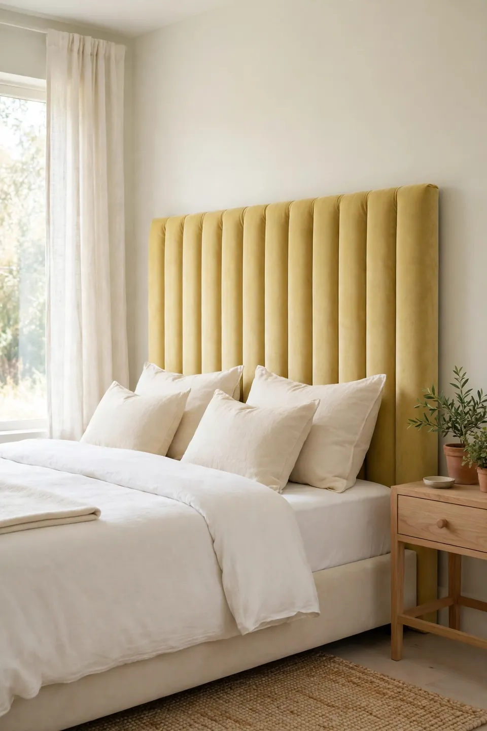
BEFORE: The bed floated against a bare wall with a plain white frame, neat but unfinished, like a sentence missing its last word. Pillows slumped with nothing tall to lean against, and the wall showed every scuff.
AFTER: A channel tufted headboard in butter yellow velvet now rises behind the pillows, soft and generous. The bed reads as a finished piece of furniture, and the whole wall has a reason to exist.
Upholstery carries color in a way paint cannot: it catches light differently at every hour. Velvet deepens the shade, linen keeps it breezy, and both pair with white bedding without a fight. Choose a height that clears stacked pillows by a hand’s width, no more.
Styled Open Shelves

- Clear the shelves fully and dust every surface first.
- Place the largest pieces, baskets and stacked books, at the ends.
- Add one yellow object per shelf: a vase, a bowl, or a framed print.
- Fill gaps with cream ceramics and one trailing green plant.
- Step back and remove one item from every shelf.
Open shelves show the palette in miniature, so they reward restraint more than abundance. Group objects in threes, vary the heights, and leave real breathing room between the groups. I’ve noticed shelves styled this way survive daily use far better, because every single object has a home to return to.
Linen Versus Cotton Bedding
| Feature | Linen | Cotton |
|---|---|---|
| Feel | Softens with every wash | Crisp from day one |
| Warmth | Breathes on warm nights | Cozy in cool rooms |
| Look | Relaxed, gentle rumples | Smooth, hotel neat |
| Care | No ironing needed | Presses for a sharp finish |
| Cost | Higher, lasts for years | Lower, easy to replace |
Neither fabric wins outright; they simply suit different sleepers. Linen breathes through warm nights and softens with every wash, while cotton percale feels crisp and hotel neat from the very first night. Many yellow rooms mix the two, a linen duvet over cotton sheets, and get both tempers on one bed. Both fabrics take pale yellow dye gently and evenly, which keeps the color soft.
Woven Basket Texture

Do:
- Use baskets for throws, books, and bedside clutter alike.
- Choose natural seagrass tones that echo the yellow palette.
- Place one large basket where the eye lands first.
- Line laundry baskets so fabrics never snag on weave.
Don’t:
- Scatter six small baskets where one large one works.
- Buy dyed baskets in colors that fight the walls.
- Store damp towels in woven baskets overnight.
- Stack baskets so high they shadow the bed.
Baskets are the hardest working texture in a soft colored room: they store, they soften hard furniture lines, and their honey tones sit naturally beside butter yellow. Woven texture also photographs beautifully in morning light, which matters for a room built around glow.
Window Seat Morning Light

Cost: $80 to $250 for cushion and pillows | Time: One weekend | Skill Level: Beginner to intermediate | Best For: A wide, sunny window
A window seat turns the sunniest square meter of the room into its favorite seat. Build the bench low enough for feet to rest flat, top it with a cream cushion, and stack butter yellow pillows against the glass side. Morning coffee lands here, books land here, and the cat, if there is one, will claim it by the second day. Keep the seat shallow so it never swallows the room, and choose washable covers, since sunlight fades fabric and breakfast spills happen exactly where the light is best.
Pale Yellow Ceiling
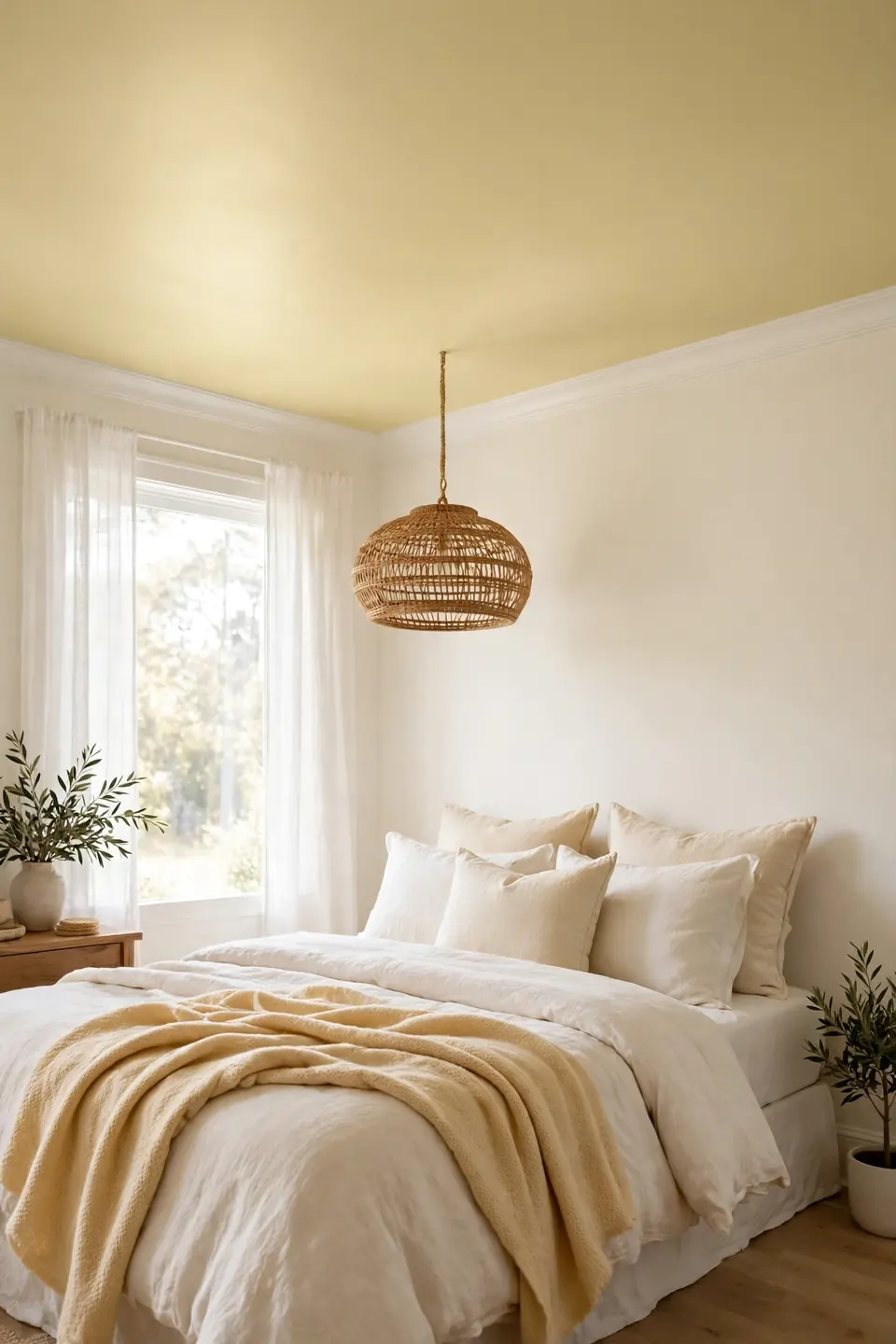
Painting the ceiling pale yellow sounds bold, but at half strength it simply removes the cold white lid from the room. Sunlight bouncing off warm walls meets a warm ceiling, and the whole box of the room holds one gentle tone from floor to crown.
Keep the ceiling two shades lighter than any yellow below it, so the effect reads as glow rather than enclosure. Flat paint is the right finish up there, hiding seams and softening light. Test the color on the ceiling itself, since overhead light changes everything. I’ve seen this work well in north facing rooms, where every degree of warmth counts double.
Pattern Mixing Made Simple
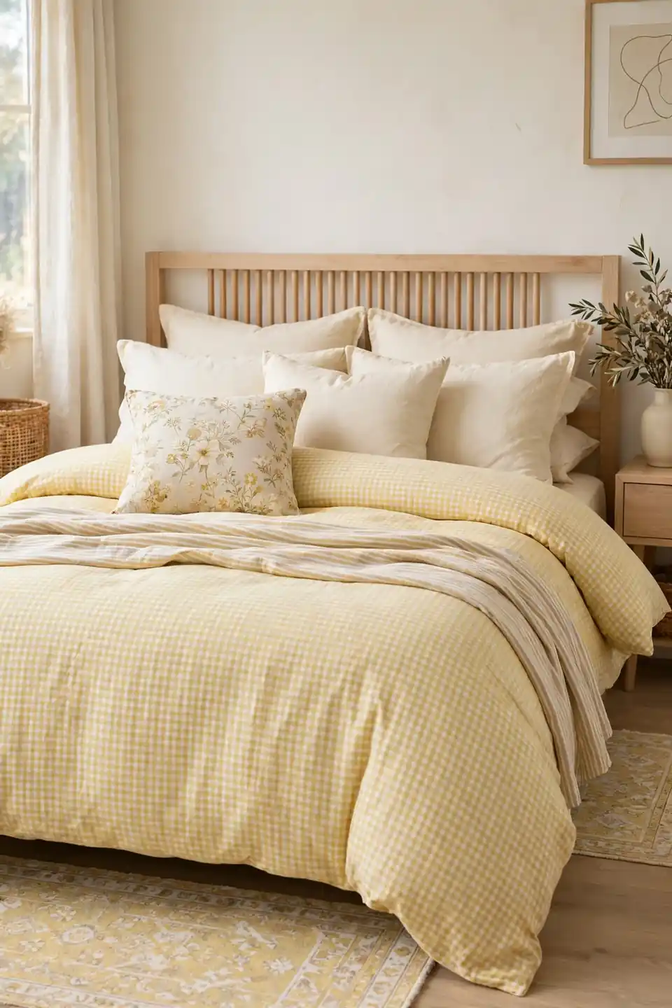
- Let gingham lead on the bedding, the largest pattern field.
- Add one floral cushion as the second pattern voice in the room.
- Keep stripes thin and quiet on a single folded throw.
- Repeat each pattern once more, smaller, somewhere across the room.
- Hold every pattern inside the same yellow and cream family.
Patterns clash when they fight over scale or color, almost never when they share one palette. One large, one medium, one small is the whole formula, and these soft colors forgive nearly any combination built on it. When a mix feels wrong, remove the medium pattern first and judge again.
Vintage Quilt Layering
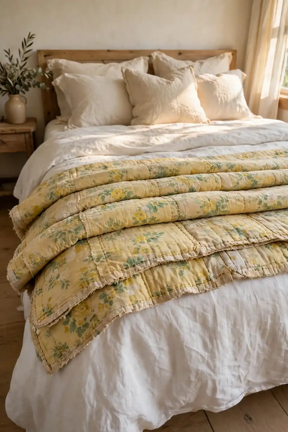
Quick Tip: Fold a vintage yellow quilt into thirds and lay it across the foot of the bed, pattern side up. The folded band shows the print, the stitching, and the soft worn edge all at once, like a story told in one strip.
Old quilts bring history that new bedding cannot fake, and their faded yellows sit perfectly inside this palette. Check stitching before buying, and mend loose seams before the first wash. Fold it away in summer if the room runs warm. In my experience, one genuine vintage piece anchors a room of new things and keeps it from feeling like a showroom.
Two Tone Wall Panels
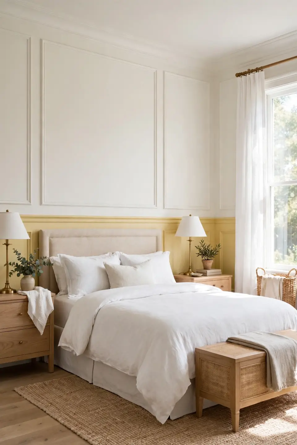
BEFORE: The walls were one flat cream from skirting to ceiling, pleasant and forgettable. The bed sat against them without a backdrop, and the room’s lower half felt heavier than its top.
AFTER: Panel molding now divides each wall, butter yellow below the rail and warm white above it. The bed gained a tailored backdrop, and the room reads taller because the eye travels up the white.
Two tone walls reward the same color confidence behind moody half bathroom ideas, where a single bold choice carries a small room. Keep the darker or warmer tone below the rail, where furniture hides its scuffs, and let the upper wall stay light enough to bounce daylight around the bed.
Sunny Little Vanity Corner

- Choose a small desk or table that fits the corner without crowding.
- Hang a round mirror where it catches morning light sideways.
- Add a butter yellow stool or a cushion in the same tone.
- Line up bottles and brushes in one cream ceramic tray.
- Finish with a small vase of fresh or dried flowers.
A vanity corner gives the bedroom a second job beyond sleeping, and it uses the sunniest spot twice. The mirror doubles morning light onto the bed, while the yellow stool carries the palette into a corner paint never reached. Keep the surface ruthlessly tidy; five objects is plenty.
Butter Versus Ochre Paint
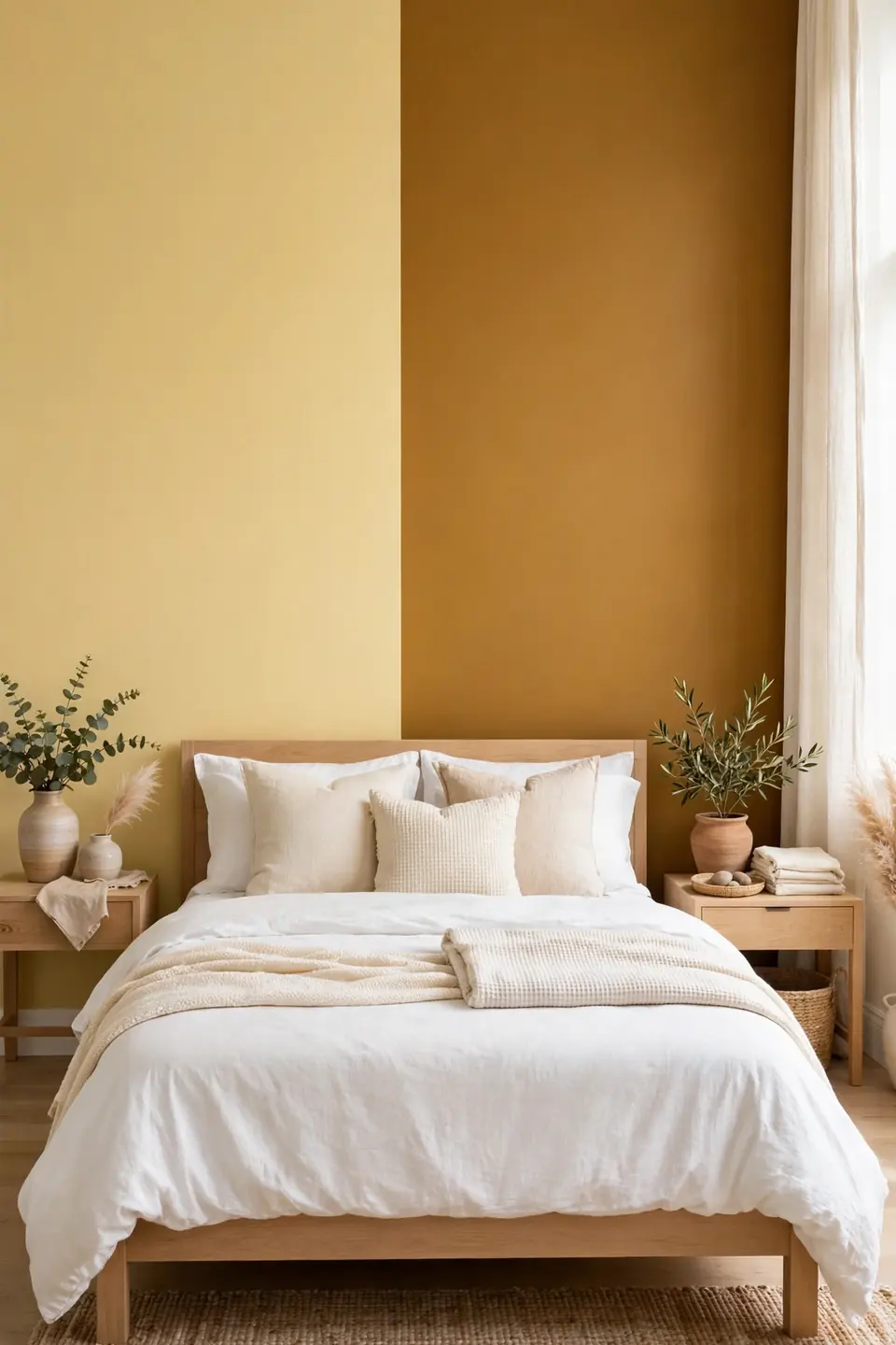
| Feature | Butter Yellow | Warm Ochre |
|---|---|---|
| Undertone | Creamy, soft gold base | Earthy, brown based depth |
| Mood | Morning fresh and gentle | Evening rich and moody |
| Light behavior | Glows in soft daylight | Deepens after sunset |
| Pairing | White, cream, pale wood | Walnut, black, deep green |
| Best use | Full walls and bedding | One accent piece only |
Butter and ochre sit on the same branch of the family tree, but they raise different rooms. Butter stays soft and morning fresh, while ochre turns earthy and evening rich. Choose butter for the full scheme in this article, and save ochre for one deep accent, a door or a dresser.
Conclusion
Yellow asks for very little: a soft shade, a calm partner, and a few natural textures to lean on. Start with one wall or one quilt, live with the glow for a week, and then decide how much further to take it. A butter yellow bedroom built this way stays cheerful without ever shouting, sunny in January as surely as in June. Save this pin for your next bedroom refresh, try the smallest idea first, and share the result with a friend whose room needs morning light. I’ve seen how small changes like these can shift the whole feeling of a home.