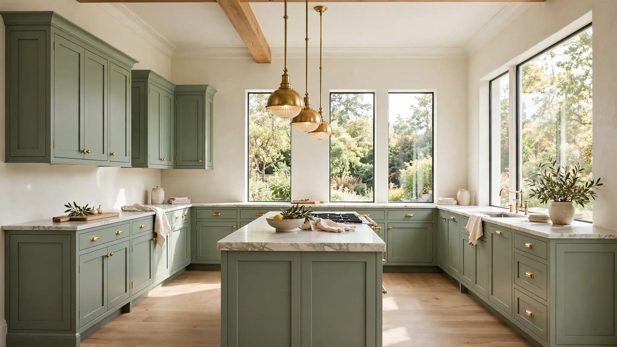
21 Sage Green and Cream Kitchen Ideas for Timeless Warmth
Some kitchens feel warm the second you walk in, and sage green paired with cream is usually why. These sage green and cream kitchen ideas bring that soft, lived-in calm without feeling dull or dated. I have seen this exact pairing rescue cold, stark kitchens more than once. The green grounds the space while cream keeps it light and airy. For a bolder take on color-drenched cabinetry, these aubergine kitchen cabinet ideas show the dramatic end of the spectrum.
Below you will find 21 ways to work the palette, from full cabinet repaints to small styling swaps that cost almost nothing. Each idea includes the exact shades, finishes, and pairings that make sage and cream sing together. Pin your favorites as you scroll, then start with the change that makes you smile. Your kitchen should feel like a deep breath, and this palette delivers exactly that.
Soft Sage Cabinets
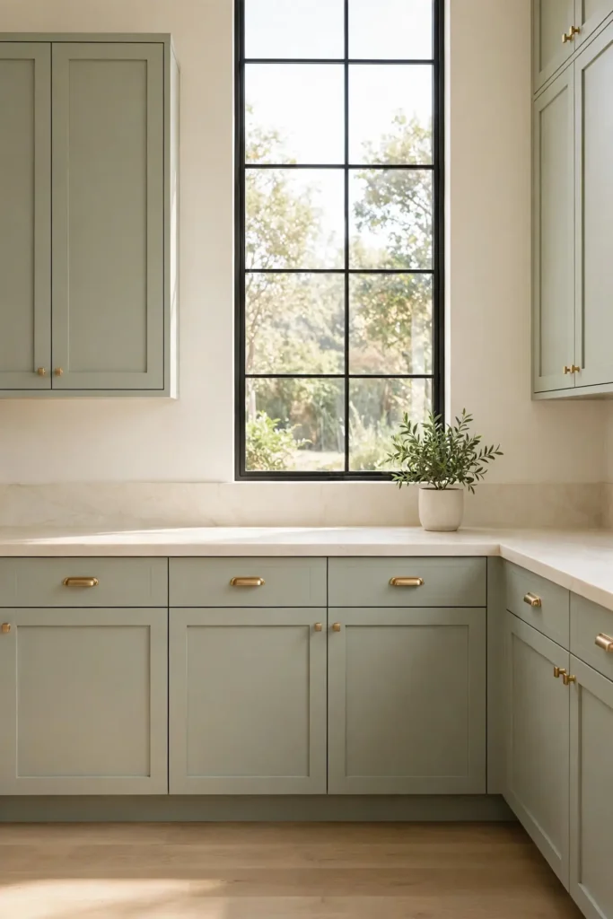
Painting your cabinets sage green is the single biggest move you can make with this palette. The color reads calm and collected, never loud, and it pairs beautifully with cream walls. I have noticed that a muted sage with gray undertones looks expensive and hides daily wear well. Choose a satin or eggshell finish for wipeability. Paint the uppers and lowers the same shade for a cohesive, enveloping feel.
Keep the hardware simple; brushed brass or matte black both sing against sage. If a full repaint feels like too much, start with just the island or lower cabinets. That two-tone approach gives the look with half the commitment. Cream walls and ceiling keep the green from feeling heavy. The result feels both fresh and familiar.
Cream Upper Shelves
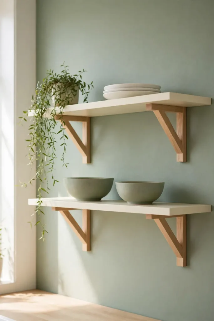
- Swap heavy upper cabinets for cream open shelves to lighten the whole room instantly.
- Style them with white dishes, small plants, and one or two sage accents for cohesion.
- Keep everyday items within easy reach and decorative pieces up high.
- Dust shelves weekly, since open storage shows everything.
- Repeat the sage green in small doses so the shelves tie into the rest of the room.
Open shelving in cream keeps the kitchen airy while giving sage walls room to breathe. The trick is restraint: leave breathing room between objects and repeat the green in small doses. A stack of sage bowls or a trailing plant ties the shelves to the rest of the room. Start with one wall before committing further.
Two-Tone Island Charm
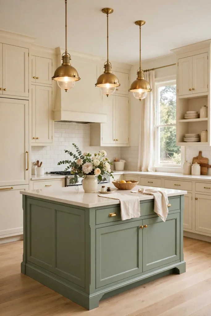
Quick Tip: Paint the island sage and leave the perimeter cabinets cream. The island becomes the star without overwhelming the room. Pick an island shade two tones deeper than the wall color for depth. Add a cream countertop to bridge the two tones cleanly.
Two-tone kitchens feel custom and considered, and this is the easiest way to get the look. The cream perimeter keeps things bright while the sage island anchors the space with color. I have seen this work well in many cases, especially in open-plan kitchens where the island faces the living area. Finish with pendant lights in brass or black to frame the island beautifully.
Sage Tile Backsplash
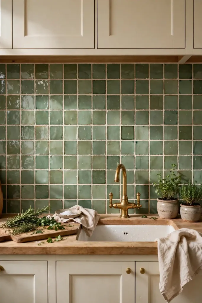
BEFORE: The kitchen had plain white subway tile that felt cold and clinical against the cream cabinets. Nothing tied the sage island to the rest of the room, and the space lacked personality.
AFTER: Handmade-look sage tiles with visible variation brought warmth and craft. The slight color shifts catch the light differently through the day, and the island finally feels connected to the walls.
A sage backsplash is commitment without the full cabinet repaint. Zellige-look or handmade ceramic tiles add texture that flat paint cannot match. Keep grout lines tight and choose a warm white grout to blend with cream cabinets. In my experience, the backsplash is where handmade texture pays off most in any kitchen.
Warm Brass Hardware
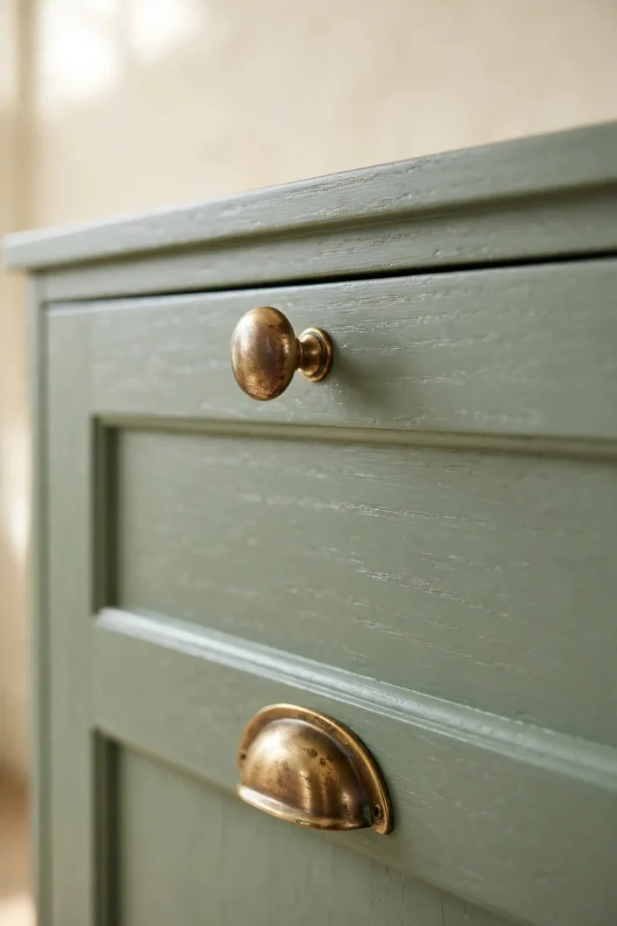
- Choose unlacquered brass knobs and pulls; they develop a rich patina over time.
- Match the finish across faucets, lighting, and cabinet hardware for cohesion.
- Install pulls on drawers and knobs on doors, the classic combination.
- Wipe brass monthly with a soft cloth to control the patina.
Brass is the warm metal that makes sage green glow. Against cream cabinets, it reads elegant rather than flashy. I always suggest unlacquered brass for a lived-in feel; it ages beautifully and hides fingerprints well. If brass feels too warm, brushed nickel is a cooler alternative. But for timeless warmth, brass wins every single time.
Calm sage green and cream kitchen ideas
| Choice | Best for | Vibe |
|---|---|---|
| Full sage cabinets | Bold color lovers | Enveloping, dramatic |
| Sage island only | Cautious first-timers | Balanced, safe |
| Sage accents, cream base | Renters, small budgets | Fresh, flexible |
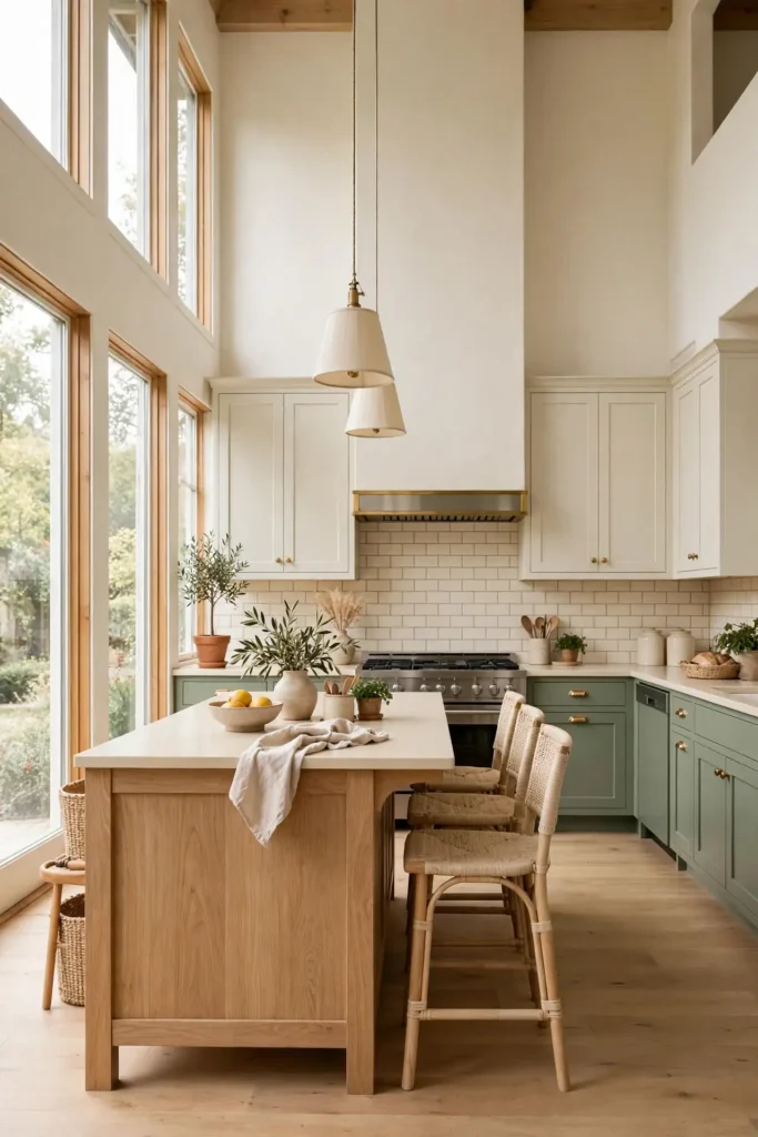
Deciding how much sage to use comes down to your comfort with color. Full sage cabinets make the strongest statement and suit larger kitchens with good light. The island-only route gives you the look with less risk. Accents alone work for renters or anyone testing the waters. I have noticed that lighting changes everything; a north-facing kitchen can take more sage than you think. Sample your shade on a large board and move it around the room through the day.
Cream Linen Curtains
DO:
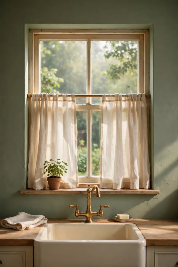
- Hang cream linen cafe curtains for soft, filtered light.
- Choose a natural flax tone that echoes the cream cabinets.
- Keep curtains above the sill in a working kitchen.
DON’T:
- Don’t use heavy drapes that trap cooking smells.
- Don’t pick stark white; it clashes with warm cream.
- Don’t let fabric hang near the stovetop or oven.
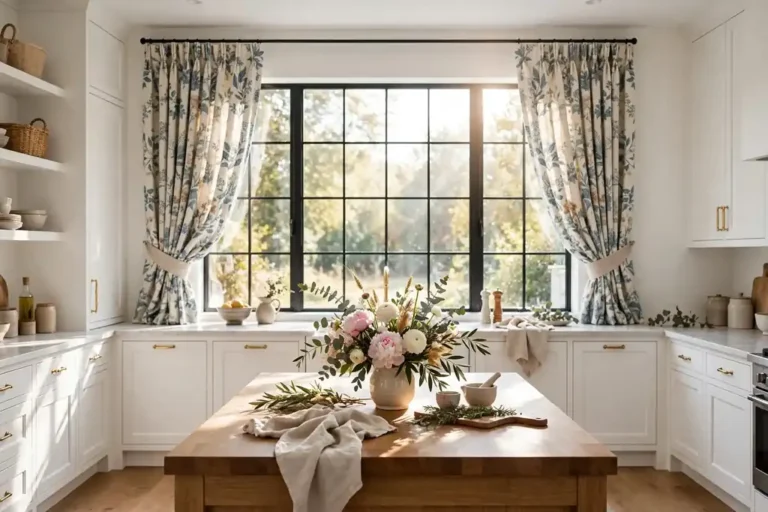
Linen curtains soften the hard surfaces every kitchen has. Cream linen glows in morning light and adds the textile warmth that cabinets and tile cannot provide. I have noticed that cafe-length curtains feel charming without getting in the way of cooking. Wash them seasonally to keep the cream fresh and bright.
Sage Open Shelving
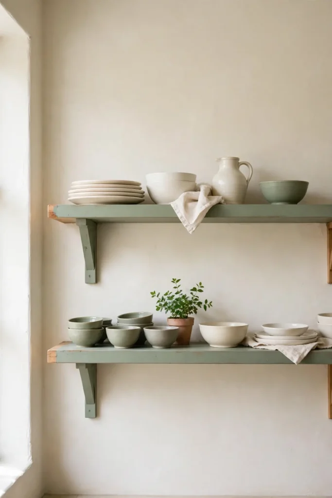
Cost: Low | Time: One weekend | Skill Level: Beginner | Best For: Displaying pretty dishes
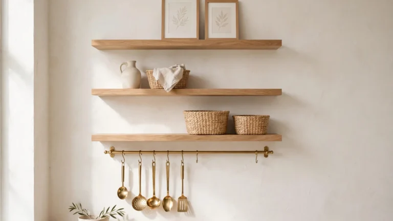
A run of sage-painted open shelves adds color exactly where your eyes land. Paint simple wood brackets and boards in your sage shade, then style with cream and white dishes. The green frames your prettiest pieces like art. Mount shelves at eye level for maximum impact, spacing them 15 to 18 inches apart. This leaves room for stacked bowls below and small art above. In my experience, one styled shelf beats three cluttered ones every time. Keep it edited, dust it weekly, and let the color do the talking.
Marble Cream Counters
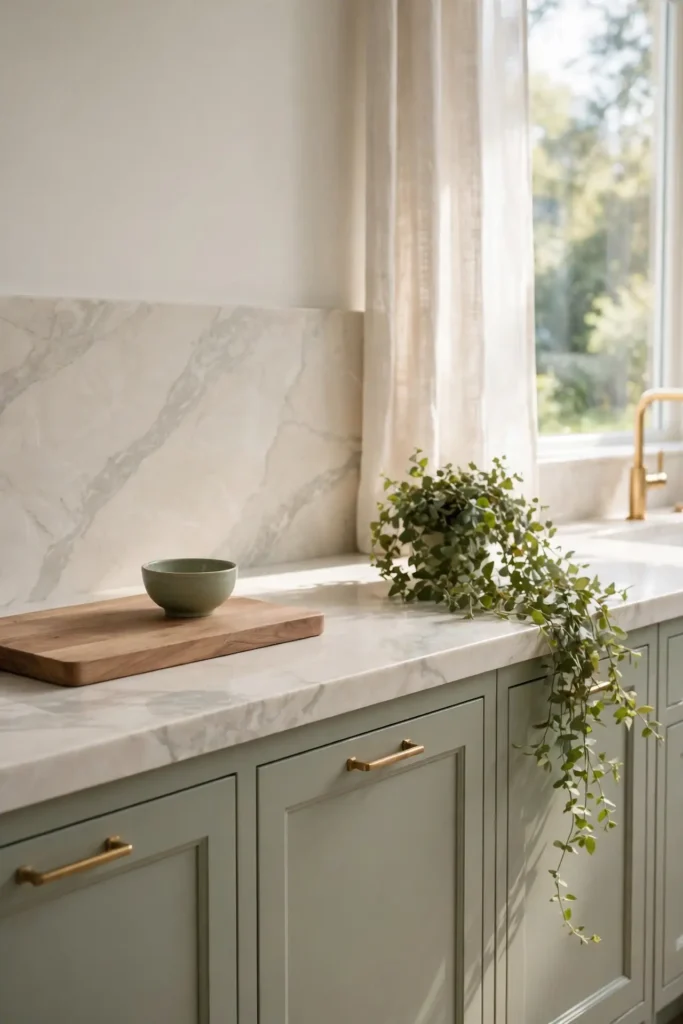
Cream marble or quartzite counters are the luxurious backbone of this palette. The soft veining picks up both the sage and the cream, tying everything together. I have seen Carrara-look quartz work beautifully for busy families who want the look without the maintenance. Choose a honed finish for a softer, less reflective surface.
Keep counters mostly clear to let the stone shine. A wooden cutting board, a small sage bowl, and a trailing plant are all the styling you need. The cream stone brightens the sage cabinets around it. It is an investment, but it sets the tone for the whole kitchen. Timeless warmth starts right at the countertop.
Vintage Cream Details
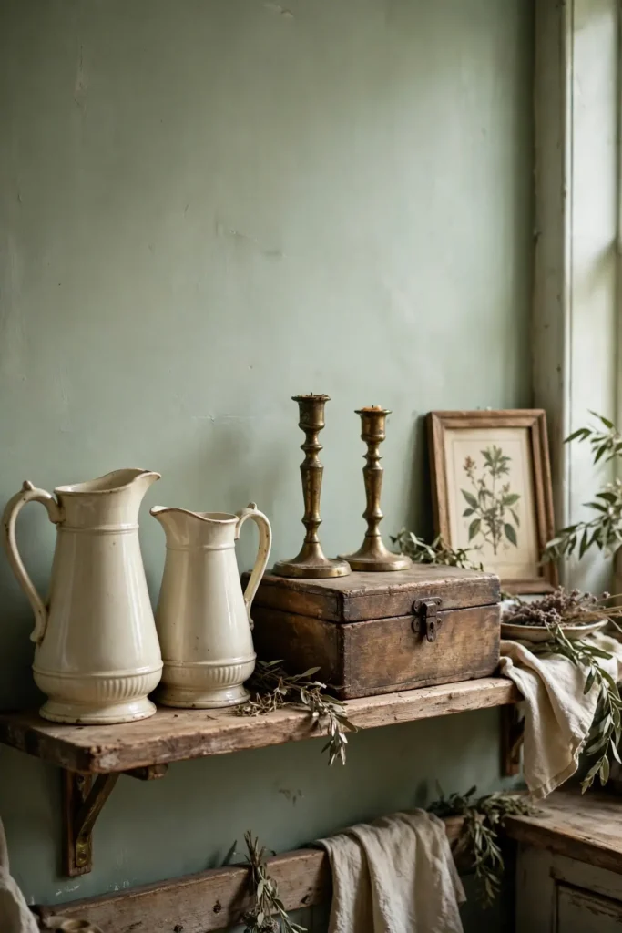
- Hunt flea markets for cream ironstone pitchers and platters.
- Display a collection of vintage cream canisters on open shelves.
- Add a retro-style cream toaster or kettle for charm.
- Frame old botanical prints in thin brass frames.
- Use a vintage runner rug in muted sage and cream tones.
Vintage cream pieces add the soul that new kitchens often lack. Ironstone, aged brass, and worn wood all sit beautifully against sage green. I always suggest starting with one vintage find and building slowly over time. The hunt is half the fun. These collected details make the kitchen feel storied rather than staged.
Soft sage green and cream kitchen ideas
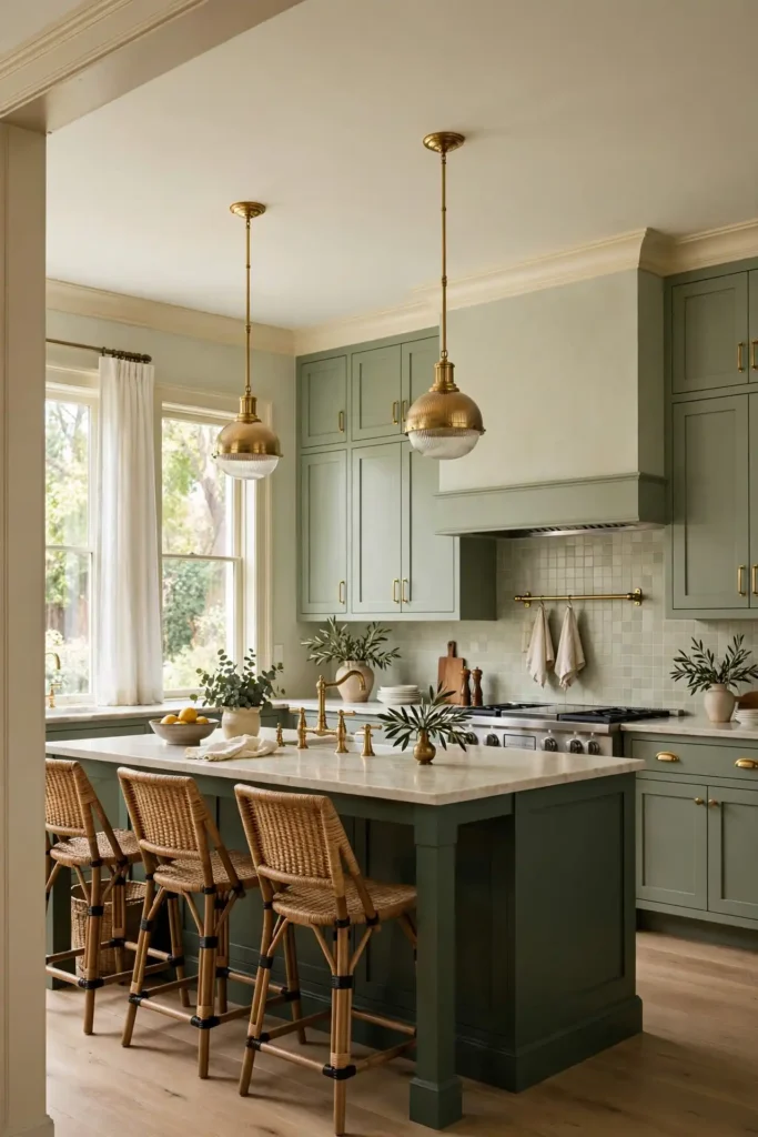
Quick Tip: Layer three shades of sage, from pale to deep, for a designer look. Use the palest on walls, mid-tone on cabinets, and the deepest on the island or shelves. This tonal layering adds depth without introducing new colors. Keep cream constant throughout to unify the layers.
Tonal layering is the secret behind kitchens that look professionally designed. When sage appears in several depths, the eye moves around the room instead of landing flat. Cream acts as the visual rest between green moments. I have noticed this trick works in any size kitchen. It is the easiest way to look like you hired a designer.
Sage Range Hood
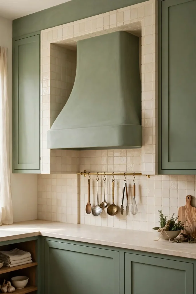
BEFORE: The stainless range hood stuck out against the soft sage cabinetry. It felt industrial in a kitchen aiming for warmth, breaking the calm line of the wall.
AFTER: A plaster hood painted sage blends into the cabinetry line. The kitchen reads as one calm composition, and the hood becomes architecture instead of appliance.
The range hood is often the visual center of a kitchen wall, so it deserves the sage treatment. A custom-look hood in cabinet paint makes the whole wall feel built-in and intentional. If a full replacement is too much, a sage panel over the existing hood works. Either way, cohesion is the goal here.
Cream Pantry Doors
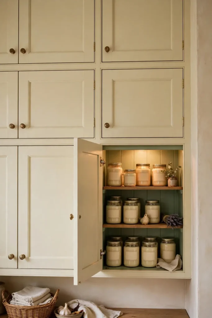
- Paint pantry or larder doors cream to keep the storage wall light.
- Add sage interior paint for a surprise pop when doors open.
- Fit simple shaker fronts for a timeless look.
- Label jars in cream and kraft for a cohesive pantry.
The pantry wall is a big surface, and cream keeps it from weighing down the room. Painting the interior sage is the kind of delightful detail guests remember. I have seen this work well in many cases; it makes everyday storage feel special. Choose a wipeable satin finish inside since pantries take a beating. The sage interior also makes it easier to find things against the darker background.
Natural Wood Accents
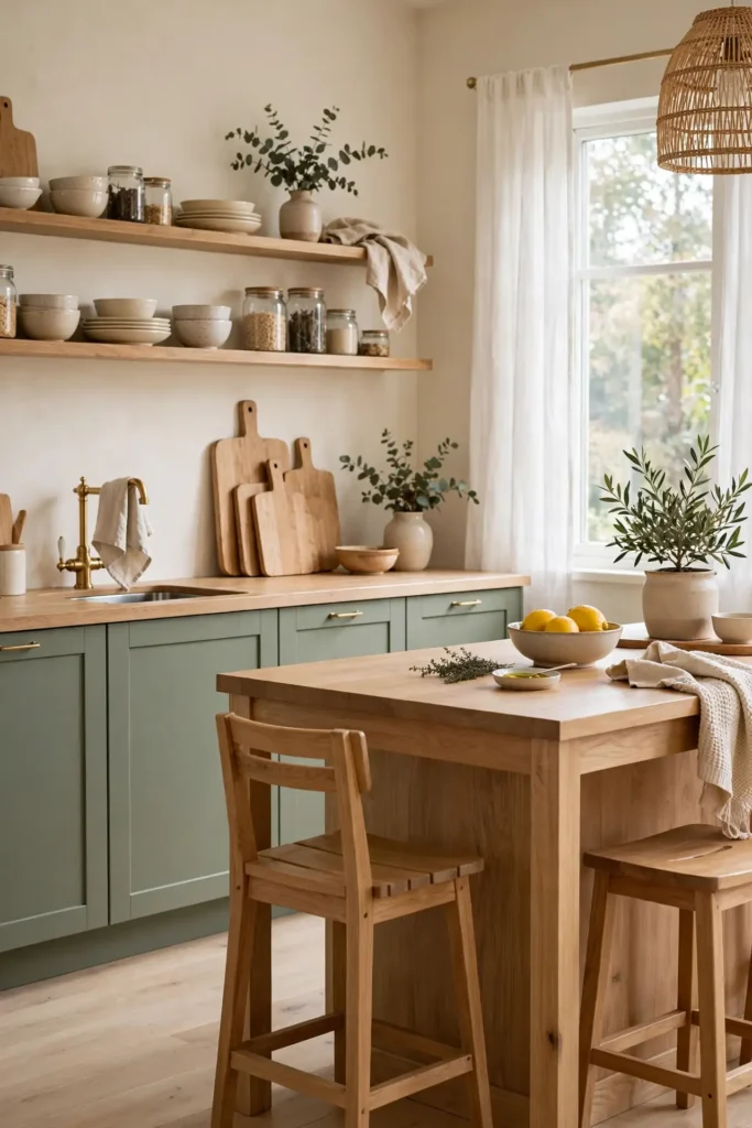
| Wood tone | Pairs with | Mood |
|---|---|---|
| Light oak | Sage and cream | Airy, Scandinavian |
| Warm walnut | Deep sage | Rich, moody |
| Reclaimed pine | Cream-dominant | Rustic, cozy |
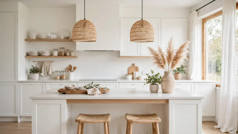
Wood is the third player that keeps sage and cream from feeling flat. Light oak cutting boards and stools add airiness, while walnut brings richness. For more ways to mix wood tones with painted cabinetry, these natural wood kitchen cabinet ideas are full of inspiration. I always suggest starting with the cutting board you use daily, then echoing that tone in stools or open shelves. Repeating one wood three times creates rhythm without clutter. Mixed woods can work in skilled hands, but one consistent tone is the safer path to a calm, cohesive kitchen.
Sage Beadboard Walls
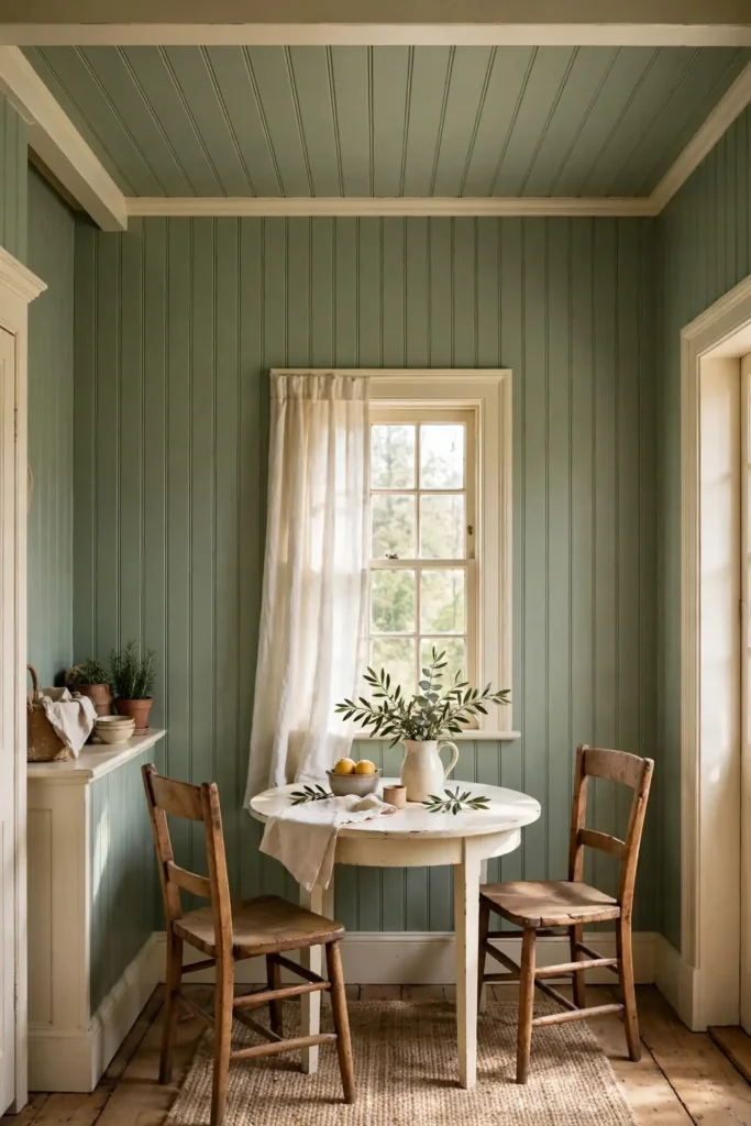
DO:
- Paint beadboard sage for cottage texture and color in one.
- Run it to the ceiling for a cozy, enveloping feel.
- Pair with cream trim for crisp contrast.
DON’T:
- Don’t beadboard every wall; one or two is plenty.
- Don’t skip primer; beadboard drinks paint.
- Don’t use high-gloss; satin looks softer.
Beadboard adds the architectural texture that makes sage feel at home. The vertical lines draw the eye up, making ceilings feel taller. Cream trim against sage beadboard is a classic cottage combination. I have noticed it works especially well in breakfast nooks and pantry walls. Caulk the seams before painting for a crisp finish, and use two coats of quality cabinet paint.
Bright sage green and cream kitchen ideas
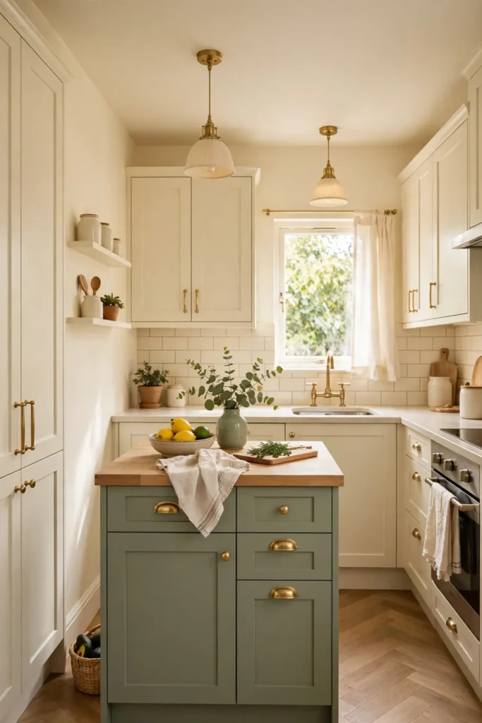
Cost: Medium | Time: A few days | Skill Level: Intermediate | Best For: Dark kitchens needing light
If your kitchen lacks natural light, lean cream-heavy with sage as the accent. Cream cabinets and walls bounce light around, while sage appears on the island, shelves, and textiles. This ratio keeps dark kitchens feeling bright and open. In my experience, the 70-30 split of cream to sage is the sweet spot for low-light rooms. Add under-cabinet lighting to bounce more brightness onto cream counters and multiply what little daylight you have. A large mirror or glass-front cabinets also help. Every reflective surface lets the cream do its brightening work, so the room never feels like a cave.
Cream Bar Stools
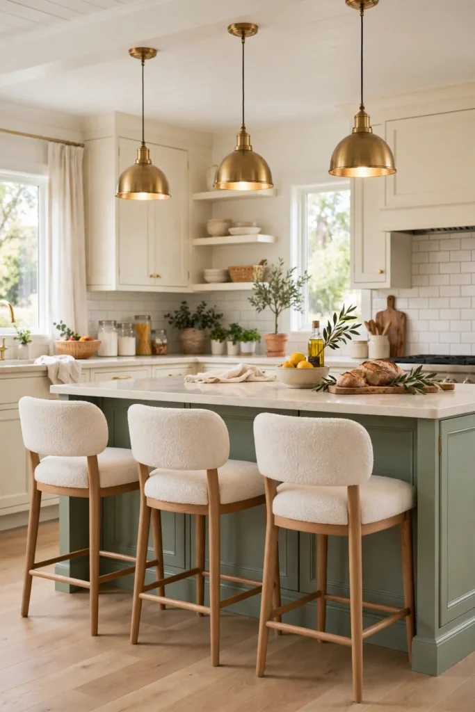
Cream upholstered bar stools soften the island and invite lingering. Boucle or linen upholstery in a warm cream adds the textile layer every hard-surfaced kitchen needs. I have seen wipeable performance fabrics handle real family life beautifully. Choose a backless or low-back style to keep sightlines open across the room.
Three stools are the classic number for a standard island; leave 24 inches per seat. The cream upholstery echoes the cabinets and keeps the palette calm. Add a sage cushion for a small color echo. Comfortable seating turns the island into the heart of the home. People gather where they can sit.
Sage Herb Corner
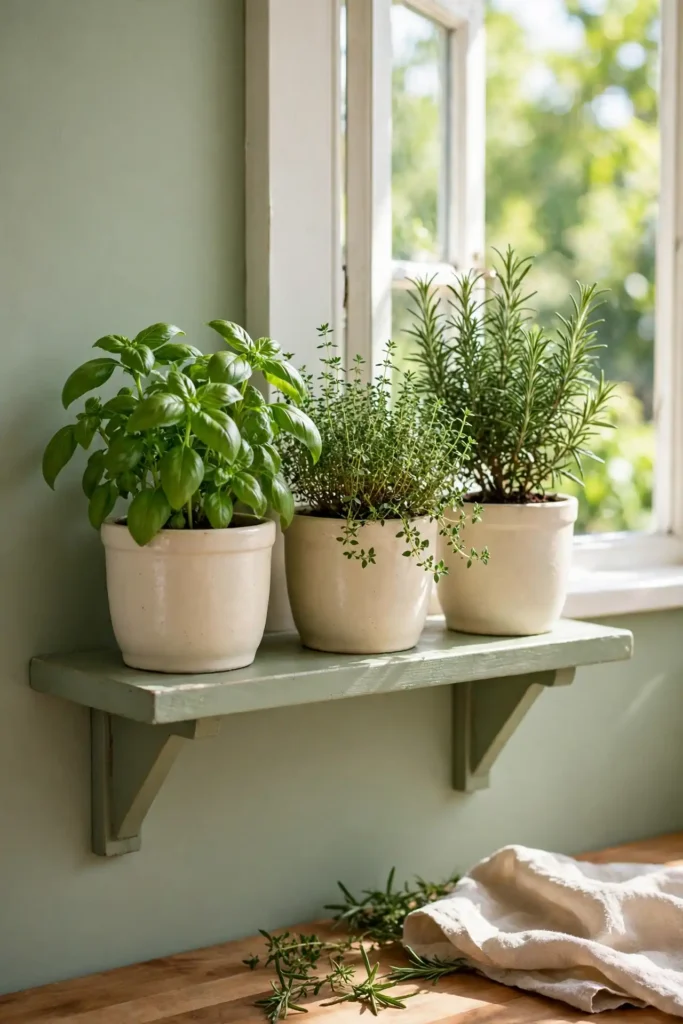
- Dedicate a sunny corner to potted herbs in cream planters.
- Grow basil, thyme, and rosemary for cooking and scent.
- Use a small sage-painted shelf to hold the pots.
- Water consistently; herbs hate drying out.
A living herb corner brings the sage palette to life, literally. Green plants against sage paint create a lush, layered effect that no decor can fake. Cream planters keep the look clean and cohesive. I always suggest starting with three easy herbs. Rotate the pots weekly so all sides get sun, and snip herbs often to encourage bushy growth. A small watering can in cream or brass keeps the corner pretty and practical. Few things beat snipping fresh basil steps from the stove.
Layered Cream Textiles
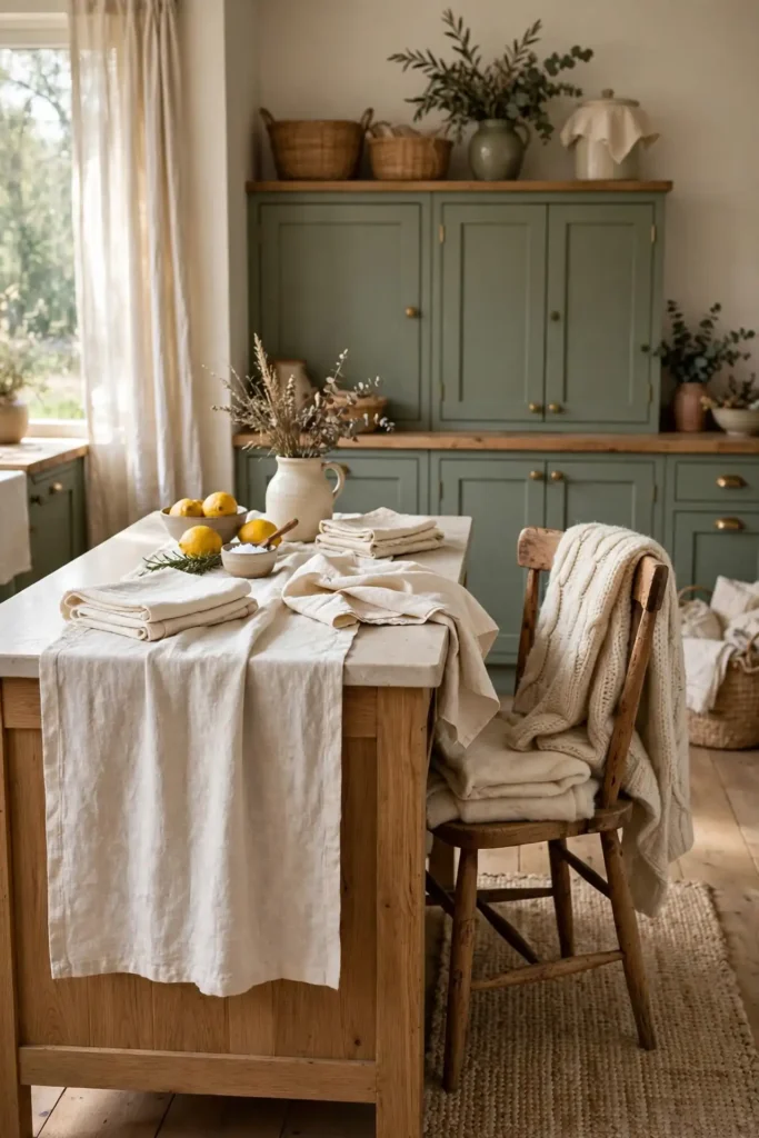
Quick Tip: Layer cream textiles in three textures: linen, cotton, and wool. A linen runner, cotton dish towels, and a wool throw over a chair add depth without new colors. Stick to warm cream tones so they harmonize. Texture is what keeps neutrals interesting.
Textiles are the unsung heroes of a sage and cream kitchen. They soften hard edges and add the cozy layer that makes a kitchen feel like home. I have noticed that mixing textures matters more than matching exact shades. Cream in several weaves looks collected and rich. It is the cheapest way to add warmth, and you can swap them seasonally for a fresh feel.
Sage Pendant Lights
BEFORE: Generic builder-grade pendants disappeared against the ceiling and added nothing to the design. The island felt unfinished despite the beautiful sage paint below.
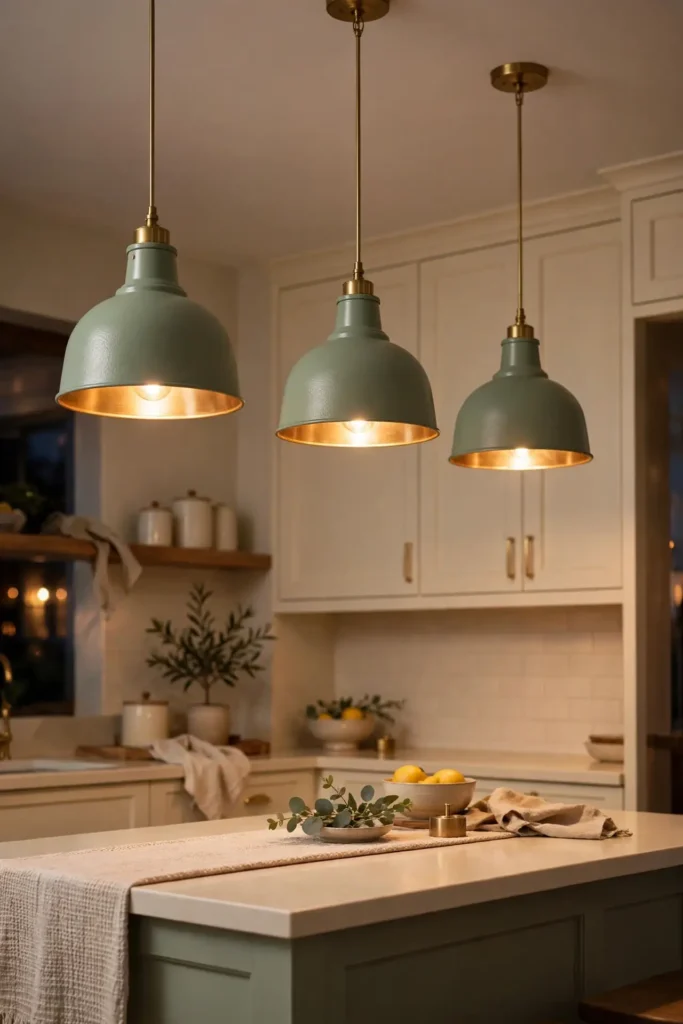
AFTER: Sage pendants with brass interiors cast a warm glow and complete the island vignette. The lighting becomes part of the palette instead of an afterthought.
Pendants are jewelry for the island, so let them join the color story. Sage metal shades or cream glass globes both work beautifully. Look for brass interiors that warm the light. Hang them 30 to 36 inches above the counter. Put them on a dimmer so you can shift from bright task light to a soft evening glow.
Timeless sage green and cream kitchen ideas
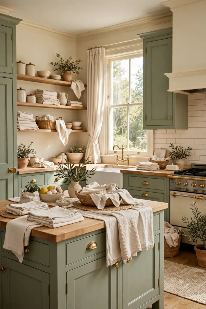
- Start with the biggest surface: cabinets or walls in sage.
- Add cream as the balancing neutral on remaining surfaces.
- Layer in wood, brass, and textiles for warmth.
- Edit ruthlessly; restraint keeps it timeless.
- Live with it a month, then adjust one thing.
Timeless kitchens are built in layers, not bought in a day. Start with the sage foundation, balance with cream, then add the warm details that make it yours. I have seen this work well in many cases; patience beats perfection every time. Photograph your kitchen before you start so you can see how far it comes. The palette is forgiving and flexible, so enjoy the process.
Conclusion
These sage green and cream kitchen ideas prove that calm color never goes out of style. Whether you repaint every cabinet or just add a linen curtain and a brass knob, the palette rewards every effort. I have seen how small changes like these can completely shift the way a space feels. Save your favorites on Pinterest, pick one idea to try this weekend, and watch your kitchen warm up. Timeless is not boring; it is the confidence to choose what you love. Start small, trust the palette, and enjoy a kitchen that finally feels like home.
2 Comments