21 Two Tone Kitchen Cabinet Color Combinations for a Fresh Look
A kitchen with a single cabinet color can feel flat, but two tone kitchen cabinet color combinations add instant depth and personality. I have watched this one choice change the whole mood of a room, from a plain white box to a space with real character. The trick is pairing colors that balance each other, so the room feels designed rather than random.
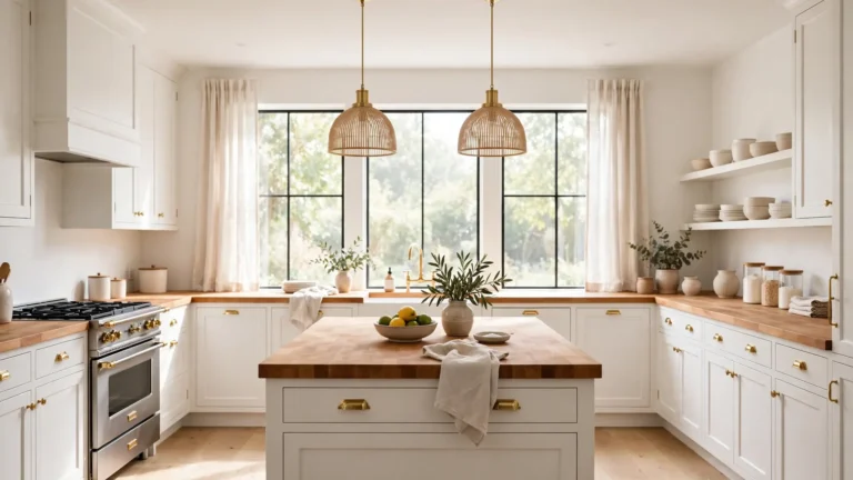
Below you will find 21 pairings that work in real homes, from bold navy and white to soft clay and cloud white. If you love the warmth of mixed materials, you may also enjoy these white kitchen cabinets with wood countertops for more inspiration. Each idea includes practical tips on where to place each color, what hardware to choose, and how to keep the look balanced.
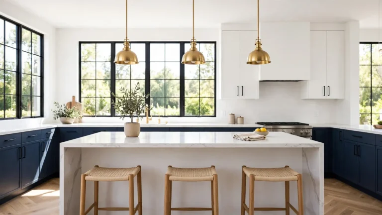
Navy and White two tone kitchen cabinet color combinations
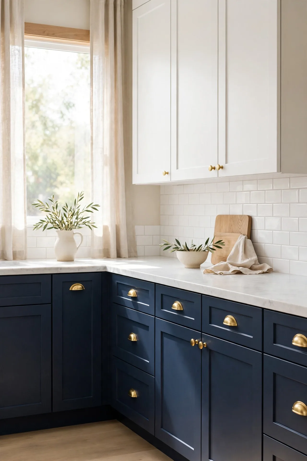
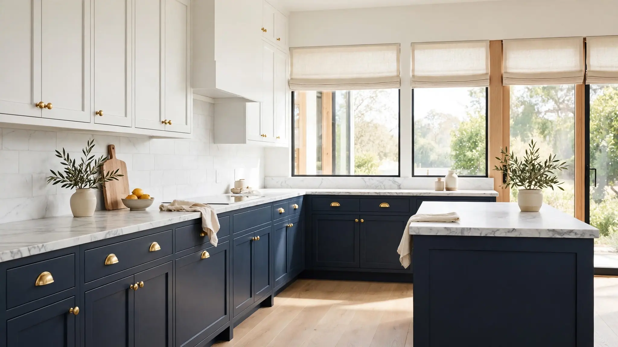
Navy lower cabinets grounded in crisp white uppers create a kitchen that feels both classic and current. The dark base hides everyday wear while the white above keeps the room feeling open and bright. I have seen this pairing work in small galley kitchens and large open plans alike.
Keep the balance by placing navy on the lower cabinets and white on the uppers. Brass or matte black hardware ties the two tones together beautifully. A light stone countertop bridges the contrast so the shift feels smooth rather than sharp, and pale walls keep everything airy, bright, and welcoming. You will never tire of this classic combination.
Sage Green and Warm Cream
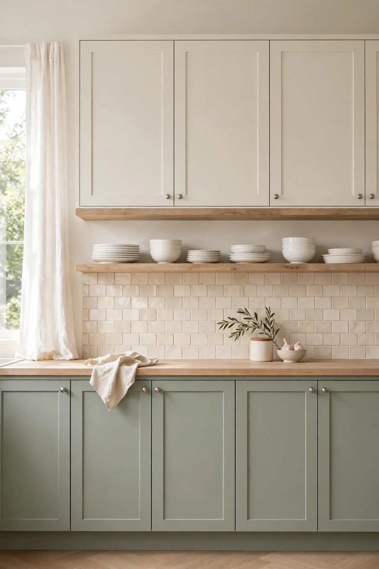
- Paint the island sage green and keep the perimeter cabinets warm cream for a soft, collected look.
- Choose brushed nickel hardware to keep the palette calm and cohesive from every angle.
- Add open wood shelves to warm up the green and display everyday dishes within easy reach.
- A creamy subway tile backsplash connects the two cabinet colors without adding visual noise.
- In my experience, sage green hides fingerprints better than darker greens, which helps in busy family kitchens.
This pairing suits kitchens with plenty of natural light, where the green reads fresh rather than dark. Keep counters light and let the cream cabinets bounce daylight around the room. The result feels calm and welcoming, a combination that ages gracefully in any home today.
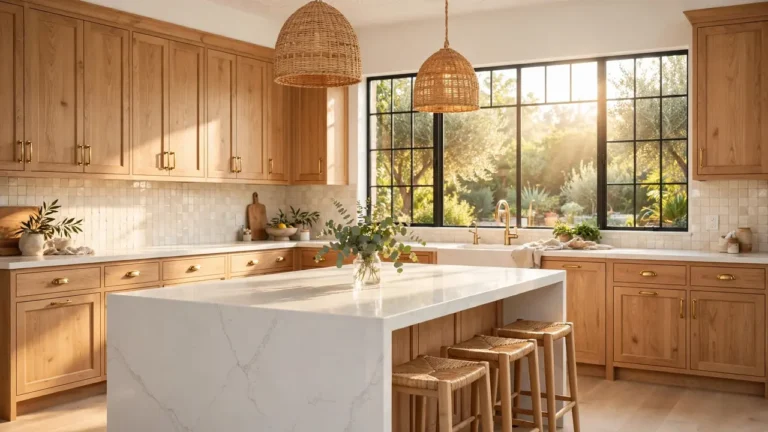
Charcoal and Light Oak
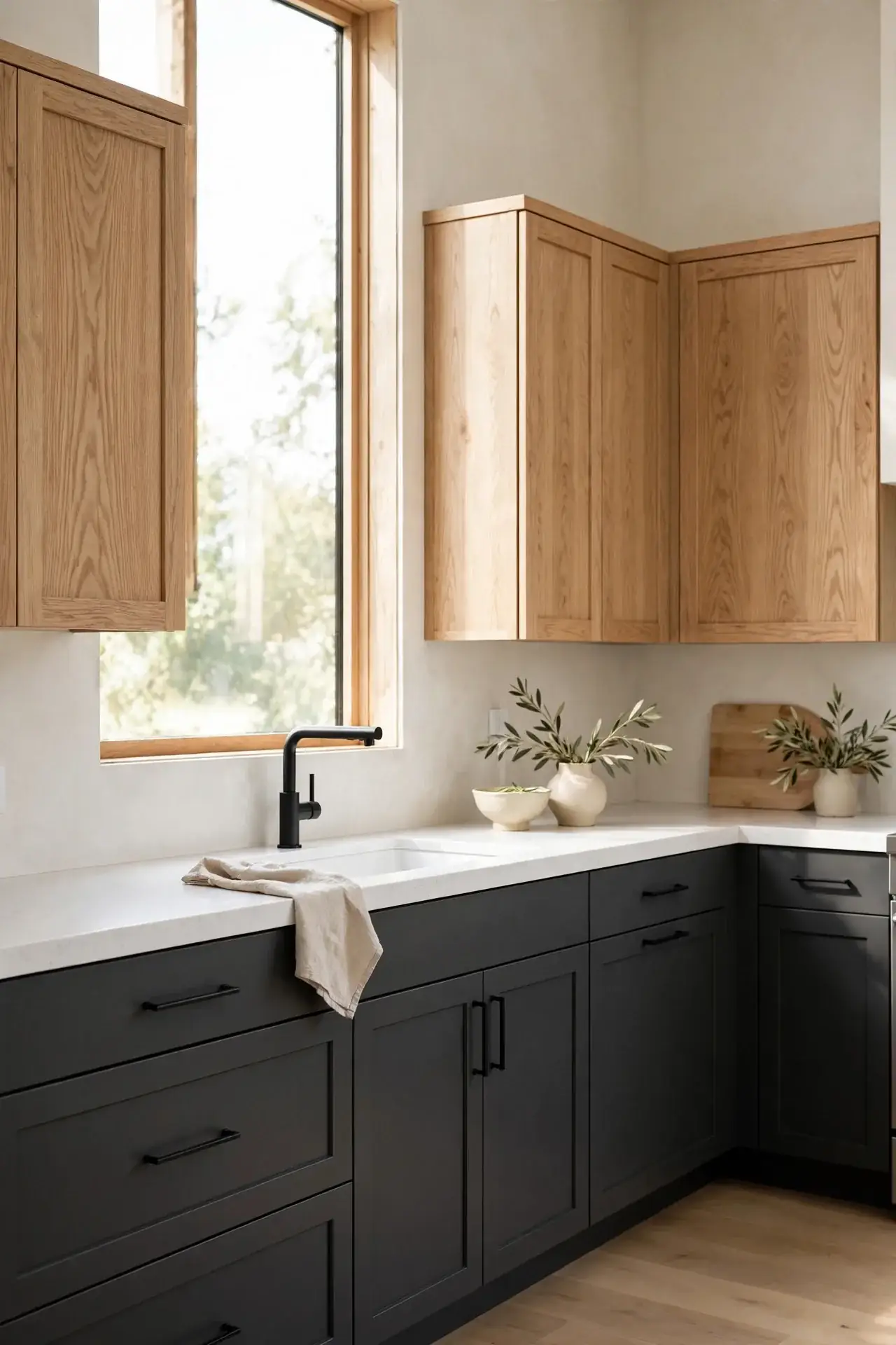
Quick Tip: Use charcoal on the island or lower cabinets only, and let light oak handle the uppers or a tall pantry wall. This keeps the dark tone from closing in the room while still giving you that moody, modern edge. If your kitchen gets limited daylight, keep the charcoal to one run of cabinets and let oak and pale walls do the heavy lifting for brightness.
Oak brings warmth that stops charcoal from feeling cold or heavy. I have seen this work well in many cases where homeowners want drama without darkness. Pair with black hardware for a clean look, or try leather pulls for a softer touch that echoes the wood grain beautifully.
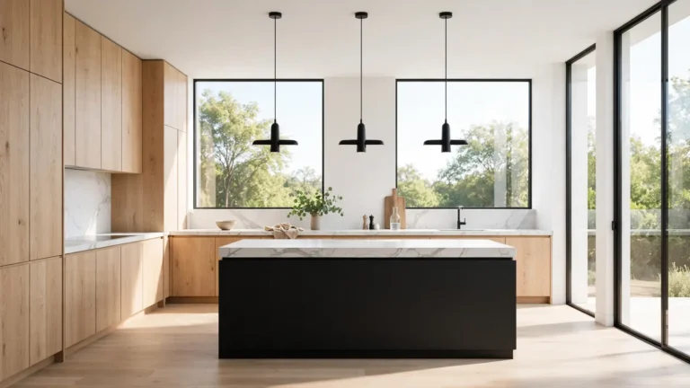
Matte Black and Natural Maple

BEFORE: The kitchen had builder-grade oak cabinets everywhere, and the space felt flat and dated. Nothing stood out, and the room lacked any sense of style or intention.
AFTER: Matte black lowers ground the room with drama while natural maple uppers add warmth and light. The contrast makes both materials look richer, and the kitchen finally feels designed.
This is a bold move, so commit fully to the contrast. Keep walls pale and floors light to balance the black base. I have tried this in a narrow kitchen and the maple uppers kept it from feeling closed in, while the black hid every scuff.
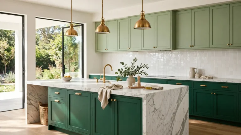
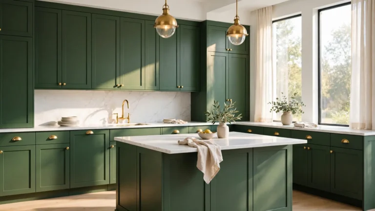
Forest Green and Soft White
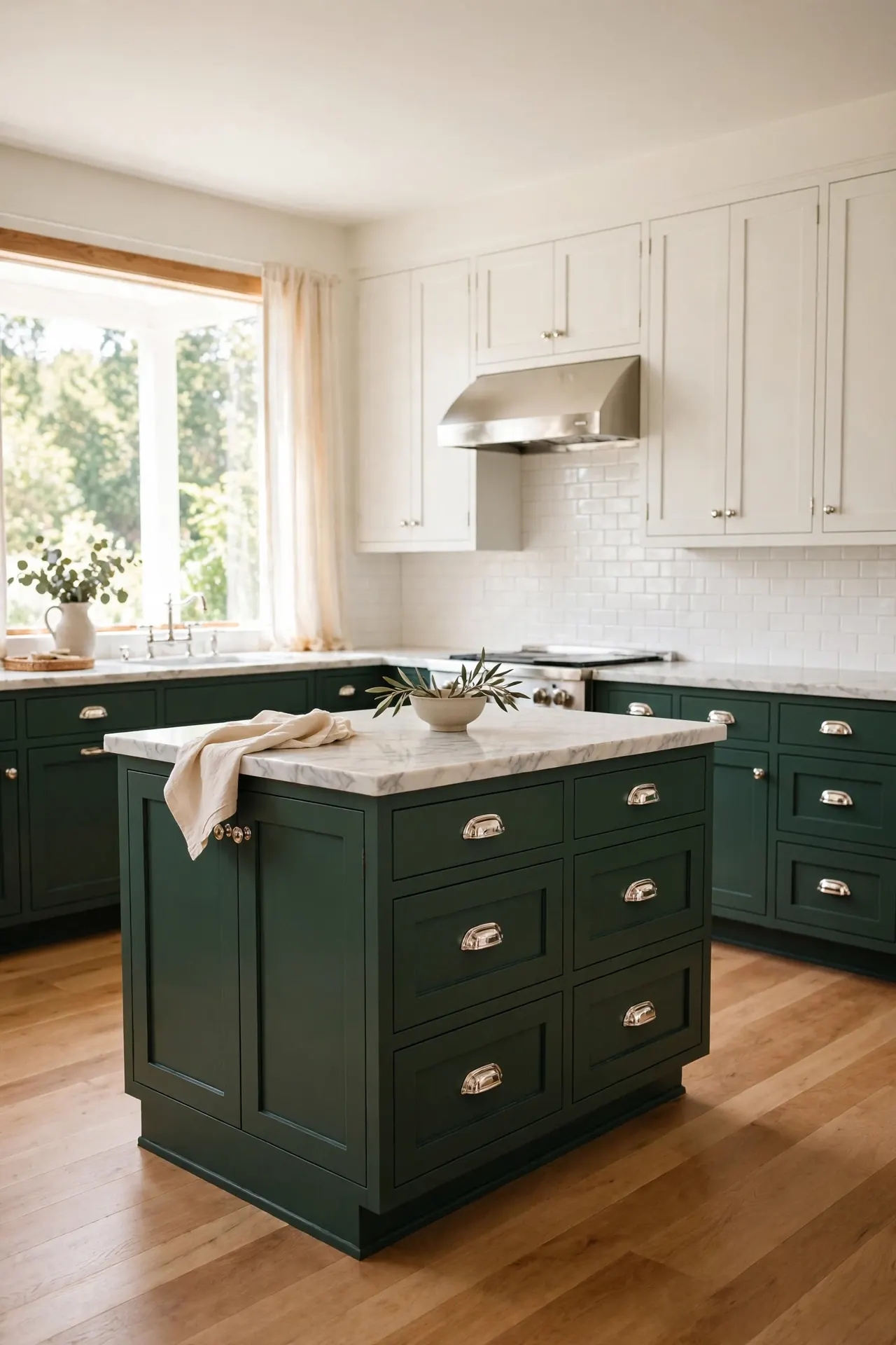
- Start with the island in forest green to anchor the room and test the color.
- Paint the remaining lower cabinets green once you love the island.
- Keep uppers soft white to reflect light and keep the ceiling feeling high.
- Choose polished nickel or brass hardware to bridge the green and white.
Forest green brings a library-like richness that white keeps from feeling heavy. When planning two tone kitchen cabinet color combinations, always sample the green in your own light first, since it shifts from emerald to nearly black. I have seen this work well in many cases with warm wood floors underneath.
Slate Blue and Butcher Block
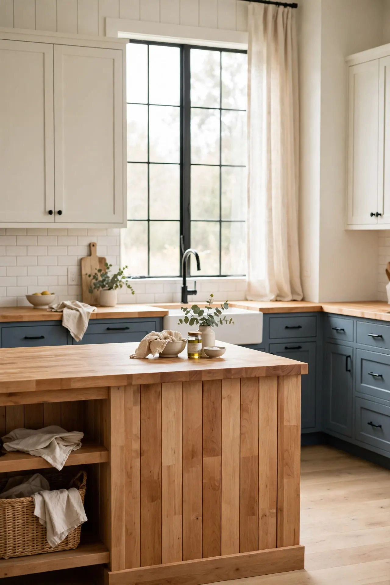
| Feature | Slate Blue Lowers | Butcher Block Island |
| Paint Cost | $30 to $60 per gallon, DIY friendly | $400 to $800 for the island top |
| Maintenance | Wipes clean with a damp cloth | Oil monthly to prevent drying |
| Durability | Resists chips with proper primer | Scratches add character over time |
| Style Match | Modern farmhouse and coastal | Rustic, Scandinavian, traditional |
| Best For | Busy families wanting color | Home cooks who chop daily |
Blue paint and natural wood are a natural team because cool and warm tones balance each other. Keep the blue muted rather than bright so the wood stays the star. A simple black faucet and hardware pull the whole look together without competing for attention.
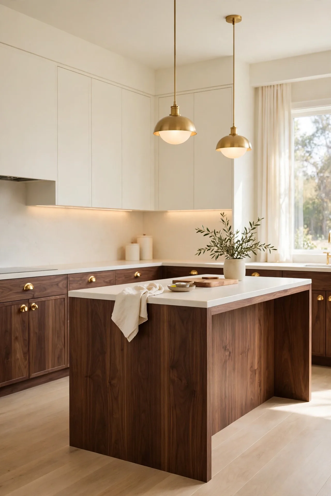
Cream and Rich Walnut
DO:
- Do use walnut on the island to make it the clear focal point.
- Do pair with brass hardware that picks up the warm wood undertones.
- Do keep countertops light to contrast the dark walnut base.
- Do add under-cabinet lighting for a soft glow.
DON’T:
- Don’t use walnut everywhere or the kitchen may feel too dark.
- Don’t mix walnut with cherry or mahogany nearby.
- Don’t choose cool gray walls, which fight the warm wood.
- Don’t skip primer on cream cabinets or stains may bleed through.
Walnut is a luxury material, so let it shine in one strong placement. Cream keeps the room feeling open while the dark wood adds depth and richness. I have noticed this pairing photographs beautifully, which matters if you love sharing your kitchen online.
Olive and Linen two tone kitchen cabinet color combinations
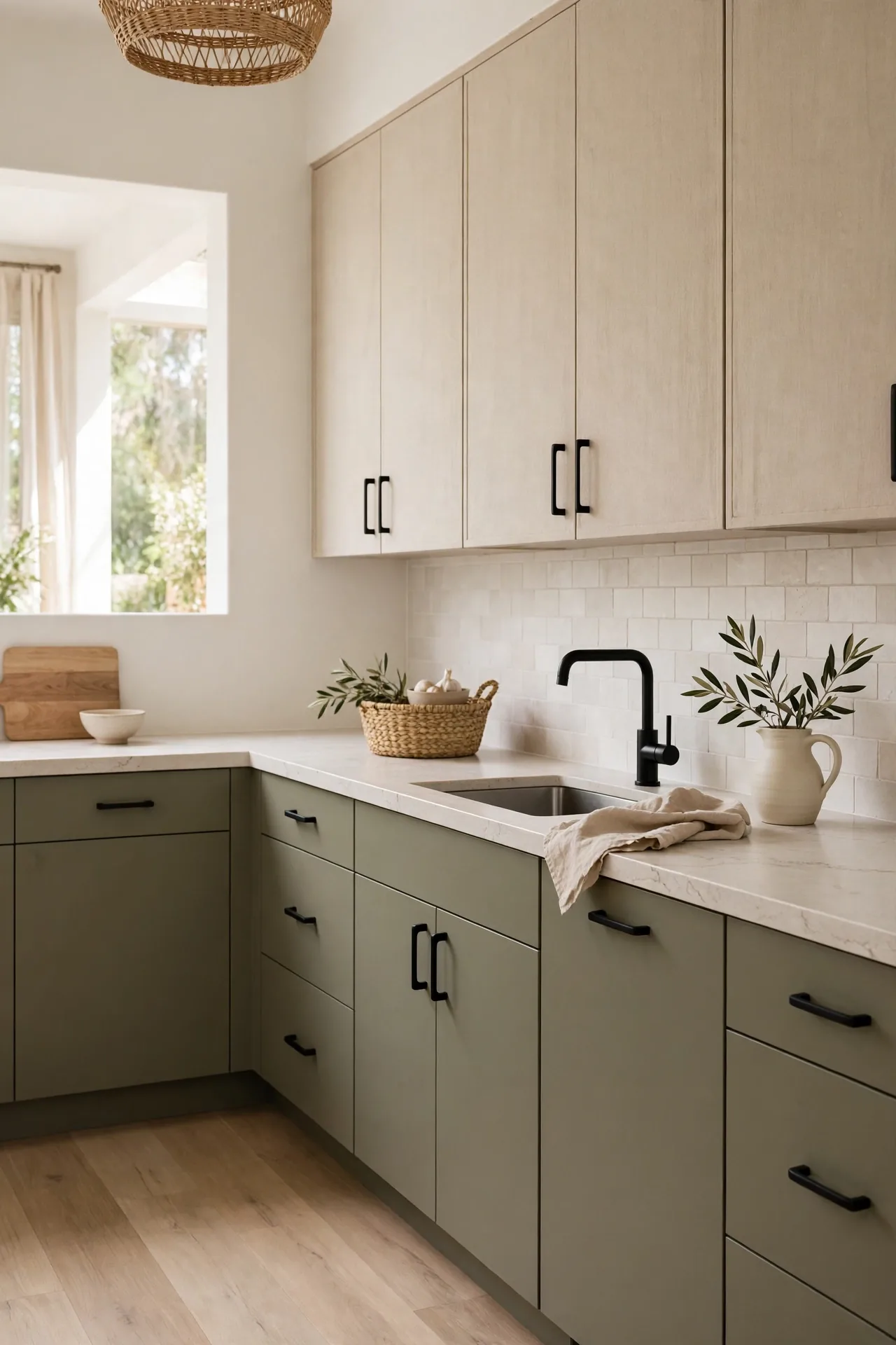
Cost: Moderate | Time: One week | Skill Level: Intermediate | Best For: Nature lovers
Olive and linen feel pulled straight from nature, which is why they calm a busy kitchen so effectively. The muted green hides everyday wear while the pale linen uppers keep things bright and open. This is a combination that works beautifully with wood floors, woven textures, and handmade ceramics throughout the space. I have found that olive green looks different in every light, so test it morning and evening. Pair with matte black hardware for contrast, or brushed brass for warmth. Keep the backsplash simple and let these earthy tones create a kitchen that feels grounded and peaceful.
Terracotta and Warm Ivory
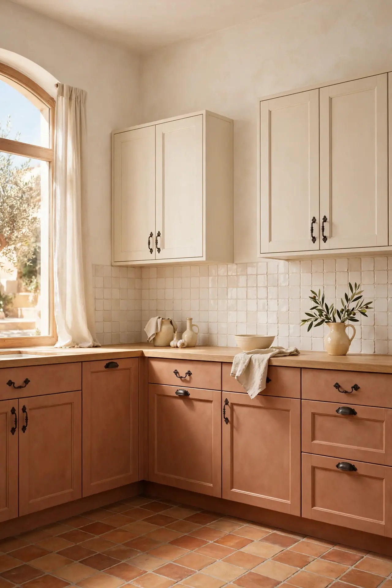
Terracotta lowers bring a sun-baked warmth that makes the whole kitchen feel like a Mediterranean villa. The earthy orange clay tone glows in afternoon light and pairs naturally with handmade textures. I have always loved how this color makes a kitchen feel welcoming before you even step inside.
Balance the warmth with ivory uppers that keep the ceiling feeling high and bright. Wrought iron or oil-rubbed bronze hardware suits the rustic mood. Keep the backsplash simple, perhaps handmade ivory tile, so the terracotta remains the star of the room. I have seen this work well in many cases with arched doorways and textured plaster walls that complete the Mediterranean feel.
Midnight Blue and Crisp White
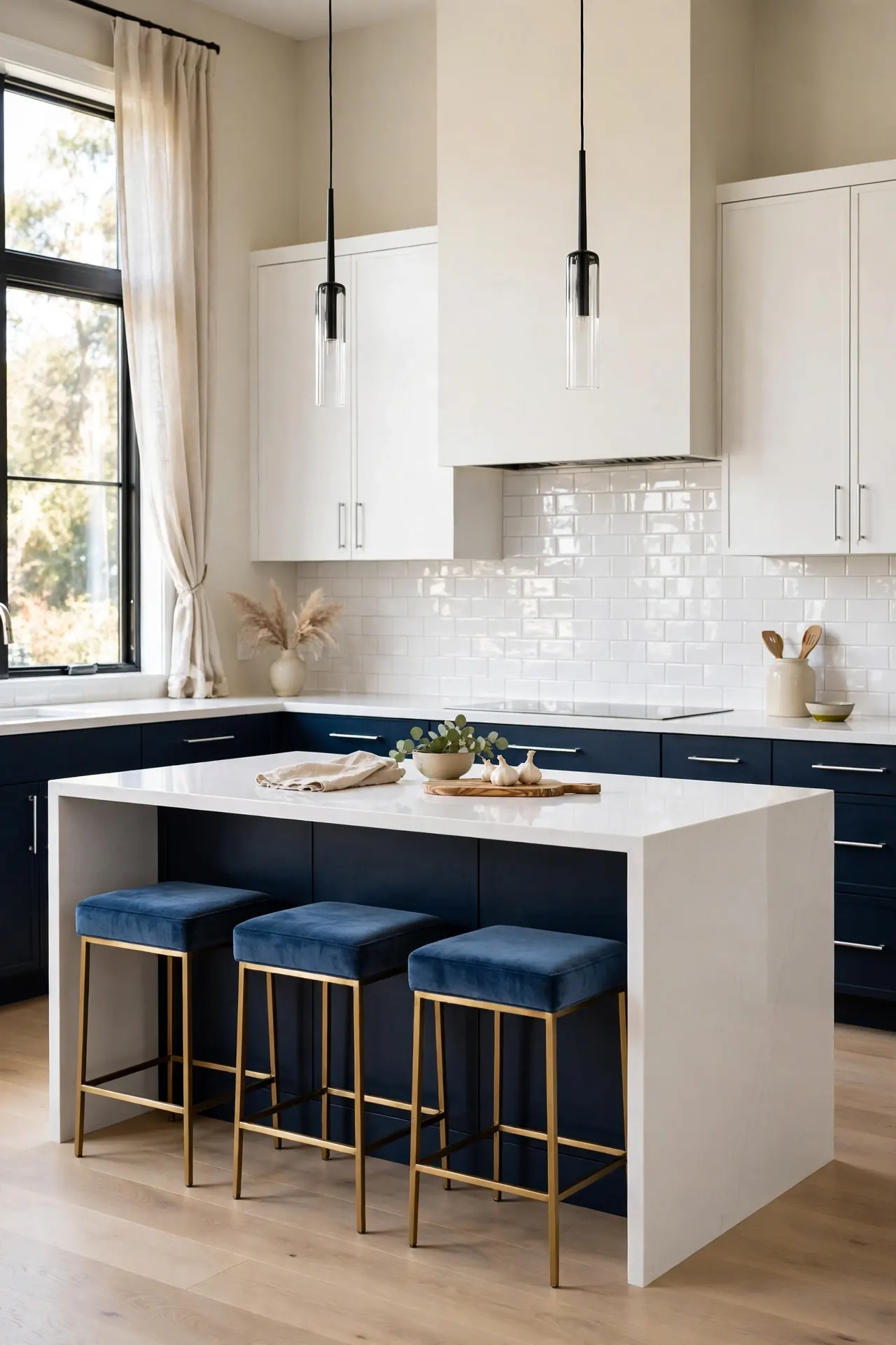
- Use midnight blue on all lower cabinets for a bold, confident foundation.
- Keep uppers bright white to stop the dark blue from overwhelming the room.
- Choose silver or chrome hardware for a crisp, modern finish.
- A white quartz waterfall island ties the two tones together in one clean line.
- I’ve noticed midnight blue looks almost black at night, which adds cozy drama after dark.
This high-contrast pairing works best in kitchens with good lighting, natural or layered. The white uppers bounce light around while the blue grounds the design. Add blue velvet stools or a patterned rug to echo the lower cabinets and complete the look.
Greige and White Oak
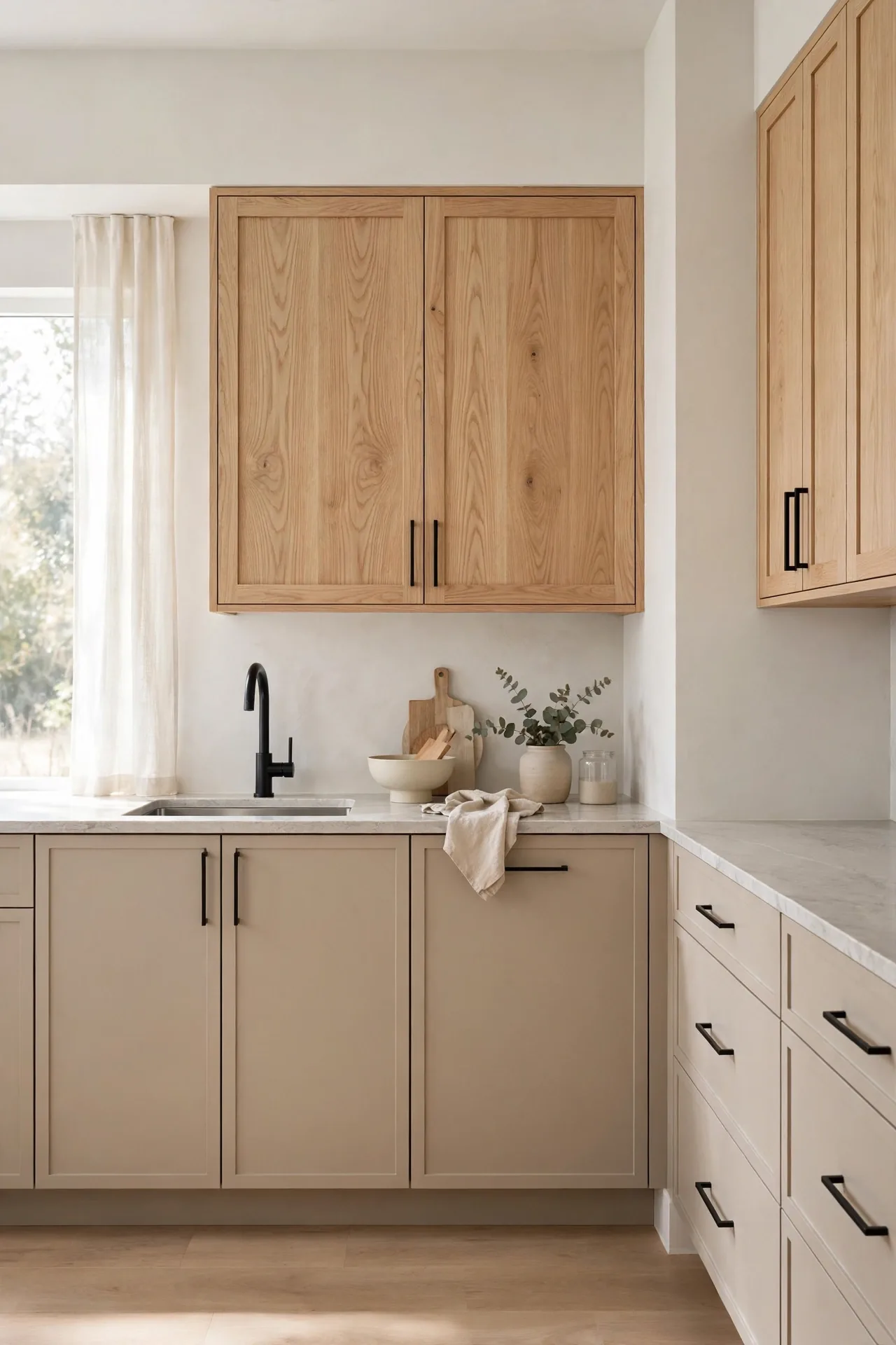
Quick Tip: Greige sits between gray and beige, so test samples against your flooring before committing. Pair it with white oak uppers that show natural grain for texture. Among two tone kitchen cabinet color combinations, this is the safest choice for resale because it appeals to almost every buyer.
Greige lowers hide dust and wear far better than plain white, which busy households appreciate. The white oak uppers add natural texture that keeps the neutral palette from feeling flat. Finish with matte black hardware for definition and light stone counters to keep everything fresh. This is a kitchen that will still look current ten years from now.
Deep Teal and Sandy Beige
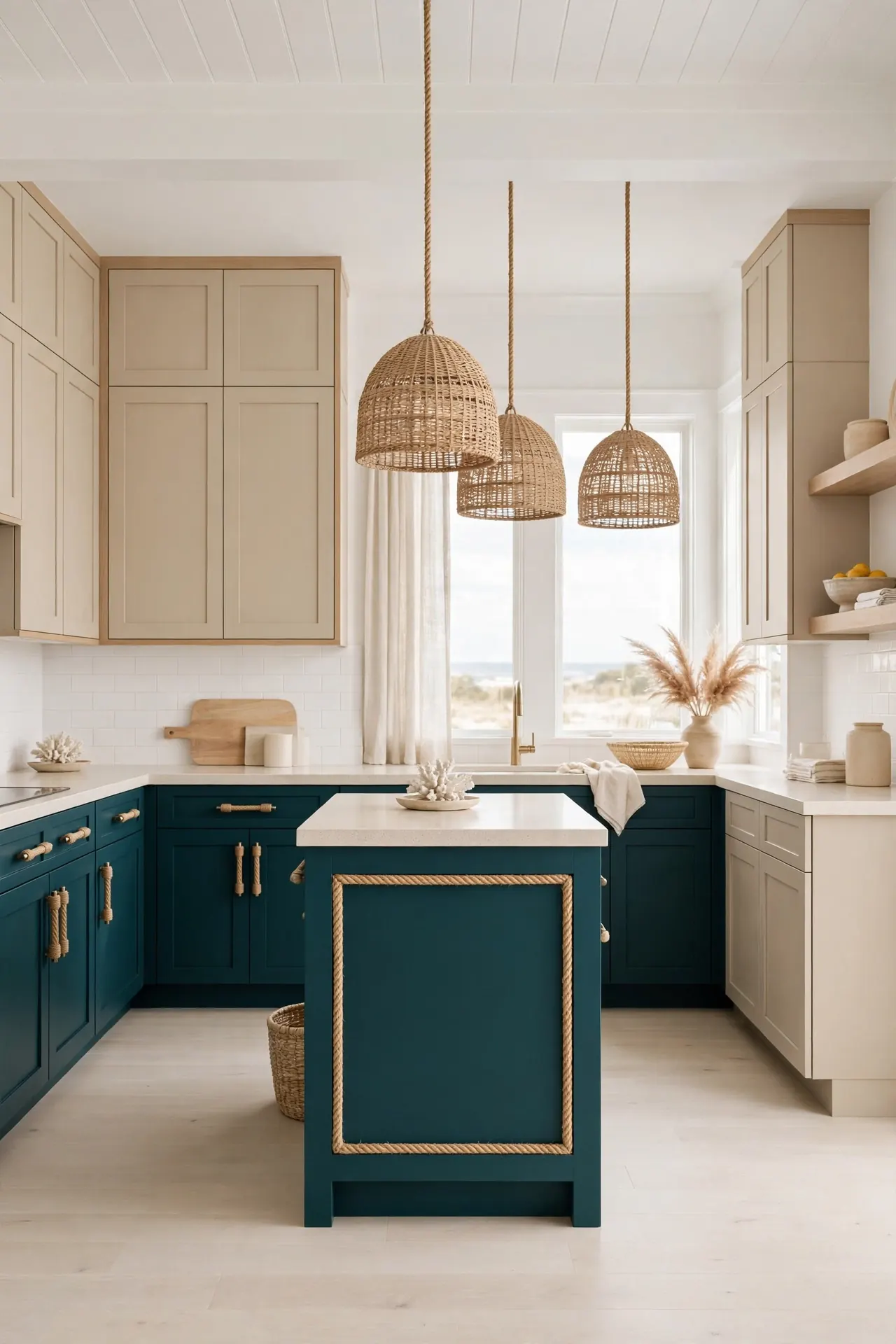
BEFORE: The kitchen was all beige and completely forgettable, with no focal point and no energy. It felt like a rental, even though the homeowners owned the place.
AFTER: Deep teal lowers bring coastal depth while sandy beige uppers keep the room light and airy. The kitchen now has a clear personality that feels both relaxed and pulled together.
Teal works hardest on the island or a single run of lowers, so it reads as an accent rather than a takeover. Sandy beige keeps the palette grounded in neutrals. Add rope details, light wood stools, or woven pendants to complete the coastal mood.
Espresso and Soft Gray
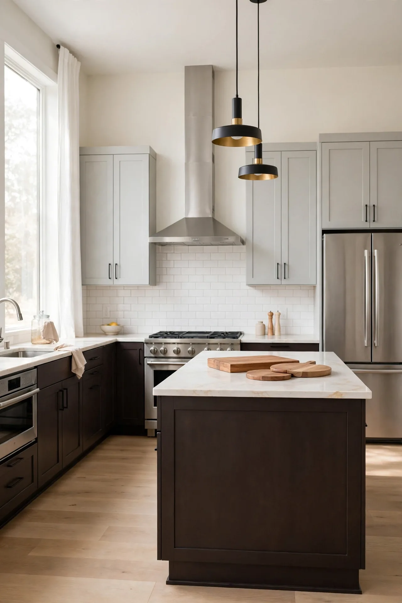
- Paint lower cabinets espresso for a rich, furniture-like foundation.
- Keep uppers soft gray to maintain brightness and contrast.
- Choose stainless appliances that bridge the dark and light tones.
- Add warm wood accents to stop the palette from feeling too cool.
Espresso brings the depth of black with more warmth, which suits traditional and transitional kitchens. Soft gray uppers keep the room from feeling heavy. I have seen this work well in many cases with cream walls and warm lighting that flatters both tones beautifully. Choose a warm gray rather than a cool one so it harmonizes with the brown. Under-cabinet lighting prevents the espresso lowers from disappearing into shadow after dark.
Hunter Green and Honey Maple two tone kitchen cabinet color combinations
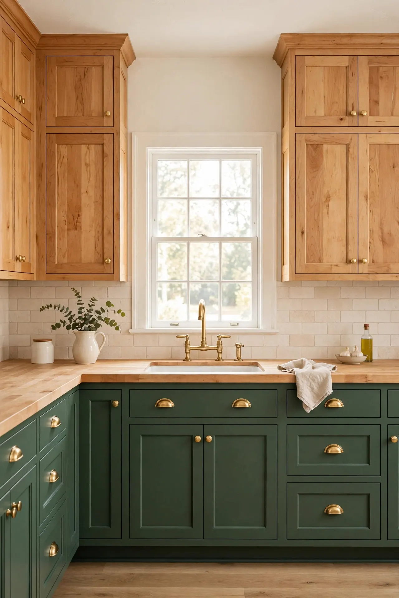
| Feature | Hunter Green Lowers | Honey Maple Uppers |
| Mood | Classic, grounded, traditional | Warm, welcoming, golden |
| Light Needs | Needs good lighting to glow | Reflects light naturally |
| Hardware | Brass cup pulls shine here | Simple knobs keep it calm |
| Pairs With | Marble and cream stone | Butcher block counters |
| Best For | Period homes and cottages | Family kitchens with kids |
Hunter green and honey maple feel like they were always meant to be together. For more green cabinet inspiration, see these green kitchen cabinets with brass hardware ideas. The golden wood warms the deep green, and brass hardware ties everything into a classic, collected look. This is a timeless pairing that suits homes with traditional bones.
Dusty Blue and Antique White
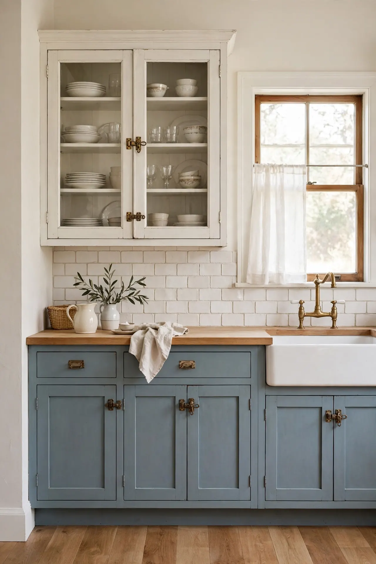
DO:
- Do choose a blue with gray undertones so it reads soft, not bright.
- Do use glass-front uppers to lighten the antique white cabinets.
- Do add vintage-style latches for cottage charm.
- Do keep the backsplash simple with handmade white tile.
DON’T:
- Don’t pair with stark modern hardware that fights the vintage mood.
- Don’t use this blue in a dark kitchen where it may read gray.
- Don’t forget to sample the blue next to your flooring.
- Don’t overcrowd open shelves or the soft look turns cluttered.
Dusty blue and antique white create a kitchen that feels like a countryside cottage. The muted blue hides everyday marks while the creamy white keeps things bright. This is a forgiving palette that welcomes patina and looks better as it gently ages.
Cocoa and Coconut White
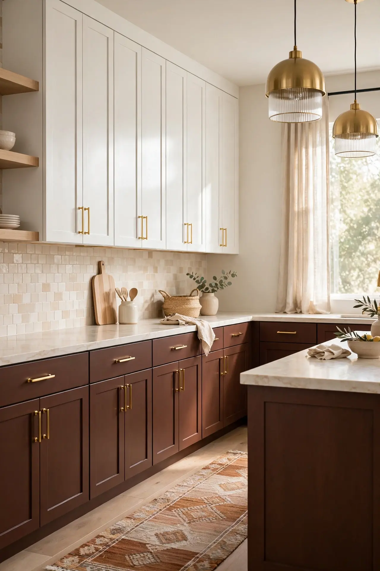
Cost: Low to moderate | Time: One weekend | Skill Level: Beginner | Best For: DIY painters
Cocoa brown brings cozy warmth that stark black cannot match, while coconut white keeps the uppers crisp and clean. Gold hardware adds a touch of glamour against the deep brown. This is an easy DIY-friendly pairing that transforms flat-pack cabinets into something custom and expensive looking. I recommend satin or eggshell finish on the cocoa lowers so they wipe clean easily. Keep the coconut white bright with good lighting, since dingy light can make white look yellow. Add a runner rug in warm tones to tie the brown and white together across the floor.
Ink Black and Oatmeal
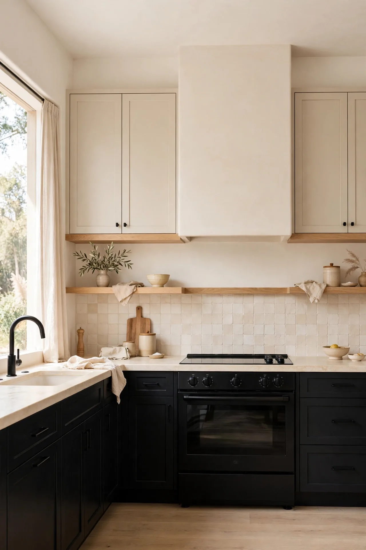
Ink black lowers make a confident statement, but the soft black reads less harsh than pure jet black. The deep tone anchors the room and makes everything above it feel lighter by contrast. I have watched guests walk in and immediately comment on the drama of this look. It is not for the faint of heart, but the payoff is huge.
Oatmeal uppers warm the palette with their creamy beige tone, stopping the black from feeling cold. Open wood shelves between the two tones create a natural bridge. Keep the hardware simple and black, and let the contrast do all the talking in this bold kitchen.
Emerald and Champagne Beige
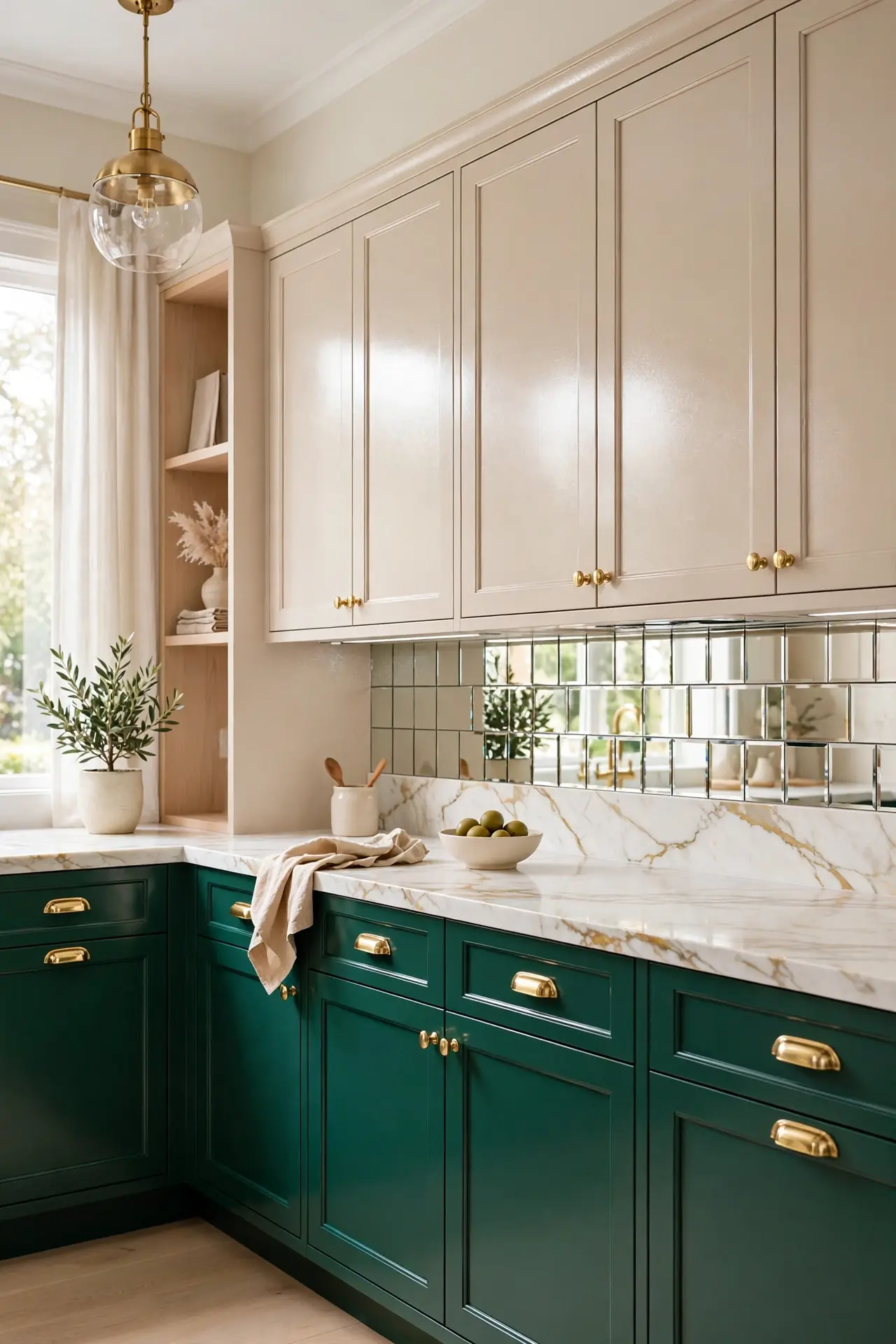
- Use emerald on the island and lower cabinets for jewel-box richness.
- Keep uppers champagne beige to reflect light with a warm shimmer.
- A mirrored or metallic backsplash amplifies the glamorous mood.
- Brass hardware is non-negotiable here for full luxury effect.
- I’ve noticed emerald pairs beautifully with marble that has gold veining.
Emerald and champagne feel straight out of a boutique hotel, glamorous yet livable. Of all the two tone kitchen cabinet color combinations here, this one makes the biggest statement, so keep surrounding decor simple. Let the cabinets shine and resist adding competing patterns nearby. A simple white countertop keeps the focus on the rich cabinet colors.
Burgundy and Warm Taupe
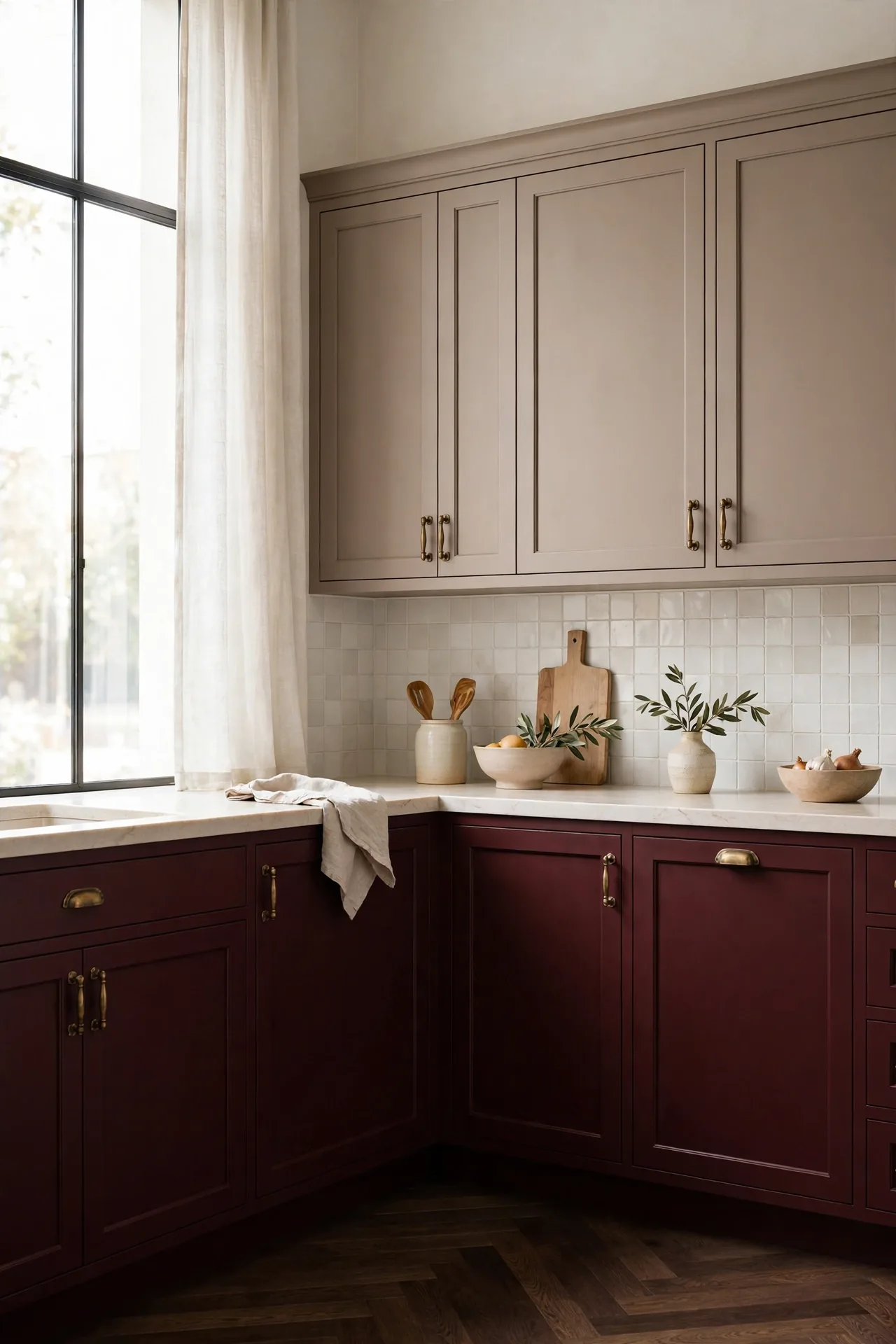
Quick Tip: Burgundy is a bold choice, so start with the island to test your comfort level. The wine red tone feels rich and autumnal without the intensity of true red. Pair it with warm taupe uppers that soften the look, and choose antique brass hardware to complete the moody, sophisticated mood.
Warm taupe keeps burgundy from feeling too dark or heavy in everyday light. Dark wood floors echo the wine tones beautifully. This pairing suits dining kitchens where the rich color makes evening meals feel special and intimate. I have seen this work well in many cases with dimmable lighting that lets the burgundy glow at night.
Pewter Gray and Porcelain
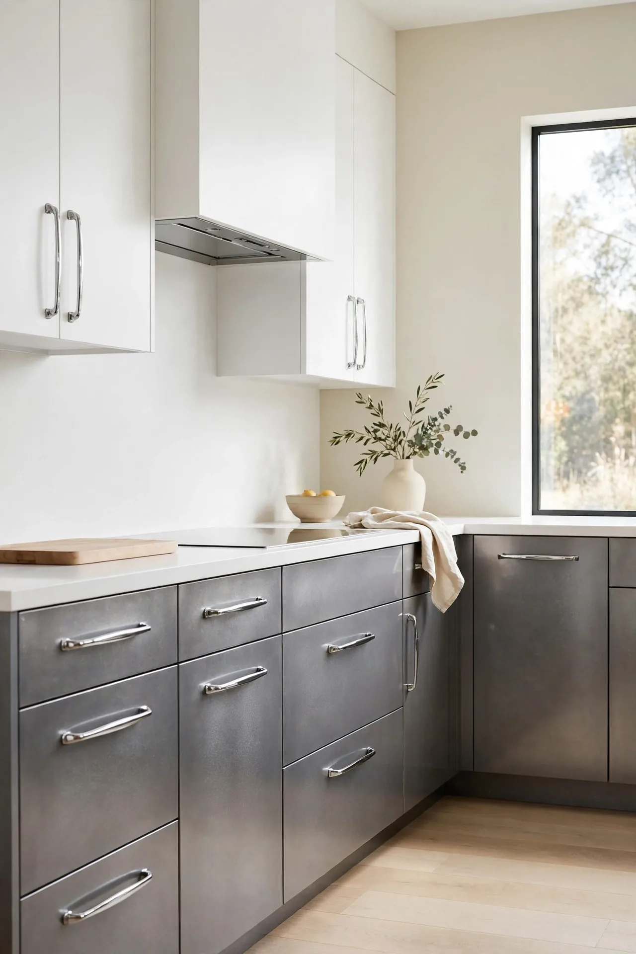
BEFORE: The kitchen had plain white cabinets that showed every mark and felt clinical. The space lacked depth and the flat white felt cold under the bright lights.
AFTER: Pewter gray lowers add metallic depth while porcelain uppers stay crisp and bright. The kitchen now feels layered and intentional, with the gray hiding wear the white never could.
Pewter sits between silver and charcoal, giving you depth without darkness. Chrome or polished nickel hardware suits its cool metallic tone. Keep counters white and walls pale so the pewter reads as a deliberate accent rather than a shadow. This is a smart update for anyone tired of plain white but not ready for bold color.
Clay and Cloud White
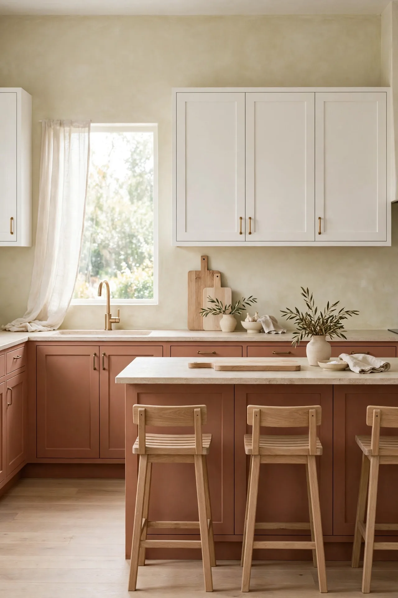
- Choose a muted clay tone, not bright terracotta, for the lower cabinets.
- Keep uppers cloud white, which is softer than stark white.
- Add light wood cutting boards and stools to echo the earthy mood.
- Finish with matte black or bronze hardware for gentle contrast.
Clay and cloud white bring an earthy calm that suits slow mornings and relaxed cooking. The muted terracotta feels natural rather than bold. I have seen this work well in many cases with limewashed walls and plenty of texture in linens and ceramics. Test the clay in your own light, since it can shift from peachy to rosy. Keep hardware simple and let the earthy tones create a kitchen that feels calm and grounded.
Conclusion
Choosing from these two tone kitchen cabinet color combinations comes down to how you want your kitchen to feel each morning. Dark lowers with light uppers suit busy homes that need forgiveness and brightness in equal measure. Softer pairings like sage and cream or clay and white bring calm to open plans. I have seen how small changes like these can completely shift the way a space feels. Save your favorites on Pinterest, test samples on your own walls, and enjoy building a kitchen that feels truly yours. The right pair will make every meal prep a little more joyful.