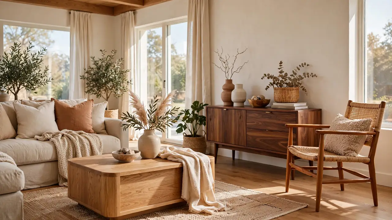
20 Mix Wood Tones Living Room Ideas for Warm Harmony
Matching wood furniture is officially over, and these mix wood tones living room ideas prove why. Oak, walnut, ash, and teak can share one room beautifully when you follow a few simple rules. I have always loved the collected warmth of mixed woods over matchy sets. These 20 ideas help you blend tones with confidence and harmony. From choosing a dominant wood to balancing grain patterns, every tip builds a room that feels collected over time. Start with the piece you love most, and let the mix grow naturally around it. Confidence with wood tones is a skill, and this guide is your first lesson.
Below are 20 warm ideas, from oak coffee tables to a unified finish seal. For dramatic kitchen inspiration, see my dark green kitchen hardware lighting. Cozy living room fans will love my warm minimalist living room ideas. Let’s mix it up.
Oak Coffee Table
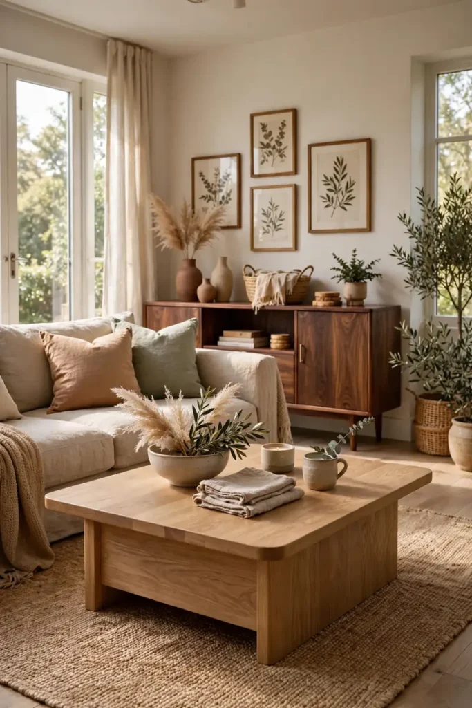
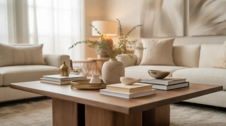
A light oak coffee table anchors the mixed wood living room without dominating it. The pale honey tone plays beautifully against darker walnut pieces nearby. Keep the table’s lines simple so the wood grain does the talking. Simple shapes let the natural beauty lead without competition.
Style the table with books and a small plant, leaving wood visible. I’ve noticed that the coffee table sets the tone for every other wood in the room. Choose it first, then build every other wood choice around it. The anchor piece makes all the later decisions easier.
Walnut Media Console
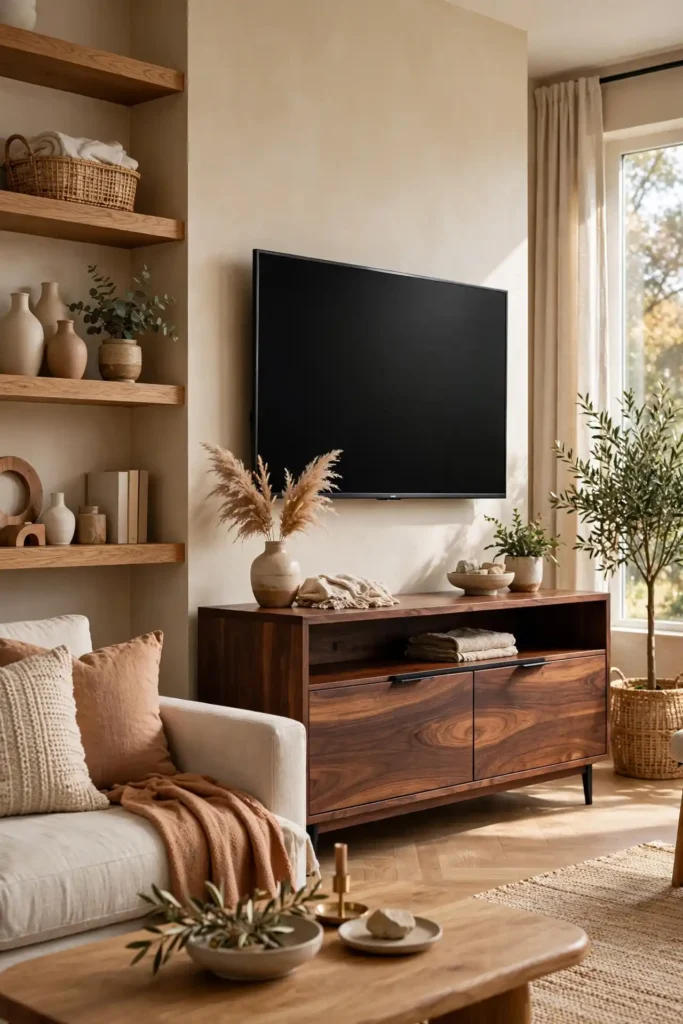
- A walnut media console brings rich chocolate depth to the living room. The dark tone grounds lighter woods and stops the room feeling washed out.
- Keep the console low and long for a modern profile. The horizontal lines balance tall bookshelves and high ceilings.
- Style the top simply with a lamp and one art piece. The walnut itself is the decoration, so restraint pays off.
- Pair it with oak or ash pieces nearby for the classic light dark contrast. The pairing is the foundation of mixed wood design.
Walnut is the anchor tone that makes mixing feel intentional. Its depth gives lighter woods something to play against. One strong dark piece changes the whole room’s confidence.
Light Ash Shelving
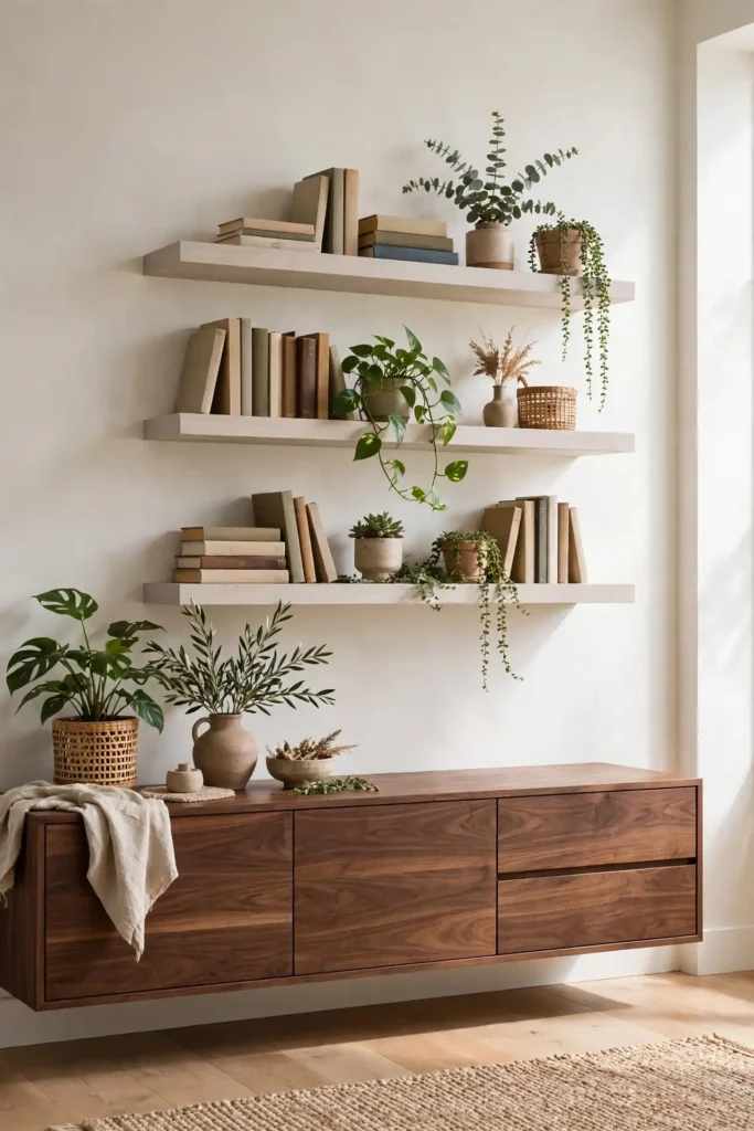
Quick Tip: Mount light ash floating shelves on the wall to lift the room visually. The pale wood draws the eye upward and keeps walls feeling open. Style the shelves with books, plants, and ceramics in odd numbered groupings for a natural, collected look. The styling matters as much as the wood itself.
Ash shelving adds a light wood tone without new furniture. The shelves bridge pale and dark woods on the same wall. Vertical mixing is just as powerful as mixing across the floor. Walls offer fresh territory for your wood tone story.
Dark Stained Beams

BEFORE: The white ceiling felt disconnected from the warm wood furniture below. The room had nice pieces but no architectural thread tying them together.
AFTER: Dark stained beams now crown the room with rich architectural warmth. The beams echo the walnut furniture below, and the whole space finally feels composed.
Ceiling beams count as a wood tone in the mix, so plan them deliberately. Dark beams pair beautifully with light floors for striking contrast. Architecture is the biggest wood piece you own.
Two Tone Dining Set
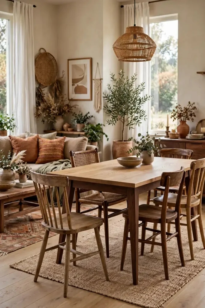
- Choose a dining table that already mixes two tones, like an oak top on walnut legs. The table itself teaches the room how to mix.
- Surround it with chairs in a third wood tone for confident layering. Mismatched chairs look intentional when the table leads.
- Repeat each wood tone elsewhere in the room at least once. Repetition is what makes the mix feel designed rather than random.
- Keep upholstery neutral so the woods stay the stars. Linen and wool let the grain patterns shine.
A two tone table gives you permission to mix everywhere else. The piece proves that woods play well together. Start with the table, and the rest of the room follows its lead.
Wood Finish Chart

| Wood | Tone | Pairs Best With |
|---|---|---|
| White oak | Light, honeyed | Walnut, black accents |
| Walnut | Dark, chocolate | Oak, ash, brass |
| Ash | Pale, neutral | Walnut, teak |
| Teak | Warm, golden | Oak, dark stains |
A finish chart takes the guesswork out of mixing woods. Compare samples in your own light before committing to big pieces. The chart keeps your palette to three tones maximum, which is the sweet spot for harmony. Pin the chart to your project board and consult it before every wood purchase. The five minutes you spend comparing will save expensive mistakes later.
Reclaimed Wood Accents
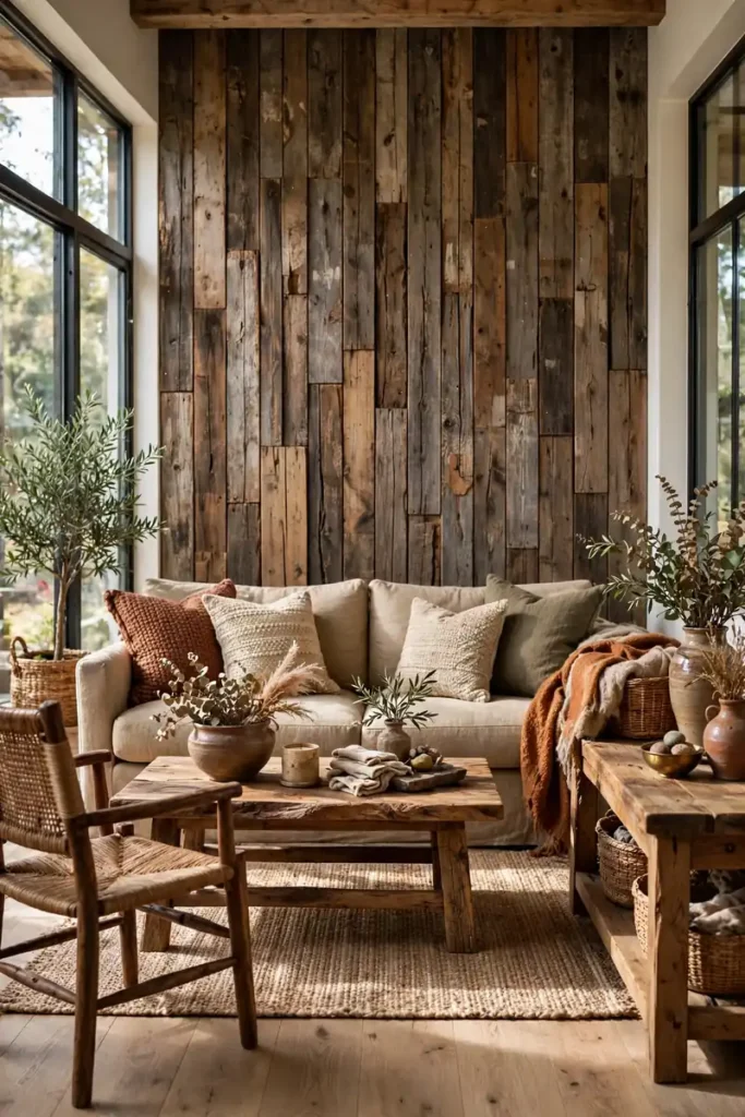
Do:
- Use reclaimed wood for one accent: a wall, mantel, or beam.
- Let its varied tones inspire the rest of the room’s palette.
- Seal reclaimed wood well to control dust and splinters.
Don’t:
- Don’t use reclaimed wood on every surface; it overwhelms.
- Don’t mix too many reclaimed pieces with different histories.
- Don’t skip the sealant, since old wood needs protection.
Reclaimed wood brings instant history and a ready made mix of tones. One accent wall can carry the whole room’s wood story. The variation looks collected, never chaotic, when it stands alone.
Grain Pattern Mix
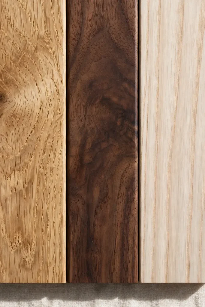
Straight grain: Oak’s clean lines suit modern rooms best and never overwhelm. Bold grain: Walnut’s swirls add drama and beautiful movement. Subtle grain: Ash stays quiet, letting the other woods star. Rule: Mix one bold grain with two quieter ones for perfect balance.
Grain pattern matters as much as color when mixing woods. Too many bold grains compete, while varied grains create rhythm. Think of grain like pattern mixing in textiles: contrast with control. The same instincts that dress a sofa will dress your wood palette.
Cherry Side Tables
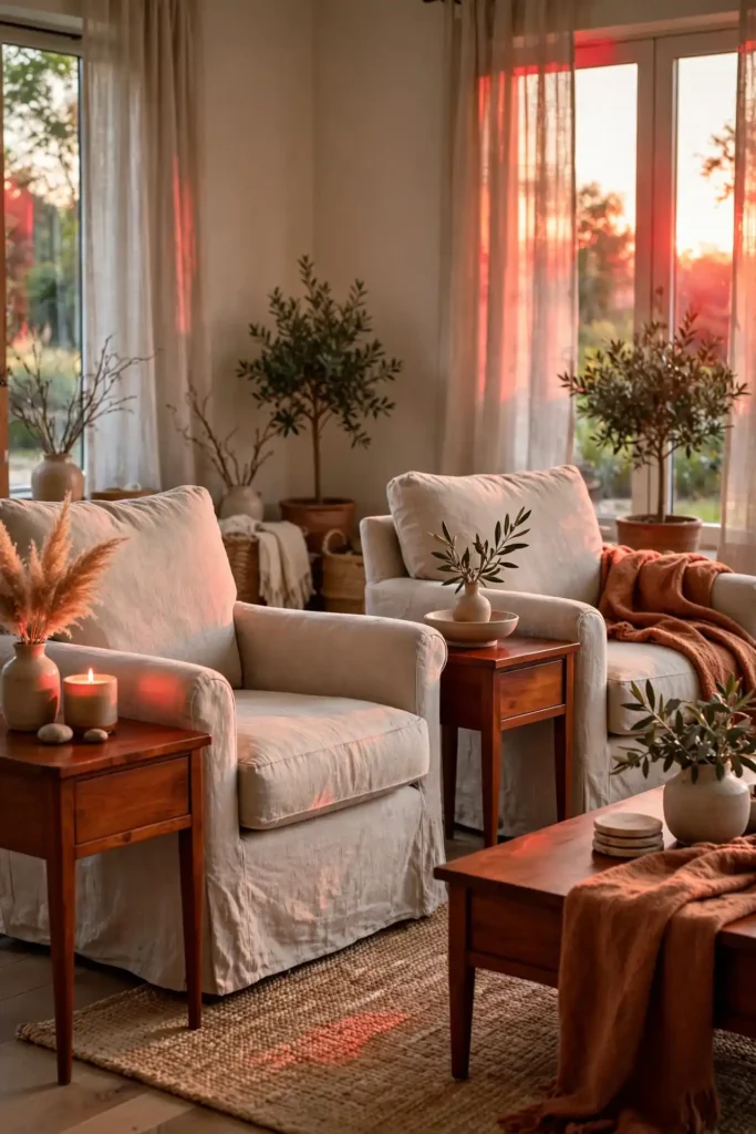
Cherry side tables add a warm reddish note to the wood mix. The rich color deepens beautifully with age and light exposure. They glow like embers beside neutral upholstery. The reddish depth adds a jewel tone to the wood palette.
Place cherry tables where lamplight hits them in the evening for maximum glow. I’ve noticed that warm light brings out cherry’s depth like nothing else. Small tables deliver big warmth, so give them the spotlight they deserve. Cherry rewards patience, growing more beautiful with every passing year.
Bamboo Light Fixtures
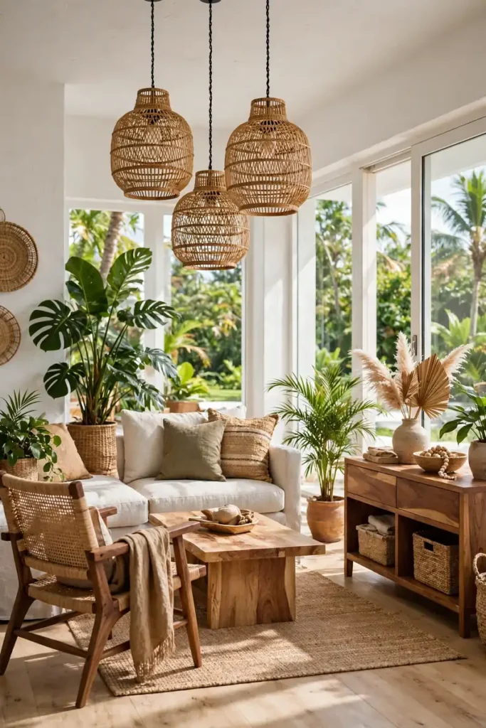
- Woven bamboo pendants add a light, natural wood tone overhead. The texture contrasts beautifully with smooth furniture woods.
- Hang them in pairs or trios for real impact. A single small bamboo shade gets lost in a large living room.
- Choose warm bulbs to enhance the golden bamboo glow. The light itself becomes part of the wood story.
- Keep the fixture scale generous against dark furniture. Light fixtures can carry the pale tone while furniture goes dark.
Bamboo lighting counts as a wood tone and brings airy texture. The woven shade filters light into beautiful patterns. Overhead wood balances all the furniture wood below.
Whitewashed Wood Frames
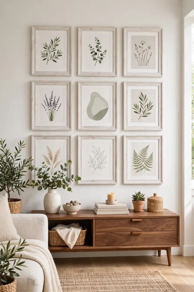
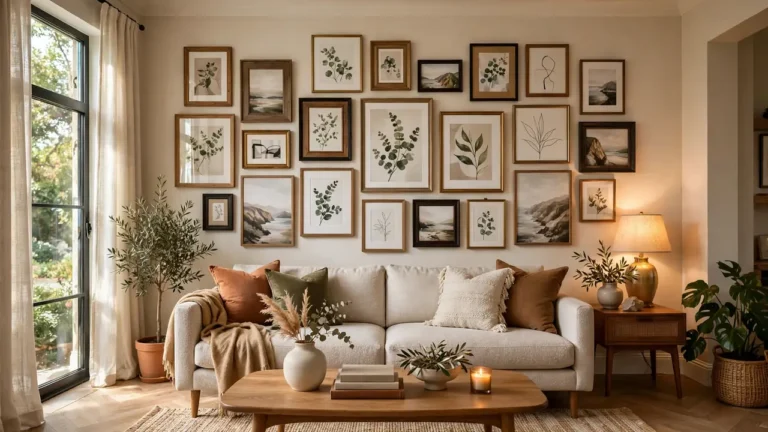
Quick Tip: Frame your art in whitewashed wood to add the palest tone to the mix. The washed finish lightens dark walls and bridges white trim with wood furniture. Group the frames in a gallery wall for maximum impact with minimum cost. A full wall of washed frames reads as intentional design.
Whitewashed frames are the gentlest way to add a light wood tone. They read almost as neutral while still counting in the mix. Art walls do double duty as wood tone strategy. The palest wood in the room can live on the walls, not the floor.
Ebony Picture Ledges

BEFORE: The art hung scattered on a pale wall with no connection to the furniture. The wall felt flat and the frames competed with each other. Nothing tied the display to the furniture below it.
AFTER: Dark ebony ledges now line the wall with art layered casually. The near black wood adds the darkest tone to the mix and makes every frame pop. Layer art casually, overlapping pieces for a collected feel.
Ebony ledges add the exclamation point to your wood palette. The near black tone sharpens everything around it. Dark accents make light woods look lighter by contrast. Every palette needs its darkest note to feel complete.
Stain Matching Steps
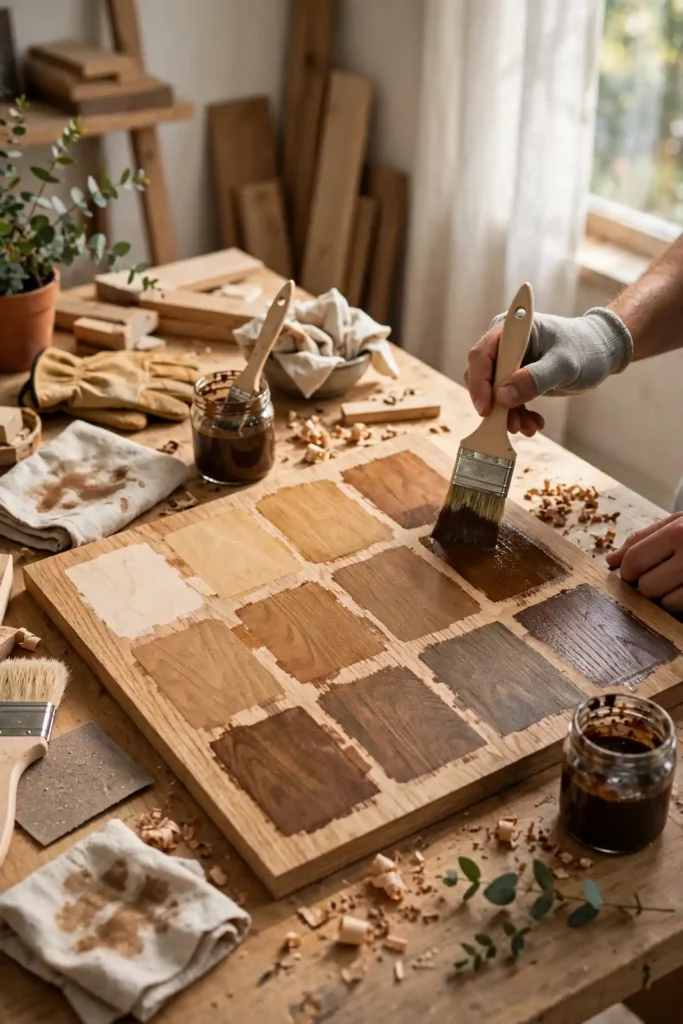
- Test every stain on a hidden spot or scrap of the same wood. Stain looks different on every species, so never trust the can label alone.
- Apply two thin coats rather than one thick one for even color. Thin coats build rich tone without blotching.
- Let samples dry fully and view them in your room’s light. Wet stain lies; dry stain tells the truth.
- Live with the samples for two days before committing. Morning and evening light change everything.
Stain matching lets you nudge wood tones toward harmony. A slightly darker oak can meet walnut halfway with the right stain. Test patiently, since stain is forever and rushed choices show.
Warm Vs Cool Woods

| Feature | Warm Woods | Cool Woods |
|---|---|---|
| Examples | Cherry, teak, warm oak | Ash, gray washed oak |
| Mood | Cozy, inviting, traditional | Crisp, modern, calm |
| Best light | Warm bulbs enhance them | Daylight keeps them fresh |
| Mixing rule | Pick one temperature family and stay mostly within it | |
Wood temperature matters more than exact color matching. Warm woods share golden undertones that harmonize naturally, while cool woods share gray ones. Choose one family as your dominant story, then add contrast carefully and sparingly. Temperature discipline is the invisible rule behind every harmonious room.
Butcher Block Tops

Do:
- Use butcher block on a bar or console for warm worktop charm.
- Oil it regularly to keep the wood fed and glowing.
- Pair it with darker base furniture for beautiful contrast.
Don’t:
- Don’t let water sit on the surface; wipe spills fast.
- Don’t pair it with an identical wood tone below.
- Don’t skip the oil; dry butcher block looks tired.
Butcher block tops add a hardworking wood tone with craft character. The striped grain brings pattern to the mix. Oil brings out a honeyed glow that flat finishes cannot match.
Wood Tone Ratios
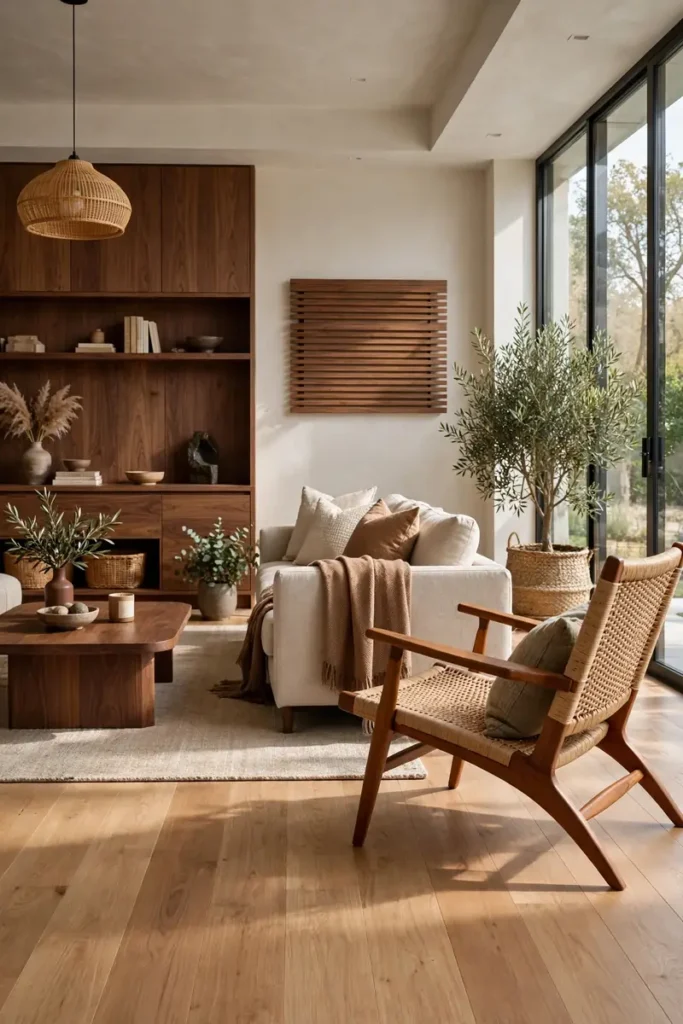
60 percent: Let one dominant wood cover most of the room, usually the floor. 30 percent: A secondary wood appears in the largest furniture pieces. 10 percent: An accent wood shows up in small doses for spice and surprise. Result: The ratio keeps the mix balanced, calm, and intentional.
The 60-30-10 rule works for wood tones just like color. A clear dominant tone prevents the mix from feeling chaotic. When every wood shouts equally, nobody gets heard. Give each tone its role, and the room will sing in harmony.
Teak Lounge Chair
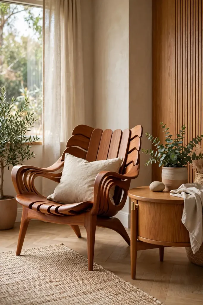
A teak lounge chair adds golden mid century warmth to the mix. The sculptural wood grain makes it art as much as seating. It glows beside cooler toned furniture like a sunset. The golden hue warms the entire corner around it.
Give the teak chair a prime spot where light hits the grain. That’s why many experts recommend placing statement wood where daylight finds it. One beautiful chair can carry the whole warm story. Invest in the piece you will touch every single day.
Pine Ceiling Planks
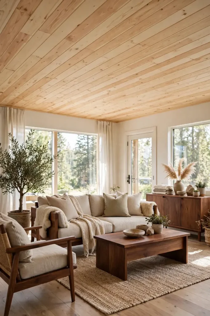
- Light pine planks on the ceiling add the palest wood tone overhead. The planks warm up white ceilings without darkening the room.
- Run the planks in the same direction as the floor boards for flow. Aligned lines stretch the room visually.
- Keep the pine finish light and natural, not orangey. The wrong stain turns cozy into dated fast.
- Balance the pale ceiling with darker furniture below. The contrast keeps the room grounded and rich.
Pine ceilings bring cabin warmth without cabin darkness. The pale planks count as your lightest wood tone. Look up more often; the ceiling deserves design attention too.
Distressed Wood Decor
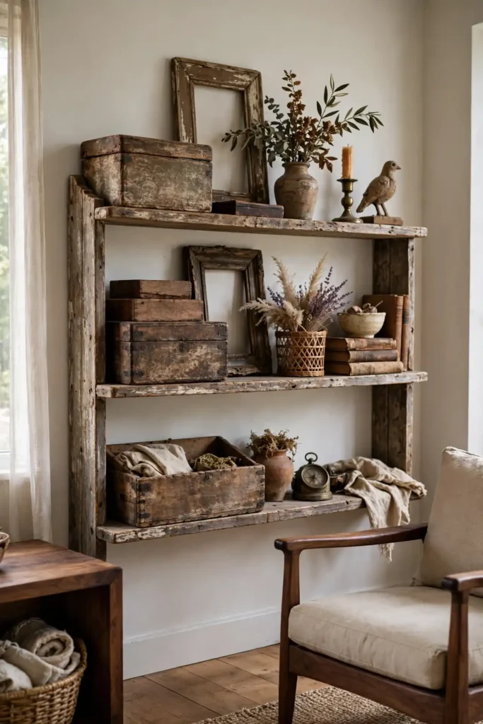
Quick Tip: Scatter a few distressed wood decor pieces on shelves and tables. The weathered finish adds a relaxed tone that bridges formal furniture woods. Keep the pieces small: frames, boxes, and trays do the job without overwhelming the mix. A few well placed pieces beat a shelf full of clutter.
Distressed wood is the casual friend in a room of polished pieces. The texture contrast keeps mixed woods feeling collected, not decorated. A little roughness makes everything else look richer. Contrast is what gives polished woods their glow.
Unified Finish Seal
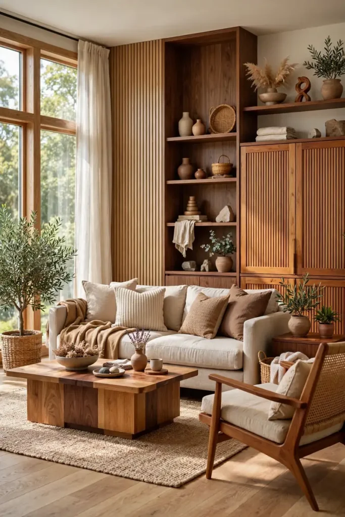
BEFORE: The woods clashed: shiny next to matte, orange next to gray. Each piece fought the others, and the room felt like a furniture warehouse. The eye found no rest anywhere.
AFTER: A unifying matte seal across key pieces harmonized the sheens. The tones still vary beautifully, but the consistent finish makes them feel like family. Sheen unity is the designer’s secret handshake.
Matching sheen matters as much as matching tone. A consistent matte or satin finish unifies even wildly different woods. When in doubt, unify the finish and let the tones play. The eye reads consistent sheen as intentional, even across different species.
Conclusion
These mix wood tones living room ideas prove that harmony beats matching every time. From oak coffee tables to unified finishes, each idea builds a collected warmth that single tone rooms cannot touch. Which wood pairing will you try first? Save your favorites on Pinterest, start with one new tone this weekend, and share this guide with a friend who fears mixing woods. Warm harmony is waiting, and your living room deserves the rich, collected look only mixed woods deliver. Pin your favorite pairings, try one idea this weekend, and enjoy the warmth.
One Comment