24 Chocolate Brown and Powder Blue Bedroom Decor Ideas for Chic Contrast
Some color pairings feel bold on paper but land beautifully in real life, and chocolate brown and powder blue bedroom decor is one of those rare duos that delivers both drama and calm. The deep, cocoa richness of brown grounds the room while powder blue keeps everything light, airy, and fresh. Together they create a chic contrast that feels grown up yet playful, moody yet bright. If your bedroom has been stuck in neutral territory, this pairing gives you a clear path to something far more interesting. Below are 24 ideas to mix these two shades with confidence.
Start by deciding which shade leads and which one supports, because balance is what keeps this contrast chic instead of chaotic. A chocolate headboard with powder blue bedding reads cozy and calm, while blue walls with brown furniture lean bolder and more dramatic. You will also find ideas here that borrow texture and warmth from other styles, much like the layered look of limewash paint living room inspiration, proving soft finishes work in every room. Scroll through, save your favorites, and picture how each idea could settle into your own space.
Chocolate Velvet Headboard
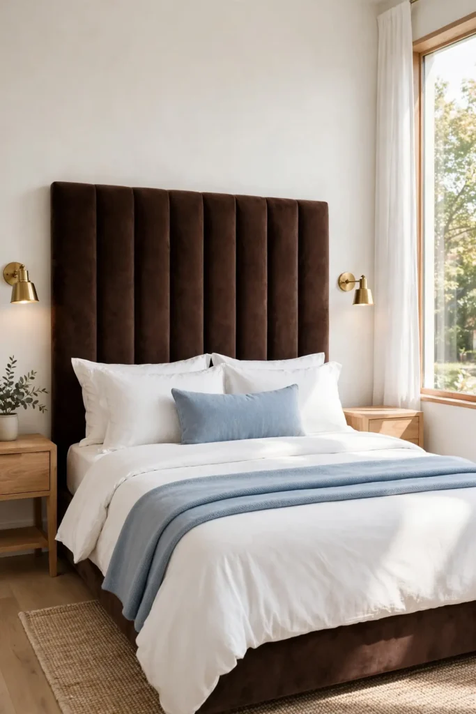
A chocolate velvet headboard does the heavy lifting in this color story, giving the bed a plush, tailored backdrop that instantly reads expensive. Velvet catches light in a way flat fabrics never manage, so the brown shifts from deep espresso in shadow to warm cocoa where daylight hits. A tall headboard in this fabric anchors the room and pulls the eye straight to the bed.
Keep the surrounding palette quiet so the headboard keeps its star status. Powder blue nightstands or a soft blue bench at the foot of the bed echo the accent shade without competing. Warm brass reading lights on either side add a jewelry-like finish, and a single powder blue lumbar pillow ties the composition together in one clean line.
Powder Blue Bedding
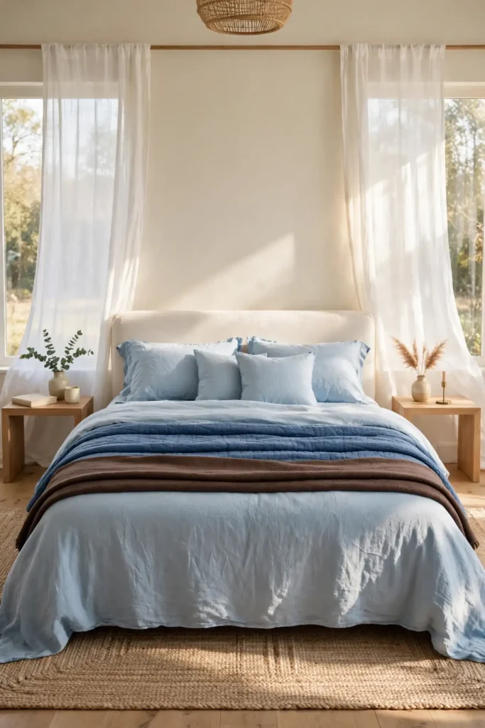
- Start with powder blue sheets in washed linen or percale for a soft, breathable base that sets the tone.
- Layer a quilt or coverlet in a slightly deeper blue to build dimension without adding visual weight.
- Fold a chocolate brown throw across the foot of the bed to anchor the palette and add warmth.
- Finish with sleeping pillows in white and shams in powder blue for a crisp, hotel-like stack.
Blue bedding keeps the room feeling light even when brown furniture runs dark and heavy. I’ve noticed cotton and linen blends wrinkle gracefully, which suits the relaxed mood of this palette. Wash everything in cool water to keep the blue from fading, and the set will look fresh for years.
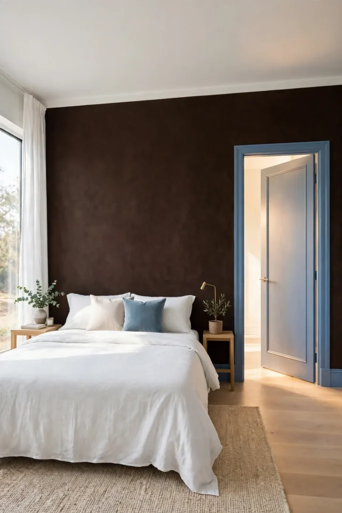
Rich Cocoa Accent Wall
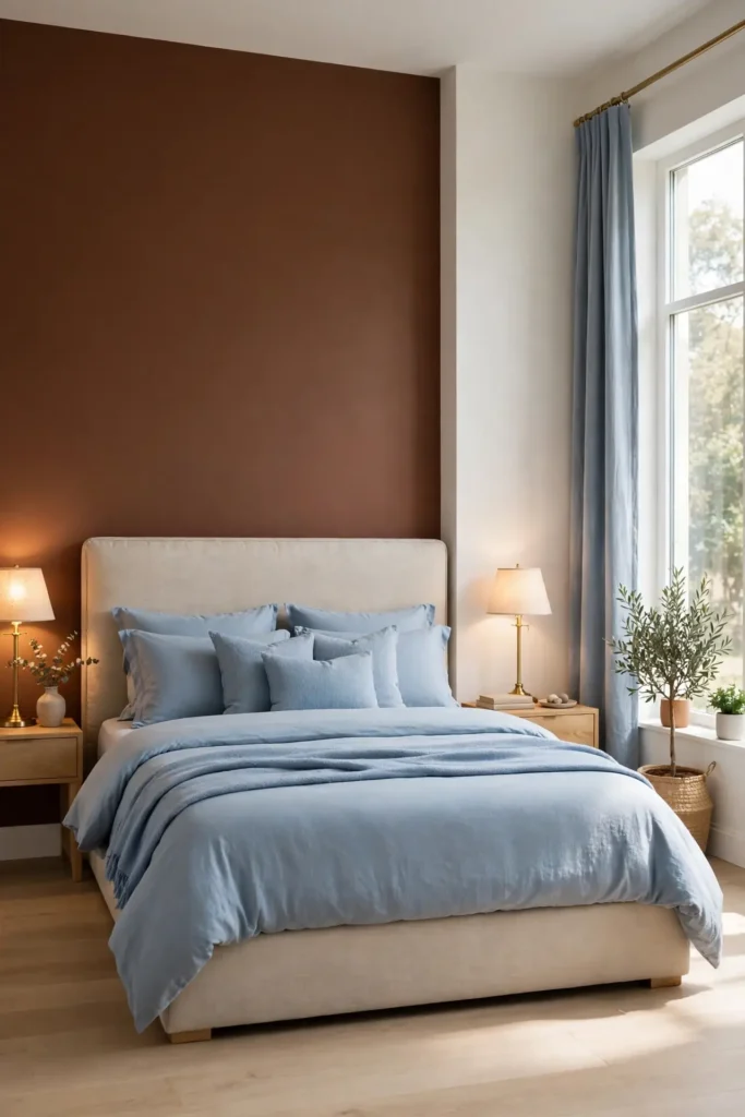
Quick Tip: Paint the wall behind the bed in a rich cocoa brown and keep the other three walls a warm white. This single dark wall adds depth without shrinking the room, and it makes powder blue accents pop like jewelry against it. Sample the paint in both daylight and lamplight before committing.
A cocoa accent wall works best when the brown leans warm rather than gray, so look for undertones of caramel or espresso. Keep trim and ceiling bright white to frame the dark wall cleanly. Then repeat the brown in smaller doses, like a throw or a tray, so the wall feels connected to the rest of the room.
Soft Blue Throw Layers

BEFORE: The bed wears a single chocolate brown comforter that looks handsome but flat, and the room reads darker than it is. Without a lighter layer, the brown has nothing to play against.
AFTER: Two powder blue throws, one folded at the foot and one draped diagonally, break up the brown and add instant softness. The bed suddenly looks styled rather than simply made, and the blue picks up daylight beautifully.
Choose throws in different textures, like a waffle weave plus a smooth cotton, so the layers look collected instead of matched. Drape rather than fold for a relaxed feel. This is also the cheapest way to test the palette before buying bigger pieces.
Warm Walnut Nightstands
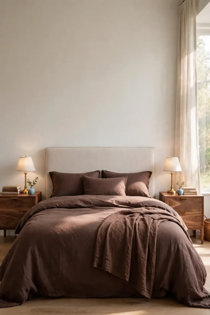
- Measure your mattress height and choose nightstands that land within two inches of the top of the mattress.
- Look for warm walnut or medium brown wood with visible grain, which flatters powder blue beautifully.
- Style the top with a small lamp, a short stack of books, and one blue object like a bud vase.
- Leave the lower shelf or drawer for the clutter you want hidden, keeping the surface calm.
Matching nightstands bring symmetry, but mixed ones add character if the wood tones stay in the same warm family. In my experience, a slightly darker nightstand than the bed frame creates pleasing depth. Keep cords tucked behind so the vignette stays clean from every angle.
Drapes or Shades

| Full-Length Drapes | Woven Roman Shades |
|---|---|
| Best fabric: powder blue linen or velvet | Best fabric: warm brown woven fibers |
| Excellent light control with blackout lining | Soft glow with gentle light filtering |
| Higher cost, especially custom lengths | Moderate cost, many ready-made sizes |
| Ideal for tall windows needing softness | Ideal for small windows needing texture |
| Panels are machine washable | Dust regularly with a soft cloth |
Drapes in powder blue soften tall windows and add graceful height, while woven shades in warm brown bring texture without bulk. Either choice frames the window as part of the palette. Hang drapes high and wide so the window looks larger, and the whole room gains a welcome sense of air.
Linen Cushion Mix
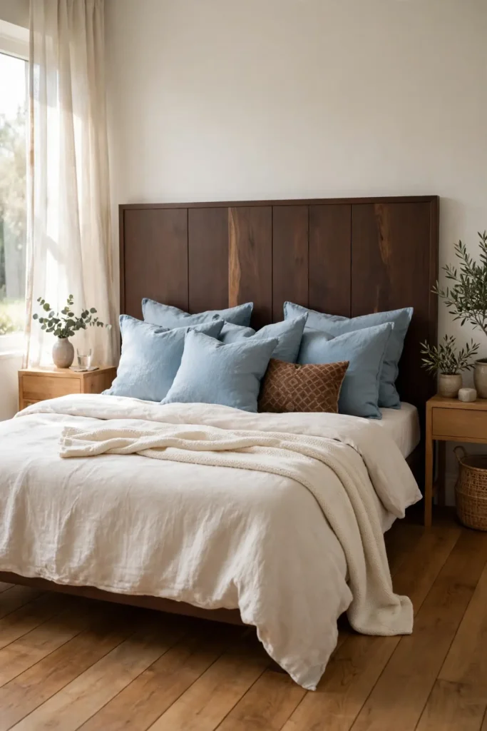
DO:
- Mix three pillow sizes: large squares behind, mediums in front, and one lumbar across.
- Combine solid powder blue linen with one small brown pattern for easy contrast.
- Stick to natural fibers like linen and cotton for a relaxed, breathable feel.
DON’T:
- Don’t buy four identical pillows, which looks stiff and showroom-like.
- Don’t mix more than two patterns or the bed starts to feel busy.
- Don’t pair shiny satin against matte linen, since the textures will clash.
A good cushion mix follows a simple ratio of pattern to solid, roughly one patterned pillow for every three solids. Karate-chop the tops of feather-filled pillows for that styled dent. Swap covers seasonally instead of buying new inserts.
Brass Table Lamps
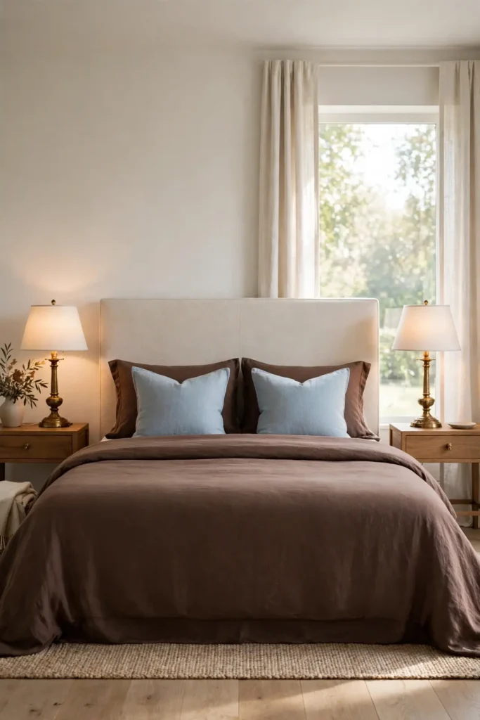
Cost: $40 to $120 per lamp for quality brass-finish options.
Time: 15 minutes to unbox, place, and style each lamp.
Skill Level: Beginner, no tools or wiring needed.
Best For: Nightstands and dressers that need a warm metallic glow.
Shade Tip: White linen shades keep the glow soft and flattering.
Brass lamps bridge chocolate brown and powder blue better than any other metal, warming the blue and gilding the brown. Choose simple drum or tapered shades in white or cream so the light stays soft. Keep both lamps identical for symmetry, which suits this calm, tailored palette perfectly.
Plush Brown Area Rug

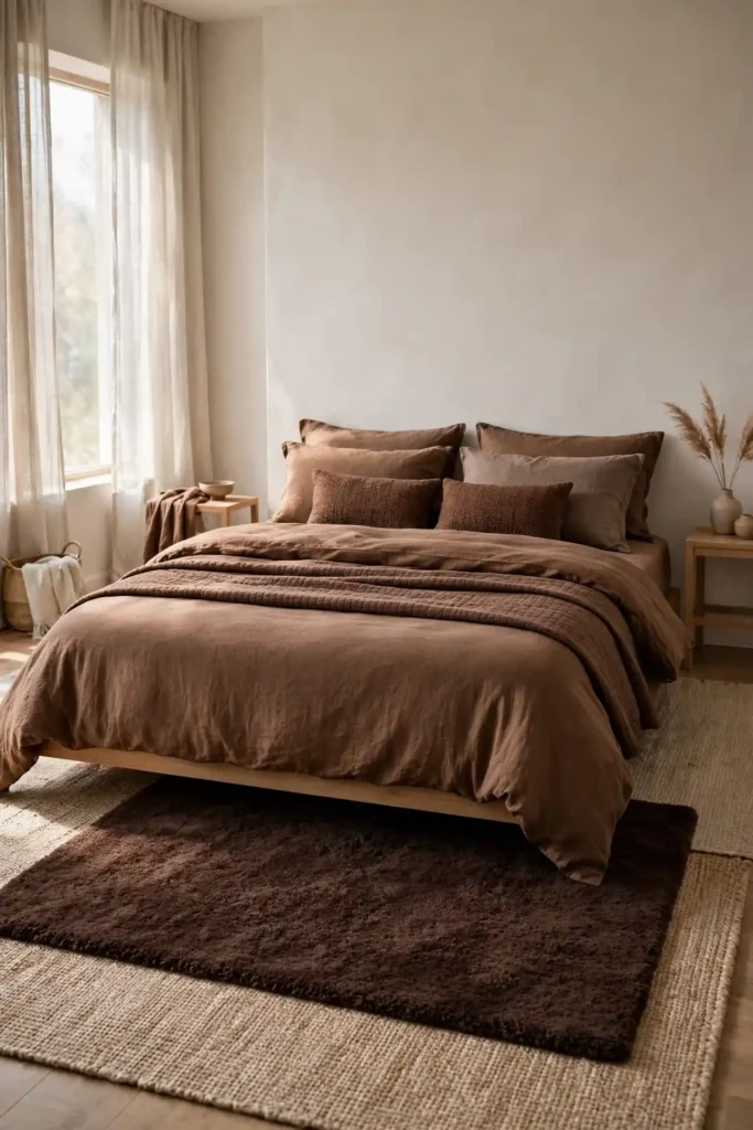
A plush brown area rug grounds the bed and keeps bare feet happy on cold mornings. Choose a warm chocolate tone with a high, soft pile that invites you to linger, and size it so it extends at least two feet beyond each side of the bed. In my experience, the rug should slide under the lower two-thirds of the bed for the most generous look.
Layer a smaller flat-weave rug in powder blue on top for a designer trick that adds pattern and color at once. The blue layer breaks up the brown expanse and ties the floor into the bedding above. Keep the edges aligned and the pile heights different so each layer reads clearly instead of blurring together.
Blue Botanical Artwork
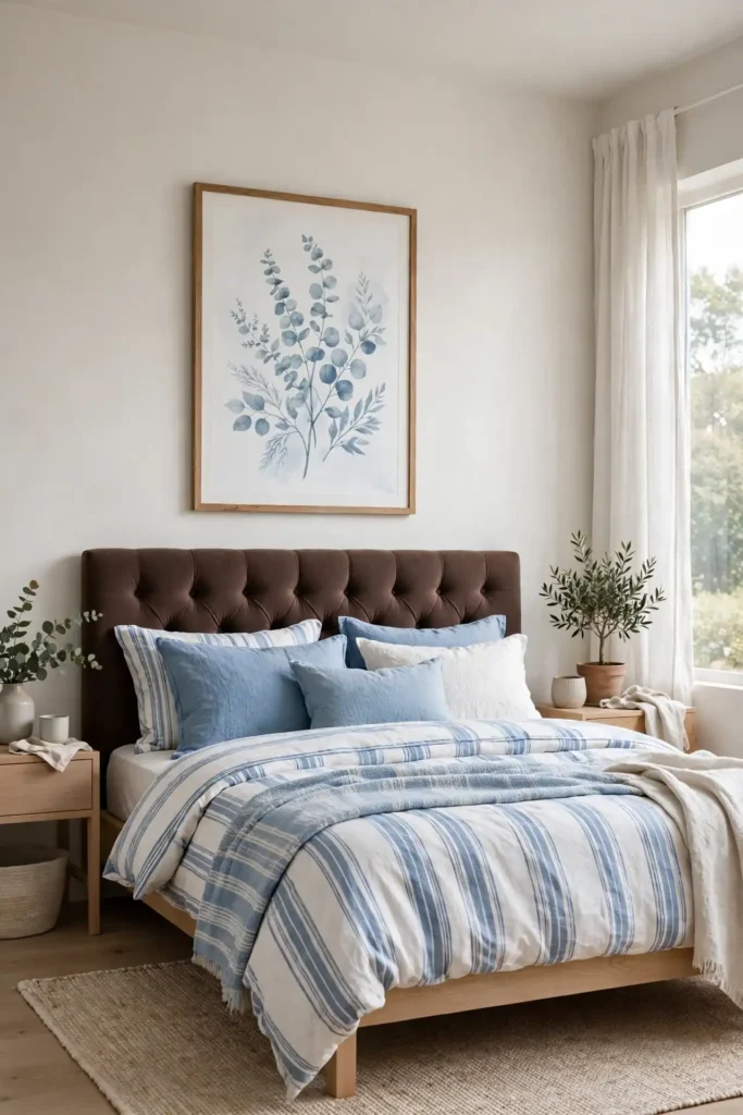
- Hang one large botanical print in powder blue tones above the bed for a calm focal point.
- Choose simple white or light wood frames so the artwork, not the frame, gets attention.
- Keep the art’s blue slightly softer than the bedding so the layers don’t compete.
- Center the piece about six inches above the headboard for balanced spacing.
Botanical prints bring an organic softness that suits brown wood beautifully, echoing the relaxed warmth of modern Mediterranean bedroom ideas without copying the style. I’ve noticed eucalyptus and olive branch prints flatter this palette especially well. One strong piece beats a cluttered gallery wall here.
Chunky Knit Pouf
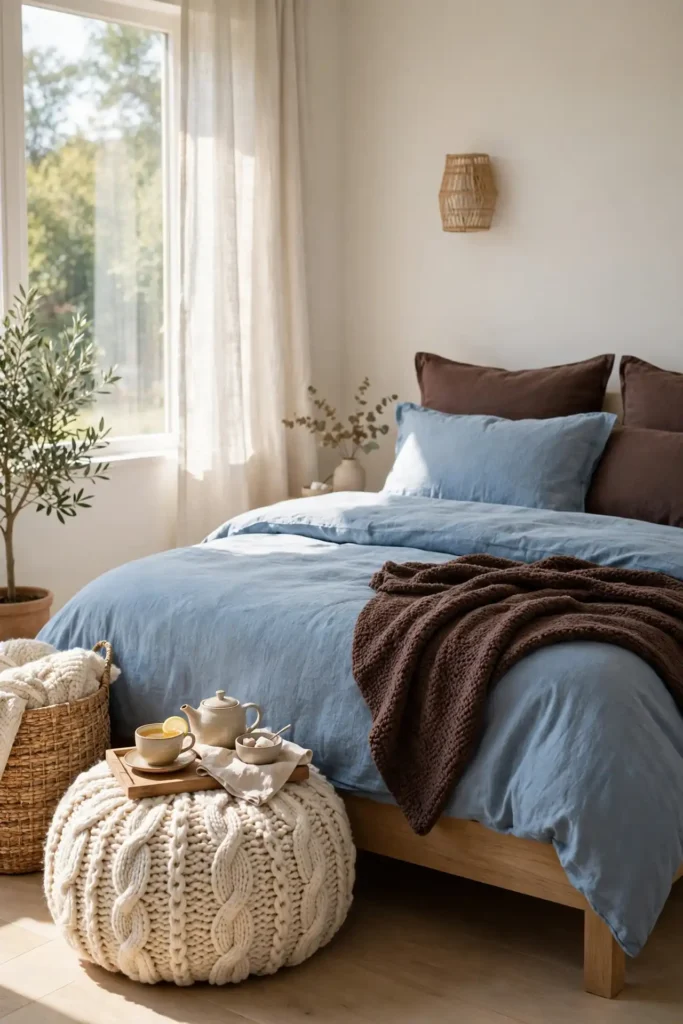
Quick Tip: Drop a chunky knit pouf in cream or powder blue beside the bed or under a window. It adds soft texture, works as a footrest or extra seat, and costs far less than an upholstered ottoman. Choose a washable cover so it survives daily use without worry.
Poufs fill awkward empty corners that make a bedroom feel unfinished. A round knit shape softens all the straight lines of bed frames and dressers. Tuck a small tray on top and it doubles as a side table for tea. Move it wherever you need softness most, since its light weight makes rearranging easy.
Upholstered End Bench
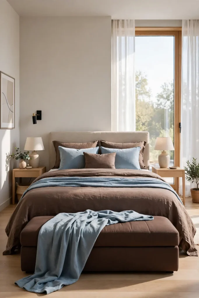
BEFORE: The foot of the bed sits empty, and the room’s layout feels like it stops short. The eye travels from the pillows straight to the floor with nothing to rest on.
AFTER: A low upholstered bench in chocolate brown fills the gap and gives the room a finished, boutique-hotel feel. Draped with a powder blue throw, this is where chocolate brown and powder blue bedroom decor shows its chic contrast most clearly.
Choose a bench no wider than the bed and low enough to see over from the pillows. Storage benches hide extra blankets while keeping the silhouette slim. Keep the upholstery simple and let the throw provide the pattern.
Layered Sheer Curtains
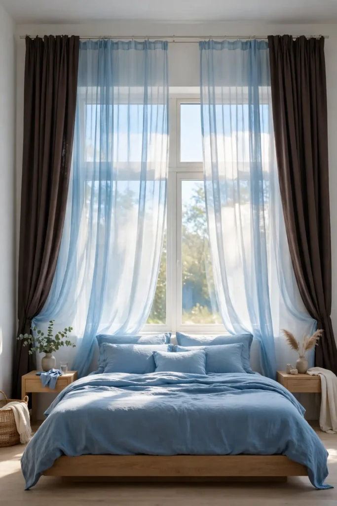
- Hang a double rod and dress the back layer with powder blue sheers for soft daylight.
- Add chocolate brown blackout panels on the front rod for sleep-friendly darkness.
- Let the sheers stay closed during the day so the room glows blue and bright.
- Close the brown panels at night for a cozy, cocoon-like feel.
This layered approach gives you two rooms in one: airy by day and enveloping by night. I’ve noticed sheers also blur hard window edges, which flatters small bedrooms especially. Iron or steam the panels once after hanging, and they will drape cleanly for months.
Matte or Satin Paint
| Matte Finish | Satin Finish |
|---|---|
| Flat sheen with no shine at all | Soft sheen with a subtle glow |
| Excellent at hiding wall imperfections | Shows bumps and flaws more clearly |
| Harder to wipe clean after marks | Wipes clean easily with a damp cloth |
| Best for chocolate accent walls | Best for powder blue walls and trim |
| Touch-ups blend in invisibly | Touch-ups may flash slightly |
Matte chocolate walls look rich and velvety, absorbing light for a cocooning effect that suits bedrooms perfectly. Satin powder blue reflects a gentle glow that keeps the room feeling fresh and open. Match the sheen to the mood you want, and always test large swatches before buying gallons.
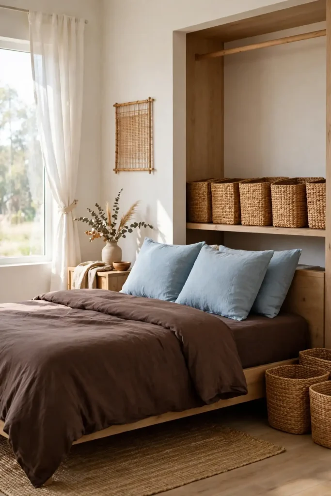
Woven Storage Baskets
DO:
- Choose seagrass or rattan baskets in warm honey tones that echo chocolate brown.
- Use lidded baskets for visual calm and open ones for grab-and-go items.
- Line a closet shelf with matching baskets for instant built-in style.
DON’T:
- Don’t scatter many tiny baskets, which reads as clutter rather than storage.
- Don’t pick cool gray wicker, since it fights the warm brown palette.
- Don’t overfill baskets past the rim, which ruins their tidy look.
Baskets add the natural texture this polished palette needs to feel livable. I keep one by the bed for books, one in the closet for off-season clothes, and one large one for spare throws. When every stray item has a woven home, the whole bedroom stays neat with almost no work.
Antique Brass Hardware

Cost: $3 to $8 per knob or pull at most hardware stores.
Time: About one hour to swap every handle in the room.
Skill Level: Beginner, only a screwdriver is required.
Best For: Dressers, nightstands, and closet doors needing warmth.
Finish Tip: Unlacquered brass develops a rich patina over time.
Swapping hardware is the fastest facelift in decorating, and antique brass flatters both chocolate brown wood and powder blue paint. Keep every piece in the same finish so the room reads cohesive. Save the old knobs in a labeled bag in case a future refresh calls for them again.
Powder Blue Ceiling

A powder blue ceiling is the boldest move on this list, and it pays off beautifully. The soft blue overhead feels like open sky, lifting a chocolate-heavy room and keeping it from ever feeling cave-like. Because ceilings catch less direct scrutiny than walls, the color reads as atmosphere rather than statement.
Keep the walls warm white so the blue ceiling gets full attention without competition. I’ve noticed this trick makes standard eight-foot ceilings feel noticeably taller. Finish the edge with crisp white crown molding or a clean cut line, and the whole room gains a custom, designer-done quality.
Chocolate Duvet Cover
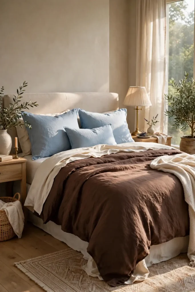
- Choose a chocolate brown duvet cover in washed linen for softness that improves with every wash.
- Pick a shade with warm red undertones so it reads rich, never muddy.
- Layer white or cream sheets underneath to keep the dark cover from feeling heavy.
- Add powder blue shams on top so the blue appears in the bed’s upper half.
A chocolate duvet makes the bed the undeniable star, especially against pale walls. I’ve noticed darker bedding also hides wrinkles better, which keeps the room looking tidy with less fuss. Wash it inside out in cold water to protect the color, and it will stay rich for years.
Patterned Accent Pillows
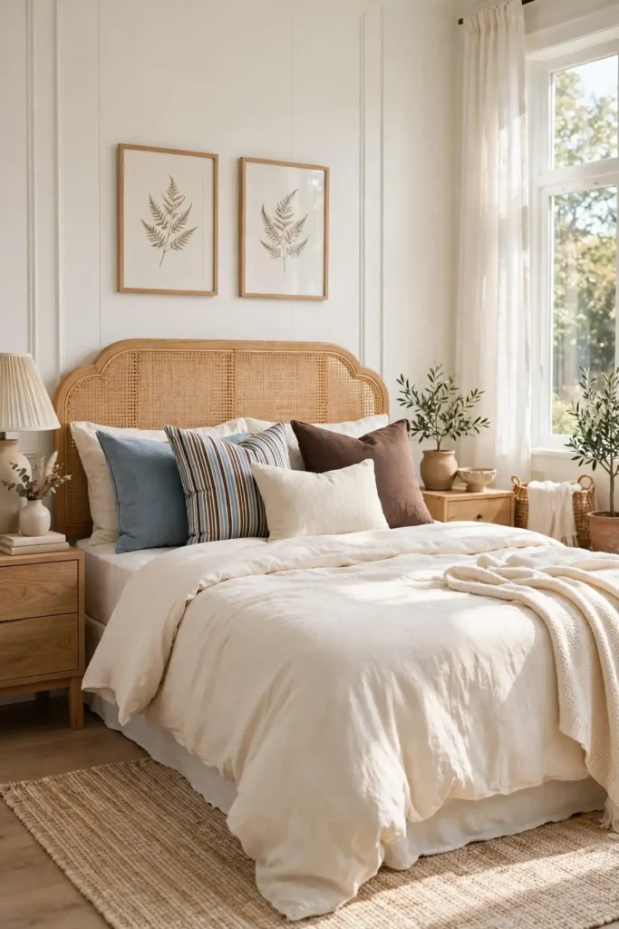
Quick Tip: Add two patterned pillows that mix chocolate brown and powder blue in one print, like a small stripe or a classic ticking. They act as translators between the solid brown pieces and the solid blue ones. Keep the scale of the pattern small so it reads as texture from across the room.
Patterned pillows are the diplomats of a two-color palette, giving the eye a place where both shades meet. Place one against each sleeping pillow for symmetry, or cluster both on one side for a relaxed look. When the pattern includes both colors, every solid piece in the room suddenly feels more connected.
Bedside Water Carafe
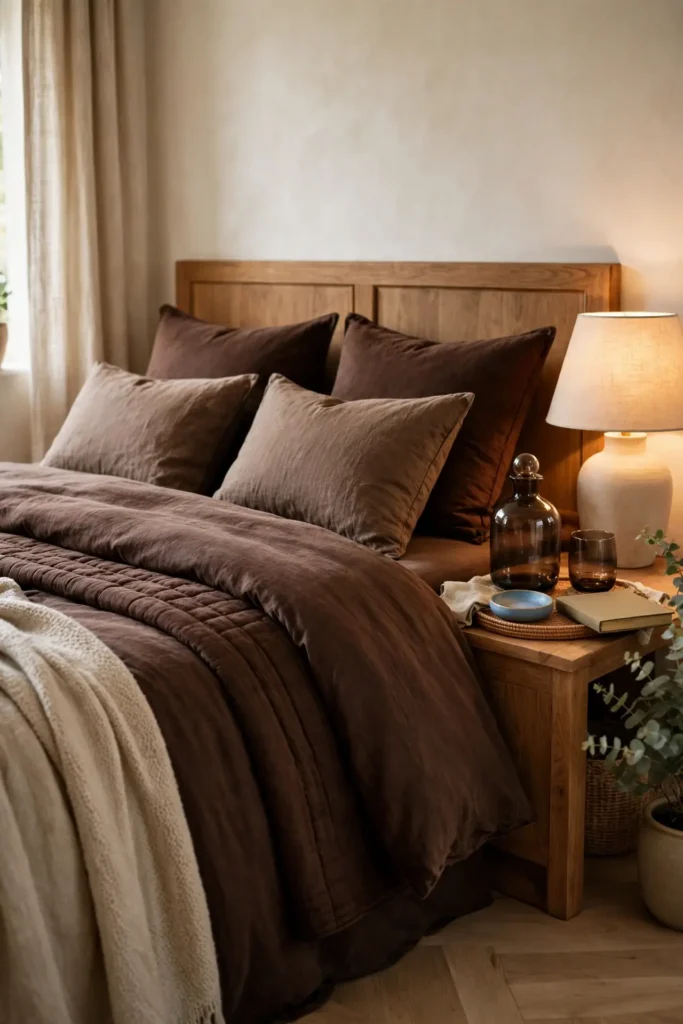
BEFORE: Nighttime water means a plastic bottle or a trek to the kitchen, and the nightstand holds only a lamp and a phone charger.
AFTER: A glass carafe with a matching tumbler turns the nightstand into a thoughtful little station. Choose smoky brown glass or powder blue ceramic to echo the palette. It is a small luxury that makes every night feel slightly more considered.
Look for a carafe with a tumbler that doubles as a lid to keep dust out. Keep the set on a small tray with your book to create a tidy vignette. This tiny ritual of fresh water by the bed is one of those details guests always notice and remember.
Double Curtain Rods

- Mount a double bracket set four inches above the window frame and three inches wider on each side.
- Hang powder blue sheers on the inner rod, hemmed to just kiss the floor.
- Hang chocolate brown panels on the outer rod, lined for better drape.
- Train the folds with loose ties for the first few days so they fall evenly.
Double rods are the hardware secret behind every layered curtain look you admire. They cost little more than single rods but double your styling options overnight. I’ve noticed this setup also improves sleep, since the combined layers block far more light than either one alone.
Rug Pile Options
| High-Pile Rug | Low-Pile Rug |
|---|---|
| Deep, cushiony softness underfoot | Smooth surface, easy to walk on |
| Traps dust and needs regular vacuuming | Shakes out and vacuums with ease |
| Best beside the bed for soft mornings | Best under the bed, extending outward |
| Claws can snag the long fibers | Claws glide over the short fibers |
| Higher price for quality wool | Moderate price, many affordable options |
High-pile rugs feel luxurious where your feet land first thing in the morning, while low-pile rugs handle the area under the bed with less maintenance. Many designers layer both, with low-pile underneath and a high-pile runner on top. Choose the pile that matches how you actually live.
Leaning Floor Mirror
DO:
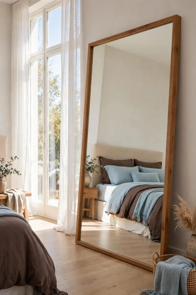
- Lean a full-length mirror against the wall opposite a window to double the daylight.
- Choose a warm wood or brass frame that echoes the room’s brown tones.
DON’T:
- Don’t place it where it reflects clutter, since it doubles mess too.
- Don’t choose a cool silver frame, which clashes with the warm palette.
- Don’t skip the wall anchor, especially in homes with kids or pets.
A leaning mirror makes a bedroom feel nearly twice its size by bouncing light into dark corners. It also gives you a full outfit check without dedicating wall space to a mounted piece. Keep the glass streak-free with a simple vinegar spray, and the reflection stays as crisp as the room itself.
Dried Flower Stems

Cost: $10 to $25 for a generous bunch of dried stems.
Time: 10 minutes to trim and arrange in a vase.
Skill Level: Beginner, no arranging experience needed.
Best For: Dressers, nightstands, and empty corners needing life.
Vase Choice: A simple ceramic or glass vase keeps focus on the stems.
Dried eucalyptus, pampas grass, or bleached ruscus add organic shape without the upkeep of fresh flowers. Their muted tones sit beautifully against both chocolate brown and powder blue. Keep stems out of direct sun so the colors stay soft, and one bunch will look good for a year or more.
Conclusion
Your bedroom should feel like the best part of coming home, and this palette delivers exactly that mix of comfort and polish. Start with one or two ideas that excited you most, like the velvet headboard or the layered throws, and let the look grow from there. Remember that chocolate brown and powder blue bedroom decor works because the contrast does the styling for you. Save this guide to Pinterest so you can revisit it while you shop, then try your favorite idea this weekend. Small changes compound into a room that feels entirely new. Your chic, calm retreat is closer than you think.