24 Bathroom Paint Colors for a Fresh, Spa-Like Makeover
A tired bathroom rarely needs a remodel. It needs color. I learned this when my own guest bath felt dark and dated, so I tested bathroom paint colors on a single accent wall first. The change was instant. Fresh paint bounced light into corners the overhead fixture never reached, and the whole room started to feel like a small spa. That one weekend project convinced me that wall color is the fastest, cheapest bathroom upgrade you can make.
Below you will find 24 shades that work in real bathrooms, from soft sage to classic navy. I have grouped them by mood so you can match the color to the feeling you want each morning. Paint lovers who also refresh other rooms will enjoy these curtains for bedroom ideas that pair soft fabric with calm walls. Grab painter’s tape, sample two shades, and paint with confidence.
Charming bathroom paint colors
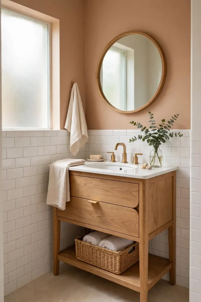
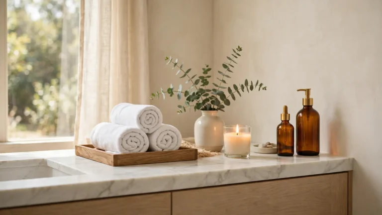
Every bathroom deserves one color that makes people stop and smile. For me, that color is the warm shade I sampled on three foam boards before committing. Welcoming tones set the mood before any decor goes up. They flatter skin in the mirror, hide small scuffs, and make morning light feel golden and soft.
This warm shade works hardest in small or windowless rooms. They bounce warm light into corners and pair beautifully with white tile and wood accents. In my experience, a mid-tone shade hides wear better than pale or dark extremes. Test three swatches at noon and night, then pick the one that still charms you.
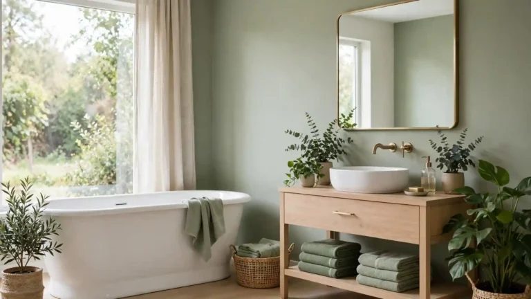
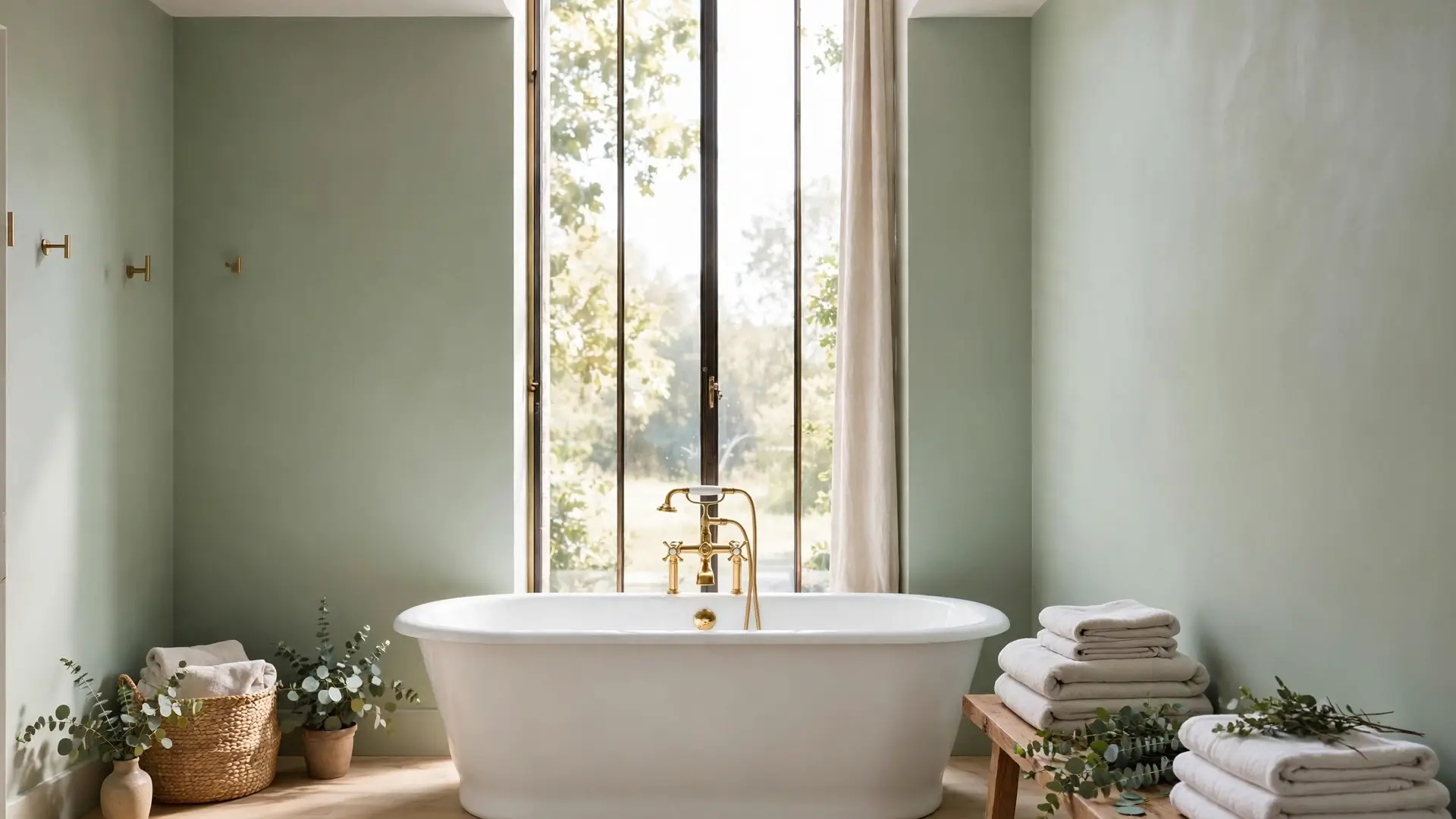
Soft Sage Wash
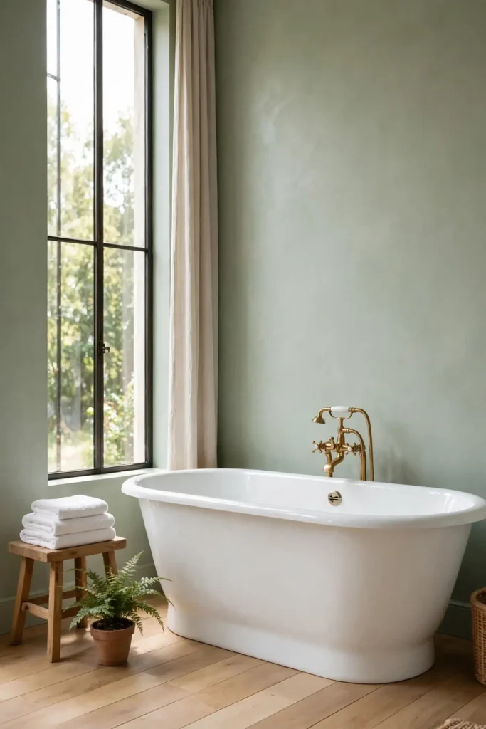
- Sage green calms busy bathrooms the way a deep breath calms a busy mind.
- Pair it with brushed brass fixtures and white towels for a classic spa look.
- It flatters both warm and cool tile tones, so matching stays easy.
- Use a satin finish to resist steam and wipe away splashes fast.
- In my experience, sage hides water spots better than stark white walls.
Morning routines feel slower in a sage bathroom, and I mean that as praise. The muted green softens harsh overhead light and pairs with plants beautifully. I have noticed renters love sage because one coat covers well. Keep the ceiling bright white so the room still feels tall and open.
Crisp White Refresh
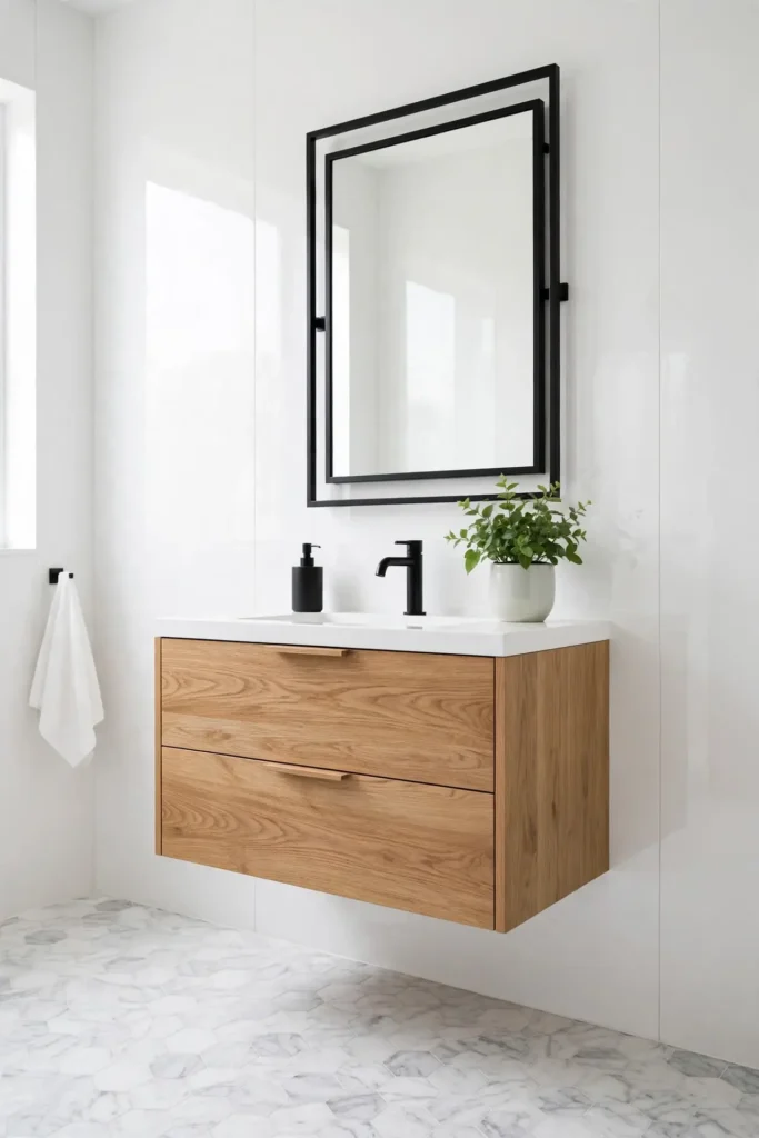
Quick Tip: White makes tiny bathrooms feel twice their size, so sample it on the darkest wall first. Choose a warm white, not a blue white, because cool whites can look clinical under LED lights. Always use a mildew-resistant satin or semi-gloss paint made for bathrooms.
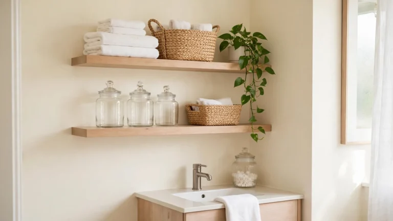
A crisp white refresh never goes out of style because it lets tile and fixtures shine. White bounces every bit of light, which matters in windowless baths. I have seen this work well in many cases where owners feared white would feel cold. Warm it up with wood, plants, and soft textiles. Layer two whites, one on walls and one on trim, for subtle depth.
Warm Greige Glow
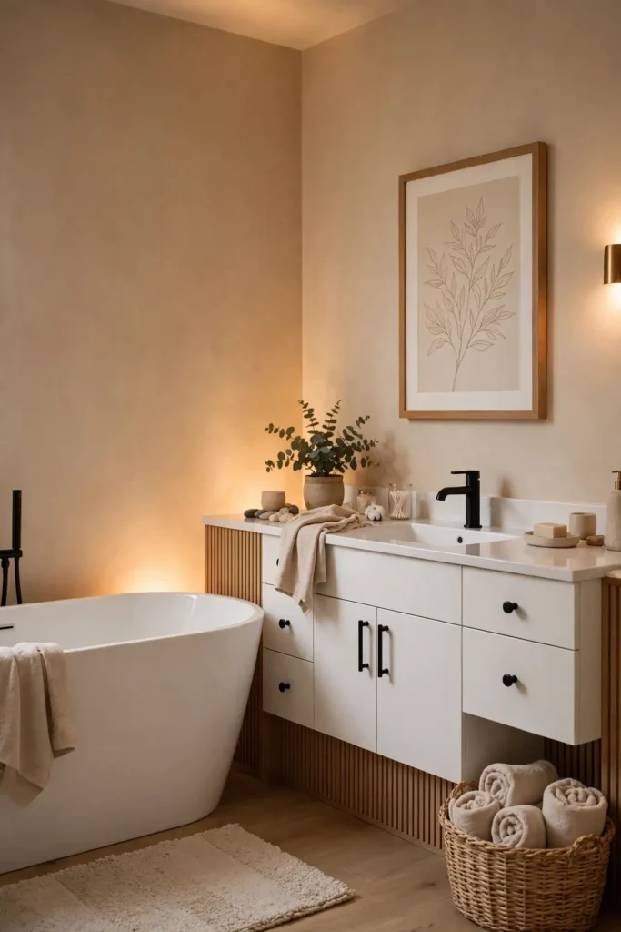
BEFORE: My hallway bath had flat beige walls that made the space feel dim and dated. The old color flattened every feature and made the white tub look yellow. Nothing in the room stood out.
AFTER: Two coats of warm greige changed everything in one weekend. The walls now glow softly under the vanity lights, and the white fixtures look crisp again. The room feels larger, calmer, and far more current.
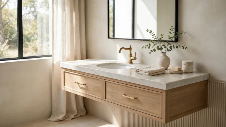
Greige sits perfectly between gray and beige, which is why designers reach for it constantly. It warms cool tile and cools warm wood, balancing both. Pair it with black hardware for contrast. I have noticed greige never clashes with existing finishes, making it the safest full-room choice.
Pale Blue Calm
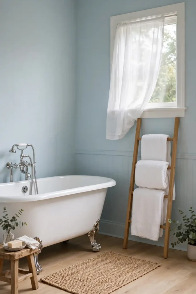
- Sample three pale blues on poster board and tape them to the wall.
- View each swatch in morning, noon, and evening light before deciding.
- Paint the ceiling bright white so the blue walls feel airy, not heavy.
- Finish with a satin bathroom-grade paint that resists steam and mildew.
- Add white towels and a wood stool to warm the cool blue tones.
Pale blue turns an ordinary bath into a quiet retreat. I have noticed guests relax the moment they step inside. The right bathroom paint colors in blue tones hide soap splashes well too. Keep grout lines bright white so the blue stays fresh and clean, never dingy.
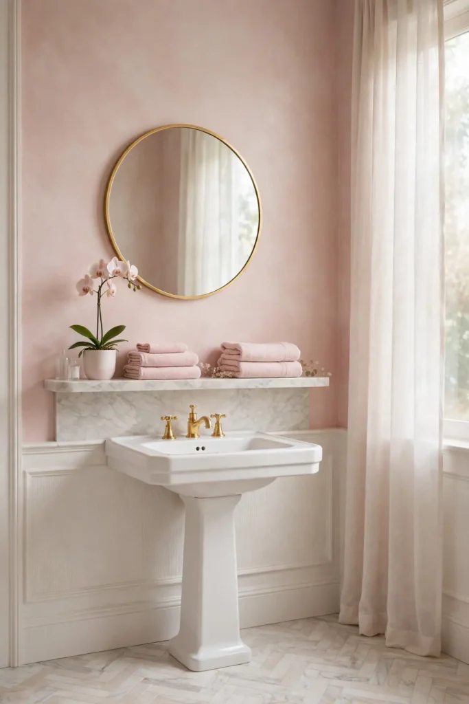
Blush Pink Mist
| Feature | Soft Blush | Dusty Rose |
|---|---|---|
| Cost | Low | Mid range |
| Light | Warm glow | Cozy dim |
| Mood | Fresh | Romantic |
Blush pink mist brings warmth without shouting, which suits bathrooms that need softness. I have seen this work well in many cases where owners wanted color but feared commitment. Pink flatters every skin tone in the mirror, a quiet bonus. Pair it with white tile and gold accents for a polished finish. Keep the rest of the palette neutral so the pink stays the star. Sample it on the wall behind the mirror first, since that is where you will see it most. I have noticed pink looks deeper at night, so check the swatch under your evening lights too.
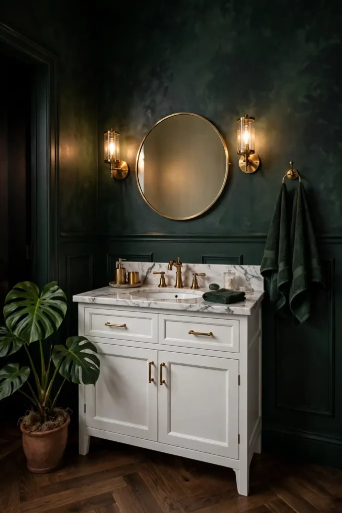
Deep Forest Drama
DO:
- Do paint all four walls for a cocooning, spa-like effect.
- Do pair dark green with marble and brass for timeless contrast.
- Do add layered lighting so the deep color never feels flat.
- Do use a satin finish that reflects light softly.
DON’T:
- Don’t pair it with dark tile, or the room may feel cave-like.
- Don’t skip primer on previously glossy walls.
- Don’t forget white towels and plants to lift the mood.
Deep forest drama suits bathrooms with good light and white fixtures. The rich green makes brass shine and white tile pop. I have noticed small powder rooms wear dark green best, since the bold choice feels intentional. Keep the ceiling white to hold the height.
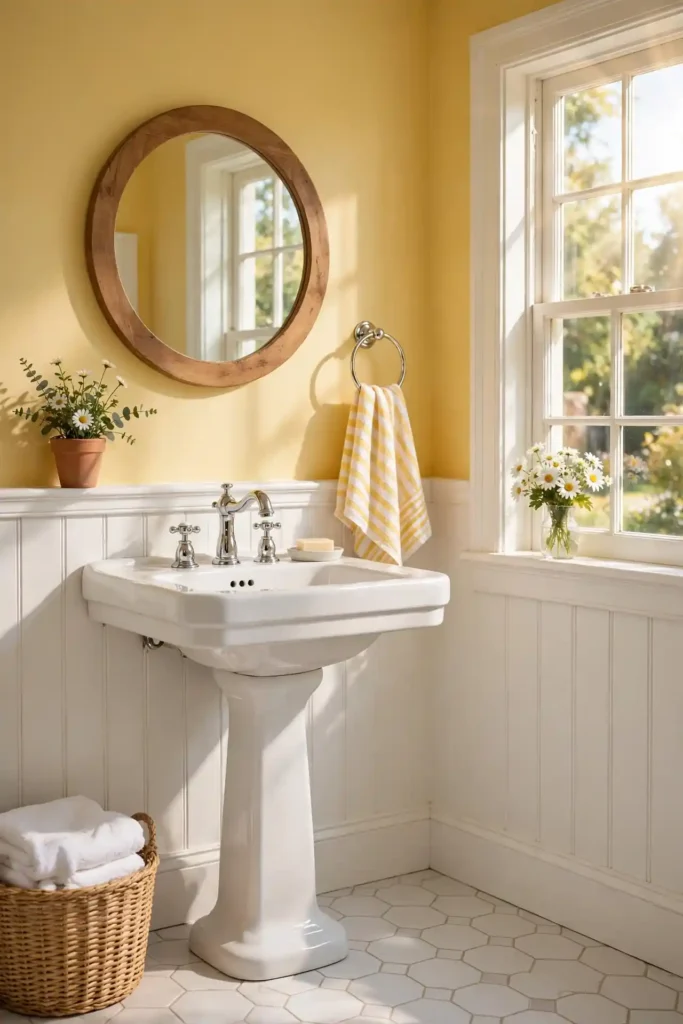
Sunny Butter Tone
Cost: Low | Time: One weekend | Skill Level: Beginner | Best For: Dark, north-facing bathrooms
Sunny butter tone pours warmth into bathrooms that never see direct sun. I tried it in a north-facing bath and the gloom lifted immediately. Yellow reflects artificial light beautifully, so the room glows even at night. Pair it with white wainscoting for a classic cottage feel. Keep the shade soft, never neon, or the warmth turns harsh. In my experience, butter yellow makes small baths feel cheerful without overwhelming them. Add white towels and a green plant to balance the warmth. Sample two yellows side by side, since undertones shift fast.
Coastal Teal Pop
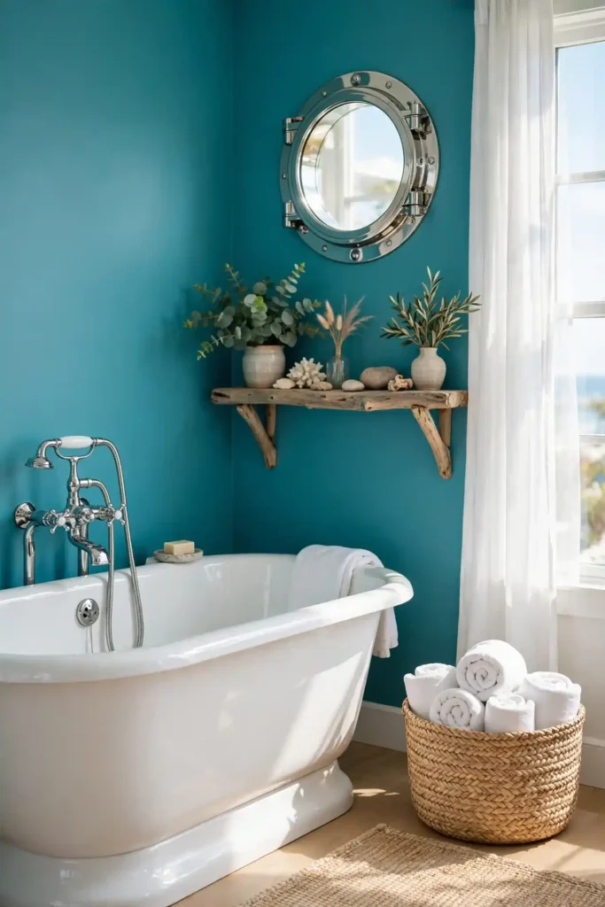
Teal brings the ocean indoors, and bathrooms love that energy. I painted a rental bath in coastal teal and guests asked about it for months. The blue-green mix flatters white porcelain and chrome. It hides water spots better than pale shades, which keeps cleaning easy. Choose a mid-tone teal so the room feels vibrant, not dark.
Among bathroom paint colors, teal ranks as the boldest crowd-pleaser I know. It pairs with natural wood, woven baskets, and white towels for a beachy finish. I have noticed teal photographs beautifully, which matters for resale listings. Keep the ceiling bright white to balance the saturated walls.
Muted Lavender Haze
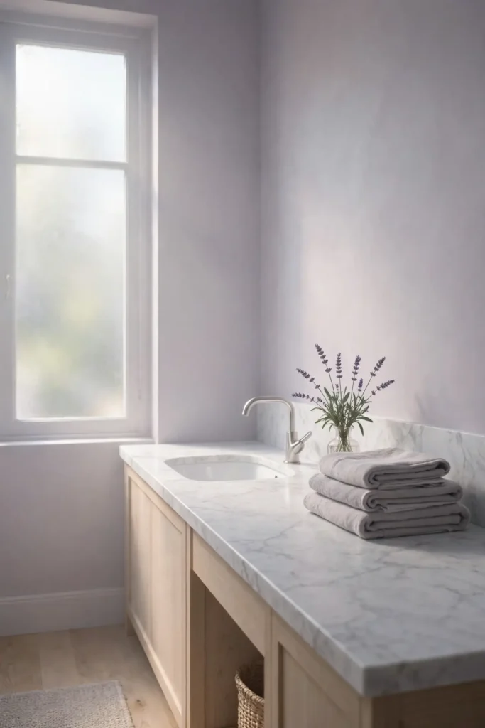
- Muted lavender softens harsh bathroom light with a gentle purple-gray wash.
- Pair it with silver fixtures and white marble for a serene, modern feel.
- It suits small baths best, where the subtle color feels intentional.
- Use two coats of satin paint for even coverage over old colors.
- In my experience, lavender hides yellowing better than pure white.
Lavender haze feels like dusk in the best way, calm and a little dreamy. I have noticed it flatters candlelight beautifully for evening baths. Keep towels white or gray so the purple stays subtle. Add a wood tray across the tub for spa styling.
Classic Navy Depth
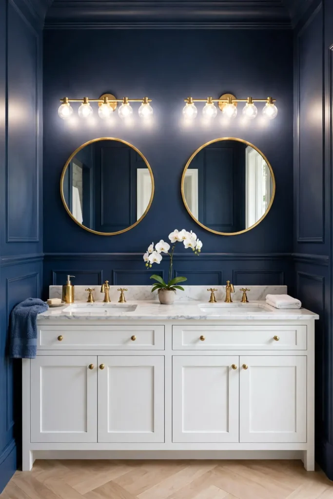
Quick Tip: Navy makes white fixtures look brighter by contrast, so it suits baths with classic porcelain. Paint the vanity wall navy and keep the rest light for balance. Use a satin finish because flat navy shows every splash. Test it at night, since navy deepens under warm bulbs.
Classic navy depth turns a plain bathroom into a tailored retreat. I have seen this work well in many cases where owners wanted drama without darkness. Navy pairs with brass, marble, and crisp white for a timeless trio. Keep the ceiling and trim bright white so the room holds its height. Add a round mirror to soften the strong color.
Earthy Clay Warmth
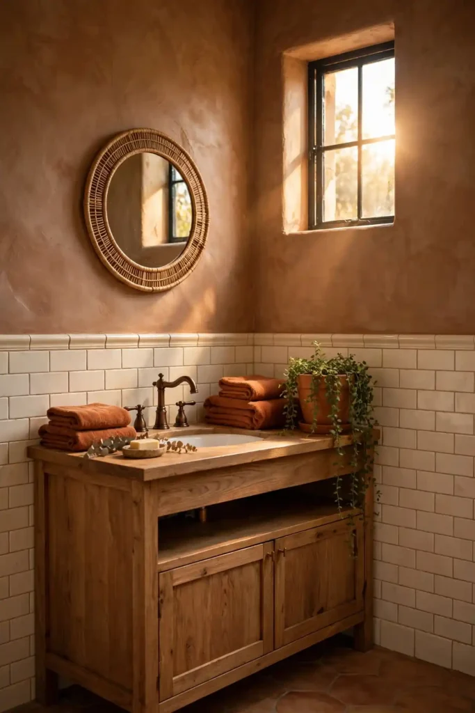
BEFORE: My powder room had cold gray walls that felt unwelcoming every single day. The gray clashed with the warm wood vanity I loved. Guests never lingered, and honestly, neither did I.
AFTER: Earthy clay transformed it in a single weekend. The terracotta warmth hugs the wood vanity and makes the white sink glow. Now the small room feels like a desert sunset, cozy and inviting.
Clay tones ground a bathroom with natural warmth that never feels trendy. Pair them with cream tile and bronze fixtures for an earthy palette. These renter friendly bathroom makeovers show similar warm tones using peel-and-stick tricks. Keep textiles simple so the rich walls stay the focus.
Mint Green Breeze
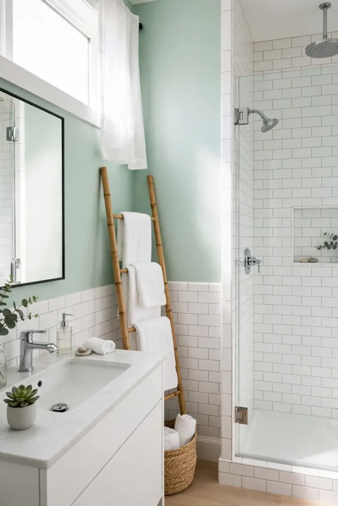
- Clean walls with a degreaser so the mint paint bonds properly.
- Tape trim and fixtures, then roll on a mold-resistant primer.
- Apply two thin coats of satin mint, drying fully between coats.
- Remove tape while the final coat is slightly tacky for crisp lines.
Mint green breeze feels like a deep breath on a hot day. I have noticed it wakes up tired tile without a full renovation. The cool tone flatters chrome and white porcelain beautifully. Pair it with black accents for a crisp, modern edge. Keep the shade pale so the room stays bright and airy. Sample it beside your tile before buying gallons.
Charcoal Gray Edge
| Feature | Soft Charcoal | Deep Slate |
|---|---|---|
| Cost | Low | Low |
| Mood | Modern | Dramatic |
| Pairing | White tile | Brass fixtures |
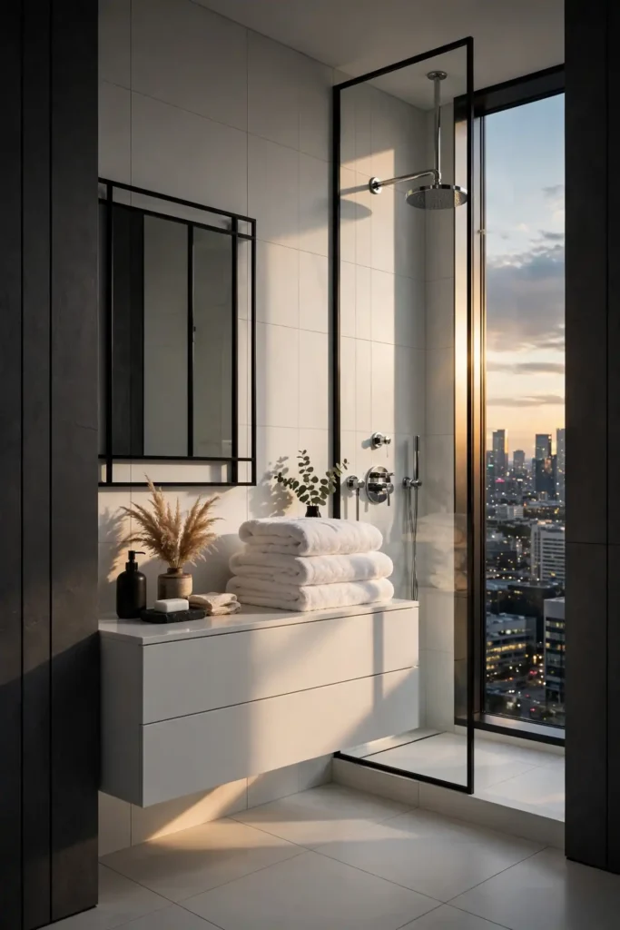
Charcoal gray edge brings city sophistication to any bathroom. I have seen this work well in many cases where owners wanted modern without stark white. Among bathroom paint colors, charcoal ranks as the most forgiving for hiding scuffs and water marks. Pair it with white tile and chrome for crisp contrast. Keep lighting layered, since dark walls need good bulbs to glow. Add a large mirror to double the light. Use a satin finish so the deep color reflects light softly instead of going flat. I have noticed charcoal makes small baths feel intentional, like a boutique hotel.
Powder Blue Air
DO:
- Do use powder blue on all walls for a light, airy envelope.
- Do pair it with white beadboard for classic cottage charm.
- Do add silver or chrome fixtures that echo the cool tone.
DON’T:
- Don’t pair it with yellow bulbs, which can turn blue walls greenish.
- Don’t use flat paint in a steamy bath; choose satin instead.
- Don’t forget to paint the ceiling bright white for height.
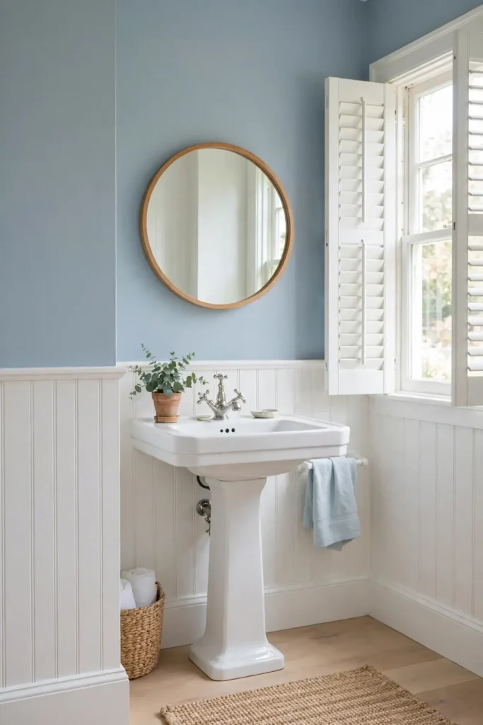
Powder blue air feels like a clear morning sky. I have noticed it makes windowless baths feel less closed in. The pale tone reflects light well and flatters every tile color. Keep decor minimal so the airy color breathes.
Creamy Ivory Shine
Cost: Low | Time: One weekend | Skill Level: Beginner | Best For: Renters and quick flips
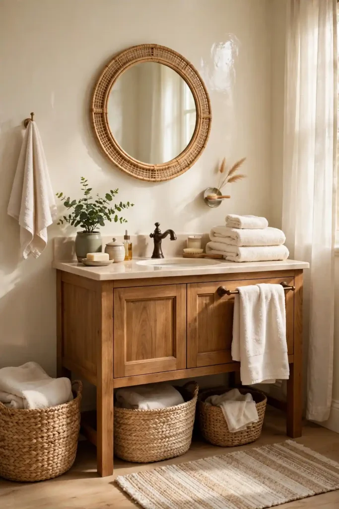
Creamy ivory shine warms a bathroom without any hint of yellow overload. I painted a rental bath in ivory and got my full deposit back, since landlords love neutrals. The soft white flatters every fixture finish, from chrome to oil-rubbed bronze. Pair it with warm wood for a cozy, collected feel. Keep the trim bright white for crisp definition. In my experience, ivory never photographs badly, which helps resale listings. Add texture with woven baskets and plush towels. Two coats of satin ivory cover most old colors completely.
Seafoam Serenity
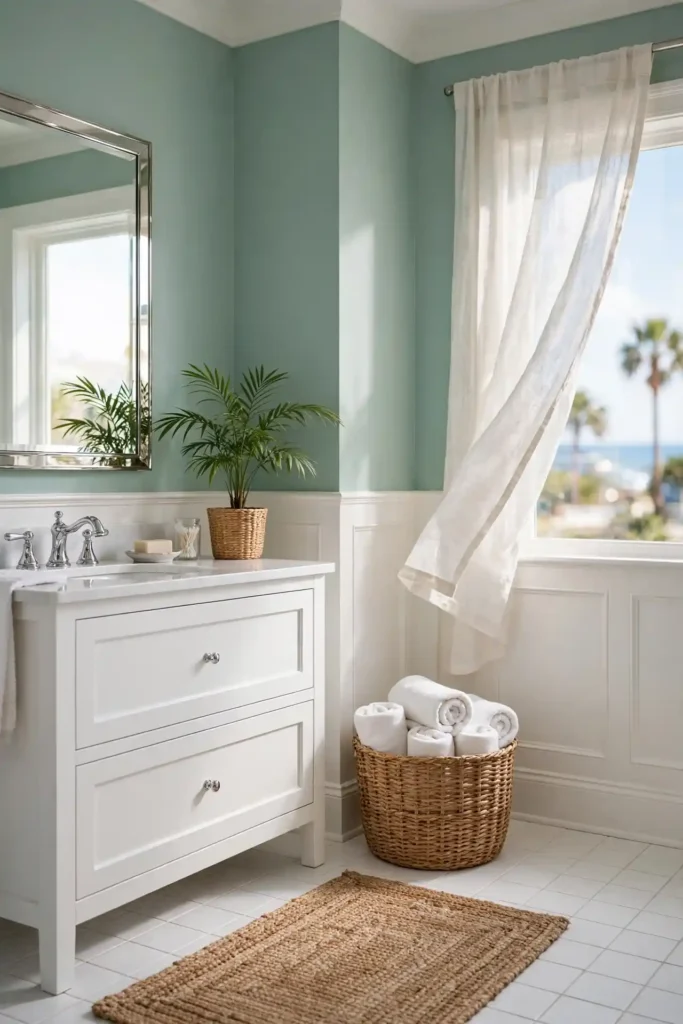
Seafoam sits between blue and green, and bathrooms adore that balance. I chose it for a beach-house bath and the whole room exhaled. The soft tone flatters white tile and natural wood equally. It hides water spots well, which keeps the walls looking fresh longer. Choose a pale seafoam so the color whispers instead of shouts.
Pair seafoam with white wainscoting for a crisp coastal finish. I have noticed it makes small baths feel breezy and open. Add woven baskets and a jute rug for texture. Keep the fixtures chrome or brushed nickel to echo the cool undertone. In my experience, seafoam never clashes with existing tile, so it suits quick refreshes.
Terracotta Sunset
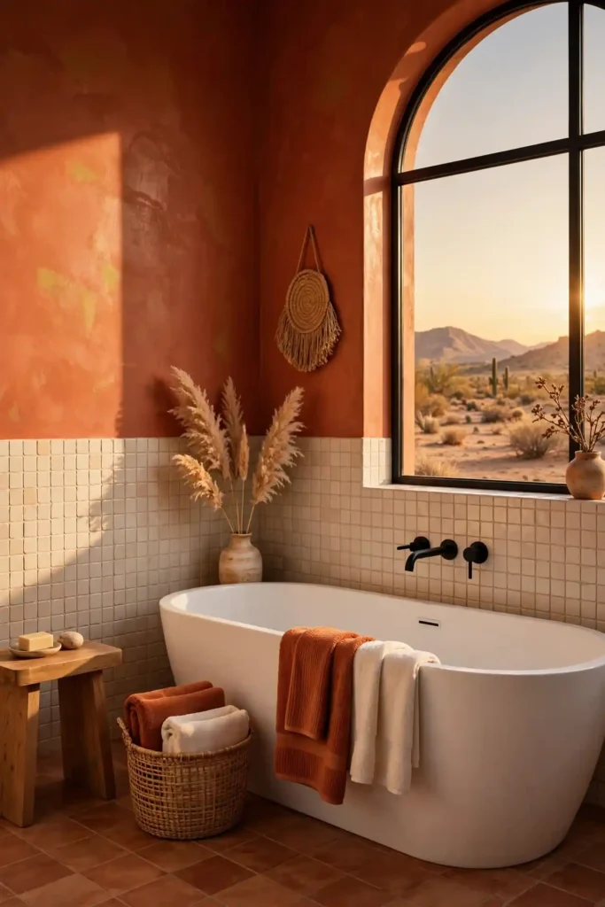
- Terracotta sunset wraps the bathroom in warm, earthy desert tones.
- Pair it with cream tile and black fixtures for bold contrast.
- It flatters warm wood vanities better than any cool color.
- Use a satin finish to keep the rich pigment wipeable.
- In my experience, terracotta makes white tubs look extra crisp.
Terracotta feels brave on the swatch and perfect on the wall. I have noticed guests always comment on it first. The best bathroom paint colors for warmth include terracotta, clay, and ochre tones. Keep the ceiling white and the textiles neutral so the sunset shade glows. Two coats give the richest, most even finish.
Dusty Rose Charm
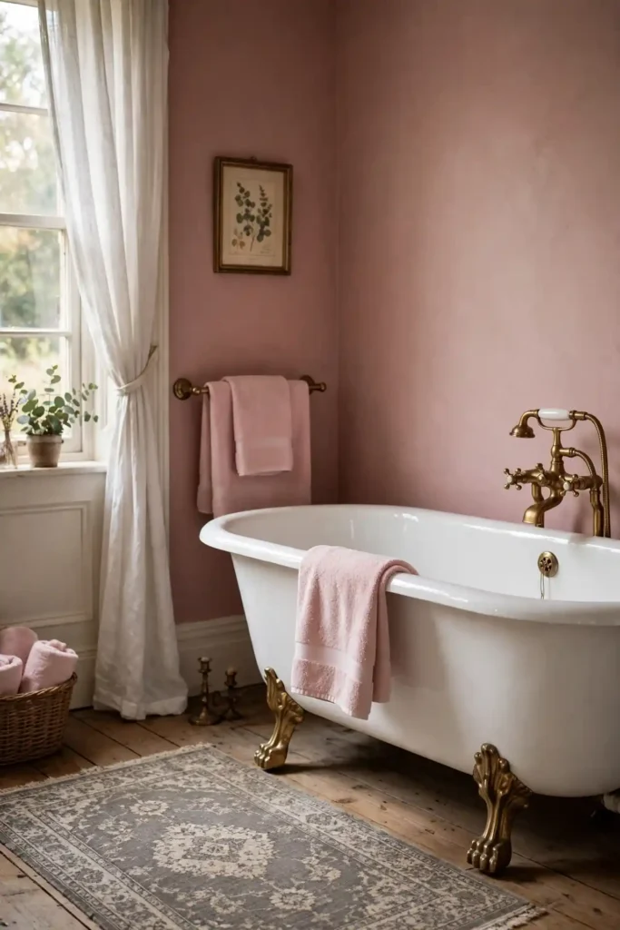
Quick Tip: Dusty rose adds vintage charm without the sweetness of bright pink. Sample it next to your tile, since undertones shift against white porcelain. Pair it with antique brass for a collected, timeless look. Use satin paint so the soft color wipes clean easily.
Dusty rose charm suits bathrooms with vintage bones, like clawfoot tubs and hex tile. I have seen this work well in many cases where owners wanted feminine without frilly. The muted tone pairs with gray, cream, and warm wood beautifully. Keep the palette restrained so the rose stays sophisticated. Add a vintage rug for extra character. Sample two roses side by side before committing.
Sky Gray Whisper
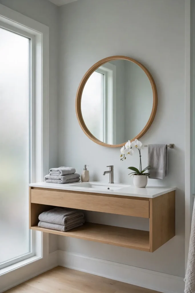
BEFORE: My guest bath had stark white walls that felt cold and unfinished. The white showed every scuff and made the small room feel clinical. It lacked any personality or warmth.
AFTER: Sky gray whisper softened everything in one afternoon. The pale gray-blue adds just enough color to feel designed. White fixtures pop against it, and the room finally feels finished and calm.
Sky gray whisper is the introvert of bathroom colors, quiet but confident. I have noticed it flatters both warm and cool fixtures. The pale tone reflects light well while hiding scuffs. Pair it with white trim and soft textiles. Keep the shade light so the room stays airy.
Olive Green Ground
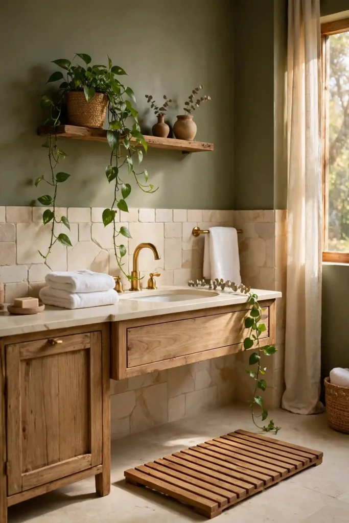
- Wash walls with sugar soap to remove grease and soap residue.
- Sand glossy spots lightly, then wipe away all dust.
- Roll on a stain-blocking primer and let it cure overnight.
- Apply two coats of satin olive, cutting in edges first.
- Finish with white towels and a wood bath mat for warmth.
Olive green grounds a bathroom with earthy, organic calm. I have noticed it pairs beautifully with brass, wood, and cream stone. The muted tone hides wear well in busy family baths. Keep the ceiling white and add plants to echo the green. In my experience, olive never feels trendy, so it ages gracefully.
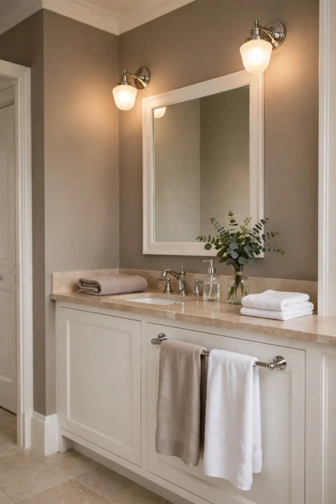
Warm Taupe Comfort
| Feature | Light Taupe | Deep Taupe |
|---|---|---|
| Cost | Low | Low |
| Mood | Airy | Cozy |
| Pairing | Chrome | Bronze |
Warm taupe comfort wraps the bathroom in soft, neutral calm. I have seen this work well in many cases where owners could not choose between gray and beige. The best bathroom paint colors for resale include taupe, greige, and soft white tones. Taupe flatters every fixture finish and hides dust well. Pair it with white trim for crisp definition. Keep the lighting warm so the taupe glows instead of flattening. Sample it on the largest wall first, since taupe shifts with light. I have noticed north-facing baths need the warmer taupe, while south-facing rooms suit cooler tones.
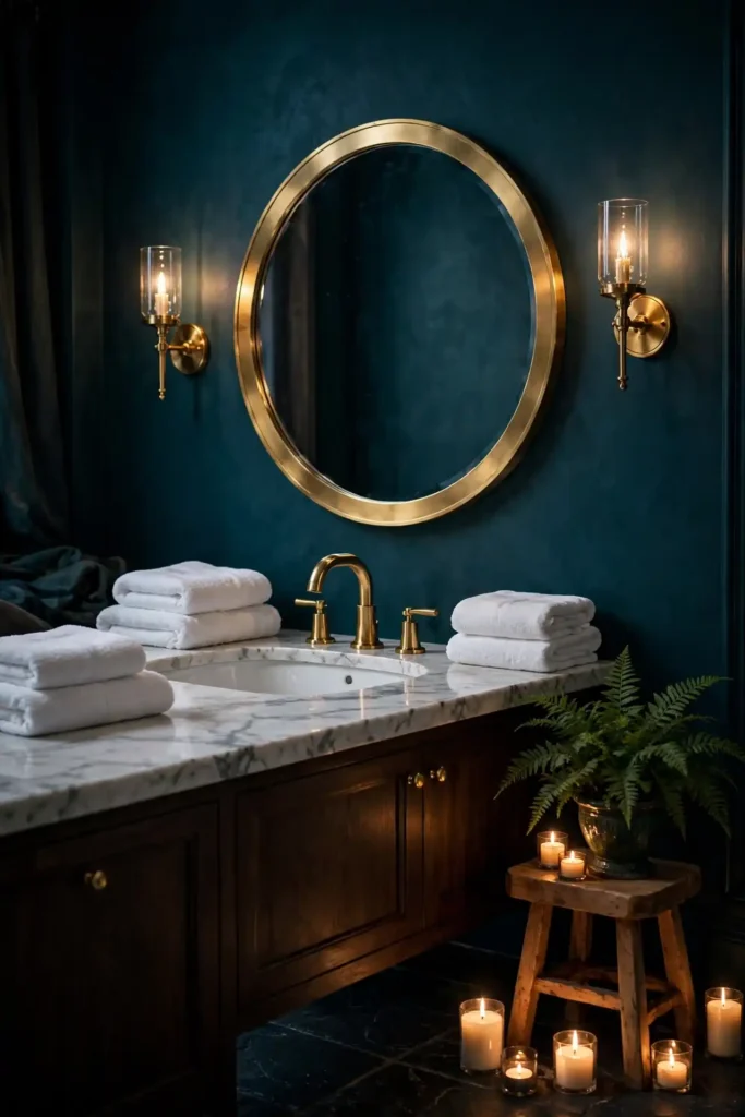
Moody Teal Nights
DO:
- Do paint a small powder room fully for maximum drama.
- Do add a large mirror to bounce light around dark walls.
- Do pair moody teal with gold fixtures for luxe contrast.
- Do keep the ceiling bright white to hold the height.
DON’T:
- Don’t use moody teal in a windowless bath without strong lighting.
- Don’t pair it with black tile, or the room may feel heavy.
- Don’t skip the satin finish, since flat shows every mark.
Moody teal nights turn a bathroom into an evening escape. I have noticed candlelight looks magical against the deep blue-green. Keep towels white and plush for contrast. Add a small stool with a plant to soften the drama.
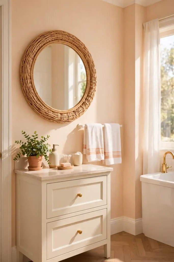
Peach Cream Glow
Cost: Low | Time: One weekend | Skill Level: Beginner | Best For: Dated baths needing warmth
Peach cream glow warms a bathroom like late-afternoon sun. I tried it in a dated bath with beige tile, and the old tile suddenly looked intentional. The soft peach flatters skin tones beautifully in the mirror. Pair it with white trim and rattan accents for a fresh, collected look. Keep the shade pale so the warmth stays subtle. In my experience, peach never feels cold, which suits windowless baths. Add white towels and a green plant to finish. Two coats of satin peach cover most old colors well.
Conclusion
Paint is the smallest budget with the biggest payoff in a bathroom. Pick one shade from these 24, sample it on your wall, and live with it for two days before you commit. I have seen how small changes like these can completely shift the way a space feels. The right bathroom paint colors turn a rushed morning routine into a calm ritual you look forward to. Save this list on Pinterest, share it with a friend who is mid-makeover, and enjoy every brushstroke of your fresh, spa-like retreat. Your future self will thank you every single morning.