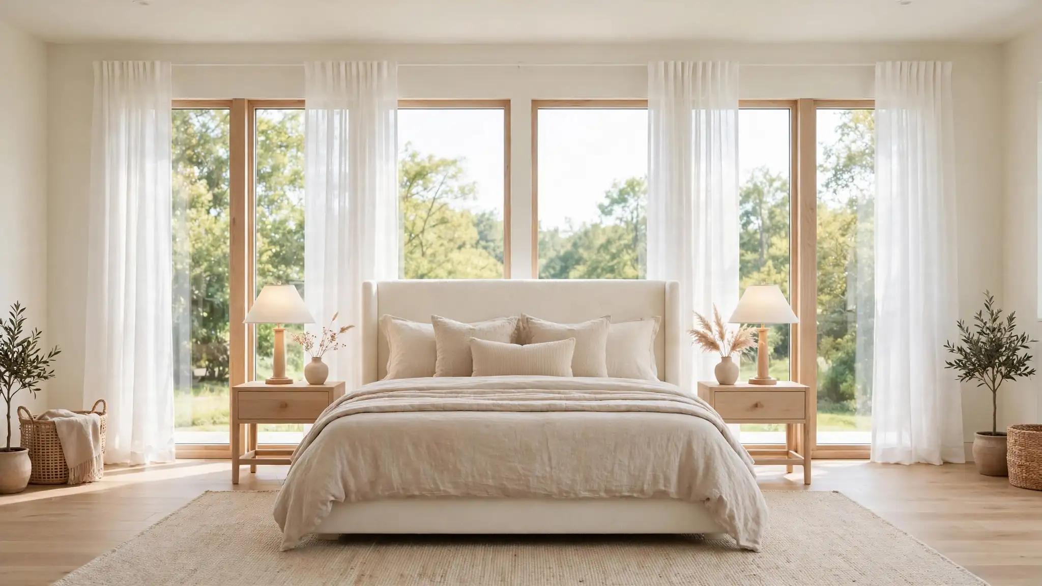
23 Primary Bedroom Layouts for Perfect Flow and Balance
Your bedroom should feel like a deep exhale at the end of every day, and primary bedroom layouts play the biggest role in creating that calm. I’ve noticed that rooms with clear zones and breathing space help you unwind faster than cluttered ones ever could. A thoughtful arrangement balances sleep, dressing, and quiet moments without crowding the floor. When furniture sits with intention, the whole room feels larger and more peaceful. This guide walks you through 23 serene arrangements that bring order, softness, and spacious flow to your personal retreat. Each layout works with real room shapes, so you can find one that fits your space and your style.
Before we begin, a quick note on scale. If your room runs small, these calm principles still apply, and you can borrow extra tricks from our guide to small bedroom layouts for tight floor plans. The ideas below focus on the main suite, where a little extra square footage lets you build real zones for rest and routine. In my experience, even one dedicated corner for reading or dressing changes how the whole room feels. Read on and picture which arrangement matches the way you live.
Bed Under Window
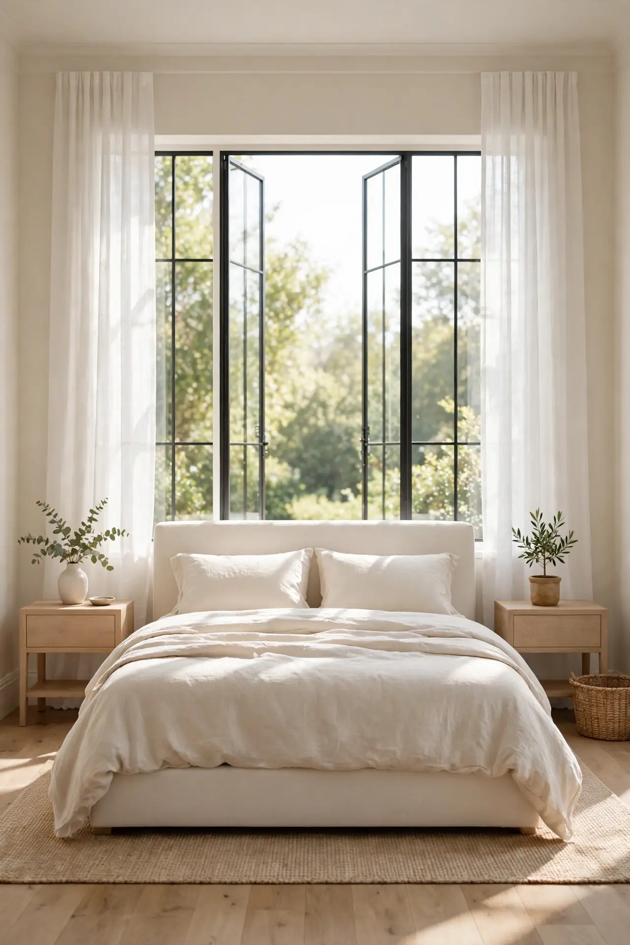
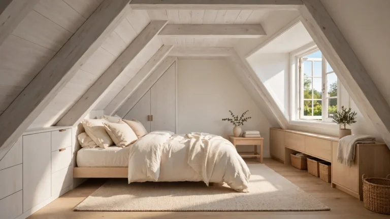
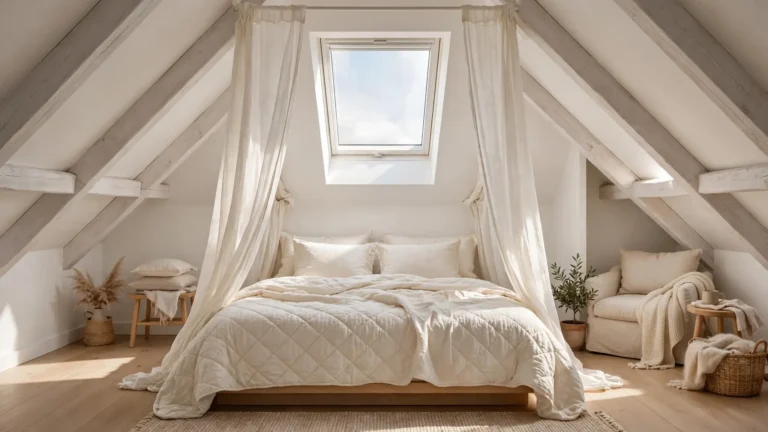
Morning light does half the decorating when the bed sits beneath the window. The headboard frames the view while soft daylight wakes you gently. This placement suits rooms where the window wall runs widest. Keep bedding low and simple so the glass stays the star. In my experience, people who try this rarely move the bed back.
Check for drafts before you commit to this spot. A slim gap behind the headboard or a draft stopper handles most chill. Choose curtains that filter glare yet keep the brightness. The payoff is an airy room where the bed rests against the brightest wall, and every morning starts with natural light.
Split Side Zones
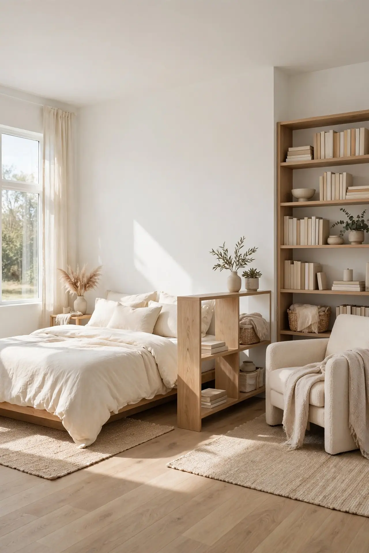
- Place the bed on the left half of the room and dedicate the right half to dressing or reading.
- Use a low bench or open shelf as a soft divider that keeps sightlines clear.
- Repeat one accent color on both sides so the zones feel connected, not chopped.
- Keep walkways at least 30 inches wide on each side for easy movement.
- Anchor each zone with its own rug to define the space visually.
Dividing the room into two clear sides stops the space from feeling like one big empty box. Each half gets a purpose, and the layout reads as intentional. I’ve seen this work well in many cases where couples need different morning routines. The divider stays low so light travels across the whole room.
Corner Bed Placement
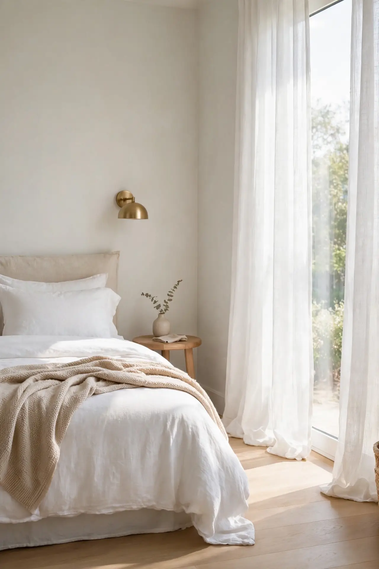
Quick Tip: Push the bed into the far corner at a slight angle only if the room is square; in long rooms, keep it flush to the short wall. Leave one side fully open for easy bed-making and a clear path to the door.
Tucking the bed into a corner frees a surprising amount of floor in the middle of the room. The open center can hold a rug, a chair, or simply stay empty for that spacious feel. This works best when the corner gets decent light so the bed never feels buried. Add a wall sconce above the inner side since a nightstand may not fit there. The corner becomes a snug sleep pocket while the rest of the room breathes.
Floating Nightstand Pair
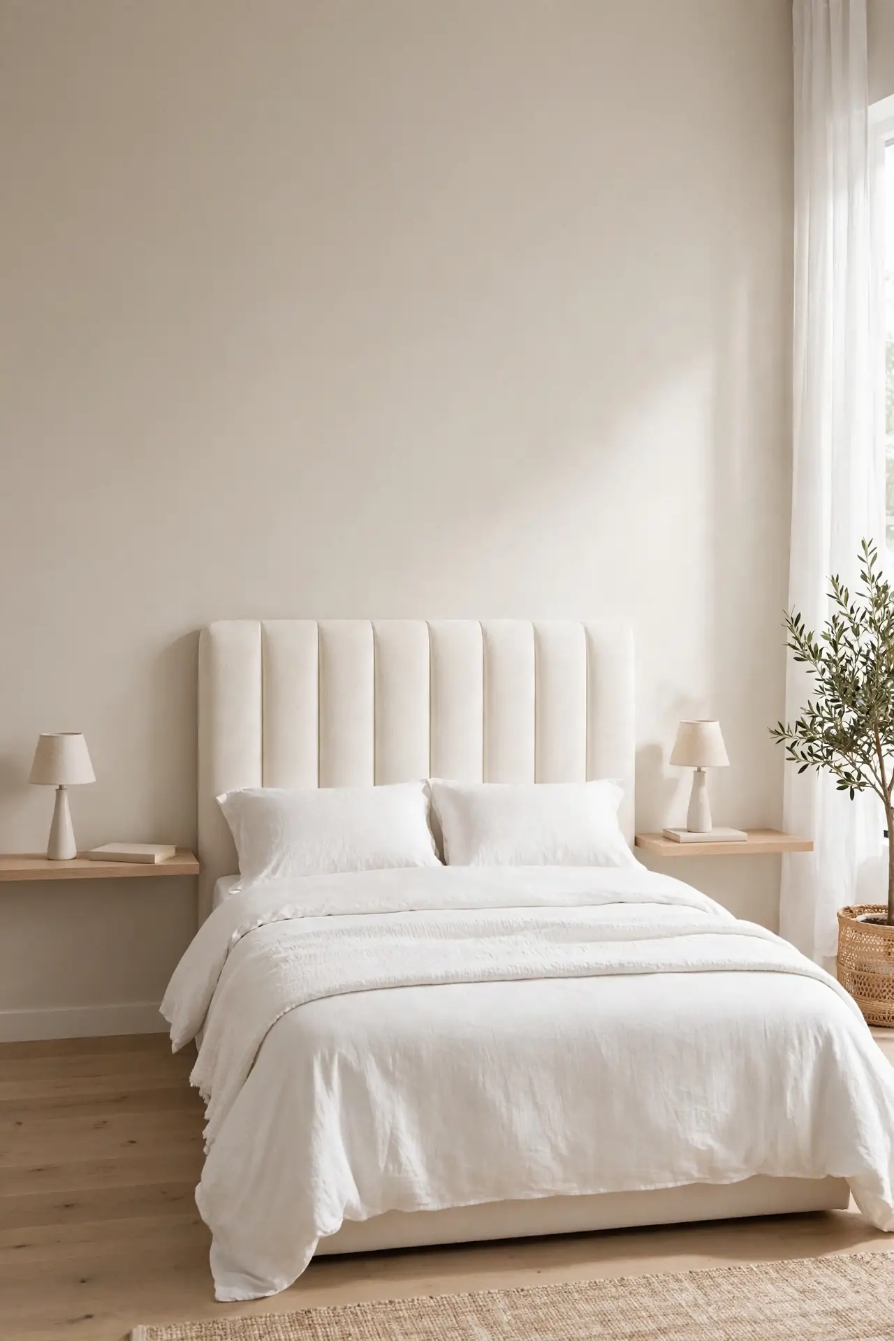
BEFORE: Two bulky nightstands crowd a small wall, their drawers half blocked by the bed frame. The surface disappears under chargers, books, and water glasses. The room feels heavy on both sides of the bed.
AFTER: Slim floating shelves replace the boxes, holding only a lamp and one book each. The floor stays visible beneath them, which tricks the eye into seeing more space. The bed wall suddenly looks light and intentional.
Wall-mounted nightstands change the whole footprint of the bed wall. Without legs touching the floor, cleaning gets easier and the room reads larger. Choose shelves with a small lip so nothing slides off. This swap costs little and delivers an instant sense of air.
Centered Rug Layout
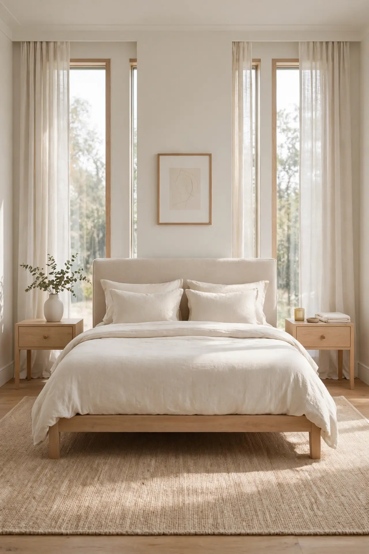
- Measure your bed and buy a rug that extends at least 24 inches beyond each side.
- Center the rug under the bed so equal borders show on the left and right.
- Slide the rug far enough down that it also frames the foot of the bed.
- Layer a smaller flatweave on top if you want extra texture without bulk.
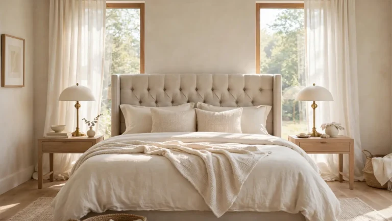
A centered rug pulls the entire layout together like a frame around a picture. It softens footsteps, adds warmth, and makes even a plain bed look styled. The symmetry calms the eye, which is exactly what a restful room needs. Stick with low-pile weaves so doors clear them easily.
Dual Dresser Walls
| Low Dresser | Tall Chest | |
|---|---|---|
| Footprint | Wide and low | Narrow and tall |
| Best wall | Under a window | Beside the closet |
| Storage feel | Open and airy | Compact and deep |
| Style note | Works with art above | Needs clear ceiling height |
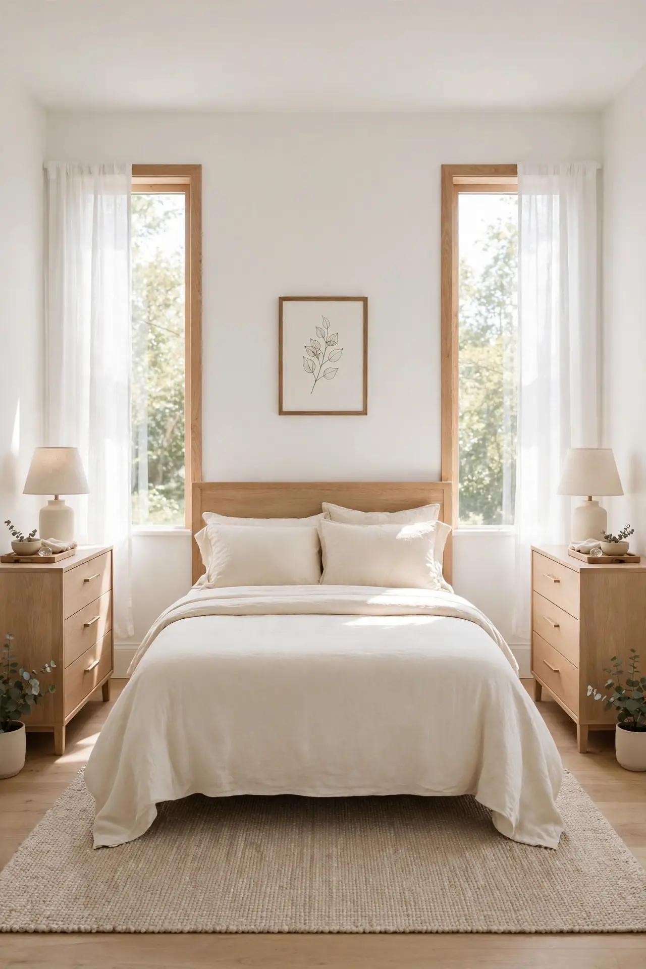
Splitting storage across two matching dressers balances the room better than one giant wardrobe. Place them on opposite walls to spread visual weight evenly. The pair reads as intentional design rather than leftover furniture. In my experience, this symmetry makes even medium rooms feel composed. Keep the tops styled simply: one lamp, one small tray, nothing more. The clean surfaces keep the calm mood intact while hiding plenty of folded clothes inside.
Bench At Foot
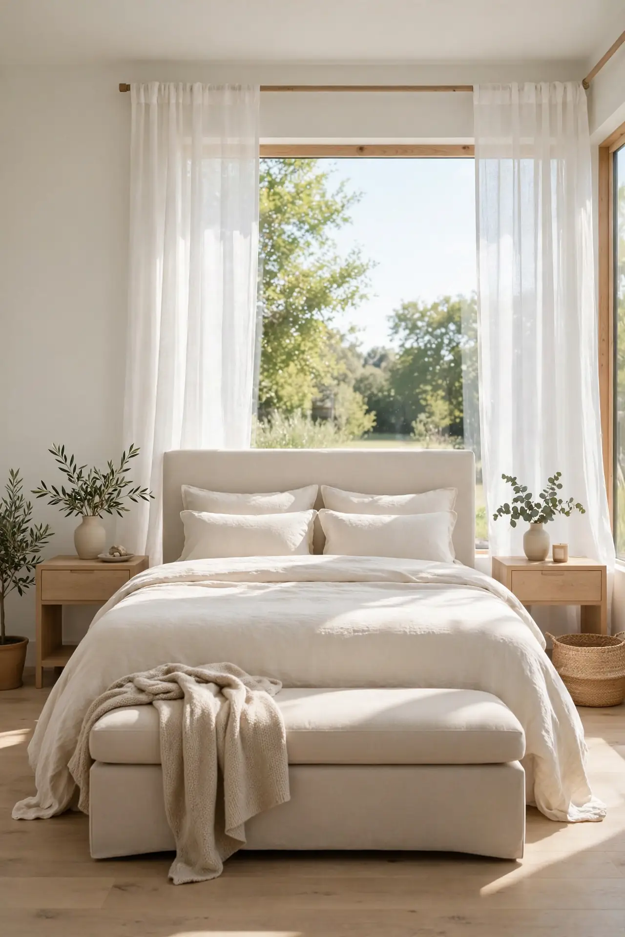
DO:
- Choose a bench no wider than the bed frame.
- Pick washable fabric if you toss clothes there nightly.
- Leave six inches of clearance on each side.
- Match the bench legs to your nightstand finish for cohesion.
DON’T:
- Don’t block the walkway with an oversized trunk.
- Don’t pile it so high the bench disappears.
- Don’t skip it if your room lacks a chair.
A bench at the foot of the bed finishes the layout like a period at the end of a sentence. It gives you a spot to sit while dressing and a landing zone for the morning throw. The piece adds structure without closing off the room.
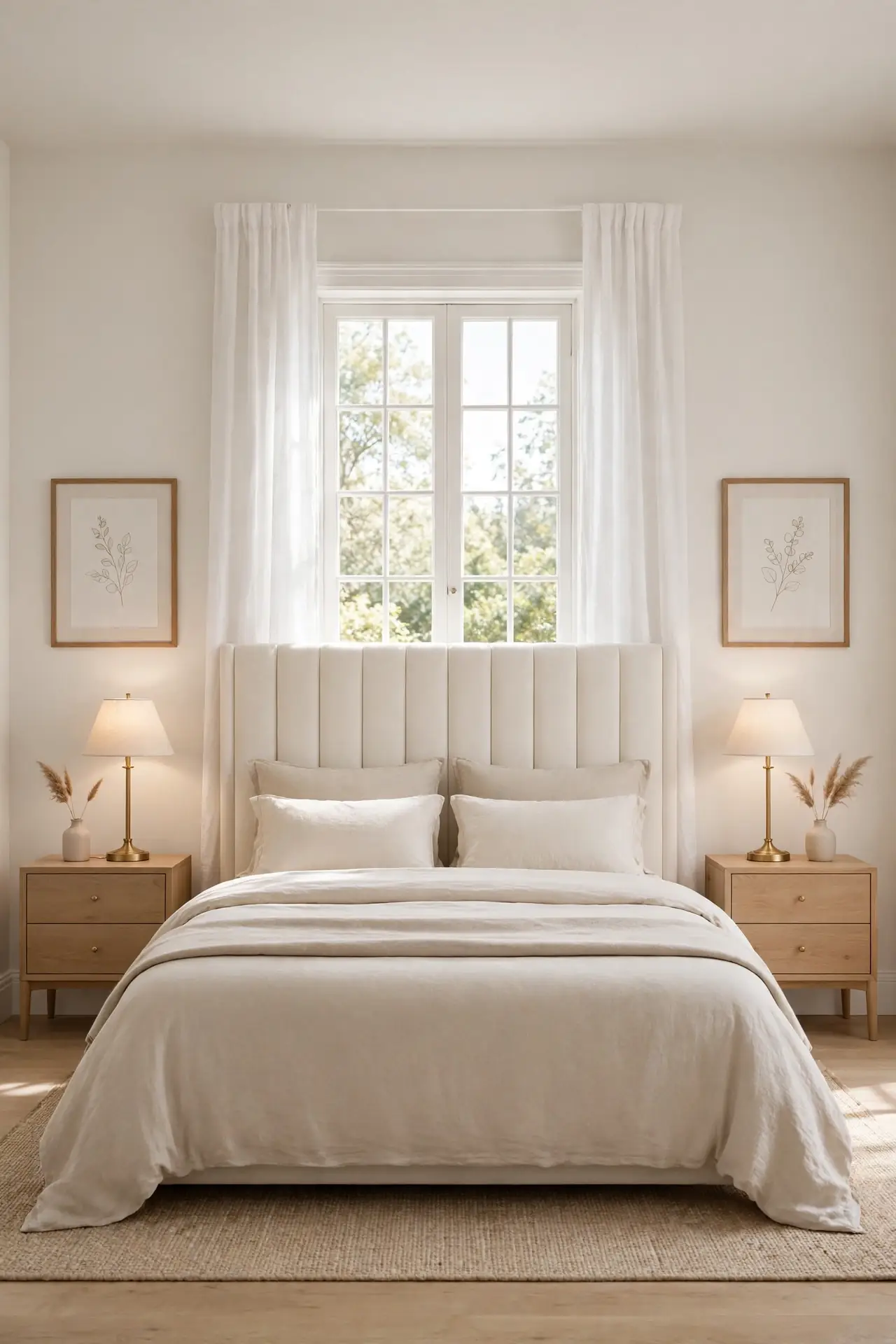
Symmetry First Plan
Cost: Low, since it uses furniture you own
Time: One weekend afternoon
Skill Level: Beginner friendly
Best For: Rectangular rooms with a clear focal wall
Start every layout decision by mirroring the two sides of the bed. Matching nightstands, matching lamps, and equal spacing create instant calm because the eye loves balance. Once the bed wall is symmetrical, let the rest of the room follow the same logic. Pairs of art, pairs of pillows, and even spacing do the quiet work of making the space feel settled. This approach forgives small rooms too. Symmetry draws attention to order instead of size, so even a modest suite feels composed. I’ve noticed guests always call symmetrical rooms restful, even when they cannot name why.
Reading Corner Nook
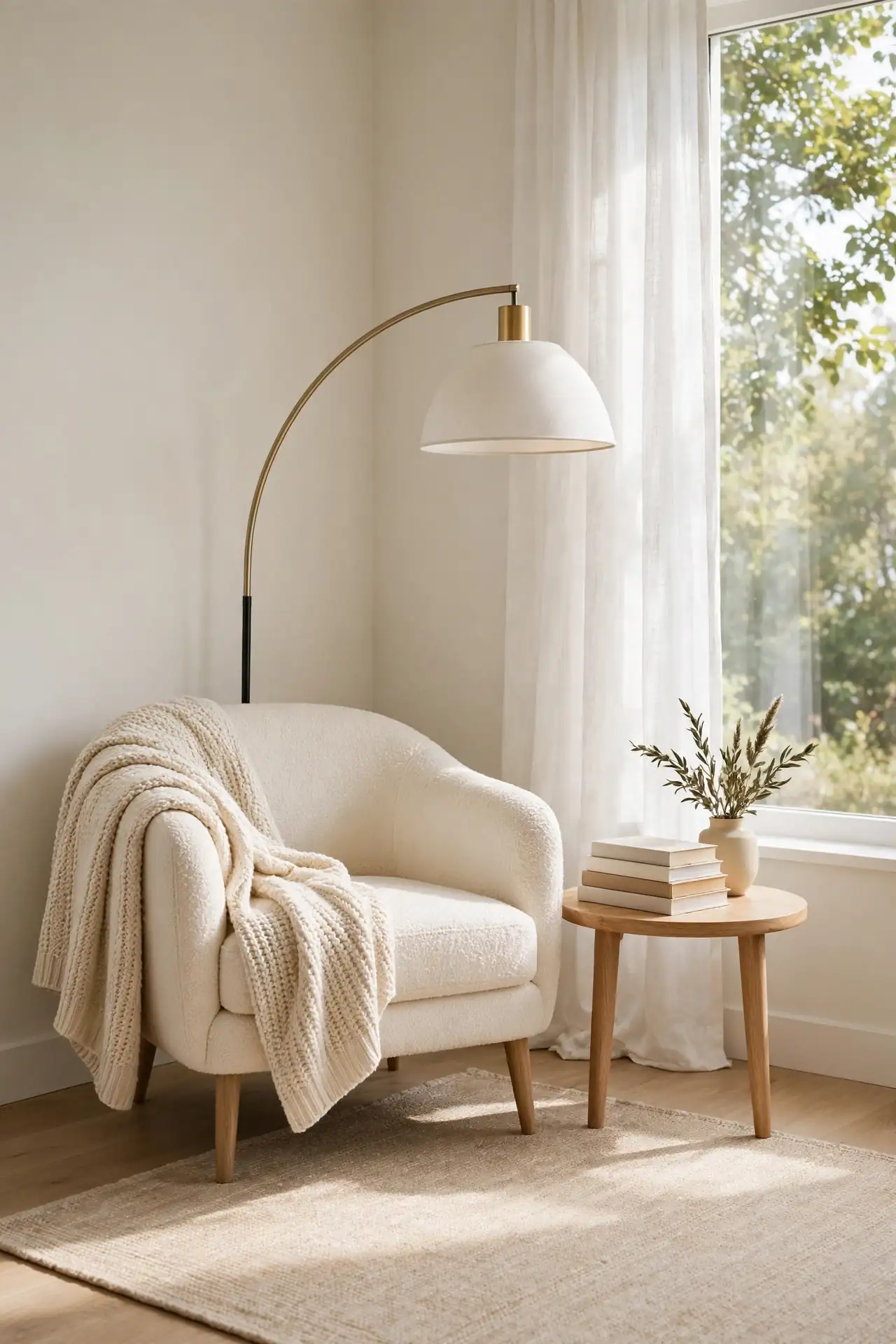
Every primary suite deserves one chair that belongs to slow mornings. Tuck it near the brightest corner with a small side table and a floor lamp. The spot becomes a natural magnet for coffee, books, and quiet scrolling. Keep the chair angled toward the room so the corner feels connected, not exiled. A soft throw over the arm makes it irresistible.
The reading nook also balances the bed visually. One large piece on each side of the room keeps the layout from tipping toward the sleep zone. Choose a chair with legs rather than a skirt so the floor shows beneath it. That sliver of visible floor keeps the corner light and the whole room feeling open.
Dressing Area Divide
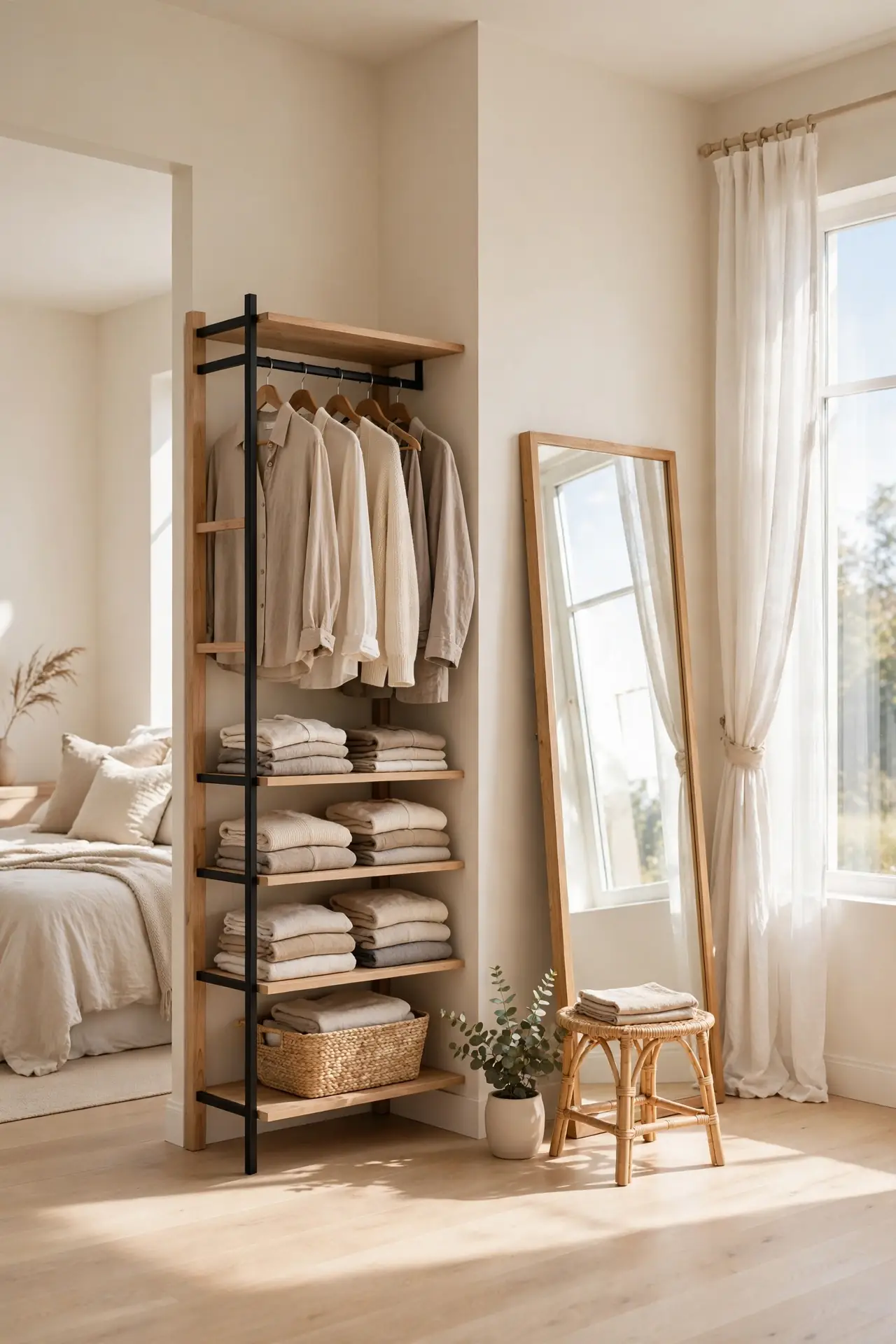
- Place a wardrobe or open rack perpendicular to the wall to carve out a dressing pocket.
- Add a full-length mirror on the inside face where morning light hits it.
- Keep a small stool nearby for shoes and folding.
- Use the same wall color throughout so the divider feels built in.
A defined dressing area keeps morning clutter contained in one zone. Clothes, shoes, and accessories live together instead of drifting across the room. The divider also adds privacy when one person sleeps in. I’ve seen this work well in many cases for couples on different schedules. The room stays calmer because every item has a home.
Walkway Clear Path
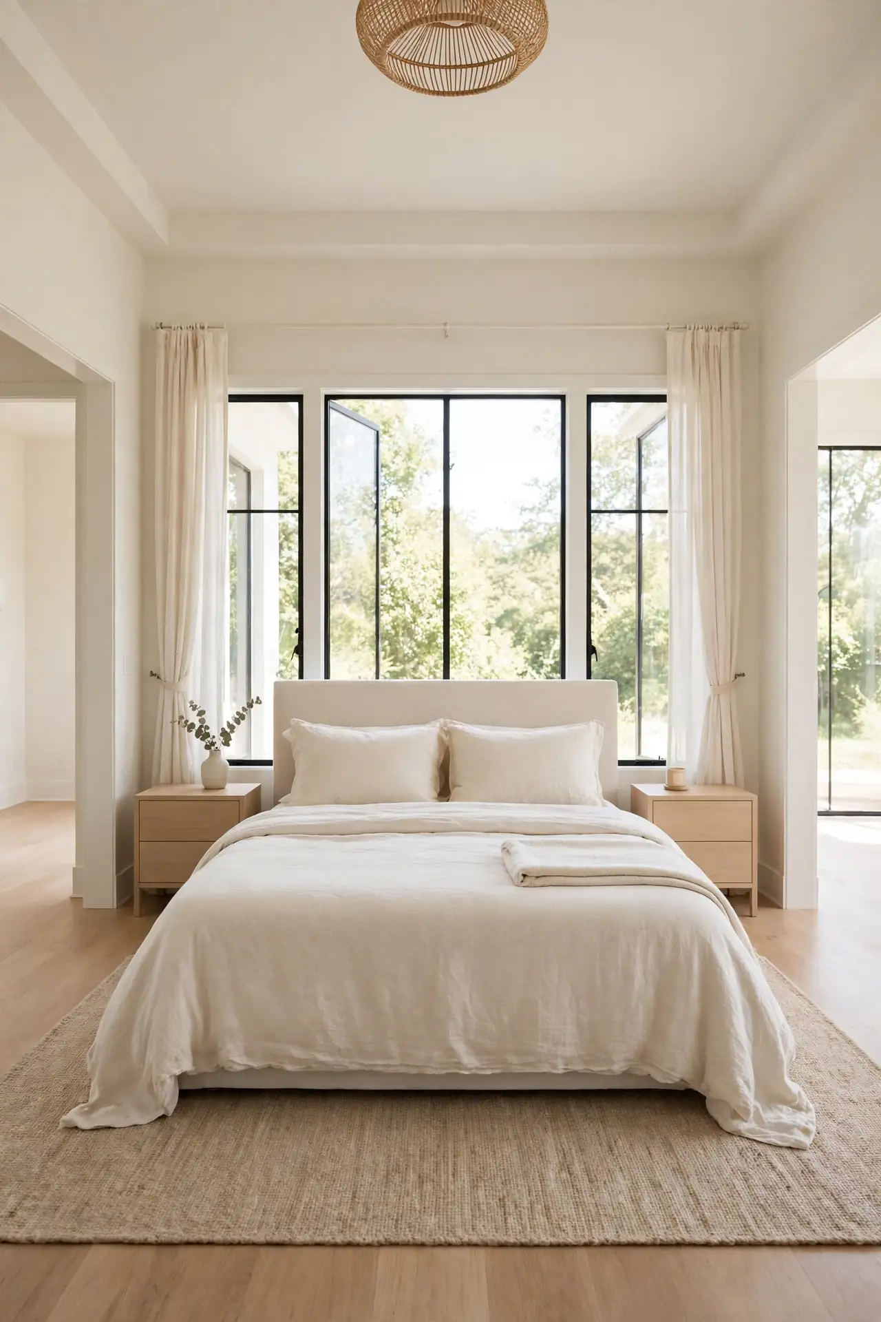
Quick Tip: Walk every route in the room and mark tight spots with painter’s tape. Keep main paths 30 to 36 inches wide and secondary paths at least 24 inches. If your hip brushes furniture, shift the piece.
Clear walkways are the invisible ingredient in every serene layout. You notice them only when they are missing, usually as a stubbed toe or a squeezed shoulder. Generous paths let the room breathe and make daily routines feel easy. They also make the space look larger in photos and in person. When planning, trace the route from door to bed, bed to closet, and bed to bathroom. Every turn should feel natural, never pinched. A room you can cross with eyes half closed is a room that truly rests you.
Layered Lighting Zones
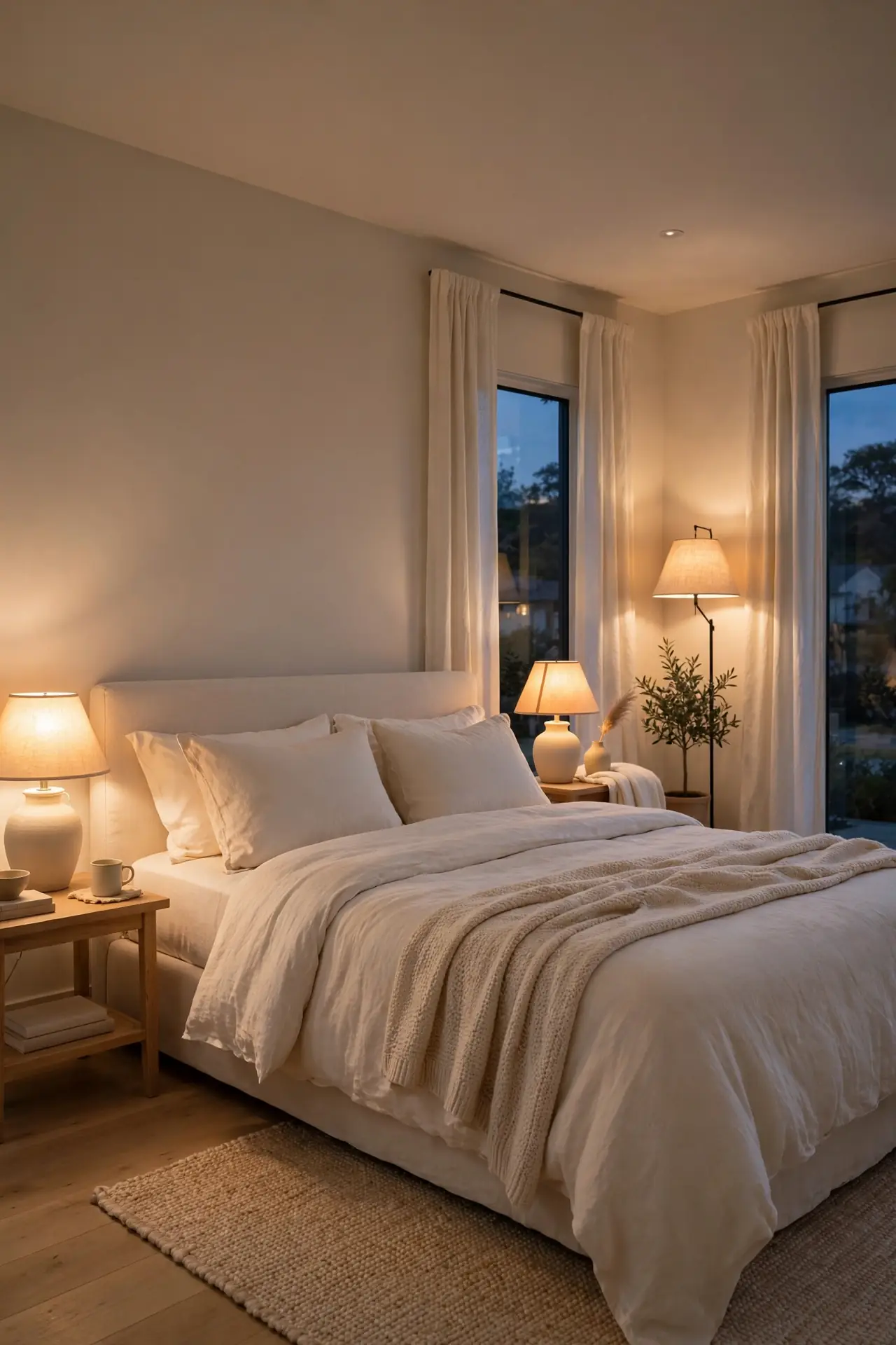
BEFORE: A single ceiling fixture blasts the whole room with flat light. Corners stay shadowy, reading feels strained, and the mood never shifts from day to night. Everything looks the same at noon and midnight.
AFTER: Bedside lamps, a floor lamp, and a dimmer on the overhead each serve one zone. Evenings glow warm and low while mornings stay bright. The room finally has moods that match the hour.
Three light sources per room is the baseline designers swear by. Each zone gets its own switch or dimmer so you control the atmosphere. Warm bulbs near the bed signal your body to wind down. This small upgrade changes how the layout feels after dark.
Headboard Feature Wall
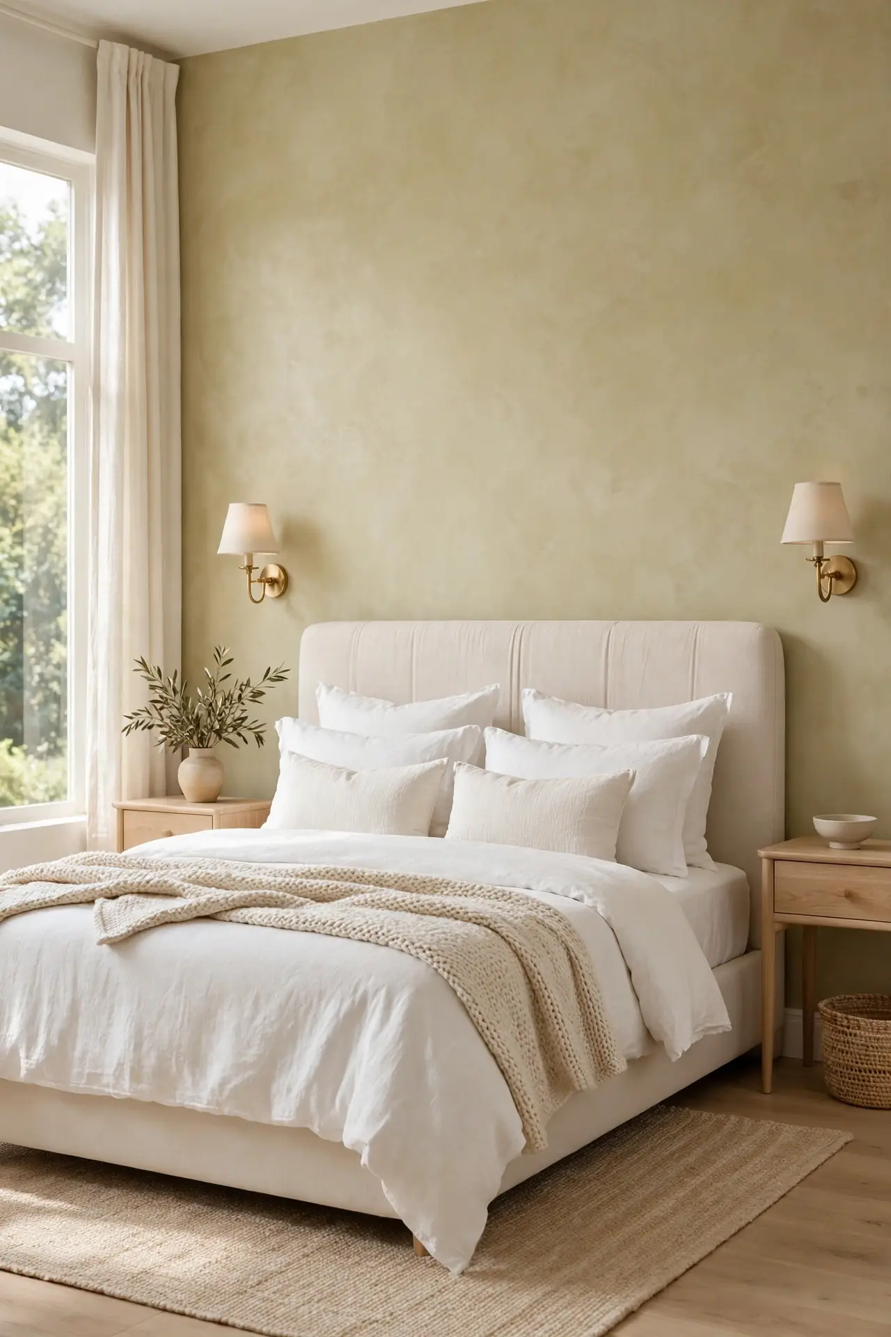
- Choose the wall the bed faces least; usually it is the one behind the bed.
- Paint it one shade deeper than the other walls or add limewash texture.
- Mount the headboard so its top sits two thirds up the wall.
- Flank it with matching sconces or art at equal heights.
A feature wall gives the bed a backdrop worthy of its size. The eye lands there first, which organizes the whole room around one calm focal point. Keep the treatment simple: color or texture, not both competing. The result feels designed without feeling busy, and the bed finally looks anchored.
Mirror Opposite Window
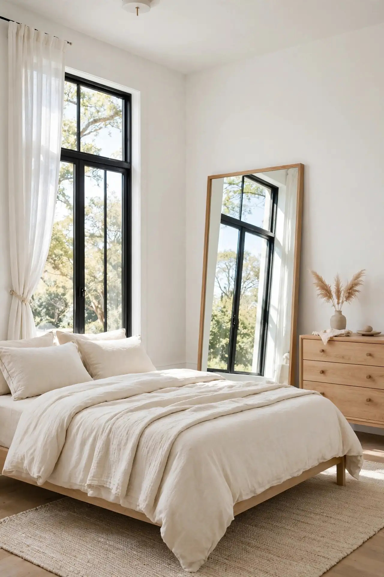
| Large Leaner | Round Wall Mirror | |
|---|---|---|
| Placement | Opposite the window | Above the dresser |
| Light effect | Doubles daylight | Brightens one corner |
| Room feel | Expands the space | Adds soft focus |
| Watch out | Needs a stable lean | Hang at eye level |
A mirror across from the window bounces daylight deep into the room and visually doubles the space. It is the oldest layout trick for a reason: it works in every room shape. For more ways to style reflective pieces, browse our primary bedroom ideas collection. Position the mirror to catch greenery or sky, not clutter. The reflection becomes living art that shifts with the day.
Alcove Bed Inset
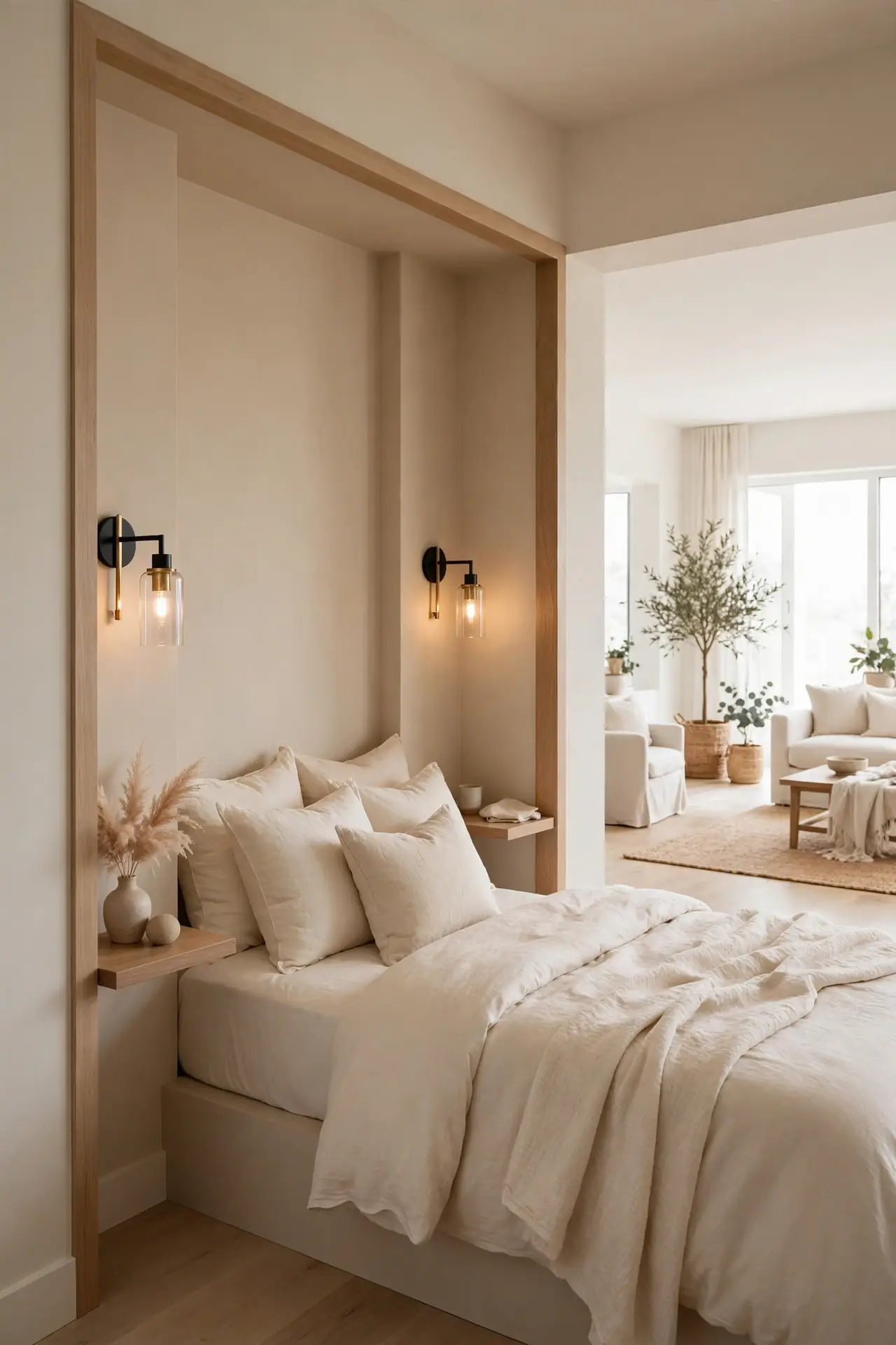
DO:
- Do measure the alcove before buying the bed frame.
- Do add wall sconces since table space runs short.
- Do paint the inset one tone deeper for depth.
- Do leave the bedding simple so the nook feels calm.
DON’T:
- Don’t use a tall headboard that crowds the ceiling.
- Don’t block the alcove edges with wide nightstands.
- Don’t forget an outlet inside for charging.
An alcove turns the bed into a built-in retreat. The walls hug the mattress and the room beyond stays open for living space. This layout suits rooms with odd nooks that otherwise collect clutter. Treat the inset like a separate tiny room with its own light and color.
Two Chair Conversation
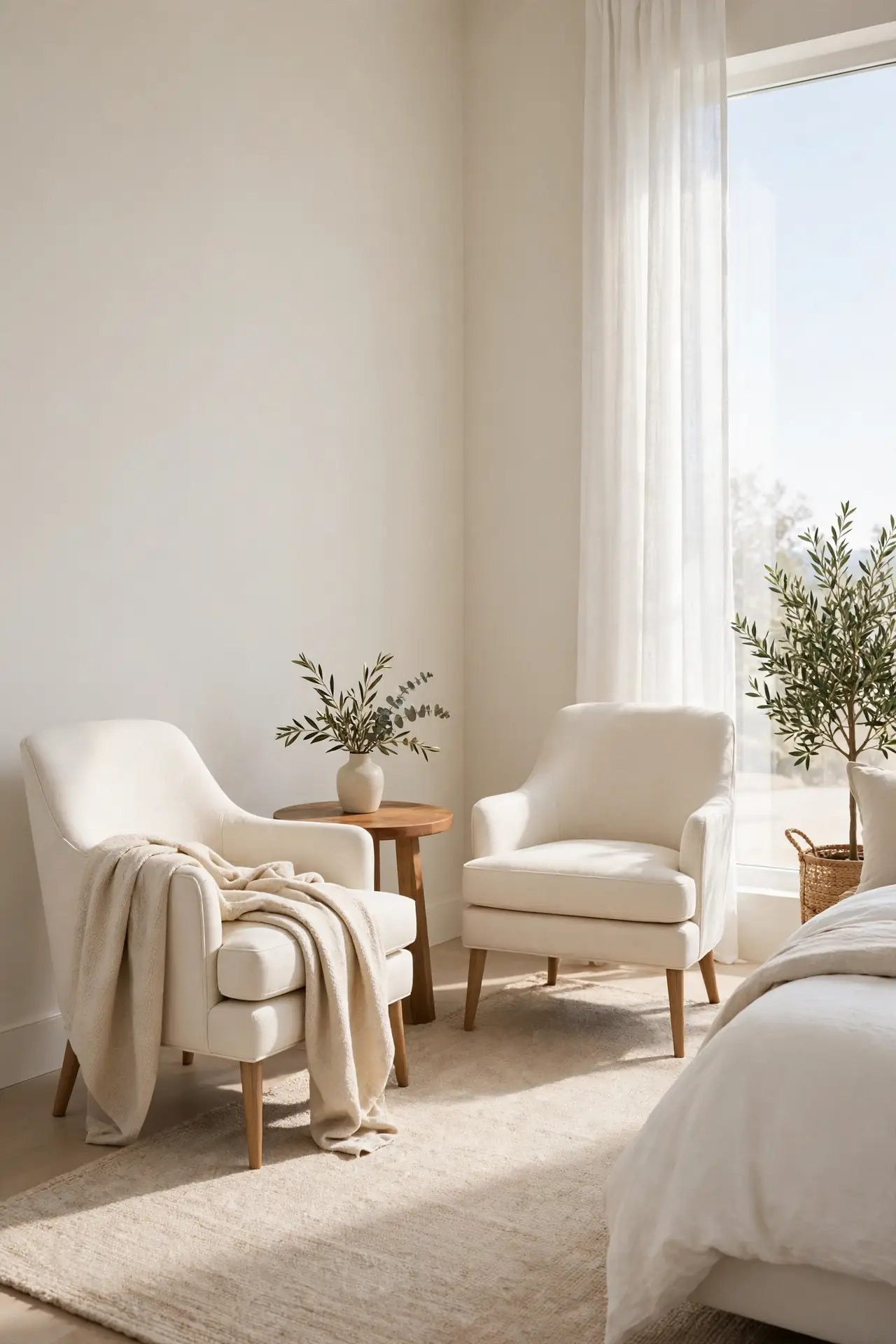
Cost: Medium, two accent chairs
Time: One afternoon to arrange
Skill Level: Beginner friendly
Best For: Large suites with empty corners
Two chairs facing each other create a small living room inside the bedroom. This setup invites slow conversation, morning coffee, or an evening wind-down away from the bed. Place a small table between them for cups and books. The arrangement fills dead corners with purpose and makes the suite feel like a true retreat. Keep the chairs light in scale so they never overwhelm the bed as the star. A shared throw across one arm ties them to the bedding palette. I’ve noticed couples use this corner more than they expect once it exists.
Low Profile Layout
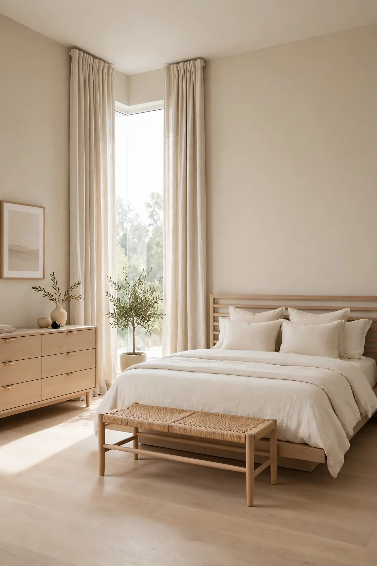
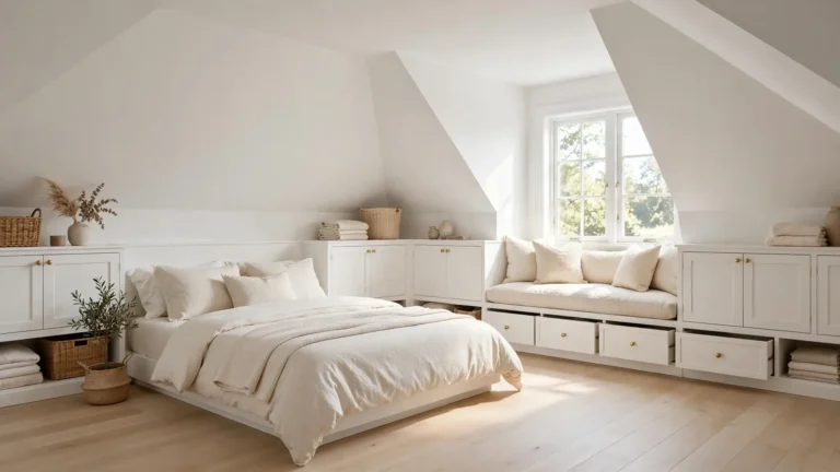
Low furniture makes ceilings feel taller and rooms feel wider. Choose a platform bed, low dresser, and short bench to keep every sightline open. The horizontal emphasis calms the eye and suits modern tastes. This trick works wonders in rooms with standard eight-foot ceilings. Everything sits below the halfway mark of the wall, which leaves generous breathing room above.
Pair the low pieces with tall curtains hung near the ceiling. The contrast stretches the walls visually and adds softness. Keep artwork hung a touch lower than usual to match the furniture scale. Avoid tall wardrobes here; choose wide low storage that echoes the bed height instead. The room ends up feeling serene, grounded, and quietly spacious.
Open Floor Flow
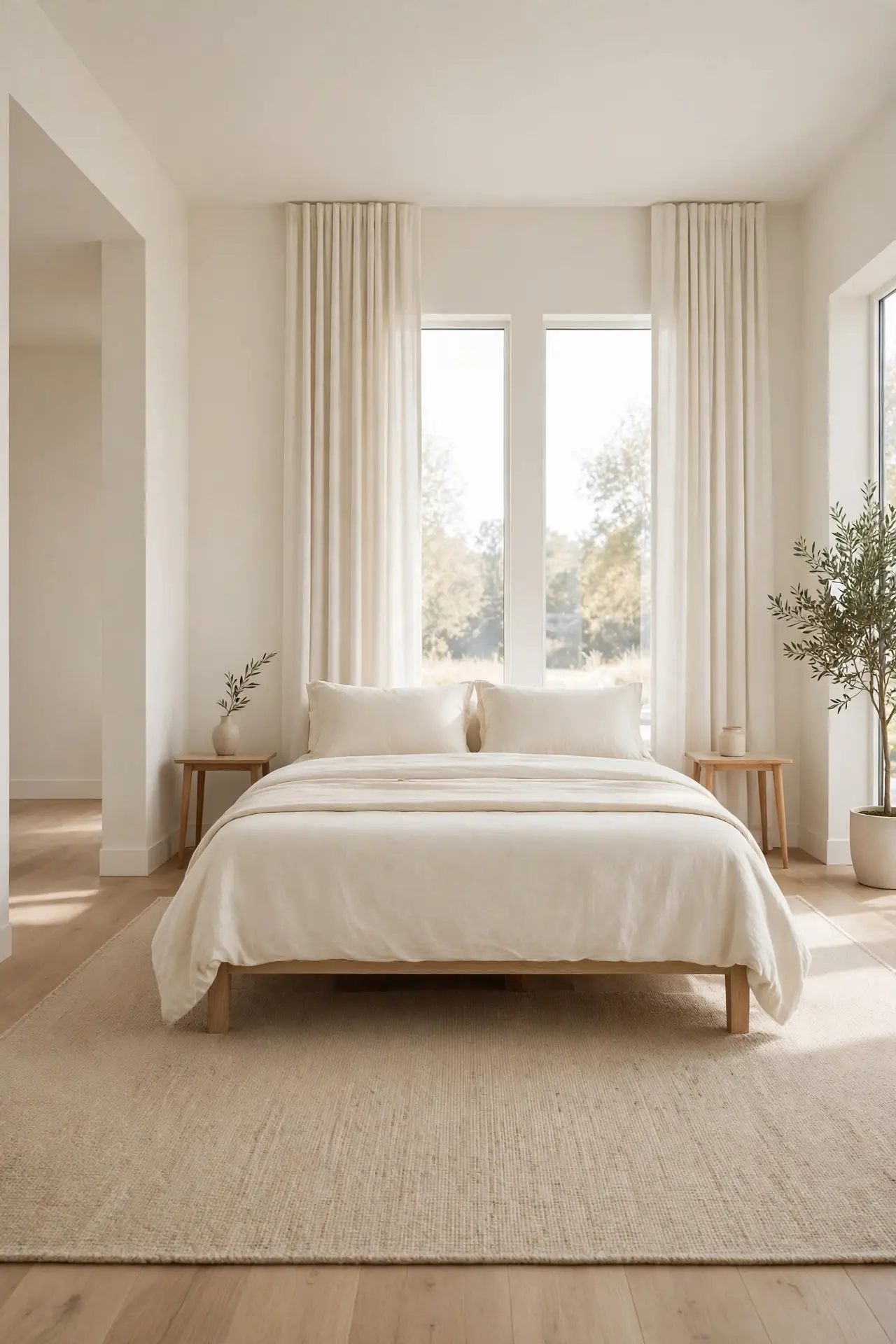
- Pull furniture six inches off the walls to let air circulate visually.
- Choose pieces with legs so the floor continues underneath.
- Limit the room to one large rug instead of several small ones.
- Keep the center of the room completely clear of furniture.
- Let curtains hang straight without tiebacks for clean lines.
Open floor space is a luxury you can create without knocking down walls. When the middle of the room stays empty, movement feels easy and the eye travels freely. This layout suits anyone who finds cluttered rooms stressful. The breathing room becomes the design feature, and every piece you keep earns its place.
Statement Art Anchor
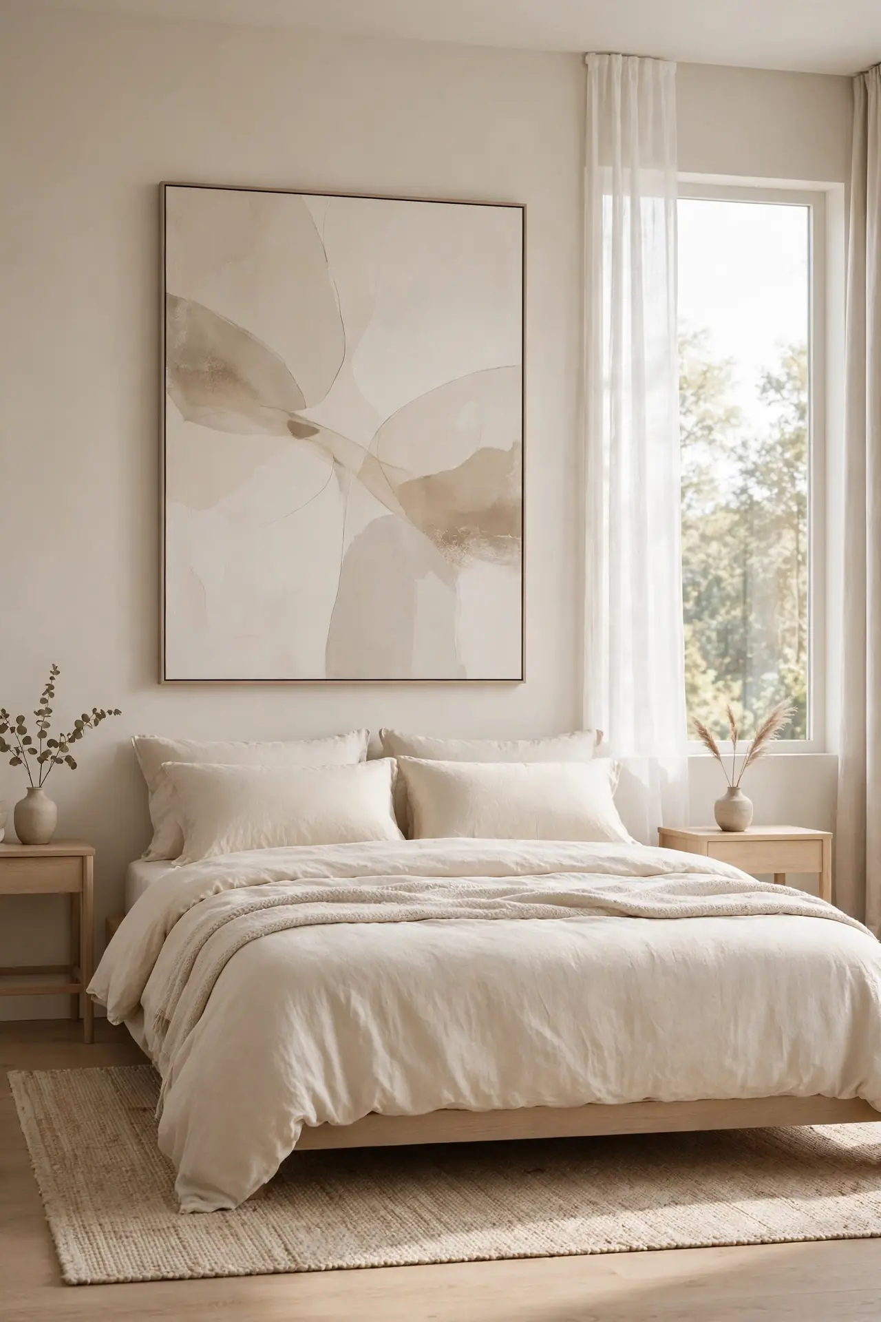
Quick Tip: Hang one oversized piece above the bed instead of a gallery wall. Keep its width to two thirds of the headboard. The single bold choice organizes the room faster than many small frames.
Large art gives the layout a confident focal point. The eye knows exactly where to land, which makes the rest of the room feel settled by comparison. Choose abstract shapes or soft landscapes in tones that echo your bedding. The piece should feel calm, not loud, since it hangs where you rest your gaze each night. Keep the frame simple so the art does the talking. One strong anchor beats a scattered collection in a room meant for rest.
Calm Neutral Palette
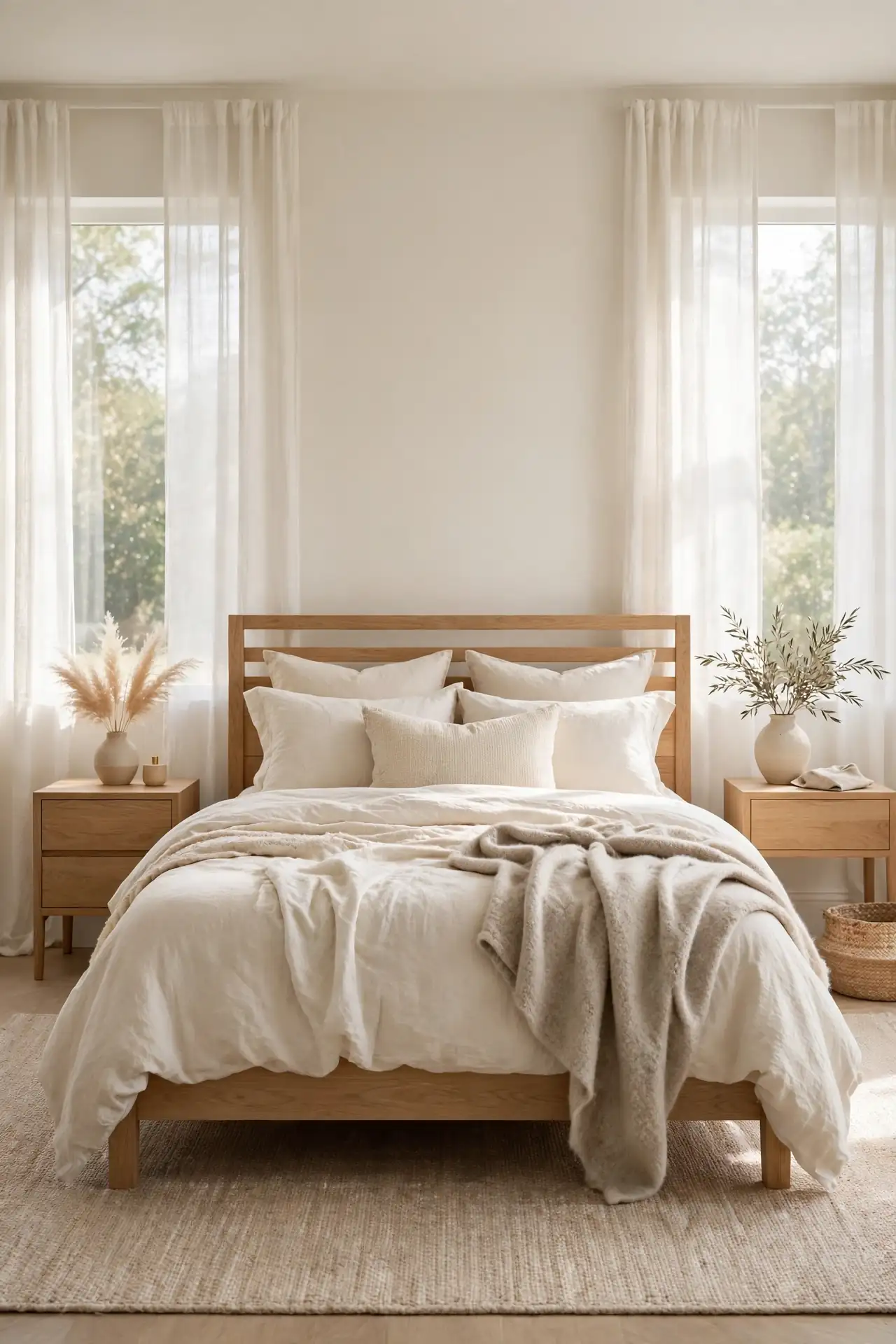
BEFORE: Mixed brights and busy patterns fight for attention on every surface. The eye jumps from pillow to curtain to rug without landing anywhere. Rest feels impossible when the room shouts.
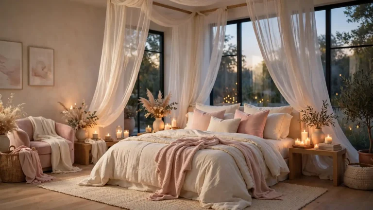
AFTER: Creams, warm whites, and light wood create one continuous calm. Textures do the talking: linen, wool, and oak. The room finally exhales, and sleep comes easier in the quiet palette.
A neutral palette is the fastest way to make any layout feel serene. When colors stay close together, the room reads as one peaceful whole. Add depth with texture rather than contrast. The simplicity also makes future updates cheap: swap one throw, not the whole room.
Bedside Sconce Setup
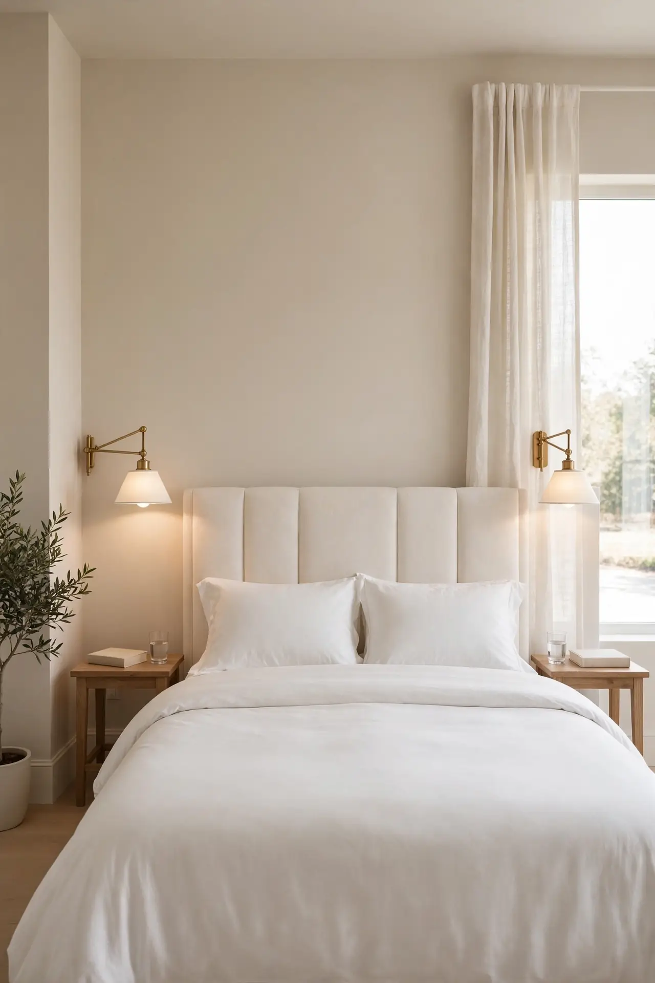
- Mount sconces 30 inches above the mattress on each side.
- Choose swing-arm styles so each sleeper aims their own light.
- Wire them to a dimmer or pick plug-in versions with cords hidden.
- Match the shade color to your bedding for a custom look.
- Add a small dimmer switch by the door so you control both lights from the entrance.
Sconces free the nightstand surface completely. No lamp base means room for a book, water, and a small plant. The wall-mounted light also reads as a design choice rather than an afterthought. Guests always notice this detail and ask where you found the fixtures.
Closet Adjacent Dressing
| Open Rack | Built-in Wardrobe | |
|---|---|---|
| Placement | Opposite the window | Above the dresser |
| Light effect | Doubles daylight | Brightens one corner |
| Room feel | Expands the space | Adds soft focus |
| Watch out | Needs a stable lean | Hang at eye level |
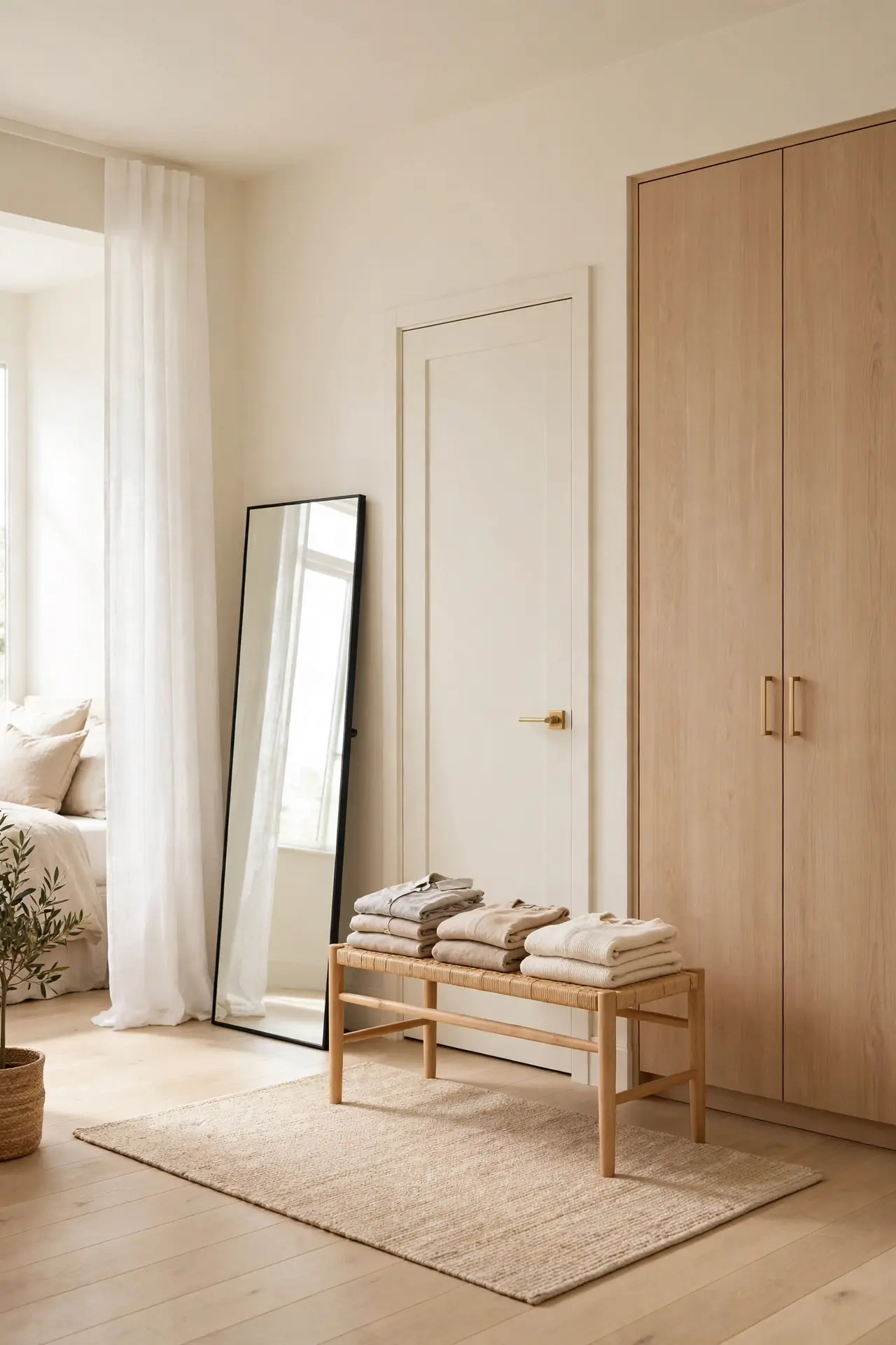
Placing dressing storage right beside the closet creates one efficient morning station. Everything you need lives within a few steps, which streamlines the routine. The zone also keeps bedroom clutter out of the sleep area. Choose closed storage if visual calm matters most to you. Open racks work for minimalists who edit ruthlessly. Either way, the layout keeps getting dressed simple and the bedroom serene. A small bench nearby gives you a seat for shoes and ties the whole station together.
Breathe Easy Spacing
DO:
- Do leave 36 inches between the bed and the dresser.
- Do keep one wall mostly empty for visual rest.
- Do choose furniture scaled to the room, not the showroom.
- Do edit decor down to pieces you truly love.
DON’T:
- Don’t push every piece against the walls.
- Don’t fill corners just because they are empty.
- Don’t crowd the bed with too many pillows.
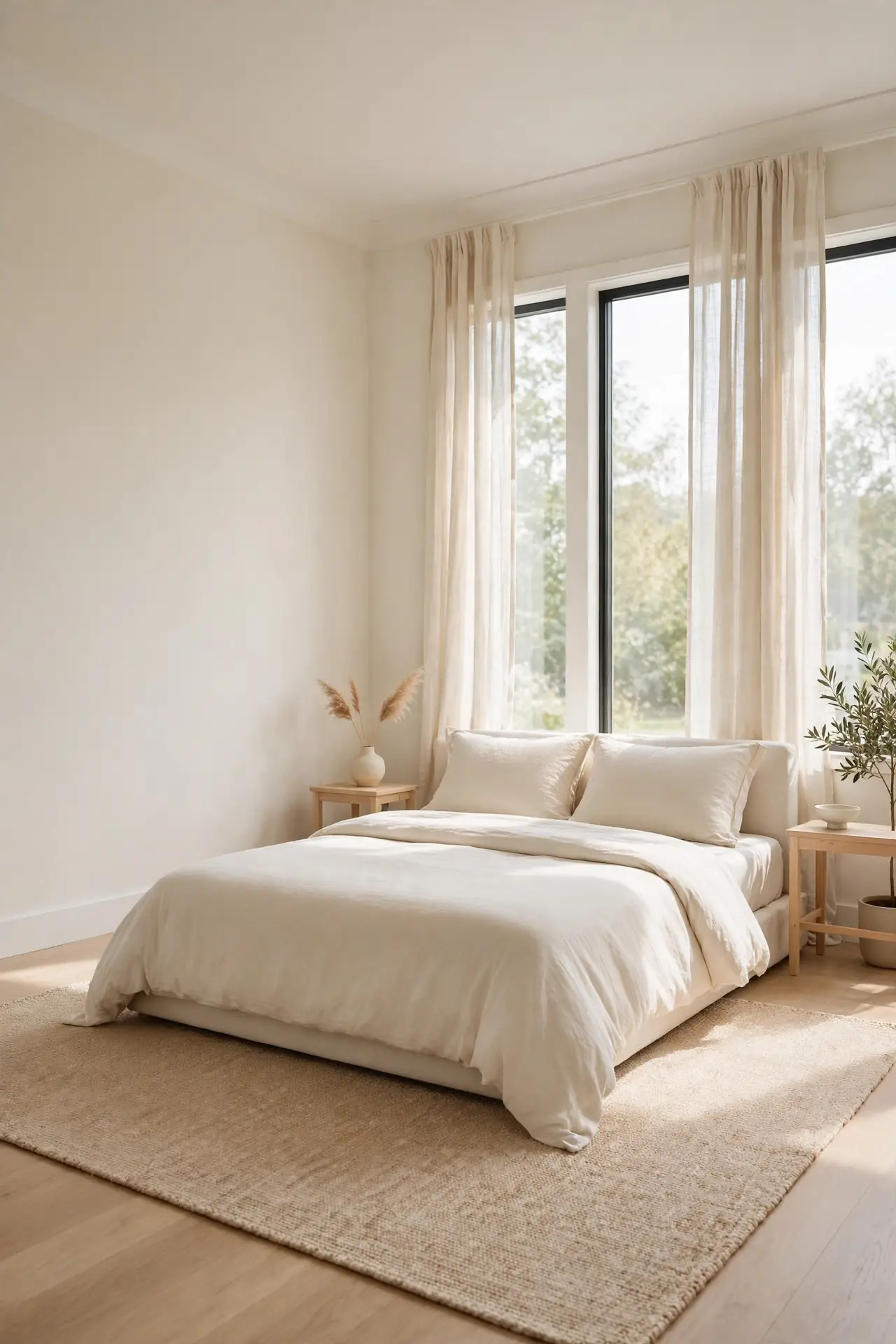
Generous spacing is what separates a calm suite from a crowded one. Air between pieces lets each item stand out and the room feel larger. This restraint takes confidence because empty space can feel unfinished at first. Trust the calm; it grows on you daily.
Conclusion
These 23 primary bedroom layouts prove that calm is a design choice, not a room size. Whether you tucked the bed under the window or built a reading corner, each arrangement brings the same gift: space to breathe. Start with one change this weekend and notice how the room shifts. Save your favorites to Pinterest so the ideas stay handy when you are ready for more. I’ve seen how small changes like these can completely shift the way a space feels. Your serene suite is closer than you think; all it needs is a layout that lets it shine.

One Comment