25 Modern Black and White Living Room Ideas for Bold Contrast
Black and white is the boldest pairing a living room can wear, and it never dates. Every piece earns its place, so rooms feel sharp yet calm. Handled well, modern black and white living room ideas give even a plain small room a confident presence. The palette hides nothing, which is exactly why it works.
In my experience, the rooms that hold up best start with one anchor, usually the sofa or the rug, and let everything else support it. If the tailored calm of luxury hotel style bedroom decor appeals to you, this palette delivers the same order with far more punch. The twenty-five ideas ahead build the look layer by layer, from floors to lighting.
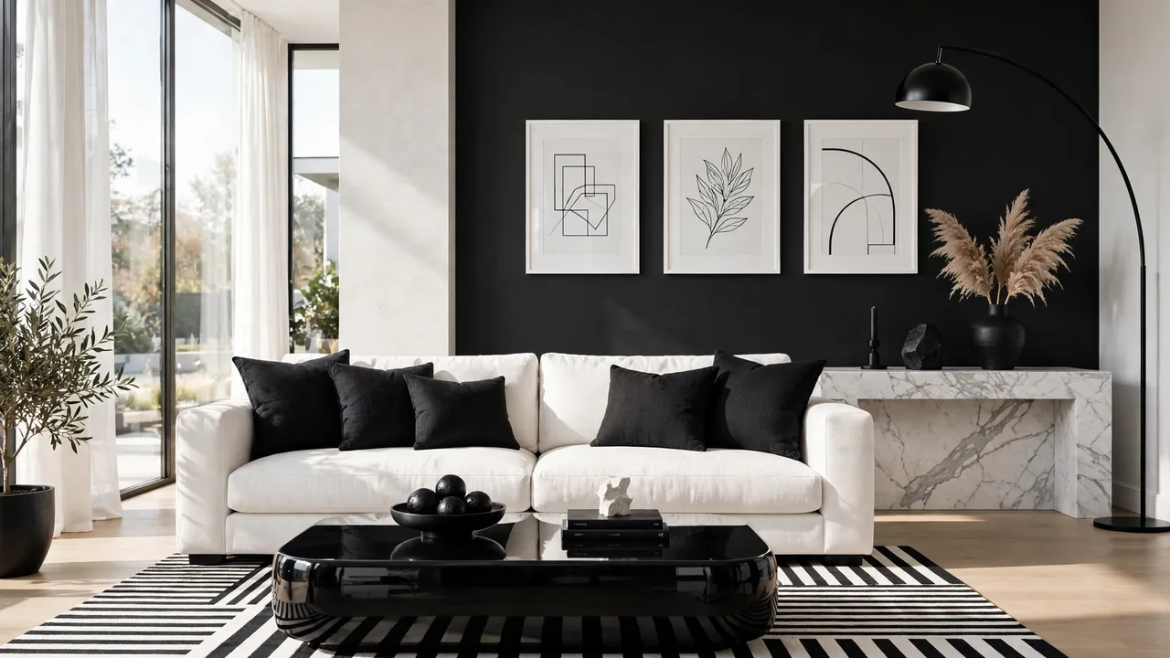
Graphic Striped Area Rug

A striped rug settles the whole argument between black and white before any furniture arrives. Wide bands ground the seating, narrow pinstripes sharpen it, and the pattern hides everyday dust better than a solid pale carpet ever could. Anchor the front legs of the sofa and chairs on the rug so the stripes read as one field, not a mat floating in the middle.
Direction matters more than most people expect. Stripes running across the room widen it; stripes running lengthwise pull the eye toward the window and make a short room feel longer. Keep the rest of the floor bare. One strong pattern underfoot lets walls and upholstery stay quiet, and quiet is what makes the contrast feel expensive.
Crisp White Sofa Foundation
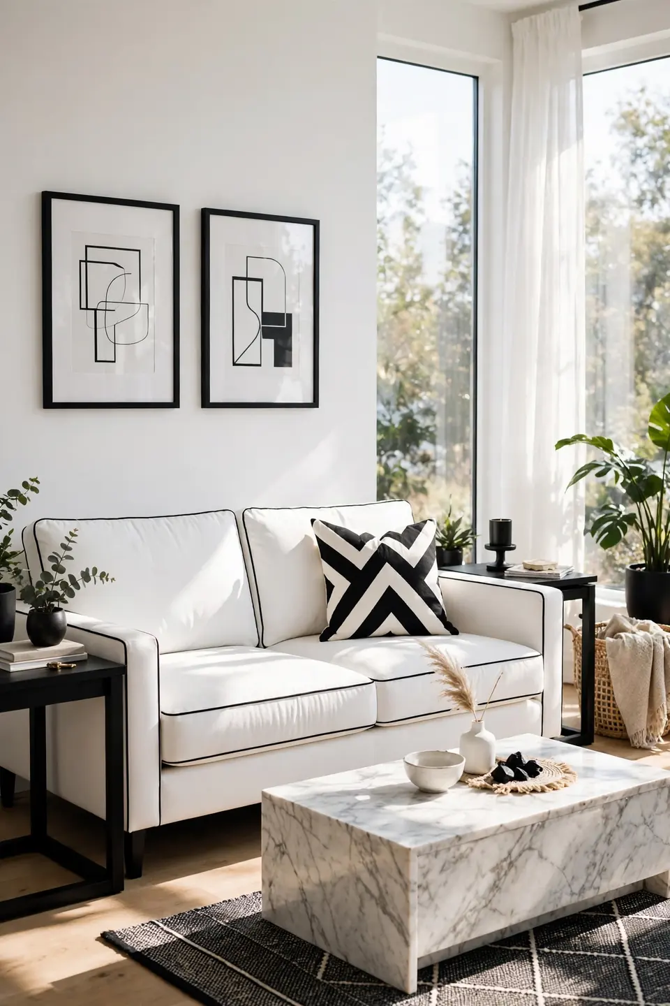
- Pick a tight-back silhouette; loose cushions in white slouch and gray fast.
- Performance linen or canvas shrugs off coffee, newsprint, and muddy paws.
- Washable slipcovers turn a pale sofa from risk into routine.
- Black piping or a dark wood base sharpens the outline instantly.
- Keep the seat depth near 22 inches for upright, tailored sitting.
White works as the anchor because it reflects the room’s light back at the black pieces around it. Set the sofa first, live with it for a week, and only then choose the rug and chairs. That order prevents the common trap of buying dark furniture to hide dirt and ending with a room that feels heavy.
Matte Black Accent Wall
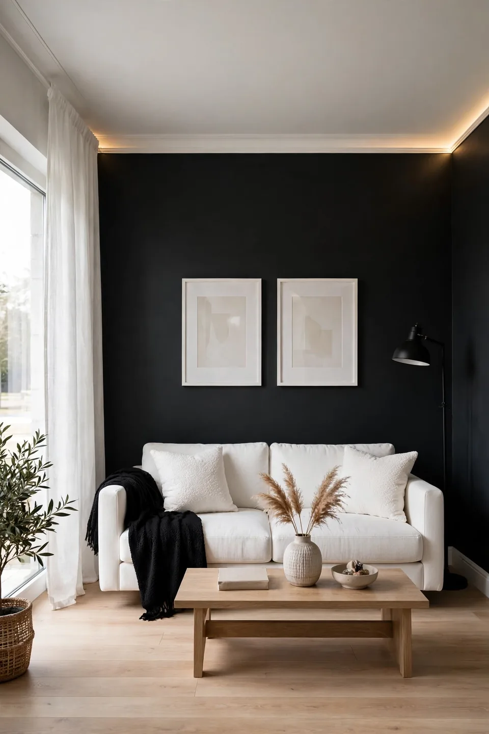
Quick Tip: Paint one wall matte black and stop there. Flat paint swallows light and makes white trim, pale art, and a light sofa glow against it. Test the darkest wall first, usually the one behind the sofa, and live with a big swatch for two days before committing the gallon.
A black wall fails when it fights the room instead of framing it. Keep the ceiling white, the floor light, and repeat the black in two smaller pieces, a lamp and a frame, so the wall reads as a decision. North-facing rooms should warm the black with a brown-based shade; pure blue-black can turn cold and chalky by afternoon.
Checkerboard Tile Floor Pop
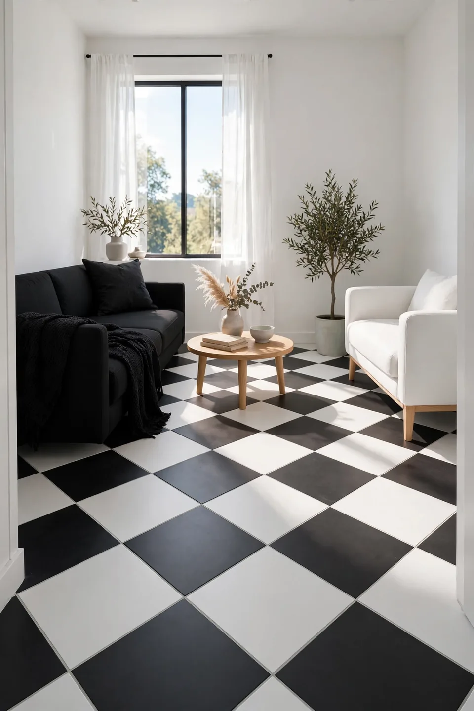
BEFORE: The old floor was beige tile that made every white wall look faintly yellow. Guests noticed the grout lines more than the furniture, and the black sofa seemed to float on a sea of tan.
AFTER: Large black and white checks now run corner to corner, laid on the diagonal. The pattern sets a rhythm the furniture follows, white pieces look cleaner, and the room reads deliberate from the doorway.
Checkerboard suits small rooms best, where the pattern finishes before it can overwhelm. Choose tiles at least twelve inches square so the grid stays calm, and keep grout pale gray to soften the joints. Vinyl and porcelain both handle the traffic; sealed marble is the splurge with the longest memory.
Sculptural Arc Floor Lamp
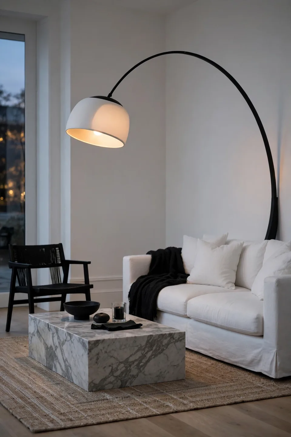
- Place the base behind the sofa’s corner so the arc clears the cushions.
- Aim the shade’s center over the coffee table, about 30 inches above it.
- Choose a black stem with a white inner shade for glare-free light.
- Add a dimmer plug; sculptural lamps earn their keep at low settings.
An arc lamp solves the dark corner problem without a ceiling fixture or an electrician. The curve itself becomes the room’s sculpture, echoing in black what the white walls do in light. Keep other tall pieces out of that corner so the silhouette stays clean, and let low furniture fill the rest of the wall.
Marble Versus Iron Tables
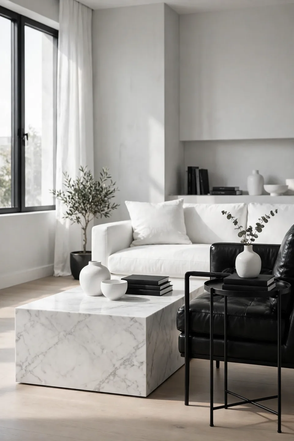
Coffee tables carry the center of a monochrome room, and two materials fight for the job.
| Feature | Carrara Marble | Matte Iron |
|---|---|---|
| Surface Mood | Cool and formal | Industrial and quiet |
| Upkeep | Seal yearly, wipe rings fast | Dust shows, wipe weekly |
| Weight | Heavy, two-person move | Light, easy to shift |
| Best Beside | White sofas, brass lamps | Leather chairs, wool rugs |
Most rooms land happiest with one of each: marble in the center where drinks land, iron at the side where books stack. The pairing keeps the palette strict while the textures argue politely. Match the iron’s finish to your lamp stems and picture frames, and the two tables read as a set bought on purpose.
Zebra Print Accent Pieces
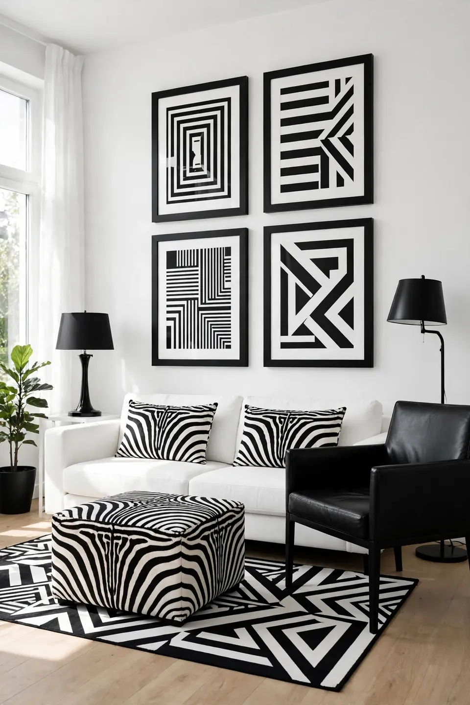
Do:
- Limit zebra to two pieces, a cushion pair or one ottoman.
- Pair it with plain black leather so the print reads graphic.
- Repeat the black in frames and lamp bases for balance.
- Keep walls white; the print needs a quiet stage.
Don’t:
- Stack zebra beside other animal prints in the same view.
- Choose brown-toned versions; they break the monochrome contract.
- Cover a whole sofa; scale is the print’s whole point.
- Add bright color cushions to soften it; commitment looks better.
Zebra works because it is pattern and palette in one move, with no third color to manage. One bold piece energizes the seating group; three pieces turn the room into a theme. Vintage hide rugs and printed cotton both hold up if the scale stays large.
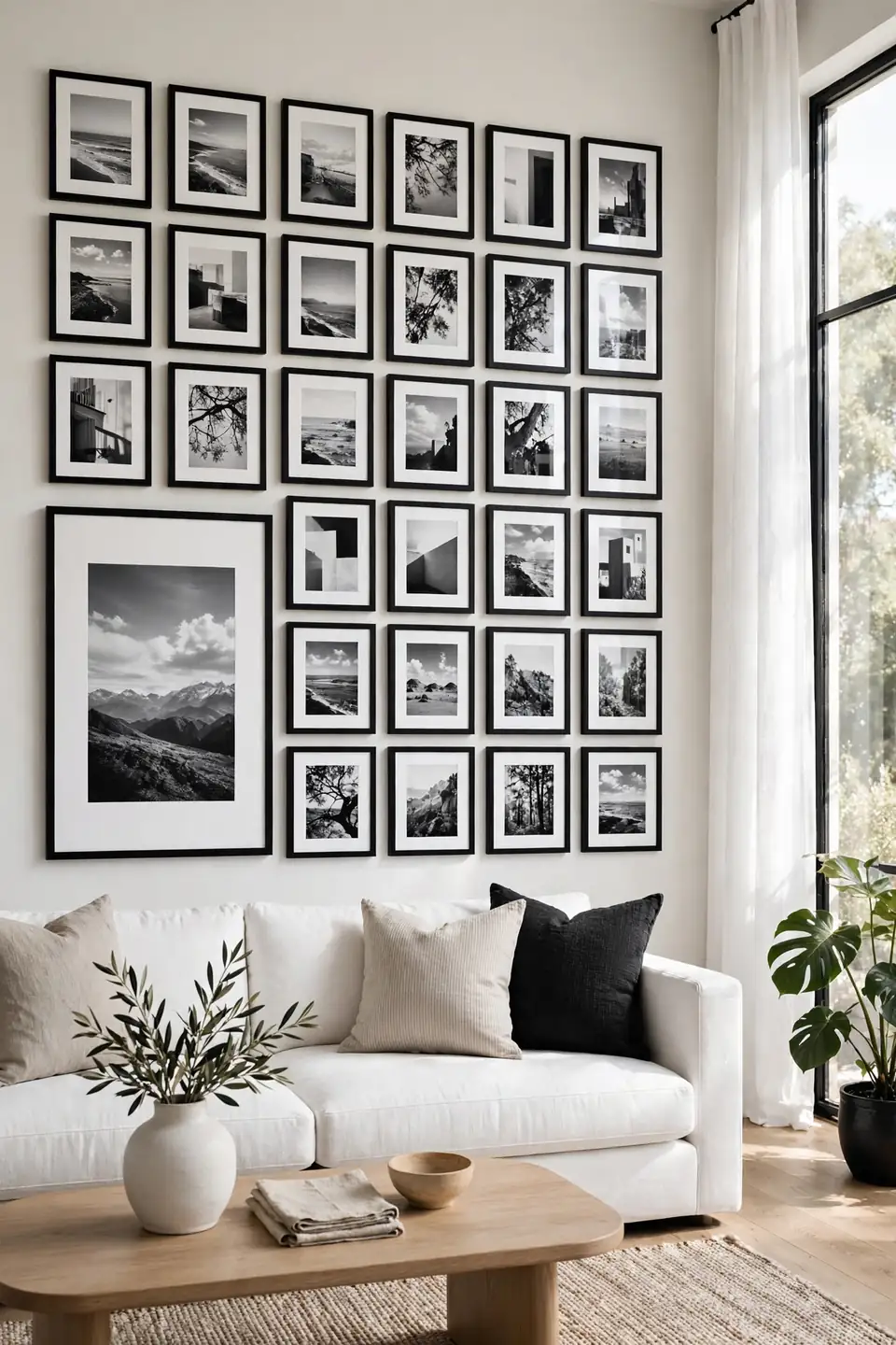
Monochrome Gallery Wall Grid
Cost: Low, thrifted frames repainted in two finishes
Time: One afternoon including layout on the floor
Skill Level: Beginner, paper templates do the planning
Best For: Long walls above sofas that feel empty
Black and white prints in mixed frames succeed when the spacing stays disciplined. Hang the grid with two inches between frames, keep every mat white, and let one large piece anchor the lower left. Photographs, line drawings, and plain posters all belong; the palette unifies what the subjects cannot. Tape the layout on the wall first, then step back after every third frame and correct drift early, while the nails are still negotiable.
Black Leather Reading Chair
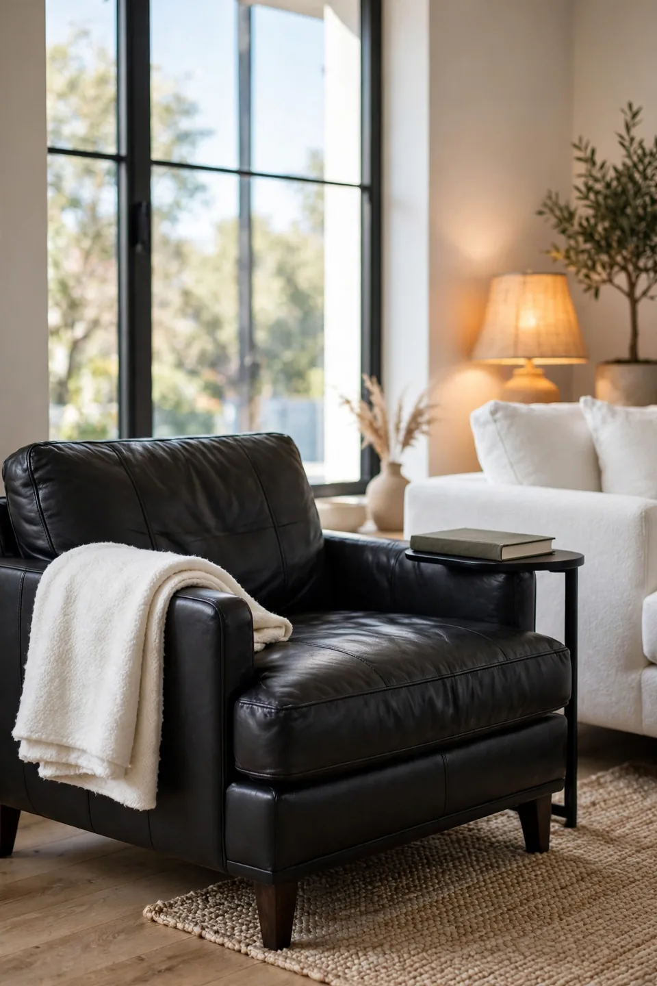
Every white room needs one piece with weight, and a black leather chair supplies it without a single cushion change. The hide darkens the corner, catches lamp light on its shoulders, and gives the pale sofa something serious to talk to. Choose a low, wide silhouette so the chair reads grounded rather than office-like.
Leather also solves the practical problem of a light palette: it wipes clean and ages into the room instead of against it. Condition it twice a year, keep it out of direct sun, and pair it with a white wool throw so the seat invites rather than intimidates. A small black side table completes the corner.
White Built In Shelving
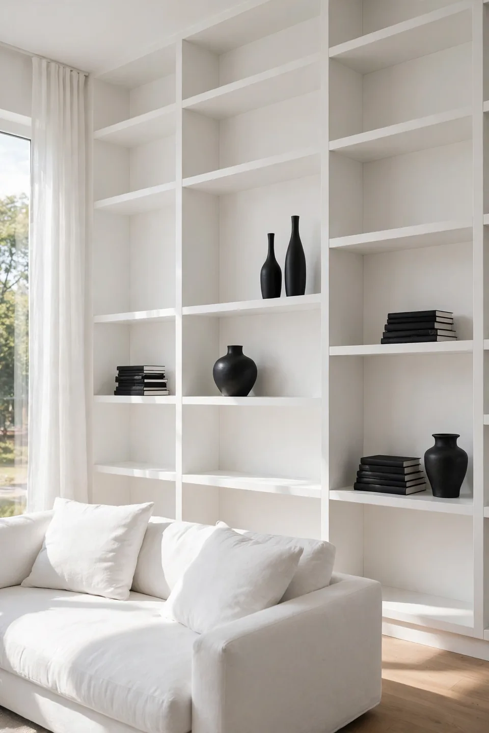
- Paint shelves and wall one white so the unit reads as architecture.
- Style with black book spines grouped in short horizontal stacks.
- Leave one shelf in three empty; breathing room looks expensive.
- Add black ceramic vases at eye level for punctuation.
- Hide routers and chargers inside a lidded black box.
Built-ins earn their cost by turning storage into the room’s calmest wall. The white field swallows clutter visually, while black objects supply the rhythm. Keep everyday items behind the lowest doors and display only what you would dust happily. Symmetry is optional; balance of dark and light is not. Start with the longest wall and let the remaining walls stay plain.
High Contrast Throw Pillows
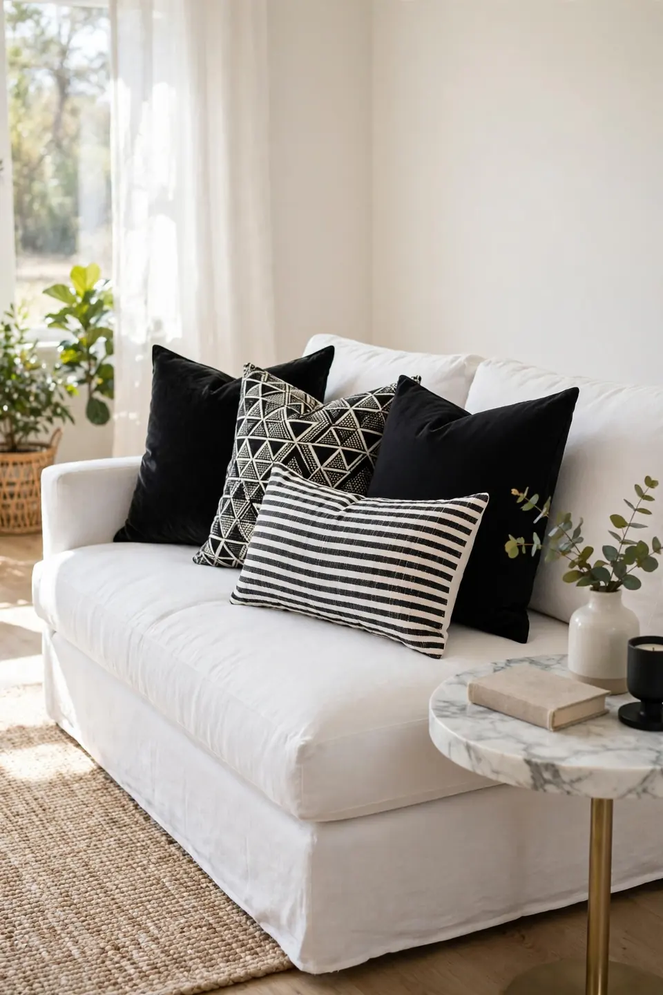
Quick Tip: Work in odd numbers and two patterns only: one geometric, one organic. Three pillows on a white sofa, black, patterned, black, keep the arrangement graphic instead of busy, and swap covers with the seasons instead of buying new inserts every year.
Pillows are where a strict palette gets to play. Velvet black against white linen gives contrast of texture as well as tone, and a single striped lumbar ties the rug into the seating. Keep fills plump; a sagging pillow in either color reads tired. When guests ask why the room feels finished, it is usually this layer doing the quiet math.
Glossy Black Coffee Table

BEFORE: A pale wood table sat in the center doing nothing, too light to anchor the white sofa and too warm against the cool rug. Drink rings marked it monthly, and the styling on top changed weekly without ever landing.
AFTER: A glossy black table now holds the center like a piano lid. Reflections double the light from the windows, white ceramics on top read as sculpture, and the whole seating group finally orbits something.
Gloss teaches the real lesson behind modern black and white living room ideas: finish matters as much as color. The shine adds a third texture between matte walls and soft upholstery. Keep a microfiber cloth in the drawer beneath; thirty seconds of wiping protects the mirror effect that makes the piece worth owning.
Layered Monochrome Textile Mix
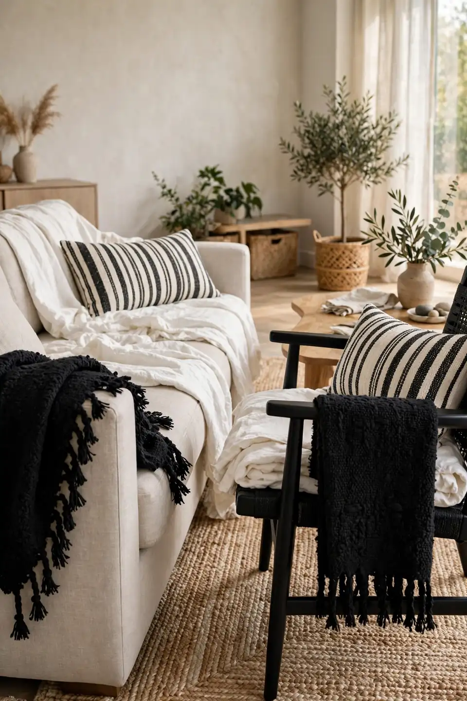
- Start with a white base layer: sofa throw or cotton blanket.
- Add black in the middle layer, a wool throw across one arm.
- Finish with pattern on top, a striped cushion at the center.
- Repeat the stack on the opposite chair to close the loop.
Layering keeps monochrome from feeling like a showroom. Each added texture, nubby wool, flat cotton, slubbed linen, catches light differently, so the eye reads depth where the palette offers none. Fold throws to show their edges; a visible fringe or hemline is a small detail guests register without naming. Wash the white layers together and the system maintains itself.
Painted Brick Fireplace Focus

A fireplace already owns the room’s attention; the finish decides whether it whispers or shouts.
| Feature | Painted Brick | Natural Stone |
|---|---|---|
| Color Effect | Clean white field, black firebox pops | Busy tones fight the palette |
| Cost | Paint and primer, one weekend | Cleaning or costly refacing |
| Upkeep | Touch up chips each spring | Dust settles in deep joints |
| Best With | Black mantel, white walls | Rustic beams, leather seating |
Painting brick scares purists, but in a monochrome room the white field is what lets the black firebox and mantel art perform. Limewash softens the commitment if solid paint feels final. Keep the hearth styling to three objects, one black, one white, one metallic, and the fireplace stays a focal point instead of a shelf.
Graphic Black Window Frames
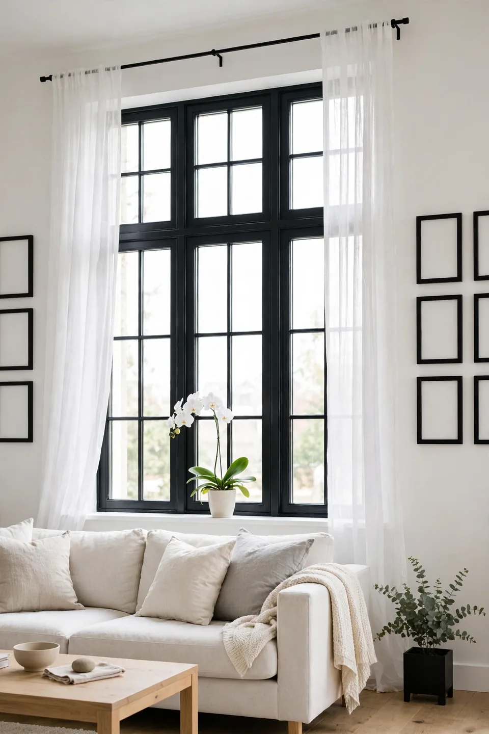
Do:
- Paint interior frames black while walls stay white and bright.
- Repeat the black in curtain rods and tiebacks above.
- Choose sheer white panels that filter light, not block it.
- Keep sills bare except one white orchid or ceramic.
Don’t:
- Paint frames in rooms with tiny windows and low light.
- Mix black frames with warm brass rods on one wall.
- Hang short curtains; panels should kiss the floor.
- Add patterned drapes beside already busy rugs.
Black frames turn windows into artwork the room already owns. The grid of muntins echoes in picture frames and table legs, and daylight itself becomes part of the palette. Renters can copy the effect with removable black tape on frame edges, a weekend experiment that peels away clean.
Marble Top Console Styling

Cost: Moderate, stone remnants cut to size run cheap
Time: Two hours to style and level
Skill Level: Beginner, symmetry does the heavy lifting
Best For: Entry walls and the space behind sofas
A marble console behind the sofa gives the room a second stage for styling. Work in pairs: two black lamps, two white coffee table books, one bowl centered between them. The stone’s gray veining bridges the palette, softening the jump from black frames to white upholstery. Keep the surface two-thirds empty; marble shows best when it is allowed to be the decoration. Guests notice this wall first, often before the sofa.
Oversized Abstract Canvas Art
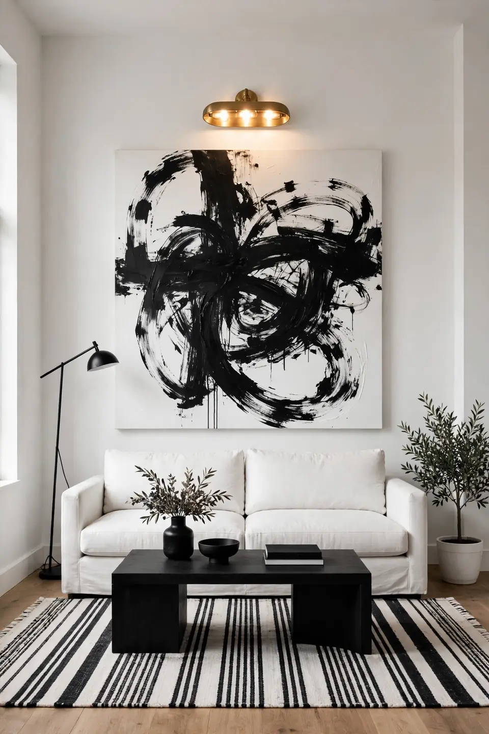
One huge canvas does what six small frames cannot: it gives the contrast a single, confident voice. Black brushwork on a white ground, or the reverse, hangs like a window into a bolder room. Scale up until the piece feels slightly too big; that tension is the style working.
Hang the canvas so its center sits at eye level from the sofa, and light it with the same warmth as the reading lamps. The graphic energy recalls mid century modern bedroom decor ideas, where one bold piece carried a whole wall. Keep neighboring walls bare for a full three feet on each side; the emptiness is part of the composition.
Striped Curtain Panel Drama

- Hang panels from ceiling height to make black stripes soar.
- Choose wide bands; thin stripes vibrate and tire the eye.
- Line white panels in black for a tailored reverse edge.
- Let hems pool one inch for a relaxed, expensive finish.
- Repeat the stripe direction in the rug for quiet agreement.
Curtains are the cheapest way to add architecture to a plain box of a room. Striped panels frame the windows like columns, and their vertical lines lift a low ceiling more honestly than paint tricks. Keep hardware black and slim so the fabric keeps the spotlight, and steam panels after hanging; wrinkles break the graphic spell faster than any wrong color could.
Lacquered Black Bookcase Backs
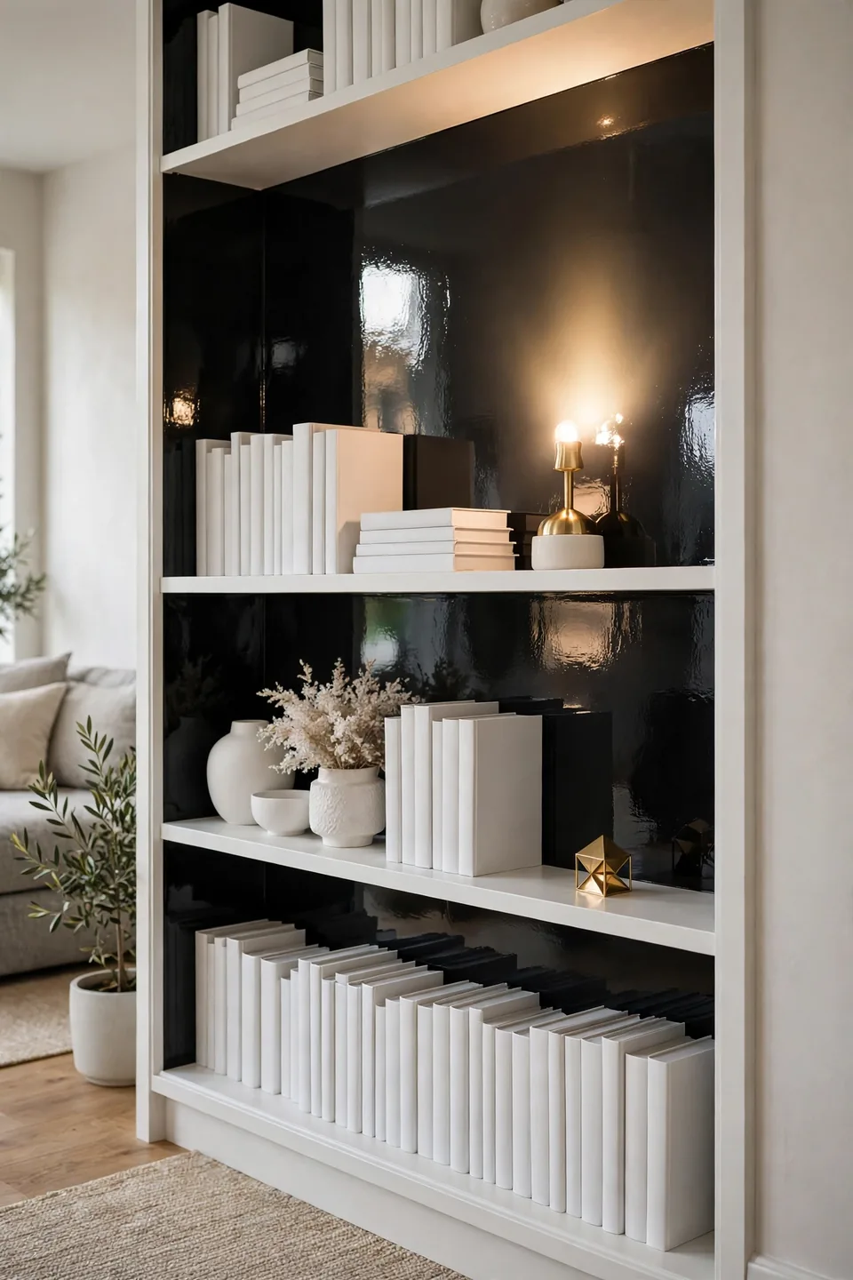
Quick Tip: Paint only the back panel of a white bookcase in high-gloss black. The shine turns shelves into shadow boxes, white ceramics glow against it, and the job takes one small can of paint and a single afternoon.
The trick borrows from gallery retail, where dark backdrops sell pale objects. Books with white jackets, glass vessels, and one brass piece per shelf keep the display from reading as storage. Gloss reflects lamp light upward at night, giving the case a lit-from-within warmth that matte paint cannot copy. Dust shows sooner on gloss, so keep a soft brush nearby and make peace with a weekly pass.
Patterned Monochrome Ottoman Centerpiece
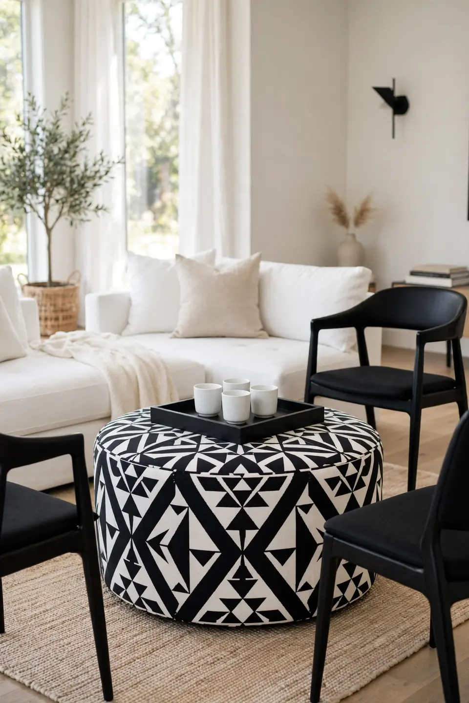
BEFORE: The seating circled an empty rug center that nobody used. Feet landed on the coffee table, trays balanced on sofa arms, and the room’s middle felt like a hallway everyone crossed instead of a place anyone stayed.
AFTER: A round ottoman in a bold black and white pattern now fills the center. It takes feet, trays, and extra guests with equal ease, and its soft edge makes the whole seating group feel closer and warmer.
An ottoman centerpiece works hardest in rooms that host often. Choose a pattern scale that matches the rug’s energy without copying it, and keep a rigid tray on top for drinks. Casters hidden under the base let the piece move for games, cleaning, and the occasional dance floor negotiation.
Sculptural White Ceramic Vases
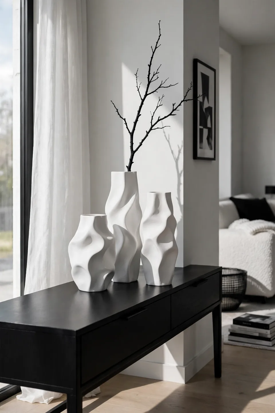
- Group three vases in odd heights on the mantel or console.
- Keep every finish matte white; gloss belongs to the black pieces.
- Add one black branch or stem per group for a drawn line.
- Leave the tallest vase empty; silhouette is the decoration.
White ceramics supply the softness a hard palette needs. Their curves interrupt the room’s straight lines, and matte glazes absorb light instead of bouncing it, which calms busy corners. Cluster them where daylight crosses in the morning; shadows do half the styling. One chipped vintage piece adds more soul than a perfect matched set, and a monthly dusting keeps the matte finish honest through every season.
Linen Versus Velvet Sofas
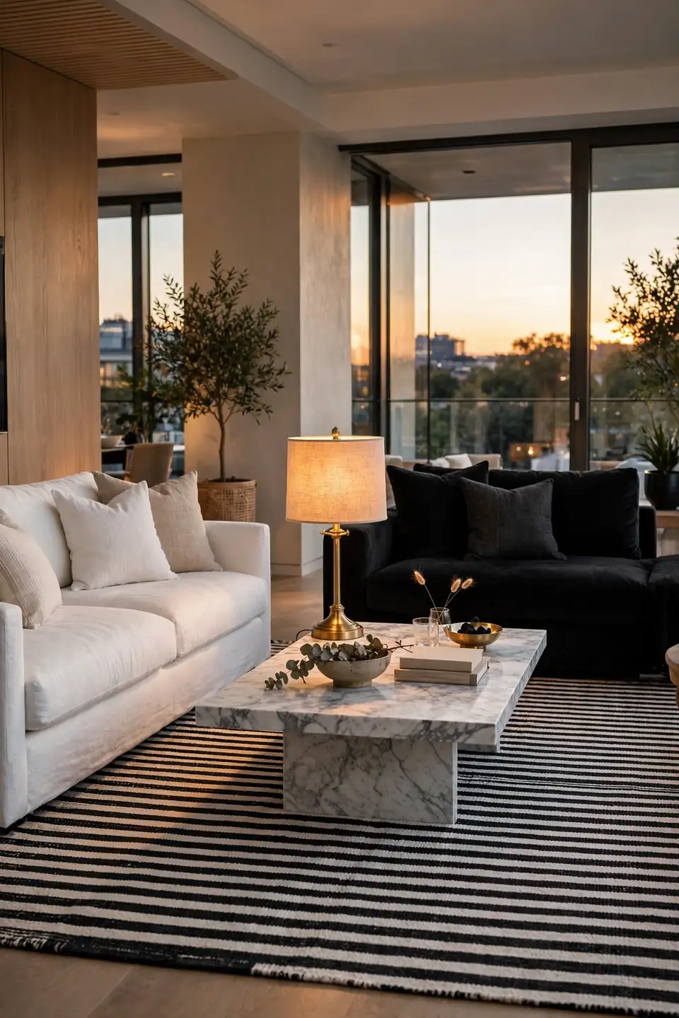
Fabric decides whether a monochrome room feels breezy or formal, and the two classics split the vote.
| Feature | White Linen | Black Velvet |
|---|---|---|
| Light Play | Bright, airy, shows every shadow | Absorbs light, glows at edges |
| Upkeep | Slipcovers wash, wrinkles expected | Lint shows, brush weekly |
| Mood | Coastal calm, daytime room | Evening drama, cocktail hour |
| Best With | Striped rugs, iron tables | Marble, brass, crystal |
Neither fabric wins outright; the room’s schedule decides. Daytime readers and dog owners live easier with linen, while evening hosts get more theater from velvet. Some rooms split the difference, linen sofa, velvet chairs, and let the two finishes divide the day between them. Either way, commit fully: half-hearted fabric reads as an accident in a palette this strict.
Black Metal Room Divider
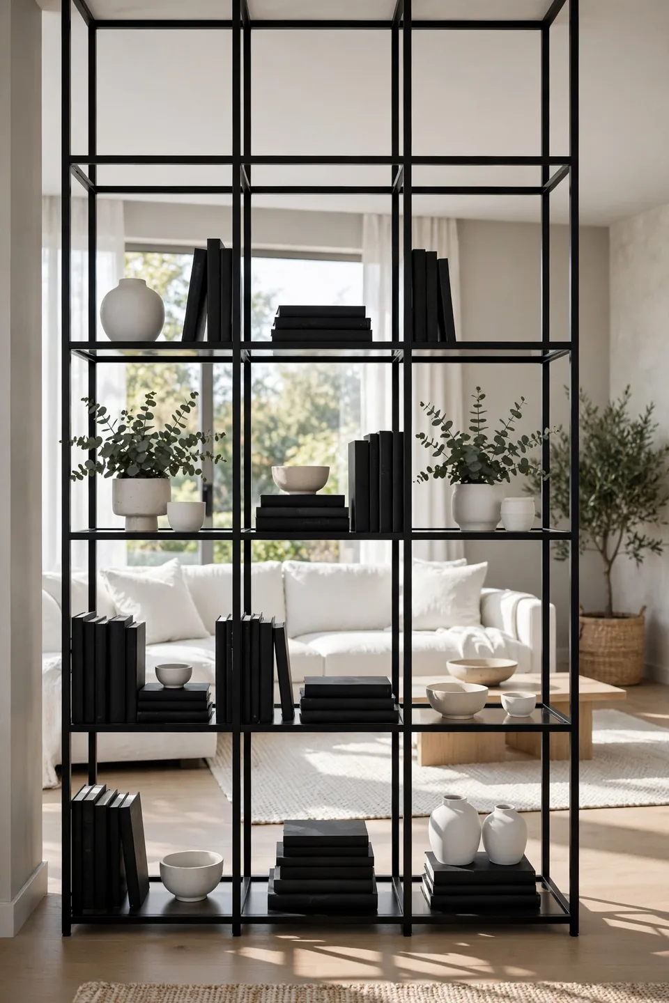
Do:
- Choose open shelving dividers that store books and ceramics.
- Anchor the unit to wall studs; tall metal must never wobble.
- Style both faces; a divider has no back side.
- Leave the top shelf empty to keep sight lines open.
Don’t:
- Block a window’s light path with a solid panel divider.
- Fill every shelf; storage creep erases the airy effect.
- Mix divider metal with chrome elsewhere in the room.
- Angle the unit diagonally; grids want right angles.
A divider earns its footprint when a studio or open plan needs a boundary that borrows light. The black grid repeats window frames and bookcase lines, so the partition reads as architecture. Measure twice: the unit should stop a foot short of the ceiling to keep the room’s volume intact.
Layered Rug Monochrome Trick

Cost: Low to moderate, the top rug carries the budget
Time: One hour including furniture lifts
Skill Level: Beginner, a second pair of hands helps
Best For: Renters covering floors they cannot change
Layering solves the renter’s oldest problem: a floor that fights the palette. A large white or natural base rug silences the offending color, and a smaller black patterned rug on top sets the seating zone. Keep eight inches of base visible on every side so the layers read as design, not shortage. The stack also warms the room acoustically; footsteps soften, and conversation stops echoing off hard floors.
Statement Chandelier Silhouette
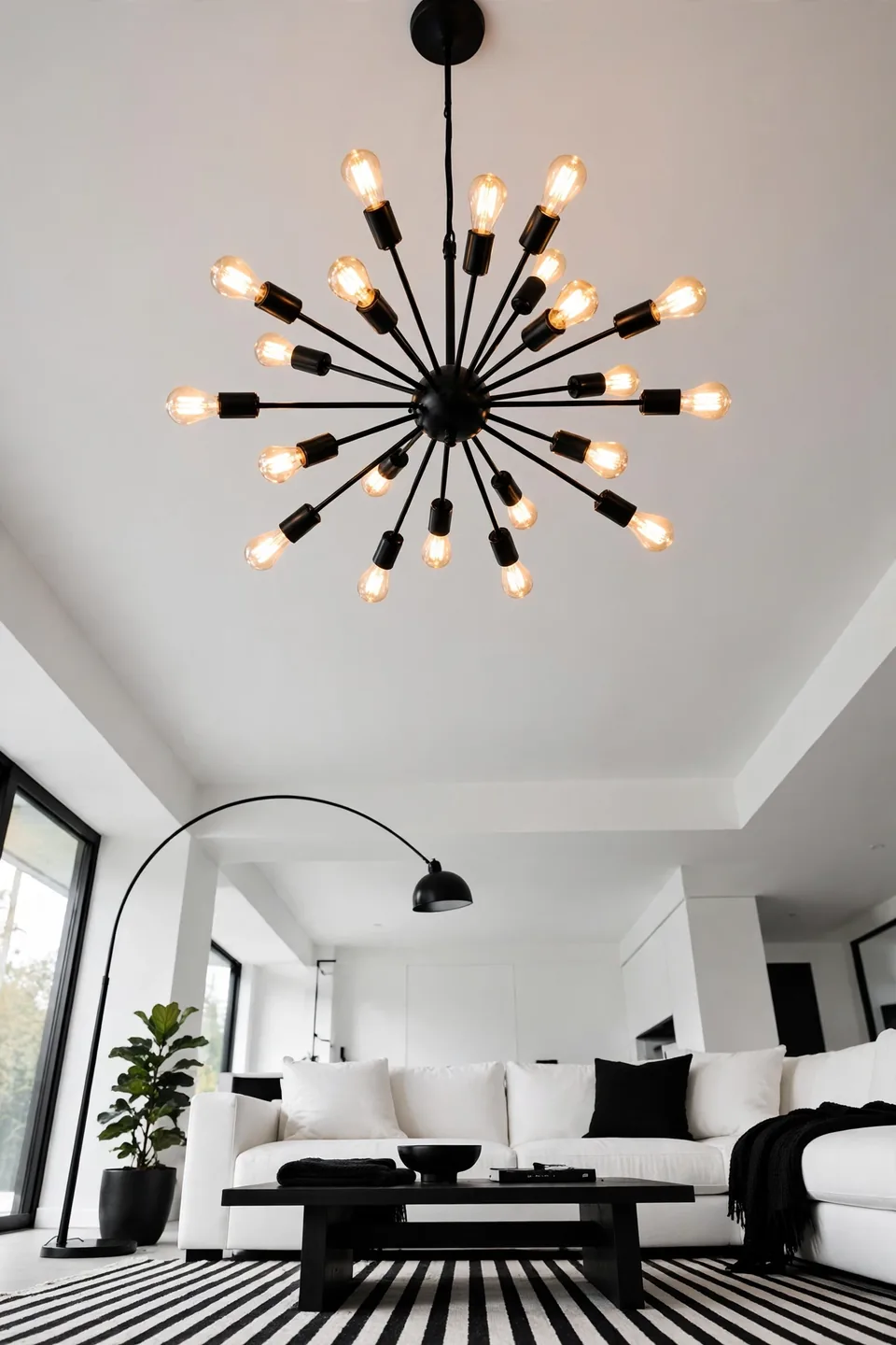
Look up: the ceiling is the one surface a monochrome room often forgets, and a black chandelier fixes that in a single installation. Sputnik spokes, a ring of candles, or a tiered drum all read as silhouette against white, turning light itself into the room’s artwork.
Scale the fixture to the seating group, not the room: about one-third the rug’s width feels right. Warm bulbs keep the black metal from reading cold, and a dimmer lets the piece shift from sculpture by day to glow by night. Every other finish in the room can stay quiet once the ceiling speaks this clearly.
Conclusion
Contrast this strong forgives almost everything else. Black and white rooms stay flexible for years, because new pieces answer one question: light or dark? Start with the rug or the sofa, add pattern in threes, and let texture carry the warmth the palette leaves out. These modern black and white living room ideas reward patience; one piece at a time builds the room faster than a weekend spree. Save this list on Pinterest before your next shopping trip, try two ideas this month, and share it with a friend whose living room plays too safe. I’ve seen this work well in many cases: the simplest palette often makes the bravest room.