24 Open Concept Kitchen Living Room Ideas for a Spacious Look
Tearing down the wall between your kitchen and living room opens up endless possibilities, and the right open concept kitchen living room ideas make the whole space feel twice as large. I’ve noticed that homes with open layouts sell the dream of togetherness, yet without a plan they can look scattered and undefined. A few smart choices in color, furniture placement, and lighting pull everything together. Here is how to get that airy, connected look.
The secret is treating the two zones as one story told in two chapters. Keep a consistent palette, repeat materials, and let sightlines stay clear from the stove to the sofa. Even renters can fake the flow with rugs and lighting. If you love cozy seasonal touches, these small apartment christmas decor ideas layer beautifully into an open plan without cluttering the sightlines.
Neutral Color Flow
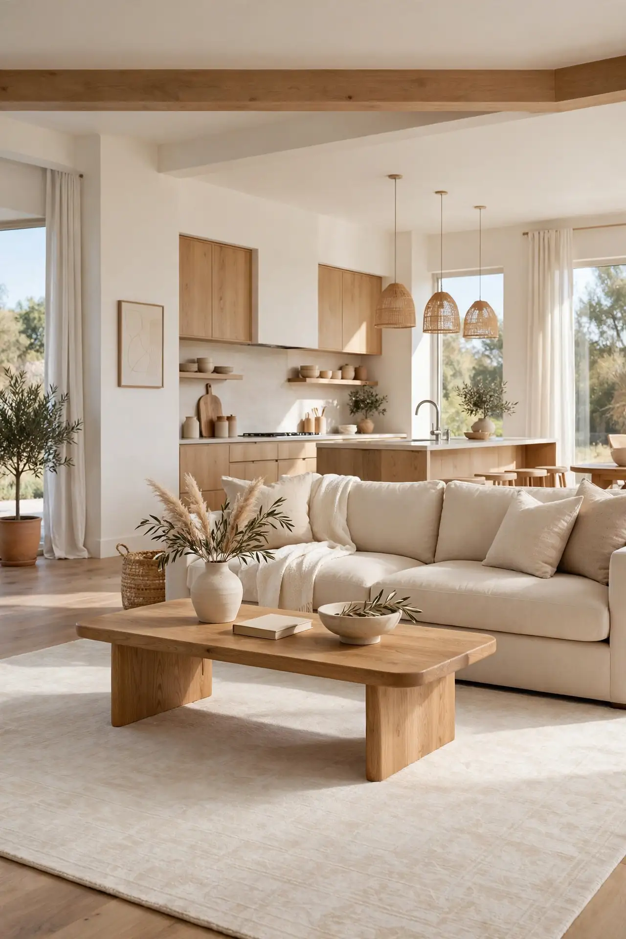
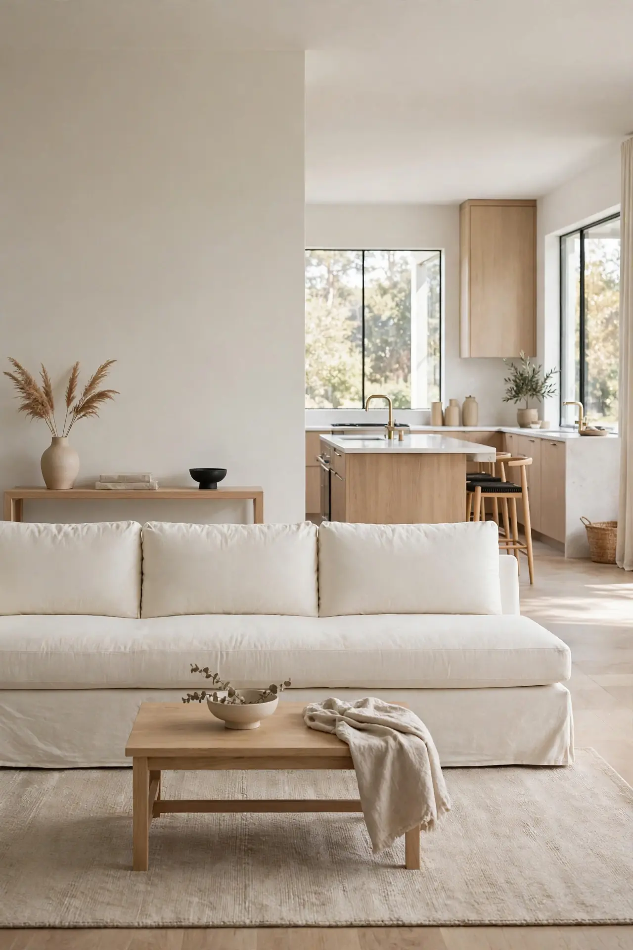
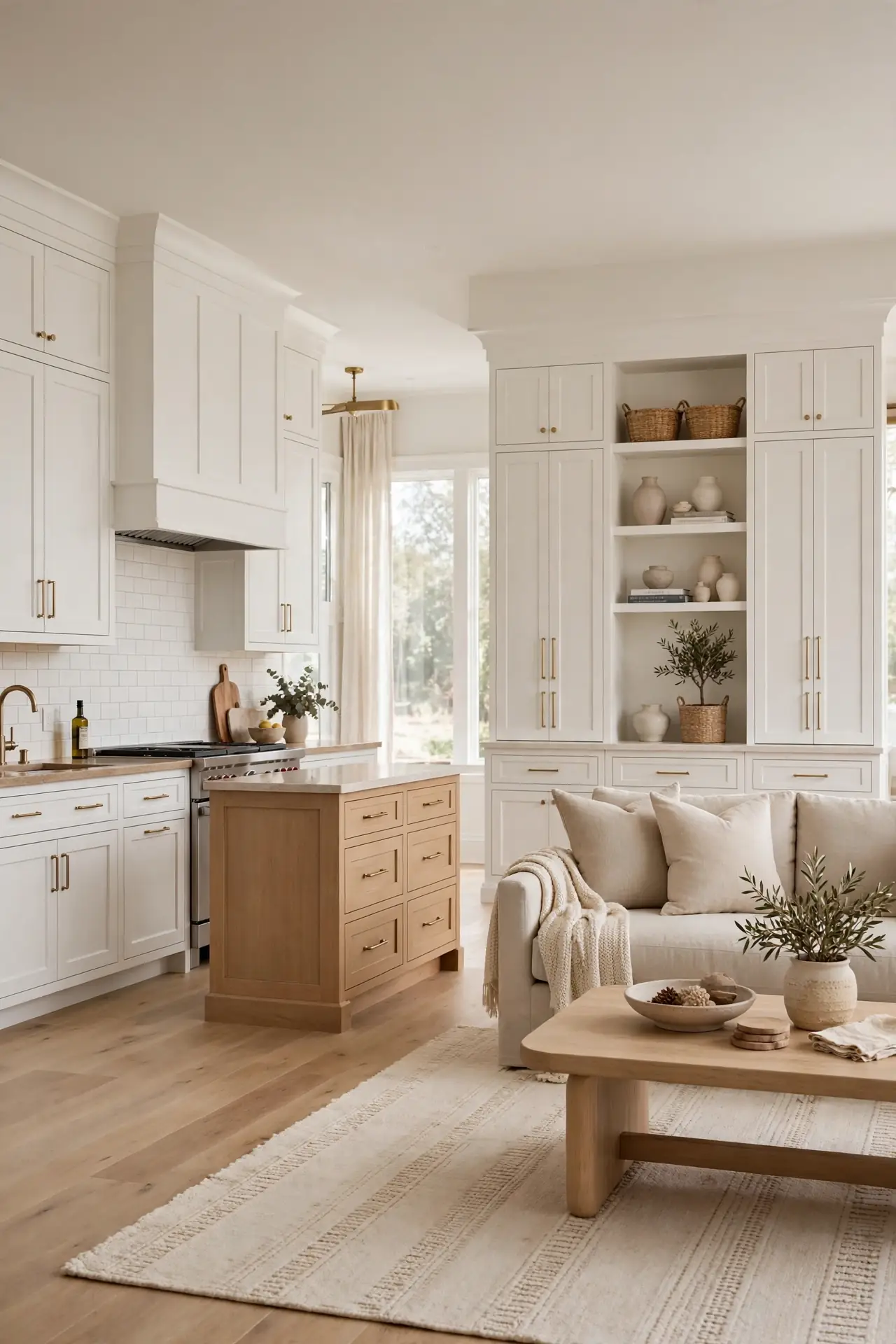
A single neutral palette is the fastest way to make two rooms read as one. Warm whites, soft beiges, and light greys on walls and large furniture blur the line between cooking and lounging. I’ve seen this work well in many cases where owners simply repainted one accent wall to match the other zone. Keep contrast low and let texture do the talking, so the eye glides across the space instead of stopping.
Build depth with tonal layers rather than new colors. Cream bouclé against pale oak, linen curtains beside a sand colored sofa, and small doses of black in hardware ground the scheme. Stick to three neutrals maximum for a calm, pulled together feel. This restraint keeps the open layout feeling serene instead of busy.
Island Seating Hub
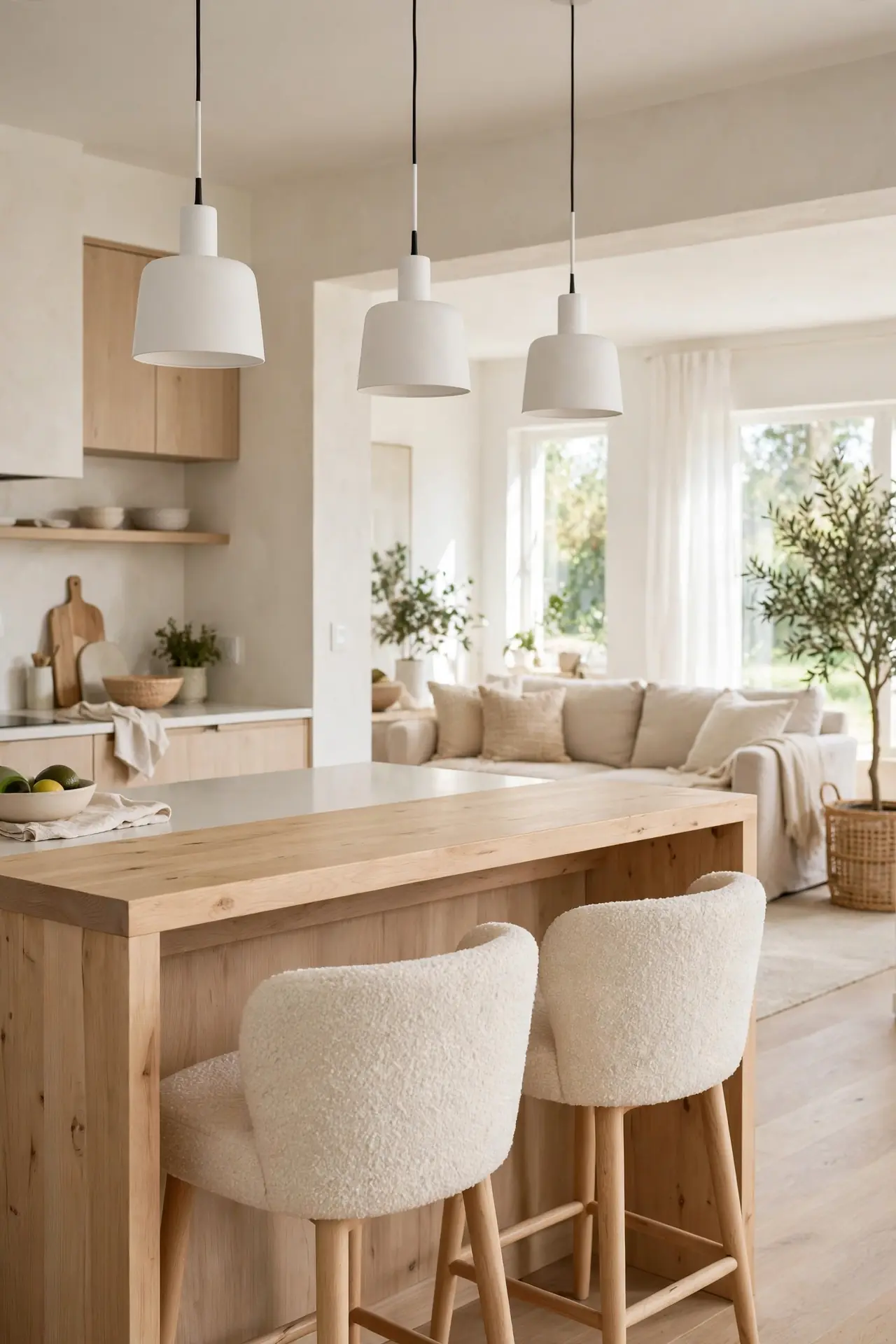
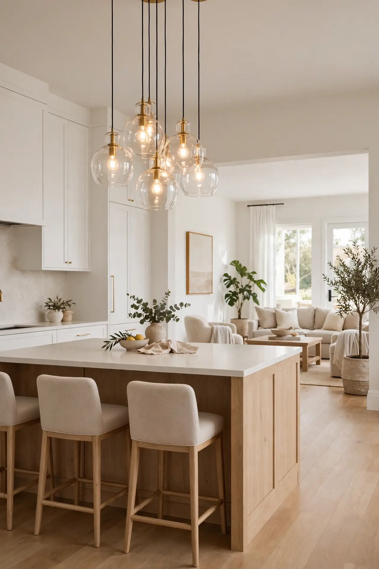
- Choose an island with seating on the living room side so cooks face family and guests.
- Pick stools in the same fabric family as your sofa for an instant visual link.
- Leave at least 36 inches of walkway behind the stools for easy movement.
- Hang two or three pendants above to mark the island as the heart of the home.
- Keep the countertop mostly clear so it doubles as a serving station.
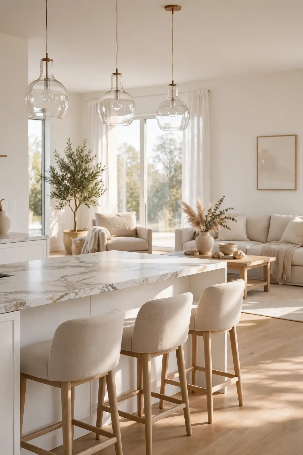
The island becomes the natural gathering point when it bridges both zones. In my experience, families spend more time together once the kitchen faces the living area instead of a wall. A waterfall edge in light stone keeps the look sleek and easy to wipe down. This single piece of furniture can carry the whole open plan.
Matching Wood Tones
Quick Tip: Hold wood samples from your kitchen cabinets next to living room furniture in daylight before committing. Artificial light hides undertones that clash by day. Aim for woods within one shade family, and repeat each tone at least twice across the space so nothing looks accidental.
Repeating wood tones is a quiet trick that ties everything together. When your kitchen island base echoes the living room coffee table and the dining bench, the brain reads one continuous room. Light oak and pale walnut are the easiest pairings for a neutral scheme. Mixed metals on hardware can vary, but keep the wood story simple and consistent.
Area Rug Zones
BEFORE: The sofa floated on bare floor with kitchen tiles running into the living area, and nothing marked where one zone ended. Furniture felt scattered, and the room looked smaller than its footage.
AFTER: A large flat weave rug anchors the seating group and clearly defines the lounge zone while the kitchen keeps its hard flooring. The boundary feels intentional instead of accidental, and each area gains purpose without a single wall.
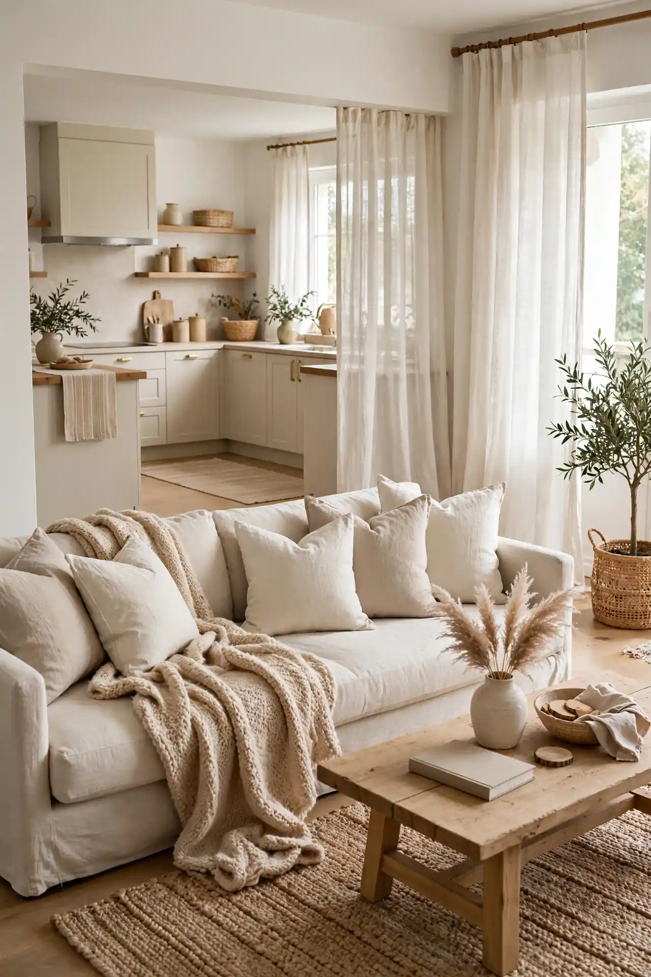
Rugs are the easiest zoning tool for open layouts. Choose one big enough that front legs of all seating sit on it, and keep the pattern subtle so it does not fight the kitchen finishes. A low pile rug in cream or jute handles traffic well. This simple layer adds warmth and gives the living zone clear purpose.
Glass Pendant Clusters
- Hang pendants 30 to 36 inches above the island countertop for the best glow.
- Use an odd number, three or five, for a balanced designer look.
- Match the pendant finish to your faucet and cabinet hardware.
- Install dimmers so the same lights shift from task lighting to evening mood.
Glass pendants define the kitchen zone without blocking a single sightline. Their transparency keeps the view open from the sofa to the far wall, which matters in a shared space. I’ve noticed clear glass reads lighter than metal shades in small open plans. Choose simple shapes and let them repeat the room’s clean lines.
Open Shelf Styling
| Styled open shelves | Closed upper cabinets |
| Keep sightlines open and airy | Hide clutter completely |
| Display pretty everyday dishes | Store mismatched items out of view |
| Need regular dusting | Lower maintenance choice |
| Suit minimalists with few items | Suit busy families with lots of gear |
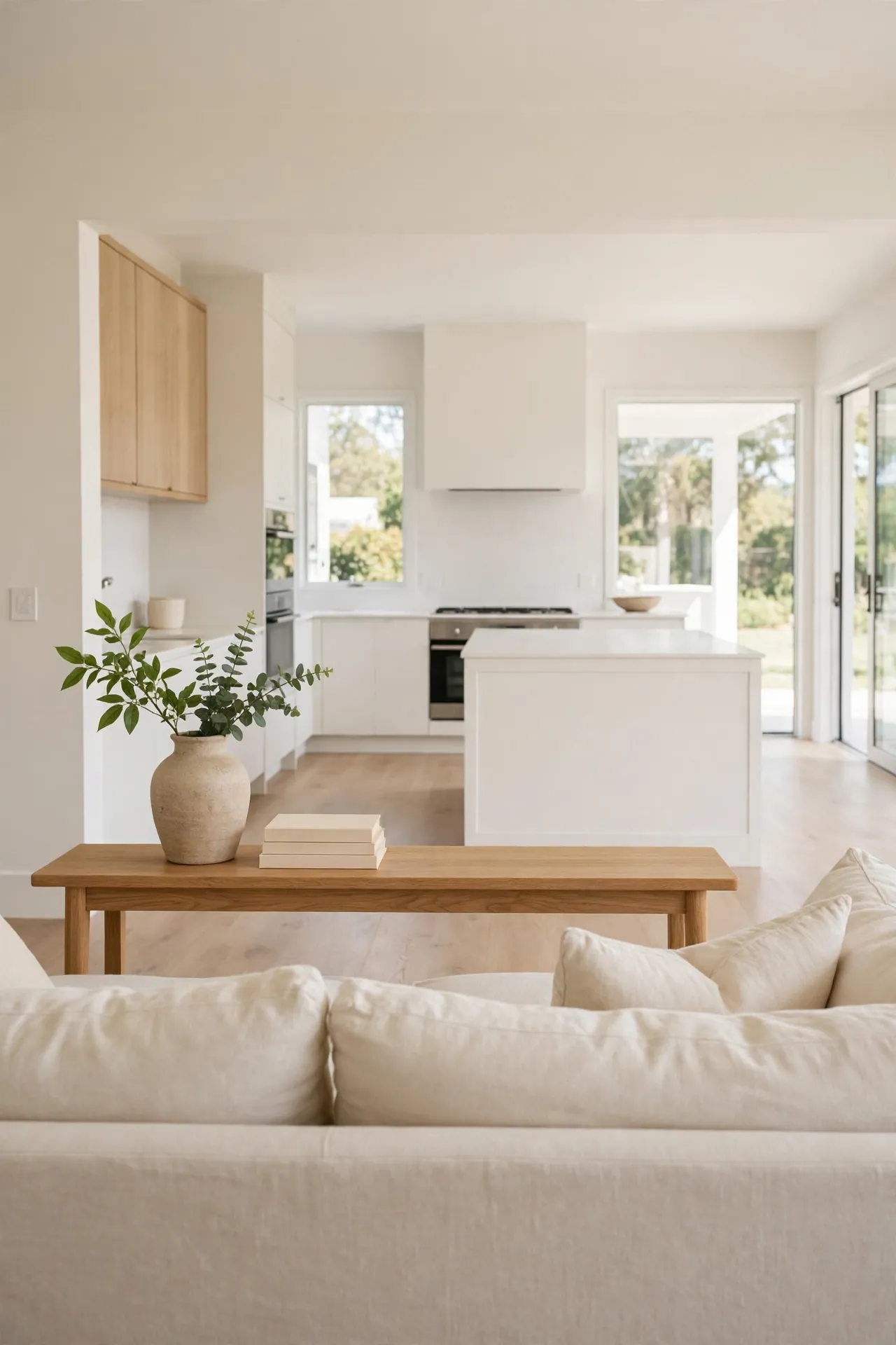
A short run of open shelves near the living zone keeps the kitchen feeling light. Style them with restraint: stacks of white bowls, a few wooden boards, one trailing plant. That’s why many experts recommend limiting open shelving to one wall while keeping closed storage elsewhere. You get the airy look without the constant styling pressure, and the kitchen stays visually connected to the living area.
Low Profile Furniture
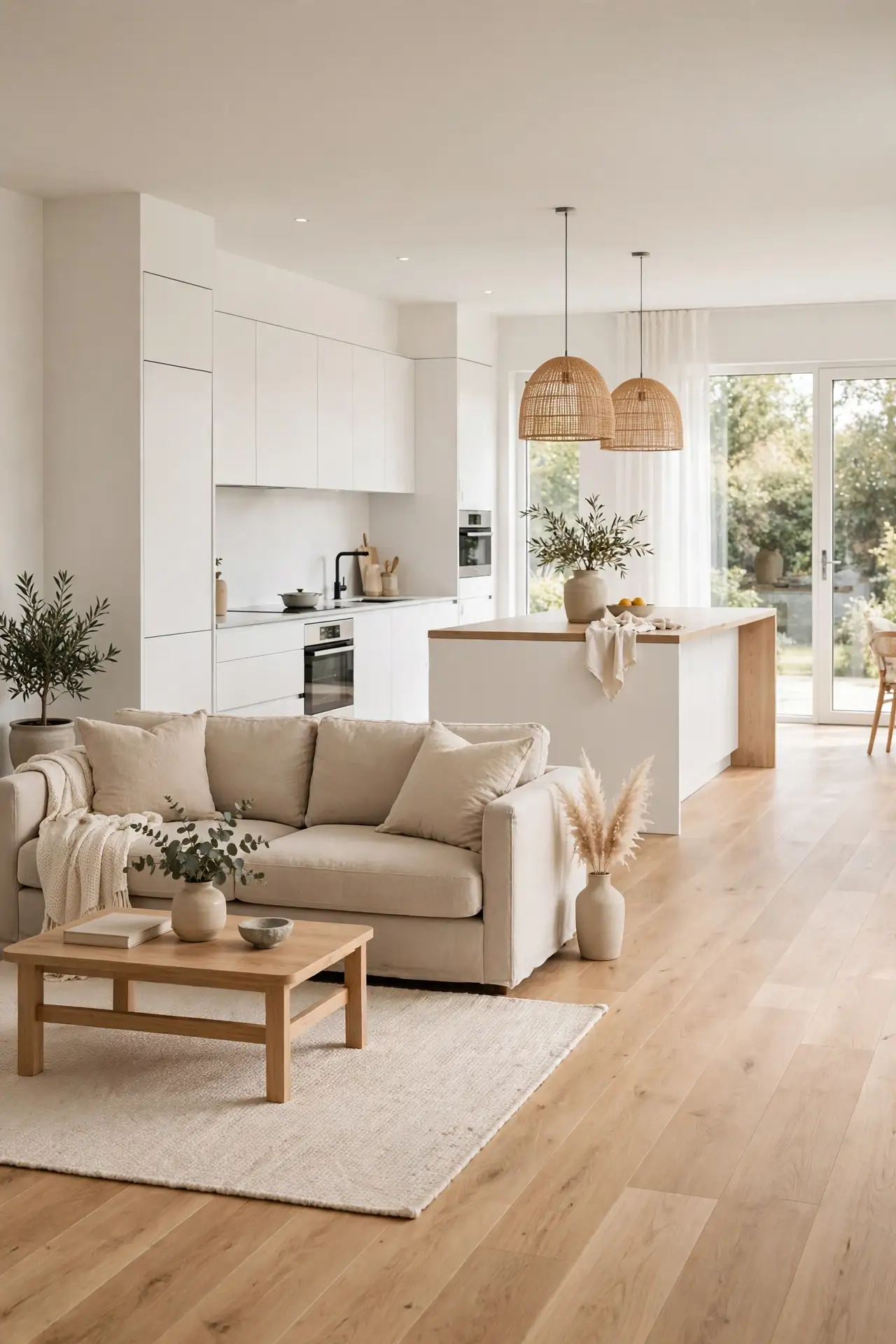
DO: Choose sofas with low backs that let light travel over them. DO: Pick leggy pieces that reveal floor for an airier read. DO: Keep tall furniture against walls, out of sightlines. DO: Use a low media console that doubles as a subtle room divider.
DON’T: Place a tall bookcase between the kitchen and sofa. DON’T: Buy oversized recliners that swallow the walkway. DON’T: Hang art so low it competes with the kitchen backsplash. DON’T: Ignore scale; one large piece beats five small ones.
Low furniture protects the long views that make open plans feel generous. Seeing from the front door straight to the kitchen window lets the whole home breathe. This suits anyone with modest square footage. Keep profiles slim and the space instantly feels larger than its measurements.
Statement Backsplash Wall
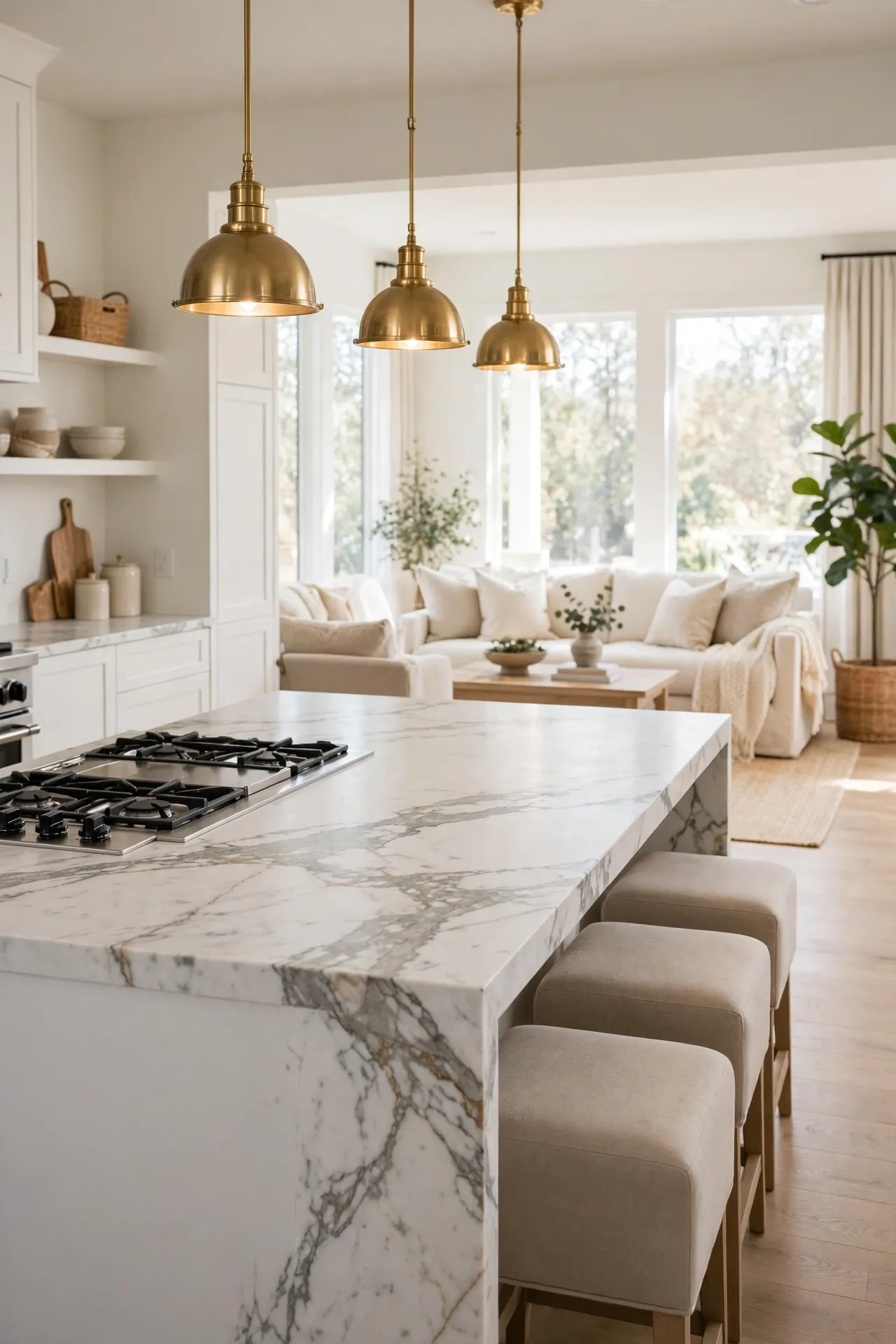
Cost: Medium | Time: One weekend | Skill Level: Intermediate | Best For: Adding character without color chaos
A full height backsplash gives the kitchen its own moment while staying inside the neutral story. Handmade look tiles in warm white add subtle variation that catches daylight beautifully. Run the tile from counter to ceiling on one wall for maximum impact. This single feature wall anchors the cooking zone so the living area can stay soft and simple around it. Choose a grout color close to the tile so the surface reads as one calm plane. Seal natural stone yearly to guard against cooking splatter and stains.
Continuous Flooring Run
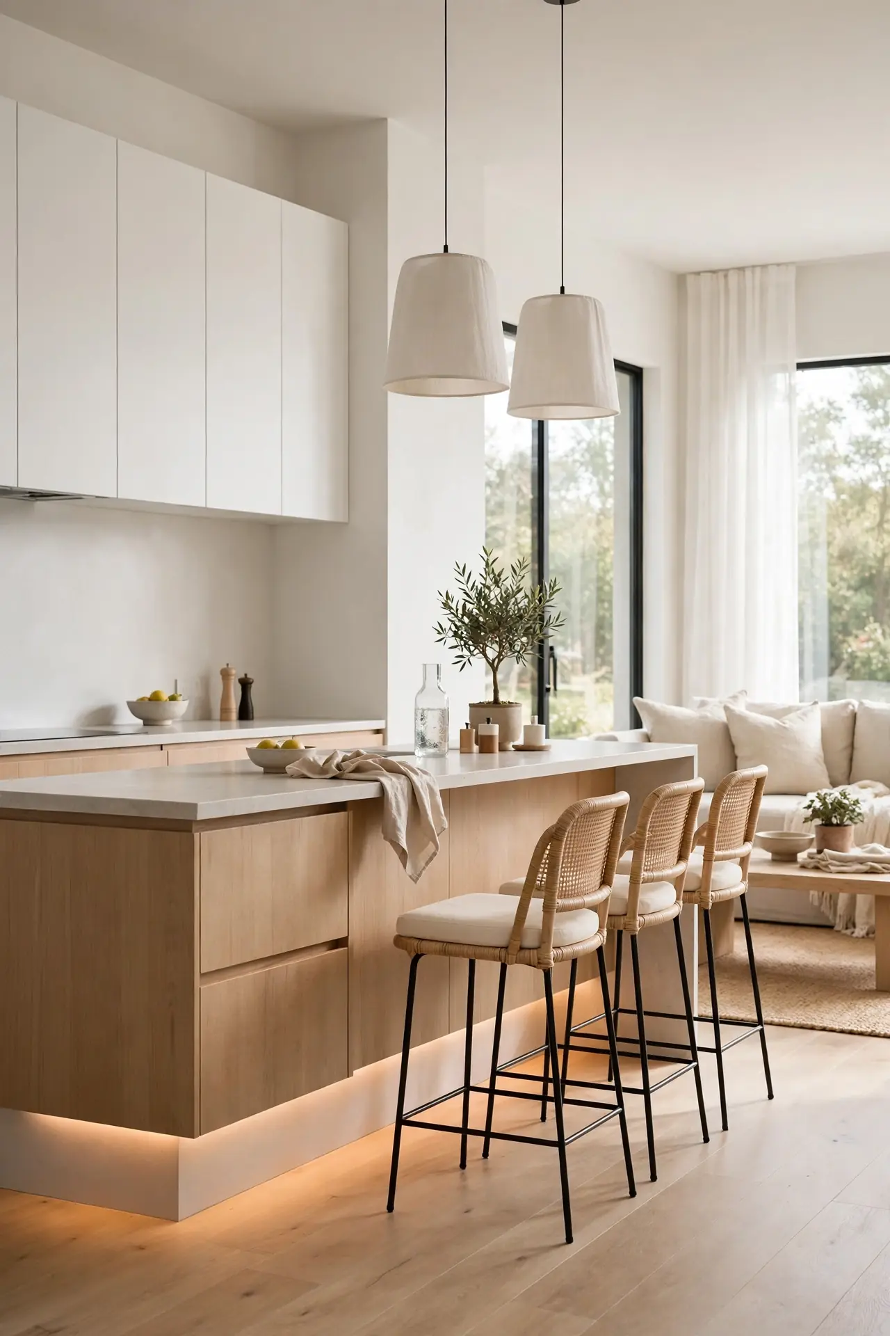
One floor material from wall to wall is the oldest trick for visual spaciousness. Light oak, pale luxury vinyl, or large format tile running unbroken under both zones erases the boundary completely. I’ve seen this work well in many cases where a simple floor update made a dated galley kitchen and closed living room feel like a new build. Avoid thresholds and transition strips wherever possible.
The finish matters as much as the continuity. Matte and low sheen floors hide daily wear and keep glare down in bright rooms. If a full replacement is out of budget, a large rug over existing tile can fake the effect in the living zone. Either way, the unbroken plane underfoot tells the eye the room goes on and on.
Breakfast Bar Seating
- A narrow 12 inch overhang creates casual seating without a bulky table.
- Two stools tuck fully under to keep walkways clear when not in use.
- Backless stools disappear visually and suit tight spaces best.
- Repeat the stool fabric on living room cushions for cohesion.
- Wipeable performance fabric survives daily breakfasts and homework sessions.
A breakfast bar turns dead counter space into the hardest working seat in the house. Kids eat cereal there while you cook, and guests perch with coffee during parties. The low profile keeps sightlines open in both directions. For small open plans, this beats a separate dining table that would chop up the floor.
Layered Lighting Plan
Quick Tip: Plan three layers in each zone: overhead for tasks, table or floor lamps for warmth, and accent light for art or shelves. Put every layer on dimmers. In the evening, lower the kitchen overheads and raise the living room lamps so the space shifts from work mode to relax mode.
Lighting does the zoning work that walls used to do. Bright, even light over the island says cook here, while a warm pool of lamplight around the sofa says rest here. Keep bulb color temperature consistent at 2700 to 3000 kelvin throughout. Mixed temperatures are the fastest way to make an open plan feel disjointed and cheap.
Greenery Accent Corners
BEFORE: The corner where the kitchen met the living room sat empty and awkward, a dead zone that collected clutter. Both areas felt flat and a little lifeless despite nice furniture.
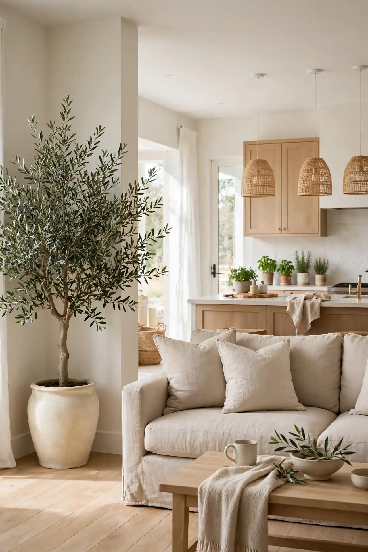
AFTER: A tall olive tree in a cream pot fills the corner with life and softens the hard lines of cabinetry. Smaller herbs on the kitchen counter echo the green, and the whole open plan feels fresh and finished.
Plants are the bridge between hard kitchen surfaces and soft living textiles. One large tree plus two or three small pots is plenty; more starts to feel like a greenhouse. Choose low maintenance varieties if your thumbs are not green. The organic shapes relax the geometry of an open layout beautifully.
Floating Cabinet Rows
- Mount a run of base cabinets on the wall with a 6 inch shadow gap underneath.
- Run LED strip lighting in the gap for a soft evening glow.
- Keep the floating run on the living room facing side for maximum effect.
- Match the cabinet finish to nearby living room furniture.
- Store less used items inside since access requires a slight bend.
Floating cabinets lift visual weight off the floor, which is gold in an open plan. The shadow gap tricks the eye into reading more floor space than exists. This works especially well for the island side facing the sofa. The floating look feels custom and modern while keeping every inch of storage you need.
Cohesive Textile Mix
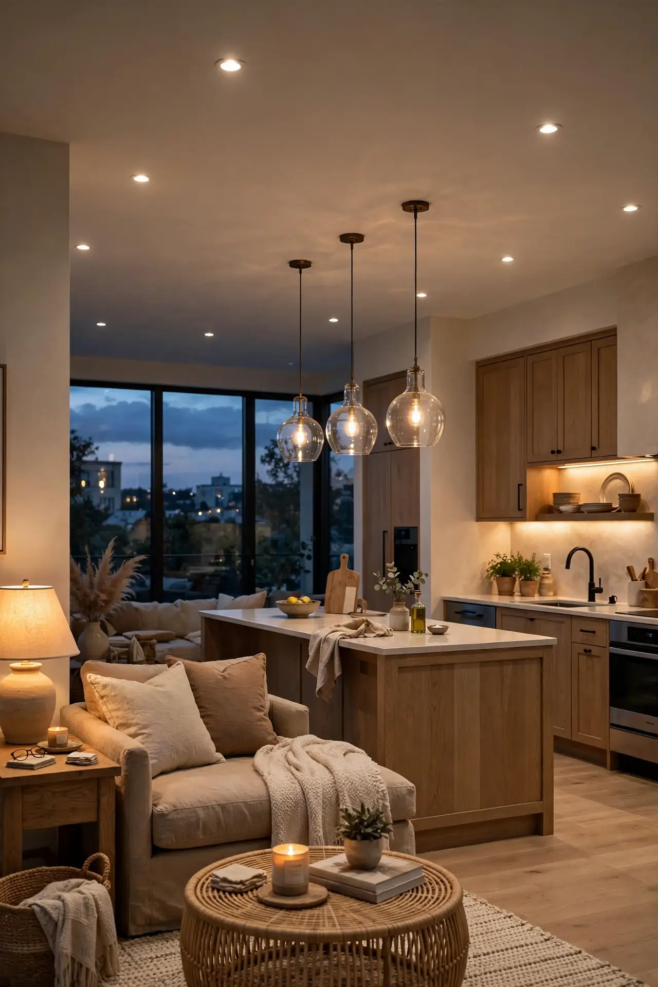
| Living room textiles | Kitchen textiles |
| Linen sofa cushions in oatmeal | Linen-look runner in matching tone |
| Chunky wool throw on armchair | Waffle weave hand towels |
| Jute area rug under coffee table | Flat cotton rug by the sink |
| Sheer linen curtain panels | Cafe curtain in same sheer fabric |
Textiles carry the color story across the open divide. When the living room cushions and the kitchen runner share a palette, the zones feel deliberately linked. For pretty styling above the cabinets, these decorating above kitchen cabinets ideas keep the display tonal so it blends with the living area. Stick to washable fabrics near cooking zones for easy care.
Armless Sofa Choice
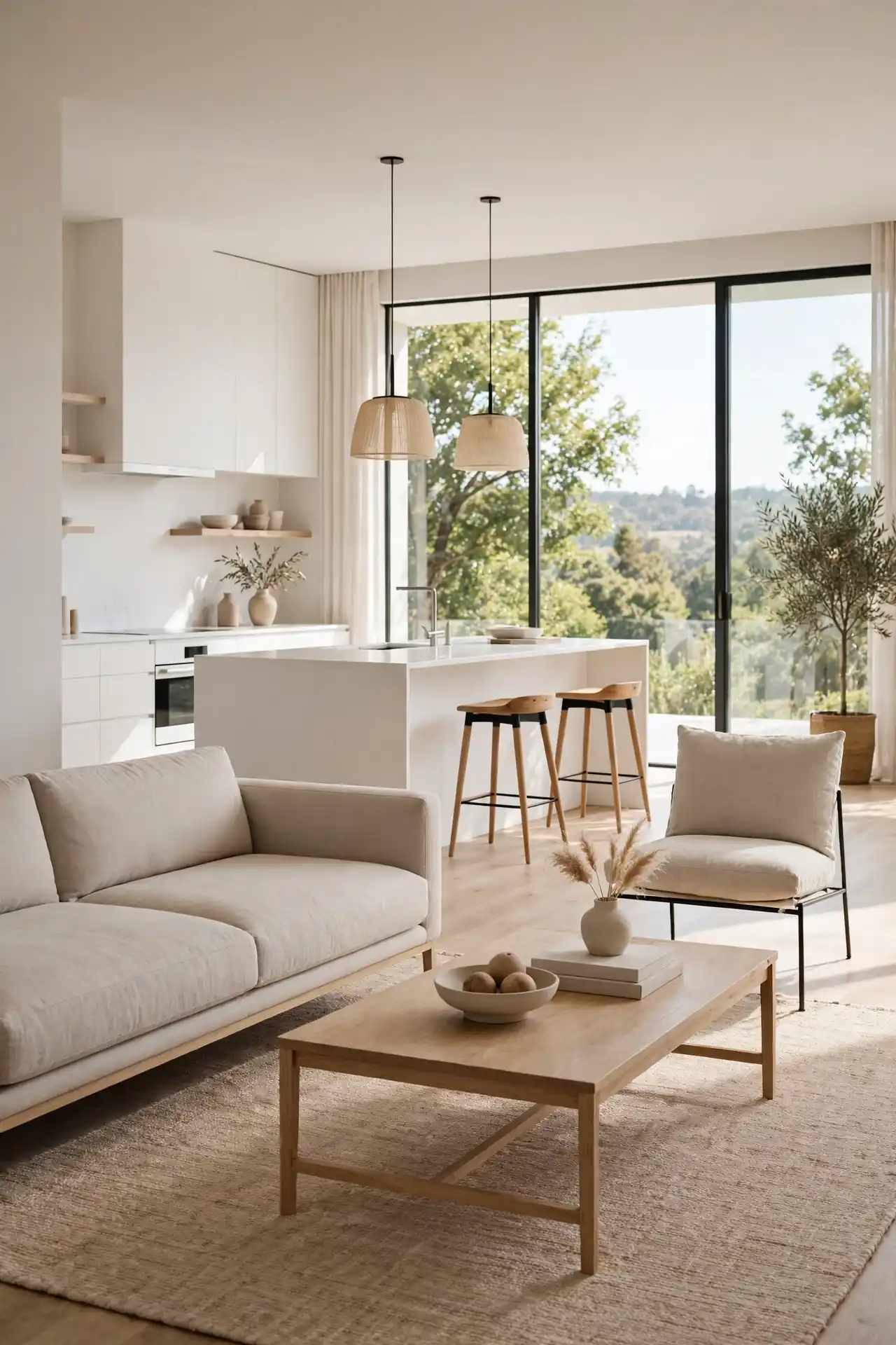
DO: Pick an armless or track arm sofa to keep the profile slim. DO: Choose performance fabric for kitchen-adjacent living. DO: Float the sofa back to the kitchen as a soft divider. DO: Add a slim console table behind it for lamps and storage.
DON’T: Face the sofa away from the kitchen if you want togetherness. DON’T: Choose a deep bulky sectional that eats the walkway. DON’T: Mix a formal Chesterfield with a casual shaker kitchen. DON’T: Skip measuring traffic paths first.
An armless sofa keeps the middle of an open plan feeling light and passable. The lower visual mass means you see over it to the kitchen, preserving that connected feeling. Slipcovers are smart this close to cooking splatter, and this one choice changes how big the floor feels.
Hidden Storage Benches
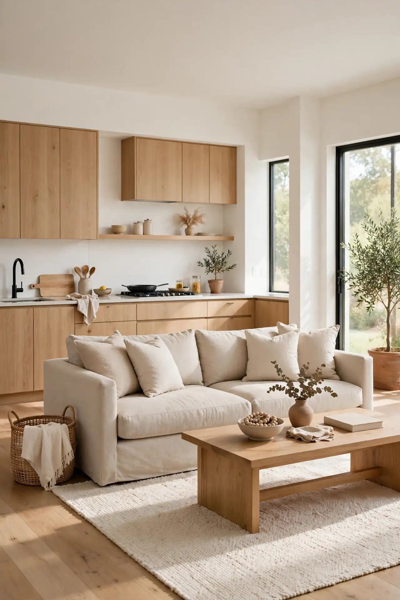
Cost: Low to medium | Time: One afternoon | Skill Level: Beginner | Best For: Hiding everyday clutter fast
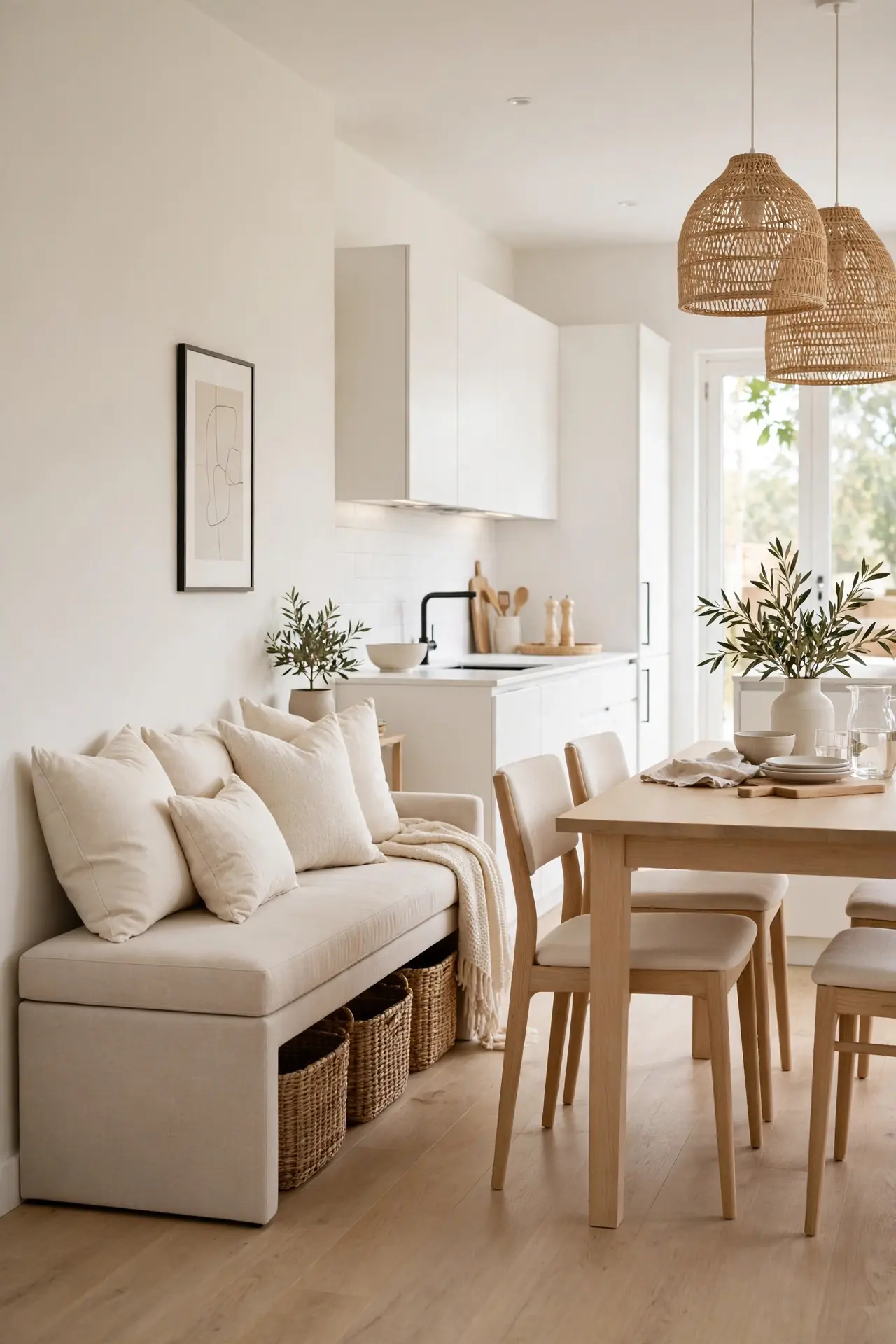
Open plans show everything, so hidden storage is not optional. A bench with a lift up seat swallows throws, toys, and placemats in seconds. Place one against the sofa back or under a window between the zones. In my experience, the tidiest looking open layouts always have generous concealed storage. Choose pieces that look like furniture first and storage second. A lidded ottoman near the entry corrals shoes and bags just as well. Look for solid joinery and washable upholstery so each piece survives daily family use.
Double Duty Island
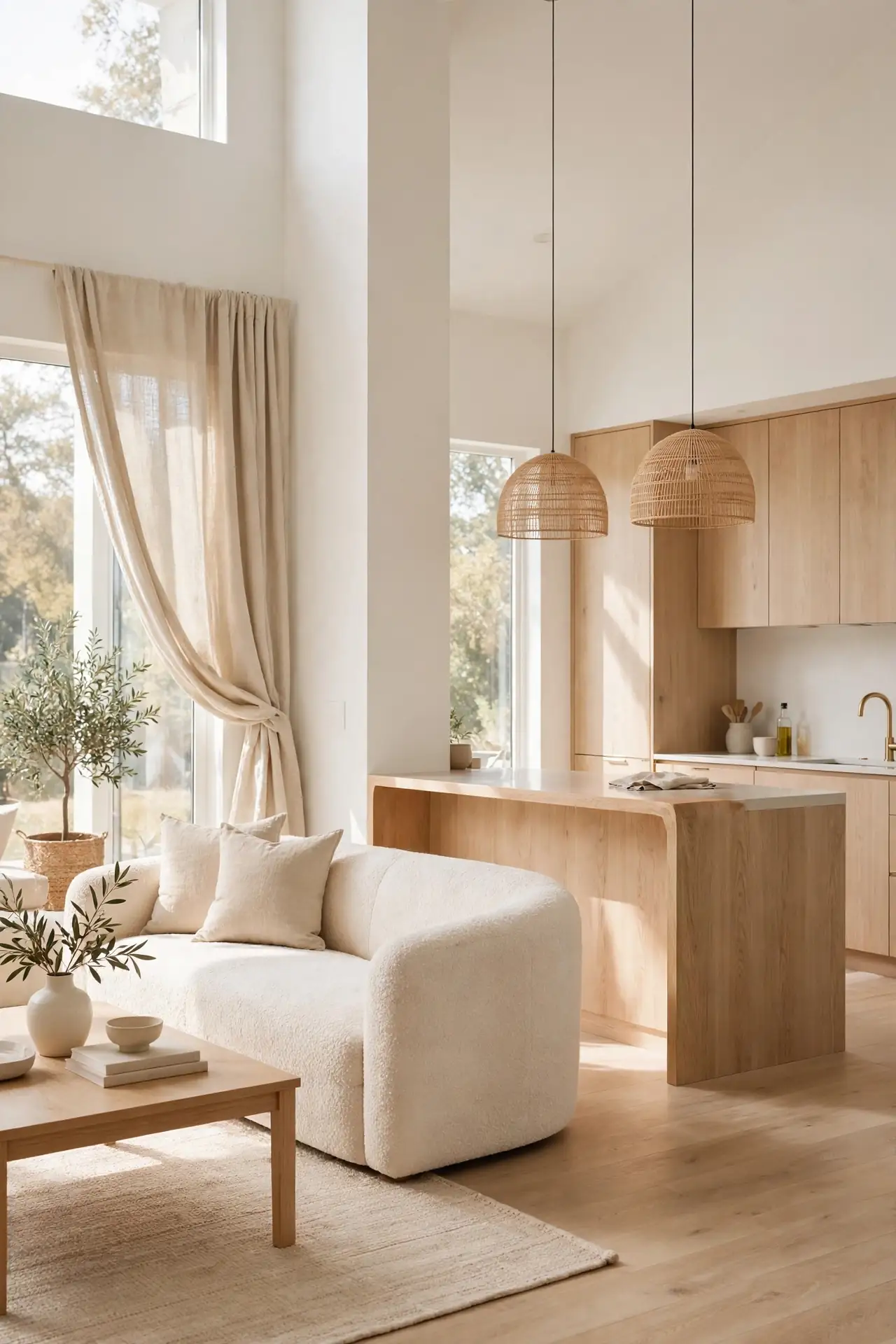
Design the island to work from both sides and it earns its footprint twice. Prep and cooking face the kitchen while seating, a charging drawer, and display shelving face the living room. I’ve seen this work well in many cases where a standard island felt like a barrier but a double sided one became the social center. Keep the living side calm and styled, the kitchen side practical.
Details make the double duty succeed. A waterfall edge on the seating side looks like furniture, while the kitchen side keeps durable finishes. Add outlets on both faces so laptops and small appliances both plug in easily. When one piece serves two zones this gracefully, the open plan finally feels intentional rather than just open.
Warm Metal Accents
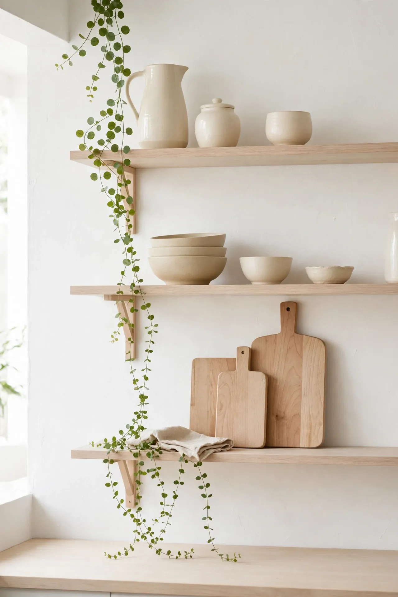
- Brushed brass warms up white kitchens without adding color.
- Repeat the same metal on faucets, pendants, and living room lamp bases.
- Keep finishes matching; mixed metals need a careful hand here.
- Matte finishes hide fingerprints better than polished ones.
- Small doses work best: hardware, lighting, and one mirror frame.
A single warm metal running through both zones acts like jewelry for the room. Brass or champagne bronze against creamy neutrals feels rich but still calm. The repetition is what matters; one brass faucet alone looks random, but brass pendants plus a brass floor lamp base look planned. This small commitment delivers an outsized designer effect.
Sightline Decor Rules
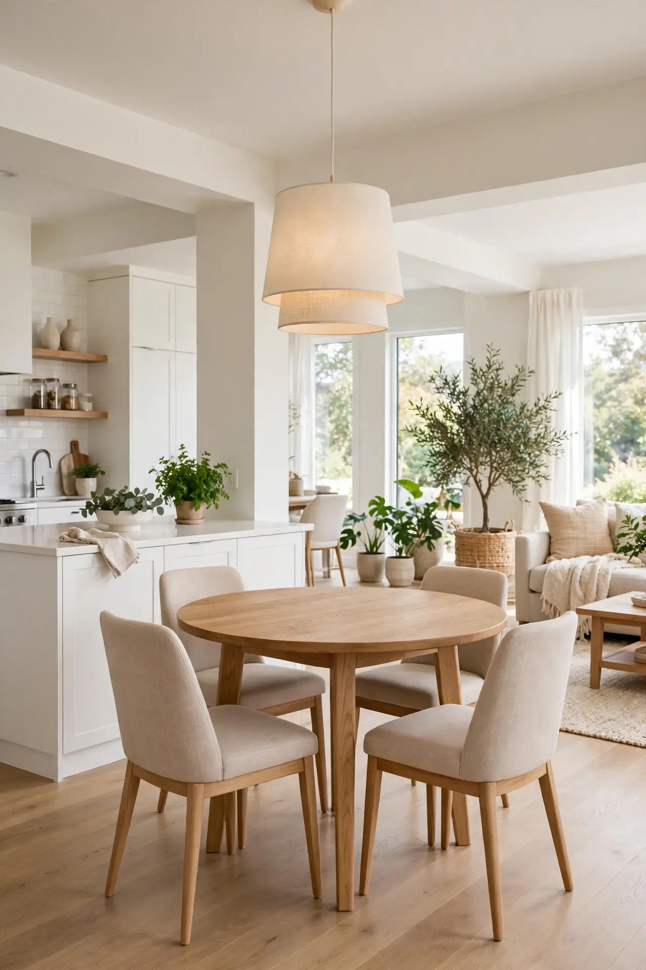
Quick Tip: Sit on your sofa and note everything you see straight ahead into the kitchen. That view is your most seen vignette, so style it deliberately. Keep the visible counter run clear, hang one piece of art at seated eye level on the far wall, and make sure no tall clutter breaks the horizon line.
Decorate for the longest view in the room first. In an open plan, you see the kitchen from the couch all day, so that sightline deserves the most attention. Low bowls, a small plant, and one pretty cutting board are enough. Anything taller starts to chop up the view. This mindset shift alone makes open layouts feel calmer and more expensive.
Unified Cabinet Style
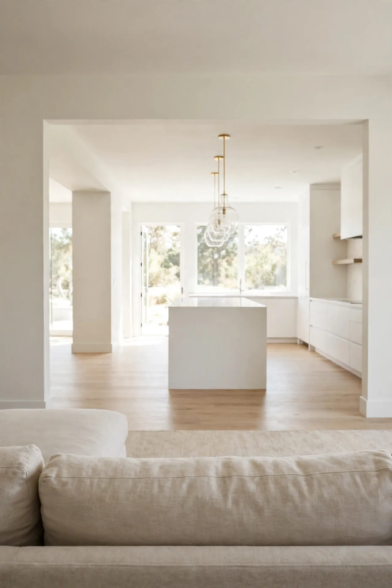
BEFORE: The kitchen had sleek flat front cabinets while the living room built ins were ornate and traditional, and the clash was visible from every seat. Each zone felt like a different house.
AFTER: Matching the living room built ins to the kitchen’s simple shaker profile unified the whole wall. Painted the same warm white, they read as one architectural gesture instead of two competing styles.
Cabinet style is architecture, and architecture should agree across an open plan. If a full match is too much, echo just the door profile or the paint color. Even matching the hardware finish helps. When the millwork speaks one language, the furniture gets to have all the fun.
Round Table Anchor
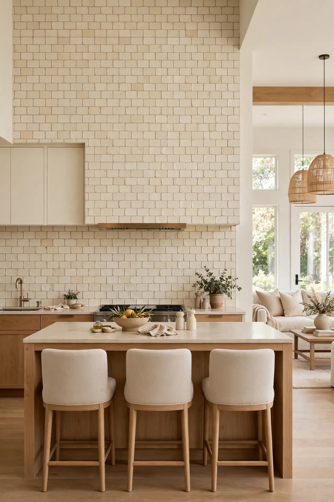
- Place a round table in the transition zone between kitchen and sofa.
- Choose 42 to 48 inches diameter for four comfortable seats.
- Hang a single pendant centered above to claim the spot.
- Keep chairs light enough to pull out without scraping floors.
A round table softens the geometry of an open plan full of rectangles. With no sharp corners, traffic flows around it naturally from kitchen to living room. I’ve noticed round tables encourage longer lingering conversations too. In light oak with simple upholstered chairs, it bridges both zones without visually dividing them. Center it on the pendant light for a pulled together look that feels deliberate from every angle.
Window Light Maximize
| More light | Less light |
| Sheer curtains on every window | Heavy drapes that block glass |
| Mirrors opposite windows | Dark art on the sunniest wall |
| Glass front cabinet doors | Closed dark upper cabinets |
| Pale reflective backsplash tile | Matte dark stone surfaces |
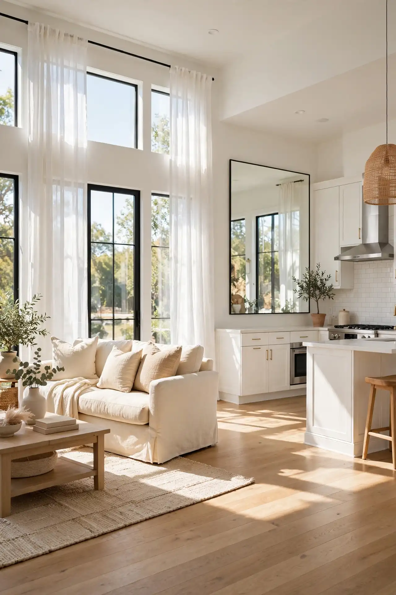
Daylight is the best free tool for making open plans feel spacious. Keep window treatments sheer and mount them high and wide so glass stays fully exposed. A mirror placed to catch the kitchen window doubles the brightness in the living zone. Every reflective surface you add bounces light deeper into the shared space. Clean windows inside and out twice a year, since grime silently dims even the sunniest open plan.
Console Divider Piece
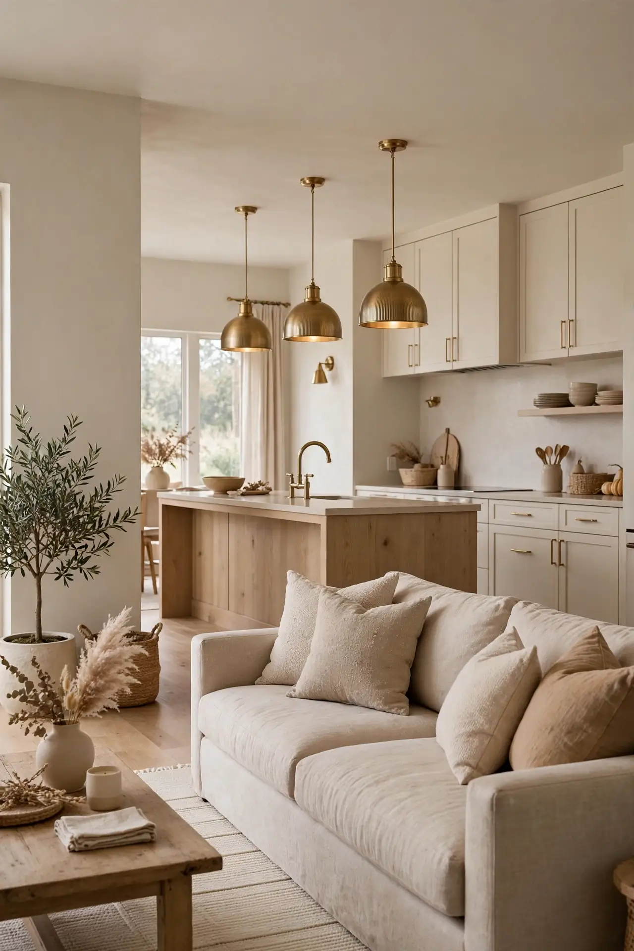
DO: Use a narrow console, 12 inches deep, behind the sofa. DO: Style it low so sightlines stay open above it. DO: Add a pair of lamps for evening warmth on both sides. DO: Choose open shelving underneath for baskets and throws.
DON’T: Use a tall bookcase that blocks the kitchen view. DON’T: Clutter the top with more than five objects. DON’T: Pick a dark heavy piece that visually walls off the space. DON’T: Forget to anchor it securely.
A console table is the gentlest divider an open plan can have. It marks where lounging ends and cooking begins without any visual weight. The surface earns its keep with lamps, a catchall bowl, and a little greenery. This zoning rearranges in minutes whenever the layout needs a refresh.
Balanced Wall Art
Cost: Low | Time: One afternoon | Skill Level: Beginner | Best For: Personality without visual noise
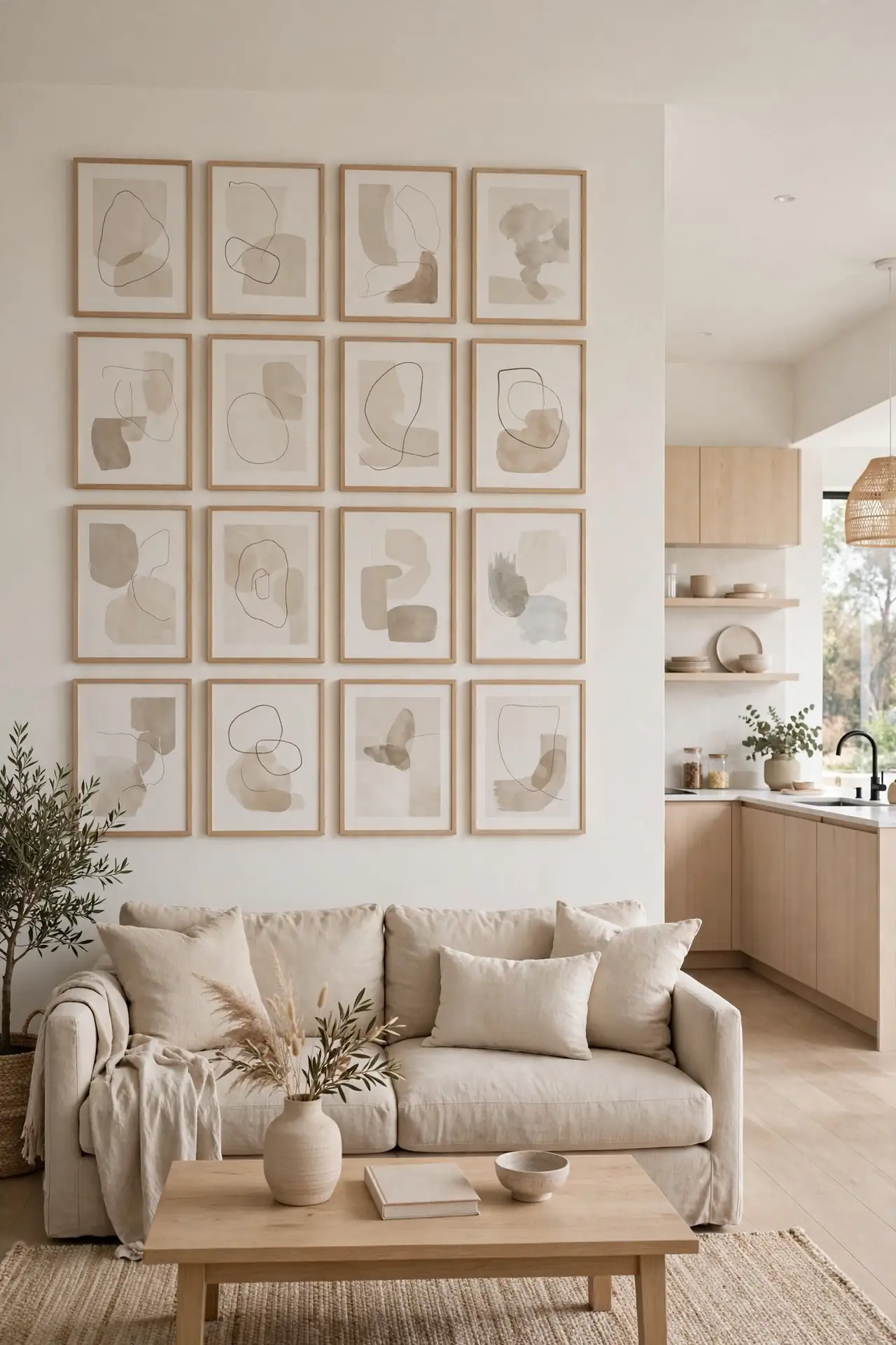
Art ties the zones together when it shares a palette and framing. Keep living room pieces in the same neutral family as the kitchen, with matching light wood frames throughout. One large calm abstract beats a busy gallery wall in an open plan. Hang the center at 57 inches for a gallery feel. Restrained art lets the architecture and light stay the stars. Shop secondhand frames and print your own abstracts to keep costs low. Step back to the kitchen and check the view; if it feels calm from the farthest seat, you nailed it.
Conclusion
The best open concept kitchen living room ideas all serve one goal: making two hardworking zones feel like a single calm home. Start with a unified palette and continuous flooring, then layer in smart zoning with rugs, lighting, and low furniture. I’ve seen how small changes like these can completely shift the way a space feels, turning a choppy layout into a place everyone gravitates toward. Pick three ideas that fit your budget, try them this weekend, and save your favorites on Pinterest to guide the rest of the refresh.