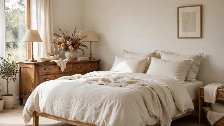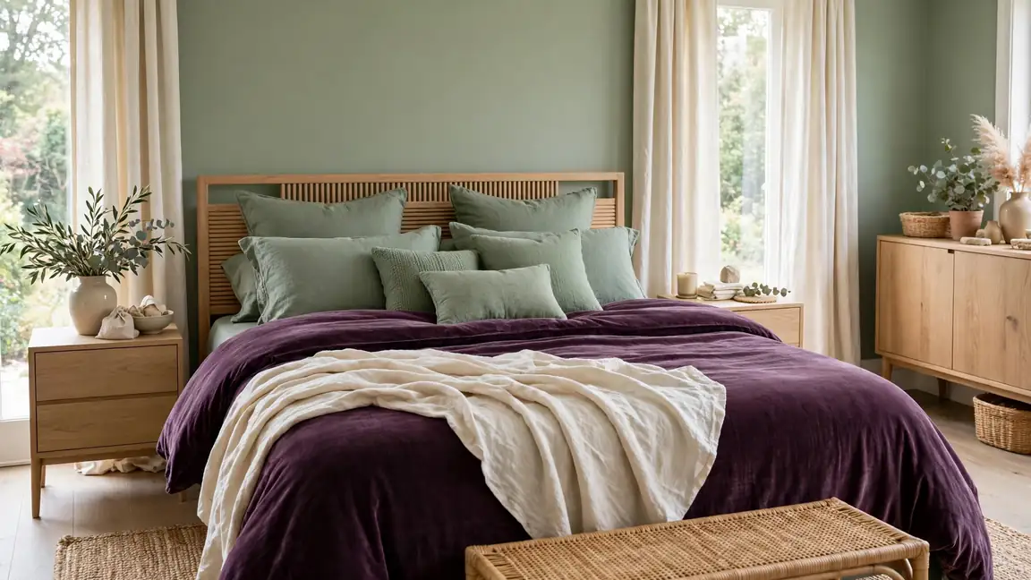
23 Plum and Sage Green Bedroom Decor Ideas for Elegant Color Harmony
Deep plum brings the drama, sage green brings the calm, and together they make a bedroom feel both rich and restful. The smartest plum and sage green bedroom decor leans on that contrast: one deep tone for warmth, one soft tone for air, and plenty of cream between them so nothing feels heavy.
Start small if the pairing feels bold: one velvet throw, one painted nightstand, one cluster of cushions. The gentle layering in regencycore home decor ideas proves how jewel tones stay graceful when neutrals do the quiet work around them. I’ve noticed this duo flatters north facing rooms especially well, because plum adds the warmth that flat daylight steals, while sage keeps the whole scheme feeling fresh rather than moody.
Plum Velvet Bedding Layers
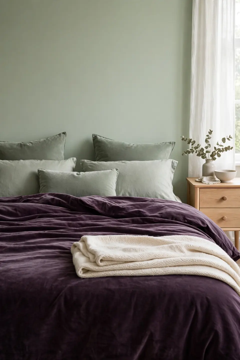
Velvet changes how plum behaves in daylight. The pile catches light on its folds, so one duvet reads as three shades at once, deep at the edges and almost berry bright where the sun lands. Choose a full velvet duvet rather than scattered cushions when the bed needs to anchor the whole room.
Layer sage and cream on top in that order: sage cushions against the pillows first, then a cream throw folded at the foot. The pale layer stops the plum from swallowing the bed, and the sage bridges the gap between deep bedding and soft walls. Wash velvet inside out on a gentle cycle, and it keeps its glow for years.
Sage Green Accent Wall
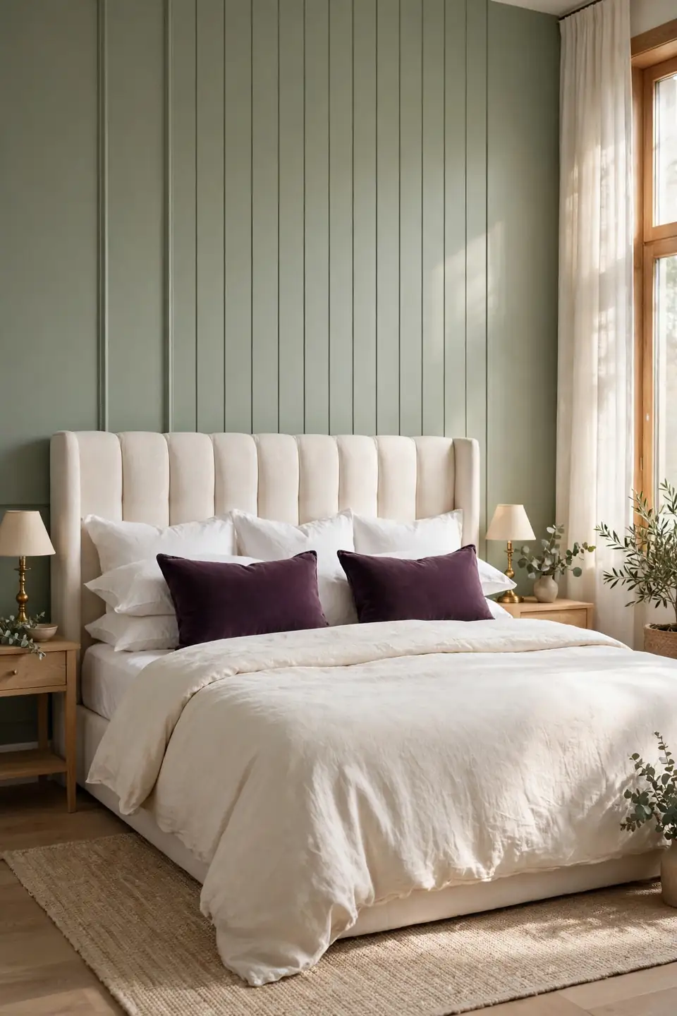
- Paint the wall behind the headboard only, so the colour frames the bed like a painted backdrop.
- Pick a grey leaning sage for small rooms; yellow leaning sage suits warm afternoon light.
- Carry the same sage into one cushion or a painted stool so the wall never looks accidental.
- Keep the ceiling and remaining walls warm white to hold the room’s brightness.
- Test a large swatch first; sage can shift almost blue under cool LED bulbs.
A single painted wall does the work of a full scheme because the bed sits directly against it. Every cushion, throw, and lamp you add afterwards lands inside a colour frame that already agrees with itself, which is why this move suits renters and cautious decorators alike.
Cream Linen Balance
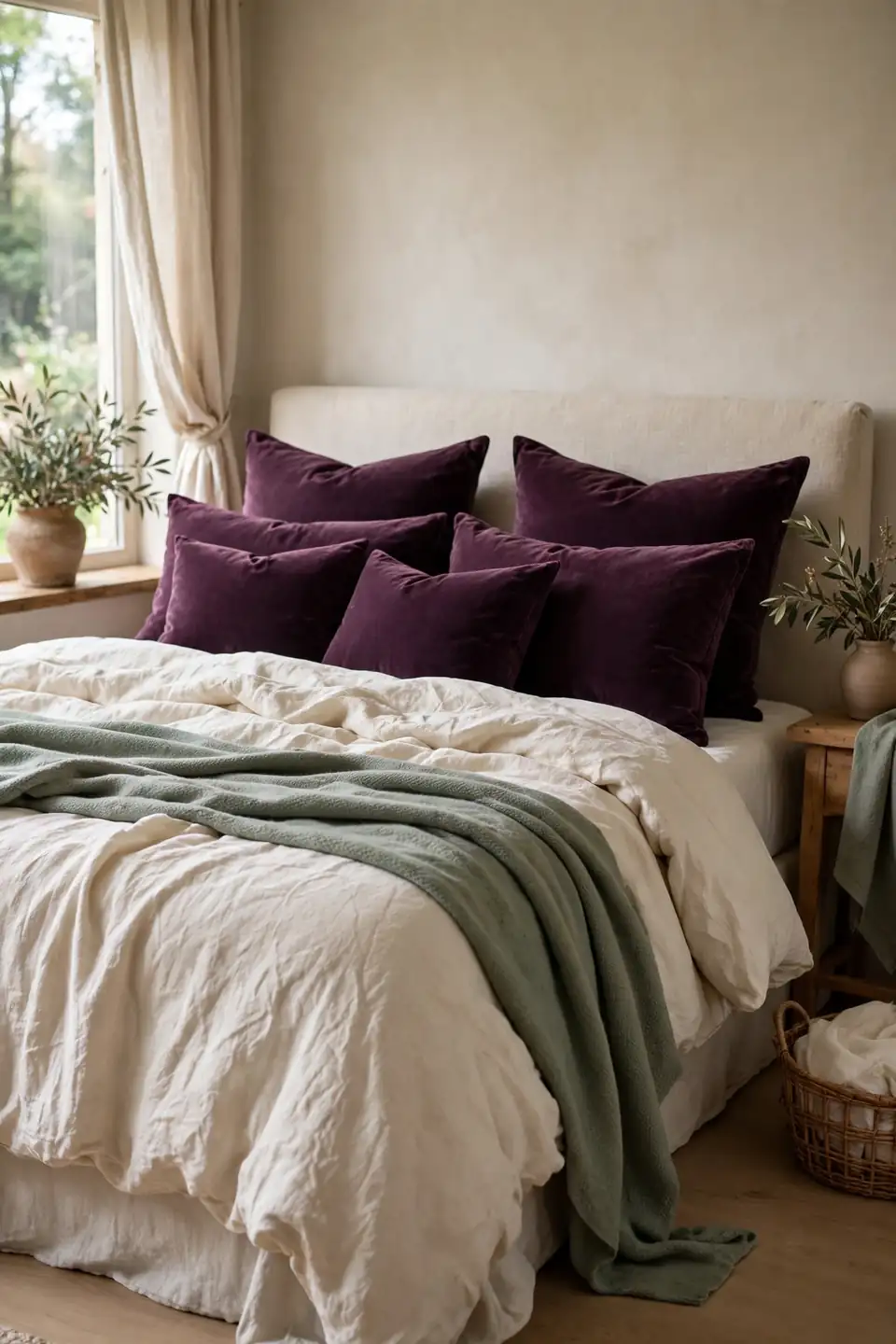
Quick Tip: Wash cream linen twice before the first styling session, and skip the iron afterwards. Linen relaxes into its natural crumple after a few washes, and that soft texture is exactly what plum velvet needs beside it to stop the bed looking staged or stiff.
Cream is the referee in this pairing. Plum and sage are both mid tone colours, and without a pale neutral between them they can blur into one flat mood. Cream sheets, a cream throw, or a pale rug under the bed keeps each colour distinct, so the eye reads depth instead of darkness. Choose warm cream over bright white; the yellow base shakes hands with plum instead of arguing with it.
Two Tone Curtain Pairing
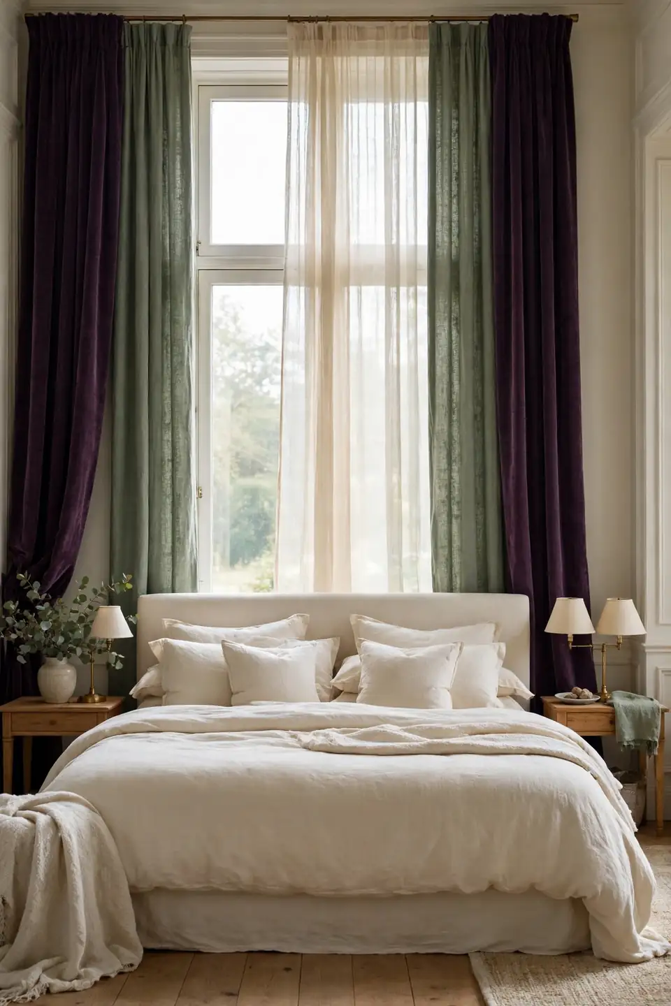
BEFORE: Plain white curtains left the window looking unfinished. The plum bed seemed to float, with no colour echoing it across the room.
AFTER: Plum velvet panels hang at the outer edges with sage linen inside them and a cream sheer at the centre. The window now repeats the bed’s colours in order, and daylight lands softly across the bedding.
Layering curtains in both colours costs little more than one pair, because each panel does half the visual work. Keep the plum on the outside, where its depth frames the glass, and let sage sit nearer the light, where it glows softly instead of turning heavy or dark.
Layered Rug Foundation
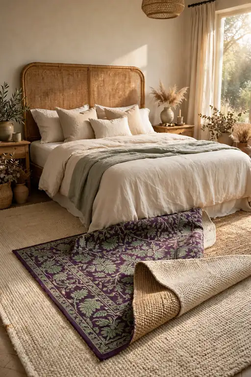
- Start with a flat cream jute rug extending 60 centimetres beyond both sides of the bed.
- Lay a smaller plum patterned rug across the foot, angled slightly for a collected feel.
- Fold one corner of the top rug back so both layers show from the doorway.
- Anchor the layers by tucking the base rug well under the bed frame.
- Repeat the rug’s sage thread in one cushion on the bed.
Rugs settle arguments that paint cannot. A cold floor makes even rich colours feel harsh, while layered natural fibres slow the room down and give plum a softer stage. The pattern on the top rug is also the safest place to trial bolder prints, since swapping a small rug costs little.
Velvet Versus Linen Textures

| Deep Velvet | Sage Linen |
|---|---|
| Catches light in soft folds | Stays matte and calm |
| Feels rich on duvets and cushions | Feels fresh on sheets and curtains |
| Hides creases through busy weeks | Shows a relaxed natural crumple |
| Needs gentle washing, no heat | Washes warm and dries fast |
| Deepens plum to near burgundy | Keeps sage soft and greyed |
Neither fabric wins outright; the pairing is the point. Velvet supplies the evening richness this colour scheme promises, while linen keeps mornings feeling aired and easy. Split the bed between them and the room holds both moods at once, changing with the light instead of fighting it. In my experience, texture contrast also stops two strong colours from reading flat in photographs.
Nightstand Styling Rules
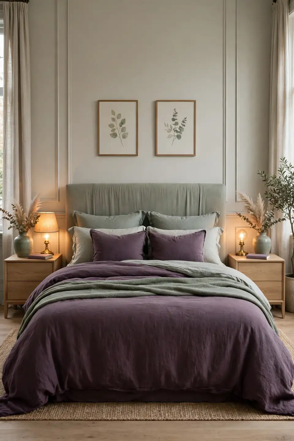
Do:
- Mirror both sides with matching lamps so the bed feels anchored and balanced.
- Give each side one plum or sage object, never a cluster of small pieces.
- Hide chargers inside the drawer and run cords behind the nightstand.
Don’t:
- Do not stack magazines higher than the lamp base; the pile reads as clutter.
- Avoid matching the vase colour to the wall behind it, or it disappears.
- Never leave both surfaces bare; one styled object per side is the minimum.
Nightstands are where this colour scheme proves its manners. Small repeated notes of plum and sage at pillow height tie the bed to the room at exactly the spot your eyes rest each night, and matched lamps keep the pairing feeling intentional rather than gathered by accident.
Color Ratio Quick Guide
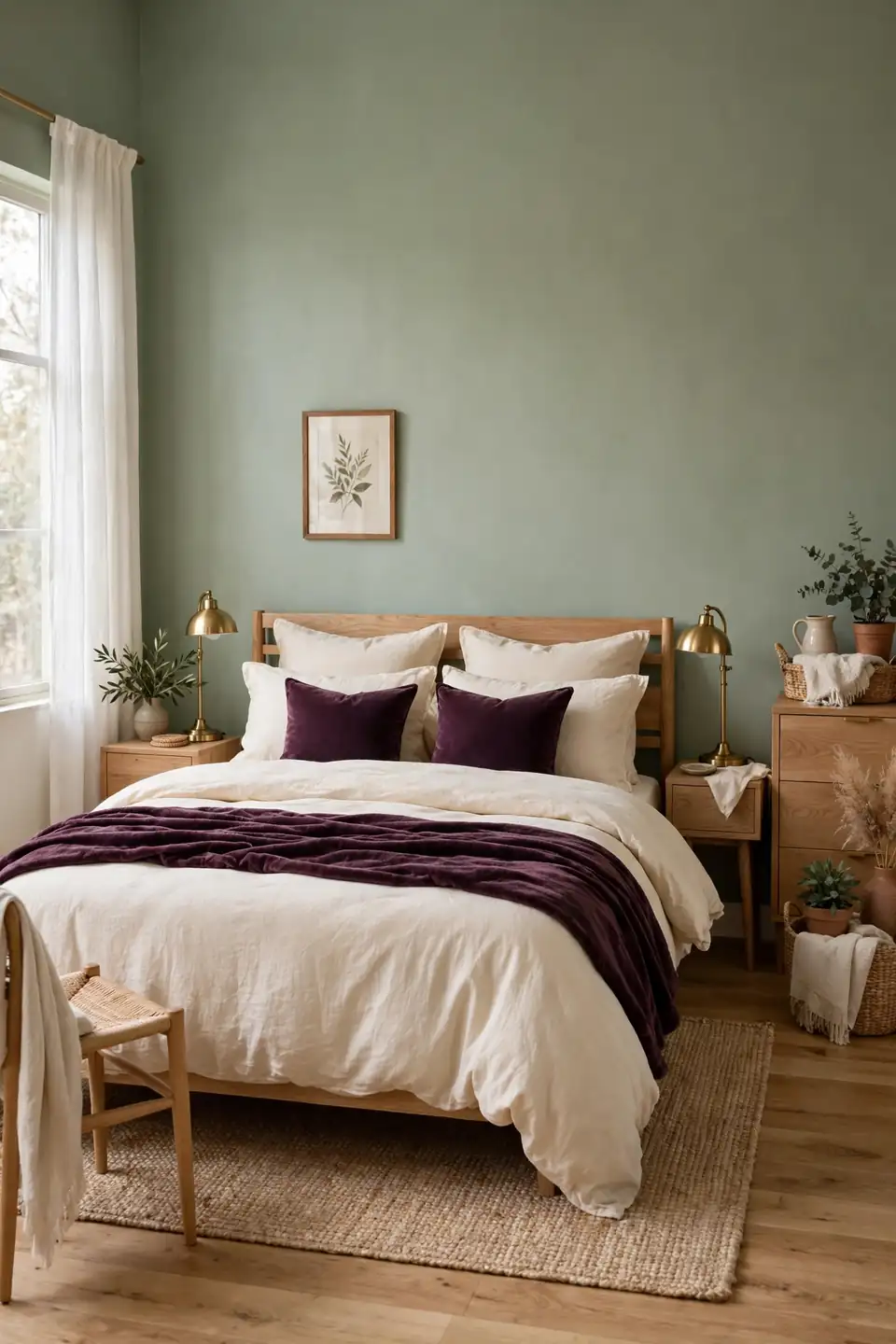
Cost: Paint and textiles only | Time: One weekend | Skill Level: Beginner | Best For: Rooms that feel unbalanced
Ratios turn guessing into a plan. Give sage and cream roughly seventy percent of the room across walls, bedding bases, and curtains, then let plum claim thirty percent through the duvet, cushions, and one piece of art. That split keeps plum feeling precious instead of overwhelming, because the eye meets it in doses. When a room feels off, the ratio is usually the culprit: too much plum and the space sulks, too little and the sage drifts bland. Adjust one textile at a time, live with it for two days, and only then decide whether the balance has truly settled.
Botanical Print Bedding
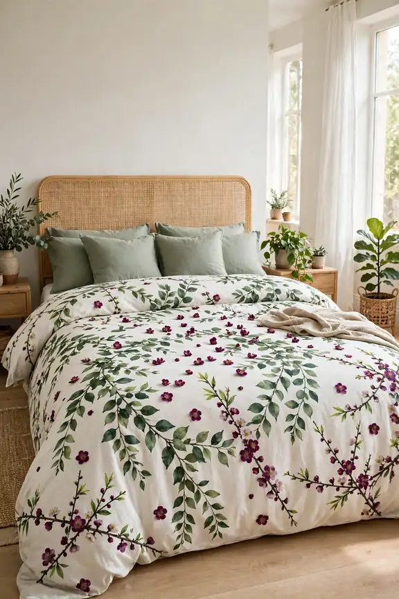
Printed bedding is the fastest route into this palette, because one duvet set carries both colours plus the cream ground they need. Look for trailing leaves, small scattered blooms, and a pattern scale that stays readable from the doorway rather than dissolving into dots. Vintage style prints suit the pairing best, since their colours arrive slightly muted.
Keep everything around the print plain. Sage cushions, a cream throw, and unpatterned curtains let the botanical design hold the stage without rivals, and the bed becomes the room’s one garden moment. Choose cotton percale for a crisp finish or washed linen if you prefer the pattern softened and slightly faded.
Brass Lamp Warmth
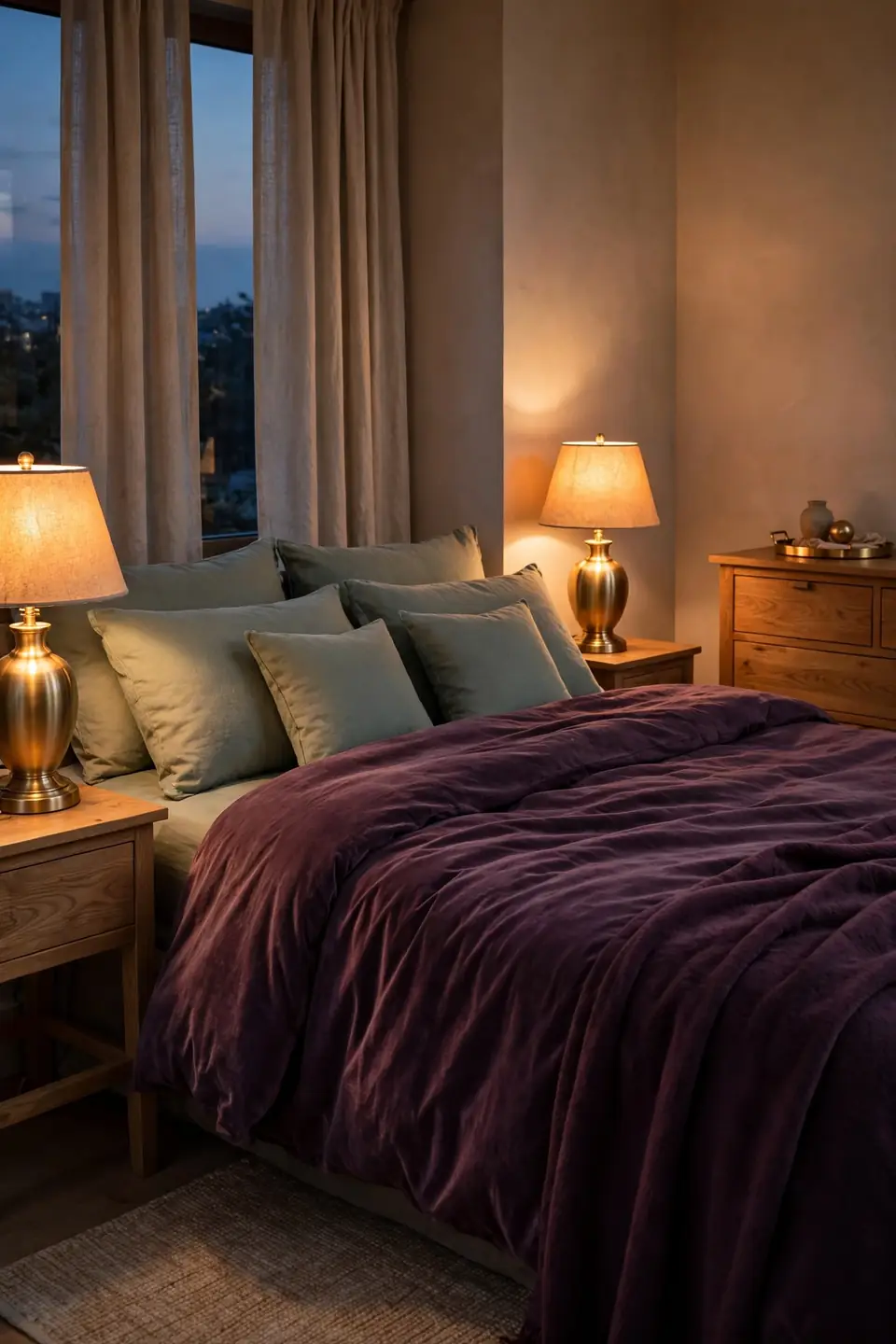
- Choose brushed brass over polished; the softer finish sits calmer beside matte sage walls.
- Fit warm bulbs around 2700 kelvin so plum reads rich instead of muddy brown.
- Match lamp height to the headboard’s middle rail for a composed sightline.
- Repeat brass once more in the room, a tray or frame, to ground the pairing.
- Put both lamps on one dimmer switch for even, adjustable evening light.
Metal choice matters more than lamp shape here. Cool chrome fights both colours, while brass warms plum and gives sage a gentle glow. The same logic guides the pottery styling in handcrafted pottery shelf styling ideas, where handmade glazes and warm metals share shelf space without competing. One metal, repeated quietly, holds the scheme together.
Woven Throw Texture
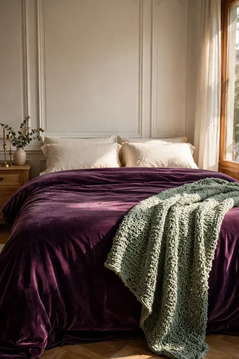
Quick Tip: Drape the throw diagonally across one corner of the bed instead of folding it straight along the foot. Diagonal lines break the bed’s rectangle, draw the eye across both colours, and make the whole arrangement feel gathered rather than arranged by a ruler.
Texture is the quiet third colour in this scheme. Plum velvet and sage paint can look flat side by side in photographs, but a chunky weave between them adds shadow and depth that the eye reads as richness. Choose natural fibres, wool, cotton, or a blend, and keep the weave loose enough to show its handmade character.
Sage Painted Furniture
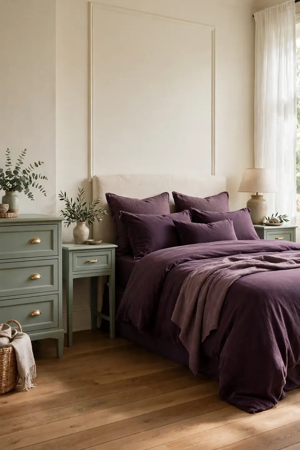
BEFORE: Dark mahogany furniture crowded the room and fought the bedding for attention. Every piece shouted at once, and the colours felt accidental instead of chosen.
AFTER: Two coats of sage chalk paint softened the dresser and nightstands into the background. The plum bedding finally leads, the wood floors glow warmer, and the room breathes at a slower pace.
Painted furniture is where plum and sage green bedroom decor becomes forgiving, because paint lets older pieces join the scheme without replacement costs. Chalk paint needs no primer on most wood, and small chips only add to the relaxed finish. Keep one natural wood piece unpainted, though; a room where everything is painted can feel like a showroom set.
Reading Nook Corner

- Claim the corner nearest the window so daylight serves daytime reading without a lamp.
- Set a plum velvet chair at a slight angle toward the bed, never flat against the wall.
- Add a sage cushion and a cream throw so the chair borrows the bed’s palette.
- Place a narrow side table within arm’s reach for tea, glasses, and the current book.
- Finish with a brass floor lamp arched over the chair’s shoulder for evening pages.
A nook gives the bedroom a second job, and second jobs make rooms feel generous. It also rescues the pairing from prettiness alone: the plum chair becomes a place, not just a colour, and guests understand the room’s story the moment they see it.
Cushion Mix Formula

| Back Row | Front Row |
|---|---|
| Two large cream linen squares | One plum velvet lumbar |
| Plain weave, relaxed edges | Smooth pile, tailored piping |
| Sage pair in the middle row | Pattern only on the smallest |
| Sets the calm background | Delivers the colour accent |
| Cream largest, sage medium | Plum smallest, placed last |
Work in odd numbers and descending sizes, and the bed styles itself. Three rows read as deliberate, two look sparse, and four tip into clutter. The formula also makes laundry day simple: covers rotate through the wash while the arrangement survives, because each cushion owns a fixed position in the sequence. Swap only the front cushion seasonally and the whole bed feels new.
Mirror Placement Tricks
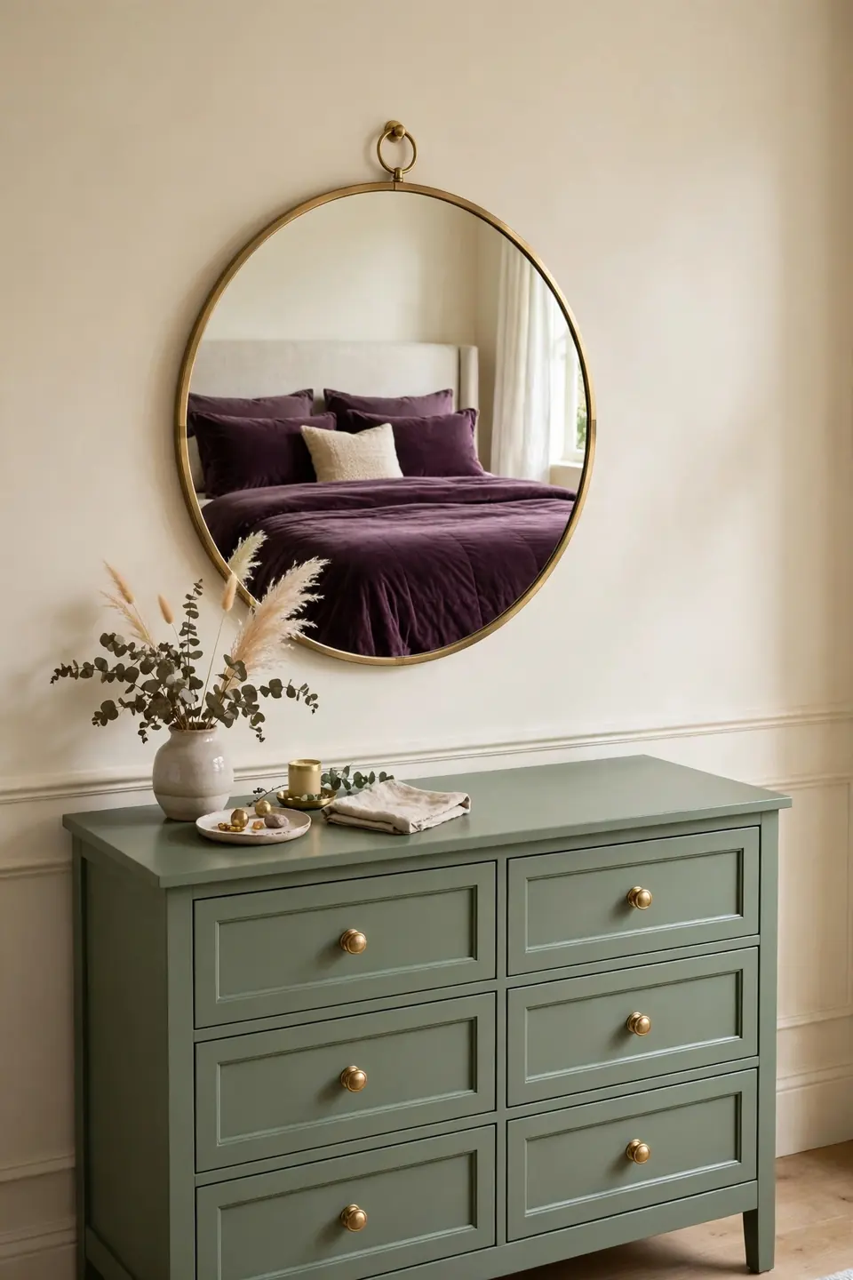
Do:
- Hang the mirror where it reflects the bed, doubling both colours at once.
- Choose a brass or warm wood frame to echo the lamps.
- Angle a leaning mirror slightly so it catches window light, not ceiling light.
Don’t:
- Do not face a mirror directly at the pillows; reflections disturb sleep.
- Avoid tiny mirrors in this scheme; they read as nervous, not elegant.
- Never hang glass where it reflects a bare bulb at full glare.
Mirrors multiply whatever a room already does well. In this pairing they act like a second window for the colours, throwing plum and sage onto walls the paint never touched. One generous mirror beats three small ones, because scale is what turns a reflection into a design decision.
Plant Shelf Greenery
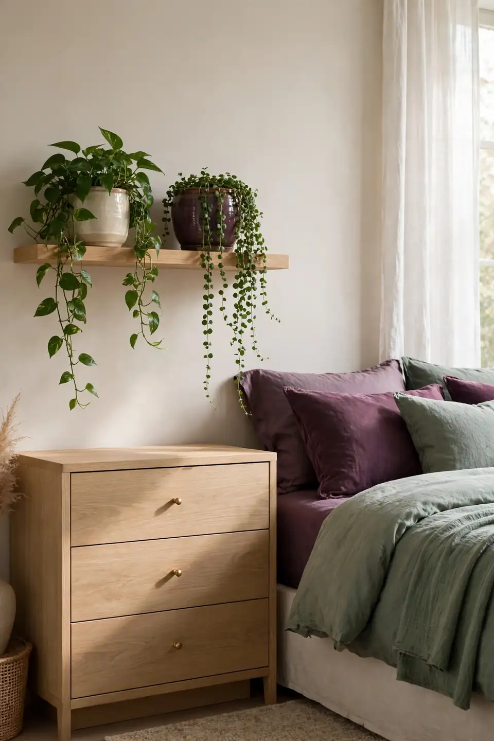
Cost: Low, cuttings are free | Time: One hour to style | Skill Level: Beginner | Best For: Rooms low on natural green
Living green does what sage paint only promises. A trailing pothos or a soft fern repeats the wall colour in a moving, breathing form, and the plum pots tie the shelf back to the bedding across the room. Keep plants where morning light reaches them, and group pots in threes with one tall, one trailing, one round. Dust leaves monthly so the green stays vivid against the paint. Rooms with plants also feel quieter, a small hush that suits a bedroom built around rest, deep colour, and slow evenings at home.
Plum Headboard Statement
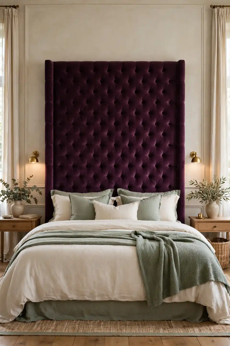
An upholstered headboard in plum velvet gives the bed a spine. The colour sits exactly where eyes land first, framed by pillows in front and wall behind, so even a plain room gains a focal point with genuine weight. Tall shapes suit this colour best; height shows off the pile.
Balance the statement with restraint everywhere else. Sage bedding, cream curtains, and bare nightstand tops keep the headboard from shouting, and the contrast makes its colour read richer. I’ve seen this work well in many cases where a full plum wall felt risky, because fabric softens the commitment and the piece can move house with you.
Pattern Mixing Basics
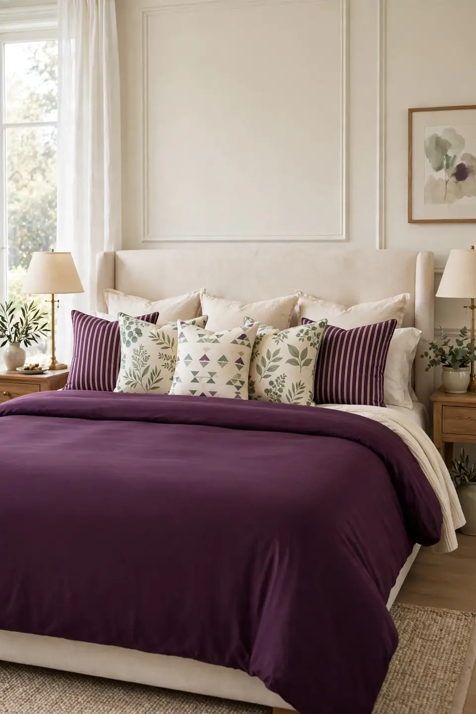
- Let one large scale print lead, then support it with a smaller, quieter pattern.
- Keep every pattern inside the plum, sage, and cream family, no guest colours.
- Separate two busy prints with a solid cushion so each gets breathing room.
- Repeat a stripe somewhere small, a cushion edge or a lampshade trim.
- Limit the bed to three patterns at most; restraint keeps mixes elegant.
Patterns succeed when they argue politely. Shared colours make strangers look related, while clashing palettes make even good prints look random. Stand at the doorway and squint: if the bed reads as one plum and sage story with texture, the mix works. If single cushions shout for attention, swap one print for a solid.
Sheer Curtain Softness
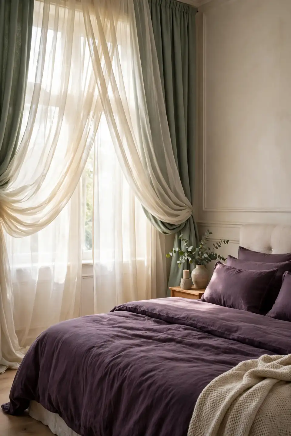
Quick Tip: Hang sheers on a separate inner rod so they can stay closed all day while the heavier sage panels open fully. Privacy and soft light continue together, and the plum bedding keeps its depth instead of bleaching under direct sun.
Harsh light is this palette’s quiet enemy. Direct sun turns sage chalky and plum dusty by midday, and both colours lose the richness that made you choose them. A cream sheer works like a soft filter on a camera, rounding every edge in the room. The bed gains a gentle halo, fabrics look freshly washed, and mornings arrive gradually instead of all at once.
Bedside Rug Runner
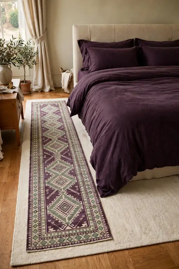
BEFORE: Bare boards ran beside the bed, cold every morning. The plum duvet seemed to hover, disconnected from the floor and the room below it.
AFTER: A patterned runner now lands exactly where feet land, carrying plum and sage to ground level. The bed looks planted, the room feels finished, and winter mornings start considerably kinder.
Runners are the hardest working textiles in a bedroom because they serve comfort and composition at once. Choose a pattern that borrows both colours but leans cream, so the strip stays light beside the bed. Flatweave cotton washes easily and slides less than plush piles, which matters at 6 a.m. in the dark.
Wall Art Pairing Steps
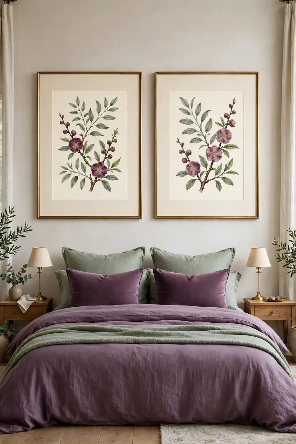
- Pick prints that borrow both colours, botanical subjects suit this palette naturally.
- Frame them identically in thin brass with wide cream mats for breathing space.
- Hang the pair 15 centimetres apart, centred on the bed, not the wall.
- Set the bottom edge roughly 25 centimetres above the headboard’s top line.
- Live with the pair for a week before adding any third frame.
Art finishes what textiles start. Bedding brings colour in soft, changeable forms, while framed prints give the same palette a fixed address on the wall. That permanence steadies the scheme, and guests read the room as designed rather than assembled. Choose subjects with movement, trailing stems or loose washes, to echo the softness below.
Dark Versus Light Bedding
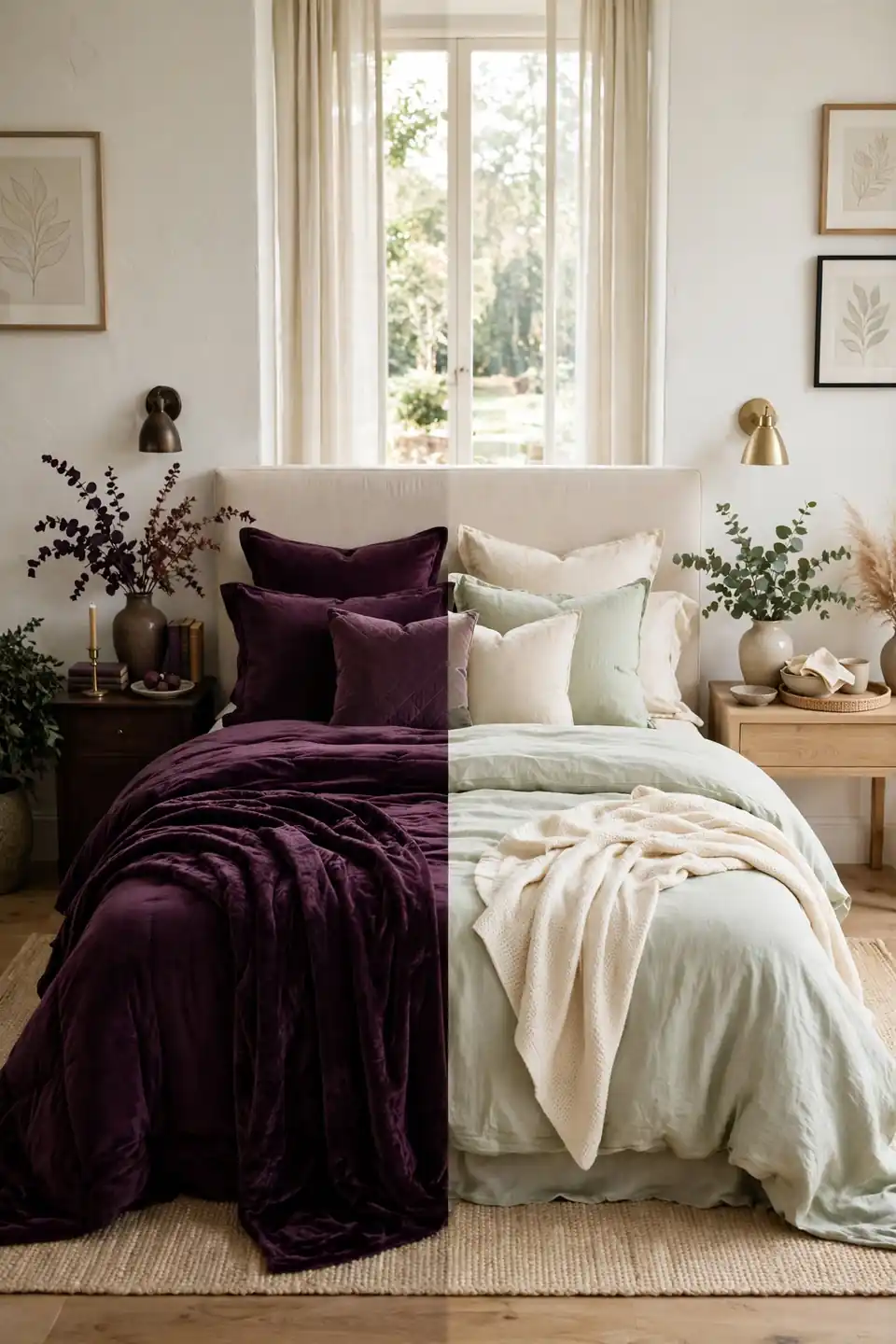
| Deep Plum Bedding | Pale Sage Bedding |
|---|---|
| Reads dramatic and cocooning | Reads airy and calm |
| Shows lint and pet hair | Shows marks and spills |
| Best for evening heavy rooms | Best for bright morning rooms |
| Pairs with cream sheets | Pairs with plum cushions |
| Warms cool north light | Cools strong south light |
Most bedrooms land happiest with both on rotation. Keep the plum set for autumn and winter, when early darkness rewards depth, and dress the bed pale through spring and summer. The walls and cushions stay constant, so each swap feels like a new room bought for the price of one duvet set. That rhythm also gives each set a rest, doubling its life.
Seasonal Swap Rules
Do:
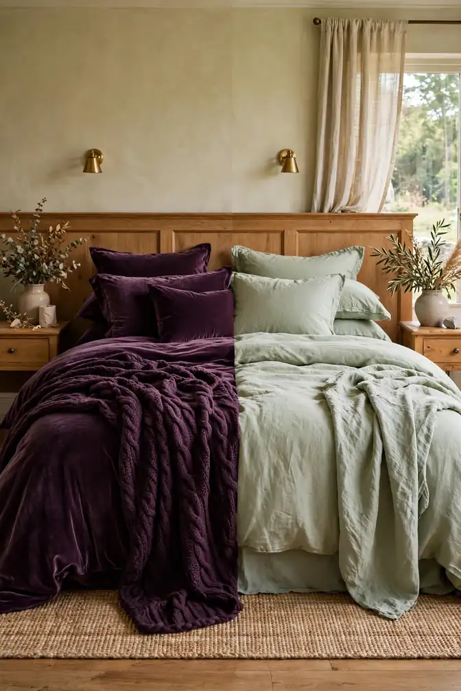
- Swap velvet for linen as seasons turn, keeping both colours in play year round.
- Store off season bedding in cream cotton bags so dyes stay true.
- Change only three pieces per swap; the room should evolve, not restart.
Don’t:
- Do not banish plum in summer; lighten its fabric weight instead.
- Avoid seasonal colours like orange creeping in beside the pairing.
- Never store velvet folded under weight; the pile crushes permanently.
Seasonal swaps protect the scheme from boredom, which is the real reason good rooms get redecorated. Small planned changes give your eye something new to enjoy while the plum and sage foundation stays untouched. Photograph the bed after each swap, and next year’s change takes minutes instead of a full redesign.
Conclusion
Plum brings the richness, sage brings the rest, and cream keeps the peace between them. That is the whole secret behind plum and sage green bedroom decor that feels elegant instead of busy: balance first, then detail. Start with bedding, add one painted piece, and let the pairing grow at its own pace. Small rooms and large rooms both benefit, since the ratio does the heavy lifting. Save these ideas to your Pinterest bedroom board before you shop, try one change this weekend, and share the before and after with someone planning their own colour pairing at home this year.