25 Venetian Plaster Wall Decor Ideas for a Luxurious Finish
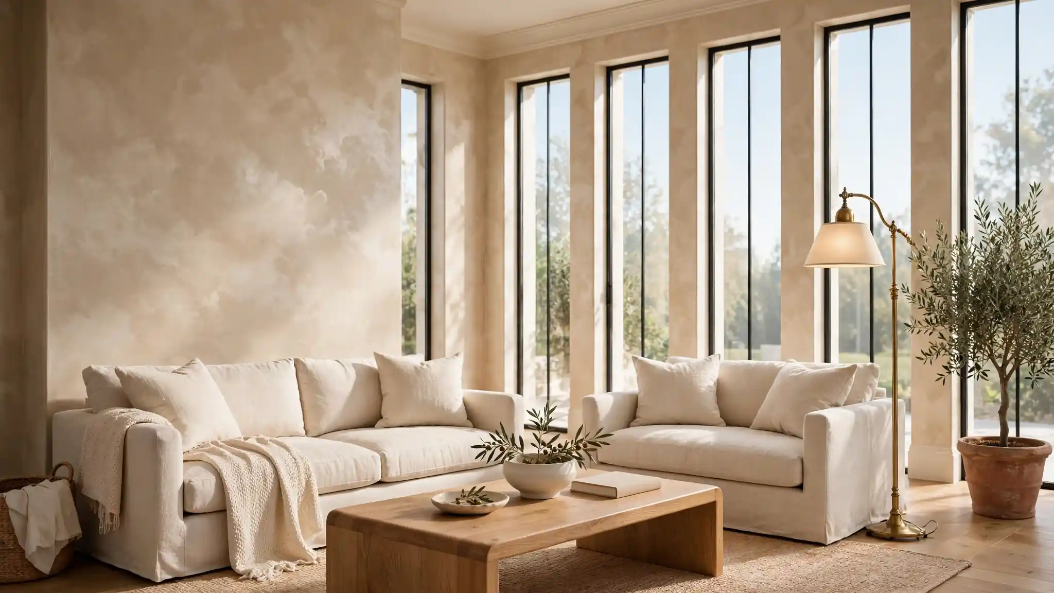
Flat walls fade into the background, but a wall with depth makes people stop and stare. If you crave that old-world Italian luxury, Venetian plaster wall decor ideas deliver it with soft movement, gentle sheen, and rich layered color. This lime-based finish has graced palaces for centuries, and today it fits just as beautifully in modern living rooms, calm bedrooms, and elegant dining spaces.
Before you commit to color and texture, it helps to gather inspiration the way designers do. I often pair plaster mood boards with softer references, and seagrass wallpaper bedroom inspiration is one of my favorites for a calm, coastal counterpoint. Keep reading, because the 25 looks below show exactly how this finish can work in nearly any home.
Warm Beige Polished Walls
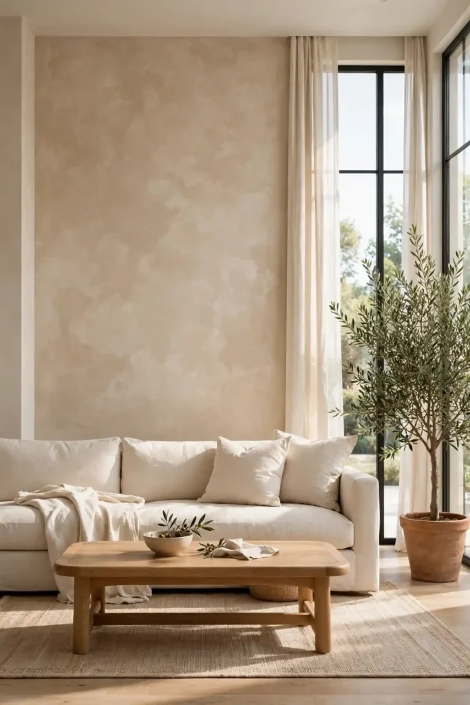
Warmth starts at the wall, and this finish proves it. Layers of beige lime plaster, burnished with a steel trowel, create a surface that shifts softly as daylight moves across it. The mottled cloud-like pattern keeps the color from feeling flat, while the polished sheen reflects just enough light to keep the room glowing. It pairs beautifully with oak floors, linen curtains, and soft cream upholstery.
In my experience, beige plaster flatters almost every lighting condition, which is why designers reach for it again and again. Apply two base coats, then skim a thinner tinted layer and polish before it fully sets. Seal with a clear wax for durability in hallways and living rooms. The result feels calm, expensive, and quietly timeless.
Soft White Lime Finish
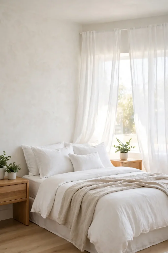
- Pick an off-white with warm undertones so walls glow instead of glaring.
- Apply three thin coats, letting each dry fully for a cloud-free finish.
- Polish the last coat with soft circular strokes for a marble-like sheen.
- Seal with matte wax in kitchens and baths where moisture lingers.
White plaster brings a gallery calm to busy homes, and the soft texture keeps it from reading as sterile. I’ve noticed it photographs beautifully for listings and rental refreshes alike. Keep the surrounding palette quiet, cream, oak, a little greenery, and let the walls carry the elegance. It suits both modern and traditional homes equally.
Sage Green Mottled Walls
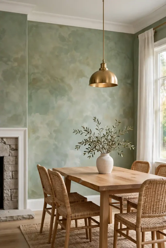
Quick Tip: Start with a lighter sage than you think you want, because plaster dries slightly darker and the mottled pattern deepens the tone. Test a full poster board in your own light before committing to a whole wall. Give the board a full day in both morning and evening light.
Sage plaster brings the outdoors in without a single leaf motif, and the soft mottle reads like drifting clouds. I love it behind a natural wood bed or flanking a stone fireplace. Keep trim crisp white and let brass fixtures warm the green, because cool sage plus warm metal is a pairing that never misses.
Charcoal Grey Dramatic Finish
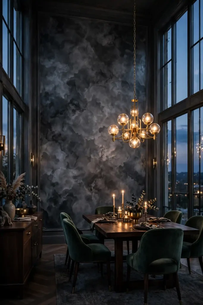
BEFORE: The dining room felt flat despite new furniture, because the plain grey paint offered no depth. Evening light died on the walls, and the space read smaller than it was.
AFTER: Charcoal plaster with a high polish turned the same wall into smoked glass, catching candlelight and chandelier glow. The mottled depth makes the room feel intimate and grand at once.
Dark plaster rewards bold rooms, and charcoal is the most forgiving of the deep tones. Use it on a single feature wall behind the dining table or headboard, then balance with pale bedding and bright art. I’ve seen this work well in many cases where a room needed drama without new furniture.
Terracotta Tuscan Texture
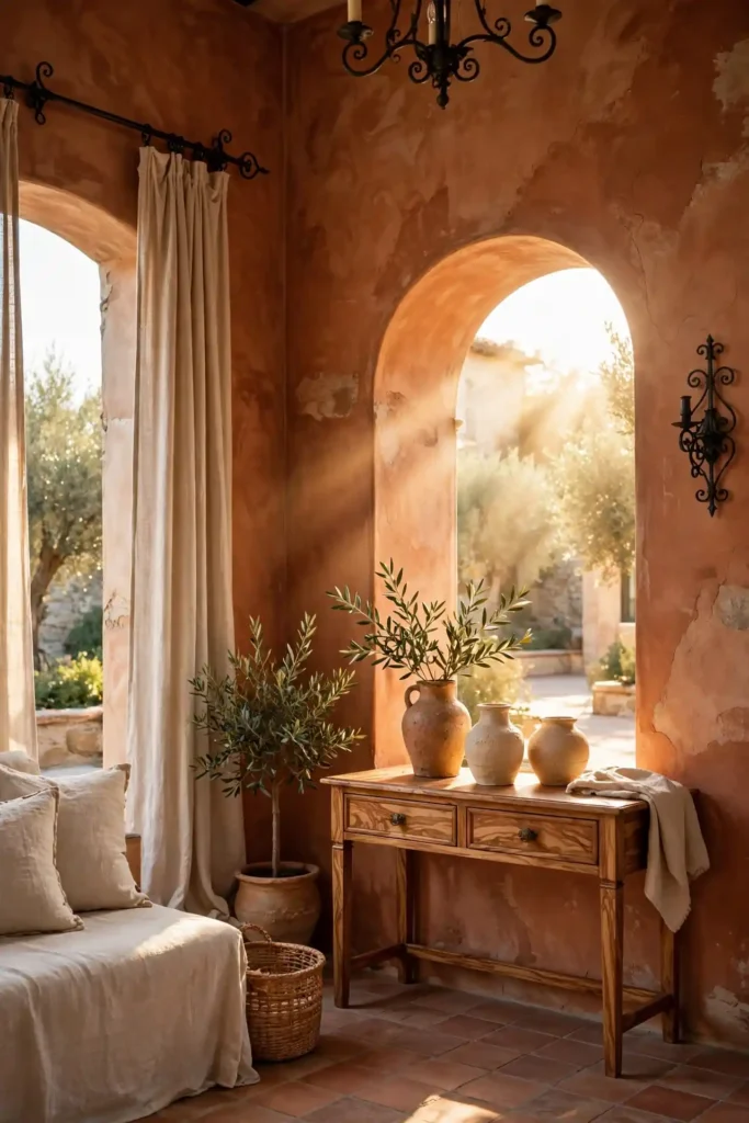
- Roll on a terracotta-tinted primer and let it cure overnight for strong adhesion.
- Trowel two plaster coats in sweeping arcs, keeping edges wet to avoid lap lines.
- Burnish lightly while tacky, then stop before the sheen turns glassy.
- Dust on a darker glaze in the recesses to deepen the Tuscan movement.
Terracotta plaster brings sun-baked warmth that flat paint can never fake. It sings beside wrought iron, olive wood, and handmade ceramics. I have noticed it pairs especially well with arched doorways and rustic beams, turning ordinary rooms into old-world retreats. Add linen drapes and the room glows like a villa at golden hour.
Blush Pink Subtle Sheen
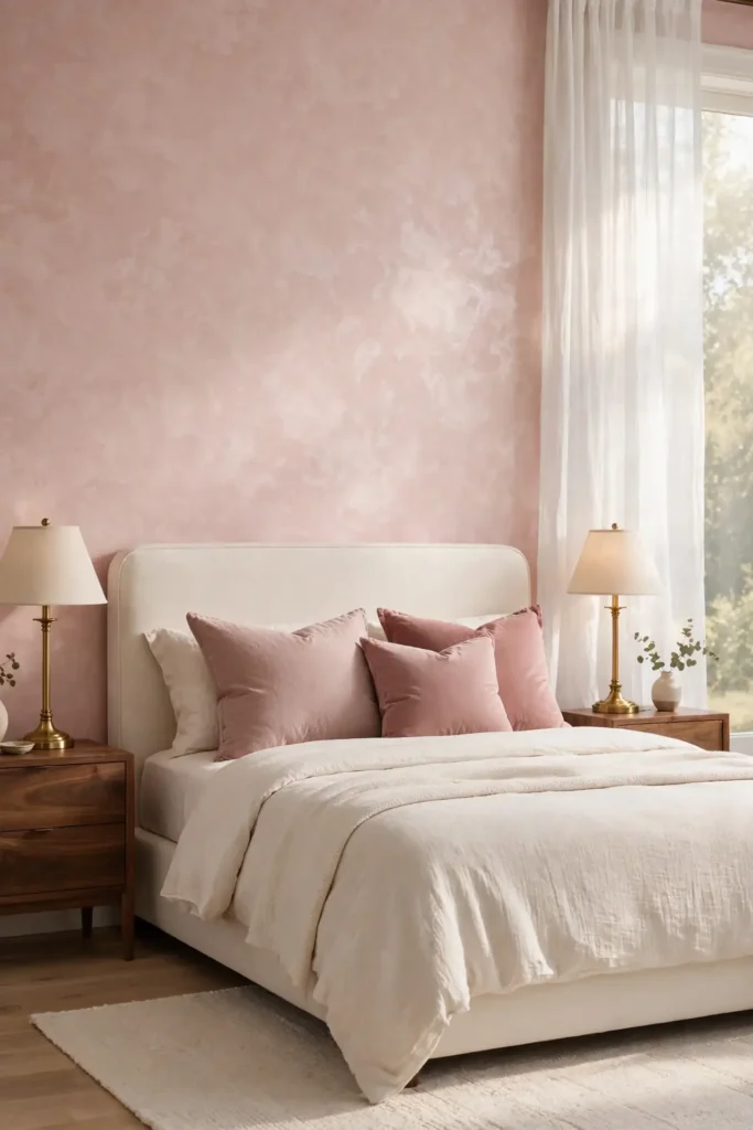
| Matte Blush | Polished Blush |
|---|---|
| Soft, powdery, light-diffusing glow | Warm satin sheen that catches lamps |
| Best choice for quiet bedrooms | Best choice for dining rooms |
| Forgiving over older, uneven walls | Shows off the mottled cloud pattern |
| Mood: calm, tender, restful | Mood: luxe, warm, alive |
| Pairs with cream and linen | Pairs with brass and glass |
Blush plaster walks the line between sweet and sophisticated, and the subtle sheen keeps it grown-up. Choose a dusty rose rather than bubblegum, then ground it with walnut furniture and cream rugs. A little restraint in the accessories lets the wall’s gentle glow do all the talking.
Deep Navy Accent Wall
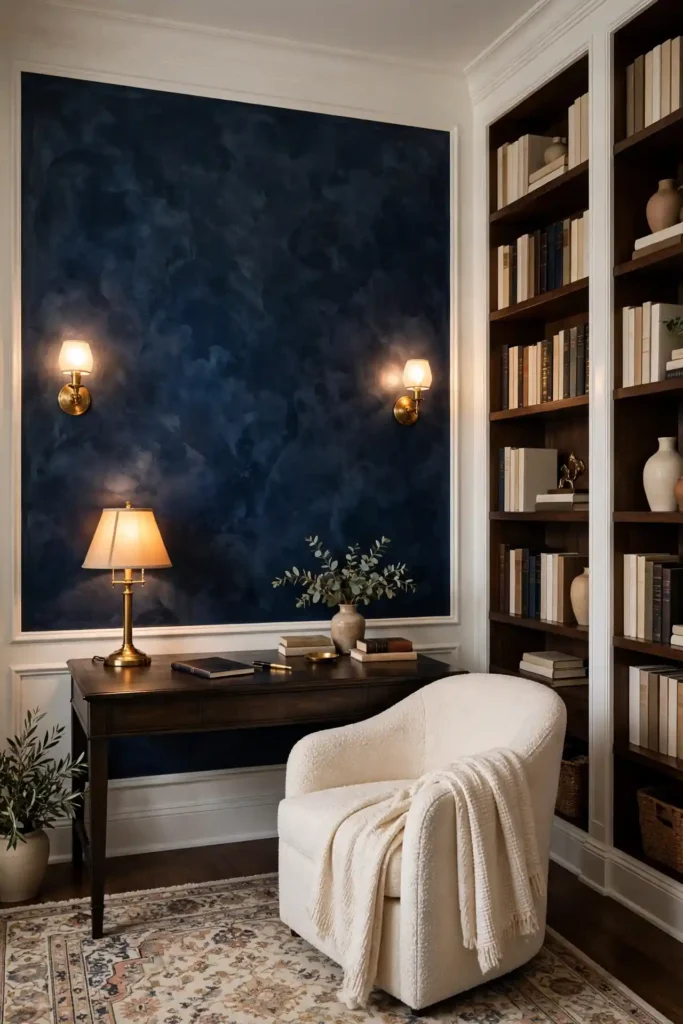
DO: Polish the navy to a soft sheen so it reads rich instead of flat.
DO: Balance it with crisp white trim and warm brass lighting.
DO: Use it on the wall your eye lands on first when entering.
DON’T: Cover all four walls, or the room will feel like a cave.
DON’T: Pair it with black furniture without warm wood to break it up.
DON’T: Skip the sealant, because dark plaster shows every fingerprint.
Navy plaster gives a study or bedroom the confidence of a tailored suit. The deep blue mottle looks almost like ocean at dusk when the light is low. Keep the rest of the palette simple, and this one wall becomes the quiet star of the room.
Cream Marble Effect
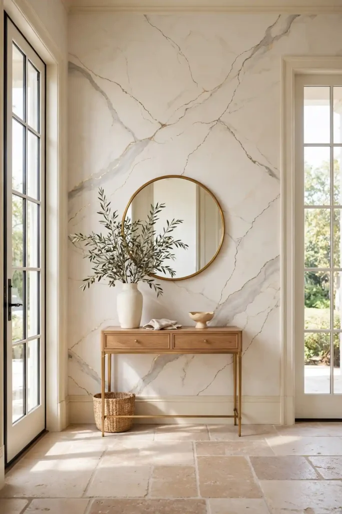
Cost: Moderate, since lime plaster and tinted glazes cost far less than real marble slabs.
Time: Two full days, allowing drying time between each clouded layer.
Skill Level: Intermediate, because believable veining needs a confident hand.
Best For: Living rooms, entryways, and fireplace surrounds craving quiet luxury.
Cream plaster with hand-painted veining fools the eye from across the room. Soft grey and gold veins drift through the warm base, mimicking Calacatta without the quarry price. I’ve tried this in a small foyer, and guests genuinely asked where the marble came from. Seal it well and wipe it gently.
Champagne Gold Glow
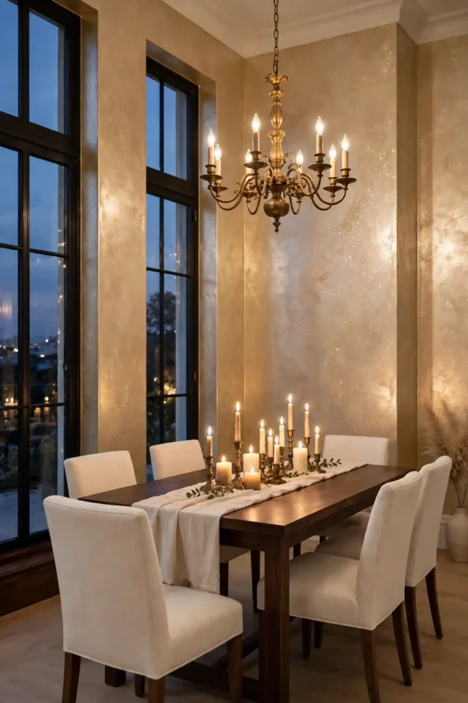
Champagne plaster catches light like the inside of a seashell. Fine gold mica mixed into the final coat gives the wall a warm shimmer that changes as you move through the room. It flatters skin tones beautifully, which is why it shines in dining rooms and dressing areas. Keep the base tone soft and let the glow do the talking.
In my experience, a little mica goes a long way, so test the mix on a board first. Trowel it on thin and burnish gently to wake up the sparkle without harsh glare. Pair it with cream upholstery and aged brass for a look that feels festive yet calm.
Olive Branch Tones
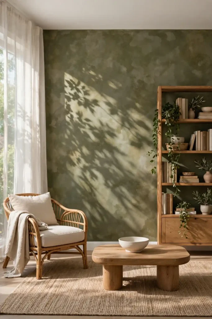
- Blend olive with a warm grey base so the green stays earthy, not neon.
- Mottle two tones together while wet for that natural leaf-shadow depth.
- Keep ceilings bright white to stop the green from closing in.
- Add rattan, jute, and oak to complete the organic, grounded mood.
- Seal with clear wax so the deep tone stays rich for years.
Olive plaster feels like a deep breath in a busy house. The earthy green sits beautifully behind bookshelves and plants, and the texture keeps it interesting up close. I have seen this tone rescue rooms that felt cold, wrapping them in a calm, woodland warmth.
Ivory Travertine Look
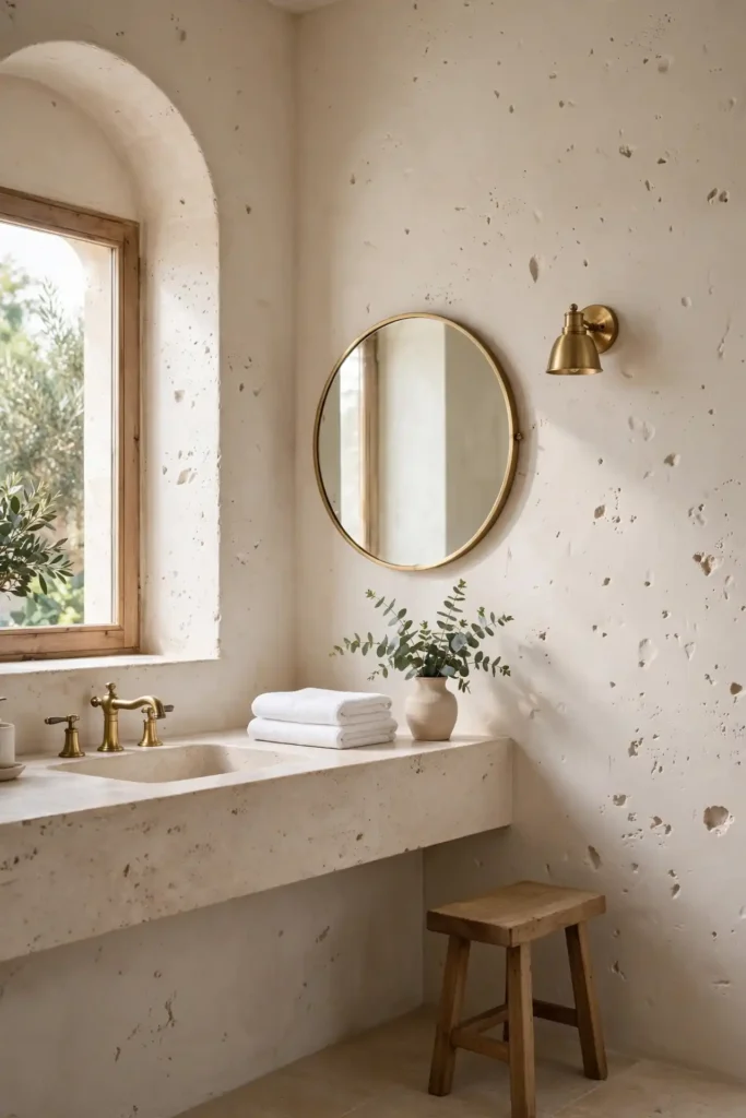
Quick Tip: Drag a dry brush through the wet final coat to carve the tiny pits that make travertine read as real. Then knock the surface back with a soft trowel so it stays smooth to the touch. Work in small sections so the coat never skins over before you texture it.
Ivory plaster with travertine texture brings ancient Roman calm to modern bathrooms and kitchens. The pitted surface catches shadows in the most flattering way, and the warm ivory base glows under natural light. Pair it with honed stone counters and simple wood stools for a cohesive, earthy look.
Dusty Blue Calm Walls

BEFORE: The home office felt tense and overstimulating, with stark white walls bouncing harsh light onto the screen. Focus slipped by midday, and the room offered no visual rest.
AFTER: Dusty blue plaster softened every edge, absorbing glare while its gentle mottle gave the eyes somewhere calm to land. The room now hums with quiet focus.
Blue plaster in a dusty tone is a productivity secret hiding in plain sight. It lowers visual noise without darkening the room, and the lime finish adds a softness paint cannot match. Add white shelving and a warm wood desk, then watch deep work get easier.
Burnished Copper Sheen
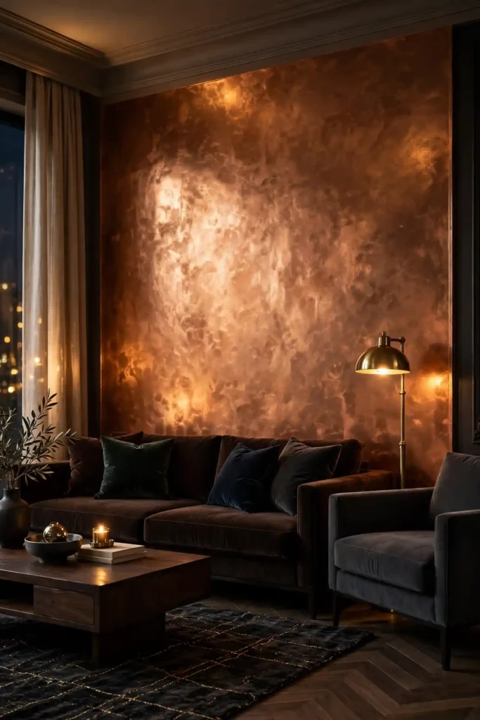
- Apply a warm brown plaster base in two smooth, even coats.
- While the final coat is tacky, press copper wax into the high points.
- Burnish with a clean trowel to blend the metallic glow into the plaster.
- Seal everything with clear wax so the copper stays bright, not dull.
Copper plaster turns a plain wall into jewelry for the room. Among all the Venetian plaster wall decor ideas I have collected, this metallic finish draws the most gasps from guests. Keep surrounding colors deep and quiet, espresso, charcoal, forest, so the copper glow becomes the undisputed focal point.
Stone Grey Minimal Finish
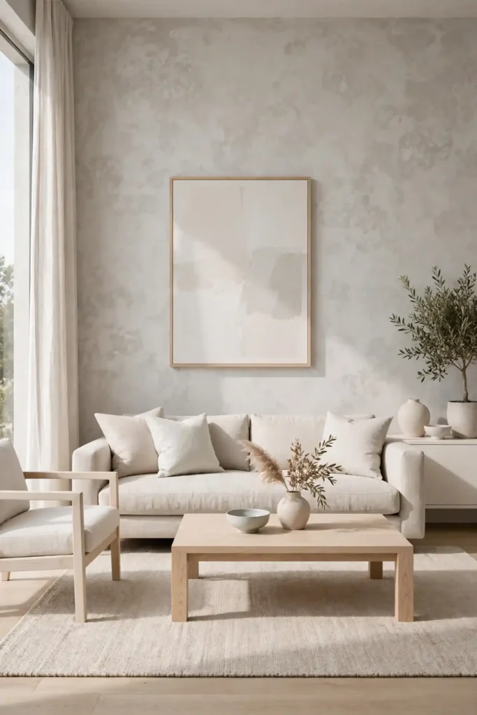
| Light Stone | Dark Stone |
|---|---|
| Brightens small, low-light rooms | Adds depth to large, open spaces |
| Pairs with white oak and linen | Pairs with walnut and black metal |
| Feels airy and modern | Feels grounded and moody |
| Shows dust less on the surface | Hides scuffs in busy hallways |
| Best behind pale artwork | Best behind bold, bright art |
Stone grey plaster is the minimalist’s answer to boring walls. The subtle mottle gives concrete-like texture with far more warmth, and the lime base keeps it breathable. Choose the light tone for calm and the dark for drama, because both wear beautifully over time.
Warm Taupe Velvet Walls

DO: Choose a taupe with pink-beige warmth to avoid a muddy look.
DO: Burnish to a velvet low sheen for that soft fabric feel.
DO: Repeat the tone in rugs or drapes for a layered effect.
DON’T: Pair it with grey furniture, or everything turns flat.
DON’T: Rush the drying time between coats.
DON’T: Use harsh white lighting that washes out the warmth.
Taupe plaster feels like cashmere for your walls. The velvety low sheen absorbs light gently, making bedrooms and lounges feel wrapped and calm. I’ve noticed it makes art pop beautifully, because the neutral ground lets every color beside it sing a little louder. It is the quiet luxury neutral that never shouts.
Midnight Black Statement

Cost: Higher, since deep pigments, extra coats, and quality sealers add up fast.
Time: Three full days, because dark coats need complete curing between layers.
Skill Level: Advanced, since lap marks and trowel lines show on dark polished plaster.
Best For: Powder rooms, libraries, dining walls, and moody home bars.
Black plaster is pure theater. Polished to a mirror sheen, it reflects candlelight and city glow like still water at night. Use it sparingly, one wall or a small powder room, and balance with brass mirrors and pale stone. The result feels bold, expensive, and unforgettable. Dare to go dark.
Pearl Shimmer Finish
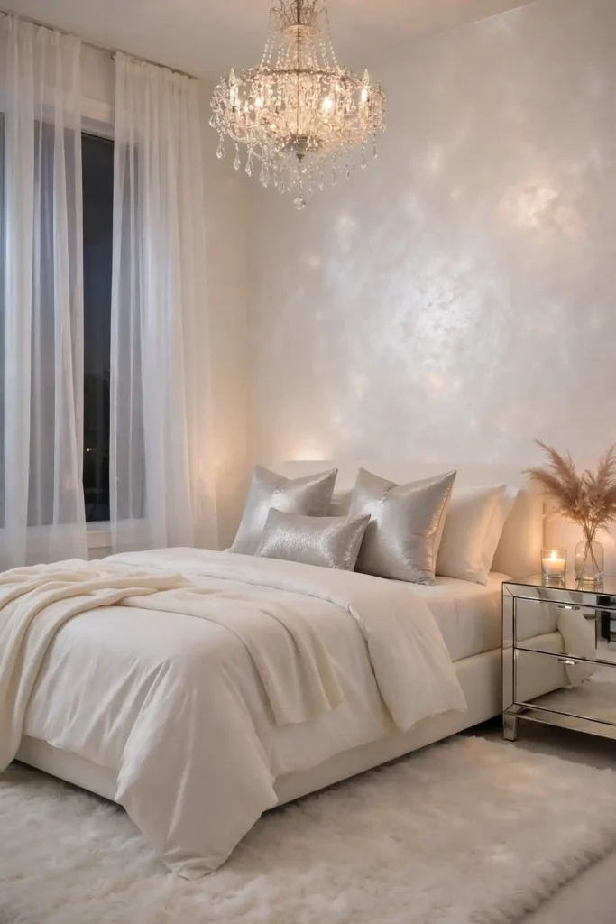
Pearl plaster glows like moonlight trapped in the wall. A whisper of pearl mica in a soft white base creates a finish that shifts from silver to cream as you walk past. It is subtle enough for whole rooms yet special enough for a single feature wall. Brides and boutique hotels adore it for good reason.
In my experience, pearl finishes photograph even better in person than on camera. Apply it over a smooth white base, trowel thin, and polish lightly to protect the shimmer. Keep lighting warm so the pearl reads creamy rather than cold, and enjoy the quiet glamour.
Rustic Sand Tones
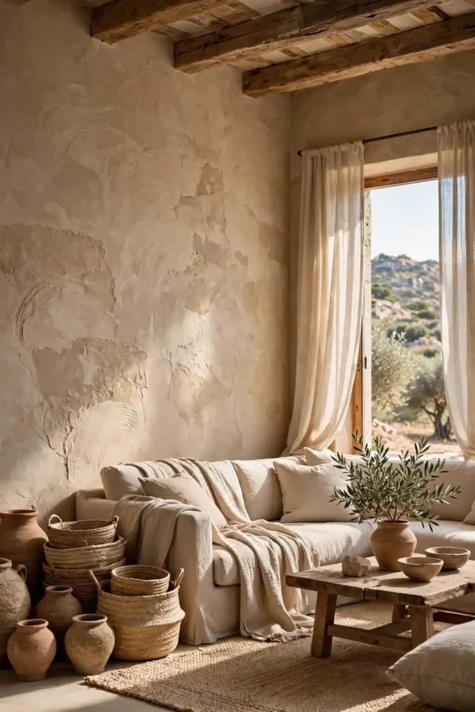
- Mix sand and ochre pigments for a sun-warmed base with natural variation.
- Leave the trowel marks visible to honor the handmade, rustic character.
- Skip heavy polishing, because a matte finish suits this earthy look.
- Seal with matte wax to protect without adding unwanted shine.
- Test the tone in daylight, since sand shades shift with the sun.
Sand-toned plaster brings desert calm indoors. The grainy texture and warm color recall adobe walls and Mediterranean courtyards, grounding modern furniture beautifully. Add woven baskets, clay pots, and linen throws, then let the room breathe with unhurried, sunlit ease. It is rustic without ever feeling rough or unfinished.
Pale Greige Elegance
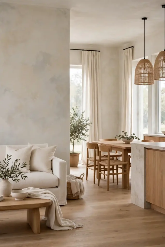
Quick Tip: Greige sits between grey and beige, so check your sample against both your flooring and your trim. If it pulls too cold next to oak floors, warm the mix with a drop of ochre. Give it 48 hours, because the final tone settles as the lime fully cures.
Greige plaster is the diplomat of neutrals, bridging warm and cool palettes with ease. The soft mottle keeps it lively, while the balanced tone plays well with almost any furniture. I love it in open-plan spaces where one wall must flatter both the kitchen and the living room at once.
Clay Earth Warmth
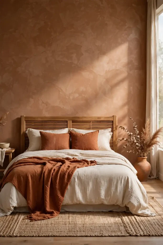
BEFORE: The bedroom felt sterile despite cozy bedding, because flat white walls drained all the warmth. Mornings felt cold, and the space never invited lingering.
AFTER: Clay-toned plaster wrapped the room in earthen warmth, its hand-troweled texture catching morning light. The same bedding suddenly looked richer, and the room finally felt like a retreat.
Clay plaster grounds a bedroom the way good soil grounds a garden. For more ideas on styling the wall behind your bed, explore these above bed wall decor ideas and layer them over the warm plaster. Keep bedding in cream and rust, and the whole room hums with organic comfort.
Silver Mist Shine
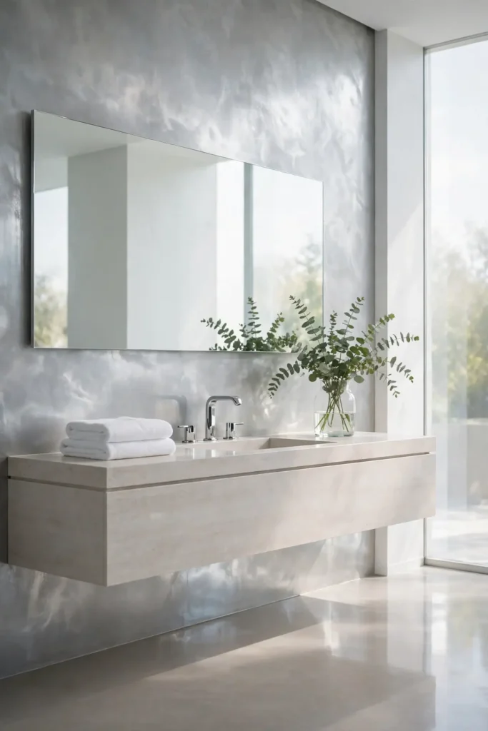
- Start with a pale grey plaster base, applied in two thin coats.
- Mist the tacky surface with diluted silver glaze using a soft brush.
- Feather the glaze with a clean trowel for a seamless mist effect.
- Polish lightly once dry to wake up the metallic shimmer.
Silver mist plaster feels like morning fog made permanent. The cool metallic veil suits modern bathrooms and sleek entryways, adding movement without color. Pair it with chrome fixtures and pale stone, then watch ordinary daylight turn quietly magical on the wall. It is modern luxury with a light, airy touch. Few finishes feel this light and futuristic.
Coffee Bean Depth
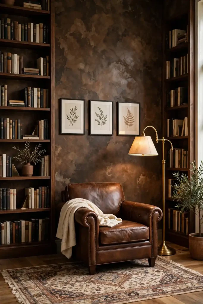
| Espresso Brown | Mocha Brown |
|---|---|
| Deep, near-black roasted richness | Softer milk-chocolate warmth |
| Best for libraries and dens | Best for kitchens and family rooms |
| Pairs with brass and leather | Pairs with cream and oak |
| Feels bold and cocooning | Feels warm and welcoming |
| Needs strong lighting nearby | Works in average daylight |
Coffee-toned plaster wraps a room like your favorite café corner. The rich brown mottle adds depth that flat paint cannot touch, and it makes wood furniture look even more expensive. Keep one wall as the star, then let cream textiles and warm lighting soften the intensity. It is comfort you can see.
Frosted Mint Freshness
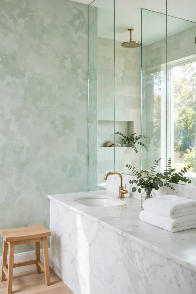
DO: Keep the mint pale and frosty to avoid a dated pastel look.
DO: Pair it with white marble and light oak for fresh contrast.
DO: Use it in bathrooms where the cool tone feels spa-like.
DON’T: Choose a mint that is too saturated or neon bright.
DON’T: Combine it with heavy dark furniture that fights the airiness.
DON’T: Forget the sealant in steamy bathrooms.
Frosted mint plaster feels like a cool drink on a warm day. The pale green mottle stays sophisticated when you keep it light, and it flatters white fixtures beautifully. Add eucalyptus sprigs and fluffy white towels, then enjoy the spa calm every single morning. It is freshness that never tries too hard.
Antique Bronze Patina
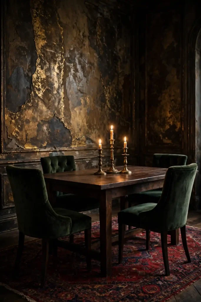
Cost: Moderate to high, since quality metallic waxes cost more than standard sealers.
Time: Two to three days, because building believable patina layers takes patience.
Skill Level: Intermediate, since the aged effect needs restraint, not heavy hands.
Best For: Dining rooms, home bars, and entryways craving old-world charm.
Bronze patina plaster looks excavated from an ancient villa. Dark bronze tones settle into the plaster’s valleys while warm gold catches the ridges, creating depth that shifts with the light. Pair it with dark wood and candlelight, then watch the wall become the room’s most storied feature. It rewards patience richly.
Linen White Simplicity
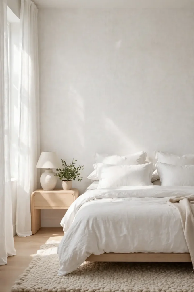
Linen white plaster is quiet luxury at its purest. The barely-there texture mimics woven fabric, softening the wall without any pattern or color to date it. It reflects light gently, making small rooms feel larger and calm rooms feel calmer. This is the finish for anyone who believes less truly is more.
I have noticed linen white works hardest in homes with beautiful natural light. Trowel it smooth with just a whisper of texture, then leave it unsealed in dry rooms or wax it lightly elsewhere. Pair with anything, because this neutral flatters every style from farmhouse to minimal.
Conclusion
The right wall finish does more than decorate a room, it changes how the whole space feels every single day. Exploring Venetian plaster wall decor ideas opened my eyes to just how much depth and warmth a single wall can add. Save your favorites to a Pinterest board, test samples on poster board before you commit, and take the process one wall at a time. You deserve rooms that feel handcrafted and timeless. Start this weekend, and enjoy watching your walls turn into the most admired feature of your home. I have seen how small changes like these can completely shift the way a space feels.