22 Sage Green and Terracotta Living Room Ideas for Earthy Charm
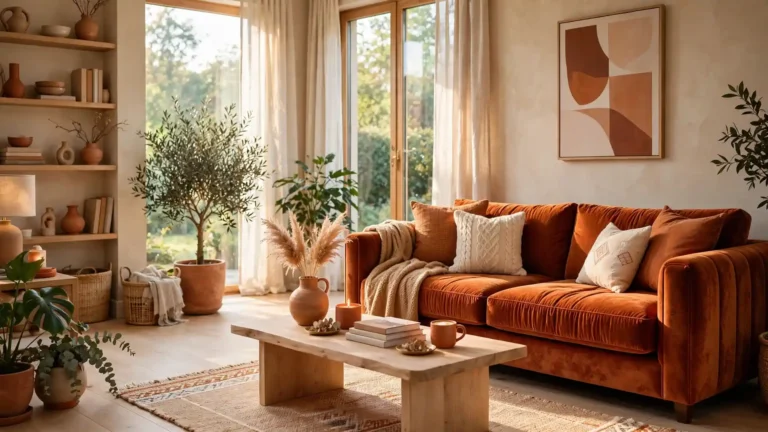
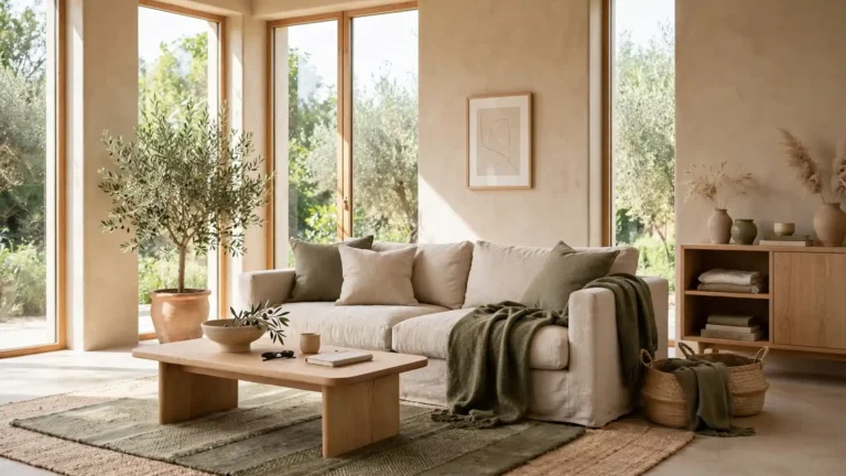
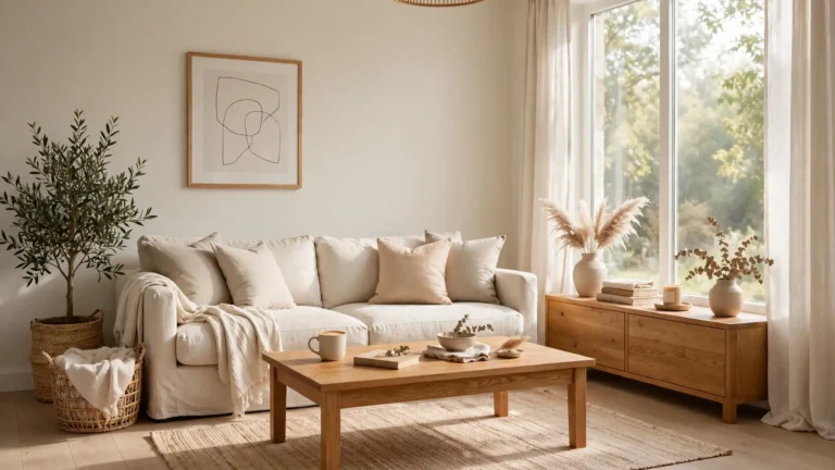
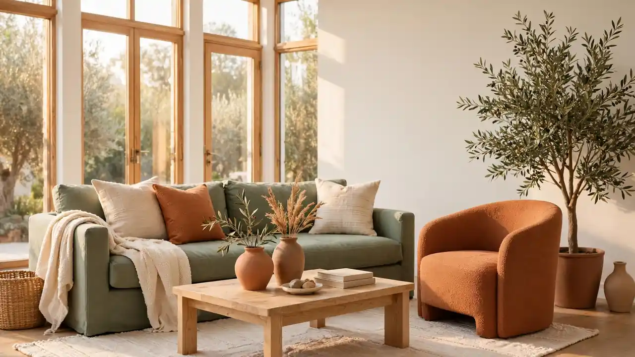
Soft sage and baked clay can make a living room feel grounded without turning dim or heavy. The secret behind sage green and terracotta living room styling is proportion: leafy green cools the warmth, terracotta adds depth, and creamy neutrals keep every surface breathing. Wood, linen, and brushed brass bridge the two colors so transitions feel natural from wall to cushion.
Start with one anchor, then repeat each color in smaller touches until the room feels connected. I’ve noticed balanced rooms rarely use equal amounts; they let one shade lead and the other spark. A richer route such as vintage maximalist home decor ideas shows the power of layering, while this palette keeps the mood calmer. The ideas ahead focus on paint, textiles, furniture, light, and small accents that renters and owners can adjust gradually.
Sage Velvet Sofa Moment
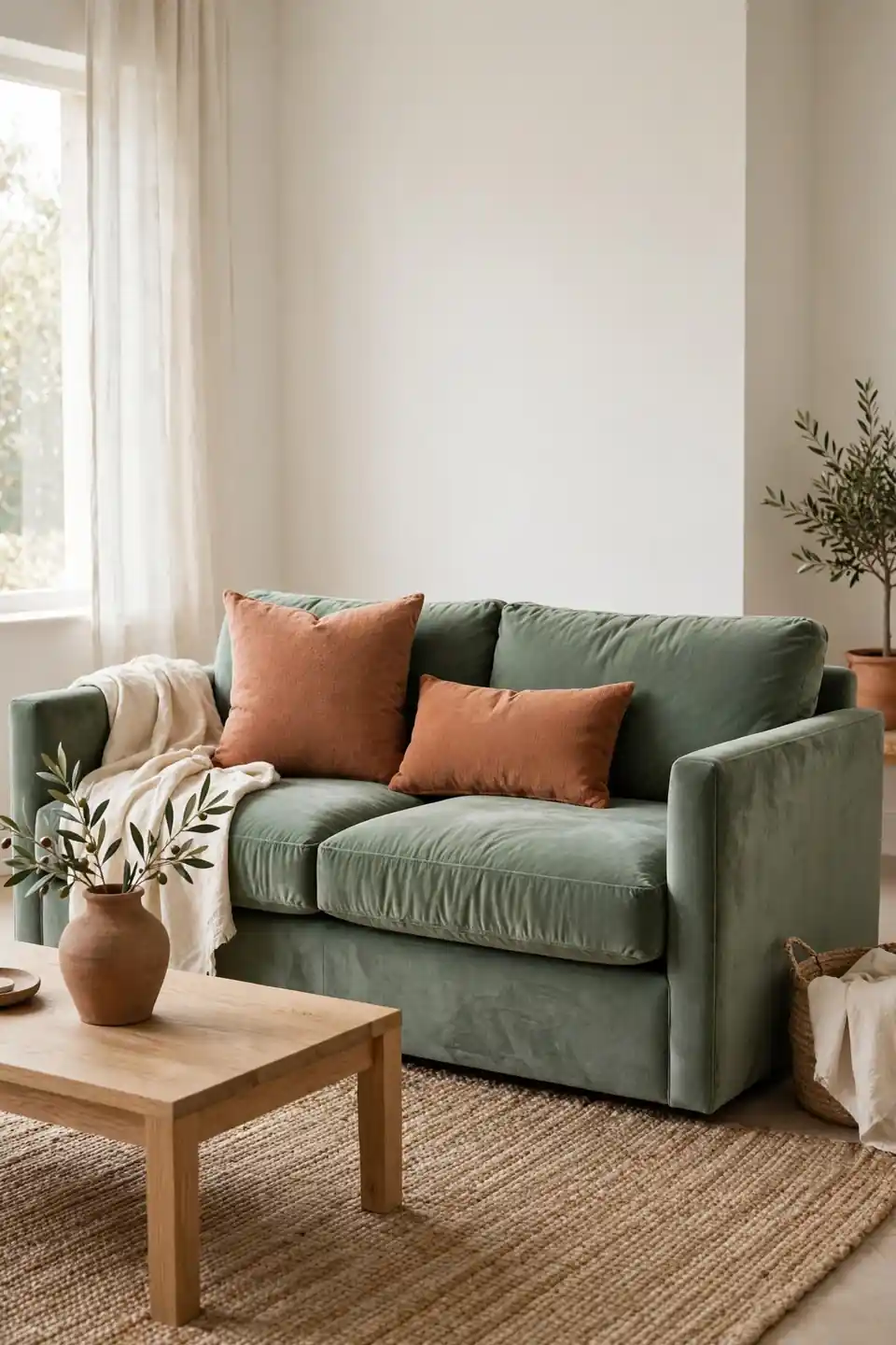
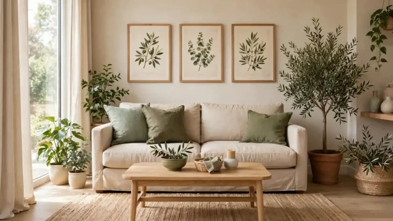
Sage velvet turns a plain sofa into the calm center of the room. Pair it with terracotta cushions in two sizes, a cream throw, and a low oak table so the green stays rich rather than sweet. A clay vase and one leafy branch repeat the earthy story without crowding the seat.
Keep nearby walls warm white or pale plaster, since strong contrast can make sage look minty under some light. I’ve noticed velvet reads deeper beside matte textures, so balance the sheen with linen, jute, and unfinished wood. Leave the arms mostly clear; the color itself carries the decoration here.
Terracotta Painted Wall
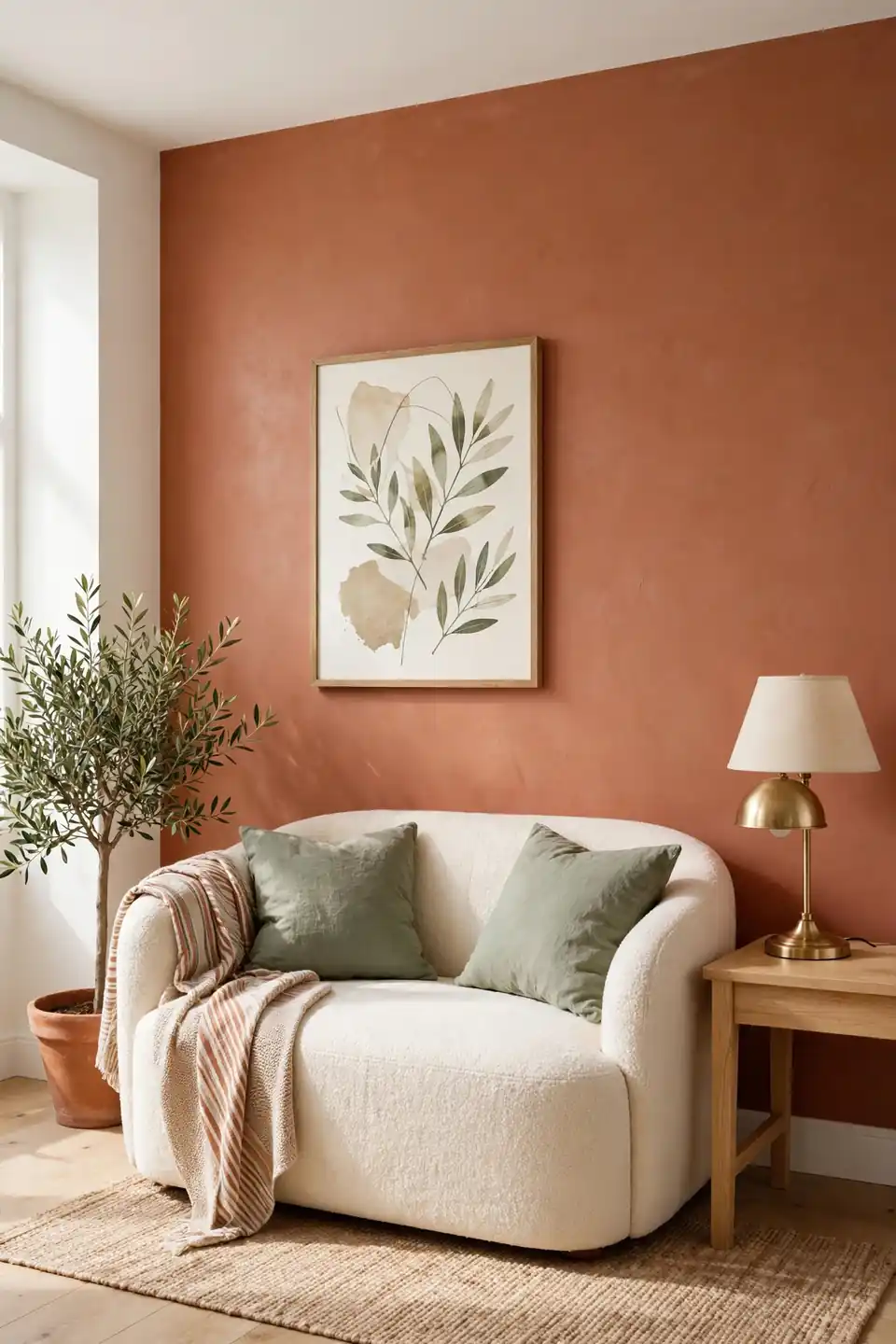
- Paint one wall terracotta behind the sofa for instant warmth and depth.
- Choose a muted clay shade with brown undertones, never bright orange.
- Repeat sage in two cushions and one piece of framed art.
- Keep the ceiling and trim warm white to hold the light.
- Test a large swatch morning and evening before committing fully.
One colored wall does the heavy lifting, so the rest of the room can stay quiet. Cream upholstery, pale wood, and woven texture stop terracotta from feeling heavy, while black accents should stay tiny. A single brass lamp warms the paint after sunset and links the wall to smaller metal details nearby.
Layered Natural Textiles
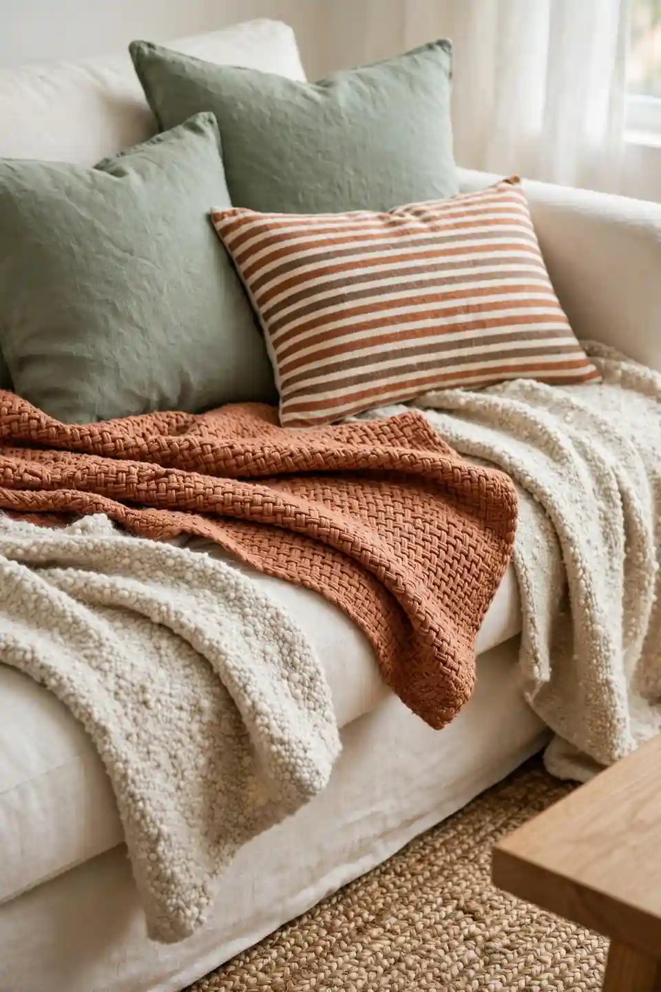
Quick Tip: Mix at least three textures before adding more color: smooth linen, nubby wool, and one woven jute or rattan piece. Texture gives sage and terracotta their depth, so a quiet sofa can still feel rich. Keep patterns small and spaced apart, with one stripe or simple block print leading the group.
Fold throws over sofa arms instead of spreading them flat, since casual folds show both sides of the fabric. Swap cushion covers seasonally if the room needs change: heavier wool for winter, pale linen for summer. The palette stays steady while the mood shifts with the weather outside.
Dull Corner Transformation
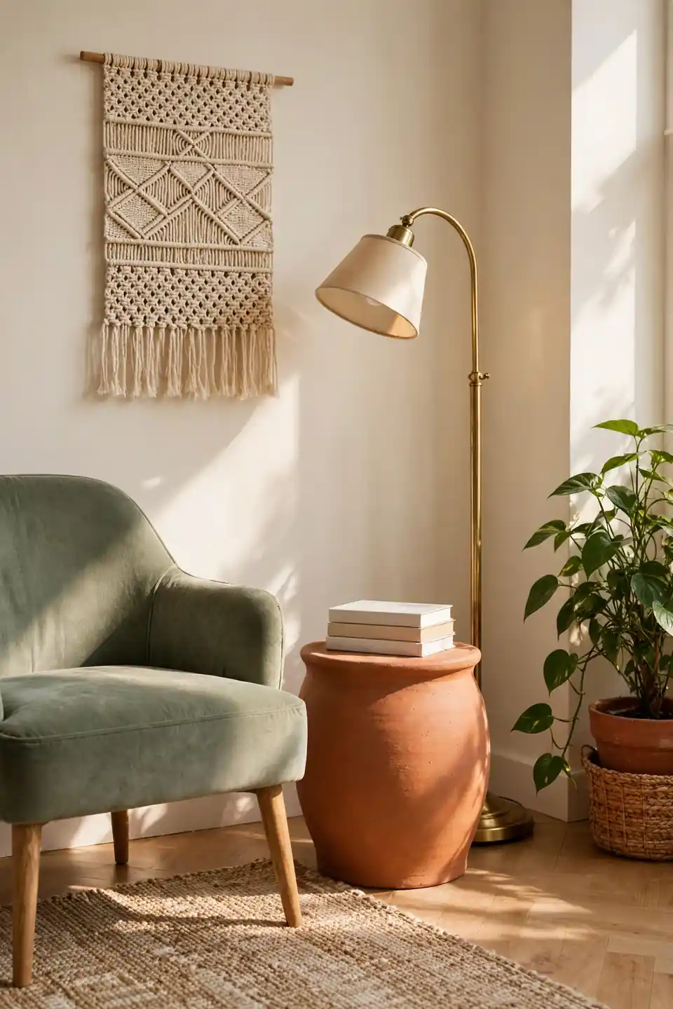
BEFORE: A spare corner held one tired chair, a blank wall, and a floor lamp that gave flat light. The seat faced nothing pleasant, so the corner collected clutter instead of inviting anyone to sit down.
AFTER: A sage chair now angles toward the window, with a terracotta side table and brass lamp beside it. A woven hanging fills the wall, a plant softens the edge, and a small book stack makes the seat feel ready.
Corners respond well to a clear job: reading, coffee, or conversation. Give the spot one seat, one surface, and one light source, then stop. Extra pieces can join later only if the corner still feels sparse after a week of real use.
Balanced Color Placement
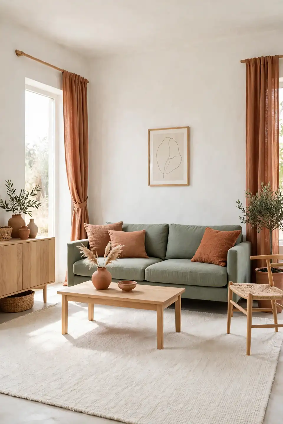
- Choose warm white or cream for about sixty percent of visible surfaces.
- Give sage the next thirty percent through the sofa, rug, or curtains.
- Reserve terracotta for ten percent: cushions, pottery, art, and one throw.
- Repeat each accent color at least three times across the room.
- Photograph the room and squint to check the balance quickly.
Ratios keep the palette from sliding into a theme. Sage needs the larger share because it recedes, while terracotta advances and feels stronger in small doses. That restraint is what makes a sage green and terracotta living room feel personal rather than matched, collected rather than copied from a showroom display.
Sofa Fabric Comparison
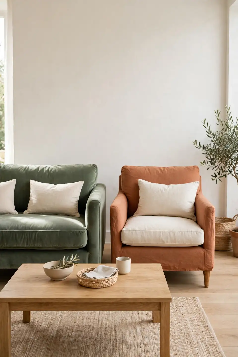
Fabric changes how both colors behave in daylight and lamplight.
| Feature | Sage Velvet | Terracotta Linen |
|---|---|---|
| Mood | Deep and plush | Airy and relaxed |
| Upkeep | Brush pile weekly | Washable covers help |
| Light | Shifts with angle | Stays matte and even |
| Best For | Formal calm rooms | Casual family spaces |
Pick velvet when the room needs richness and the sofa is the main event. Pick linen when kids, pets, or heavy daily use call for easy care and a softer, sun faded feel. Either fabric works when the other color arrives in cushions, art, or a nearby chair. Order swatches first, since screens distort both colors badly.
Earthy Palette Guardrails
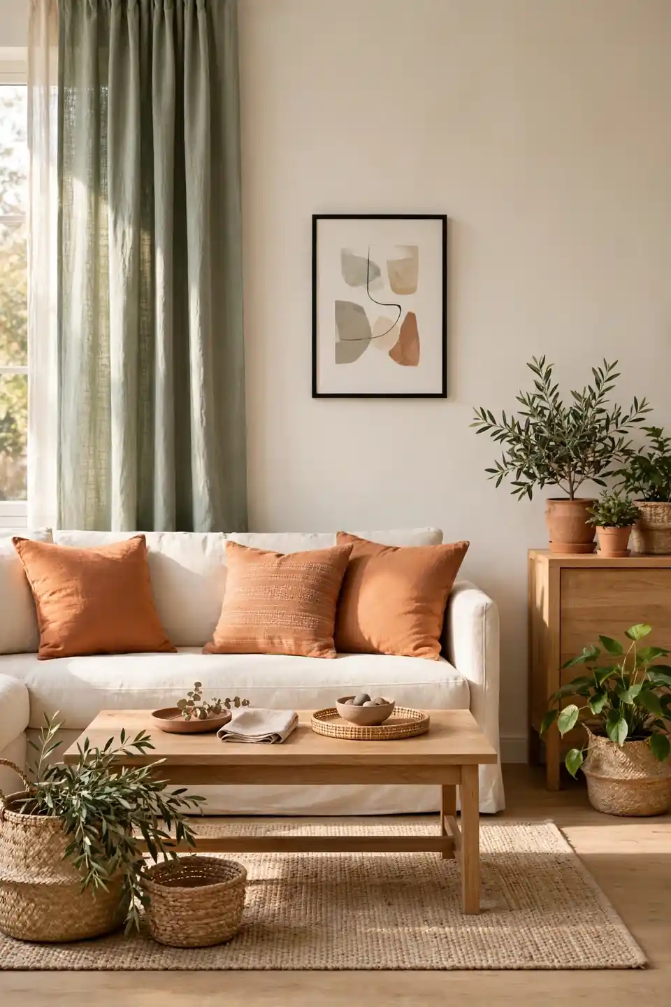
Do:
- Let sage lead on larger pieces and terracotta spark in accents.
- Repeat wood tones twice so furniture feels connected.
- Keep one quiet neutral on the biggest surface.
- Test colors together in the room’s real light.
Don’t:
- Avoid orange cushions that fight true terracotta clay tones.
- Skip blue gray walls that make sage look cold.
- Never match every accessory to the same two shades.
- Avoid glossy finishes on every surface at once.
Guardrails sound strict, but they protect the relaxed mood. Once the base feels right, one wild card is welcome: a patterned rug, a dark wood heirloom, or a single black frame. Small surprises keep earthy rooms from looking staged for a catalog photo.
Paint And Light Facts
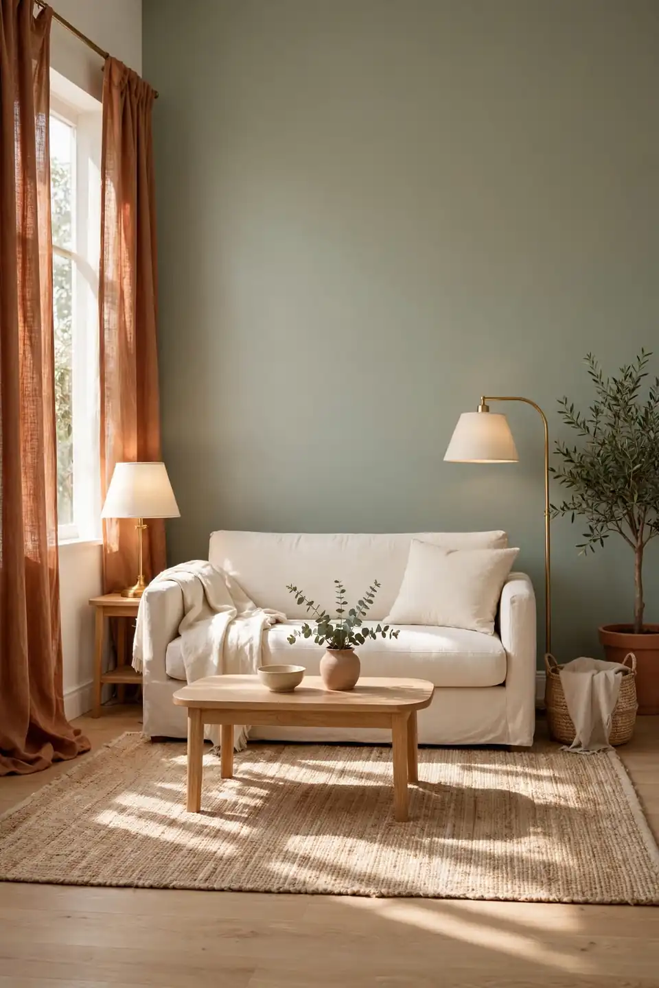
Cost: One gallon of quality paint covers most single accent walls affordably.
Time: A full day allows testing, taping, two coats, and drying.
Skill Level: Beginner friendly with a roller, ladder, and patient edges.
Best For: Rooms that feel cold, flat, or short on character.
Paint never reads the same at noon and dusk, so live with sample boards before deciding. Move one board beside the sofa, one near the window, and one under lamplight. Sage can turn gray in north facing rooms, while terracotta may deepen fast. Warm bulbs near twenty seven hundred Kelvin usually flatter both shades at night.
Sunlit Reading Corner
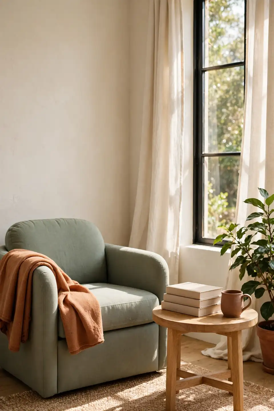
Morning light can turn one chair into the most loved seat in the house. Angle a sage armchair toward a window, fold a terracotta throw over one arm, and set a small oak table within easy reach. A plant on the sill filters glare and gives the eye something calm to rest on.
Comfort decides whether the corner gets used daily. Add a firm cushion, a low footstool, and a lamp for cloudy days, then keep the book stack short and current. Rooms that borrow ease from calmer spaces, like warm white kitchen design inspiration, prove quiet corners need honest comfort more than extra decoration.
Patterned Rug Anchor
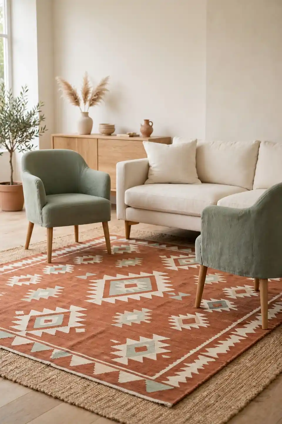
- Anchor seating on a rug large enough for front legs of every piece.
- Choose terracotta patterns softened with cream and sage motifs.
- Keep the pattern scale medium so furniture does not fight it.
- Layer a plain jute edge if the main rug feels small.
- Repeat one rug color in cushions across the room.
A rug is the fastest way to marry two strong colors, since pattern lets them share one surface peacefully. Vintage style prints forgive wear and hide crumbs between cleanings, a practical gift in busy rooms. Leave a border of bare floor visible so the rug reads as an anchor, not wall to wall carpet.
Warm Metal Accents
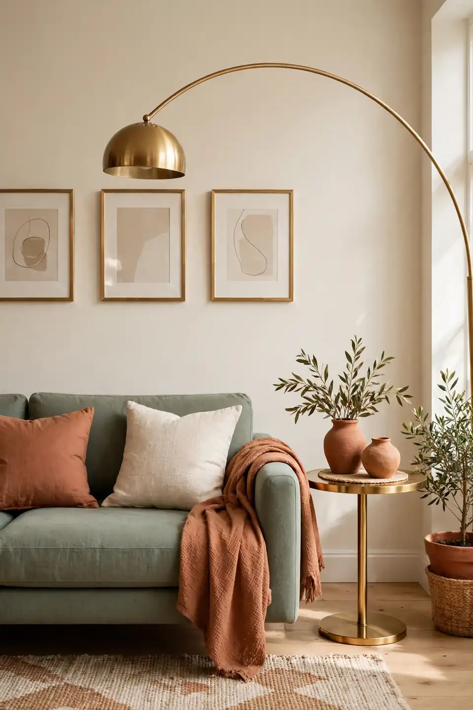
Quick Tip: Repeat one warm metal three times at different heights: a floor lamp, a side table edge, and small frames or handles. Brass and antique bronze both flatter sage and terracotta because their warmth sits between the two colors. Keep the finish matte or brushed so reflections stay gentle in daylight.
Metal works hardest in small doses. One oversized mirror frame or a pair of sconces can carry a whole wall, while tiny scattered objects may read as clutter. Wipe fingerprints weekly, since warm metals show marks faster than painted finishes in busy family rooms. Polished pieces should stay in the minority.
Dull Corner Revival
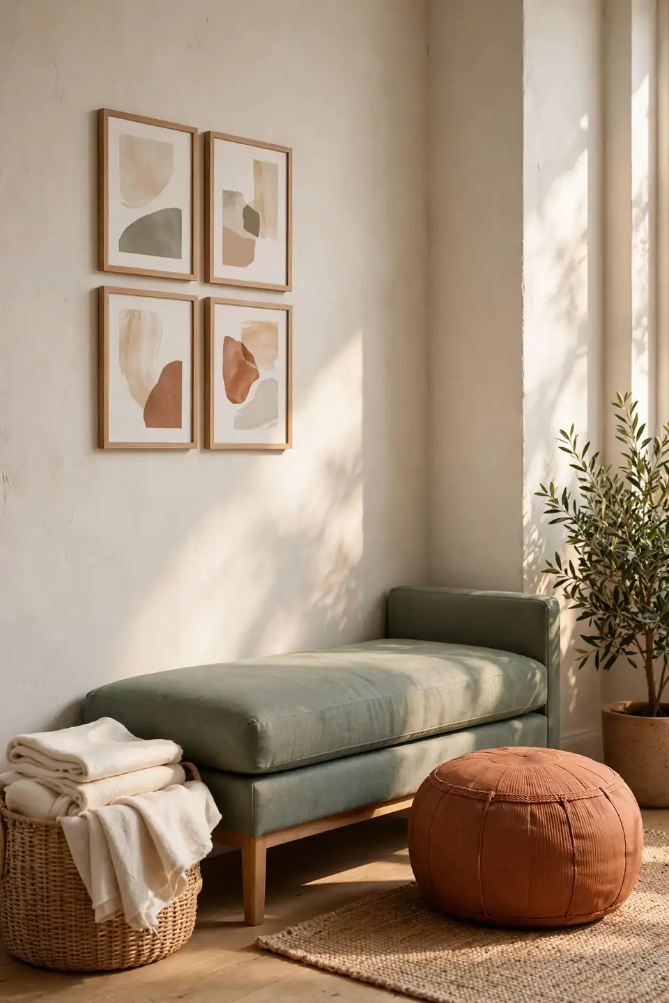
BEFORE: An empty corner beside the sofa held a dusty basket and a tangle of charging cords. The wall above it stayed blank, and the gap made the whole seating area feel unfinished.
AFTER: A sage bench now fills the width, topped with cream cushions and a folded clay throw. Framed prints hang in a tight group above, a terracotta pouf offers extra seating, and a lidded basket hides the cords completely.
Dead corners often need storage and seating more than decoration. Measure the gap first, then choose one piece that nearly fills it. A bench, trunk, or low bookcase earns its place daily, and art above it finishes the height.
Gallery Wall Sequence
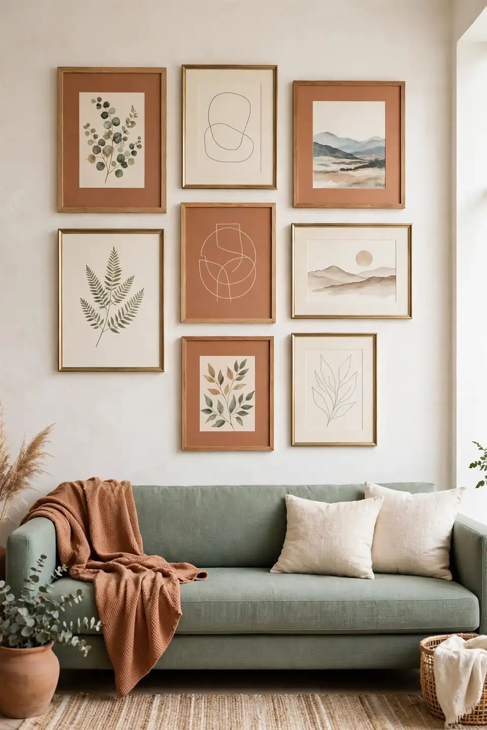
- Gather six to nine frames in wood, brass, and painted finishes.
- Choose art with sage, clay, cream, and one dark tone.
- Lay the group on the floor and photograph two arrangements.
- Hang the largest piece first, slightly off center above seating.
- Keep gaps near two inches for a calm, gathered rhythm.
Gallery walls let small art make one generous statement. Botanical prints, landscapes, and simple abstract shapes suit this palette because nature already owns both colors. Use plain covers and image ledges if rental rules limit nails, and swap one print seasonally instead of rebuilding the whole wall each time taste changes.
Curtain Fabric Comparison
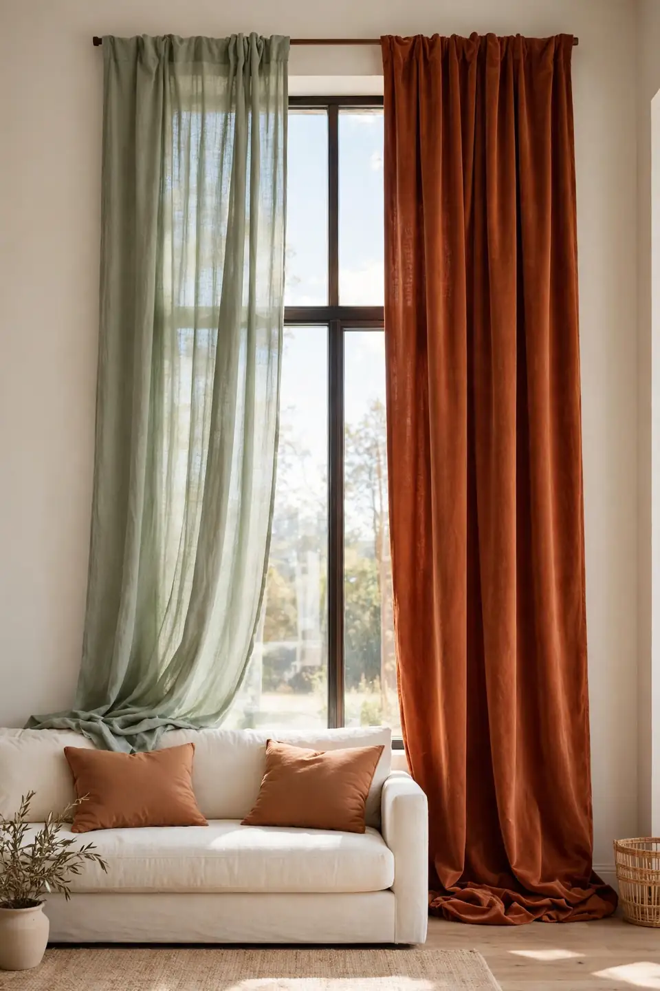
Curtains control both color weight and the quality of afternoon light.
| Feature | Sage Linen | Terracotta Velvet |
|---|---|---|
| Mood | Breezy and soft | Rich and cocooning |
| Light | Filters daylight gently | Blocks glare strongly |
| Upkeep | Steam wrinkles easily | Brush pile monthly |
| Best For | Bright small rooms | Evening media spaces |
Choose linen when windows are the room’s best feature and daylight deserves the lead role. Choose velvet when evenings matter more, or when a cold wall needs visual weight. Hang either fabric high and wide so the window looks taller and the panels clear the glass at rest. Measure drop length twice before ordering hardware or hems.
Balanced Accessory Rules
Do:
- Group accessories in threes with varied heights and textures.
- Leave open space around each group for breathing room.
- Mix clay, wood, metal, and glass across the room.
- Repeat one shape, like round pots, in two places.
Don’t:
- Avoid lining small objects along every shelf edge.
- Skip matched sets that make shelves feel like shops.
- Never hide every surface under decorative pieces.
- Avoid colors outside the palette without a clear reason.
Accessories should feel collected during real life, not placed for one photo. Edit monthly: remove one piece from each crowded surface and notice how the remaining objects gain presence. I’ve seen this work well in many cases, especially when storage baskets keep daily clutter out of sight.
Budget Refresh Facts
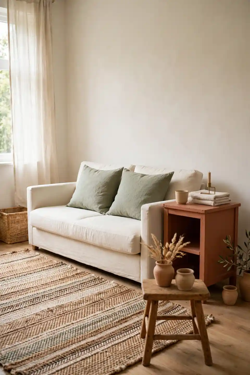
Cost: Cushion covers, one paint tin, and thrifted pottery keep costs modest.
Time: One weekend covers painting, sewing shortcuts, and full restyling.
Skill Level: Beginner, since every change is reversible and tool light.
Best For: Renters and first homes needing warmth without renovation.
Start where eyes land first: the sofa cushions and the surface beside them. New covers in sage, a painted side table in terracotta, and one plant can shift the whole palette for less than a new chair. Shop secondhand for clay pots and wood pieces, since small flaws suit the earthy mood and keep useful objects out of landfill.
Botanical Softness Layer
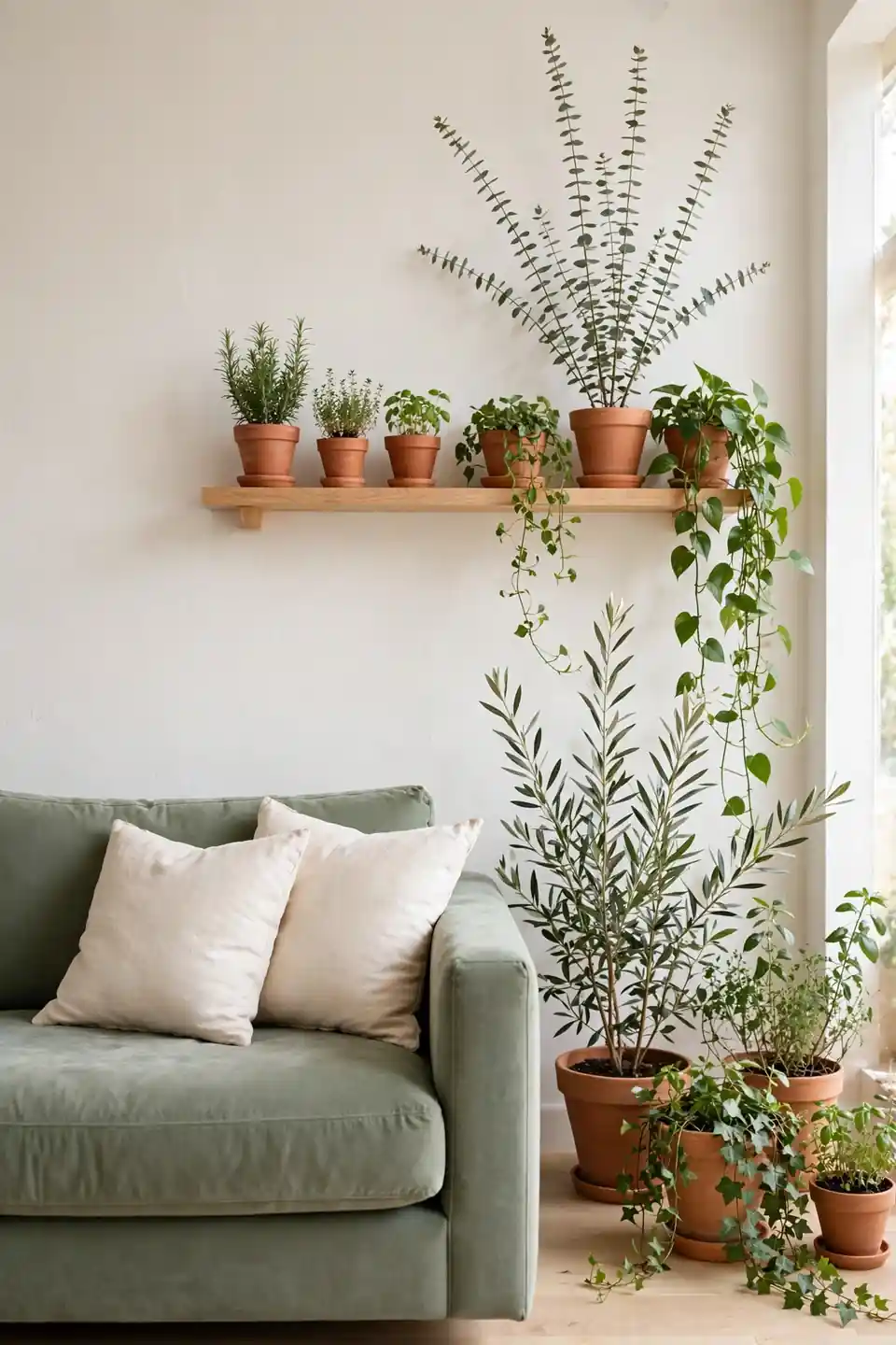
Plants soften the edges of this palette better than any extra cushion. Terracotta pots echo the warm accents, while leaves bring living shades of green that no paint swatch can copy. Group pots in threes near windows, then place one tall branch behind the sofa to lift the eye upward.
Choose plants for the light you actually have, not the light you wish for. Snake plants and pothos forgive busy schedules, while olive branches suit bright corners. Keep saucers under every pot, since clay sweats moisture onto wood. A weekly wipe keeps leaves glossy and photos on the sofa more inviting.
Terracotta Clay Accents
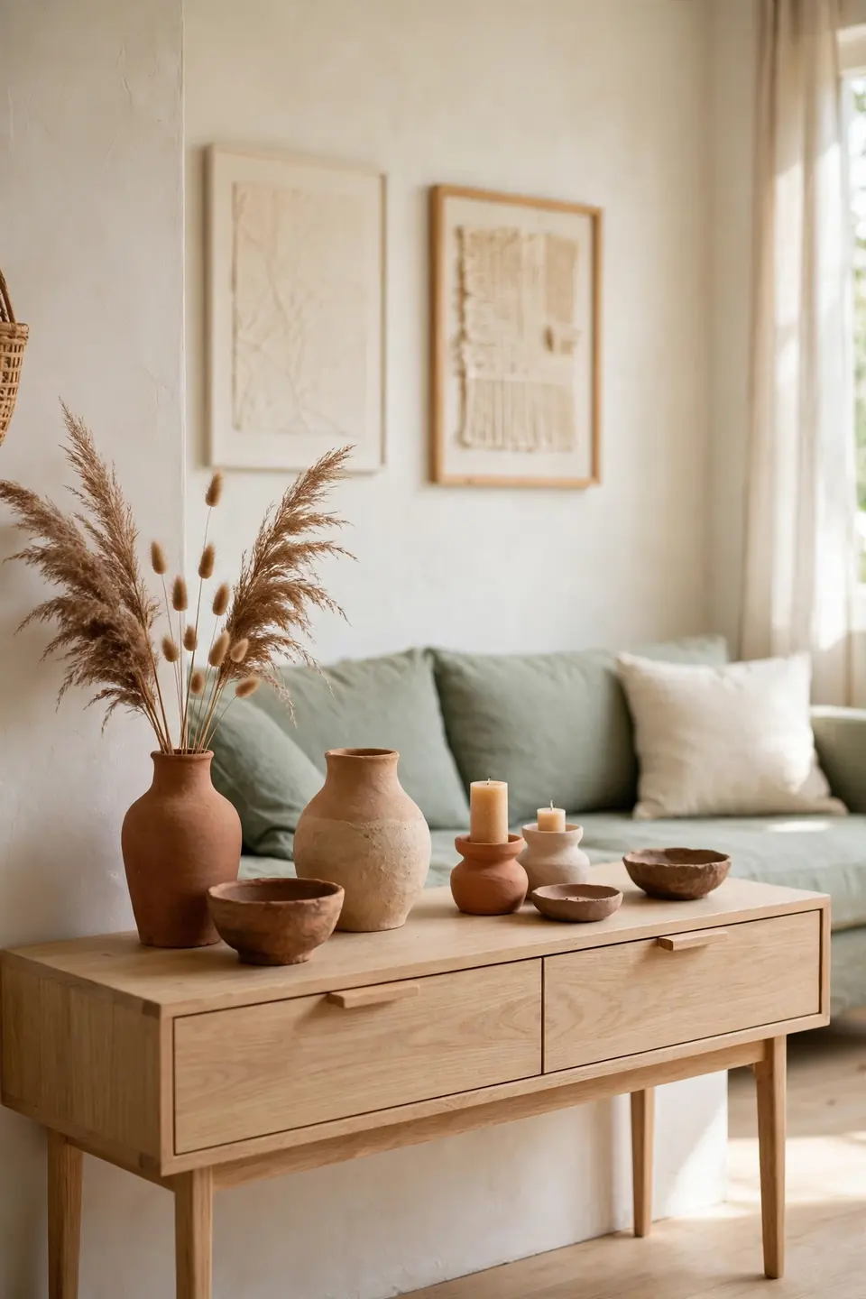
- Group clay vases in odd numbers with varied heights and finishes.
- Mix raw terracotta with glazed pieces for gentle contrast.
- Fill one vase with dried grasses and leave others empty.
- Place a clay bowl on the coffee table for daily keys.
- Repeat pottery on shelves so accents feel connected.
Clay carries the warmth of the palette in its most honest form, complete with small marks from the maker’s hands. Handmade pieces vary in tone from dusty rose to deep rust, which keeps terracotta from looking flat. Support local makers when possible; their work gives the room a story no factory finish can match.
Lighting Temperature Harmony
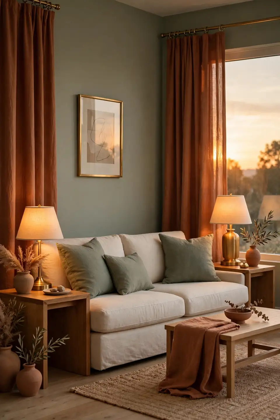
Quick Tip: Keep every bulb in the room near the same warm temperature, around twenty seven hundred Kelvin. Mixed bulbs make sage look blue in one corner and muddy in another, while matched warmth lets both colors settle. Dimmers help even more, lowering light for movies without losing the palette.
Layer light at three heights: ceiling, table, and one low glow near the floor or fireplace. Shades in cream linen soften output and repeat the neutral base. Test the room after dark before buying art, since lamplight can deepen terracotta and cool sage more than expected. One lamp per seat keeps the glow even.
Rental Friendly Makeover
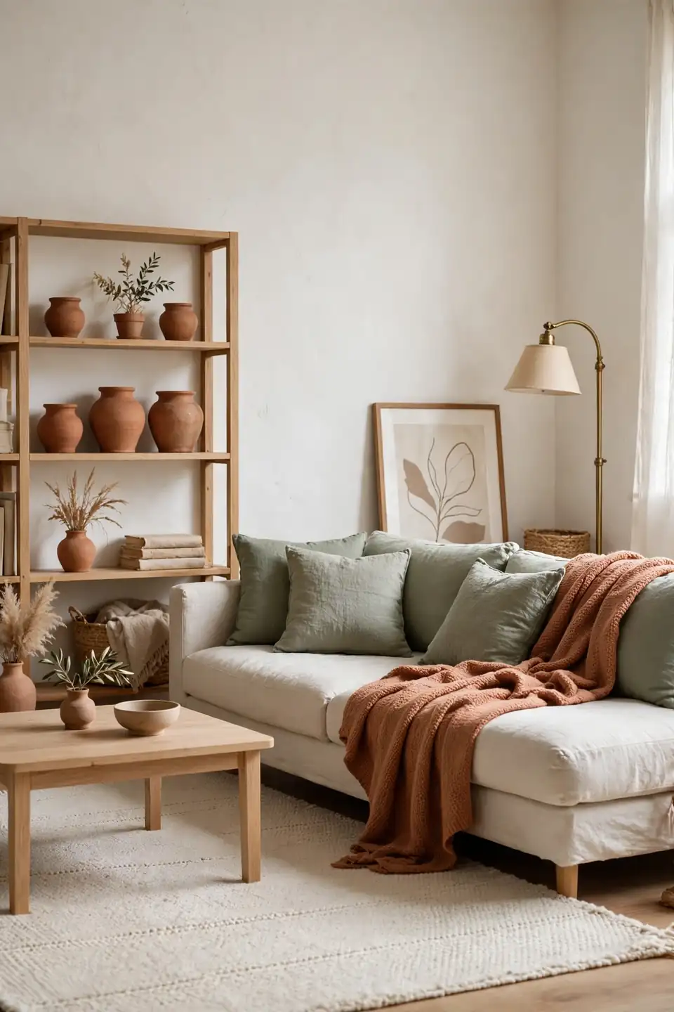
BEFORE: A rental room wore plain white walls, a gray sofa, and no rug, so every sound echoed. Rules banned paint and nails, leaving the space clean but cold and oddly temporary.
AFTER: A large cream rug grounds sage cushion covers and a terracotta throw on the same sofa. Leaning art, a brass floor lamp, and clay pots on a bookcase add color and height without one new hole.
Removable changes work when they are generous in scale. One big rug beats three small mats, and tall lamps beat tiny decor scattered around. Photograph the room before moving in, and keep deposit rules in mind while planning each layer.
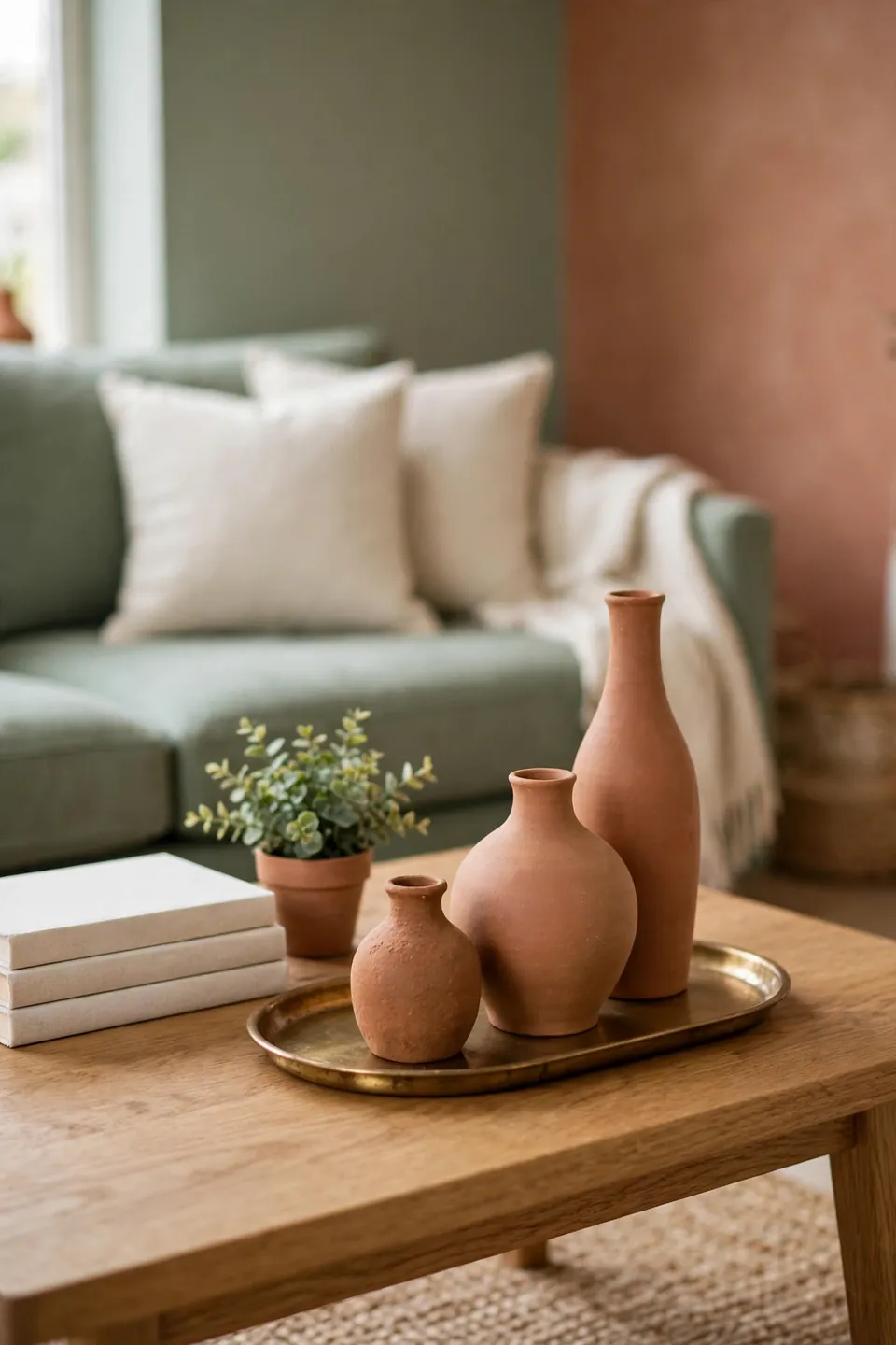
Coffee Table Styling Steps
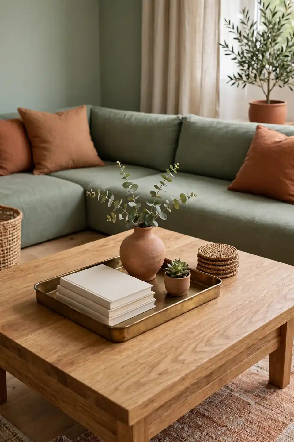
- Set a low tray to gather small pieces into one group.
- Stack two plain covered books for height and color.
- Add one clay vase with branches, stems, or nothing.
- Leave half the table open for cups and feet.
- Finish with one small plant or woven coaster stack.
Tables stay useful when styling respects daily habits. Keep the arrangement off center if the household plays games or folds laundry there, and choose pieces that can move in one trip. A tray does that job neatly, turning five loose objects into a single lift and set down routine. Rotate one object monthly to keep the arrangement fresh.
Flooring Tone Comparison
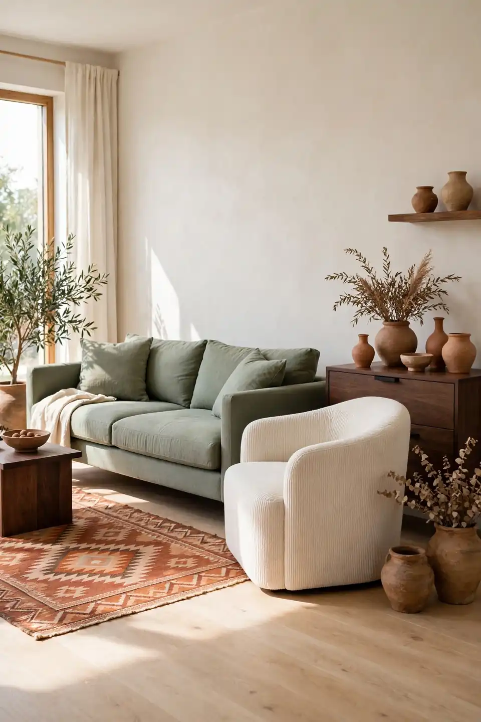
Floor tone quietly decides how strong both colors appear all day.
| Feature | Light Oak | Dark Walnut |
|---|---|---|
| Mood | Fresh and open | Moody and grounded |
| Sage Effect | Looks soft and pale | Looks deep and rich |
| Terracotta Effect | Reads warm and dusty | Reads bold and glowing |
| Best For | Small bright rooms | Large evening rooms |
Work with the floor already in place before choosing paint strength. Pale floors can carry deeper terracotta, while dark floors often need lighter sage and more cream to stay balanced. A large rug lets renters shift the floor tone without touching a single board. Samples beside the sofa reveal the truest pairing.
Conclusion
Begin with one anchor piece, then let sage cool the room while terracotta brings the warmth back in small, repeated touches. Cream, oak, linen, and brass keep a sage green and terracotta living room feeling open instead of themed, and plants finish the story with living color. I’ve seen how small changes like these can shift the way a space feels by evening. Save these ideas to Pinterest, test one corner this weekend, and share the corner that surprised you most. The palette rewards patience, so add pieces slowly and enjoy watching the room settle into itself.