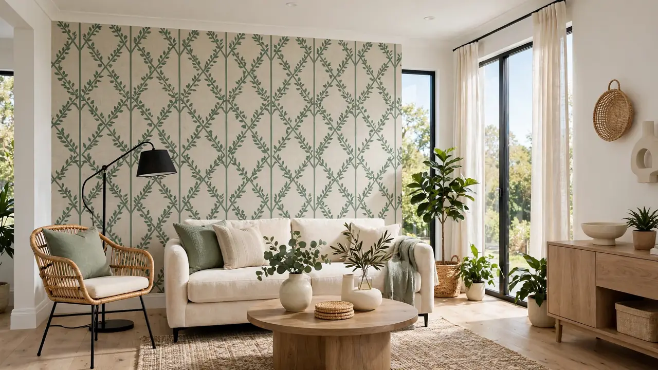
21 Peel Stick Wallpaper Patterns for Striking Room Style
Pattern is personality, and peel stick wallpaper patterns let you wear it on your walls without commitment. In my experience, the pattern you choose sets the entire mood of a room before furniture even enters the picture. These 21 patterns range from timeless damask to playful polka dots, each one ready to apply in an afternoon and remove without a trace. You will discover which patterns make small rooms feel bigger, which add cozy warmth, and how to mix patterns without chaos. Grab some samples, trust your gut, and let’s find the pattern that feels like you. From classic to quirky, there is something here for every taste.
Below are 21 patterns, from classic damask to bold animal prints. For more wall ideas, see my peel stick wallpaper. Let’s explore the patterns.
Damask Classic Revival
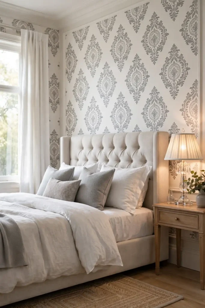
Damask never truly leaves the design world, and today’s peel and stick versions make this classic accessible to everyone. The ornate medallion motif brings old-world elegance to bedrooms and dining rooms, reading as expensive from the moment you enter. Choose tone-on-tone damask in soft gray or cream for a subtle effect, or go bold with navy and gold for full drama.
In my experience, damask works best when the rest of the room stays simple. Let the pattern carry the formality and keep furniture clean-lined so the space feels fresh rather than stuffy. Hang it on the headboard wall or in a formal dining room where its heritage shines. This is the pattern for anyone who loves timeless style with a modern easy application.
Toile Story Scenes
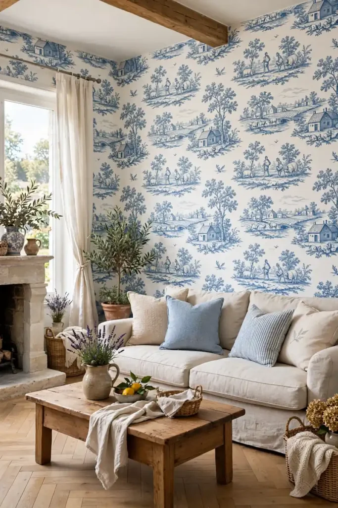
- Choose classic blue and white toile for French country charm that never dates.
- Use toile in powder rooms and hallways where guests pause to study the scenes.
- Pair with simple linen upholstery and natural wood to keep the look fresh.
- Keep the scale medium; tiny toile gets lost and oversized toile overwhelms.
- Frame a section of toile as art if a full wall feels like too much.
Toile wallpaper tells stories on your walls, with pastoral scenes of villages, gardens, and countryside life. The narrative quality makes it perfect for rooms where people linger and look closely. I’ve seen this work well in powder rooms, where guests always notice the charming details. Stick to classic blue and white for the most versatile look.
Ikat Global Weave
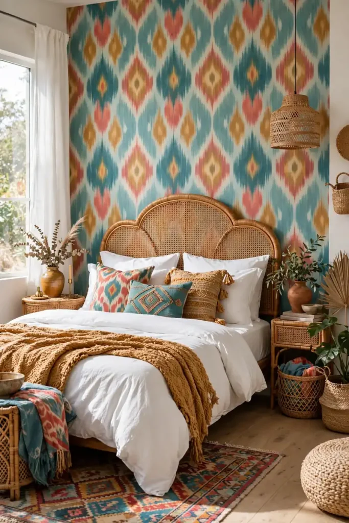
Quick Tip: Ikat’s blurred edges are forgiving at the seams, making it one of the easiest patterns for beginners. The soft focus of the design hides small misalignments that crisp geometrics would expose.
Ikat brings the soul of handwoven textiles to your walls. The blurred diamond motifs in rich teals, corals, and ochres add global warmth to bedrooms and living rooms. This pattern loves layered textiles, so pile on throw pillows and woven blankets. The artisan feel makes any room look collected and well-traveled.
Use ikat on one accent wall and keep the remaining walls warm white. Pull two or three colors from the wallpaper for textiles. The blurred edges mean you can hang it solo without stressing over seams.
Trellis Garden Lines
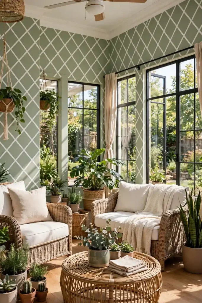
BEFORE: The sunroom feels flat and undefined, with plain walls that do nothing for the plants and wicker furniture. The space lacks structure and feels like an afterthought. AFTER: Crisp trellis lines give the walls garden structure, and the room feels like an elegant conservatory. The lattice pattern frames the plants beautifully and the space finally has purpose.
Trellis patterns bring order and garden charm to sunrooms, porches, and garden-facing rooms. The geometric lattice reads as both classic and fresh, pairing well with wicker, rattan, and lots of greenery. Choose white on soft green for the most garden-like effect, or navy on white for a crisper look. Keep furniture simple so the trellis lines stay the star of the space.
Polka Dot Cheer
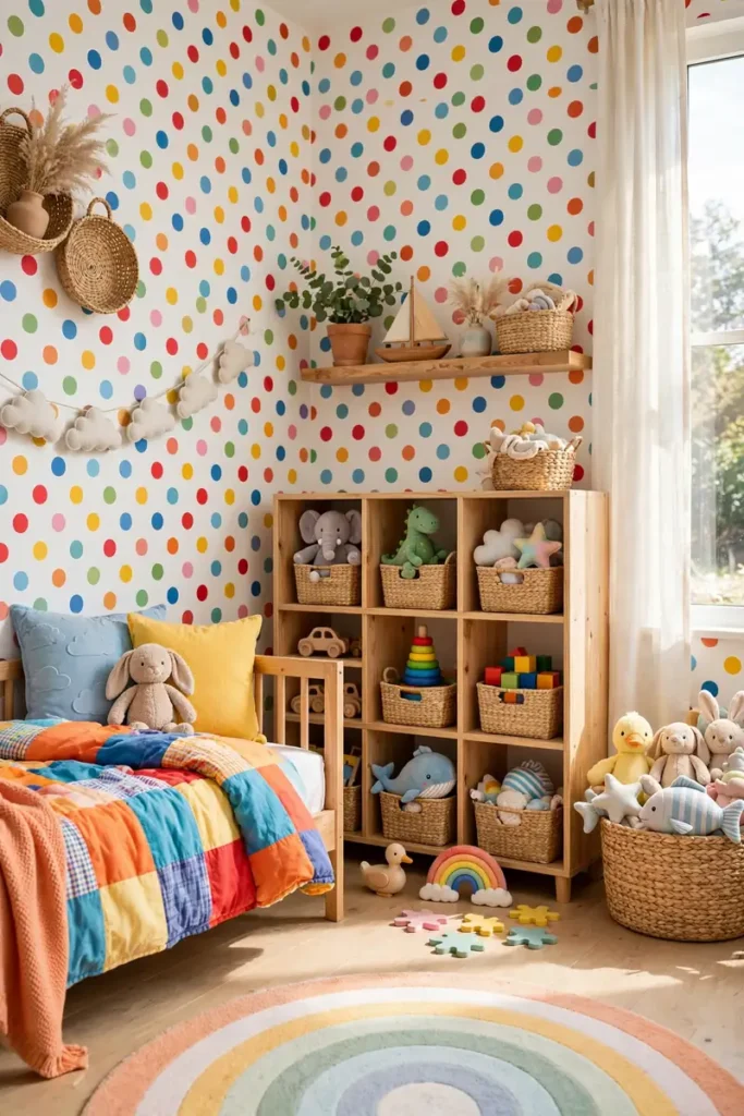
- Pick a dot size that suits the room: large dots for playrooms, small dots for nurseries.
- Choose multicolor dots for maximum joy, or two-tone dots for a calmer feel.
- Start from the top center so the dot grid stays balanced on both sides.
- Use a level for the first row; dots reveal crooked lines immediately.
Polka dots are pure happiness on a wall. The cheerful pattern suits kids’ rooms, playrooms, and craft spaces where joy is the whole point. That’s why many experts recommend dots for rooms that should feel fun rather than formal. Multicolor dots on white create the most energetic effect, while navy dots on white feel preppy and classic. This is the pattern for anyone who believes rooms should make you smile.
Houndstooth Tailored Look
| Feature | Classic Black White | Colored Houndstooth |
|---|---|---|
| Mood | Sharp, formal, timeless | Playful, modern, fresh |
| Best rooms | Offices, libraries | Bedrooms, powder rooms |
| Pairing | Leather, dark wood, brass | White, pastels, light wood |
| Scale | Small for sophistication | Large for fun |
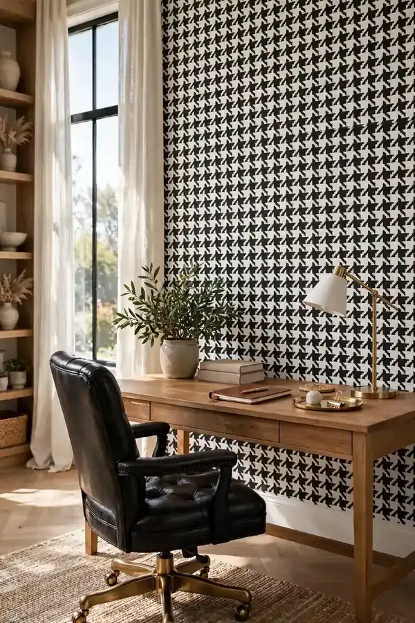
Houndstooth wallpaper dresses your walls in tailored menswear. The broken check pattern brings instant sophistication to home offices and libraries, signaling taste and tradition. Classic black and white is the safest choice, reading as elegant in any light. For a modern twist, try houndstooth in unexpected colors like blush or sage. Keep the scale small for the most refined effect, and pair with leather and dark wood.
Ogee Curve Elegance
DO:
- Choose metallic ogee on neutral grounds for understated luxury.
- Use it in living rooms and master bedrooms where elegance matters.
- Pair with velvet, marble, and mirrored surfaces for full glamour.
DON’T:
- Mix ogee with other curved patterns that create visual confusion.
- Use large-scale ogee in tiny rooms where it overwhelms.
- Forget lighting; metallic ogee needs light to show its shimmer.
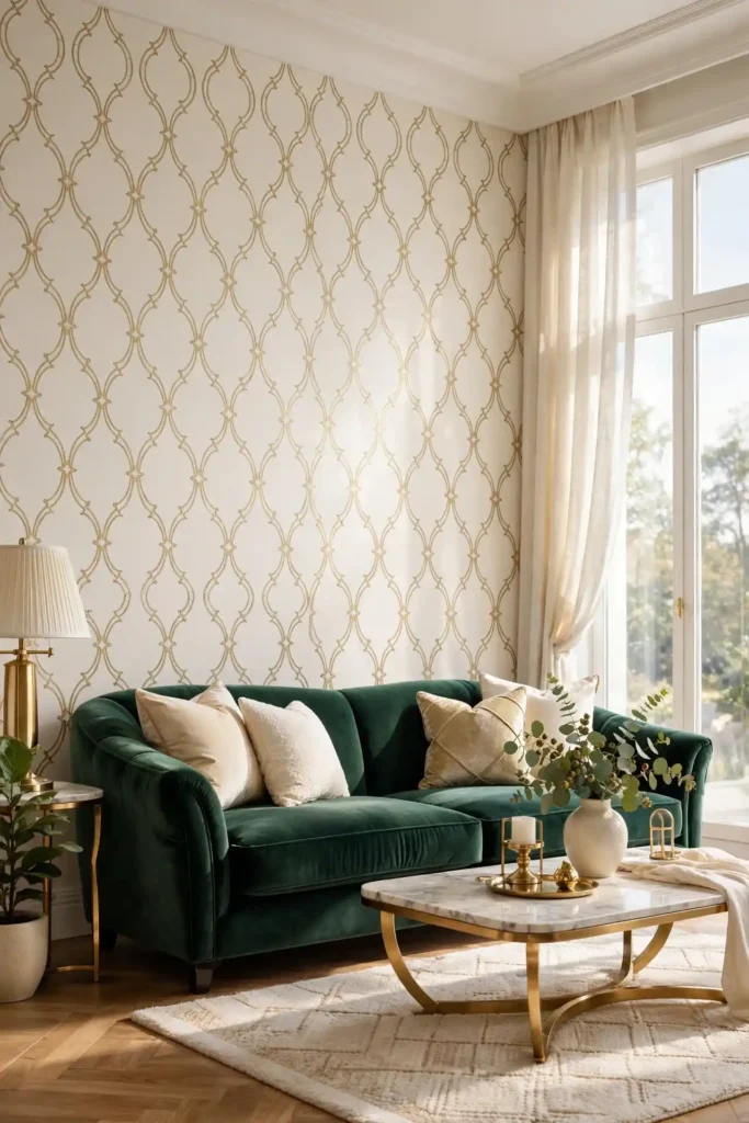
Ogee curves bring graceful movement to walls, with their flowing onion-dome lattice. The pattern feels both Moroccan and modern, which is why it suits so many styles. I’ve seen this work well in living rooms where homeowners want elegance without formality. Choose gold on cream for warmth, or silver on gray for a cooler look. The curves soften angular furniture and make rooms feel more inviting.
Animal Print Boldness
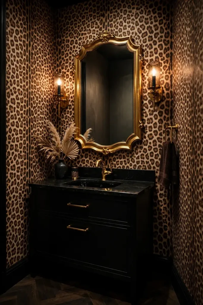
Cost: Low, similar to other printed wallpapers. Time: One afternoon for a powder room. Skill Level: Beginner. Best For: Powder rooms, closets, and anyone with fierce style.
Animal print wallpaper is the fashionista’s choice for walls. Leopard, zebra, and tiger patterns bring wild energy to small spaces where boldness feels intentional. Powder rooms are the ideal canvas since their tiny size makes the print feel like a jewel box rather than a jungle. Pair with black fixtures and gold accents for maximum glamour. This is the pattern for anyone who treats their home like a wardrobe: with daring and delight.
Plaid Cozy Layers
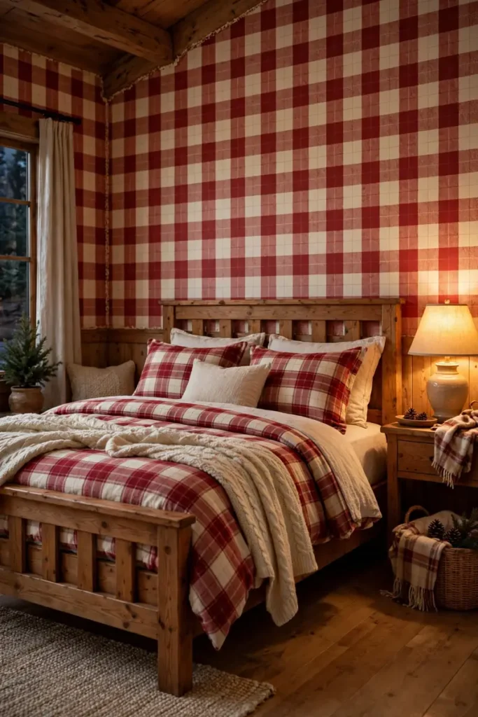
Plaid wallpaper wraps rooms in cabin coziness without a single log. The familiar check pattern in warm reds, greens, or neutrals makes bedrooms feel snug and inviting, especially in fall and winter. It pairs naturally with wood furniture, flannel bedding, and chunky knit throws. Choose a large-scale plaid for modern rustic style, or a small check for traditional charm.
In my experience, plaid works best in rooms meant for rest and relaxation. The pattern’s regularity feels orderly and calming, like a well-made bed. I recommend it for bedrooms, reading nooks, and home offices where you want warmth. Keep the color palette to two or three tones so the plaid reads as cozy rather than busy. This is the pattern for anyone who loves sweater weather indoors.
Feather Soft Plumes
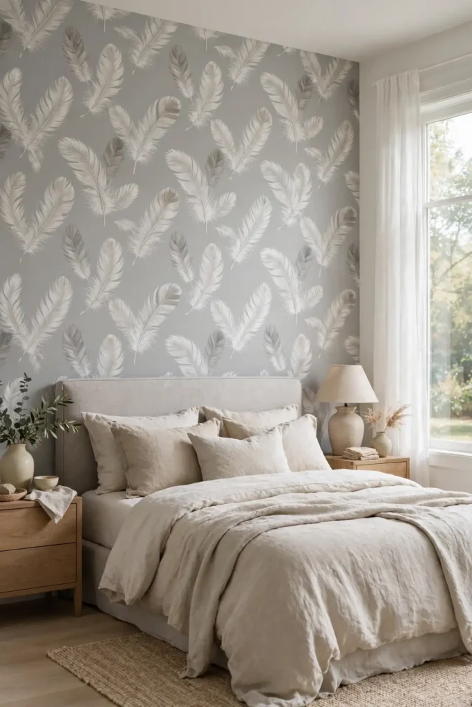
- Choose white feathers on soft gray or blush for the most calming effect.
- Use feather patterns in bedrooms where lightness and rest matter most.
- Pair with linen bedding and sheer curtains to enhance the airy feel.
- Keep the scale delicate; oversized feathers lose their grace.
- Add a plush rug to ground the ethereal walls with softness underfoot.
Feather wallpaper floats across walls like a gentle breeze. The delicate plumes in soft whites and grays create the most tranquil pattern on this list, perfect for bedrooms and meditation spaces. I’ve noticed feather patterns help light sleepers relax, since the soft imagery suggests calm. Keep everything else soft and light to maintain the cloud-like mood.
Honeycomb Geo Buzz
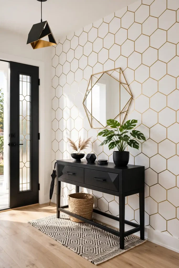
Quick Tip: Honeycomb hexagons align easily at the seams because the geometric grid is forgiving. Start from the center and work outward, and the pattern practically places itself.
Honeycomb wallpaper brings nature’s perfect geometry indoors. The hexagonal pattern feels modern and energetic, making it ideal for entryways, home offices, and kids’ rooms. Gold outlines on white create a chic contemporary look, while colorful honeycombs feel playful. The pattern’s regularity makes small spaces feel organized and intentional.
Because hexagons tile perfectly, this is one of the most forgiving geometrics for DIY hanging. I recommend it for first-time wallpaper users who want a graphic look without stress. Pair it with simple modern furniture and let the geometry provide the visual interest. Add a round mirror to echo the shapes.
Floral Chintz Charm

BEFORE: The bedroom feels sparse and cold, with empty walls that offer no warmth or character. It could be anyone’s room, with nothing personal or inviting about it. AFTER: Abundant chintz florals bloom across the walls, and the room feels like an English garden indoors. The generous roses and peonies bring romance and warmth that plain walls never could.
Chintz is florals at their most abundant and joyful. The all-over rose and peony patterns in pinks, corals, and creams create the ultimate romantic bedroom. For more wall inspiration, see my living room gallery wall ideas. I recommend chintz for anyone who loves the grandmillennial style. Keep furniture white or cream so the blooms stay the focus, and add vintage brass details for charm.
Striped Ticking Classic
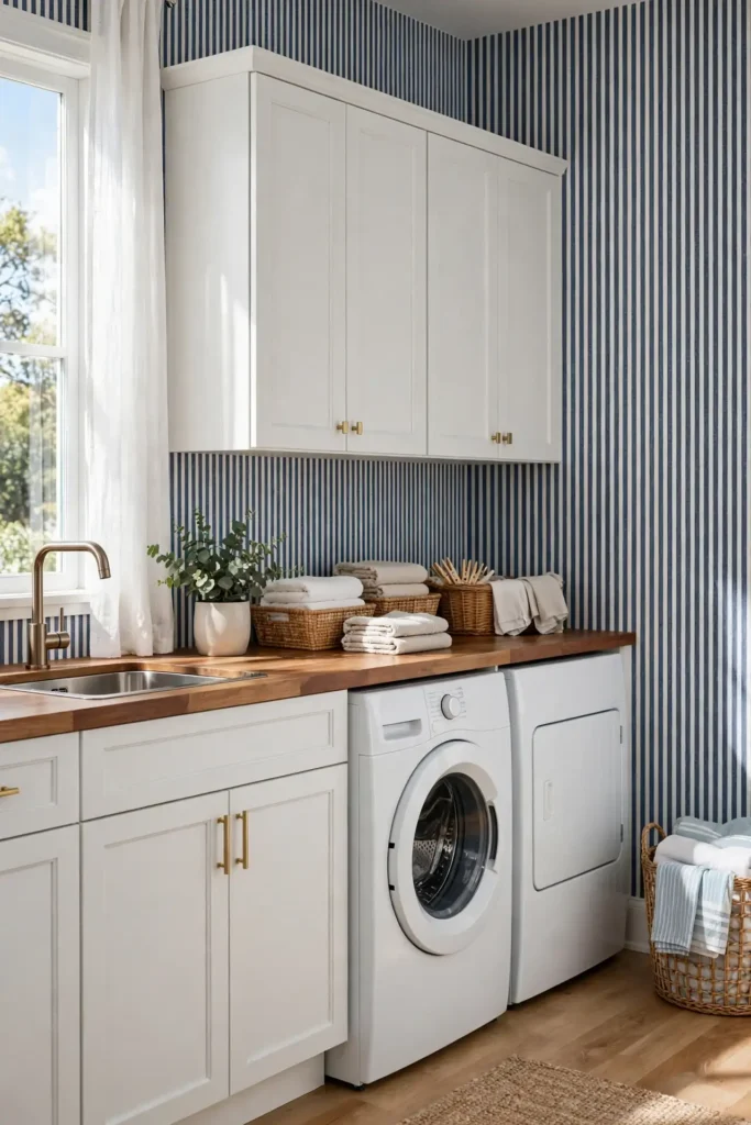
- Choose classic blue and white ticking for the most timeless look.
- Hang stripes vertically to lift the ceiling in small utility rooms.
- Match the stripe color to your cabinetry for a cohesive feel.
- Keep decor minimal; ticking stripes provide all the pattern you need.
Ticking stripes are the workhorse of classic patterns, borrowed from vintage mattress fabric. The simple pinstripes in blue, red, or black on white bring crisp order to laundry rooms, mudrooms, and kids’ rooms. That’s why many experts recommend ticking for hardworking spaces that still deserve style. The pattern hides scuffs well and never looks dated. This is the pattern for anyone who loves timeless utility with a preppy twist.
Cloud Dream Softness
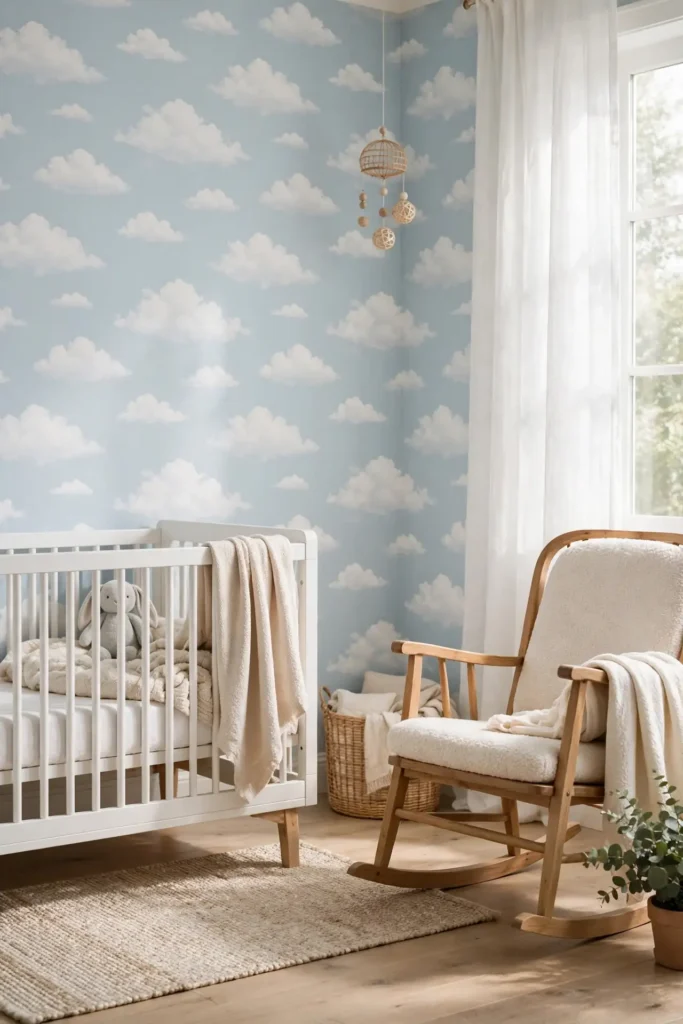
| Feature | Cloud Pattern | Star Pattern |
|---|---|---|
| Mood | Calm, dreamy, soft | Magical, exciting, bright |
| Best rooms | Nurseries, bedrooms | Kids’ rooms, playrooms |
| Colors | White on pale blue | Gold on navy |
| Longevity | Grows with the child | Best for younger kids |
Cloud wallpaper drifts across nursery walls like a gentle sky. The soft white clouds on pale blue create the calmest pattern for babies and young children, promoting restful sleep. Unlike character prints that kids outgrow, clouds age gracefully into the teen years. I recommend it for nurseries where peace matters most. The dreamy pattern pairs with any crib and grows with your child beautifully.
Lattice Crisp Geometry
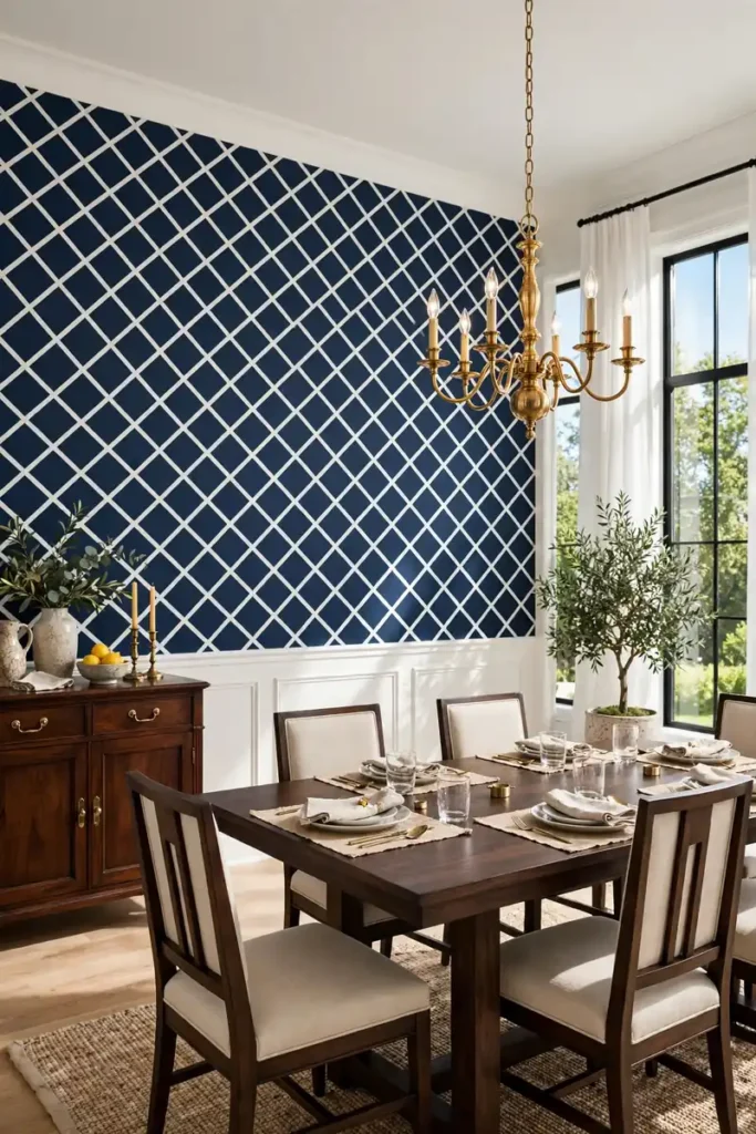
DO:
- Choose high-contrast lattice like white on navy for maximum impact.
- Use it in dining rooms and entryways where structure impresses.
- Pair with dark wood and brass for a rich traditional look.
DON’T:
- Combine lattice with other geometrics that compete for attention.
- Use low-contrast lattice that reads as texture rather than pattern.
- Hang it crooked; geometric grids expose every mistake.
Lattice wallpaper brings crisp architectural order to walls. The repeating geometric grid feels both classic and contemporary, which is why designers return to it constantly. I’ve seen this work well in dining rooms where the structured pattern makes gatherings feel more formal. Choose bold contrast for drama, or tone-on-tone for subtle texture. The grid’s precision signals intention and care in every room it touches.
Palm Beach Preppy
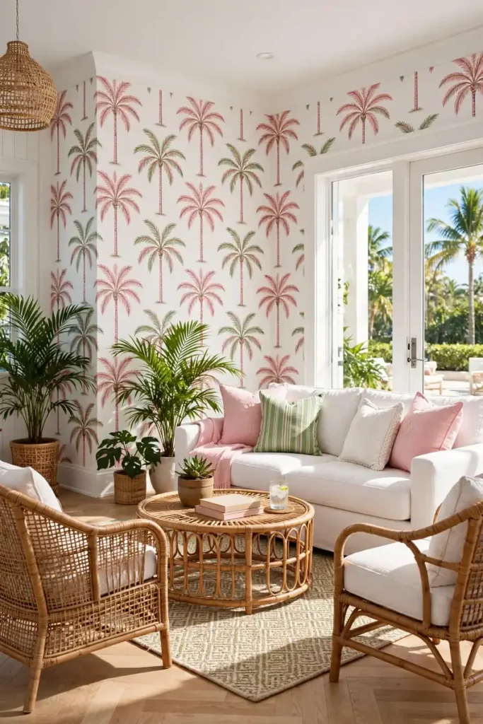
Cost: Low to medium. Time: Half a day per wall. Skill Level: Beginner. Best For: Living rooms, sunrooms, and anyone who loves resort style.
Palm Beach preppy wallpaper is Lilly Pulitzer for your walls. The pink and green palms, pineapples, and chinoiserie monkeys bring resort cheer to living rooms and sunrooms. This pattern refuses to take itself seriously, which is exactly its charm. Pair it with white furniture, rattan, and bright art for the full Palm Beach effect. This is the pattern for anyone whose ideal day involves sunshine, a good book, zero worries, and a tall glass of something cold.
Starburst Retro Pop
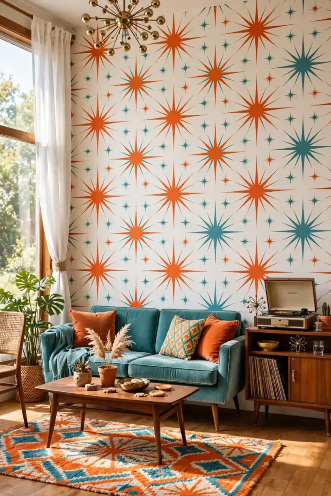
Starburst wallpaper channels the atomic age with its energetic exploding stars. The retro pattern in oranges, teals, and mustard yellows brings mid-century modern fun to living rooms and home bars. It pairs perfectly with vintage furniture, record players, and bold art. Choose a colorful starburst for maximum retro joy, or a metallic version for a more refined take.
In my experience, starburst works best as a single accent wall rather than a full room. The energetic pattern can overwhelm in large doses, but as a feature wall it delights. I recommend it for anyone who loves mid-century style and wants their walls to join the party. Keep the rest of the decor simple and let the starbursts pop. This is the pattern for retro souls with a sense of humor.
Vine Trail Botanicals
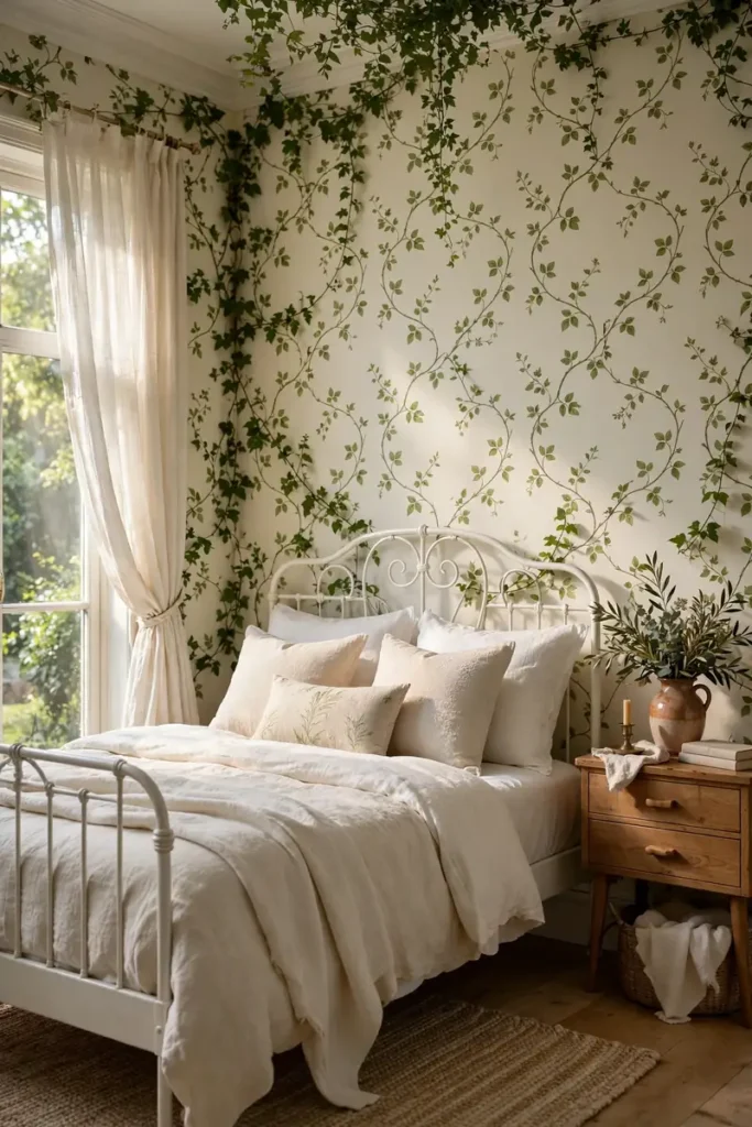
- Choose trailing vines in soft greens for a natural garden bower effect.
- Use vine patterns in bedrooms where their organic lines promote rest.
- Pair with white bedding and wood furniture for a fresh botanical look.
- Let vines climb the full wall height for the most immersive effect.
Vine trail wallpaper lets a garden climb your walls. The organic trailing lines in soft greens create a natural bower effect that feels both romantic and calming. That’s why many experts recommend botanical trails for bedrooms, where their gentle curves ease the mind. The pattern’s vertical movement also lifts low ceilings beautifully. This is the pattern for anyone who wants to sleep in a garden without the watering can.
Gingham Fresh Checks
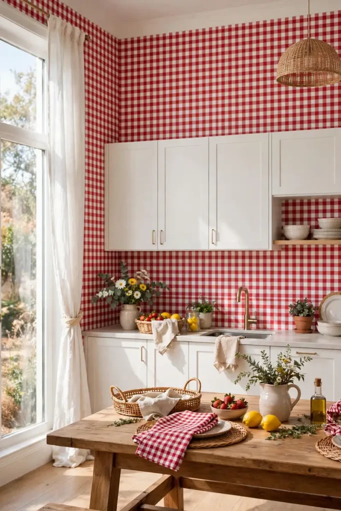
Quick Tip: Gingham checks align easily because the grid is perfectly regular. Match the checks at the seams carefully, and the pattern will look like crisp picnic cloth across the whole wall.
Gingham wallpaper brings picnic happiness indoors. The fresh checks in red, blue, or green on white create instant country charm in kitchens and breakfast nooks. This pattern loves simple white cabinetry and wood tables, creating kitchens where everyone gathers. The cheerful grid feels nostalgic and current at once.
Because the check grid is so regular, gingham is wonderfully forgiving for DIY installers. I recommend it for kitchens where you want pattern without fuss. Keep the scale medium so checks read clearly from across the room. Pair with solid dishware and simple linens for the happiest kitchen.
Medallion Focal Points
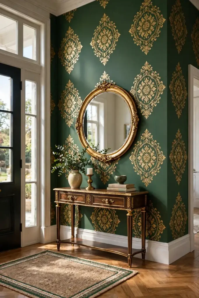
BEFORE: The entryway feels empty and unimportant, with bare walls that give no hint of the home’s style. Guests walk through without noticing anything. AFTER: Grand medallions command attention from the front door, and the entryway feels stately and welcoming. The ornate pattern sets an elegant tone for the entire home.
Medallion wallpaper makes a grand first impression. The large ornate motifs in metallic gold on deep jewel tones turn entryways and formal living rooms into stately spaces. I recommend medallions for anyone who wants their home to feel established and elegant. Keep furniture classic and refined to match the wallpaper’s formality. This is the pattern for homes with presence and poise.
Abstract Brush Strokes
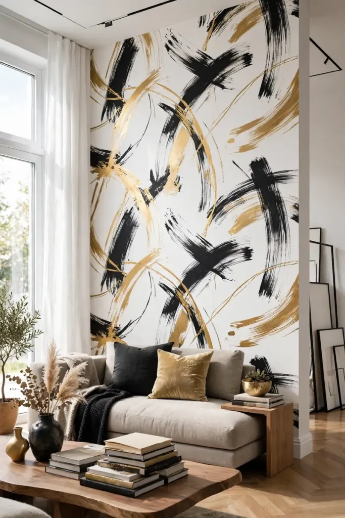
- Choose brush strokes in colors pulled from your existing art and decor.
- Hang the mural-style pattern as one continuous scene across the wall.
- Keep furniture low and minimal so the artistic strokes stay visible.
- Light the wall evenly so the painterly texture shows beautifully.
Abstract brush strokes turn your wall into a canvas. The painterly marks in bold blacks, golds, and earth tones bring gallery energy to living rooms and creative spaces. I’ve seen this work well in homes where the owners love art but want something larger than framed prints. The expressive strokes add movement and emotion that geometric patterns cannot match. This is the pattern for anyone who wants their walls to feel like original art.
Conclusion
These peel stick wallpaper patterns prove that the right pattern changes everything about a room. Start with the pattern that makes your heart beat faster, order samples, and test them in your light. I’ve seen how small changes like these can completely shift the way a space feels. Save your favorites on Pinterest, try one accent wall this weekend, and share your results. Pick up a smoothing tool, take your time with the first panel, and enjoy the transformation. Before you know it, your room will feel brand new. Your walls deserve personality; give them a pattern that tells your story.
One Comment