24 Gallery Wall Layout Ideas for Beginners to Try With Confidence
Starting a gallery wall can feel overwhelming, but gallery wall layout ideas for beginners make the process simple and fun. You do not need an art degree or a big budget to create a display that feels personal and polished. If you love reflective accents, explore these large mirror ideas for entryways for extra inspiration. The secret is planning your arrangement before you pick up a hammer.
In my experience, the best beginner walls start small and grow over time. I have seen how a simple grid of four frames can change a blank hallway, and how mixing in personal photos makes a rental feel like home. This guide walks you through 24 approachable layouts, each with a clear plan you can follow today. Pick the one that fits your space and style, then gather your frames.
Classic Grid Formation
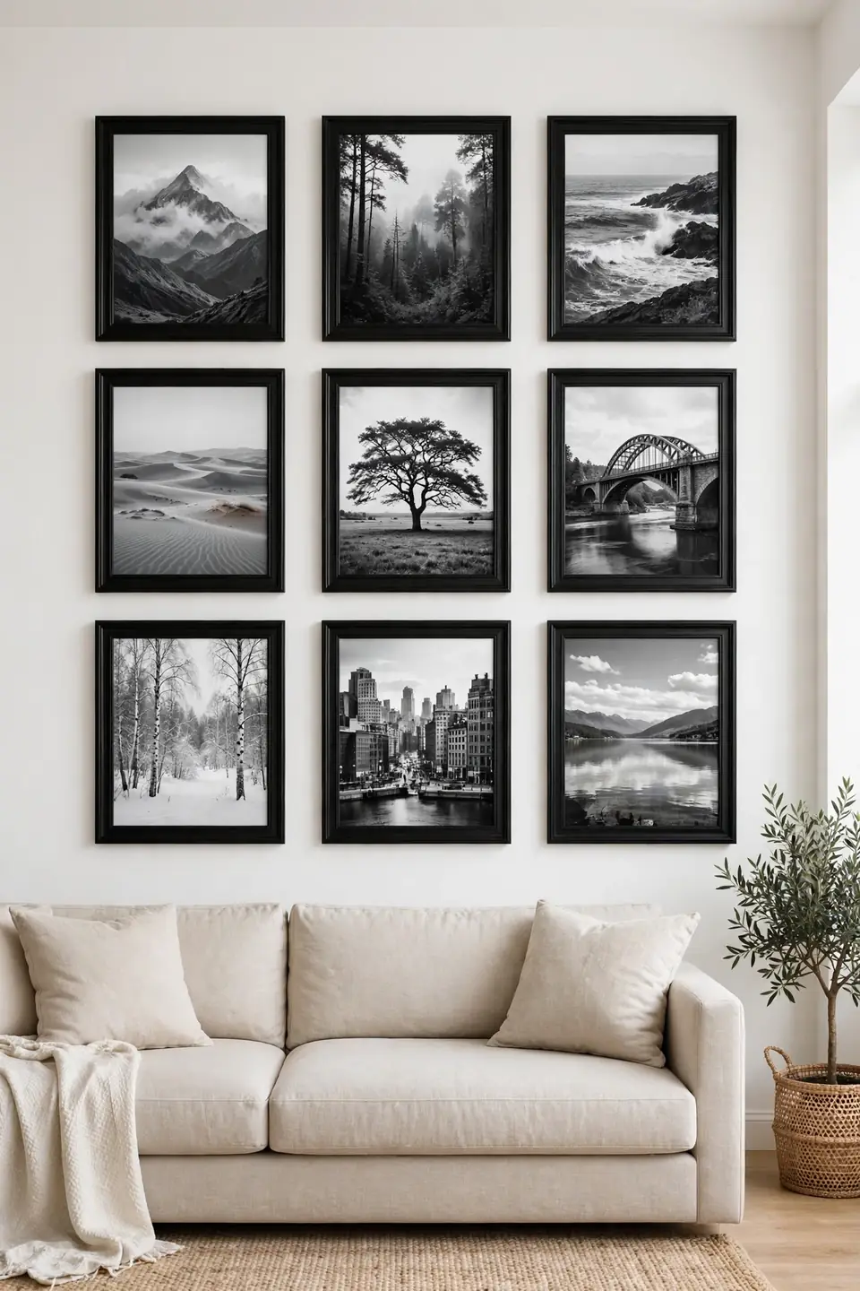
A grid never fails. Matching frames in straight rows remove all the guesswork for beginners. Measure equal spacing between each frame, usually two to three inches, and use a level for crisp lines that look professionally installed. Mark nail positions with painter’s tape first so you can adjust the layout without extra holes. This saves patching later.
Choose prints with a common theme, like black and white family photos, to keep the grid feeling intentional rather than random. I have seen this work well in dining rooms and home offices where a tidy look matters. For extra polish, use identical mats in every frame and keep the outer edges perfectly aligned. That crisp border is what makes a simple grid look expensive.
Eclectic Salon Mix
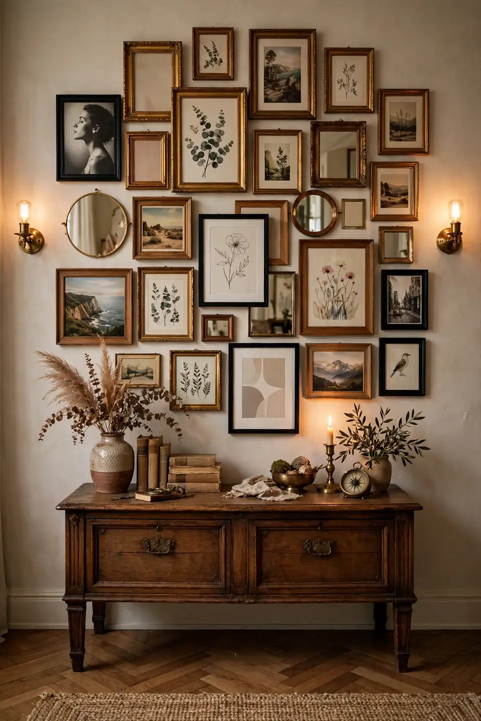
- Start with your largest piece slightly off center as the anchor.
- Fill outward with medium frames, keeping two inches between each.
- Tuck small pieces into gaps for a collected, organic feel.
- Mix frame finishes but repeat each one at least twice.
- Step back often to check balance as you build.
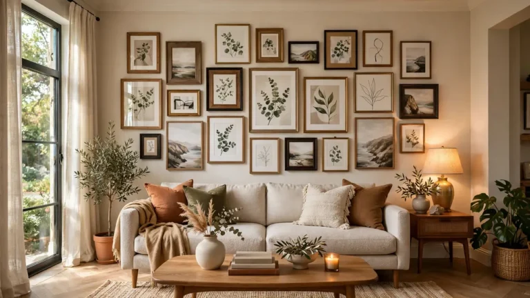
The salon style forgives mistakes beautifully. With no rigid pattern, you can add pieces over months without disrupting the look. Start with what you own, then hunt for complementary finds at thrift stores and flea markets. That is why many experts recommend it for collectors who love flea market art. Keep a unifying thread, like a shared color or subject, so the mix feels intentional instead of chaotic.
Floating Ledge Display
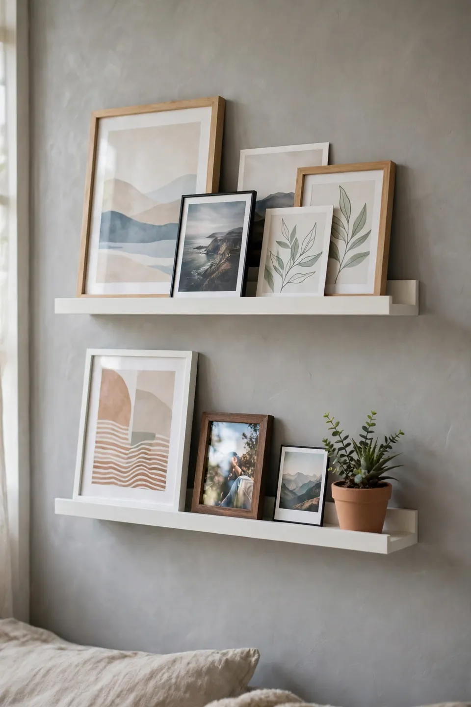
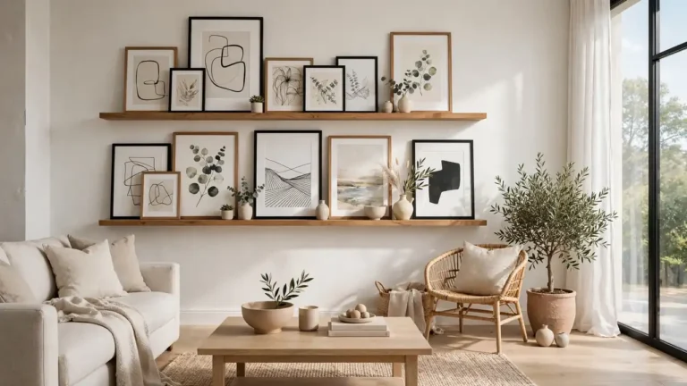
Quick Tip: Ledges are the most forgiving option for renters. You can rearrange frames in seconds without new nail holes, and the layered look hides uneven spacing. Choose ledges at least 36 inches wide for a substantial display, and secure them into wall studs so they hold heavier frames safely.
Layer larger frames at the back and smaller ones in front for depth. This method works beautifully above desks and dressers where you might want to swap art seasonally. Keep the color palette tight so the casual arrangement still feels cohesive. I have noticed that mixing one small plant or candle among the frames keeps the ledge from looking like a storage shelf. Dust the ledges monthly since horizontal surfaces collect it fast.
Symmetrical Pairings
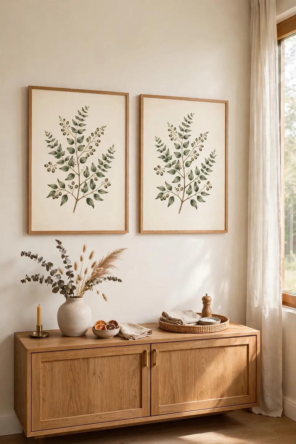
BEFORE: A single small frame looked lost on the wide dining room wall, and the space felt unfinished despite nice furniture. The wall needed presence but not clutter.
AFTER: Two matching large prints now anchor the wall with quiet confidence. The symmetry feels calm and intentional, and the room finally looks complete. Guests notice the difference immediately.
Pairs work when you want impact without complexity. Hang them at eye level with three inches between, and let the simplicity speak. This is perfect for narrow walls where a full gallery would overwhelm. Choose art with a shared mood, like two serene landscapes, so the pair reads as one thoughtful statement instead of two random pieces.
Staircase Ascending Flow
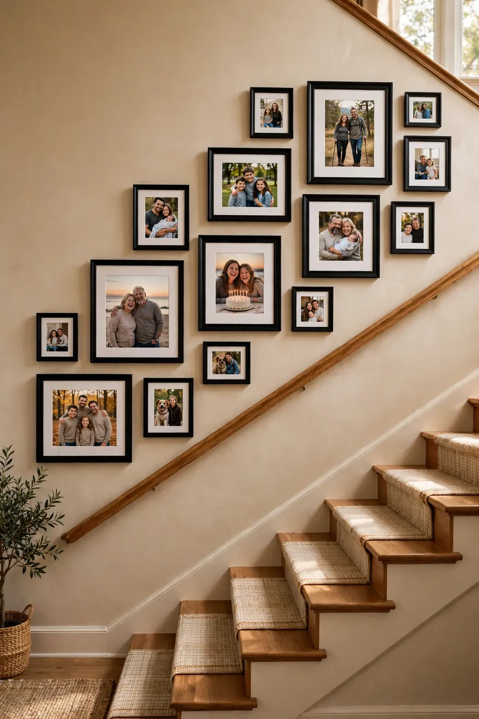
- Measure the stair angle and mark a parallel line on the wall with painter’s tape.
- Hang the first frame at the bottom step, centered at 57 inches from that step.
- Place each next frame higher, following the tape line upward.
- Keep bottom edges aligned to the stair slope for a smooth visual climb.
Staircase walls intimidate beginners, but the slope guides your layout. Follow the angle and let frames climb naturally, keeping the spacing consistent as you rise. Black and white photos look striking against the diagonal movement. I have seen this work well when every frame shares the same mat width, which keeps the climb feeling orderly. Leave the tape up until every piece hangs so you can fine tune the rhythm.
Cozy Corner Wrap
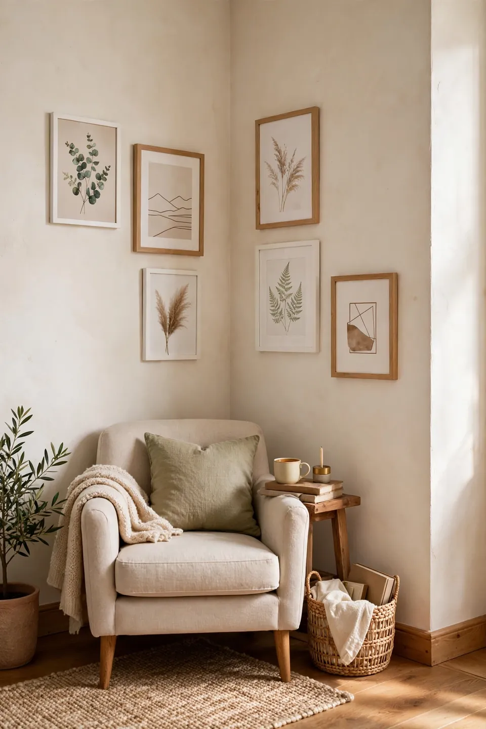
| Corner Approach | Flat Wall Approach |
|---|---|
| Uses awkward corners beautifully | Simpler to measure and hang |
| Feels intimate and enveloping | Feels open and airy |
| Great for reading nooks | Great for large art pieces |
Corners often go unused, yet they make magical gallery spots. Start your arrangement on one wall and let it turn the corner naturally, keeping the spacing even across the bend. Keep frames small so the wrap feels cozy rather than crowded. In my experience, mixing a few tiny art prints with family photos makes the corner feel personal and lived in. Add a small chair or floor cushion below to turn the spot into a reading nook you will actually use.
Bold Oversized Anchor
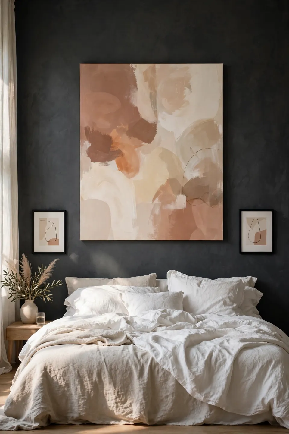
DO:
- Choose an anchor piece at least 36 inches wide for real presence.
- Center it at eye level, about 57 inches from the floor.
- Flank it with smaller pieces for balance.
DON’T:
- Hang the anchor too high where it disconnects from furniture.
- Choose competing bold pieces that fight for attention.
- Crowd the anchor with too many small frames.
One large piece does the heavy lifting. A single decision creates instant impact for beginners, and you avoid the measuring marathon of a multi frame wall. Let the anchor shine and keep surrounding pieces quiet. I have noticed thrift stores often hide oversized canvases for very little money, so check there before buying new. If the anchor feels too stark alone, add a slim picture light above it for a gallery finish.
Mixed Frame Textures
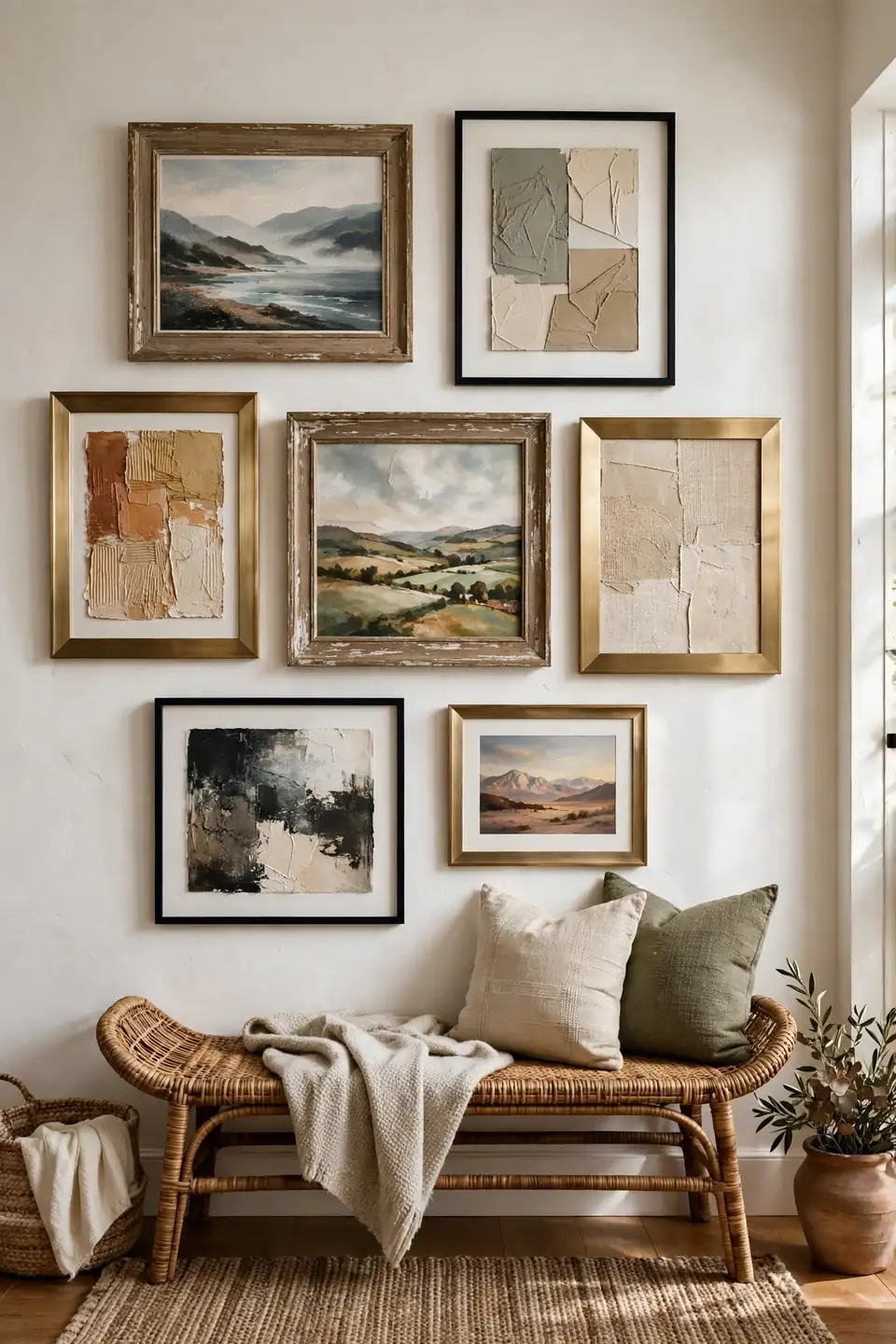
Cost: Low to medium | Time: One weekend | Skill Level: Beginner | Best For: Entryways and living rooms
Texture mixing adds richness without color chaos. Stick to two or three frame materials and repeat each one for rhythm, spacing the repeats evenly so no single texture clusters in one spot. In my experience, wood plus black metal plus one metallic creates a warm, modern mix that suits almost any decor style beautifully. Keep the art inside simple so the frames provide the interest. Dust textured frames with a soft brush regularly since grooves trap dust faster than smooth finishes do.
Monochrome Photo Story
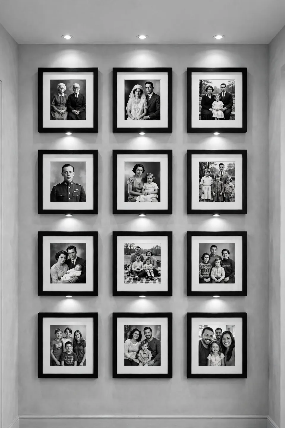
Black and white unifies everything. When your photos span different eras and lighting conditions, converting them to monochrome creates instant cohesion. Print them in identical sizes with white mats for a gallery quality look that feels timeless.
This approach shines in hallways where people walk past slowly. Arrange photos chronologically to tell your family story, or group by theme like vacations or celebrations. The consistent palette keeps even a large collection feeling calm and unified. Leave one empty frame in the grid for future memories, which turns the wall into a growing project. I have seen families update theirs every year, and the ritual becomes part of their story too.
Warm Color Palette
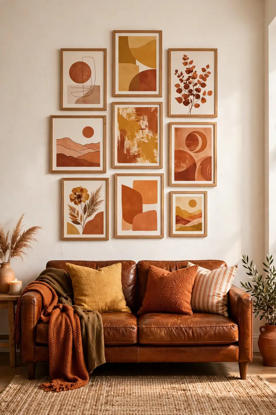
- Pick three warm tones and repeat them across all artwork.
- Use natural wood frames to enhance the cozy feeling.
- Include one deeper shade for contrast and grounding.
- Keep wall color neutral so the art provides the warmth.
Color discipline makes beginner walls look professional. When every piece shares warm undertones, the arrangement feels intentional even with varied subjects. This palette brings instant comfort to living rooms and bedrooms alike. Pull your three tones from one inspiration piece, like a favorite rug or throw pillow, so the wall ties into the room. I have noticed that warm galleries glow beautifully in evening lamplight, which makes them perfect above sofas where families gather at night.
Petite Cluster Charm
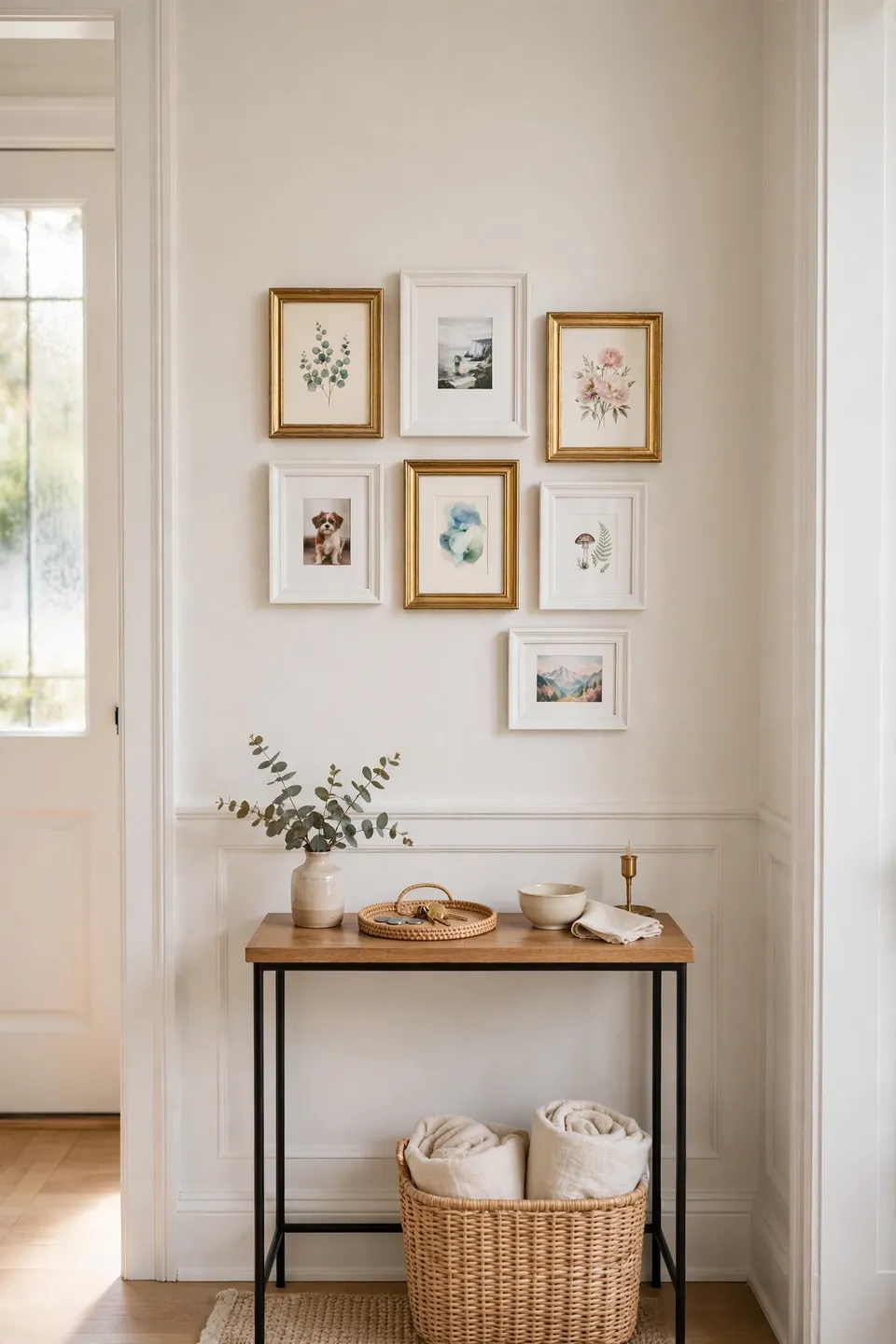
Quick Tip: Small walls need small arrangements. Keep your cluster within a 24 inch square and use frames no larger than 8 by 10. Trace each frame on paper, tape the shapes to the wall, and adjust until the cluster feels balanced.
Tiny galleries suit powder rooms, narrow hallways, and kitchen corners. The intimate scale draws people closer, creating a moment of discovery. Choose detailed art that rewards a closer look, like mini landscapes or intricate patterns. Keep the outer shape roughly square or circular so the cluster reads as one intentional grouping. I have seen tiny galleries steal the show at parties because guests lean in to study every little frame.
Sofa Centered Arrangement
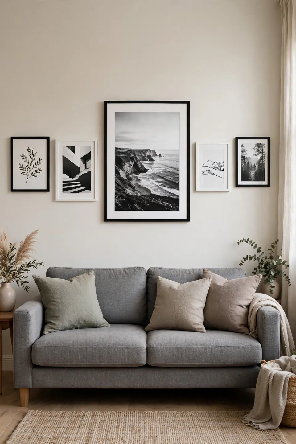
BEFORE: The sofa floated against a bare wall, and the living room felt incomplete despite comfortable seating. Something above the furniture was clearly missing.
AFTER: A centered arrangement now anchors the seating area perfectly. The wall feels finished, and the room has a clear focal point that ties everything together.
Center your gallery on the sofa, not the wall. Span two thirds of the sofa width and hang the bottom edge six to eight inches above cushions. This grounds the furniture and completes the room. If your sofa sits off center on the wall, follow the sofa anyway, since the furniture relationship matters more than wall symmetry. Step back to the room entrance to confirm the balance before driving the final nails.
Hallway Journey Wall
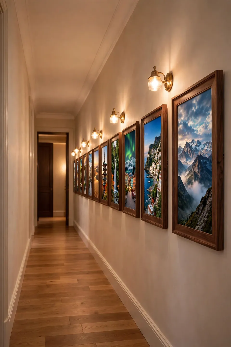
- Mark a level line at 57 inches along the entire hallway wall.
- Space frames evenly, leaving four to six inches between each.
- Hang the first frame, then use a spacer to position the rest.
- Keep all frames identical for a clean, museum-like rhythm.
Hallways beg for linear galleries. A single row at consistent height turns a pass through space into a destination. Travel photos work wonderfully here, letting guests journey with you as they walk toward the bedrooms. Keep lighting in mind, since hallways run dark, and add picture lights or sconces if the art disappears in shadow. I have noticed that a hallway gallery makes a narrow space feel wider because the eye travels along the art instead of the walls.
Shadow Box Depth
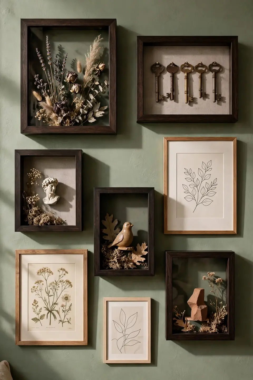
| Shadow Boxes | Flat Frames |
|---|---|
| Add sculptural dimension | Keep walls feeling light |
| Display keepsakes beautifully | Better for large art collections |
| Create intriguing shadows | Easier to dust and maintain |
Depth makes walls come alive. Mix two or three shadow boxes among flat frames for delightful surprise. Display shells from beach trips, heirloom brooches, or tiny plants. The dimension invites touch and closer inspection. Keep the boxes shallow, around two inches deep, so they do not jut awkwardly past neighboring frames. In my experience, grouping the dimensional pieces toward the center creates a focal point that draws the eye inward naturally every time.
Tape Outline Planning
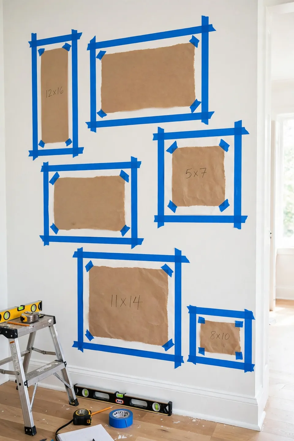
DO:
- Trace every frame on kraft paper and cut out the shapes.
- Tape the templates up and live with them for a day.
- Number the backs of frames to match their template positions.
DON’T:
- Skip the planning step and start hammering immediately.
- Use tape that might peel paint when removed.
- Forget to check how the layout looks from the doorway.
Planning on the wall prevents regret. This method lets you perfect spacing with zero holes. I have seen this save beginners from patching mistakes later. Photograph the taped layout from the doorway and from seating positions, since a wall that looks good up close can feel off from across the room. Adjust the templates until every angle pleases you, then hang with confidence.
Ceramic Plate Accents
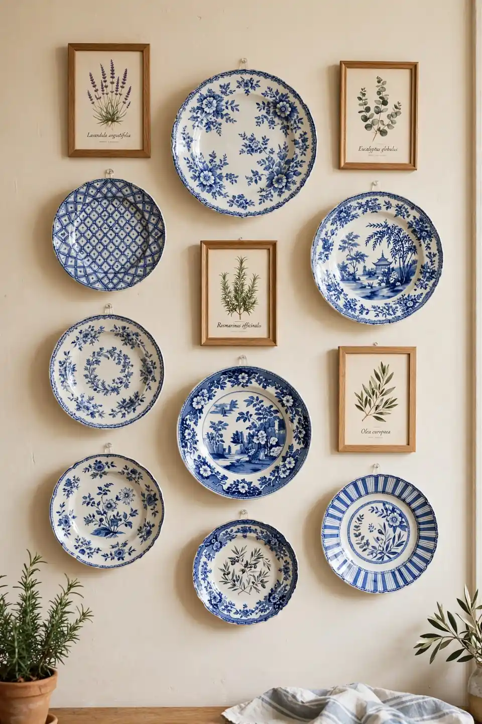
Cost: Low | Time: One afternoon | Skill Level: Beginner | Best For: Kitchens and dining rooms
Plates break the frame monotony beautifully. Secure them with discreet plate hangers and intersperse among prints for a collected, charming look. Stick to one color family, like blue and white, so the mix feels harmonious rather than random and busy. Vary the plate sizes for rhythm, placing the largest near the center for balance. I have noticed that thrifted plates cost very little yet look collected over time, which suits beginners building on a budget. Start with three plates and expand the collection slowly over time.
Botanical Print Series
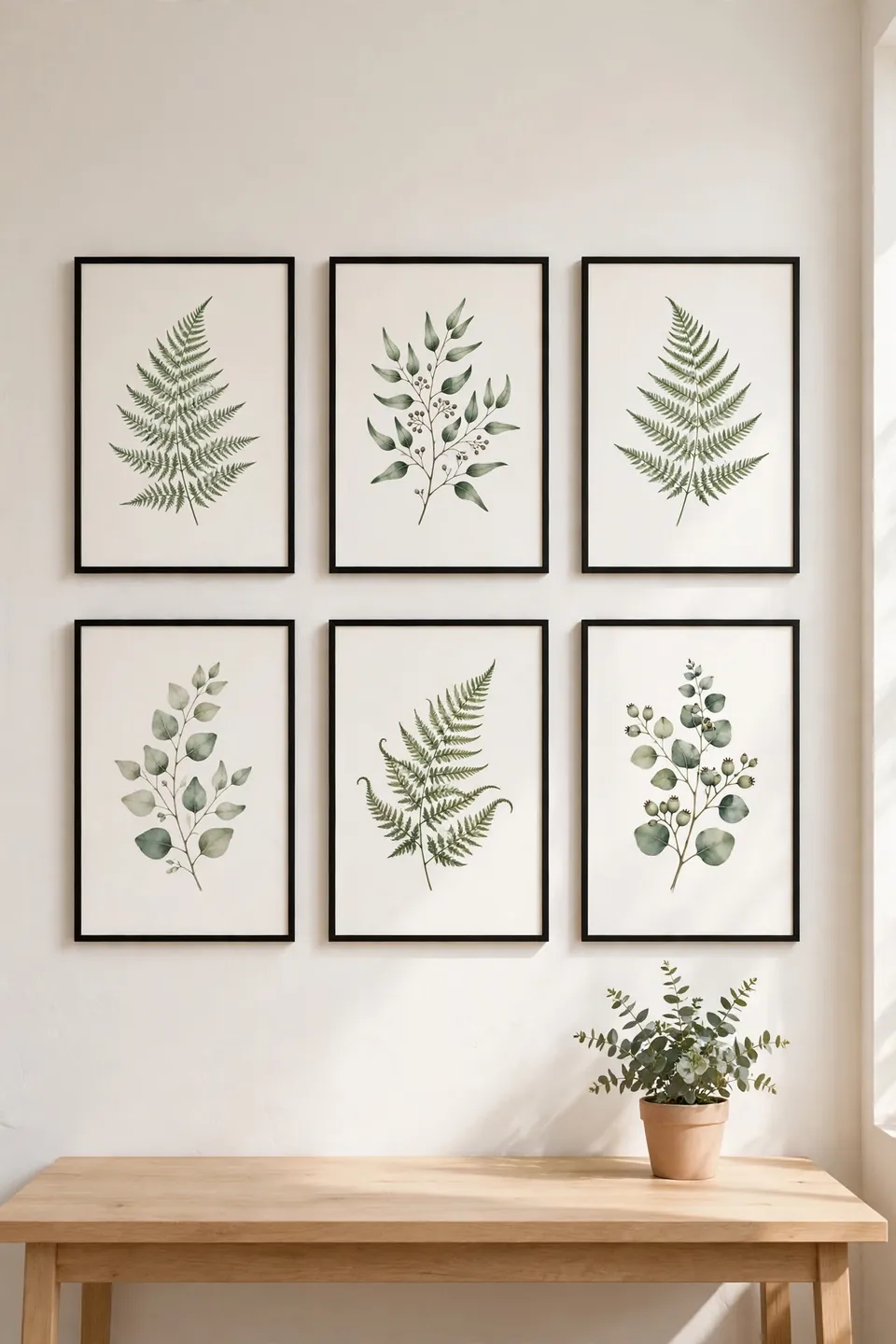
Series bring calm cohesion. When every print shares the same subject and style, the wall feels like a boutique hotel collection. Botanical illustrations suit beginners because they complement almost any color scheme without demanding attention.
Buy prints as a set or create your own by pressing leaves and framing them. Keep mats wide and white for an airy feel. This approach works beautifully in bathrooms and offices where you want beauty without visual noise. Hang them in a strict grid for a botanical study vibe, or stagger them slightly for a relaxed feel. Either way, the shared subject keeps the wall cohesive with almost no effort.
Wanderlust Memory Lane
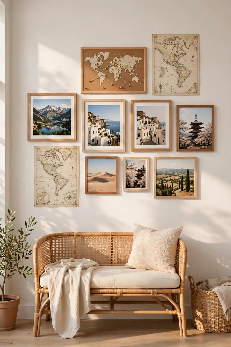
- Print favorite travel photos in consistent sizes for unity.
- Add a small map with pins marking your journeys.
- Include tickets or postcards in small floating frames.
- Mix in one landscape painting from a beloved destination.
Travel walls spark conversation. Guests linger, asking about each destination, and the display becomes a living scrapbook. Let the arrangement grow with every trip, adding new memories to your visual travel diary. Leave breathing room between clusters so future additions fit without crowding. I have seen travelers frame boarding passes and currency too, which adds lovely texture and rich storytelling that photos alone cannot match.
Playful Kids Gallery
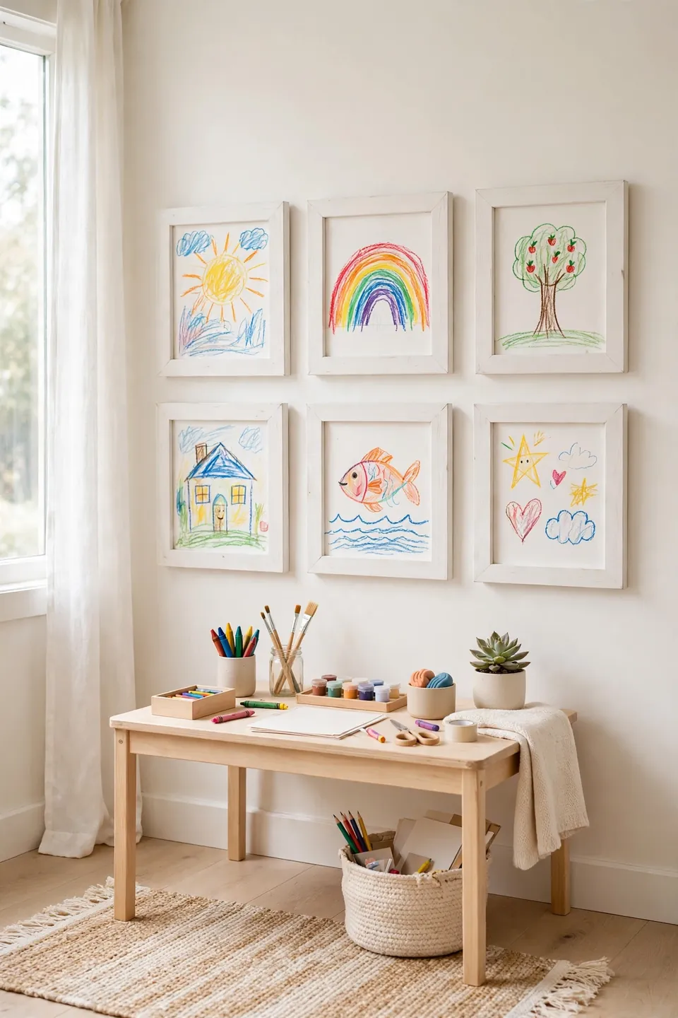
Quick Tip: Hang kids art at their eye level, not yours. Use lightweight frames with acrylic instead of glass for safety. Clip frames or magnetic strips let you rotate new masterpieces weekly without any tools.
Celebrating their creativity builds confidence beautifully. Dedicate one wall to their work and watch their pride grow. I have noticed that children who see their art displayed take more care with future creations. Date the backs of pieces so you remember when each masterpiece was made. Rotate seasonally to keep the wall fresh, storing past favorites in a portfolio box the kids can revisit proudly.
Reflective Mirror Touches
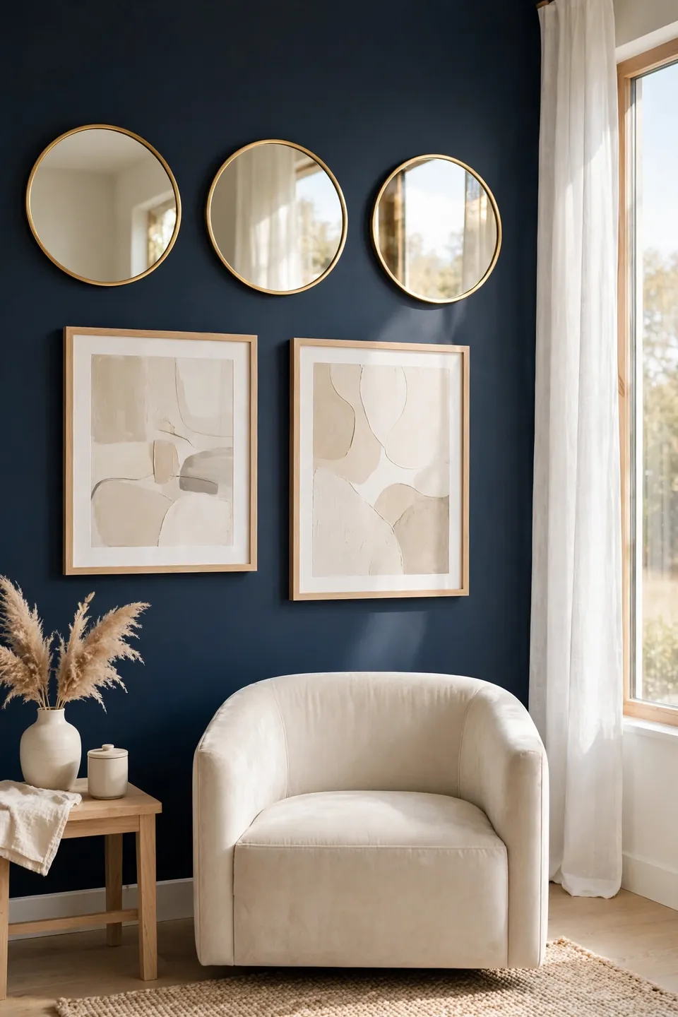
BEFORE: The navy accent wall felt heavy and dark, absorbing light despite beautiful furniture. Art alone was not enough to lift the moody color.
AFTER: Brass mirrors now bounce light around the room, and the wall feels balanced instead of oppressive. The reflection adds life that flat art could not achieve alone.
Mirrors multiply light and space. Tuck two or three small mirrors among your frames, especially on dark walls. For more reflective inspiration, browse picture ledge decor ideas that pair beautifully with mirrored accents. Keep mirror shapes simple, like rounds or arches, so they complement rather than compete with the art. Wipe them monthly since dust dulls the reflective bounce quickly.
Woven Textile Layers
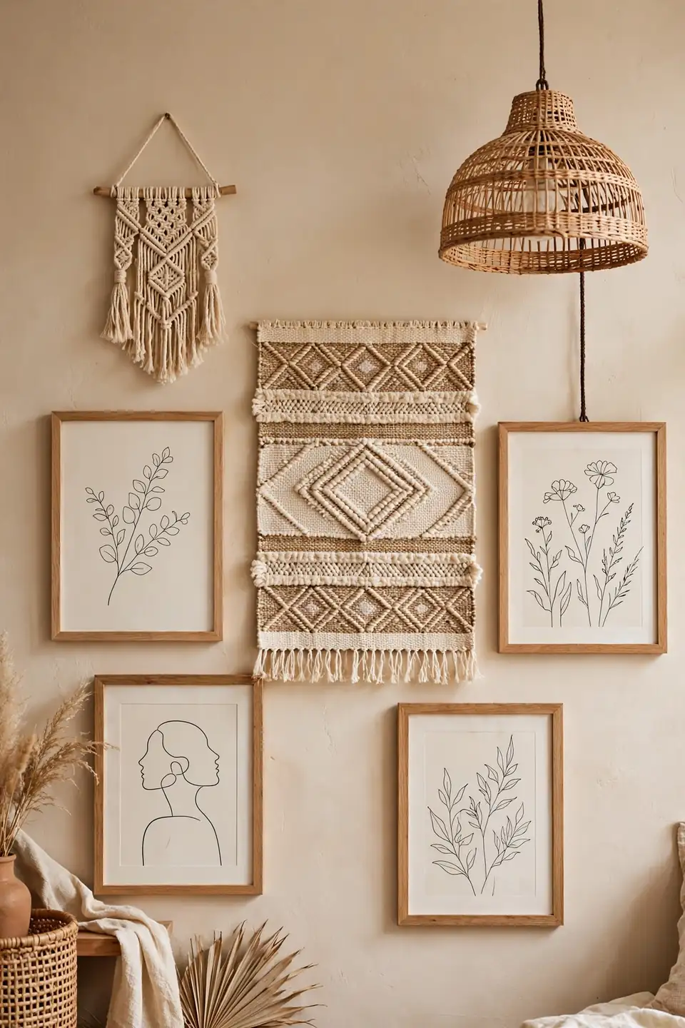
- Hang your textile piece first as the soft focal point.
- Flank it with simple framed prints in natural wood.
- Keep the palette neutral so textures provide the interest.
- Secure textiles flat with hidden clips to prevent curling.
Textiles soften the hard edges of frames. A small weaving or macrame piece adds handmade warmth that prints alone cannot deliver. This works beautifully in bedrooms where you want the wall to feel cozy rather than formal. Choose natural fibers in cream or jute so the textile blends with your palette. I have seen a single weaving transform a stark gallery into an inviting retreat, proving softness matters as much as structure.
Seasonal Art Rotation
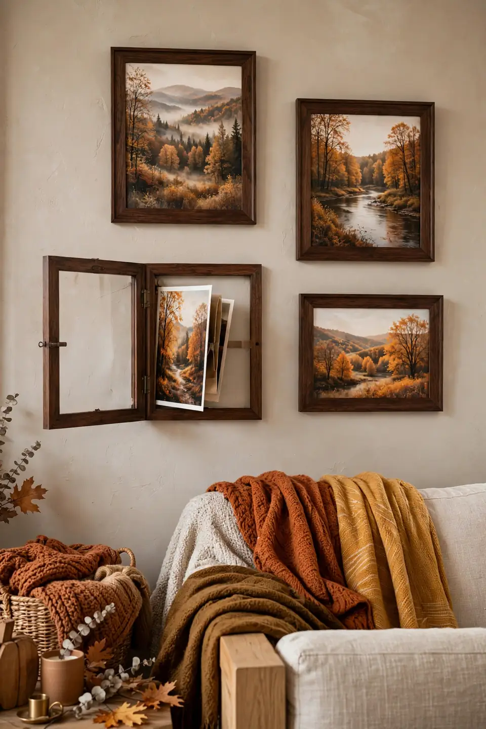
| Fixed Gallery | Rotating Gallery |
|---|---|
| Hang once and forget | Fresh look each season |
| Best for treasured pieces | Best for affordable prints |
| Lower long term effort | More creative fun yearly |
Swapping art keeps walls feeling fresh. Use frames with easy open backs and store off season prints flat between cardboard sheets. Choose autumn landscapes for fall, bright florals for spring. Your wall becomes a canvas that changes with your mood. I have noticed that even swapping two or three pieces makes the whole room feel renewed, so you never need to redo the entire wall in any single season. Label your stored prints clearly so each seasonal swap takes only minutes.
Welcoming Entryway Moment
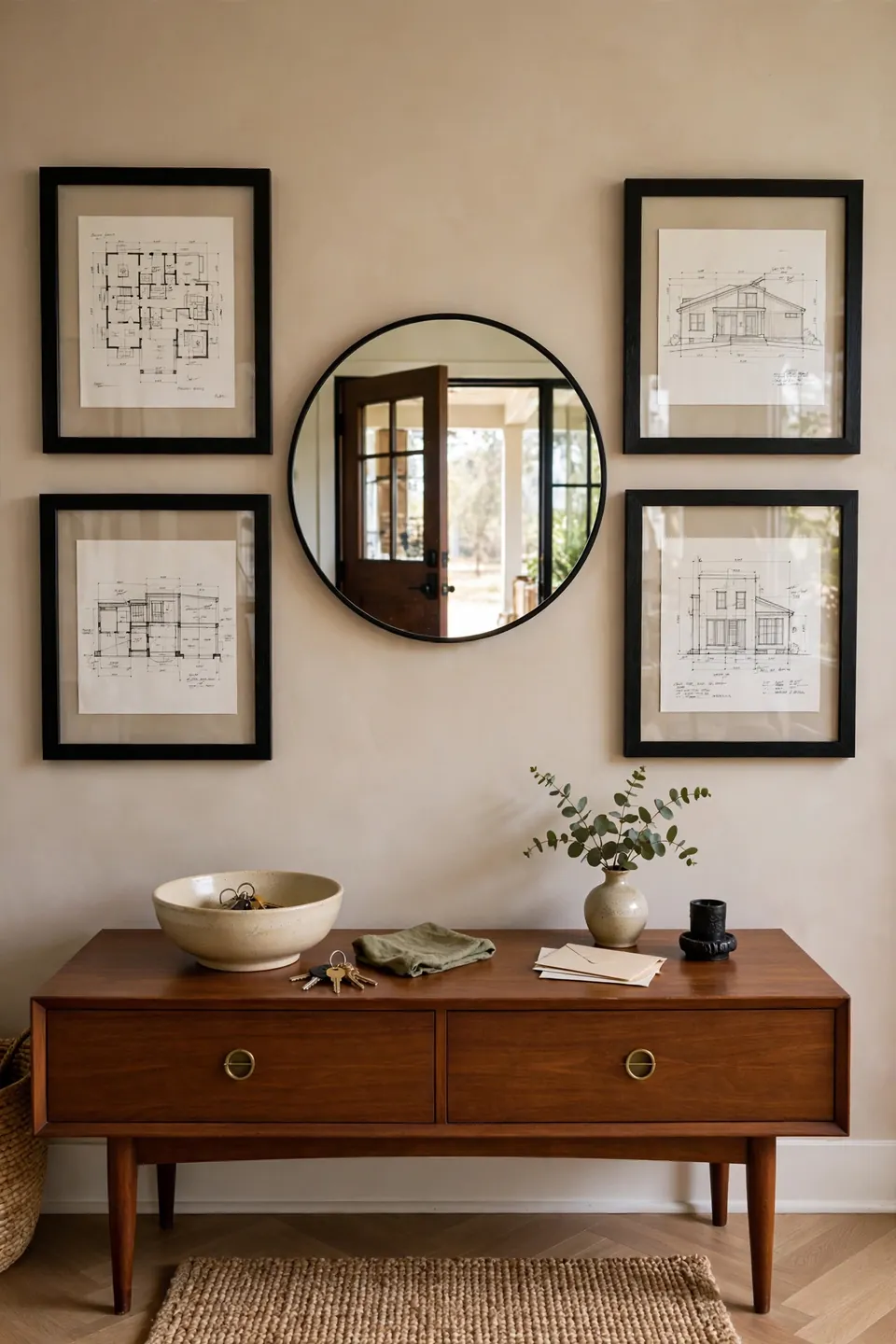
DO:
- Keep the arrangement compact so it does not overwhelm the entry.
- Include a mirror to check your look before heading out.
- Choose art that sets a warm, inviting tone.
DON’T:
- Hang frames where the front door might swing into them.
- Use glass frames at shoulder height in tight spaces.
- Clutter the console below with too many small objects.
Entryways deserve a greeting. A small gallery tells visitors they are welcome. Keep it simple and let your home shine from the first step inside. Choose art with warm tones that echo your living room palette, creating a smooth visual transition. I have noticed that a well styled entry makes the whole home feel more intentional, since first impressions set the tone for everything beyond the door.
Serene Bedroom Retreat
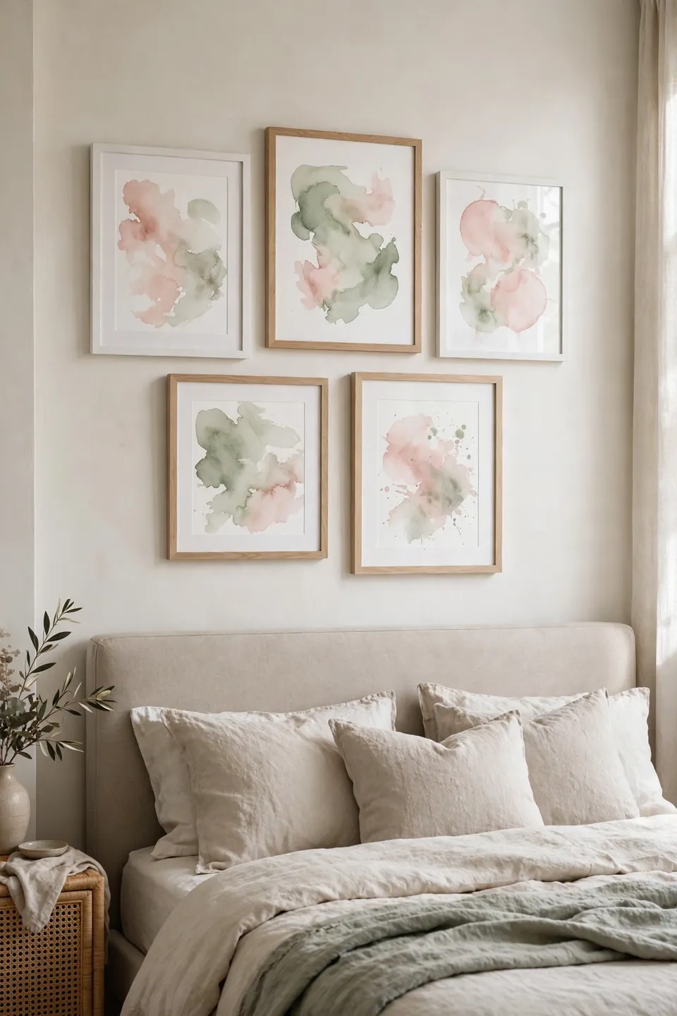
Energy: Calm | Palette: Blush, sage, cream | Mood: Restful | Best For: Master bedrooms
Bedrooms call for tranquility. Choose soft abstracts in muted tones and keep the arrangement simple and airy. In my experience, less truly is more above the bed, where you want rest rather than stimulation. Let gentle colors lull you toward sleep each night. Hang the center of the grouping at eye level when standing, which keeps it visible without dominating the room. Avoid high contrast pieces here, since bold art can feel energizing when you truly need deep calm rest. Keep lighting soft with warm bulbs for extra coziness.
Conclusion
Your walls are waiting for their moment. These gallery wall layout ideas for beginners prove that anyone can create a display with confidence, one frame at a time. Start with the layout that speaks to you, hang your first piece, and let the collection grow naturally. I have noticed that the most loved walls are the ones that evolve with real life. Save your favorite ideas on Pinterest, gather a friend to help you hang, and enjoy watching blank space turn into your favorite part of home.