24 Painted Flower Pots to Add Cheerful Charm to Any Space
A plain clay pot sits on the shelf, and ten minutes later it becomes the prettiest thing on your porch. That is the magic of painted flower pots: small, affordable, and endlessly personal. You do not need artistic training or fancy supplies, just a brush, some paint, and a free afternoon.
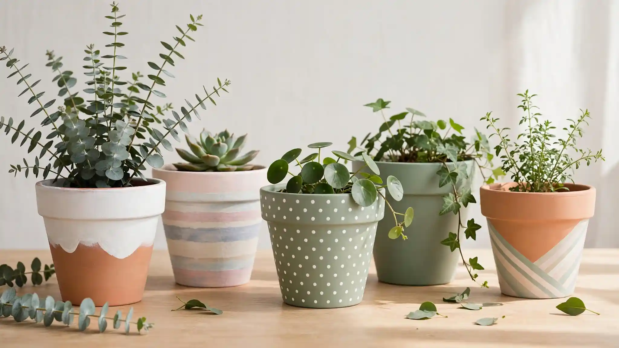
This guide walks you through 24 creative ways to decorate pots with paint, from soft neutrals to bold patterns. Each idea includes simple steps and practical tips so your results look polished, not crafty. If you enjoy quick outdoor refreshes, these outdoor dinner party decor ideas pair beautifully with freshly painted planters.
Terracotta White Dips
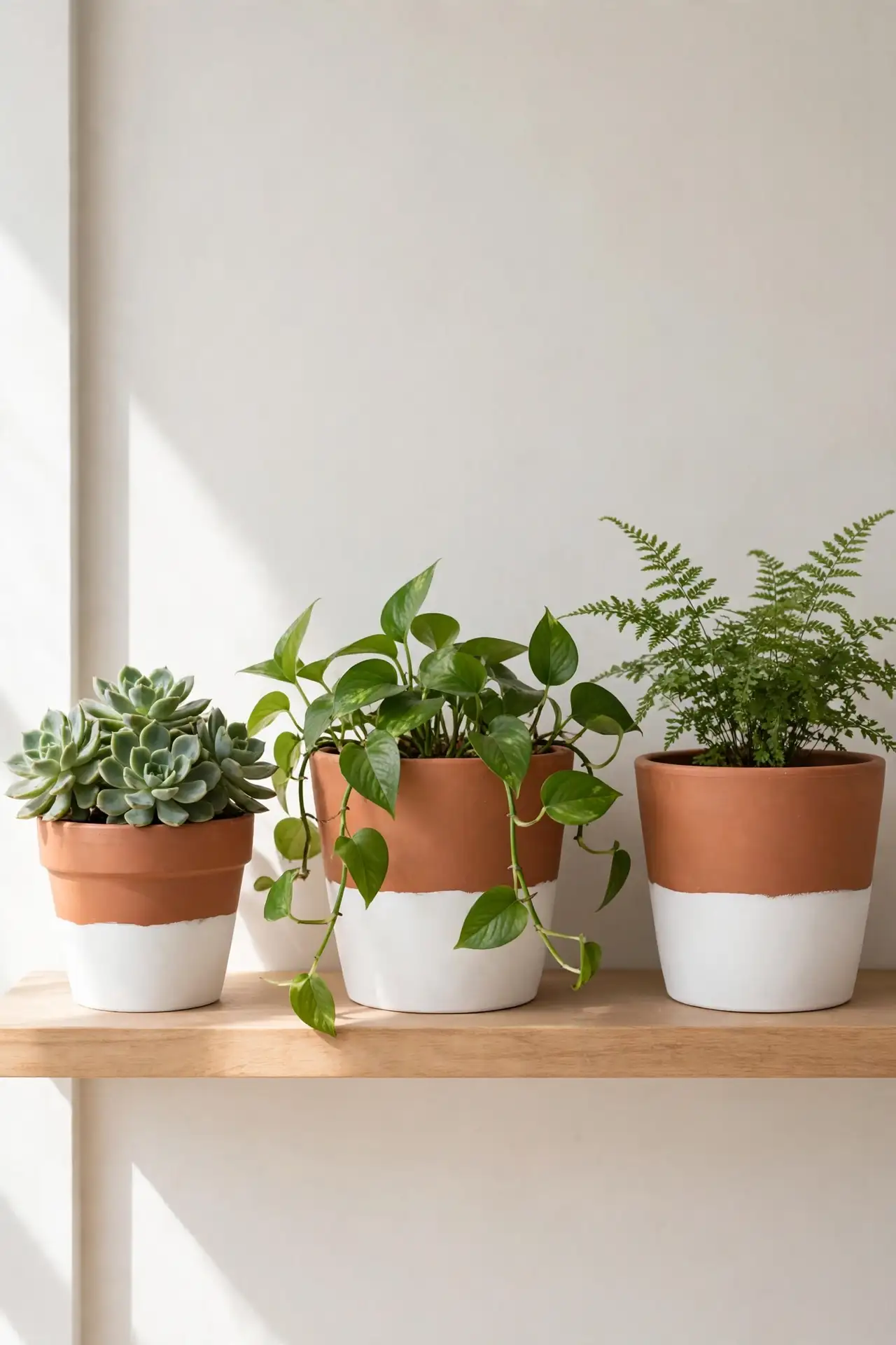
Half-dipped pots look like they came from an expensive boutique, yet the technique takes minutes. Brush white acrylic paint over the bottom half of a terracotta pot, keeping the edge slightly uneven for a relaxed, handmade feel. Let the warm clay show through on top for a beautiful contrast that suits both modern and rustic homes.
Seal the paint with a clear matte spray so the finish survives watering and rain. Group three pots in different sizes together for a styled shelf or entryway display. This project costs almost nothing if you already own leftover white paint, and the results photograph beautifully for social sharing.
Pastel Stripe Bands
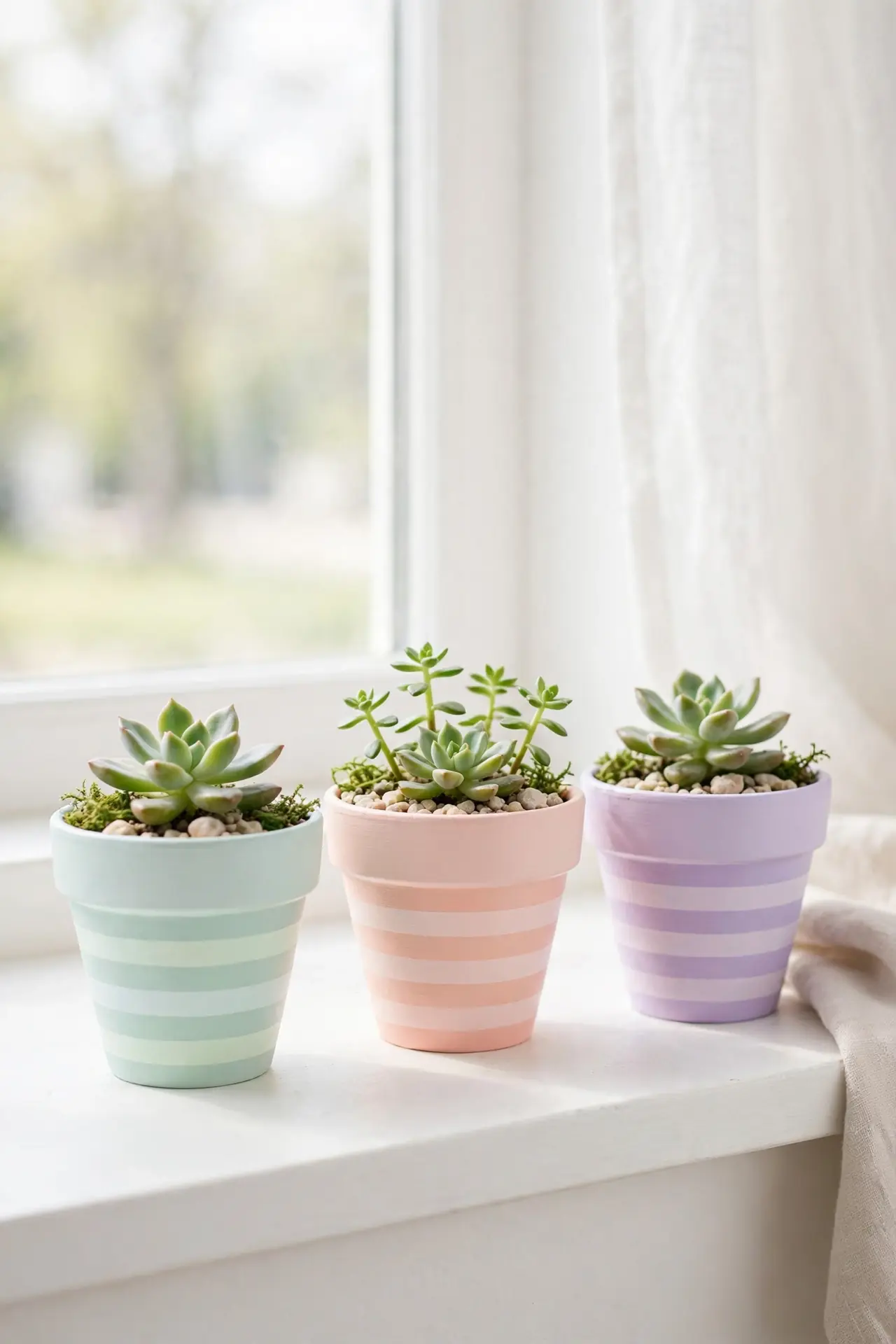
- Wrap painter’s tape in even bands around the pot before you start painting.
- Choose three pastel shades like mint, peach, and lavender for a soft, cheerful look.
- Apply two thin coats of acrylic paint, letting each coat dry fully between layers.
- Peel the tape away slowly while the final coat is still slightly tacky.
- Touch up any rough edges with a small detail brush and matching paint.
Striped pots bring instant energy to balconies, kitchen windowsills, and nursery shelves. Keep the rest of your decor simple so the colors take center stage. In my experience, grouping odd numbers of striped pots looks more natural than even rows. A clear sealant keeps the stripes crisp through the season.
Polka Dot Charm
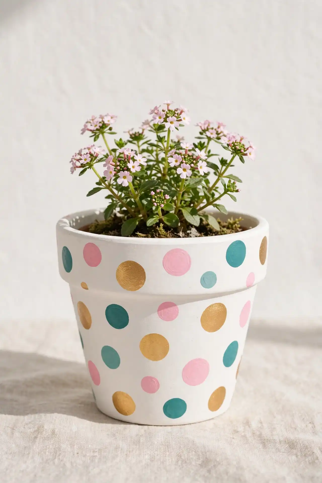
Quick Tip: Use the round end of a pencil eraser as a stamp for perfectly round dots. Dip it lightly in paint, press gently, and lift straight up without twisting. Practice on scrap paper first to get comfortable with the pressure. Wipe the eraser clean between colors to keep each dot crisp and bright.
Polka dots turn ordinary clay pots into playful accents for kids’ rooms and sunny patios. Vary the dot sizes for a more artistic, less uniform pattern that feels handmade. White dots on colored backgrounds pop the most, while gold dots on white look elegant and refined for living spaces.
Sage Green Matte
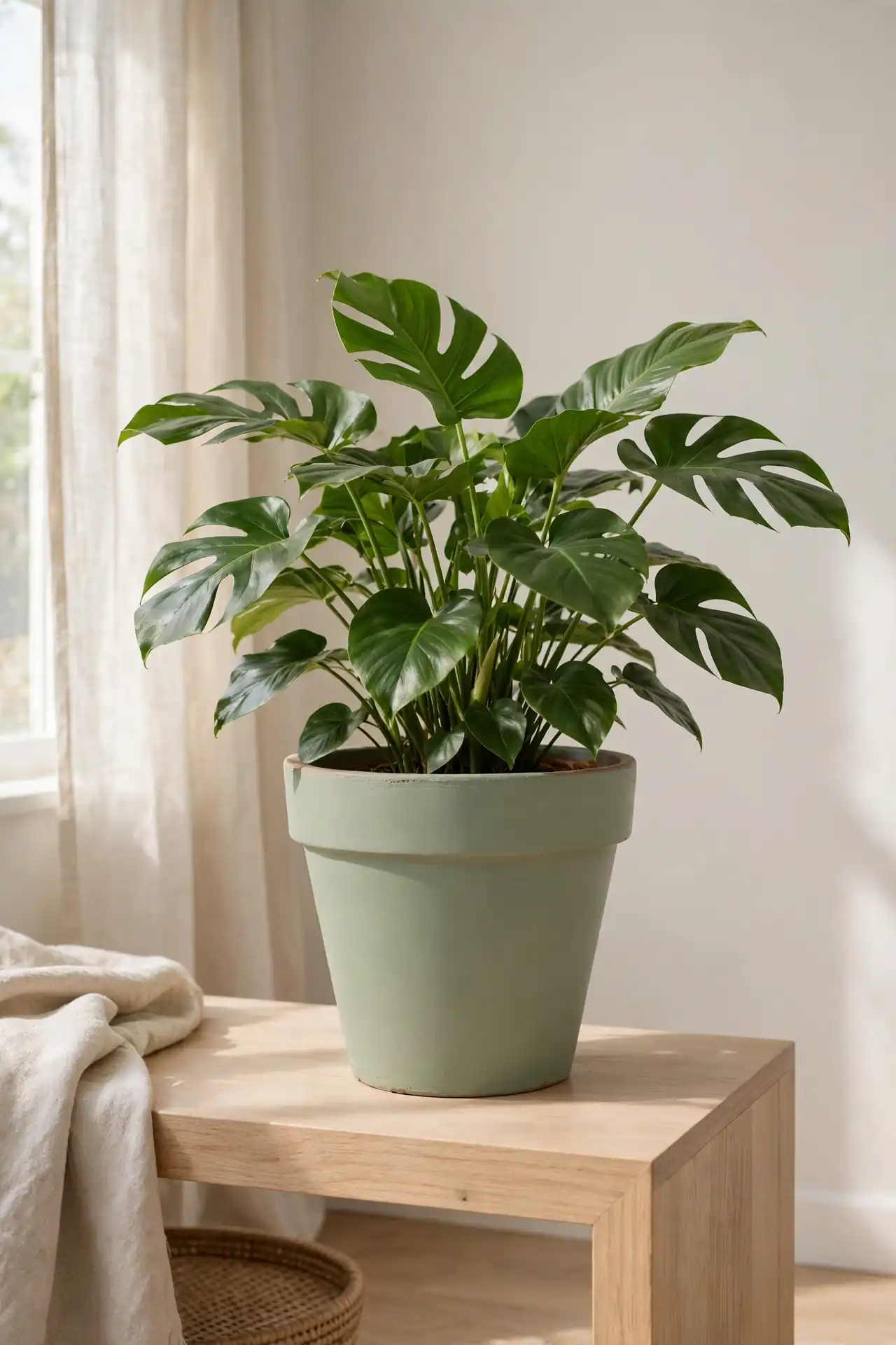
BEFORE: The orange clay pot clashed with the calm, neutral palette of the living room. It drew the eye for the wrong reasons and made the corner feel busy instead of restful.
AFTER: Two coats of matte sage green paint settled the pot into the space beautifully. The soft, muted tone lets the plant become the star while the pot quietly supports the overall look.
Matte finishes hide brush marks better than glossy ones, which makes sage green very forgiving for beginners. Pair these pots with linen cushions and light wood furniture for a cohesive, calming corner. I’ve seen this work well in many cases where homeowners want color without visual noise.
Geometric Triangle Art
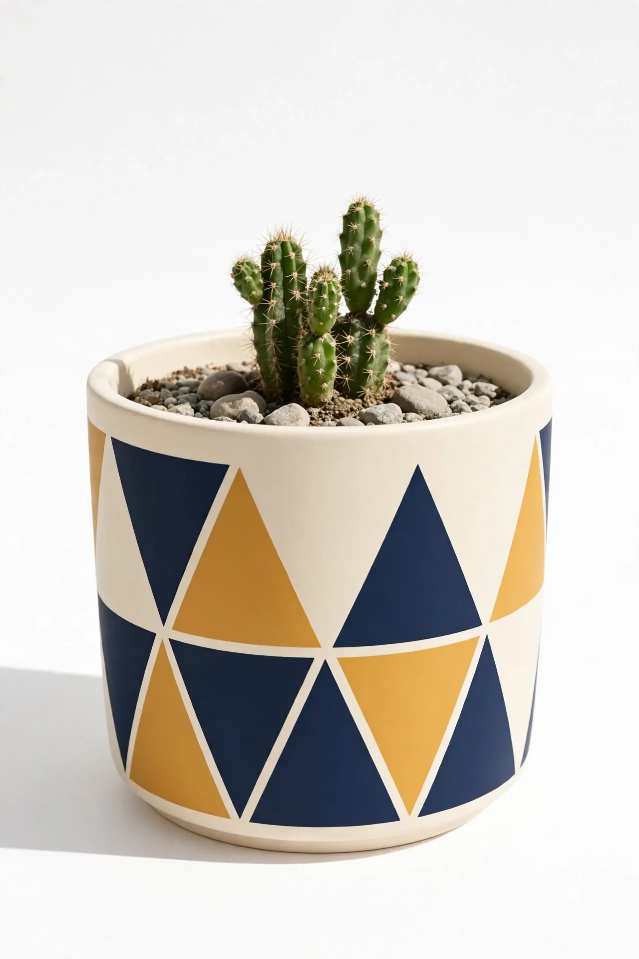
- Paint the entire pot in a light base color like cream or soft gray and let it dry completely.
- Cut small triangles from painter’s tape and arrange them in a scattered pattern around the pot.
- Fill the exposed triangles with a bold accent color such as navy, mustard, or terracotta.
- Remove the tape carefully, then seal the design with a clear protective spray.
Geometric patterns give plain pots a modern, graphic punch that suits contemporary interiors. Keep the color palette limited to two or three shades so the design stays clean and bold. These make wonderful handmade gifts because each pattern turns out slightly different. A steady hand matters more than perfect symmetry here.
Linen Wrap Tones
| Feature | Faux Linen Paint Finish | Real Fabric Wrap |
|---|---|---|
| Total cost | Under five dollars for paint and brushes | Around twelve dollars for fabric and adhesive |
| Water resistance | Excellent once sealed with clear spray | Poor, fabric frays and stains with moisture |
| Time to complete | About one hour including drying time | Around two hours with cutting and gluing |
| Best use | Outdoor porches and garden beds | Sheltered indoor shelves only |
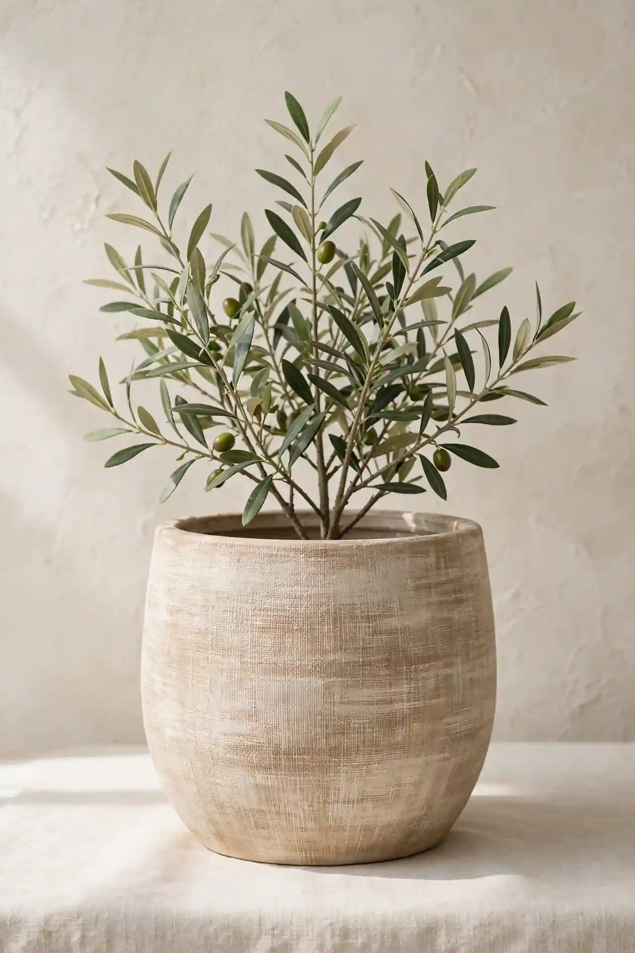
The faux linen paint technique creates a soft, woven texture using dry brush strokes in neutral beige tones. It suits coastal and farmhouse porches especially well. Seal the finish with two light coats, and the texture will survive the season. I’ve noticed guests always ask whether these are real fabric.
Sunny Yellow Pops
DO:
- Choose a warm, golden yellow that feels like sunshine rather than neon.
- Pair yellow pots with green plants for a fresh, high-contrast look.
- Use outdoor-rated acrylic paint so the color stays bright in sunlight.
DON’T:
- Paint every pot yellow, or the effect loses its cheerful punch.
- Skip the primer on dark clay, since yellow needs a light base.
- Place yellow pots against busy patterned backgrounds that compete for attention.
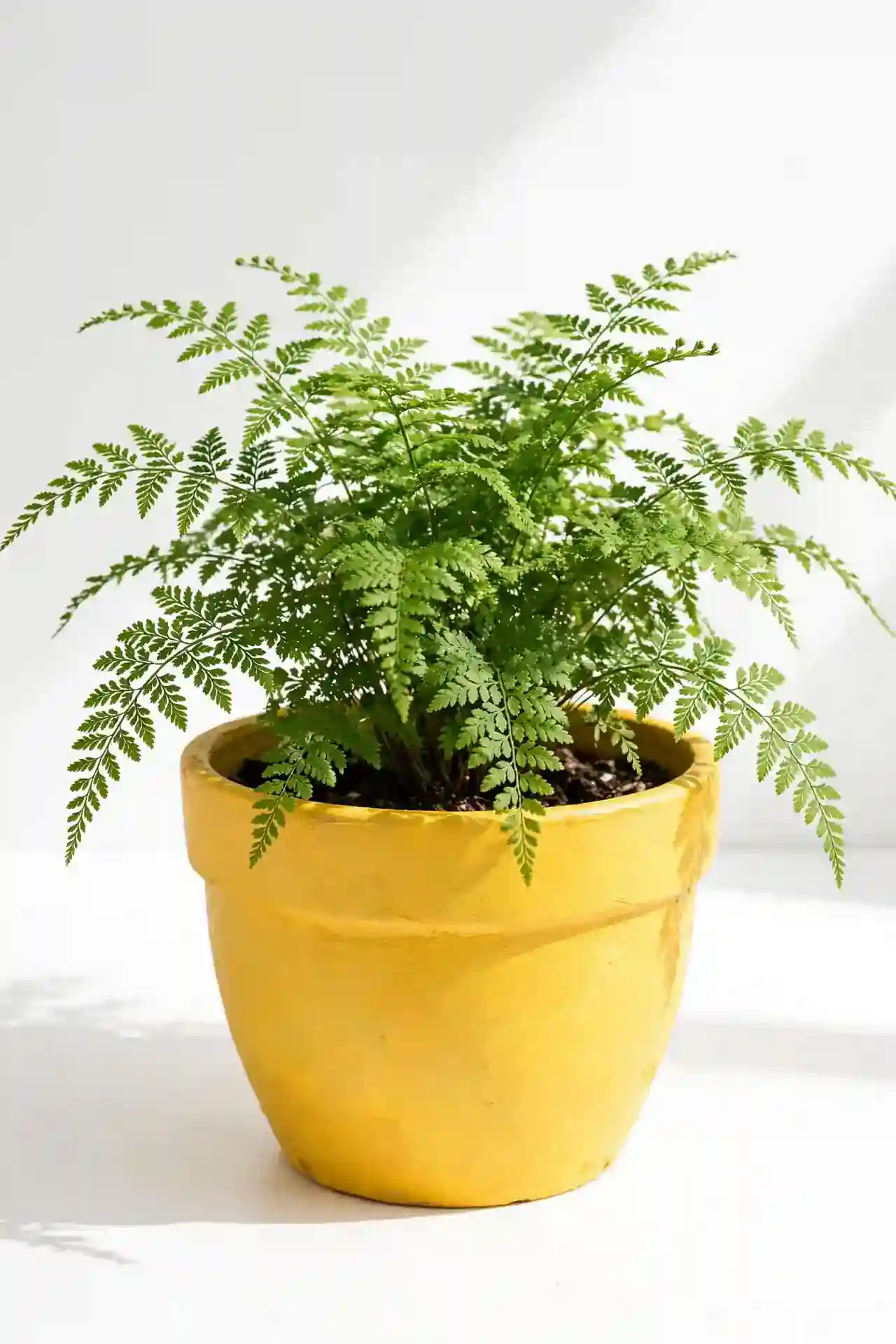
A single sunny pot can lift the mood of an entire patio or kitchen corner. Yellow works hardest when surrounded by neutrals like white, gray, and natural wood. That’s why many experts recommend using bold color as an accent rather than the main event. One bright pot beats five competing ones.
Ombre Sunset Fade
Cost: Low, around eight dollars for three small bottles of acrylic paint
Time: One relaxed afternoon including drying between layers
Skill Level: Beginner friendly with no experience needed
Best For: Patios, balconies, and sunset-facing windows
Difficulty: Easy blending with a dry brush technique
Result: A glowing gradient finish that photographs beautifully in evening light
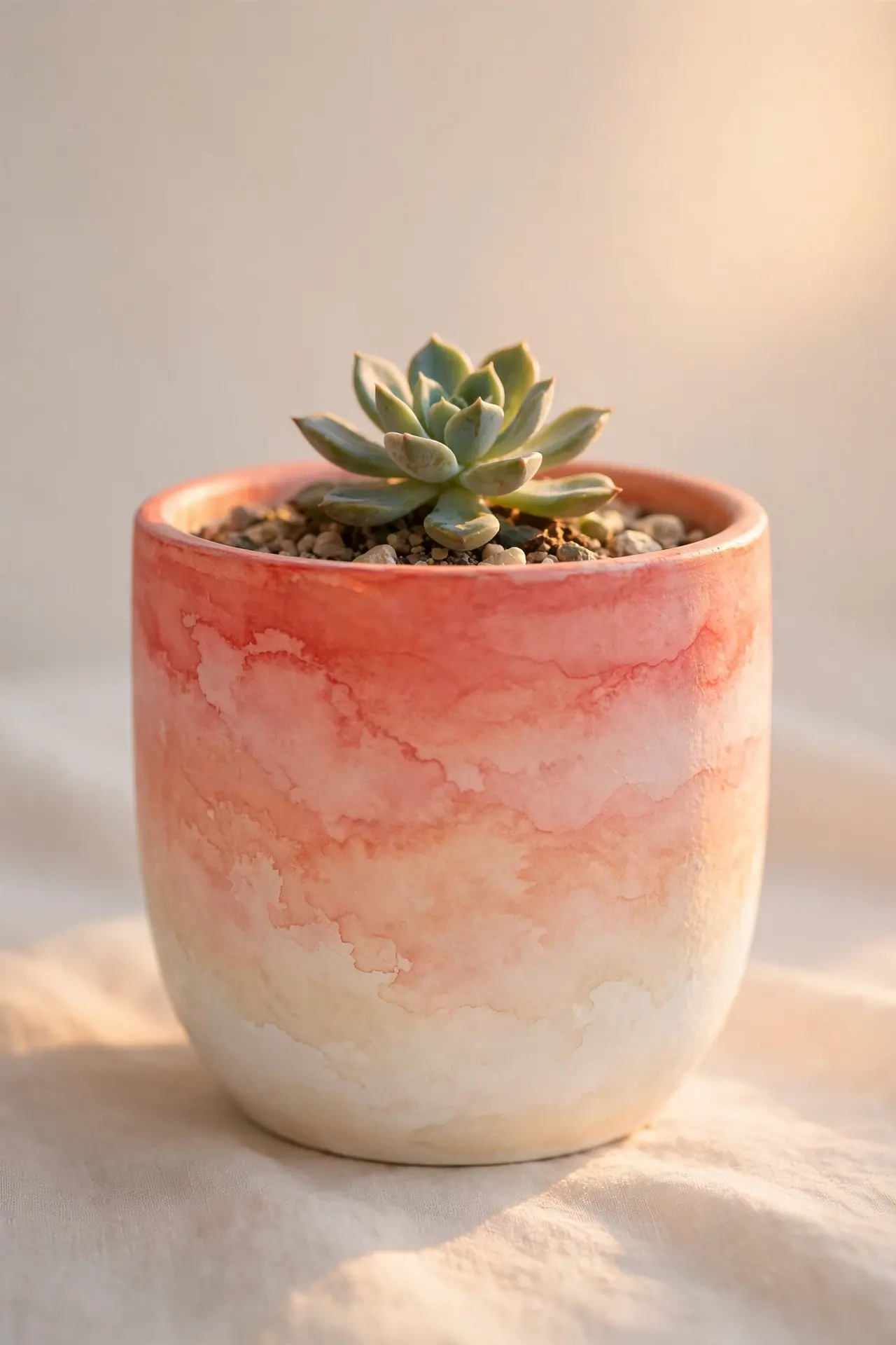
Blend coral, peach, and cream from bottom to top for a gradient that glows in evening light. Work while the paint is wet, feathering each color into the next with a dry brush. The soft transition hides every brush mark, which makes this technique wonderfully forgiving for first-timers.
Botanical Leaf Prints
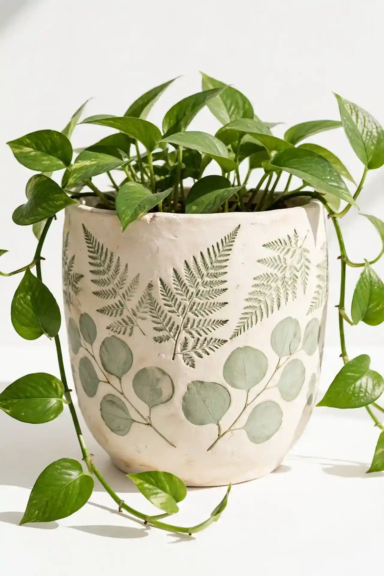
Press real leaves into wet paint for delicate botanical impressions that look professionally printed. Choose leaves with strong veins like fern, oak, or eucalyptus for the clearest patterns. Paint the pot in a solid base color first, then press the painted leaf gently onto the surface and peel it away.
This technique works beautifully in soft green on cream, or white on deep charcoal for dramatic contrast. Seal with a clear coat to protect the fine details from watering. I’ve noticed these leaf-printed pots become instant conversation pieces whenever guests visit the garden. The natural patterns never look mass-produced, which gives each pot a one-of-a-kind charm.
Checkerboard Accents
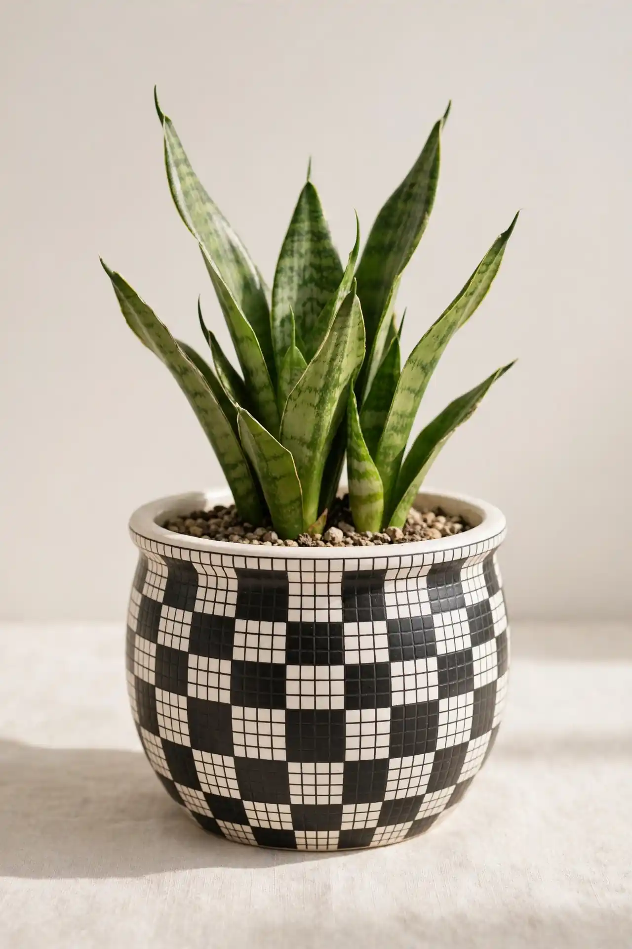
- Start with a white base coat and let it dry fully overnight.
- Use thin painter’s tape to mark a grid of even squares around the pot.
- Fill alternating squares with black or navy paint using a small foam brush.
- Remove the tape once the paint feels dry to the touch.
- Seal the checkerboard with matte spray to soften the contrast slightly.
Checkerboard pots add a playful retro vibe to kitchens and patios. Keep the squares small for a subtle effect, or go large for bold graphic impact. Pair them with simple green plants so the pattern remains the star of the show. This classic pattern never goes out of style.
Blush Pink Softness
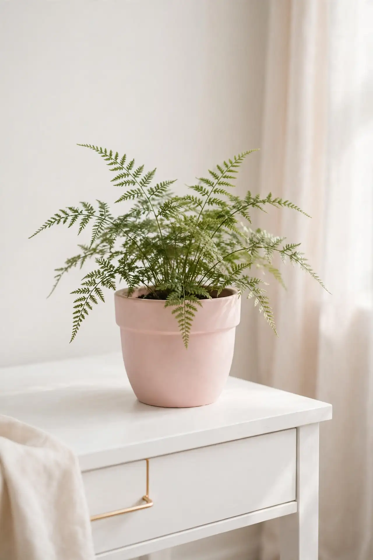
Quick Tip: Mix a drop of brown into pink paint to create a sophisticated blush instead of bubblegum. Test the shade on paper before committing to the pot. The right undertone makes all the difference between playful and elegant. Warm undertones suit terracotta bases, while cool undertones pair with gray.
Blush pink pots bring a soft, romantic touch to bedrooms, nurseries, and vanity tables. The muted shade works as a neutral, pairing well with whites, creams, and natural wood. Add a trailing pothos or soft fern to complete the gentle, dreamy look. This shade flatters nearly every plant you pair with it.
Speckled Stone Look
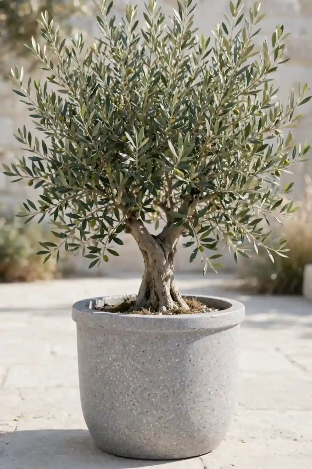
BEFORE: The bright orange pot looked too casual next to the elegant stone patio furniture. Its glossy finish clashed with the natural textures of the outdoor space. Something needed to change.
AFTER: A speckled gray finish made the pot look like carved stone at a fraction of the cost. The matte texture blends perfectly with concrete, slate, and natural rock elements.
Flick paint from a stiff brush or old toothbrush to create realistic speckles over a gray base. Layer two or three speckle colors for depth that mimics real stone. I’ve seen this work well in many cases where gardeners want a high-end look on a small budget.
Coastal Blue Wash
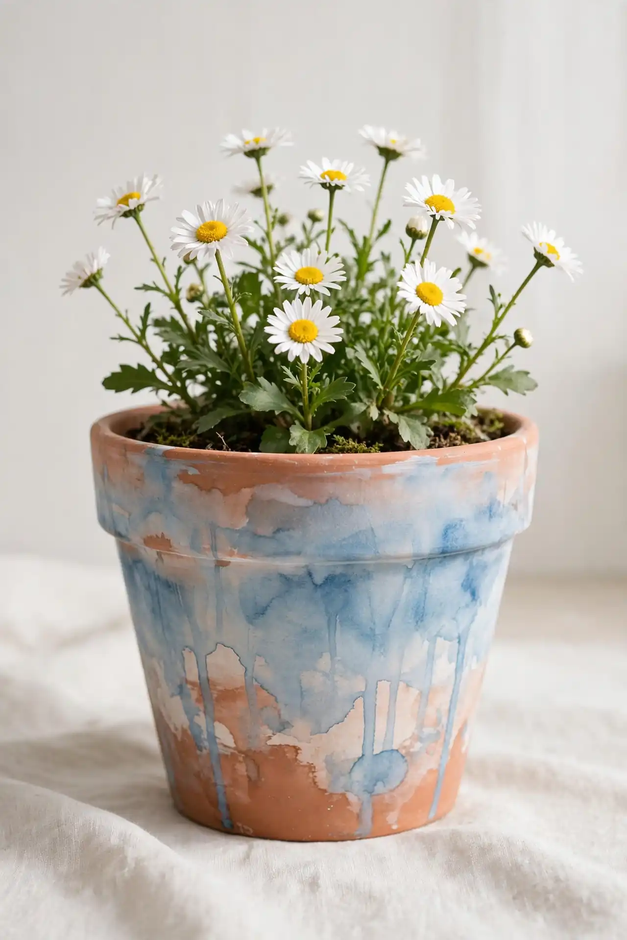
- Thin blue acrylic paint with equal parts water to create a translucent wash.
- Brush the wash over the pot in long vertical strokes, letting the clay show through.
- Add a second layer on the lower half for a subtle gradient effect.
- Lightly sand the raised edges once dry to enhance the weathered coastal feel.
The washed blue finish evokes breezy beach houses and relaxed summer afternoons. It pairs beautifully with white flowers, sandy neutrals, and driftwood accents. This is one of the fastest techniques here, making it ideal when you want to refresh several pots in one sitting. The imperfections are what make it charming.
Gold Rim Details
| Feature | Gold Paint Pen | Metallic Gold Paint |
|---|---|---|
| Application | Precise lines with no brush needed | Smooth coverage with a fine brush |
| Best for | Thin rims and small details | Wide bands and larger areas |
| Drying time | About ten minutes | Around one hour |
| Finish quality | Bright and sharp | Rich with subtle texture |
| Cost | Around six dollars per pen | Around eight dollars per bottle |
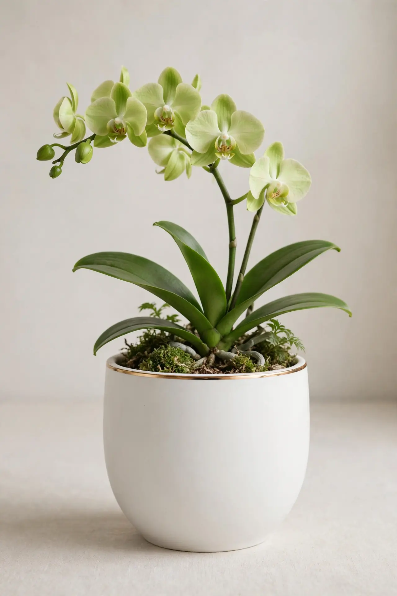
A thin gold rim instantly makes any painted pot look more expensive and intentional. Keep the rest of the design simple so the metallic accent takes center stage. In my experience, gold details photograph especially well for online shops and gift giving. Less truly is more with metallic touches.
Herb Label Markers
DO:
- Use chalkboard paint on a small section for labels you can change seasonally.
- Write herb names in neat capital letters with a chalk marker.
- Seal the surrounding painted areas while leaving the label section writable.
DON’T:
- Use permanent markers for labels, since you cannot update them later.
- Make the label area too small to read from a few steps away.
- Forget to cure chalkboard paint for 24 hours before writing on it.
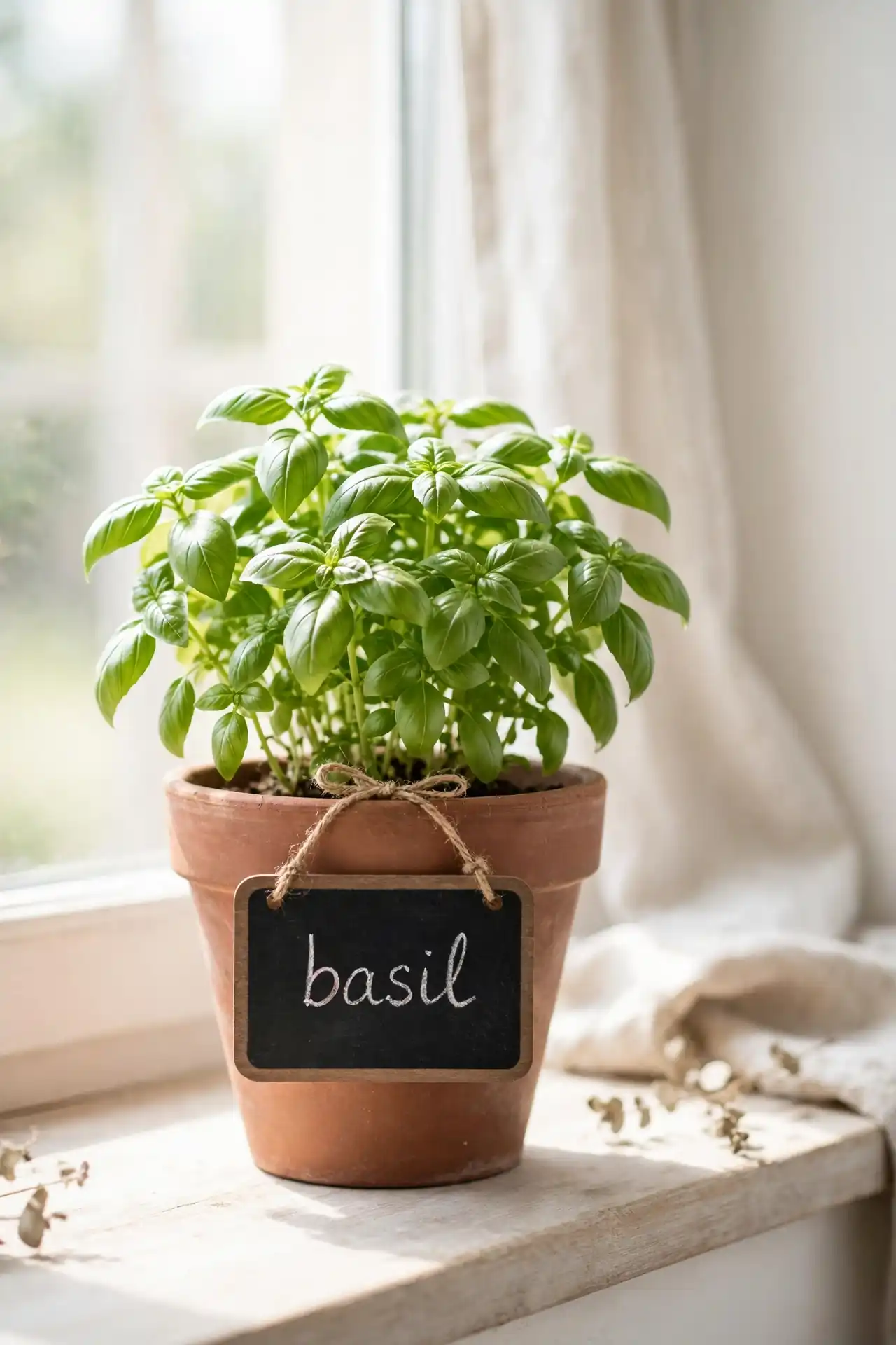
Labeled herb pots turn a kitchen windowsill into a functional mini garden. The chalkboard section adds a charming farmhouse touch while keeping things organized. That’s why many experts recommend labeling for anyone growing more than three herbs at once. Fresh labels also make wonderful gifts for cooking enthusiasts.
Rainbow Arc Bands
Cost: Low, basic acrylics in rainbow shades
Time: About two hours with drying
Skill Level: Intermediate, steady arcs needed
Best For: Kids’ rooms and cheerful patios
Difficulty: Moderate freehand curves
Result: A joyful burst of color that lifts any corner
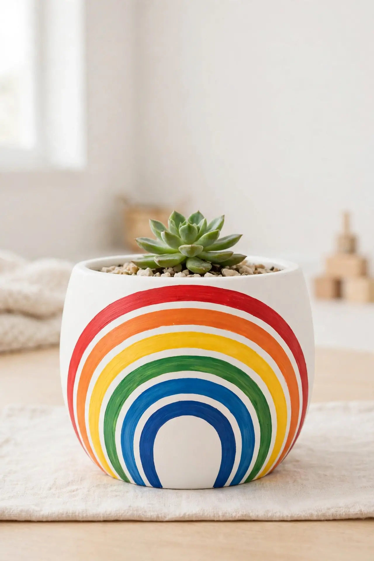
Paint concentric rainbow arcs across the pot for a design that radiates pure happiness. Use a compass or trace around different sized lids to keep each curve clean and even. Start with red on the outside and work inward through the spectrum for the classic rainbow order. The bright bands look especially charming against white walls and simple furniture that let the colors shine.
Minimalist Line Art
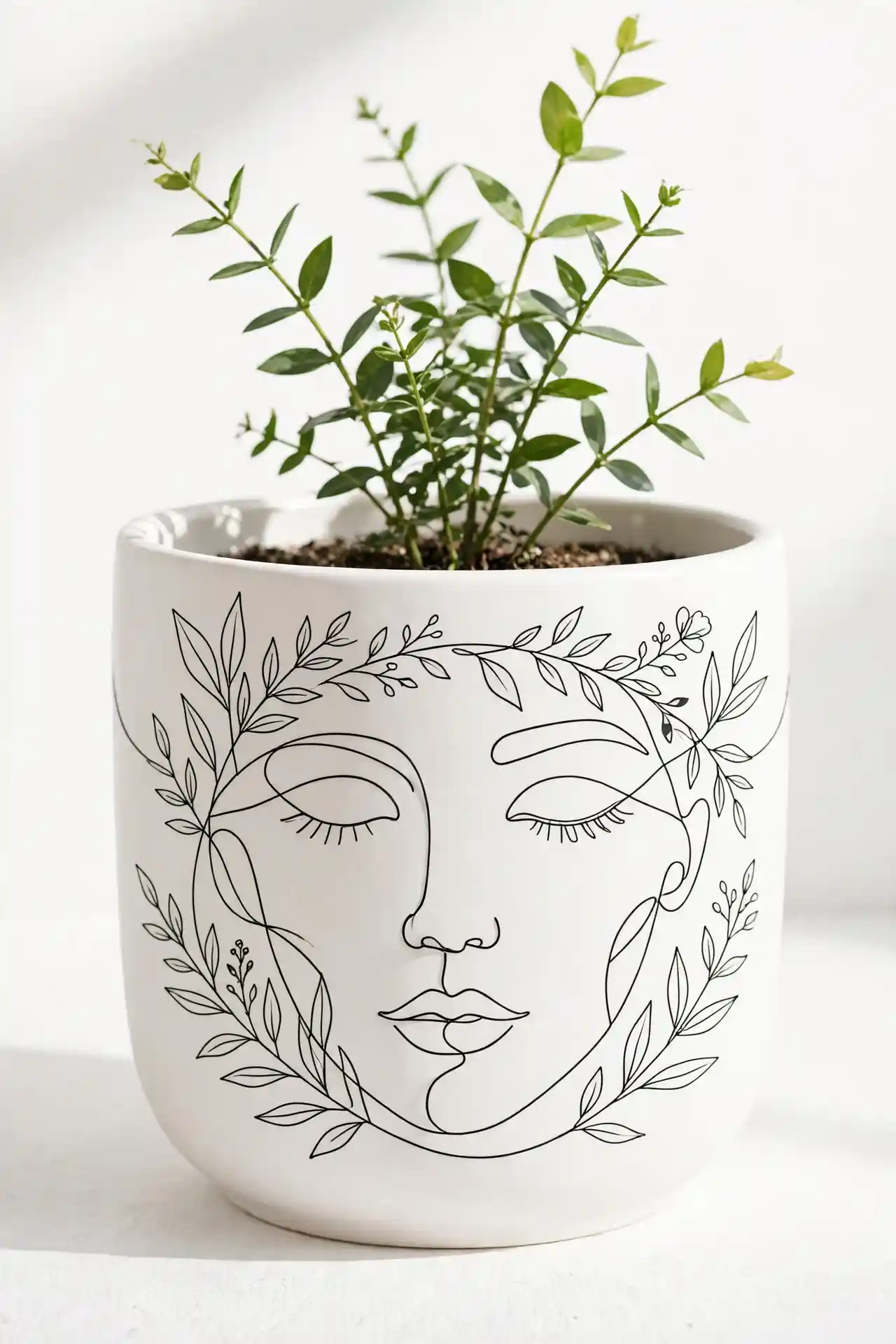
Single continuous line drawings give pots a gallery-worthy, artistic edge. Sketch faces, botanical stems, or abstract shapes with a thin black paint pen on a white or cream base. The simplicity of one unbroken line creates striking visual impact. No artistic training is required, just a steady hand and quiet confidence. Practice the design on paper first to build muscle memory.
This style suits modern interiors where less truly is more. Keep the plant simple too, since busy foliage competes with the delicate artwork. I’ve noticed minimalist pots sell quickly at craft markets because the style feels fresh and current. One bold line drawing beats a cluttered design every time.
Marble Swirl Finish
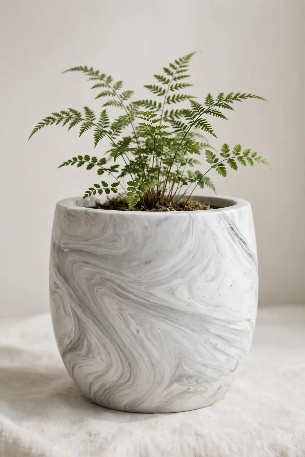
- Fill a disposable container with water and drip in two or three nail polish colors.
- Swirl the colors gently with a toothpick to create a marbled pattern.
- Dip the pot slowly into the water, letting the polish wrap around the surface.
- Lift straight out and let it dry completely before handling.
- Seal with clear spray to protect the delicate swirled finish.
Marbled pots look like expensive stoneware but cost almost nothing to make. Each dip creates a unique pattern, so no two pots ever match exactly. Work in a ventilated area since nail polish fumes are strong. The results always surprise you in the best way.
Chalkboard Message Pots
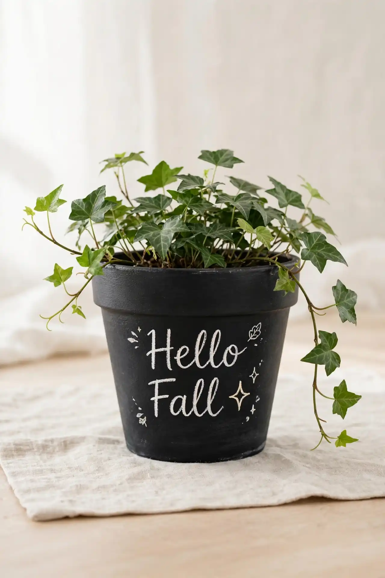
Quick Tip: Apply three thin coats of chalkboard paint rather than one thick coat for the smoothest writing surface. Let each coat dry for one hour. Condition the surface by rubbing chalk over it and wiping clean before writing your first message. This prevents ghosting from your first design. Store chalk in a small dish beside the pot.
Write seasonal greetings, plant names, or sweet quotes that you can change anytime. Chalkboard pots work wonderfully for weddings, parties, and holiday decorating. Keep a piece of chalk nearby so updating the message feels easy and fun. Guests love leaving their own little notes on them.
Vintage Crackle Glaze
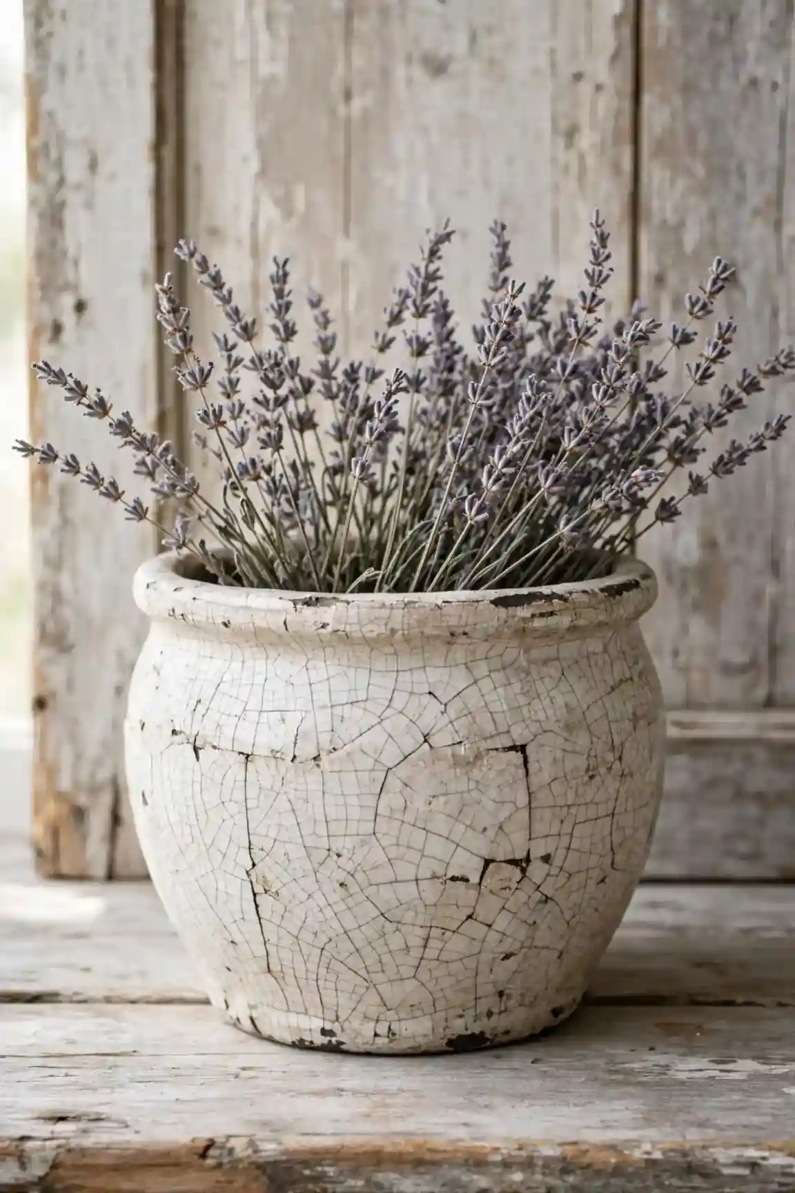
BEFORE: The plain white pot looked too new and stark against the antique wooden sideboard. It lacked the character and warmth that the vintage-inspired room demanded. Something needed to change.
AFTER: A crackle medium between two paint layers created authentic-looking aged texture. The fine cracks catch the light beautifully and give the pot a beloved, timeworn presence.
Apply the crackle medium over a dark base coat, then brush a light top coat over it. As the top layer dries, cracks form naturally to reveal the darker color beneath. I’ve seen this work well in many cases for farmhouse and shabby chic decorating styles, especially alongside vintage home decor ideas.
Terracotta Rose Blooms
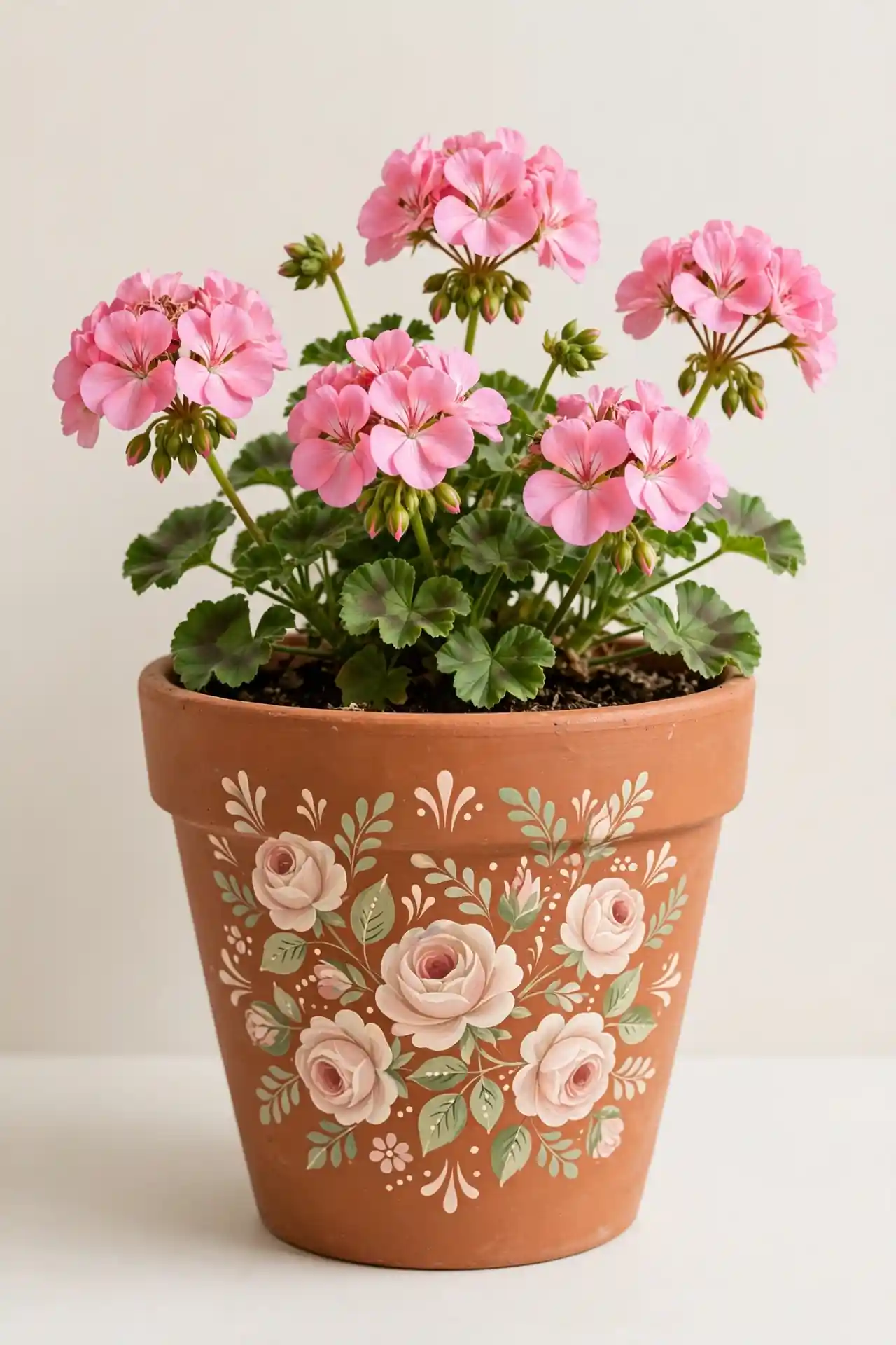
- Paint the pot in a warm terracotta base and let it dry completely.
- Use a round brush to stamp simple five-petal rose shapes in cream and blush.
- Add small green leaves between the blooms with the tip of the brush.
- Dot tiny yellow centers in each rose for a finished, detailed look that pops.
Hand-painted roses bring cottage garden charm to any windowsill or patio table. The folk art style looks intentional even when the blooms are imperfect. These pots make thoughtful Mother’s Day gifts that feel personal and heartfelt. Practice the rose shape on paper until it feels natural. Each bloom gets better with practice.
Two Tone Color Block
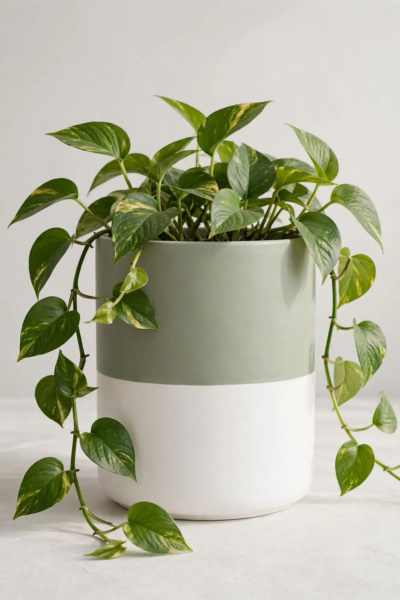
| Feature | Horizontal Split | Diagonal Split |
|---|---|---|
| Tape method | One straight band around the middle | Angled tape from rim to base |
| Visual effect | Calm and balanced | Dynamic and modern |
| Difficulty | Very easy for beginners | Needs careful measuring |
| Best colors | White over sage or clay | Navy over cream or blush |
| Plant pairing | Trailing pothos or ferns | Bold succulents or snake plants |
Color blocking divides the pot into two bold sections for maximum visual impact. The crisp line between colors looks sharp and contemporary. Choose shades that complement your existing decor for a cohesive, designer look. In my experience, the diagonal split photographs more dramatically. Both styles work beautifully in modern spaces.
Pressed Flower Seal
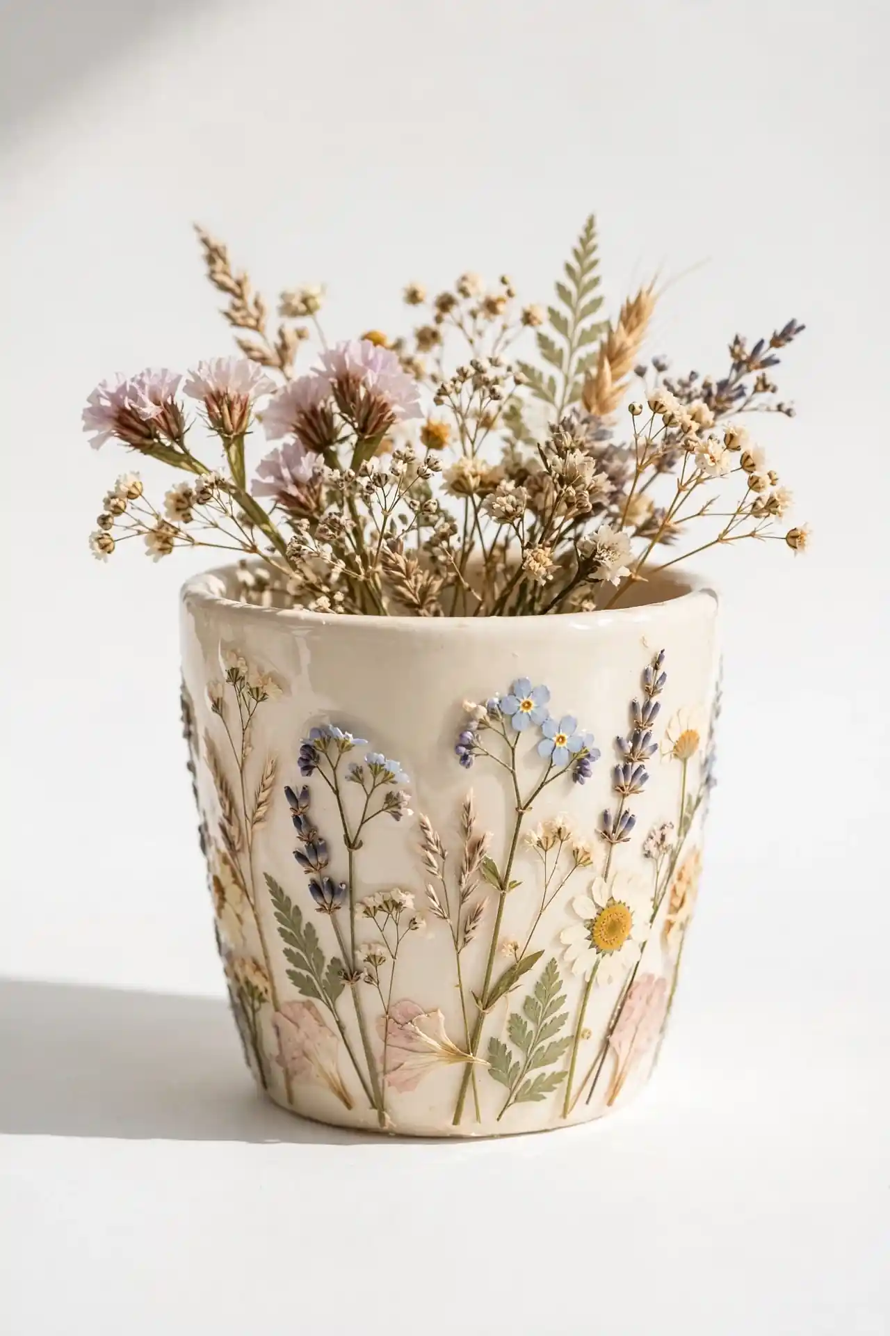
DO:
- Press flowers for one week in a heavy book before using them.
- Arrange the dried blooms on the pot with tweezers for precision.
- Seal with three thin layers of decoupage glue for full protection.
DON’T:
- Use fresh flowers, since moisture causes browning under the seal.
- Apply thick glue layers that trap air bubbles underneath.
- Skip the final clear coat that guards against watering splashes.
Real pressed flowers preserved under sealant create a delicate, botanical keepsake. Each pot captures a moment from your garden in lasting form. These make meaningful gifts for gardeners who appreciate handmade, personal touches. The translucent petals glow beautifully when light hits them. No two arrangements ever look exactly alike.
Neutral Sand Texture
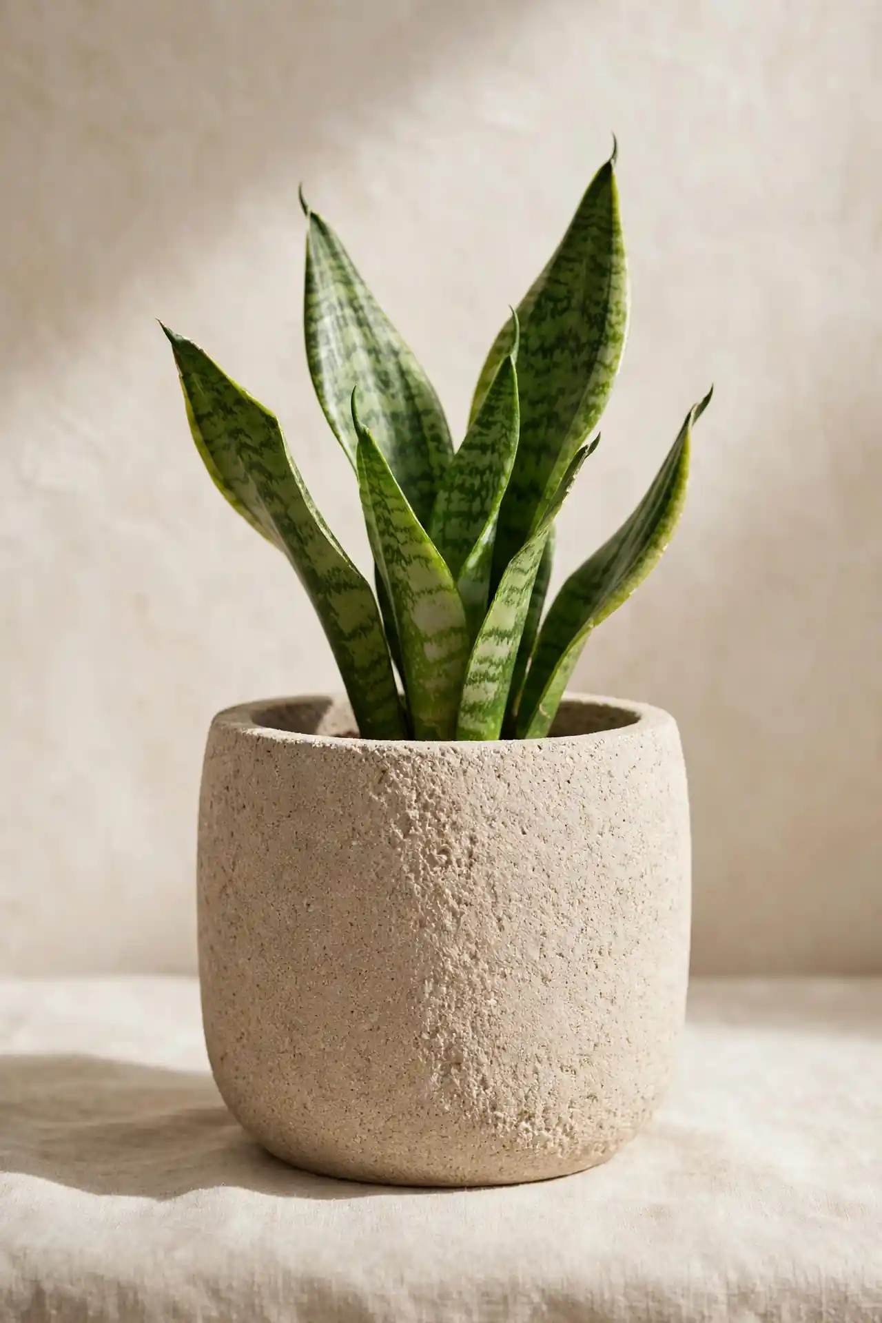
Cost: Low, textured paint or sand additive
Time: One hour plus overnight drying
Skill Level: Beginner, very forgiving technique
Best For: Modern and Japandi style spaces
Difficulty: Easy, mistakes add character
Pairs With: Olive trees, snake plants, and dried grasses
Result: A tactile, stone-like finish in warm neutrals
Mix fine sand into beige paint for a gritty texture that mimics natural stone. The tactile surface adds depth without introducing new colors to your palette. This finish works beautifully in minimalist spaces where texture matters more than pattern. Run your fingers over the dried surface to feel the subtle, organic grain. The neutral tone blends with any decor style.
Conclusion
These 24 ideas prove that a little paint goes a long way. Whether you tried bold patterns or subtle textures, your painted flower pots now reflect your personal style. Save your favorite designs on Pinterest for future inspiration, and share your creations with fellow plant lovers. I’ve seen how small changes like these can completely shift the way a space feels. Start with one pot to build confidence, then tackle a whole collection for your porch or patio. Your plants deserve beautiful homes, and your space deserves the personal touch that only handmade decor provides. Pick up that brush and enjoy every colorful minute.